TikZ and PGF Manual
Data Visualization
83 Visualizers
83.1 Overview
In a data visualization a long stream of data points is visualized using visualizers. Recall that it is the job of the axis systems as described in Section 82 to determine where data points are visualized. It is the job of the visualizers to determine how they are visualized.
The most basic and common visualizer is the line visualizer. It simply connects subsequent data points by straight lines to indicate either that the points on these lines interpolate between the real data points or the straight lines are used to indicate the order in which the data points appear. A different, more “conservative” visualizer is the scatter visualizer or mark visualizer, which just places a small mark at each data point. Such a visualizer does not imply any interpolation or ordering between the data points.
Visualizers may, however, also be more complicated. For instance, a visualizer used for a box plot could visualize a data point as a box with a median value, standard deviation, outliers, and other information; a rectangle visualizer might visualize data points as larger areas; a projection visualizer might visualize the projection of data points onto different axes; and so.
Creating a new visualizer is not quite trivial since a new pgf class needs to be implemented. Fortunately, using visualizers is much simpler: For each kind of visualizer there is a key that allows you to create such a visualizer. You can then use further keys to configure the visualizer and to connect it to the data.
In a data visualization multiple visualizers may exist at the same time. This happens in different situations:
-
• A data visualization may contain several independent data sets that are to be visualized. There might be a line plot, for which a line visualizer is used, and also a scatter plot, for which a scatter visualizer would be used.
In this case, for each data point only one visualizer will do anything. To achieve this, each data point has an attribute called visualizer which tells the visualizer objects whether they should “react” to the data point or not.
-
• A single data point might be visualized several times. For instance, a scatter visualizer might draw a mark at the data point’s position on the page and a projection visualizer might draw, additionally, a mark at the projected position.
83.2 Usage
83.2.1 Using a Single Visualizer
The simplest scenario for using visualizers are data visualizations in which there is only a single data set that is visualized in one style. In this case, all that needs to be done in order to choose a visualizer is use one of the options starting with visualize as ... together with the \datavisualization command:
\usetikzlibrary {datavisualization}
% Define a data set:
\tikz \datavisualization data
group {example} = {
data {
x, y
0, 0
0.5, 2
1, 2
1.5, 1.5
2, 0.5
}};
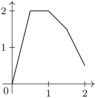
\tikz \datavisualization [school book axes, visualize as line] data
group {example};
\qquad
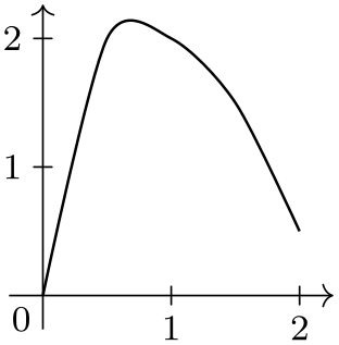
\tikz \datavisualization [school book axes, visualize as smooth line] data
group {example};
\qquad
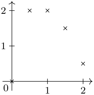
\tikz \datavisualization [school book axes, visualize as scatter] data
group {example};
Methods for styling visualizers are discussed in Section 83.2.3.
83.2.2 Using Multiple Visualizers
A data visualization may contain multiple data groups and for each data set we might wish to use a different visualizer. In this case, we need some way of telling the data visualization engine to which visualizer should be used with the different data points.
To solve this problem, you can name a visualizer. The visualizer’s name can then both be used to configure the visualizer and also to indicate that data points “belong” to the visualizer.
Naming a visualizer is quite simple: The visualize as ... keys actually take a single parameter, which is the name of the visualizer. For instance, the following code creates three visualizers, named sin, cos, and tan:
(When you just say visualize as line without providing a name, the name line is chosen as a default, for visualize as scatter the name scatter is the default and so.)
In order to indicate which data points should be visualized by which of these visualizers, the following key is important:
-
/data point/set(no value) 
A visualizer will only act on a data point when its name matches the value of this key. Initially, this key is set to the last visualizer created, so if there is only one, there is no need to set or worry about this key.
Since the set key has the path prefix /data point, it can be set like any other attribute of a data key:
\usetikzlibrary {datavisualization}
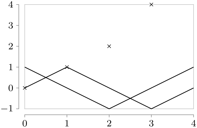
\tikz \datavisualization
[scientific axes=clean,
visualize as line=sin,
visualize as line=cos,
visualize as scatter=tan]
data {
x, y, set
0, 0, sin
1, 1, sin
2, 0, sin
3, -1, sin
4, 0, sin
0, 1, cos
1, 0, cos
0, 0, tan
1, 1, tan
2, 2, tan
3, 4, tan
2, -1, cos
3, 0, cos
4, 1, cos
};
As can be seen, the data points with the same set attribute do not need to be consecutive.
The above method of specifying the visualizer works nicely, but in most cases it would be more natural to keep the set attribute out of the table. This is easy to achieve by using multiple data and using the following key:
-
/pgf/data/set=⟨name⟩(no default) 
Shorthand for /data point/set=⟨name⟩.
                    \usetikzlibrary {datavisualization}

                    \tikz \datavisualization

                     [scientific axes=clean,

                      visualize as line=sin,

                      visualize as line=cos]

                    data [set=sin] {

                      x, y

                      0, 0

                      1, 1

                      2, 0

                      3, -1

                      4, 0

                    }

                    data [set=cos] {

                      x, y

                      0, 1

                      1, 0

                      2, -1

                      3, 0

                      4, 1

                    };
When you need to visualize several similar things in a single plot (like ten lines that all get visualized by visualize as line), it is somewhat cumbersome having to write this ten times. In this case you can shorten your code by making use of the .list key handler: When you add it to a key, the “value” passed to the key is parsed as a list of values. The key is then executed once for each of these values:
                \usetikzlibrary {datavisualization.formats.functions}

                \tikz \datavisualization

                 [scientific axes=clean,

                  visualize as line/.list={sin, cos, tan}]

                data [set=sin, format=function] {

                  var
                x
                :
                interval[0:3*pi];

                  func
                y
                =
                sin(\value x r);

                }

                data [set=cos, format=function] {

                  var
                x
                :
                interval[0:3*pi];

                  func
                y
                =
                cos(\value x r);

                }

                data [set=tan, format=function] {

                  var
                x
                :
                interval[0:pi/2.2];

                  func
                y
                = tan(\value x r);

                };
83.2.3 Styling a Visualizer
In order to style a visualizer that has been created using for instance visualize as line=⟨visualizer name⟩, you can use the following key:
-
/tikz/data visualization/⟨visualizer name⟩=⟨options⟩(no default) 
For each visualizer, a key of the same name is created with the path prefix /tikz/data visualization. This key takes the ⟨options⟩ and executes them with the path prefix
                    /tikz/data
                    visualization/visualizer
                    options/
These options are then used to configure the appearance of the current visualizer. (This is quite similar to the way options are passed to an axis in order to configure the axis.) Possible options include style, but also label in legend and label in data. The latter two options are discussed in Section 84.3, the first option below.
                    \usetikzlibrary {datavisualization.formats.functions}

                    \tikz \datavisualization

                     [scientific axes=clean,

                      visualize as smooth line/.list={sin, cos},

                      sin={style=red},

                      cos={style=blue}]

                    data [set=sin, format=function] {

                      var
                    x
                    :
                    interval[0:3*pi];

                      func
                    y
                    =
                    sin(\value x r);

                    }

                    data [set=cos, format=function] {

                      var
                    x
                    :
                    interval[0:3*pi];

                      func
                    y
                    =
                    cos(\value x r);

                    };
-
/tikz/data visualization/visualizer options/style=⟨options⟩(no default) 
The ⟨options⟩ given to this key should be normal TikZ options. They will be executed when the visualizer is used.
                    \usetikzlibrary {datavisualization.formats.functions}

                    \tikz \datavisualization

                     [scientific axes=clean,

                      visualize as smooth line=sin,

                      sin={style={red, densely dotted}},

                      visualize as smooth line=cos,

                      cos={style={mark=x}},

                    ]

                    data [set=sin, format=function] {

                      var
                    x
                    :
                    interval[0:3*pi];

                      func
                    y
                    =
                    sin(\value x r);

                    }

                    data [set=cos, format=function] {

                      var
                    x
                    :
                    interval[0:3*pi];

                      func
                    y
                    =
                    cos(\value x r);

                    };
When you have multiple visualizers in a single data visualization, you can use the style option with each visualizer to configure their different appearances as in the above example. However, it is usually much better (and easier) to use a style sheet, see Section 84.

                    \usetikzlibrary {datavisualization.formats.functions}

                    \tikz \datavisualization

                     [scientific axes={clean, end labels},

                      x axis={label=$x$}, y axis={grid={major also at=0}},

                      visualize as smooth line/.list={sin,cos,sin 2,cos
                      2},

                      legend={below, rows=2},

                      sin={label in legend={text=$\sin x$}},

                      cos={label in legend={text=$\cos x$}},

                      sin 2={label in legend={text=$\sin 2x$}},

                      cos 2={label in legend={text=$\cos 2x$}},

                      style sheet=strong colors]

                    data [set=sin, format=function] {

                      var
                    x
                    :
                    interval[0:3*pi];

                      func
                    y
                    =
                    sin(\value x r);

                    }

                    data [set=cos, format=function] {

                      var
                    x
                    :
                    interval[0:3*pi];

                      func
                    y
                    =
                    cos(\value x r);

                    }

                    data [set=sin 2, format=function] {

                      var
                    x
                    :
                    interval[0:3*pi];

                      func
                    y
                    =
                    sin(2*\value x r);

                    }

                    data [set=cos 2, format=function] {

                      var
                    x
                    :
                    interval[0:3*pi];

                      func
                    y
                    =
                    cos(2*\value x r);

                    };
-
/tikz/data visualization/visualizer options/ignore style sheets(no value) 
This option, which should be passed to a visualizer after its creation before another visualizer is created, causes style sheets not to apply to the visualizer (but the style option will still have an effect). This allows you to create visualizers that are used for special purposes and that do not “take part” in the usual styling. For instance, a visualizer might be used internally to depict a regression line, even though the regression line itself should not participate in the usual styling by, say, dashing or different coloring.
In addition to the options passed to a visualizer via style, the following also gets executed when a visualizer is used:
-
/tikz/data visualization/every visualizer(style, no value) 
This style is used with every visualizer. Note that it should contain normal TikZ keys.
                    \usetikzlibrary {datavisualization.formats.functions}

                    \tikz \datavisualization

                     [scientific axes=clean,

                      every visualizer/.style={dashed},

                      visualize as smooth line]

                    data [format=function] {

                      var
                    x
                    :
                    interval[0:3*pi];

                      func
                    y
                    =
                    sin(\value x r);

                    };
83.3 Reference: Basic Visualizers
83.3.1 Visualizing Data Points Using Lines
-
/tikz/data visualizers/visualize as line=⟨visualizer name⟩ (default line) 
-
1. A new object is created (of class plot handler visualizer) that is configured to collect the canvas positions of all data points whose set attribute equals ⟨visualizer name⟩.
-
2. During the end of the data visualization, pgf’s plotting mechanism (see Section 112) is used to plot the stream of recorded data points.
This means that, in principle, all of the plot handlers available in TikZ could be used for the visualization (such as the smooth handler). However, some plot handlers such as, say, the xcomb are unsuitable as plot handlers since they do not support the advanced axis handling done by the data visualization engine. Because of this (and also for other reasons), you cannot set the plot handler directly, but must use one of the options like straight line, smooth line and others, documented in a moment.
-
3. Additionally, plot marks can be drawn at the collected data points. Here, all of the options available to TikZ for drawing plot marks are available. To configure them, all options offered by TikZ for configuring marks are available such as mark repeat:
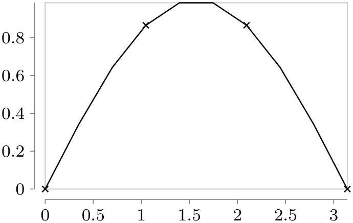
                        \usetikzlibrary {datavisualization.formats.functions}

                        \tikz \datavisualization

                         [scientific axes=clean,

                          visualize as line=my data,

                          my data={style={mark=x, mark repeat=3}}]

                        data [format=function] {

                          var
                        x
                        :
                        interval [0:pi] samples
                        10;

                          func
                        y
                        =
                        sin(\value x r);

                        };
-
/data point/outlier=⟨value⟩ (default true, initially empty) 
Creates a new visualizer named ⟨visualizer name⟩. Basically, this visualizer connects all data points for which the /data point/set attribute equals ⟨visualizer name⟩ by a line that is styled by the visualizer’s style.
In more detail, the following happens:
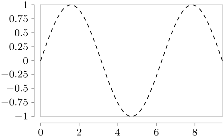
The line visualizer also provides a method of dealing with gaps in a line. Take for instance the function \(f(x) = \tan x\). When this function is plotted over the interval \([0,\pi ]\), then the function will go to \(\pm \infty \) at \(\pi /2\). When we plot this, we might plot the function in the interval \([0,\frac {\pi }{2}-\epsilon ]\) and then continue in the interval \([\frac {\pi }{2}+\epsilon ,\pi ]\). However, we do not want the point at coordinate \(\bigl (\frac {\pi }{2}- \epsilon , \tan (\frac {\pi }{2}- \epsilon )\bigr )\) to be connected to the coordinate \(\bigl (\frac {\pi }{2}+ \epsilon , \tan (\frac {\pi }{2}+ \epsilon )\bigr )\) by a line. Rather, there should be a “gap” or a “jump” between these coordinates. To achieve this, the following key can be used:
When this key is set to anything non-empty value, a visualizer will consider this data point to be an “outlier”. For a line visualizer this means that the point is not shown and that the current line ends at the previous data point and a new line starts at the next data point.

                        \usetikzlibrary {datavisualization.formats.functions}

                        \tikz \datavisualization

                         [scientific axes=clean, x axis={grid={major at=(pi/2)}},

                          visualize as smooth line]

                        data [format=function] {

                          var
                        x
                        :
                        interval[0:pi/2-0.1];

                          func
                        y
                        = tan(\value x r);

                        }

                        data
                        point [outlier]

                        data [format=function] {

                          var
                        x
                        :
                        interval[pi/2+0.1:pi];

                          func
                        y
                        = tan(\value x r);

                        };
-
/tikz/data visualizers/visualize as smooth line=⟨visualizer name⟩ (default line) 
A shorthand visualize as line=⟨visualizer name⟩ followed ⟨visualizer name⟩=smooth line.
-
/tikz/data visualization/visualizer options/straight line(no value) 
Causes the data points to be connected by straight lines.
                    \usetikzlibrary {datavisualization.formats.functions}

                    \tikz [scale=.55] \datavisualization

                     [scientific axes=clean, all axes={ticks=few},

                      visualize as smooth line=my data,  my data={straight line}]

                    data [format=function] {

                      var
                    t
                    :
                    interval [0:4] samples
                    5;

                      func
                    x
                    =
                    cos(\value t r);

                      func
                    y
                    =
                    sin(\value t r);

                    };
-
/tikz/data visualization/visualizer options/straight cycle(no value) 
Causes the data points to be connected by a polygon.
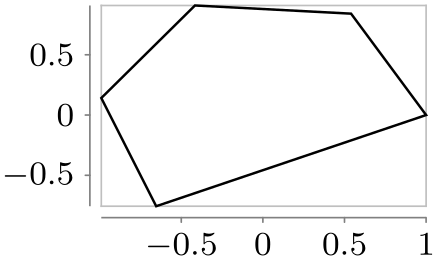
                    \usetikzlibrary {datavisualization.formats.functions}

                    \tikz [scale=.55] \datavisualization

                     [scientific axes=clean, all axes={ticks=few},

                      visualize as smooth line=my data,  my data={straight cycle}]

                    data [format=function] {

                      var
                    t
                    :
                    interval [0:4] samples
                    5;

                      func
                    x
                    =
                    cos(\value t r);

                      func
                    y
                    =
                    sin(\value t r);

                    };
-
/tikz/data visualization/visualizer options/polygon(no value) 
This is an alias for straight cycle.
-
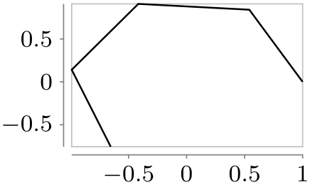
/tikz/data visualization/visualizer options/smooth line(no value) 
Causes the data points to be connected by a line that is smoothed at the joins:
                    \usetikzlibrary {datavisualization.formats.functions}

                    \tikz [scale=.55] \datavisualization

                     [scientific axes=clean, all axes={ticks=few},

                      visualize as smooth line=my data,  my data={smooth line}]

                    data [format=function] {

                      var
                    t
                    :
                    interval [0:4] samples
                    5;

                      func
                    x
                    =
                    cos(\value t r);

                      func
                    y
                    =
                    sin(\value t r);

                    };
-
/tikz/data visualization/visualizer options/smooth cycle(no value) 
Causes the data points to be connected by a circular line that is smoothed at the joins:

                    \usetikzlibrary {datavisualization.formats.functions}

                    \tikz [scale=.55] \datavisualization

                     [scientific axes=clean, all axes={ticks=few},

                      visualize as smooth line=my data,  my data={smooth cycle}]

                    data [format=function] {

                      var
                    t
                    :
                    interval [0:4] samples
                    5;

                      func
                    x
                    =
                    cos(\value t r);

                      func
                    y
                    =
                    sin(\value t r);

                    };
-
/tikz/data visualization/visualizer options/gap line(no value) 
This key causes the data points to be connected by lines that “do not quite touch” the data points. This is implemented by using the \pgfplothandlergaplineto, see Section 65.5.

                    \usetikzlibrary {datavisualization.formats.functions}

                    \tikz [scale=.55] \datavisualization

                     [scientific axes=clean, all axes={ticks=few},

                      visualize as smooth line=my data,  my data={gap line}]

                    data [format=function] {

                      var
                    t
                    :
                    interval [0:4] samples
                    5;

                      func
                    x
                    =
                    cos(\value t r);

                      func
                    y
                    =
                    sin(\value t r);

                    };
-
/tikz/data visualization/visualizer options/gap cycle(no value) 
Like gapped line, only with a cycle:
                    \usetikzlibrary {datavisualization.formats.functions}

                    \tikz [scale=.55] \datavisualization

                     [scientific axes=clean, all axes={ticks=few},

                      visualize as smooth line=my data,  my data={gap cycle}]

                    data [format=function] {

                      var
                    t
                    :
                    interval [0:4] samples
                    5;

                      func
                    x
                    =
                    cos(\value t r);

                      func
                    y
                    =
                    sin(\value t r);

                    };
-
/tikz/data visualization/visualizer options/no lines(no value) 
Suppresses the line. This option only makes sense when the mark option is used.
                    \usetikzlibrary {datavisualization.formats.functions}

                    \tikz [scale=.55] \datavisualization

                     [scientific axes=clean, all axes={ticks=few},

                      visualize as smooth line=my data,  my data={no lines, style={mark=x}}]

                    data [format=function] {

                      var
                    t
                    :
                    interval [0:4] samples
                    5;

                      func
                    x
                    =
                    cos(\value t r);

                      func
                    y
                    =
                    sin(\value t r);

                    };
83.3.2 Visualizing Data Points Using Marks
-
/tikz/data visualizers/visualize as scatter=⟨visualizer name⟩ (default scatter) 
A shorthand visualize as line=⟨visualizer name⟩ followed ⟨visualizer name⟩=no lines and setting the style of the visualizer so that is will use mark=x (plus some size adjustments) to draw marks at the data points.
                    \usetikzlibrary {datavisualization.formats.functions}

                    \tikz \datavisualization

                     [scientific axes=clean,

                      visualize as scatter]

                    data [format=function] {

                      var
                    x
                    :
                    interval [0:pi] samples
                    10;

                      func
                    y
                    =
                    sin(\value x r);

                    };
83.4 Advanced: Creating New Visualizers
Creating a new visualizer is a two-stage process that does, unfortunately, require in-depth knowledge of the data visualization backend:
-
1. First, you need to create a new class using \pgfooclass whose instances react to the signal visualize datapoint signal. This requires detailed knowledge of the data visualization engine, see Section 86.
-
2. Second, you should provide keys on the TikZ level for creating the necessary objects. These keys invoke the key new visualizer internally.
-
/tikz/data visualization/new visualizer={⟨name⟩}{⟨options⟩}{⟨legend entry options⟩}(no default) 
-
• The key /tikz/data visualization/⟨name⟩ is created. As described earlier, this key can be used to pass for instance style options to the visualizer.
-
• The style key /tikz/data visualization/visualizers/⟨name⟩/styling is created and made empty. This is the key in which the style key will store the options passed to the visualizer.
-
• The style key /tikz/data visualization/visualizers/⟨name⟩/label in legend options is set to ⟨legend entry options⟩. These options are used to configure how the visualizer should be rendered in a legend, see Section 84.9.9 for details.
-
• The key /data point/set/⟨name⟩ is set to a number that is increased for each visualizer in the current data visualization. This number is important for style sheets, see Section 84.
-
• The key /data point/⟨name⟩/execute at begin is set to code that creates a {scope} that executes the following styles as options:
-
1. The ⟨options⟩ passed to the new visualizer key.
-
2. The every visualizer style.
-
3. The styling from the currently active style sheets, see Section 84.
-
4. The styling stored in the styling key mentioned above.
-
-
• The key /data point/⟨name⟩/execute at end is set to code that will finish all paths that may have been created by the visualizer and closes the scope.
-
• Inside a new visualize as ... key, you pass the name of the to-be-created to new visualizer as the first parameter and any special default styling setup of the visualizer as the second parameter.
-
• The new visualize as ... key should also create a visualizer object using new object.
-
• When this object finally is about to create the actual visualization, it should surround the code by invoking the code stored in the execute at begin and the execute at end keys of the visualizer.
This key configures a new visualizer named ⟨name⟩. This entails the following actions:
All of the above mean the following in practice:
Everything else is usually taken care of by the new visualizer key automatically.
As an example, let us create a simple visualizer that creates a circle whose radius is dictated by the radius attribute. To keep things simple in this example, this attribute cannot be configured.
First, we need the visualizer class. For this example I have boiled it down to a minimum:
                \pgfooclass{circle
                visualizer}

                {

                  % Stores the name of the visualizer. This is needed for filtering and configuration

                  \attribute name;


                  % The constructor. Just setup the attribute.

                  \method circle
                visualizer(#1) { \pgfooset{name}{#1} }


                  % Connect to visualize signal.

                  \method default
                connects() {

                    \pgfoothis.get handle(\me)

                    \pgfkeysvalueof{/pgf/data
                visualization/obj}.connect(\me,visualize,visualize datapoint signal)

                  }


                  % This method is invoked for each data point. It checks whether the data point belongs to the correct

                  % visualizer and, if so, calls the macro \dovisualization to do the actual visualization.

                  \method visualize() {

                    \pgfdvfilterpassedtrue

                    \pgfdvnamedvisualizerfilter

                    \ifpgfdvfilterpassed

                      \dovisualization

                    \fi

                  }

                }
The \dovisualization method must now do the correct visualization.
                \def\dovisualization{

                  \pgfkeysvalueof{/data point/\pgfoovalueof{name}/execute
                at
                begin}

                    \pgfpathcircle{\pgfpointdvdatapoint}{\pgfkeysvalueof{/data
                point/radius}}

                    % \pgfusepath is done by |execute at end|

                  \pgfkeysvalueof{/data point/\pgfoovalueof{name}/execute
                at
                end}

                }
Finally, we create a visualize as key:
                \tikzdatavisualizationset{

                  visualize
                as
                circle/.style={

                    new
                object={

                      when=after
                survey,

                      store=/tikz/data
                visualization/visualizers/#1,

                      class=circle
                visualizer,

                      arg1=#1

                    },

                    new
                visualizer={#1}{%

                      color=visualizer
                color,        % a color setup by the style sheet

                      every
                path/.style={fill,draw}, % fill and draw the circle by default,

                    }{}, % let's ignore legends in this example

                    /data
                point/set=#1

                  },

                  visualize
                as
                circle/.default=circle

                }
Now, let’s see how this works:
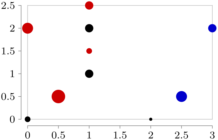
                \usetikzlibrary {datavisualization}

                \tikz \datavisualization [

                  scientific axes=clean,

                  visualize as circle/.list={a, b, c},

                  style sheet=strong colors]

                data [set=a] {

                  x, y, radius

                  0, 0, 2pt

                  1, 1, 3pt

                  1, 2, 3pt

                  2, 0, 1pt

                }

                data [set=b] {

                  x, y, radius

                  0.5, 0.5, 5pt

                  1, 1.5, 2pt

                  1, 2.5, 3pt

                  0, 2, 4pt

                }

                data [set=c] {

                  x, y, radius

                  3, 2, 3pt

                  2.5, 0.5, 4pt

                };