TikZ and PGF Manual
Data Visualization
84 Style Sheets and Legends
84.1 Overview
In many data visualizations, different sets of data need to be visualized in a single visualization. For instance, in a plot there might be a line for the sine of \(x\) and another line for the cosine of \(x\); in another visualization there might be a set of points representing data from a first experiment and another set of points representing data from a second experiment; and so on. In order to indicate to which data set a data point belongs, one might plot the curve of the sine in, say, black, and the curve of the cosine in red; we might plot the data from the first experiment using stars and the data from the second experiment using circles; and so on. Finally, at some place in the visualization – either inside the data or in a legend next to it – the meaning of the colors or symbols need to be explained.
Just as you would like TikZ to map the data points automatically onto the axes, you will also typically wish TikZ to choose for instance the coloring of the lines automatically for you. This is done using style sheets. There are at least two good reasons why you should prefer style sheets over configuring the styling of each visualizer “by hand” using the style key:
-
1. It is far more convenient to just say style sheet=strong colors than having to individually picking the different colors.
-
2. The style sheets were chosen and constructed rather carefully.
For instance, the strong colors style sheet does not pick colors like pure green or pure yellow, which have very low contrast with respect to a white background and which often lead to unintelligible graphics. Instead, opposing primary colors with maximum contrast on a white background were picked that are visually quite pleasing.
Similarly, the different dashing style sheets are constructed in such a way that there are only few and small gaps in the dashing so that no data points get lost because the dashes are spaced too far apart. Also dashing patterns were chosen that have a maximum optical difference.
As a final example, style sheets for plot marks are constructed in such a way that even when two plot marks lie directly on top of each other, they are still easily distinguishable.
The bottom line is that whenever possible, you should use one of the predefined style sheets rather than picking colors or dashings at random.
84.2 Concepts: Style Sheets
A style sheet is a predefined list of styles such as a list of colors, a list of dashing pattern, a list of plot marks, or a combinations thereof. A style sheet can be attached to a data point attribute. Then, the value of this attribute is used with data points to choose which style in the list should be chosen to visualize the data point.
In most cases, there is just one attribute to which style sheets get attached: the /data point/visualizer attribute. The effect of attaching a style sheet to this attribute is that each visualizer is styled differently.
For the following examples, let us first define a simple data set:
                \usetikzlibrary {datavisualization.formats.functions}

                \tikz \datavisualization data
                group {function
                classes} =
                {

                  data [set=log, format=function] {

                    var
                x
                :
                interval [0.2:2.5];

                    func
                y
                = ln(\value x);

                  }

                  data [set=lin, format=function] {

                    var
                x
                :
                interval [-2:2.5];

                    func
                y
                = 0.5*\value x;

                  }

                  data [set=squared, format=function] {

                    var
                x
                :
                interval [-1.5:1.5];

                    func
                y
                =
                \value x*\value x;

                  }

                  data [set=exp, format=function] {

                    var
                x
                :
                interval [-2.5:1];

                    func
                y
                = exp(\value x);

                  }

                };
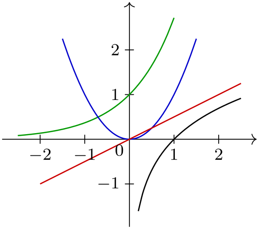
                \usetikzlibrary {datavisualization.formats.functions}

                \tikz \datavisualization [

                  school book axes, all axes={unit length=7.5mm},

                  visualize as smooth line/.list={log, lin, squared, exp},

                  style sheet=strong colors]

                data
                group {function
                classes};

                \usetikzlibrary {datavisualization.formats.functions}

                \tikz \datavisualization [

                  school book axes, all axes={unit length=7.5mm},

                  visualize as smooth line/.list={log, lin, squared, exp},

                  style sheet=vary dashing]

                data
                group {function
                classes};
84.3 Concepts: Legends
A legend is a box that is next to a data visualization (or inside it at some otherwise empty position) that contains a textual explanation of the different colors or styles used in a data visualization.
Just as it is difficult to get colors and dashing patterns right “by hand”, it is also difficult to get a legend right. For instance, when a small line is shown in the legend that represents the actual line in the data visualization, if the line is too short and the dashing is too large, it may be impossible to discern which dashing is actually meant. Similarly, when plot marks are shown on such a short line, using a simple straight line may make it hard to read the plot marks correctly.
The data visualization engine makes some effort to make it easy to create high-quality legends. Additionally, it also offers ways of easily adding labels for visualizers directly inside the data visualization, which is even better than adding a legend, in general.
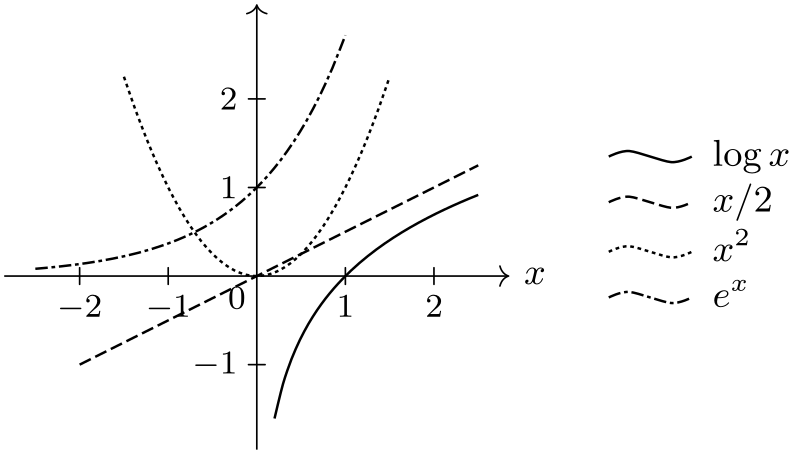
                \usetikzlibrary {datavisualization.formats.functions}

                \tikz \datavisualization [

                  school book axes, all axes={unit length=7.5mm},

                  x axis={label=$x$},

                  visualize as smooth line/.list={log, lin, squared, exp},

                  log=
                {label in legend={text=$\log x$}},

                  lin=
                {label in legend={text=$x/2$}},

                  squared={label in legend={text=$x^2$}},

                  exp=
                {label in legend={text=$e^x$}},

                  style sheet=vary dashing]

                data
                group {function
                classes};
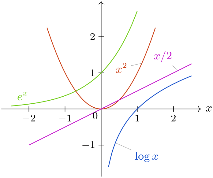
                \usetikzlibrary {datavisualization.formats.functions}

                \tikz \datavisualization [

                  school book axes,

                  x axis={label=$x$},

                  visualize as smooth line/.list={log, lin, squared, exp},

                  every data set label/.append style={text colored},

                  log=
                {pin in data={text'=$\log x$, when=y is -1}},

                  lin=
                {pin in data={text=$x/2$, when=x is 2,

                                          pin
                  length=1ex}},

                  squared={pin in data={text=$x^2$, when=x is 1.1,

                                          pin
                  angle=230}},

                  exp=
                {label in data={text=$e^x$, when=x is
                  -2}},

                  style sheet=vary hue]

                data
                group {function
                classes};
84.4 Usage: Style Sheets
84.4.1 Picking a Style Sheet
To use a style sheet, you need to attach it to an attribute. You can attach multiple style sheets to an attribute and in this case all of these style sheets can influence the appearance of the data points.
Most of the time, you will attach a style sheet to the set attribute. This has the effect that each different data set inside the same visualization is rendered in a different way. Since this use of style sheets is the most common, there is a special, easy-to-remember option for this:
-
/tikz/data visualization/style sheet=⟨style sheet⟩(no default) 
Adds the ⟨style sheet⟩ to the list of style sheets attached to the set attribute.

                    \usetikzlibrary {datavisualization.formats.functions}

                    \tikz \datavisualization [

                      school book axes, all axes={unit length=7.5mm},

                      visualize as smooth line/.list={log, lin, squared, exp},

                      style sheet=vary thickness and dashing,

                      style sheet=vary hue]

                    data
                    group {function
                    classes};
While the style sheet key will attach a style sheet only to the set attribute, the following key handler can be used to attach a style sheet to an arbitrary attribute:
-
Key handler ⟨key⟩/.style sheet=⟨style sheet⟩ 
-
• A new object is created that will monitor the attribute.
-
• Each time a special styling key is emitted by the data visualization engine, this object will inspect the current value of the attribute to which it is attached.
-
• Depending on this value, one of the styles stored in the style sheet is chosen (how this works, exactly, will be explained in a moment).
-
• The chosen style is then locally applied.
Inside a data visualization you can use this key handler together with an attribute, that is, with a key having the path prefix /data point. For instance, in order to attach the ⟨style sheet⟩ strong colors to the attribute set, you could write
                    /data
                    point/set/.style
                    sheet=strong
                    colors
Indeed, the style sheet key is just a shorthand for the above.
The effect of attaching a style sheet is the following:
In reality, things are a bit more complicated: If the attribute of the data point happens to have a subkey named in the same way as the value, then the value of is this subkey is used instead of the value itself. This allows you to “rename” a value.
In a sense, a style sheet behaves much like a visualizer (see Section 83): In accordance with the value of a certain attribute, the appearance of data points change. However, there are a few differences: First, the styling of a data point needs to be triggered explicitly and this triggering is not necessarily done for each data point individually, but only for a whole visualizer. Second, styles can be computed even when no data point is present. This is useful for instance in a legend since, here, a visual representation of a visualizer needs to be created independently of the actual data points.
84.4.2 Creating a New Style Sheet
Creating a style sheet works as follows: For each possible value that an attribute can attain we must specify a style. This is done by creating a style key for each such possible value with a special path prefix and setting this style key to the desired value. The special path prefix is /pgf/data visualization/style sheets followed by the name of the style sheet.
As an example, suppose we wish to create a style sheet test that makes styled data points red when the attribute has value foo and green when the attribute has value bar and dashed, blue when the attribute is foobar. We could then write
                /pgf/data
                visualization/style
                sheets/test/foo/.style={red},

                /pgf/data
                visualization/style
                sheets/test/bar/.style={green},

                /pgf/data
                visualization/style
                sheets/test/foobar/.style={dashed, blue},
We could then attach this style sheet to the attribute code as follows:
                /data
                point/code/.style
                sheet=test
Then, when /data point/code=foobar holds when the styling signal is raised, the style dashed, blue will get executed.
A natural question arises concerning the situation that the value of the attribute is not defined as a subkey of the style sheet. In this case, a special key gets executed:
-
/pgf/data visualization/style sheets/⟨style sheet⟩/default style=⟨value⟩(style, no default) 
This key gets during styling whenever /pgf/data visualization/style sheet/⟨style sheet⟩/⟨value⟩ is not defined.
Let us put all of this together in a real-life example. Suppose we wish to create a style sheet that makes the first data set green, the second yellow and the third one red. Further data sets should be, say, black. The attribute that we intend to style is the set attribute. For the moment, we assume that the data sets will be named 1, 2, 3, and so on (instead of, say, experiment 1 or sin or something more readable – we will get rid of this restriction in a minute).
We would now write:
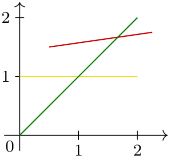
                \usetikzlibrary {datavisualization}

                \pgfkeys{

                    /pgf/data visualization/style sheets/traffic light/.cd,

                    % All these styles have the above prefix.

                    1/.style={green!50!black},

                    2/.style={yellow!90!black},

                    3/.style={red!80!black},

                    default style/.style={black}
 }

                \tikz \datavisualization [

                  school book axes,

                  visualize as line=1,

                  visualize as line=2,

                  visualize as line=3,

                  style sheet=traffic light]

                data
                point [x=0, y=0, set=1]

                data
                point [x=2, y=2, set=1]

                data
                point [x=0, y=1, set=2]

                data
                point [x=2, y=1, set=2]

                data
                point [x=0.5, y=1.5, set=3]

                data
                point [x=2.25, y=1.75, set=3];
In the above example, we have to name the visualizers 1, 2, 3 and so one since the value of the set attribute is used both assign data points to visualizers and also pick a style sheet. However, it would be much nicer if we could name any way we want. To achieve this, we use the special rule for style sheets that says that if there is a subkey of an attribute whose name is the same name as the value, then the value of this key is used instead. This slightly intimidating definition is much easier to understand when we have a look at an example:

                \usetikzlibrary {datavisualization}

                % Definition of traffic light keys as above

                \begin{tikzpicture}

                  \datavisualization data
                group {lines} = {

                    data
                point [x=0, y=0,       set=normal]

                    data
                point [x=2, y=2,       set=normal]

                    data
                point [x=0, y=1,       set=heated]

                    data
                point [x=2, y=1,       set=heated]

                    data
                point [x=0.5, y=1.5,   set=critical]

                    data
                point [x=2.25, y=1.75, set=critical]

                  };

                  \datavisualization [

                    school book axes,

                    visualize as line=normal,

                    visualize as line=heated,

                    visualize as line=critical,

                    /data point/set/normal/.initial=1,

                    /data point/set/heated/.initial=2,

                    /data point/set/critical/.initial=3,

                    style sheet=traffic light]

                  data
                group {lines};

                \end{tikzpicture}
Now, it is a bit bothersome that we have to set all these /data point/set/... keys by hand. It turns out that this is not necessary: Each time a visualizer is created, a subkey of /data point/set with the name of the visualizer is created automatically and a number is stored that is increased for each new visualizer in a data visualization. This means that the three lines starting with /data point are inserted automatically for you, so they can be left out. However, you would need them for instance when you would like several different data sets to use the same styling:

                \usetikzlibrary {datavisualization}

                % Definition of traffic light keys as above

                \tikz \datavisualization [

                  school book axes,

                  visualize as line=normal,

                  visualize as line=heated,

                  visualize as line=critical,

                  /data point/set/critical/.initial=1, % same styling as first set

                  style sheet=traffic light]

                data
                group {lines};
We can a command that slightly simplifies the definition of style sheets:
-
\pgfdvdeclarestylesheet{⟨name⟩}{⟨keys⟩} 
This command executes the ⟨keys⟩ with the path prefix /pgf/data visualization/style sheets/⟨name⟩. The above definition of the traffic light style sheet could be rewritten as follows:
                    \pgfdvdeclarestylesheet{traffic
                    light}{

                      1/.style={green!50!black},

                      2/.style={yellow!90!black},

                      3/.style={red!80!black},

                      default
                    style/.style={black}

                    }
As a final example, let us create a style sheet that changes the dashing pattern according to the value of the attribute. We do not need to define an large number of styles in this case, but can use the default style key to “calculate” the correct dashing.

                \usetikzlibrary {datavisualization}

                \pgfdvdeclarestylesheet{my
                dashings}{

                  default
                style/.style={dash
                pattern={on
                #1pt off
                1pt}}

                }

                \tikz \datavisualization [

                  school book axes,

                  visualize as line=normal,

                  visualize as line=heated,

                  visualize as line=critical,

                  style sheet=my dashings]

                data
                group {lines};
84.4.3 Creating a New Color Style Sheet
Creating a style sheet that varies colors according to an attribute works the same way as creating a normal style sheet: Subkeys lies 1, 2, and so on use the style attribute to setup a color. However, instead of using the color attribute to set the color, you should use the visualizer color key to set the color:
-
/tikz/visualizer color=⟨color⟩(no default) 
This key is used to set the color visualizer color to ⟨color⟩. This color is used by visualizers to color the data they visualize, rather than the current “standard color”. The reason for not using the normal current color is simply that it makes many internals of the data visualization engine a bit simpler.

                    \usetikzlibrary {datavisualization}

                    \pgfdvdeclarestylesheet{my
                    colors}

                    {

                      default
                    style/.style={visualizer
                    color=black},

                      1/.style={visualizer
                    color=black},

                      2/.style={visualizer
                    color=red!80!black},

                      3/.style={visualizer
                    color=blue!80!black},

                    }

                    \tikz \datavisualization [

                      school book axes,

                      visualize as line=normal,

                      visualize as line=heated,

                      visualize as line=critical,

                      style sheet=my colors]

                    data
                    group {lines};
There is an additional command that makes it easy to define a style sheet based on a color series. Color series are a concept from the xcolor package: The idea is that we start with a certain color for the first data set and then add a certain “color offset” for each next data point. Please consult the documentation of the xcolor package for details.
-
\tikzdvdeclarestylesheetcolorseries{⟨name⟩}{⟨color model⟩}{⟨initial color⟩}{⟨step⟩} 
This command creates a new style sheet using \pgfdvdeclarestylesheet. This style sheet will only have a default style setup that maps numbers to the color in the color series starting with ⟨initial color⟩ and having a stepping of ⟨step⟩. Note that when the value of the attribute is 1, which it is the first data set, the second color in the color series is used (since counting starts at 0 for color series). Thus, in general, you need to start the ⟨initial color⟩ “one early”.

                    \usetikzlibrary {datavisualization}

                    \tikzdvdeclarestylesheetcolorseries{greens}{hsb}{0.3,1.3,0.8}{0,-.4,-.1}

                    \tikz \datavisualization [

                      school book axes,

                      visualize as line=normal,

                      visualize as line=heated,

                      visualize as line=critical,

                      style sheet=greens]

                    data
                    group {lines};
84.5 Reference: Style Sheets for Lines
The following style sheets can be applied to visualizations that use the visualize as line and related keys. For the examples, the following style and data set are used:
                \tikzdatavisualizationset {

                  example
                visualization/.style={

                    scientific
                axes=clean,

                    y
                axis={ticks={style={

                          /pgf/number
                format/fixed,

                          /pgf/number
                format/fixed
                zerofill,

                          /pgf/number
                format/precision=2}}},

                    x
                axis={ticks={tick
                suffix=${}^\circ$}},

                    1={label
                in
                legend={text=$\frac{1}{6}\sin 11x$}},

                    2={label
                in
                legend={text=$\frac{1}{7}\sin 12x$}},

                    3={label
                in
                legend={text=$\frac{1}{8}\sin 13x$}},

                    4={label
                in
                legend={text=$\frac{1}{9}\sin 14x$}},

                    5={label
                in
                legend={text=$\frac{1}{10}\sin 15x$}},

                    6={label
                in
                legend={text=$\frac{1}{11}\sin 16x$}},

                    7={label
                in
                legend={text=$\frac{1}{12}\sin 17x$}},

                    8={label
                in
                legend={text=$\frac{1}{13}\sin 18x$}}

                  }

                }
-
Style sheet vary thickness 
This style varies the thickness of lines. It should be used only when there are only two or three lines, and even then it is not particularly pleasing visually.

                    \usetikzlibrary {datavisualization.formats.functions}

                    \tikz \datavisualization [

                      visualize as smooth line/.list=

                    {1,2,3,4,5,6,7,8},

                      example visualization,

                      style sheet=vary thickness]

                    data
                    group {sin
                    functions};
-
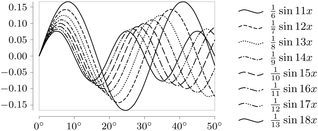
Style sheet vary dashing 
This style varies the dashing of lines. Although it is not particularly pleasing visually and although visualizations using this style sheet tend to look “excited” (but not necessarily “exciting”), this style sheet is often the best choice when the visualization is to be printed in black and white.
                    \usetikzlibrary {datavisualization.formats.functions}

                    \tikz \datavisualization [

                      visualize as smooth line/.list=

                    {1,2,3,4,5,6,7,8},

                      example visualization,

                      style sheet=vary dashing]

                    data
                    group {sin
                    functions};
As can be seen, there are only seven distinct dashing patterns. The eighth and further lines will use a solid line once more. You will then have to specify the dashing “by hand” using the style option together with the visualizer.
-
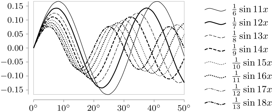
Style sheet vary thickness and dashing 
This style alternates between varying the thickness and the dashing of lines. The difference to just using both the vary thickness and vary dashing is that too thick lines are avoided. Instead, this style creates clearly distinguishable line styles for many lines (up to 14) with a minimum of visual clutter. This style is the most useful for visualizations when many different lines (ten or more) should be printed in black and white.
                    \usetikzlibrary {datavisualization.formats.functions}

                    \tikz \datavisualization [

                      visualize as smooth line/.list=

                    {1,2,3,4,5,6,7,8},

                      example visualization,

                      style sheet=vary thickness


                                  and dashing]

                    data
                    group {sin
                    functions};
For comparison, here is the must-less-than-satisfactory result of combining the two independent style sheets:

                    \usetikzlibrary {datavisualization.formats.functions}

                    \tikz \datavisualization [

                      visualize as smooth line/.list=

                    {1,2,3,4,5,6,7,8},

                      example visualization,

                      style sheet=vary thickness,

                      style sheet=vary dashing]

                    data
                    group {sin
                    functions};
84.6 Reference: Style Sheets for Scatter Plots
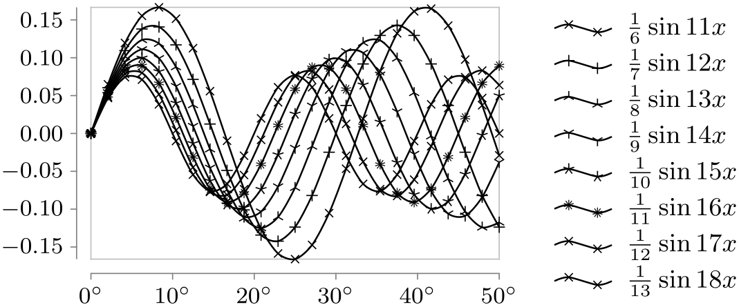
The following style sheets can be used both for scatter plots and also with lines. In the latter case, the marks are added to the lines.
-
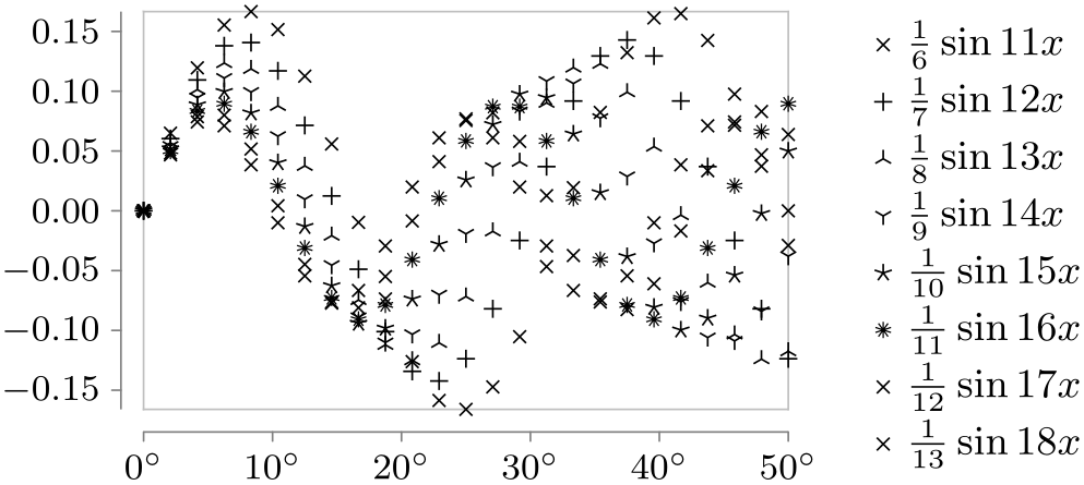
Style sheet cross marks 
This style uses different crosses to distinguish between the data points of different data sets. The crosses were chosen in such a way that when two different cross marks lie at the same coordinate, their overall shape allows one to still uniquely determine which marks are on top of each other.
This style supports only up to six different data sets and requires the plotmarks library.
                    \usetikzlibrary {datavisualization.formats.functions}

                    \tikz \datavisualization [

                      visualize as scatter/.list=

                    {1,2,3,4,5,6,7,8},

                      example visualization,

                      style sheet=cross marks]

                    data
                    group {sin
                    functions};
                    \usetikzlibrary {datavisualization.formats.functions}

                    \tikz \datavisualization [

                      visualize as smooth line/.list=

                    {1,2,3,4,5,6,7,8},

                      example visualization,

                      style sheet=cross marks]

                    data
                    group {sin
                    functions};
84.7 Reference: Color Style Sheets
Color style sheets are very useful for creating visually pleasing data visualizations that contain multiple data sets. However, there are two things to keep in mind:
-
• At some point, every data visualization is printed or photo copied in black and white by someone. In this case, data sets can often no longer be distinguished.
-
• A few people are color blind. They will not be able to distinguish between red and green lines (and some people are not even able to distinguish colors at all).
For these reasons, if there is any chance that the data visualization will be printed in black and white at some point, consider combining color style sheets with style sheets like vary dashing to make data sets distinguishable in all situations.
-
Style sheet strong colors 
This style sheets uses pure primary colors that can very easily be distinguished. Although not as visually pleasing as the vary hue style sheet, the visualizations are easier to read when this style sheet is used. Up to six different data sets are supported.
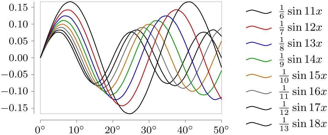
                    \usetikzlibrary {datavisualization.formats.functions}

                    \tikz \datavisualization [

                      visualize as smooth line/.list=

                    {1,2,3,4,5,6,7,8},

                      example visualization,

                      style sheet=strong colors]

                    data
                    group {sin
                    functions};

                    \usetikzlibrary {datavisualization.formats.functions}

                    \tikz \datavisualization [

                      visualize as smooth line/.list=

                    {1,2,3,4,5,6,7,8},

                      example visualization,

                      style sheet=strong colors,

                      style sheet=vary dashing]

                    data
                    group {sin
                    functions};
Unlike strong colors, the following style sheets support, in principle, an unlimited number of data set. In practice, as always, more than four or five data sets lead to nearly indistinguishable data sets.
-
Style sheet vary hue 
This style uses a different hue for each data set.
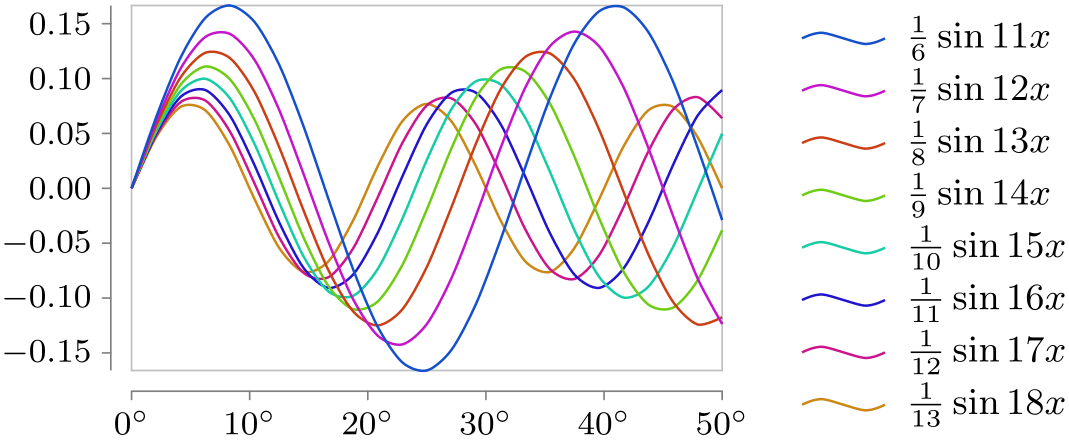
                    \usetikzlibrary {datavisualization.formats.functions}

                    \tikz \datavisualization [

                      visualize as smooth line/.list=

                    {1,2,3,4,5,6,7,8},

                      example visualization,

                      style sheet=vary hue]

                    data
                    group {sin
                    functions};
-
Style sheet shades of blue 
As the name suggests, different shades of blue are used for different data sets.
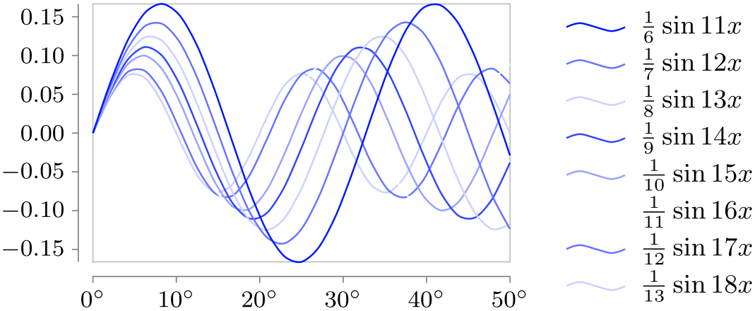
                    \usetikzlibrary {datavisualization.formats.functions}

                    \tikz \datavisualization [

                      visualize as smooth line/.list=

                    {1,2,3,4,5,6,7,8},

                      example visualization,

                      style sheet=shades of blue]

                    data
                    group {sin
                    functions};
-
Style sheet shades of red 
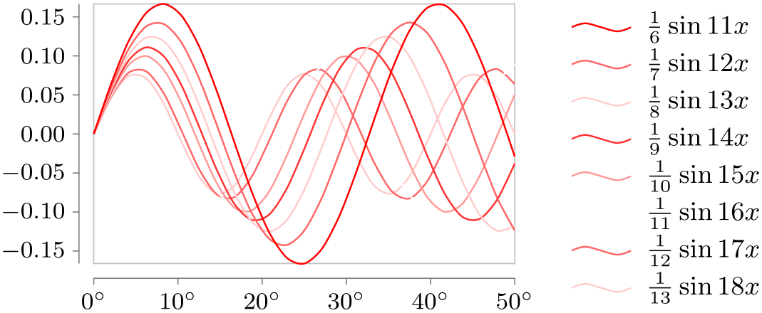
                    \usetikzlibrary {datavisualization.formats.functions}

                    \tikz \datavisualization [

                      visualize as smooth line/.list=

                    {1,2,3,4,5,6,7,8},

                      example visualization,

                      style sheet=shades of red]

                    data
                    group {sin
                    functions};
-
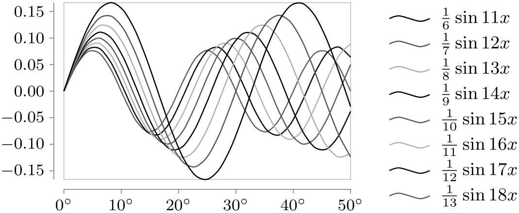
Style sheet gray scale 
For once, this style sheet can also be used when the visualization is printed in black and white.
                    \usetikzlibrary {datavisualization.formats.functions}

                    \tikz \datavisualization [

                      visualize as smooth line/.list=

                    {1,2,3,4,5,6,7,8},

                      example visualization,

                      style sheet=gray scale]

                    data
                    group {sin
                    functions};
84.8 Usage: Labeling Data Sets Inside the Visualization
In a visualization that contains multiple data sets, it is often necessary to clearly point out which line or mark type corresponds to which data set. This can be done in the main text via a sentence like “the normal data (black) lies clearly below the critical values (red)”, but it often a good idea to indicate data sets ideally directly inside the data visualization or directly next to it in a so-called legend.
The data visualization engine has direct support both for indicating data sets directly inside the visualization and also for indicating them in a legend.
The “best” way of indicating where a data set lies or which color is used for it is to put a label directly inside the data visualization. The reason this is the “best” way is that people do not have to match the legend entries against the data, let alone having to look up the meaning of line styles somewhere in the text. However, adding a label directly inside the visualization is also the most tricky way of indicating data sets since it is hard to compute good positions for the labels automatically and since there needs to be some empty space where the label can be put.
84.8.1 Placing a Label Next to a Data Set
The following key is used to create a label inside the data visualization for a data set:
-
/tikz/data visualization/visualizer options/label in data=⟨options⟩(no default) 
-
/tikz/data visualization/visualizer label options/text=⟨text⟩(no default) 
-
/tikz/data visualization/visualizer label options/text'=⟨text⟩(no default) 
-
/tikz/data visualization/visualizer label options/when=⟨attribute⟩ is⟨number⟩(no default) 
-
/tikz/data visualization/visualizer label options/index=⟨number⟩(no default) 
-
/tikz/data visualization/visualizer label options/pos=⟨fraction⟩(no default) 
-
/tikz/data visualization/visualizer label options/auto(no value) 
-
/tikz/data visualization/visualizer label options/node style=⟨options⟩(no default) 
-
/tikz/data visualization/visualizer label options/text colored(no value) 
-
/tikz/data visualization/every data set label(style, no value) 
-
/tikz/data visualization/every label in data(style, no value) 
This key is passed to a visualizer that has previously been created using keys starting visualize as .... It will create a label inside the data visualization “next” to the visualizer (the details are explained in a moment). You can use this key multiple times with a visualizer to create multiple labels at different points with different texts.
The ⟨options⟩ determine which text is shown and where it is shown. They are executed with the following path prefix:
/tikz/data
visualization/visualizer
label
options
In order to configure which text is shown and where, use the following keys inside the ⟨options⟩:
This is the text that will be displayed next to the data. It will be to the “left” of the data, see the description below.
Like text, only the text will be to the “right” of the data.
The following keys are used to configure where the label will be shown. They use different strategies to specify one data point where the label will be anchored. The coordinate of this data point will be stored in (label visualizer coordinate). Independently of the strategy, once the data point has been chosen, the coordinate of the next data point is stored in (label visualizer coordinate'). Then, a (conceptual) line is created from the first coordinate to the second and a node is placed at the beginning of this line to its “left” or, for the text' option, on its “right”. More precisely, an automatic anchor is computed for a node placed implicitly on this line using the auto option or, for the text' option, using auto,swap.
The node placed at the position computed in this way will have the ⟨text⟩ set by the text or text' option and its styling is determined by the current node style.
Let us now have a look at the different ways of determining the data point at which the label in anchored:
This key causes the value of the ⟨attribute⟩ to be monitored in the stream of data points. The chosen is data point is the first data point where the ⟨attribute⟩ is at least ⟨number⟩ (if this never happens, the last data point is used).
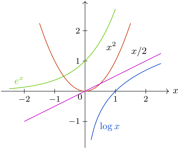
                        \usetikzlibrary {datavisualization.formats.functions}

                        \tikz \datavisualization [

                          school book axes,

                          x axis={label=$x$},

                          visualize as smooth line/.list={log, lin, squared, exp},

                          log=
                        {label in data={text'=$\log x$, when=y is -1,

                                                    text
                          colored}},

                          lin=
                        {label
                          in data={text=$x/2$,     when=x is 2}},

                          squared={label
                          in data={text=$x^2$,     when=x is 1.1}},

                          exp=
                        {label
                          in data={text=$e^x$,     when=x is -2,

                                                    text
                          colored}},

                          style sheet=vary hue]

                        data
                        group {function
                        classes};
This key chooses the ⟨number⟩th data point belonging to the visualizer’s data set.

                        \usetikzlibrary {datavisualization.formats.functions}

                        \tikz \datavisualization [

                          school book axes,

                          x axis={label=$x$},

                          visualize as smooth line/.list={exp},

                          exp=
                        {label
                          in data={text=$5$, index=5},

                                     label
                          in data={text=$10$, index=10},

                                     label
                          in data={text=$20$, index=20},

                                     style={mark=x}},

                          style sheet=vary hue]

                        data
                        group {function
                        classes};
This key chooses the first data point belonging to the data set whose index is at least ⟨fraction⟩ times the number of all data points in the data set.

                        \usetikzlibrary {datavisualization.formats.functions}

                        \tikz \datavisualization [

                          school book axes,

                          x axis={label=$x$},

                          visualize as smooth line=exp,

                          exp=
                        {label
                          in data={text=$.2$, pos=0.2},

                                     label
                          in data={text=$.5$, pos=0.5},

                                     label
                          in data={text=$.95$, pos=0.95},

                                     style={mark=x}},

                          style sheet=vary hue]

                        data
                        group {function
                        classes};
This key is executed automatically by default. It works like the pos option, where the ⟨fraction⟩ is set to \((\meta {data set's index}-1/2)/\meta {number of data sets}\). For instance, when there are \(10\) data sets, the fraction for the first one will be \(5\%\), the fraction for the second will be \(15\%\), for the third it will be \(25\%\), ending with \(95\%\) for the last one.
The net effect of all this is that when there are several lines, labels will be placed at different positions along the lines with hopefully only little overlap.

                        \usetikzlibrary {datavisualization.formats.functions}

                        \tikz \datavisualization [

                          scientific axes=clean,

                          visualize as smooth line/.list={linear, squared, cubed},

                          linear ={label in data={text=$2x$}},

                          squared={label in data={text=$x^2$}},

                          cubed ={label in data={text=$x^3$}}]

                        data [set=linear, format=function] {

                          var
                        x
                        :
                        interval [0:1.5];

                          func
                        y
                        = 2*\value x;

                        }

                        data [set=squared, format=function] {

                          var
                        x
                        :
                        interval [0:1.5];

                          func
                        y
                        =
                        \value x
                        *
                        \value x;

                        }

                        data [set=cubed, format=function] {

                          var
                        x
                        :
                        interval [0:1.5];

                          func
                        y
                        =
                        \value x
                        *
                        \value x
                        *
                        \value x;

                        };
As can be seen in the example, the result is not always satisfactory. In this case, the pin in data option might be preferable, see below.
The following keys allow you to style labels.
Just passes the options to /tikz/data visualization/node style.
Causes the node style to set the text color to visualizer color. The effect of this is that the label’s text will have the same color as the data set to which it is attached.
This style is executed with every label that represents a data set. Inside this style, use node style to change the appearance of nodes. This style has a default definition, usually you should just append things to this style.

                        \usetikzlibrary {datavisualization.formats.functions}

                        \tikz \datavisualization [

                          school book axes,

                          x axis={label=$x$},

                          visualize as smooth line/.list={log, lin, squared, exp},

                          every data set label/.append style={text colored},

                          log=
                        {label in data={text'=$\log x$, when=y is -1}},

                          lin=
                        {label in data={text=$x/2$,

                                              node
                          style=sloped,    when=x is 2}},

                          squared={label
                          in data={text=$x^2$,     when=x is 1.1}},

                          exp=
                        {label in data={text=$e^x$,

                                              node
                          style=sloped,    when=x is -2}},

                          style sheet=vary hue]

                        data
                        group {function
                        classes};
Like every data set label, this key is also executed with labels. However, this key is executed after the style sheets have been executed, giving you a chance to overrule their styling.
84.8.2 Connecting a Label to a Data Set via a Pin
-
/tikz/data visualization/visualizer options/pin in data=⟨options⟩(no default) 
-
/tikz/data visualization/visualizer label options/pin angle=⟨angle⟩(no default) 
-
• When an ⟨angle⟩ is specified using the present key, the shift is by the current value of pin length in the direction of ⟨angle⟩.
-
• When ⟨angle⟩ is empty (which is the default), then the shift is also by the current value of pin length, but now in the direction that is orthogonal and to the left of the line between the coordinate of the data point and the coordinate of the next data point. When text' is used, the direction is to the right instead of the left.
-
/tikz/data visualization/visualizer label options/pin length=⟨dimension⟩(no default) 
This key is a variant of the label in data key and takes the same options, plus two additional ones. The difference to label in data is that the label node is shown a bit removed from the data set, but connected to it via a small line (this is like the difference between the label and pin options).
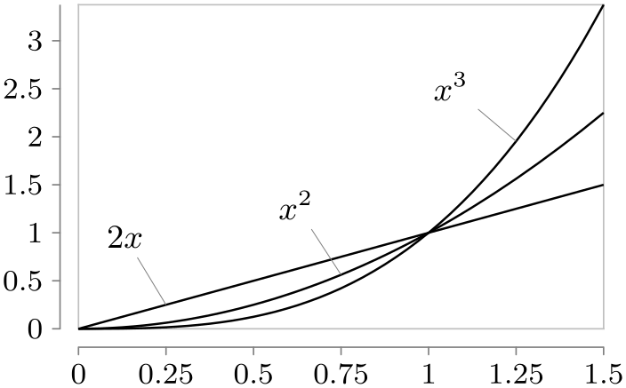
                    \usetikzlibrary {datavisualization.formats.functions}

                    \tikz \datavisualization [

                      scientific axes=clean,

                      visualize as smooth line/.list={linear, squared, cubed},

                      linear ={pin in data={text=$2x$}},

                      squared={pin in data={text=$x^2$}},

                      cubed ={pin in data={text=$x^3$}}]

                    data [set=linear, format=function] {

                      var
                    x
                    :
                    interval [0:1.5];

                      func
                    y
                    =
                    \value x;

                    }

                    data [set=squared, format=function] {

                      var
                    x
                    :
                    interval [0:1.5];

                      func
                    y
                    =
                    \value x
                    *
                    \value x;

                    }

                    data [set=cubed, format=function] {

                      var
                    x
                    :
                    interval [0:1.5];

                      func
                    y
                    =
                    \value x
                    *
                    \value x
                    *
                    \value x;

                    };
The following keys can be used additionally:
The position of the label of a pin in data is mainly computed in the same way as for a label in data. However, once the position has been computed, the label is shifted as follows:
See the description of pin angle.

                    \usetikzlibrary {datavisualization.formats.functions}

                    \tikz \datavisualization [

                      school book axes,

                      x axis={label=$x$},

                      visualize as smooth line/.list={log, lin, squared, exp},

                      every data set label/.append style={text colored},

                      log=
                    {pin in data={text'=$\log x$, when=y is -1}},

                      lin=
                    {pin in data={text=$x/2$, when=x is 2,

                                              pin
                      length=1ex}},

                      squared={pin in data={text=$x^2$, when=x is
                      1.1,

                                              pin
                      angle=230}},

                      exp=
                    {label in data={text=$e^x$, when=x is
                      -2}},

                      style sheet=vary hue]

                    data
                    group {function
                    classes};
84.9 Usage: Labeling Data Sets Inside a Legend
The “classical” way of indicating the style used for the different data sets inside a visualization is a legend. It is a description next to or even inside the visualization that contains one line for each data set and displays an iconographic version of the data set next to some text labeling the data set. Note, however, that even though legend are quite common, also consider using a label in data or a pin in data instead.
Creating a high-quality legend is by no means simple. A legend should not distract the reader, so aggressive borders should definitively be avoided. A legend should make it easy to match the actual styling of a data set (like, say, using a red, dashed line) to the “iconographic” representation of this styling. An example of what can go wrong here is using short lines to represent lines dashed in different way where the lines are so short that the differences in the dashing cannot be discerned. Another example is showing straight lines with plot marks on them where the plot marks are obscured by the horizontal line itself, while the plot marks are clearly visible in the actual visualization since no horizontal lines occur.
The data visualization engine comes with a large set of options for creating and placing high-quality legends next or inside data visualizations.
84.9.1 Creating Legends and Legend Entries
A data visualization can be accompanied by one or more legends. In order to create a legend, the following key can be used (although, in practice, you will usually use the legend key instead, see below):
-
/tikz/data visualization/new legend=⟨legend name⟩ (default main legend) 
-
/tikz/data visualization/⟨legend name⟩=⟨options⟩(no default) 
-
/tikz/data visualization/legend options/matrix node style=⟨options⟩(no default) 
-
/tikz/data visualization/legend options/every new legend(style, no value) 
This key is used to create a new legend named ⟨legend name⟩. The legend is empty by default and further options are needed to add entries to it. When the key is called a second time for the same ⟨legend name⟩ nothing happens.
When a legend is created, a new key is created that can subsequently be used to configure the legend:
When this key is used, the ⟨options⟩ are executed with the path prefix
/tikz/data
visualization/legend
options
The different keys with this path prefix allow you to change the position where the legend is shown and how it is organised (for instance, whether legend entries are shown in a row or in a column or in a square).
The different possible keys will be explained in the course of this section.
In the end, the legend is just a TikZ node, a matrix node, to be precise. The following key is used to style this node:
Adds the ⟨options⟩ to the list of options that will be executed when the legend’s node is created.
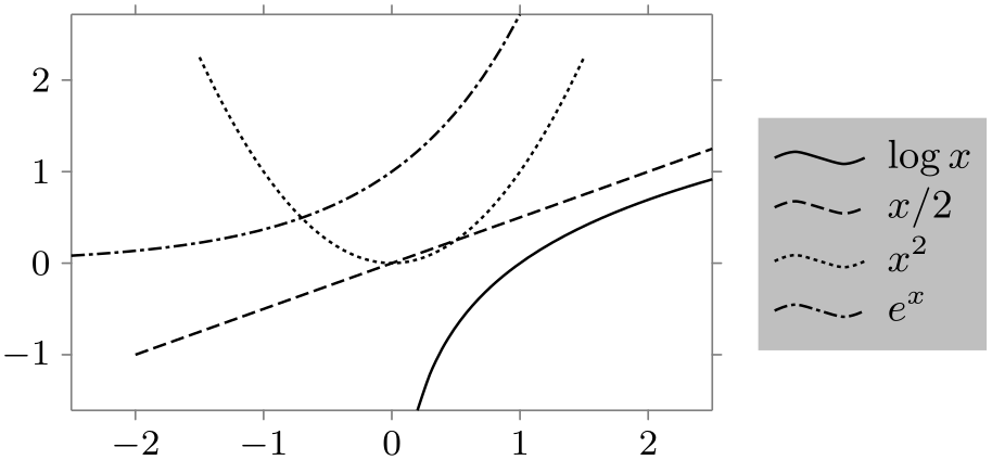
                        \usetikzlibrary {datavisualization.formats.functions}

                        \tikz \datavisualization [

                          scientific axes,

                          visualize as smooth line/.list=

                        {log, lin, squared, exp},

                          legend={matrix
                          node style={fill=black!25}},

                          log=
                        {label in legend={text=$\log x$}},

                          lin=
                        {label in legend={text=$x/2$}},

                          squared={label in legend={text=$x^2$}},

                          exp=
                        {label in legend={text=$e^x$}},

                          style sheet=vary dashing]

                        data
                        group {function
                        classes};
The following style allows you to configure the default appearance of every newly created legend:
This key defaults to east outside, label style=text right. This means that by default a legend is placed to the right of the data visualization and that in the individual legend entries the text is to the right of the data set visualization.
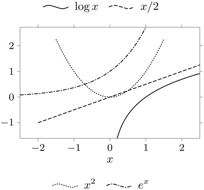
                    \usetikzlibrary {datavisualization.formats.functions}

                    \tikz \datavisualization [

                      scientific axes, x axis={label=$x$},

                      visualize as smooth line/.list={log, lin, squared, exp},

                      new legend={upper legend},

                      new legend={lower legend},

                      upper legend=above,

                      lower legend=below,

                      log=
                    {label in legend={text=$\log x$, legend=upper legend}},

                      lin=
                    {label
                      in legend={text=$x/2$, legend=upper
                      legend}},

                      squared={label
                      in legend={text=$x^2$, legend=lower
                      legend}},

                      exp=
                    {label
                      in legend={text=$e^x$, legend=lower
                      legend}},

                      style sheet=vary dashing]

                    data
                    group {function
                    classes};
-
/tikz/data visualization/legend=⟨options⟩(no default) 
This is a shorthand for new legend=main legend, main legend=⟨options⟩. In other words, this key creates a new main legend and immediately passes the configuration ⟨options⟩ to this legend.

                    \usetikzlibrary {datavisualization.formats.functions}

                    \tikz \datavisualization [

                      scientific axes, x axis={label=$x$},

                      visualize as smooth line/.list={log, lin, squared, exp},

                      legend=below,

                      log=
                    {label in legend={text=$\log x$}},

                      lin=
                    {label in legend={text=$x/2$}},

                      squared={label in legend={text=$x^2$}},

                      exp=
                    {label in legend={text=$e^x$}},

                      style sheet=vary dashing]

                    data
                    group {function
                    classes};
As pointed out above, a legend is empty by default. In particular, the different data sets are not automatically inserted into the legend. Instead, the key label in legend must be used together with a data set:
-
/tikz/data visualization/visualizer options/label in legend=⟨options⟩(no default) 
-
• The legend in which the data set should be visualized.
-
• The text that is to be shown in the legend for the data set.
-
• The appearance of the legend entries.
-
/tikz/data visualization/legend entry options/legend=⟨name⟩ (no default, initially main legend) 
-
/tikz/data visualization/legend entry options/text=⟨text⟩(no default) 
This key is passed to a data set, similar to options like pin in data or smooth line. The ⟨options⟩ are used to configure the following:
In detail, the ⟨options⟩ are executed with the path prefix
/tikz/data
visualization/legend
entry
options
To configure in which legend the label should appear, use the following key:
Set this key to the name of a legend that has previously been created using new legend. The label will then be shown in this legend.
In most cases, there is only one legend (namely main legend) and there is no need to set this key since it defaults to the main legend.
Also note that the legend ⟨name⟩ is automatically created if it nodes not yet exist.
Use this key to setup the ⟨text⟩ that is shown as the label of the data set.
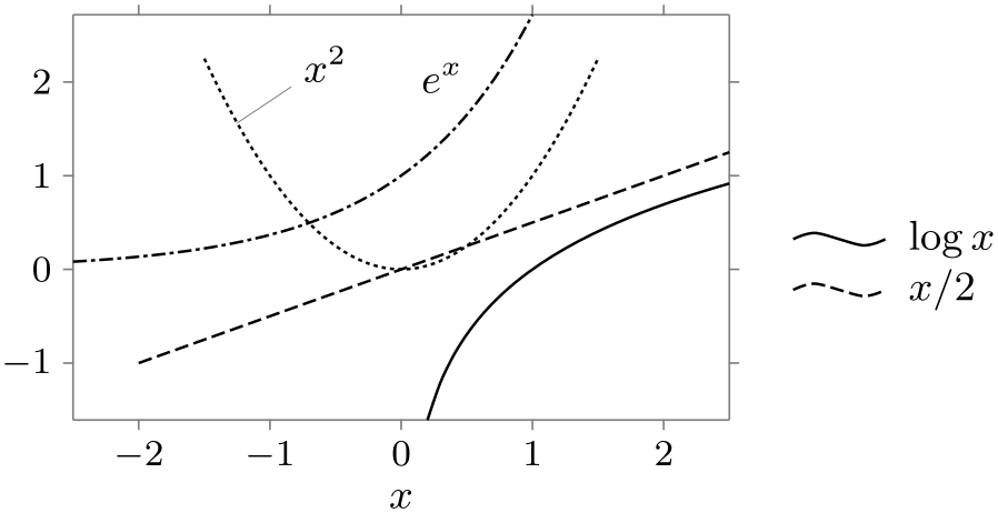
                        \usetikzlibrary {datavisualization.formats.functions}

                        \tikz \datavisualization [

                          scientific axes, x axis={label=$x$},

                          visualize as smooth line/.list=

                        {log, lin, squared, exp},

                          log=
                        {label in legend={text=$\log x$}},

                          lin=
                        {label in legend={text=$x/2$}},

                          squared={pin in
                          data    ={text=$x^2$, pos=0.1}},

                          exp=
                        {label in
                          data  ={text=$e^x$}},

                          style sheet=vary dashing]

                        data
                        group {function
                        classes};
In addition to the two keys described above, there are further keys that are described in Section 84.9.6.
84.9.2 Rows and Columns of Legend Entries
In a legend, the different legend entries are arranged in a matrix, which typically has only one row or one column. For the impatient reader: Say rows=1 to get everything in a row, say columns=1 to get everything in a single column, and skip the rest of this section.
The more patient reader will appreciate that when there are very many different data sets in a single visualization, it may be necessary to use more than one row or column inside the legend. TikZ comes with a rather powerful mechanism for distributing the multiple legend entries over the matrix.
The first thing to decide is in which “direction” the entries should be inserted into the matrix. Suppose we have a \(3 \times 3\) matrix and our entries are \(a\), \(b\), \(c\), and so on. Then, one might place the \(a\) in the upper left corner of the matrix, \(b\) in the upper middle position, \(c\) in the upper right position, and \(d\) in the middle left position. This is a “first right, then down” strategy. A different strategy might be to place the \(a\) in the upper left corner, but \(b\) in the middle left position, \(c\) in the lower left position, and \(d\) then in the upper middle position. This is a “first down, then right” strategy. In certain situations it might even make sense to place \(a\) in the lower right corner and then go “first up, then left”.
All of these strategies are supported by the legend command. You can configure which strategy is used using the following keys:
-
/tikz/data visualization/legend options/down then right(no value) 
Causes the legend entries to fill the legend matrix first downward and, once a column is full, the next column is begun to the right of the previous one. This is the default.

                    \usetikzlibrary {datavisualization.formats.functions}

                    \tikz \datavisualization [

                      visualize as smooth line/.list={1,2,3,4,5,6,7,8},

                      legend example, style sheet=vary hue,

                      main legend={down then right, columns=3}]

                    data
                    group {sin
                    functions};
In the example, the legend example is the following style:
                    \tikzdatavisualizationset {

                      legend
                    example/.style={

                        scientific
                    axes, all
                    axes={length=1cm, ticks=none},

                        1={label
                    in
                    legend={text=1}},

                        2={label
                    in
                    legend={text=2}},

                        3={label
                    in
                    legend={text=3}},

                        4={label
                    in
                    legend={text=4}},

                        5={label
                    in
                    legend={text=5}},

                        6={label
                    in
                    legend={text=6}},

                        7={label
                    in
                    legend={text=7}},

                        8={label
                    in
                    legend={text=8}}

                      }

                    }
-
/tikz/data visualization/legend options/down then left(no value) 

                    \usetikzlibrary {datavisualization.formats.functions}

                    \tikz \datavisualization [

                      visualize as smooth line/.list={1,2,3,4,5,6,7,8},

                      legend example, style sheet=vary hue,

                      main legend={down then left, columns=3}]

                    data
                    group {sin
                    functions};
-
/tikz/data visualization/legend options/up then right(no value) 

                    \usetikzlibrary {datavisualization.formats.functions}

                    \tikz \datavisualization [

                      visualize as smooth line/.list={1,2,3,4,5,6,7,8},

                      legend example, style sheet=vary hue,

                      main legend={up then right, columns=3}]

                    data
                    group {sin
                    functions};
-
/tikz/data visualization/legend options/up then left(no value) 

                    \usetikzlibrary {datavisualization.formats.functions}

                    \tikz \datavisualization [

                      visualize as smooth line/.list={1,2,3,4,5,6,7,8},

                      legend example, style sheet=vary hue,

                      main legend={up then left, columns=3}]

                    data
                    group {sin
                    functions};
-
/tikz/data visualization/legend options/left then up(no value) 

                    \usetikzlibrary {datavisualization.formats.functions}

                    \tikz \datavisualization [

                      visualize as smooth line/.list={1,2,3,4,5,6,7,8},

                      legend example, style sheet=vary hue,

                      main legend={left then up, columns=3}]

                    data
                    group {sin
                    functions};
-
/tikz/data visualization/legend options/left then down(no value) 

                    \usetikzlibrary {datavisualization.formats.functions}

                    \tikz \datavisualization [

                      visualize as smooth line/.list={1,2,3,4,5,6,7,8},

                      legend example, style sheet=vary hue,

                      main legend={left then down, columns=3}]

                    data
                    group {sin
                    functions};
-
/tikz/data visualization/legend options/right then up(no value) 

                    \usetikzlibrary {datavisualization.formats.functions}

                    \tikz \datavisualization [

                      visualize as smooth line/.list={1,2,3,4,5,6,7,8},

                      legend example, style sheet=vary hue,

                      main legend={right then up, columns=3}]

                    data
                    group {sin
                    functions};
-
/tikz/data visualization/legend options/right then down(no value) 

                    \usetikzlibrary {datavisualization.formats.functions}

                    \tikz \datavisualization [

                      visualize as smooth line/.list={1,2,3,4,5,6,7,8},

                      legend example, style sheet=vary hue,

                      main legend={right then down, columns=3}]

                    data
                    group {sin
                    functions};
Having configured the directions in which the matrix is being filled, you must next setup the number of rows or columns that are to be shown. There are actually two different ways of doing so. The first way is to specify a maximum number of rows or columns. For instance, you might specify that there should be at most ten rows to a column and when there are more, a new column should be begun. This is achieved using the following keys:
-
/tikz/data visualization/legend options/max rows=⟨number⟩(no default) 
As the legend matrix is being filled, whenever the number of rows in the current column would exceed ⟨number⟩, a new column is started.

                    \usetikzlibrary {datavisualization.formats.functions}

                    \tikz \datavisualization [

                      visualize as smooth line/.list={1,2,3,4,5,6,7,8},

                      legend example, style sheet=vary hue,

                      main legend={max rows=3}]

                    data
                    group {sin
                    functions};

                    \usetikzlibrary {datavisualization.formats.functions}

                    \tikz \datavisualization [

                      visualize as smooth line/.list={1,2,3,4,5,6,7,8},

                      legend example, style sheet=vary hue,

                      main legend={max rows=4}]

                    data
                    group {sin
                    functions};
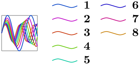
                    \usetikzlibrary {datavisualization.formats.functions}

                    \tikz \datavisualization [

                      visualize as smooth line/.list={1,2,3,4,5,6,7,8},

                      legend example, style sheet=vary hue,

                      main legend={max rows=5}]

                    data
                    group {sin
                    functions};
-
/tikz/data visualization/legend options/max columns=⟨number⟩(no default) 
This key works like max rows, only now the number of columns is monitored. Note that this strategy only really makes sense when the when you use this key with a strategy that first goes left or right and then up or down.
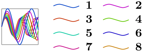
                    \usetikzlibrary {datavisualization.formats.functions}

                    \tikz \datavisualization [

                      visualize as smooth line/.list={1,2,3,4,5,6,7,8},

                      legend example, style sheet=vary hue,

                      main legend={right then down, max columns=2}]

                    data
                    group {sin
                    functions};

                    \usetikzlibrary {datavisualization.formats.functions}

                    \tikz \datavisualization [

                      visualize as smooth line/.list={1,2,3,4,5,6,7,8},

                      legend example, style sheet=vary hue,

                      main legend={right then down,max columns=3}]

                    data
                    group {sin
                    functions};

                    \usetikzlibrary {datavisualization.formats.functions}

                    \tikz \datavisualization [

                      visualize as smooth line/.list={1,2,3,4,5,6,7,8},

                      legend example, style sheet=vary hue,

                      main legend={right then down,max columns=4}]

                    data
                    group {sin
                    functions};
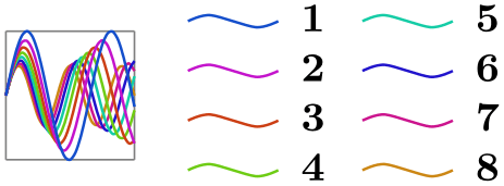
The second way of specifying the number of entries in a row or column is to specify an “ideal number of rows or columns”. The idea is as follows: Suppose that we use the standard strategy and would like to have everything in two columns. Then if there are eight entries, the first four should go to the first column, while the next four should go to the second column. If we have 20 entries, the first ten should go the first column and the next ten to the second, and so on. So, in general, the objective is to distribute the entries evenly so the this “ideal number of columns” is reached. Only when there are too few entries to achieve this or when the number of entries per column would exceed the max rows value, will the number of columns deviate from this ideal value.
-
/tikz/data visualization/legend options/ideal number of columns=⟨number⟩(no default) 
Specifies, that the entries should be split into ⟨number⟩ different columns, whenever possible. However, when there would be more than the max rows value of rows per column, more columns than the ideal number are created.
                    \usetikzlibrary {datavisualization.formats.functions}

                    \tikz \datavisualization [

                      visualize as smooth line/.list={1,2,3,4,5,6,7,8},

                      legend example, style sheet=vary hue,

                      main legend={ideal number of columns=2}]

                    data
                    group {sin
                    functions};

                    \usetikzlibrary {datavisualization.formats.functions}

                    \tikz \datavisualization [

                      visualize as smooth line/.list={1,2,3,4,5,6,7,8},

                      legend example, style sheet=vary hue,

                      main legend={ideal number of columns=4}]

                    data
                    group {sin
                    functions};

                    \usetikzlibrary {datavisualization.formats.functions}

                    \tikz \datavisualization [

                      visualize as smooth line/.list={1,2,3,4,5,6,7,8},

                      legend example, style sheet=vary hue,

                      main legend={max rows=3,ideal number of columns=2}]

                    data
                    group {sin
                    functions};
-
/tikz/data visualization/legend options/rows=⟨number⟩(no default) 
Shorthand for ideal number of rows=⟨number⟩.
-
/tikz/data visualization/legend options/ideal number of rows=⟨number⟩(no default) 
Works like ideal number of columns.

                    \usetikzlibrary {datavisualization.formats.functions}

                    \tikz \datavisualization [

                      visualize as smooth line/.list={1,2,3,4,5,6,7,8},

                      legend example, style sheet=vary hue,

                      main legend={ideal number of rows=2}]

                    data
                    group {sin
                    functions};

                    \usetikzlibrary {datavisualization.formats.functions}

                    \tikz \datavisualization [

                      visualize as smooth line/.list={1,2,3,4,5,6,7,8},

                      legend example, style sheet=vary hue,

                      main legend={ideal number of rows=4}]

                    data
                    group {sin
                    functions};

                    \usetikzlibrary {datavisualization.formats.functions}

                    \tikz \datavisualization [

                      visualize as smooth line/.list={1,2,3,4,5,6,7,8},

                      legend example, style sheet=vary hue,

                      main legend={max columns=3,ideal number of rows=2}]

                    data
                    group {sin
                    functions};
-
/tikz/data visualization/legend options/columns=⟨number⟩(no default) 
Shorthand for ideal number of columns=⟨number⟩.
84.9.3 Legend Placement: The General Mechanism
A legend can either be placed next to the data visualization or inside the data visualization at some place where there are no data entries. Both approached have advantages: Placing the legend next to the visualization minimises the “cluttering” by keeping all the extra information apart from the actual data, while placing the legend inside the visualization minimises the distance between the data sets and their explanations, making it easier for the eye to connect them.
For both approaches there are options that make the placement easier, see Sections 84.9.4 and 84.9.5, but these options internally just map to the following two options:
-
/tikz/data visualization/legend options/anchor=⟨anchor⟩(no default) 
The whole legend is a TikZ-matrix internally. Thus, in particular, it is stored in a node, which has anchors. Like for any other node, when the node is shown, the node is shifted in such a way that the ⟨anchor⟩ of the node lies at the current at position.
-
/tikz/data visualization/legend options/at=⟨coordinate⟩(no default) 
Configures the ⟨coordinate⟩ at which the ⟨anchor⟩ of the legend’s node should lie.
It may seem hard to predict a good ⟨coordinate⟩ for a legend since, depending of the size of the axis, different positions need to the chosen for the legend. However, it turns out that one can often use the coordinates of the special nodes data bounding box and data visualization bounding box, documented in Section 80.6.
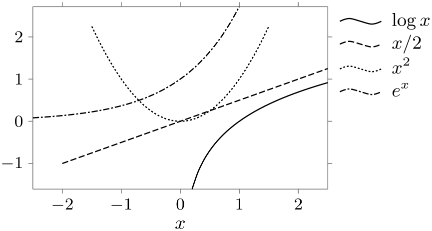
As an example, let us put a legend to the right of the visualization, but so that the first entry starts at the top of the visualization:
                    \usetikzlibrary {datavisualization.formats.functions}

                    \tikz \datavisualization [

                      scientific axes, x axis={label=$x$},

                      visualize as smooth line/.list=

                    {log, lin, squared, exp},

                      legend={anchor=north west, at=

                          (data visualization bounding box.north east)},

                      log=
                    {label in legend={text=$\log x$}},

                      lin=
                    {label in legend={text=$x/2$}},

                      squared={label in legend={text=$x^2$}},

                      exp=
                    {label in legend={text=$e^x$}},

                      style sheet=vary dashing]

                    data
                    group {function
                    classes};
As can be seen, a bit of an additional shift might have been in order, but the result is otherwise quite satisfactory.
84.9.4 Legend Placement: Outside to the Data Visualization
The following keys make it easy to place a legend outside the data visualization.
-
/tikz/data visualization/legend options/east outside(no value) 
-
/tikz/data visualization/legend options/right(no value) 
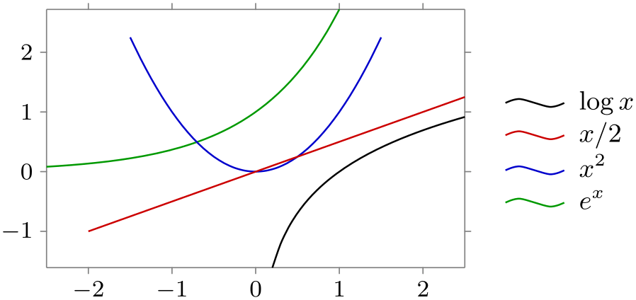
Placing the legend to the right of the data visualization is the default:
                    \usetikzlibrary {datavisualization.formats.functions}

                    \tikz \datavisualization [

                      scientific axes,

                      visualize as smooth line/.list=

                    {log, lin, squared, exp},

                      legend=east outside,

                      log=
                    {label in legend={text=$\log x$}},

                      lin=
                    {label in legend={text=$x/2$}},

                      squared={label in legend={text=$x^2$}},

                      exp=
                    {label in legend={text=$e^x$}},

                      style sheet=strong colors]

                    data
                    group {function
                    classes};
This is an easier-to-remember alias.
-
/tikz/data visualization/legend options/north east outside(no value) 
A variant, where the legend is to the right, but aligned with the northern end of the data visualization:

                    \usetikzlibrary {datavisualization.formats.functions}

                    \tikz \datavisualization [

                      scientific axes,

                      visualize as smooth line/.list=

                    {log, lin, squared, exp},

                      legend=north east outside,

                      log=
                    {label in legend={text=$\log x$}},

                      lin=
                    {label in legend={text=$x/2$}},

                      squared={label in legend={text=$x^2$}},

                      exp=
                    {label in legend={text=$e^x$}},

                      style sheet=strong colors]

                    data
                    group {function
                    classes};
-
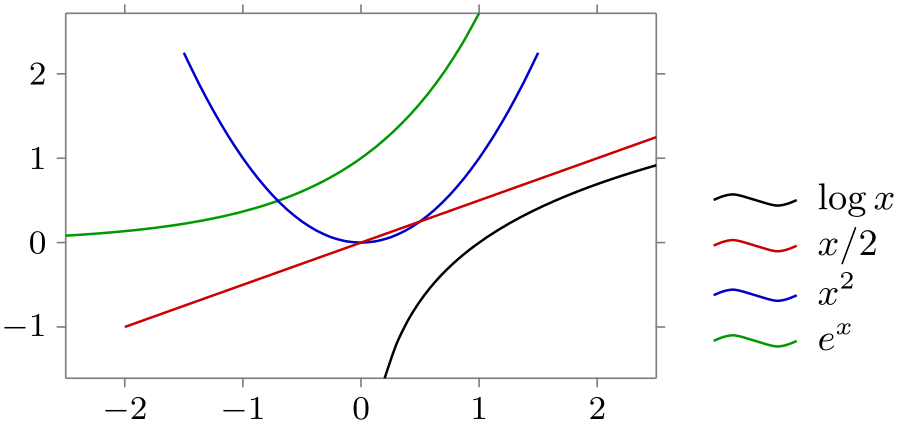
/tikz/data visualization/legend options/south east outside(no value) 
                    \usetikzlibrary {datavisualization.formats.functions}

                    \tikz \datavisualization [

                      scientific axes,

                      visualize as smooth line/.list=

                    {log, lin, squared, exp},

                      legend=south east outside,

                      log=
                    {label in legend={text=$\log x$}},

                      lin=
                    {label in legend={text=$x/2$}},

                      squared={label in legend={text=$x^2$}},

                      exp=
                    {label in legend={text=$e^x$}},

                      style sheet=strong colors]

                    data
                    group {function
                    classes};
-
/tikz/data visualization/legend options/west outside(no value) 
-
/tikz/data visualization/legend options/left(no value) 
The legend is placed left. Note that the text also swaps its position.
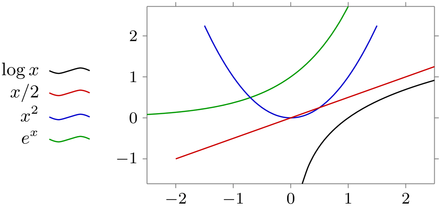
                    \usetikzlibrary {datavisualization.formats.functions}

                    \tikz \datavisualization [

                      scientific axes,

                      visualize as smooth line/.list=

                    {log, lin, squared, exp},

                      legend=west outside,

                      log=
                    {label in legend={text=$\log x$}},

                      lin=
                    {label in legend={text=$x/2$}},

                      squared={label in legend={text=$x^2$}},

                      exp=
                    {label in legend={text=$e^x$}},

                      style sheet=strong colors]

                    data
                    group {function
                    classes};
This is an easier-to-remember alias.
-
/tikz/data visualization/legend options/north west outside(no value) 
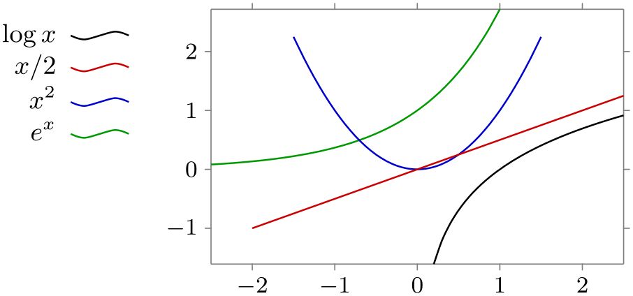
                    \usetikzlibrary {datavisualization.formats.functions}

                    \tikz \datavisualization [

                      scientific axes,

                      visualize as smooth line/.list=

                    {log, lin, squared, exp},

                      legend=north west outside,

                      log=
                    {label in legend={text=$\log x$}},

                      lin=
                    {label in legend={text=$x/2$}},

                      squared={label in legend={text=$x^2$}},

                      exp=
                    {label in legend={text=$e^x$}},

                      style sheet=strong colors]

                    data
                    group {function
                    classes};
-
/tikz/data visualization/legend options/south west outside(no value) 
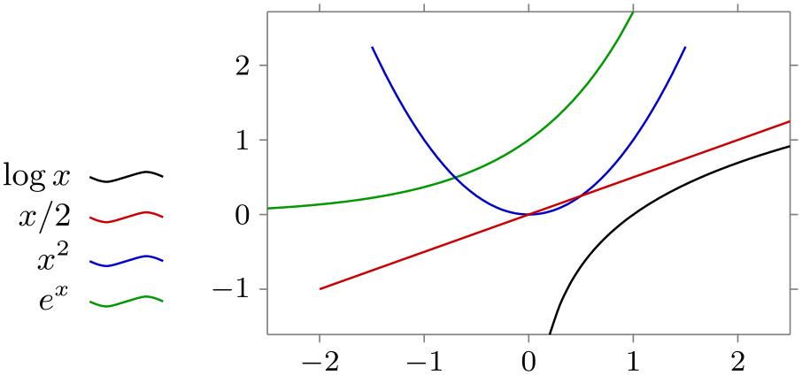
                    \usetikzlibrary {datavisualization.formats.functions}

                    \tikz \datavisualization [

                      scientific axes,

                      visualize as smooth line/.list=

                    {log, lin, squared, exp},

                      legend=south west outside,

                      log=
                    {label in legend={text=$\log x$}},

                      lin=
                    {label in legend={text=$x/2$}},

                      squared={label in legend={text=$x^2$}},

                      exp=
                    {label in legend={text=$e^x$}},

                      style sheet=strong colors]

                    data
                    group {function
                    classes};
-
/tikz/data visualization/legend options/north outside(no value) 
-
/tikz/data visualization/legend options/above(no value) 
The legend is placed above the data. Note that the legend entries now for a row rather than a column.
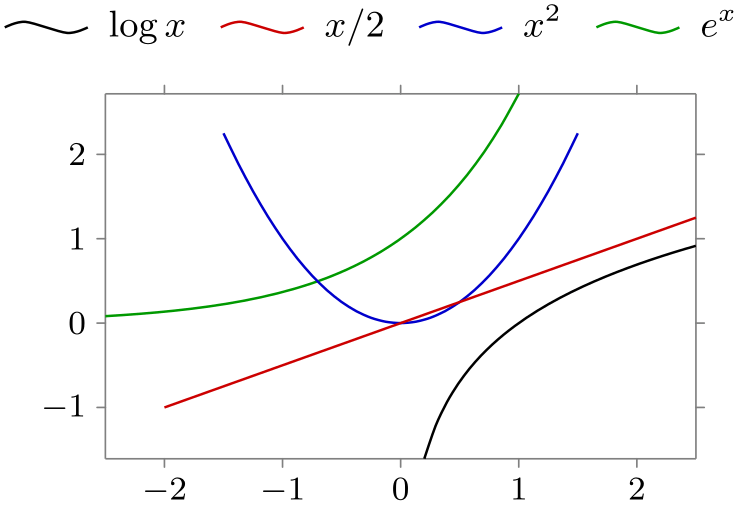
                    \usetikzlibrary {datavisualization.formats.functions}

                    \tikz \datavisualization [

                      scientific axes,

                      visualize as smooth line/.list=

                    {log, lin, squared, exp},

                      legend=north outside,

                      log=
                    {label in legend={text=$\log x$}},

                      lin=
                    {label in legend={text=$x/2$}},

                      squared={label in legend={text=$x^2$}},

                      exp=
                    {label in legend={text=$e^x$}},

                      style sheet=strong colors]

                    data
                    group {function
                    classes};
This is an easier-to-remember alias.
-
/tikz/data visualization/legend options/south outside(no value) 
-
/tikz/data visualization/legend options/below(no value) 

                    \usetikzlibrary {datavisualization.formats.functions}

                    \tikz \datavisualization [

                      scientific axes,

                      visualize as smooth line/.list=

                    {log, lin, squared, exp},

                      legend=south outside,

                      log=
                    {label in legend={text=$\log x$}},

                      lin=
                    {label in legend={text=$x/2$}},

                      squared={label in legend={text=$x^2$}},

                      exp=
                    {label in legend={text=$e^x$}},

                      style sheet=strong colors]

                    data
                    group {function
                    classes};
This is an easier-to-remember alias.
84.9.5 Legend Placement: Inside to the Data Visualization
There are two sets of options for placing a legend directly inside a data visualization: First, there are options for placing it inside, but next to some part of the border. Second, there are options for positioning it relative to a coordinate given by a certain data point.
-
/tikz/data visualization/legend options/south east inside(no value) 
-
/tikz/data visualization/legend options/every legend inside(style, no value) 
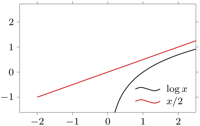
Puts the legend in the upper right corner of the data.
                    \usetikzlibrary {datavisualization.formats.functions}

                    \tikz \datavisualization [

                      scientific axes,

                      visualize as smooth line/.list=

                    {log, lin},

                      legend=south east inside,

                      log=
                    {label in legend={text=$\log x$}},

                      lin=
                    {label in legend={text=$x/2$}},

                      style sheet=strong colors]

                    data
                    group {function
                    classes};
Note that the text is now a little smaller since there tends to be much less space inside the data visualization than next to it. Also, the legend’s node is filled in white by default to ensures that the legend is clearly legible even in the presence of, say, a grid or data points behind it. This behavior is triggered by the following style key:
Executed the keys opaque by default and sets the text size to the size of footnotes.
In order to further configure the default appearance of an inner legend, the following keys might be useful:
-
/tikz/data visualization/legend options/opaque=⟨color⟩ (default white) 
When this key is used, the legend’s node will be filled with the ⟨color⟩ and its corners will be rounded. Additionally, the inner and outer separations will be set to sensible values.
-
/tikz/data visualization/legend options/transparent(no value) 
Sets the filling of the legend node to none.
The following keys work much the same way as south east inside:
-
/tikz/data visualization/legend options/east inside(no value) 
-
/tikz/data visualization/legend options/north east inside(no value) 
-
/tikz/data visualization/legend options/south west inside(no value) 
-
/tikz/data visualization/legend options/west inside(no value) 
-
/tikz/data visualization/legend options/north west inside(no value) 
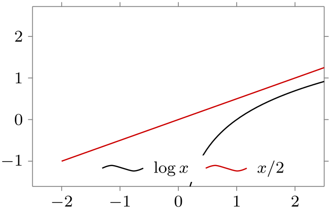
The keys south inside and north inside are a bit different: They use a row rather than a column for the legend entries:
-
/tikz/data visualization/legend options/south inside(no value) 
Puts the legend in the upper right corner of the data. Note that the text is now a little smaller since there tends to be much less space inside the data visualization than next to it.
                    \usetikzlibrary {datavisualization.formats.functions}

                    \tikz \datavisualization [

                      scientific axes,

                      visualize as smooth line/.list={log, lin},

                      legend=south inside,

                      log=
                    {label in legend={text=$\log x$}},

                      lin=
                    {label in legend={text=$x/2$}},

                      style sheet=strong colors]

                    data
                    group {function
                    classes};
-
/tikz/data visualization/legend options/north inside(no value) 
As above.
The above keys do not always give you as fine a control as you may need over the placement of the legend. In such cases, the following keys may help (or you can revert to directly setting the at and the anchor keys):
-
/tikz/data visualization/legend options/at values=⟨data point⟩(no default) 
This key allows you to specify the desired center of the legend in terms of a data point. The ⟨data point⟩ should be a list of comma-separated key–value pairs that specify a data point. The legend will then be centered at this data point.

                    \usetikzlibrary {datavisualization.formats.functions}

                    \tikz \datavisualization [

                      scientific axes,

                      visualize as smooth line/.list={log, lin},

                      legend={at values={x=-1, y=2}},

                      log=
                    {label in legend={text=$\log x$}},

                      lin=
                    {label in legend={text=$x/2$}},

                      style sheet=strong colors]

                    data
                    group {function
                    classes};
-
/tikz/data visualization/legend options/right of=⟨data point⟩(no default) 
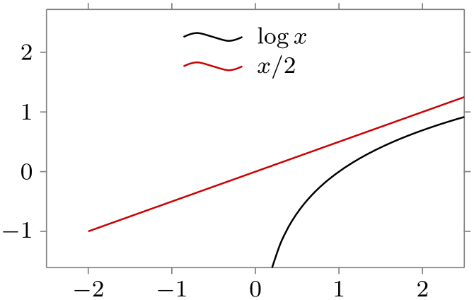
Works like at values, but the anchor is set to west:
                    \usetikzlibrary {datavisualization.formats.functions}

                    \tikz \datavisualization [

                      scientific axes,

                      visualize as smooth line/.list={log, lin},

                      legend={right of={x=-1, y=2}},

                      log=
                    {label in legend={text=$\log x$}},

                      lin=
                    {label in legend={text=$x/2$}},

                      style sheet=strong colors]

                    data
                    group {function
                    classes};
The following keys work similarly:
-
/tikz/data visualization/legend options/above right of=⟨data point⟩(no default) 
-
/tikz/data visualization/legend options/above of=⟨data point⟩(no default) 
-
/tikz/data visualization/legend options/above left of=⟨data point⟩(no default) 
-
/tikz/data visualization/legend options/left of=⟨data point⟩(no default) 
-
/tikz/data visualization/legend options/below left of=⟨data point⟩(no default) 
-
/tikz/data visualization/legend options/below of=⟨data point⟩(no default) 
-
/tikz/data visualization/legend options/below right of=⟨data point⟩(no default) 
84.9.6 Legend Entries: General Styling
The entries in a legend can be styled in several ways:
-
• You can configure the styling of the text node.
-
• You can configure the relative placement of the text node and the little picture depicting the data set’s styling.
-
• You can configure how the data set’s styling is depicted.
Before we have look at how each of these are configured, in detail, let us first have a look at the keys that allow us to save a set of such styles:
-
/tikz/data visualization/every label in legend(style, no value) 
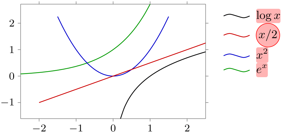
This key is executed with every label in a legend. However, the options stored in this style are executed with the path prefix /tikz/data visualization/legend entry options. Thus, this key can use keys like node style to configure the styling of all text nodes:
                    \usetikzlibrary {datavisualization.formats.functions}

                    \tikz \datavisualization [

                      scientific axes,

                      every label in legend/.style={node style=

                    {fill=red!30}},

                      visualize as smooth line/.list=

                    {log, lin, squared, exp},

                      legend=north east outside,

                      log=
                    {label in legend={text=$\log x$}},

                      lin=
                    {label in legend={text=$x/2$,

                            node style={circle, draw=red}}},

                      squared={label in legend={text=$x^2$}},

                      exp=
                    {label in legend={text=$e^x$}},

                      style sheet=strong colors]

                    data
                    group {function
                    classes};
-
/tikz/data visualization/legend options/label style=⟨options⟩(no default) 
This key can be used with a legend. It will simply add the ⟨options⟩ to the every label in legend style for the given legend.
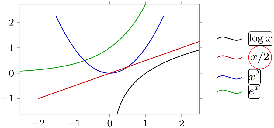
                    \usetikzlibrary {datavisualization.formats.functions}

                    \tikz \datavisualization [

                      scientific axes,

                      visualize as smooth line/.list=

                    {log, lin, squared, exp},

                      legend={label style={node style=draw}},

                      log=
                    {label in legend={text=$\log x$}},

                      lin=
                    {label in legend={text=$x/2$,

                            node style={circle, draw=red}}},

                      squared={label in legend={text=$x^2$}},

                      exp=
                    {label in legend={text=$e^x$}},

                      style sheet=strong colors]

                    data
                    group {function
                    classes};
84.9.7 Legend Entries: Styling the Text Node
The appearance of the text nodes is easy to configure.
-
/tikz/data visualization/legend entry options/node style=⟨options⟩(no default) 
This key adds ⟨options⟩ to the styling of the text nodes of the label.

                    \usetikzlibrary {datavisualization.formats.functions}

                    \tikz \datavisualization [

                      scientific axes,

                      visualize as smooth line/.list=

                    {log, lin, squared, exp},

                      legend=north east outside,

                      log=
                    {label in legend={text=$\log x$}},

                      lin=
                    {label in legend={text=$x/2$,

                            node style={circle, draw=red}}},

                      squared={label in legend={text=$x^2$}},

                      exp=
                    {label in legend={text=$e^x$}},

                      style sheet=strong colors]

                    data
                    group {function
                    classes};
-
/tikz/data visualization/legend entry options/text colored(no value) 
Causes the node style to set the text color to visualizer color. The effect of this is that the label’s text will have the same color as the data set to which it is attached.

                    \usetikzlibrary {datavisualization.formats.functions}

                    \tikz \datavisualization [

                      scientific axes,

                      visualize as smooth line/.list=

                    {log, lin, squared, exp},

                      legend={label style=text colored},

                      log=
                    {label in legend={text=$\log x$}},

                      lin=
                    {label in legend={text=$x/2$}},

                      squared={label in legend={text=$x^2$}},

                      exp=
                    {label in legend={text=$e^x$}},

                      style sheet=strong colors]

                    data
                    group {function
                    classes};
84.9.8 Legend Entries: Text Placement
Three keys govern where the text will be placed relative to the data set style visualization.
-
/tikz/data visualization/legend entry options/text right(no value) 
Placed the text node to the right of the data set style visualization. This is the default for most, but not all, legends.
-
/tikz/data visualization/legend entry options/text left(no value) 
Placed the text node to the left of the data set style visualization.
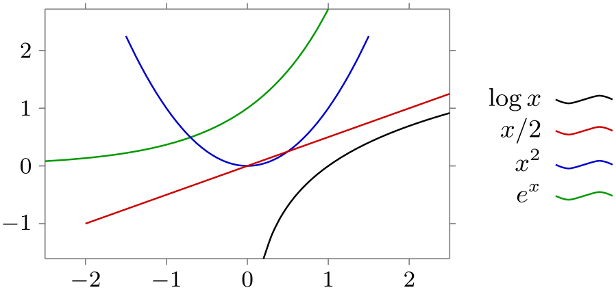
                    \usetikzlibrary {datavisualization.formats.functions}

                    \tikz \datavisualization [

                      scientific axes,

                      visualize as smooth line/.list=

                    {log, lin, squared, exp},

                      legend={label style=text left},

                      log=
                    {label in legend={text=$\log x$}},

                      lin=
                    {label in legend={text=$x/2$}},

                      squared={label in legend={text=$x^2$}},

                      exp=
                    {label in legend={text=$e^x$}},

                      style sheet=strong colors]

                    data
                    group {function
                    classes};
-
/tikz/data visualization/legend entry options/text only(no value) 
Shows only the text nodes and no data set style visualization at all. This options only makes sense in conjunction with the text colored options, which is why this options is also selected implicitly.
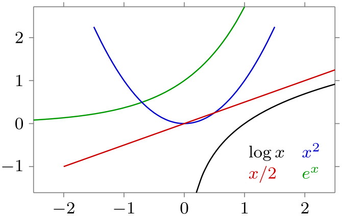
                    \usetikzlibrary {datavisualization.formats.functions}

                    \tikz \datavisualization [

                      scientific axes,

                      visualize as smooth line/.list=

                    {log, lin, squared, exp},

                      legend={south east inside, rows=2,

                                label
                      style=text only},

                      log=
                    {label in legend={text=$\log x$}},

                      lin=
                    {label in legend={text=$x/2$}},

                      squared={label in legend={text=$x^2$}},

                      exp=
                    {label in legend={text=$e^x$}},

                      style sheet=strong colors]

                    data
                    group {function
                    classes};
84.9.9 Advanced: Labels in Legends and Their Visualizers
The following explanations are important only for you if you intend to create a new visualizer and an accompanying label in legend visualizer; otherwise you can safely proceed with the next section.
A legend entry consists not only of some explaining text, but, even more importantly, of a visual representation of the style used for the data points, created by a label in legend visualizer. For instance, when data points are visualized as lines in different colors, the legend entry for the first line might consist of the text “first experiment” and a short line in black and the second entry might consist of “failed experiment” and a short line in red – assuming, of course, that the style sheet makes the first line black and the second line blue. As another example, when data sets are visualized as clouds of plot marks, the texts in the legend would be accompanied by the plot marks used to visualize the data sets.
For every visualizer, the label in legend visualizer creates an appropriate visualization of the data set’s styling. There may be more than one possible such label in legend visualizer that is appropriate, in which case options are used to choose between them.
Let us start with the key for creating a new legend entry. This key gets called for instance by label in legend:
-
/tikz/data visualization/new legend entry=⟨options⟩(no default) 
-
• For the legend entry, a little cell picture is created in the matrix of the legend (see Section 20.3 for details on cell pictures).
-
• Inside this picture, a node is created whose text is taken from the key
                        /tikz/data
                        visualization/legend
                        entry
                        options/text
-
• Also inside the picture, the code stored in the following key gets executed:
-
/tikz/data visualization/legend entry options/visualizer in legend(no value) 
Set this key to some code that paints something in the cell picture. Typically, this will be a visual representation of the data set styling, but it could also be something different.

                            \usetikzlibrary {datavisualization}

                            \tikz \datavisualization [

                              school book axes, visualize as line/.list={a,b},

                              style sheet=vary dashing,

                              a={label in legend={text=a}},

                              new legend entry={

                                  text=spacer,

                                  visualizer in legend={\draw[solid] (0,0) circle[radius=2pt];}

                                },

                              b={label in legend={text=b}}]

                            data
                            point [x=-1, y=-1, set=a]   data
                            point [x=1, y=0, set=a]

                            data
                            point [x=-1, y=1,  set=b]   data
                            point [x=1, y=0.5, set=b];
-
-
1. /tikz/data visualization/every data set label with path /tikz/data visualization
-
2. /tikz/data visualization/every label in legend with path
/tikz/data visualization/legend entry options. -
3. The ⟨options⟩.
-
4. The code in the following key:
-
/tikz/data visualization/legend entry options/setup(no value) 
Some code to be executed at this point. Mostly, it is used to setup attributes for style sheets.
-
-
5. A styling signal is emitted.
-
6. Only for the node: The current value of node style.
-
7. Only for the visualizer in legend: The styling that has been accumulated by calls to the following key:
-
/tikz/data visualization/legend entry options/visualizer in legend style=
{⟨options⟩}(style, no default) 
Calls to this key accumulate ⟨options⟩ that will be executed with the path prefix /tikz at this point.
-
This key will add a new entry to the legend that is identified by the ⟨options⟩. For this, the ⟨options⟩ are executed once with the path prefix /tikz/data visualization/legend entry options and the resulting setting of the legend key is used to pick which legend the new entry should belong to. Then, the ⟨options⟩ are stored away for the time being.
Later, when the legend is created, the ⟨options⟩ get executed once more. This time, however, the legend key is no longer important. Instead, the ⟨options⟩ that setup keys like text or visualizer in legend now play a role.
In detail, the following happens:
The following styles are applied in the following order before the cell picture is filled:
As indicated earlier, the new legend entry key is called by the label in legend=⟨options⟩ key internally. In this case, the following extra ⟨extra options⟩ are passed to new legend entry key:
-
• The styling of the visualizer.
-
• The /tikz/data visualization/every label in legend style.
-
• The /tikz/every label style with path /tikz.
-
• Setting setup to /data point/set=⟨name of the visualizer⟩.
-
• The value of the label legend options that are stored in the visualizer. These options can be changed using the following key:
-
/tikz/data visualization/visualizer options/label in legend options=⟨options⟩(no default) 
Use this key with a visualizer to configure the label in legend options. Typically, this key is used only internally by a visualizer upon its creating to set the ⟨options⟩ to setup the visualizer in legend key.
-
84.9.10 Reference: Label in Legend Visualizers for Lines and Scatter Plots
Visualizers like visualize as line or visualize as smooth line use a label in legend visualizer that draws a short line to represent the data set inside the legend. However, this line needs not be a simple straight line, but can be a little curve or a small circle – indeed, even the default line is not a simple straight line but rather a small zig-zag curve. To configure this line, the two keys are used, although you will only rarely use them directly, but rather use one of the predefined styles mentioned later on.
Before we go into the glorious details of all of these keys, let us first have a look at the keys you are most likely to use in practice: The keys for globally reconfiguring the default label in legend visualizers:
-
/tikz/data visualization/legend entry options/default label in legend path(style, no value) 
This style is set, by default, to zig zag label in legend line. It is installed by the styles straight line, smooth line, and gap line, so changing this style will change the appearance of lines in legends. The main other sensible option for this key is straight label in legend line.
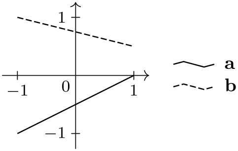
                    \usetikzlibrary {datavisualization}

                    \tikz \datavisualization [

                      school book axes, visualize as line/.list={a,b},

                      style sheet=vary dashing,

                      a={label in legend={text=a}},  b={label in legend={text=b}}]

                    data
                    point [x=-1, y=-1, set=a]   data
                    point [x=1, y=0, set=a]

                    data
                    point [x=-1, y=1,  set=b]   data
                    point [x=1, y=0.5, set=b];
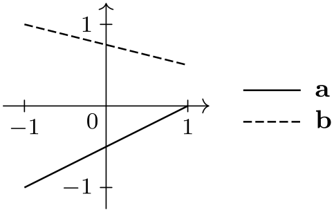
                    \usetikzlibrary {datavisualization}

                    \tikz \datavisualization [

                      school book axes, visualize as line/.list={a,b},

                      legend entry options/default label in legend path/.style=

                    straight label in legend line,

                      style sheet=vary dashing,

                      a={label in legend={text=a}},  b={label in legend={text=b}}]

                    data
                    point [x=-1, y=-1, set=a]   data
                    point [x=1, y=0, set=a]

                    data
                    point [x=-1, y=1,  set=b]   data
                    point [x=1, y=0.5, set=b];
-
/tikz/data visualization/legend entry options/default label in legend closed path(style, no value) 
This style is executed by smooth cycle and straight cycle. There are (currently) no other predefined sets of coordinates that can be used instead of the default value circular label in legend line.
-
/tikz/data visualization/legend entry options/default label in legend mark(style, no value) 
This style is executed by no lines and, implicitly, by scatter plots. The default is to use label in legend line one mark. Another possible value is label in legend line three marks.

                    \usetikzlibrary {datavisualization}

                    \tikz \datavisualization [

                      visualize as scatter/.list={a,b,c},

                      style sheet=cross marks,

                      legend entry options/default label in legend mark/.style=

                    label in legend three marks,

                      a={label in legend={text=example a}},

                      b={label in legend={text=example b}},

                      c={label in legend={text=example c}}];
-
/tikz/data visualization/legend entry options/label in legend line coordinates=
{⟨list of coordinates⟩}(no default) 
This key takes a ⟨list of coordinates⟩, which are TikZ-coordinates separated by commas like (0,0),(1,1). The effect of setting the key is the following: The label in legend visualizer used by, for instance, visualize as line will draw a path going through these points. When the line is drawn, the exact same style will be used as was used for the data set. For instance, if the smooth line key was used and also the style=red key, the line through the ⟨list of coordinates⟩ will also be red and smooth. When the straight cycle key was used, the coordinates will also be connected by a cycle, and so on.
When the line connecting the ⟨list of coordinates⟩ is drawn, the coordinate system will have been shifted and transformed in such a way that (0,0) lies to the left of the text and at half the height of the character “x”. This means that the right-most-point in the list should usually be (0,0) and all other \(x\)-coordinates should usually be negative. When the text left options is used, the coordinate system will have been flipped, so the ⟨list of coordinates⟩ is independent of whether the text is to the right or to the left of the line.
Let us now have a look at a first, simple example. We create a legend entry that is just a straight line, so it should start somewhere to the left of the origin at height \(0\) and go to the origin:

                    \usetikzlibrary {datavisualization}

                    \tikz \datavisualization [

                      school book axes, visualize as line/.list={a,b},

                      style sheet=vary dashing,

                      a={label in legend={text=a,

                            label
                      in legend line coordinates={(-1em,0), (0,0)}}},

                      b={label in legend={text=b,

                            label
                      in legend line coordinates={(-2em,0), (0,0)}}}]

                    data
                    point [x=-1, y=-1, set=a]   data
                    point [x=1, y=0, set=a]

                    data
                    point [x=-1, y=1,  set=b]   data
                    point [x=1, y=0.5, set=b];
Now let us make this a bit more fancy and useful by using shifted lines:

                    \usetikzlibrary {datavisualization}

                    \tikz \datavisualization [

                      school book axes, visualize as line/.list={a,b},

                      legend={up then right}, style sheet=vary dashing,

                      a={label in legend={text=a,

                            label
                      in legend line coordinates={(-2em,-.25ex), (0,0)}}},

                      b={label in legend={text=b,

                            label
                      in legend line coordinates={(-2em,.25ex), (0,0)}}}]

                    data
                    point [x=-1, y=-1, set=a]   data
                    point [x=1, y=0, set=a]

                    data
                    point [x=-1, y=1,  set=b]   data
                    point [x=1, y=0.5, set=b];
In the final example, we use a little “hat” to represent lines:
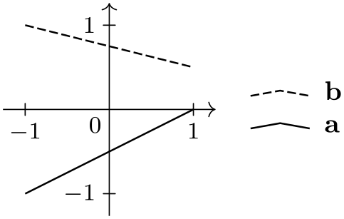
                    \usetikzlibrary {datavisualization}

                    \tikz \datavisualization [

                      school book axes, visualize as line/.list={a,b},

                      legend={up then right}, style sheet=vary dashing,

                      a={label in legend={text=a,

                            label
                      in legend line coordinates={

                              (-2em,-.2ex), (-1em,.2ex), (0,-.2ex)}}},

                      b={label in legend={text=b,

                            label
                      in legend line coordinates={

                              (-2em,-.2ex), (-1em,.2ex), (0,-.2ex)}}}]

                    data
                    point [x=-1, y=-1, set=a]   data
                    point [x=1, y=0, set=a]

                    data
                    point [x=-1, y=1,  set=b]   data
                    point [x=1, y=0.5, set=b];
-
/tikz/data visualization/legend entry options/label in legend mark coordinates=
{⟨list of coordinates⟩}(no default) 
This key is similar to label in legend line coordinates, but now the ⟨list of coordinates⟩ is used as the positions where plot marks are shown. Naturally, plot marks are only shown there if they are also shown by the visualizer in the actual data – just like the line through the coordinates of the previous key is only shown when there is a line.
The ⟨list of coordinates⟩ may be the same as the one used for lines, but usually it is not. In general, it is better to have marks for instance not at the ends of the line.
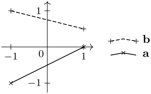
                    \usetikzlibrary {datavisualization}

                    \tikz \datavisualization [

                      school book axes, visualize as line/.list={a,b},

                      legend={up then right},

                      style sheet=vary dashing,

                      style sheet=cross marks,

                      a={label in legend={text=a,

                            label
                      in legend line coordinates={

                              (-2em,-.2ex), (-1em,.2ex), (0,-.2ex)},

                            label
                      in legend
                      mark coordinates={

                              (-1em,.2ex)}}},

                      b={label in legend={text=b,

                            label
                      in legend line coordinates={

                              (-2em,-.2ex), (-1em,.2ex), (0,-.2ex)},

                            label
                      in legend
                      mark coordinates={

                              (-2em,-.2ex), (0,-.2ex)}}}]

                    data
                    point [x=-1, y=-1, set=a]   data
                    point [x=1, y=0, set=a]

                    data
                    point [x=-1, y=1,  set=b]   data
                    point [x=1, y=0.5, set=b];
Naturally, you typically will not give coordinates explicitly for each label, but use one of the following styles:
-
/tikz/data visualization/legend entry options/straight label in legend line(no value) 
Just gives a straight line and two plot marks.

                    \usetikzlibrary {datavisualization}

                    \tikz \datavisualization [visualize as line,

                      line={style={mark=x}, label
                      in legend={text=example,

                          straight label in
                      legend line}}];
This style might seem like a good idea to use in general, but it does have a huge drawback: Some commonly used plot marks will be impossible to distinguish – even though there is no problem distinguishing them in a graph.

                    \usetikzlibrary {datavisualization}

                    \tikz \datavisualization [visualize as line/.list={a,b,c},

                      legend entry options/default label in legend path/.style=

                    straight label in legend line,

                      a={style={mark=+}, label
                      in legend={text=bad example a}},

                      b={style={mark=-}, label
                      in legend={text=bad example b}},

                      c={style={mark=|}, label
                      in legend={text=bad example c}}];
For this reason, this option is not the default, but rather the next one.
-
/tikz/data visualization/legend entry options/zig zag label in legend line(no value) 
Uses a small up-down-up line as the label in legend visualizer. The two plot marks are at the extremal points of the line. It works pretty well in almost all situations and is the default.

                    \usetikzlibrary {datavisualization}

                    \tikz \datavisualization [

                      visualize as line=a,

                      visualize as smooth line/.list={b,c},

                      a={style={mark=+}, label
                      in legend={text=better example a}},

                      b={style={mark=-}, label
                      in legend={text=better example b}},

                      c={style={mark=|}, label
                      in legend={text=better example c}}];
Even though the above example shows that the marks are easier to distinguish than with a straight line, the chosen marks are still not optimal. This is the reason that the cross marks style uses different crosses:

                    \usetikzlibrary {datavisualization}

                    \tikz \datavisualization [

                      visualize as line/.list={a,b},

                      visualize as smooth line=c,

                      style sheet=cross marks,

                      a={label in legend={text=good example a}},

                      b={label in legend={text=good example b}},

                      c={gap line, label in legend={text=good
                      example c}}];
-
/tikz/data visualization/legend entry options/circular label in legend line(no value) 
This style is especially tailored to represent lines that are closed. It is automatically selected for instance by the polygon or the smooth cycle styles.
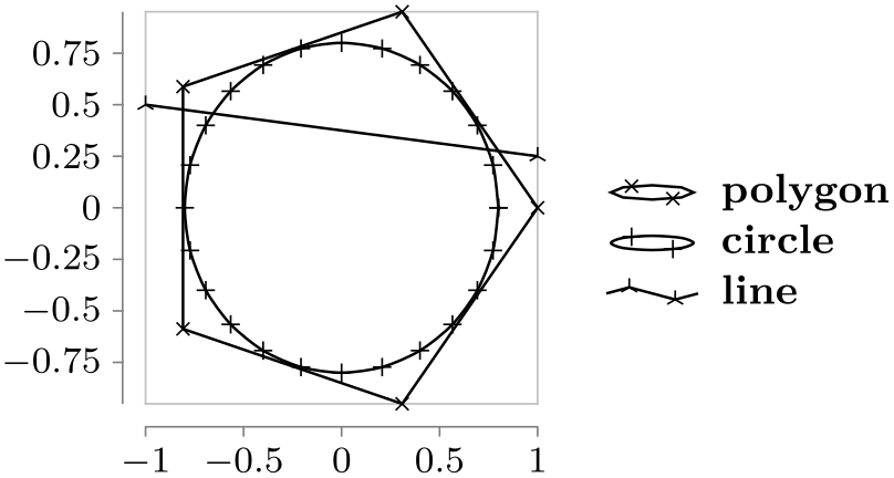
                    \usetikzlibrary {datavisualization.formats.functions}

                    \tikz \datavisualization [

                      scientific axes={clean}, all axes={length=3cm},

                      visualize as line/.list={a,b,c},

                      a={polygon}, b={smooth cycle},

                      style sheet=cross marks,

                      a={label in legend={text=polygon}},

                      b={label in legend={text=circle}},

                      c={label in legend={text=line}}]

                    data [format=function, set=a] {

                      var
                    t
                    : {0,72,...,359};

                      func
                    x
                    =
                    cos(\value t);

                      func
                    y
                    =
                    sin(\value t);

                    }

                    data [format=function, set=b] {

                      var
                    t
                    : [0:2*pi];

                      func
                    x
                    = .8*cos(\value t r);

                      func
                    y
                    = .8*sin(\value t r);

                    }

                    data
                    point [x=-1, y=0.5, set=c]

                    data
                    point [x=1,  y=0.25, set=c];
-
/tikz/data visualization/legend entry options/gap circular label in legend line(no value) 
This style is especially tailored to for the gap cycle style and automatically selected by it:

                    \usetikzlibrary {datavisualization.formats.functions}

                    \tikz \datavisualization [

                      scientific axes={clean}, all axes={length=3cm},

                      visualize as line/.list={a,b,c},

                      a={gap cycle}, b={smooth cycle}, c={gap line},

                      a={style={mark=*, mark size=0.5pt},

                           label
                      in legend={text=polygon}},

                      b={label in legend={text=circle}},

                      c={style={mark=*, mark size=0.5pt, mark
                      options=red},

                           label
                      in legend={text=line}}]

                    data [format=function, set=a] {

                      var
                    t
                    : {0,72,...,359};

                      func
                    x
                    =
                    cos(\value t);

                      func
                    y
                    =
                    sin(\value t);

                    }

                    data [format=function, set=b] {

                      var
                    t
                    : [0:352];

                      func
                    x
                    = .8*cos(\value t);

                      func
                    y
                    = .8*sin(\value t);

                    }

                    data
                    point [x=-1, y=0.5, set=c]

                    data
                    point [x=1,  y=0.25, set=c];
-
/tikz/data visualization/legend entry options/label in legend one mark(no value) 
To be used with scatter plots, since no line is drawn. Just displays a single mark (this is the default with a scatter plot or when the no line is selected.

                    \usetikzlibrary {datavisualization}

                    \tikz \datavisualization [visualize as scatter/.list={a,b,c},

                       style sheet=cross marks,

                      a={label in legend={text=example a}},

                      b={label in legend={text=example b}},

                      c={label in legend={text=example c}}];
-
/tikz/data visualization/legend entry options/label in legend three marks(no value) 
An alternative to the previous style, where several marks are shown.

                    \usetikzlibrary {datavisualization}

                    \tikz \datavisualization [visualize as scatter/.list={a,b,c},

                      style sheet=cross marks,

                      a={label in legend={text=example a, label
                      in legend three marks}},

                      b={label in legend={text=example b, label
                      in legend three marks}},

                      c={label in legend={text=example c, label
                      in legend three marks}}];