TikZ and PGF Manual
Data Visualization
82 Axes
82.1 Overview
When a data point is visualized, the most obvious way of creating a visual representation of its many attributes is to vary where the data point is shown. The data visualization system uses axes to turn data point attributes into positions on a page. The simplest – and most common – use of axes is to vary the horizontal position of data points according to one attribute and to vary the vertical position according to another attribute. In contrast, in a polar plot one attribute dictates the distance of the data point from the origin and another attribute describes the angle. From the data visualization engine’s point of view, in both cases two axes are involved.
In addition to specifying how the value of a certain attribute is converted into a displacement on the page, an axis is also typically (but not always) visualized (“drawn”) somewhere on the page. In this case, it is also customary to add a visual representation on this axis of which attribute values correspond to which positions on the page – something commonly known as ticks. Similar to ticks, grid lines also indicate positions where a certain attribute has a certain value, but instead of just indicating a single position on an axis, a grid line goes through all points that share an attribute value.
In the following, in Section 82.2 we first have a look at how axes can be defined and configured. As you will see, a lot of powerful configurations are available, but you will rarely define and configure an axis from scratch. Rather, it is more common to use a preconfigured axis instead. Section 82.3 introduces axis systems, which are predefined bundles of axes. You can define your own axis systems, but, again, in most cases it will suffice to just use one of the many preconfigured axis systems and use a few options to configure it so that it fits your need. Section 82.4 explains how ticks and grid lines can be configured. Again, several layers of options allow you to configure the way ticks look and where they are placed in great detail.
This section documents the standard axis systems that are always available. For polar axis systems, a special library needs to be loaded, which is documented in Section 85.
82.2 Basic Configuration of Axes
Inside the data visualization system, an axis is roughly a “systematic, named way of mapping an attribute to a position on a page”. For instance, the classical “\(x\)-axis” is the “systematic way of mapping the value of the x attribute of data points to a horizontal position on the page”. An axis is not its visual representation (such as the horizontal line with the ticks drawn to represent the \(x\)-axis), but a visual representation can be created once an axis has been defined.
The transformation of an attribute value (such as the value 1000000000 for the x attribute) to a specific displacement of the corresponding data point on the page involves two steps:
-
1. First, the range of possible values such as \([-5.6\cdot 10^{12},7.8\cdot 10^{12}]\) must be mapped to a “reasonable” interval such as \([0\mathrm {cm},5\mathrm {cm}]\) or \([0^\circ ,180^\circ ]\). TikZ’s drawing routines will only be able to cope with values from such a “reasonable” interval.
-
2. Second, the values from the reasonable interval must be mapped to a transformation.
The first step is always the same for all axes, while the second requires different strategies. For this reason, the command new axis base is used to create a “basic” axis that has a “scaling mapper”, whose job it is to map the range of values of a specific attribute to a reasonable interval, but such a basic axis does not define an actual transformation object. For this second step, additional objects such as a linear transformer need to be created separately.
82.2.1 Usage
To create an axis, the key new axis base is used first. Since this key does not create a transformation object, users typically do not use this key directly. Rather, it is used internally by other keys that create “real” axes. These keys are listed in Section 82.2.8.
-
/tikz/data visualization/new axis base=⟨axis name⟩(no default) 
-
1. A so called scaling mapper is created that will monitor a certain attribute, rescale it, and map it to another attribute. (This will be explained in detail in a moment.)
-
2. The ⟨axis name⟩ is made available as a key that can be used to configure the axis:
-
/tikz/data visualization/⟨axis name⟩=⟨options⟩(no default) 
This key becomes available once new axis base=metaaxis name has been called. It will execute the ⟨options⟩ with the path prefix /tikz/data visualization/axis options.
                            [new axis base=my axis,

                             my axis={attribute=some attribute}]
-
-
3. The ⟨axis name⟩ becomes part of the current set of axes. This set can be accessed through the following key:
-
/tikz/data visualization/all axes=⟨options⟩(no default) 
This key passes the ⟨options⟩ to all axes inside the current scope, just as if you had written ⟨some axis name⟩=⟨options⟩ for each ⟨some axis name⟩ in the current scope, including the just-created name ⟨axis name⟩.
-
This key defines a new axis for the current data visualization called ⟨name⟩. This has two effects:
There are many ⟨options⟩ that can be passed to a newly created axis. They are explained in the rest of this section.
Note the new axis base does not cause attributes to be mapped to positions on a page. Rather, special keys like new Cartesian axis first use new axis base to create an axis and then create an internal object that performs a linear mapping of the attribute to positions along a vectors.
82.2.2 The Axis Attribute
The first main job of an axis is to map the different values of some attribute to a reasonable interval. To achieve this, the following options are important (recall that these options are passed to the key whose name is the name of the axis):
-
/tikz/data visualization/axis options/attribute=⟨attribute⟩(no default) 
Specifies that the axis is used to transform the data points according the different values of the key /data point/⟨attribute⟩. For instance, when we create a classical two-dimensional Cartesian coordinate system, then there are two axes called x axis and y axis that monitor the values of the attributes /data point/x and /data point/y, respectively:
                      [new axis base=x axis,

                       new axis base=y axis,

                       x axis={attribute=x},

                       y axis={attribute=y}]
In another example, we also create an x axis and a y axis. However, this time, we want to plot the values of the /data point/time attribute on the \(x\)-axis and, say, the value of the height attribute on the \(y\)-axis:
                      [new axis base=x axis,

                       new axis base=y axis,

                       x axis={attribute=time},

                       y axis={attribute=height}]
During the data visualization, the ⟨attribute⟩ will be “monitored” during the survey phase. This means that for each data point, the current value of /data point/⟨attribute⟩ is examined and the minimum value of all of these values as well as the maximum value is recorded internally. Note that this works even when very large numbers like 100000000000 are involved.
Here is a real-life example. The scientific axes create two axes, called x axis and y axis, respectively.
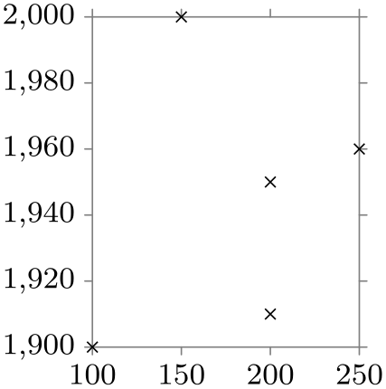
                    \usetikzlibrary {datavisualization}

                    \tikz \datavisualization [scientific axes,

                                              x axis={attribute=people, length=2.5cm, ticks=few},

                                              y axis={attribute=year},

                                              visualize as scatter]

                      data {

                        year, people

                        1900, 100

                        1910, 200

                        1950, 200

                        1960, 250

                        2000, 150

                      };
82.2.3 The Axis Attribute Range Interval
Once an attribute has been specified for an axis, the data visualization engine will start monitoring this value. This means that before anything actual visualization is done, a “survey phase” is used to determine the range of values encountered for the attribute for all data points. This range of values results in what is called the attribute range interval. Its minimum is the smallest value encountered in the data and its maximum is the largest value.
Even though the attribute range interval is computed automatically and even though you typically do not need to worry about it, there are some situations where you may wish to set or enlarge the attribute range interval:
-
• You may wish to start the interval with \(0\), even though the range of values contains only positive values.
-
• You may wish to slightly enlarge the interval so that, say, the maximum is some “nice” value like 100 or 60.
The following keys can be used to influence the size of the attribute range interval:
-
/tikz/data visualization/axis options/include value=⟨list of value⟩(no default) 
This key “fakes” data points for which the attribute’s values are in the comma-separated ⟨list of values⟩. For instance, when you write include value=0, then the attribute range interval is guaranteed to contain 0 – even if the actual data points are all positive or all negative.

-
/tikz/data visualization/axis options/min value=⟨value⟩(no default) 
This key allows you to simply set the minimum value, regardless of which values are present in the actual data. This key should be used with care: If there are data points for which the attribute’s value is less than ⟨value⟩, they will still be depicted, but typically outside the normal visualization area. Usually, saying include value=⟨value⟩ will achieve the same as saying min value=⟨value⟩, but with less danger of creating ill-formed visualizations.
-
/tikz/data visualization/axis options/max value=⟨value⟩(no default) 
Works like min value.
82.2.4 Scaling: The General Mechanism
The above key allows us specify which attribute should be “monitored”. The next key is used to specify what should happen with the observed values.
-
/tikz/data visualization/axis options/scaling=⟨scaling spec⟩(no default) 
-
/tikz/data visualization/axis options/function=⟨code⟩(no default) 
-
/tikz/data visualization/axis options/scaling/default=⟨text⟩(no default) 
The ⟨scaling spec⟩ must have the following form:
⟨\(s_1\)⟩ at ⟨\(t_1\)⟩ and ⟨\(s_2\)⟩ at ⟨\(t_2\)⟩
This means that monitored values in the interval \([s_1,s_2]\) should be mapped to values the “reasonable” interval \([t_1,t_2]\), instead. For instance, we might write
in order to map dates between 1900 and 2000 to the dimension interval \([0\mathrm {cm},5\mathrm {cm}]\).
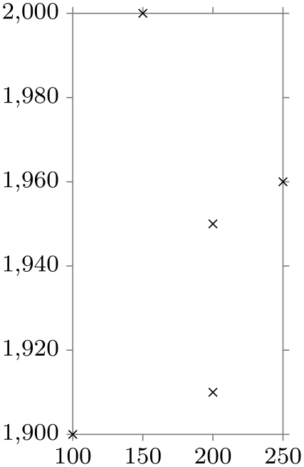
                    \usetikzlibrary {datavisualization}

                    \tikz \datavisualization

                       [scientific axes,

                        x axis={attribute=people, length=2.5cm, ticks=few},

                        y axis={attribute=year, scaling=1900 at 0cm and 2000
                      at 5cm},

                        visualize as scatter]

                      data {

                        year, people

                        1900, 100

                        1910, 200

                        1950, 200

                        1960, 250

                        2000, 150

                      };
So much for the basic idea. Let us now have a detailed look at what happens.
Number format and the min and max keywords. The source values \(s_1\) and \(s_2\) are typically just numbers like 3.14 or 10000000000. However, as described in Section 80.2, you can also specify expressions like (pi/2), provided that (currently) you put them in parentheses.
Instead of a number, you may alternatively also use the two key words min and max for \(s_1\) and/or \(s_2\). In this case, min evaluates to the smallest value observed for the attribute in the data, symmetrically max evaluates to the largest values. For instance, in the above example with the year attribute ranging from 1900 to 2000, the keyword min would stand for 1900 and max for 2000. Similarly, for the people attribute min stands for 100 and max for 250. Note that min and max can only be used for \(s_1\) and \(s_2\), not for \(t_1\) and \(t_2\).
A typical use of the min and max keywords is to say
to map the complete range of values into an interval of length of 5cm.
The interval \([s_1,s_2]\) need not contain all values that the ⟨attribute⟩ may attain. It is permissible that values are less than \(s_1\) or more than \(s_2\).
Linear transformation of the attribute. As indicated earlier, the main job of an axis is to map values from a “large” interval \([s_1,s_2]\) to a more reasonable interval \([t_1,t_2]\). Suppose that for the current data point the value of the key /data point/⟨attribute⟩ is the number \(v\). In the simplest case, the following happens: A new value \(v'\) is computed so that \(v' = t_1\) when \(v=s_1\) and \(v'=t_2\) when \(v=s_2\) and \(v'\) is some value in between \(t_1\) and \(t_2\) then \(v\) is some value in between \(s_1\) and \(s_2\). (Formally, in this basic case \(v' = t_1 + (v-s_1)\frac {t_2-t_1}{s_2-s_1}\).)
Once \(v'\) has been computed, it is stored in the key /data point/⟨attribute⟩/scaled. Thus, the “reasonable” value \(v'\) does not replace the value of the attribute, but it is placed in a different key. This means that both the original value and the more “scaled” values are available when the data point is visualized.
As an example, suppose you have written
Now suppose that /data point/x equals 1200 for a data point. Then the key /data point/x/scaled will be set to 22 when the data point is being visualized.
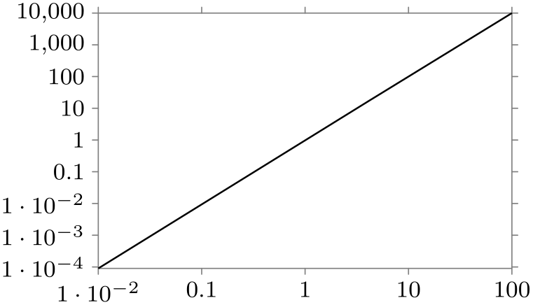
Nonlinear transformations of the attribute. By default, the transformation of \([s_1,s_2]\) to \([t_1,t_2]\) is the linear transformation described above. However, in some case you may be interested in a different kind of transformation: For example, in a logarithmic plot, values of an attribute may range between, say, 1 and 1000 and we want an axis of length 3cm. So, we would write
Indeed, 1 will now be mapped to position 0cm and 1000 will be mapped to position 3cm. Now, the value 10 will be mapped to approximately 0.03cm because it is (almost) at one percent between 1 and 1000. However, in a logarithmic plot we actually want 10 to be mapped to the position 1cm rather than 0.03cm and we want 100 to be mapped to the position 2cm. Such a mapping a nonlinear mapping between the intervals.
In order to achieve such a nonlinear mapping, the function key can be used, whose syntax is described in a moment. The effect of this key is to specify a function \(f \colon \mathbb {R} \to \mathbb {R}\) like, say, the logarithm function. When such a function is specified, the mapping of \(v\) to \(v'\) is computed as follows:
\(\seteqnumber{0}{}{0}\)\begin{align*} v' = t_1 + (f(s_2) - f(v))\frac {t_2 - t_1}{f(s_2)-f(s_1)}. \end{align*}
The syntax of the function key is described next, but you typically will not call this key directly. Rather, you will use a key like logarithmic that installs appropriate code for the function key for you.
The ⟨code⟩ should specify a function \(f\) that is applied during the transformation of the interval \([s_1,s_2]\) to the interval \([t_1,t_2]\) in the following way: When the ⟨code⟩ is called, the macro \pgfvalue will have been set to an internal representation of the to-be-transformed value \(v\). You can then call the commands of the math-micro-kernel of the data visualization system, see Section 86.4, to compute a new value. This new value must once more be stored in \pgfvalue.
The most common use of this key is to say
                        some
                        axis={function=\pgfdvmathln{\pgfvalue}{\pgfvalue}}
This specifies that the function \(f\) is the logarithm function.
                        \usetikzlibrary {datavisualization}

                        \tikz \datavisualization

                           [scientific axes,

                            x axis={ticks={major={at={1,10,100,1000}}},

                                       scaling=1
                          at 0cm and 1000
                          at 3cm,

                                       function=\pgfdvmathln{\pgfvalue}{\pgfvalue}},

                            visualize as scatter]

                          data [format=named] {

                            x={1,100,...,1000}, y={1,2,3}

                          };
Another possibility might be to use the square-root function, instead:
                        \usetikzlibrary {datavisualization}

                        \tikz \datavisualization

                           [scientific axes,

                            x axis={ticks=few,

                                      scaling=1
                          at 0cm and 1000
                          at 3cm,

                                      function=\pgfdvmathunaryop{\pgfvalue}{sqrt}{\pgfvalue}},

                            visualize as scatter]

                          data [format=named] {

                            x={0,100,...,1000}, y={1,2,3}

                          };
Default scaling. When no scaling is specified, it may seem natural to use \([0,1]\) both as the source and the target interval. However, this would not work when the logarithm function is used as transformations: In this case the logarithm of zero would be computed, leading to an error. Indeed, for a logarithmic axis it is far more natural to use \([1,10]\) as the source interval and \([0,1]\) as the target interval.
For these reasons, the default value for the scaling that is used when no value is specified explicitly can be set using a special key:
The ⟨text⟩ is used as scaling whenever no other scaling is specified. This key is mainly used when a transformation function is set using function; normally, you will not use this key directly.
Most of the time, you will not use neither the scaling nor the function key directly, but rather you will use one of the following predefined styles documented in the following.
82.2.5 Scaling: Logarithmic Axes
-
/tikz/data visualization/axis options/logarithmic(no value) 
-
1. The transformation function of the axis is setup to the logarithm.
-
2. The strategy for automatically generating ticks and grid lines is set to the exponential strategy, see Section 82.4.13 for details.
-
3. The default scaling is setup sensibly.
When this key is used with an axis, three things happen:
All told, to turn an axis into a logarithmic axis, you just need to add this option to the axis.
                    \usetikzlibrary {datavisualization.formats.functions}

                    \tikz \datavisualization [scientific axes,

                                              x axis={logarithmic},

                                              y axis={logarithmic},

                                              visualize as line]

                     data [format=function] {

                       var
                    x
                    :
                    interval [0.01:100];

                       func
                    y
                    =
                    \value x
                    *
                    \value x;

                     };
Note that this will work with any axis, including, say, the degrees on a polar axis:
                    \usetikzlibrary {datavisualization.polar}

                    \tikz \datavisualization

                        [new polar axes,

                         angle axis={logarithmic, scaling=1 at 0 and 90
                      at 90},

                         radius axis={scaling=0 at 0cm and 100
                      at 3cm},

                         visualize as scatter]

                      data [format=named] {

                        angle={1,10,...,90}, radius={1,10,...,100}

                      };
                    \usetikzlibrary {datavisualization.polar}

                    \tikz \datavisualization

                        [new polar axes,

                         angle axis={degrees},

                         radius axis={logarithmic, scaling=1 at 0cm and 100
                      at 3cm},

                         visualize as scatter]

                      data [format=named] {

                        angle={1,10,...,90}, radius={1,10,...,100}

                      };
82.2.6 Scaling: Setting the Length or Unit Length
-
/tikz/data visualization/axis options/length=⟨dimension⟩(no default) 
Sets scaling to min at 0cm and max at ⟨dimension⟩. The effect is that the range of all values of the axis’s attribute will be mapped to an interval of exact length ⟨dimension⟩.
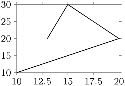
                    \usetikzlibrary {datavisualization}

                    \tikz \datavisualization [scientific axes,

                                              x axis={length=3cm},

                                              y axis={length=2cm},

                                              all axes={ticks=few},

                                              visualize as line]

                        data
                    {

                          x, y

                          10, 10

                          20, 20

                          15, 30

                          13, 20

                        };

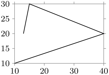
                    \usetikzlibrary {datavisualization}

                    \tikz \datavisualization [scientific axes,

                                              x axis={length=3cm},

                                              y axis={length=4cm},

                                              all axes={ticks=few},

                                              visualize as line]

                        data
                    {

                          x, y

                          10, 10

                          20, 20

                          15, 30

                          13, 20

                        };
-
/tikz/data visualization/axis options/unit length=⟨dimension⟩ per ⟨number⟩ units(no default) 
Sets scaling to 0 at 0cm and 1 at ⟨dimension⟩. In other words, this key allows you to specify how long a single unit should be. This key is particularly useful when you wish to ensure that the same scaling is used across multiple axes or pictures.
                    \usetikzlibrary {datavisualization}

                    \tikz \datavisualization [scientific axes,

                                              all axes={ticks=few, unit length=1mm},

                                              visualize as line]

                        data
                    {

                          x, y

                          10, 10

                          40, 20

                          15, 30

                          13, 20

                        };
The optional per ⟨number⟩ units allows you to apply more drastic scaling. Suppose that you want to plot a graph where one billion corresponds to one centimeter. Then the unit length would be need to be set to a hundredth of a nanometer – much too small for TeX to handle as a dimension. In this case, you can write unit length=1cm per 1000000000 units:
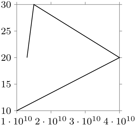
                    \usetikzlibrary {datavisualization}

                    \tikz \datavisualization

                      [scientific axes,

                       x axis={unit length=1mm per 1000000000 units, ticks=few},

                       visualize as line]

                     data {

                       x, y

                       10000000000, 10

                       40000000000, 20

                       15000000000, 30

                       13000000000, 20

                     };
-
/tikz/data visualization/axis options/power unit length=⟨dimension⟩(no default) 
This key is used in conjunction with the logarithmic setting. It cases the scaling to be set to 1 at 0cm and 10 at ⟨dimension⟩. This causes a “power unit”, that is, one power of ten in a logarithmic plot, to get a length of ⟨dimension⟩. Again, this key is useful for ensuring that the same scaling is used across multiple axes or pictures.
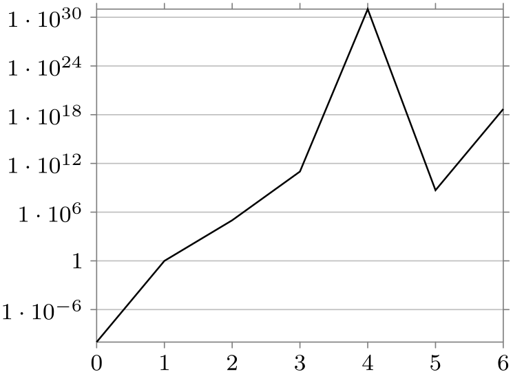
                    \usetikzlibrary {datavisualization}

                    \tikz \datavisualization

                      [scientific axes,

                       y axis={logarithmic, power unit length=1mm, grid},

                       visualize as line]

                     data {

                       x, y

                       0, 0.0000000001

                       1, 1

                       2, 100000

                       3, 100000000000

                       4, 10000000000000000000000000000000

                       5, 500000000

                       6, 5000000000000000000

                     };
82.2.7 Axis Label
An axis can have a label, which is a textual representation of the attribute according to which the axis varies the position of the page. You can set the attribute using the following key:
-
/tikz/data visualization/axis options/label={[⟨options⟩]⟨text⟩} (default axis’s label in math mode) 
This key sets the label of an axis to ⟨text⟩. This text will typically be placed inside a node and the ⟨options⟩ can be used to further configure the way this node is rendered. The ⟨options⟩ will be executed with the path prefix /tikz/data visualization/, so you need to say node style to configure the styling of a node, see Section 82.4.7.
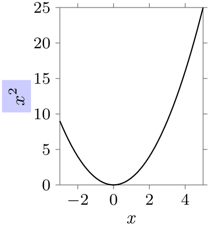
                    \usetikzlibrary {datavisualization.formats.functions}

                    \tikz \datavisualization [

                        scientific axes,

                        x axis =
                    {label, length=2.5cm},

                        y axis =
                    {label={[node style={fill=blue!20}]{$x^2$}}},

                        visualize as smooth line]

                     data [format=function] {

                       var
                    x
                    :
                    interval [-3:5];

                       func
                    y
                    =
                    \value x
                    *
                    \value x;

                     };
Note that using the label key does not actually cause a node to be created, because it is somewhat unclear where the label should be placed. Instead, the visualize label key is used (typically internally by an axis system) to show the label at some sensible position. This key is documented in Section 82.5.5.
82.2.8 Reference: Axis Types
As explained earlier, when you use new axis base to create a new axis, a powerful scaling and attribute mapping mechanism is installed, but no mapping of values to positions on the page is performed. For this, a transformation object must be installed. The following keys take care of this for you. Note, however, that even these keys do not cause a visual representation of the axis to be added to the visualization – this is the job of an axis system, see Section 82.3.
-
/tikz/data visualization/new Cartesian axis=⟨name⟩(no default) 
-
/tikz/data visualization/axis options/unit vector=⟨coordinate⟩ (no default, initially (1pt,0pt)) 
This key creates a new “Cartesian” axis, named ⟨name⟩. For such an axis, the (scaled) values of the axis’s attribute are transformed into a displacement on the page along a straight line. The following key is used to configure in which “direction” the axis points:
Recall that an axis takes the values of an attribute and rescales them so that they fit into a “reasonable” interval \([t_1,t_2]\). Suppose that \(v'\) is the rescaled dimension in (TeX) points. Then when the data point is visualized, the coordinate system will be shifted by \(v'\) times the ⟨coordinate⟩.
As an example, suppose that you have said scaling=0 and 10pt and 50 and 20pt. Then when the underlying attribute has the value 25, it will be mapped to a \(v'\) of \(15\) (because 25 lies in the middle of 0 and 50 and 15pt lies in the middle of 10pt and 20pt). This, in turn, causes the data point to be displaced by \(15\) times the ⟨coordinate⟩.
The bottom line is that the ⟨coordinate⟩ should usually denote a point that is at distance 1pt from the origin and that points into the direction of the axis.

                        \usetikzlibrary {datavisualization}

                        \begin{tikzpicture}

                          \draw [help lines] (0,0) grid
                        (3,2);


                          \datavisualization

                            [new Cartesian axis=x axis, x axis={attribute=x},

                             new Cartesian axis=y axis, y axis={attribute=y},

                             x axis={unit vector=(0:1pt)},

                             y axis={unit vector=(60:1pt)},

                             visualize as scatter]

                          data {

                            x, y

                            0, 0

                            1, 0

                            2, 0

                            1, 1

                            2, 1

                            1, 1.5

                            2, 1.5

                          };

                        \end{tikzpicture}
82.3 Axis Systems
An axis system is, as the name suggests, a whole family of axes that act in concert. For example, in the “standard” axis system there is a horizontal axis called the \(x\)-axis that monitors the x attribute (by default, you can change this easily) and a vertical axis called the \(y\)-axis. Furthermore, a certain number of ticks are added and labels are placed at sensible positions.
82.3.1 Usage
Using an axis system is usually pretty easy: You just specify a key like scientific axes and the necessary axes get initialized with sensible default values. You can then start to modify these default values, if necessary.
First, you can (and should) set the attributes to which the difference axes refer. For instance, if the time attribute is plotted along the \(x\)-axis, you would write
Second, you may wish to modify the lengths of the axes. For this, you can use keys like length or further keys as described in the references later on.
Third, you may often wish to modify how many ticks and grid lines are shown. By default, no grid lines are shown, but you can say the following in order to cause grid lines to be shown:
all axes={grid}
Naturally, instead of all axes you can also specify a single axis, causing only grid lines to be shown for this axis. In order to change the number of ticks that are shown, you can say
all axes={ticks=few}
or also many instead of few or even none. Far more fine-grained control over the tick placement and rendering is possible, see Section 82.4 for details.
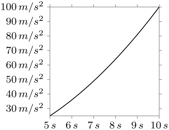
Fourth, consider adding units (like “cm” for centimeters or “\(\mathrm {m}/\mathrm {s}^2\)” for acceleration) to your ticks:
Finally, consider adding labels to your axes. For this, use the label option:
Here is an example that employs most of the above features:
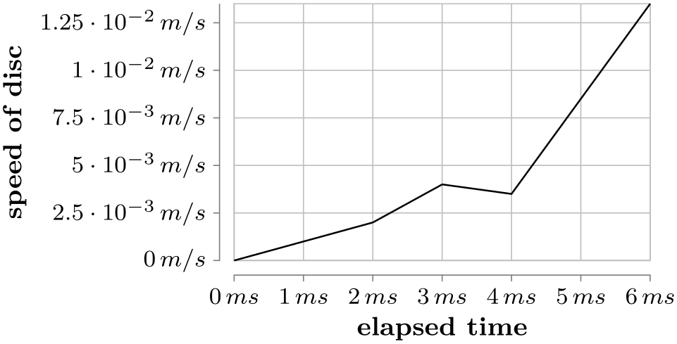
                \usetikzlibrary {datavisualization}

                \tikz \datavisualization [

                  scientific axes=clean,

                  x axis={attribute=time, ticks={tick unit=ms},

                      label={elapsed time}},

                  y axis={attribute=v, ticks={tick unit=m/s},

                      label={speed of disc}},

                  all axes=grid,

                  visualize as line]

                data {

                  time, v

                  0, 0

                  1, 0.001

                  2, 0.002

                  3, 0.004

                  4, 0.0035

                  5, 0.0085

                  6, 0.0135

                };
82.3.2 Reference: Scientific Axis Systems
-
/tikz/data visualization/scientific axes=⟨options⟩(no default) 
-
• The x-values are surveyed and the \(x\)-axis is then scaled and shifted so that it has the length specified by the following key.
-
/tikz/data visualization/scientific axes/width=⟨dimension⟩ (no default, initially 5cm) 
The minimum value is at the left end of the axis and at the canvas origin. The maximum value is at the right end of the axis.
-
-
• The y-values are surveyed and the \(y\)-axis is then scaled so that is has the length specified by the following key.
-
/tikz/data visualization/scientific axes/height=⟨dimension⟩(no default) 
By default, the height is the golden ratio times the width.
The minimum value is at the bottom of the axis and at the canvas origin. The maximum value is at the top of the axis.
-
-
• Lines (forming a frame) are depicted at the minimum and maximum values of the axes in 50% black.
-
/tikz/data visualization/every scientific axes(style, no value) 
This key installs a two-dimensional coordinate system based on the attributes /data point/x and /data point/y.

\usetikzlibrary {datavisualization.formats.functions}
\begin{tikzpicture}
\datavisualization [scientific axes,
visualize as smooth line]
data
[format=function] {
var
x
:
interval [0:100];
func
y
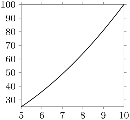
= sqrt(\value x);
};
\end{tikzpicture}
This axis system is usually a good choice to depict “arbitrary two dimensional data”. Because the axes are automatically scaled, you do not need to worry about how large or small the values will be. The name scientific axes is intended to indicate that this axis system is often used in scientific publications.
You can use the ⟨options⟩ to fine tune the axis system. The ⟨options⟩ will be executed with the following path prefix:
                    /tikz/data
                    visualization/scientific
                    axes
All keys with this prefix can thus be passed as ⟨options⟩.
This axis system will always distort the relative magnitudes of the units on the two axis. If you wish the units on both axes to be equal, consider directly specifying the unit length “by hand”:

                    \usetikzlibrary {datavisualization.formats.functions}

                    \begin{tikzpicture}

                      \datavisualization [visualize as smooth line,

                                          scientific axes,

                                          all axes={unit length=1cm per 10 units, ticks={few}}]

                        data
                    [format=function] {

                          var
                    x
                    :
                    interval [0:100];

                          func
                    y
                    = sqrt(\value x);

                        };

                    \end{tikzpicture}
The scientific axes have the following properties:
The following keys are executed by default as options: outer ticks and standard labels.
You can use the following style to overrule the defaults:
The keys described in the following can be used to fine-tune the way the scientific axis system is rendered.
-
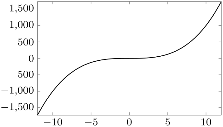
/tikz/data visualization/scientific axes/outer ticks(no value) 
This causes the ticks to be drawn “ on the outside” of the frame so that they interfere as little as possible with the data. It is the default.

\usetikzlibrary {datavisualization.formats.functions}
\begin{tikzpicture}
\datavisualization [scientific axes=outer ticks,
visualize as smooth line]
data
[format=function] {
var
x
:
interval [-12:12];
func
y
=
\value x*\value x*\value x;
};
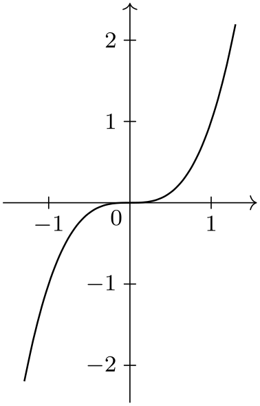
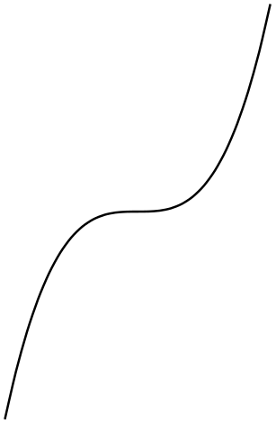
\end{tikzpicture}
-
/tikz/data visualization/scientific axes/inner ticks(no value) 
This axis system works like scientific axes, only the ticks are on the “inside” of the frame.
                    \usetikzlibrary {datavisualization.formats.functions}

                    \begin{tikzpicture}

                      \datavisualization [scientific axes=inner ticks,

                                          visualize as smooth line]

                        data
                    [format=function] {

                          var
                    x
                    :
                    interval [-12:12];

                          func
                    y
                    =
                    \value x*\value x*\value x;

                        };

                    \end{tikzpicture}
This axis system is also common in publications, but the ticks tend to interfere with marks if they are near to the border as can be seen in the following example:
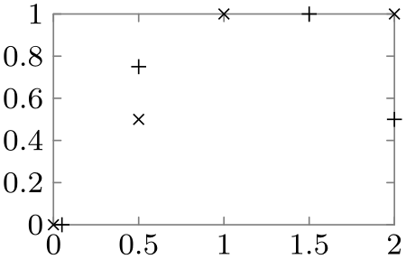
                    \usetikzlibrary {datavisualization}

                    \begin{tikzpicture}

                      \datavisualization [scientific axes={inner ticks, width=3.2cm},

                                          style sheet=cross marks,

                                          visualize as scatter/.list={a,b}]

                        data
                    [set=a] {

                          x, y

                          0, 0

                          1, 1

                          0.5, 0.5

                          2, 1

                        }

                        data
                    [set=b] {

                          x, y

                          0.05, 0

                          1.5, 1

                          0.5, 0.75

                          2, 0.5

                        };

                    \end{tikzpicture}
-
/tikz/data visualization/scientific axes/clean(no value) 
The axes and the ticks are completely removed from the actual data, making this axis system especially useful for scatter plots, but also for most other scientific plots.
                    \usetikzlibrary {datavisualization.formats.functions}

                    \tikz \datavisualization [

                      scientific axes=clean,

                      visualize as smooth line]

                    data [format=function] {

                      var
                    x
                    :
                    interval [-12:12];

                      func
                    y
                    =
                    \value x*\value x*\value x;

                    };
The distance of the axes from the actual plot is given by the padding of the axes.
For all scientific axis systems, different label placement strategies can be specified. They are discussed in the following.
-
/tikz/data visualization/scientific axes/standard labels(no value) 
As the name suggests, this is the standard placement strategy. The label of the \(x\)-axis is placed below the center of the \(x\)-axis, the label of the \(y\)-axis is rotated by \(90^\circ \) and placed left of the center of the \(y\)-axis.
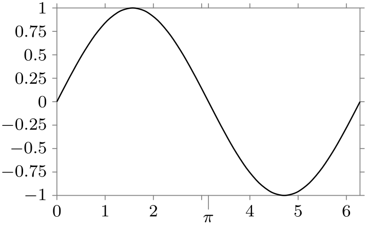
                    \usetikzlibrary {datavisualization.formats.functions}

                    \tikz \datavisualization

                     [scientific axes={clean, standard labels},

                      visualize as smooth line,

                      x axis={label=degree $d$,

                          ticks={tick unit={}^\circ}},

                      y axis={label=$\sin d$}]

                    data [format=function] {

                      var
                    x
                    :
                    interval [-10:10] samples
                    10;

                      func
                    y
                    =
                    sin(\value x);

                    };
-
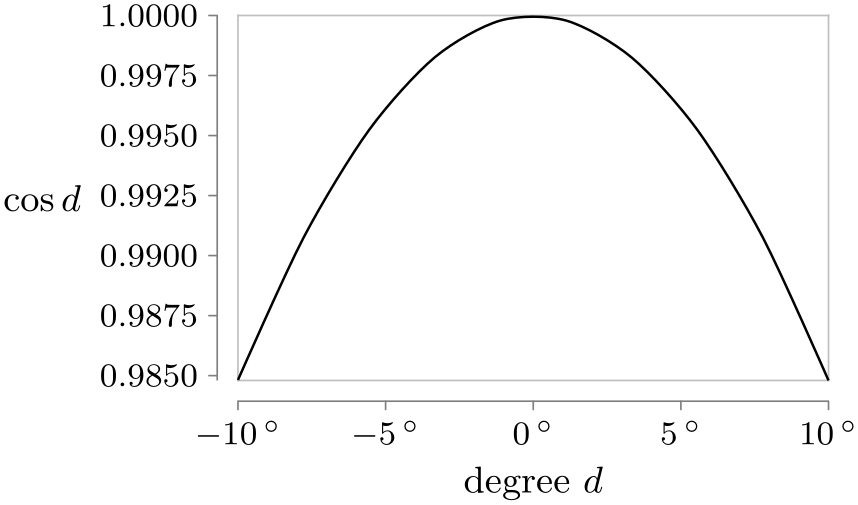
/tikz/data visualization/scientific axes/upright labels(no value) 
Works like scientific axes standard labels, only the label of the \(y\)-axis is not rotated.
                    \usetikzlibrary {datavisualization.formats.functions}

                    \tikz \datavisualization [

                      scientific axes={clean, upright labels},

                      visualize as smooth line,

                      x axis={label=degree $d$,

                          ticks={tick unit={}^\circ}},

                      y axis={label=$\cos d$, include value=1,

                          ticks={style={

                              /pgf/number format/precision=4,

                              /pgf/number format/fixed
                      zerofill}}}]

                    data [format=function] {

                      var
                    x
                    :
                    interval [-10:10] samples
                    10;

                      func
                    y
                    =
                    cos(\value x);

                    };
-
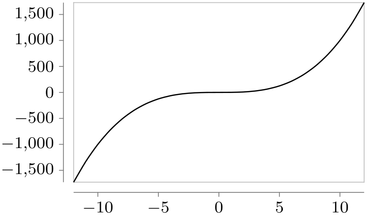
/tikz/data visualization/scientific axes/end labels(no value) 
Places the labels at the end of the \(x\)- and the \(y\)-axis, similar to the axis labels of a school book axis system.
                    \usetikzlibrary {datavisualization.formats.functions}

                    \tikz \datavisualization [

                      scientific axes={clean, end labels},

                      visualize as smooth line,

                      x axis={label=degree $d$,

                          ticks={tick unit={}^\circ}},

                      y axis={label=$\tan d$}]

                    data [format=function] {

                      var
                    x
                    :
                    interval [-80:80];

                      func
                    y
                    = tan(\value x);

                    };
82.3.3 Reference: School Book Axis Systems
-
/tikz/data visualization/school book axes=⟨options⟩(no default) 
-
/tikz/data visualization/school book axes/unit=⟨value⟩(no default) 
-
/tikz/data visualization/school book axes/standard labels(no value) 
This axis system is intended to “look like” the coordinate systems often used in school books: The axes are drawn in such a way that they intersect to origin. Furthermore, no automatic scaling is done to ensure that the lengths of units are the same in all directions.
This axis system must be used with care – it is nearly always necessary to specify the desired unit length by hand using the option unit length. If the magnitudes of the units on the two axes differ, different unit lengths typically need to be specified for the different axes.
Finally, if the data is “far removed” from the origin, this axis system will also “look bad”.
                    \usetikzlibrary {datavisualization.formats.functions}

                    \begin{tikzpicture}

                      \datavisualization [school book axes, visualize as smooth line]

                        data
                    [format=function] {

                          var
                    x
                    :
                    interval [-1.3:1.3];

                          func
                    y
                    =
                    \value x*\value x*\value x;

                        };

                    \end{tikzpicture}
The stepping of the ticks is one unit by default. Using keys like ticks=some may help to give better steppings.
The ⟨options⟩ are executed with the key itself as path prefix. Thus, the following subkeys are permissible options:
Sets the scaling so that 1 cm corresponds to ⟨value⟩ units. At the same time, the stepping of the ticks will also be set to ⟨value⟩.
                        \usetikzlibrary {datavisualization.formats.functions}

                        \begin{tikzpicture}

                          \datavisualization [school book axes={unit=10},

                                              visualize as smooth line,

                                              clean ticks,

                                              x axis={label=$x$},

                                              y axis={label=$f(x)$}]

                            data
                        [format=function] {

                              var
                        x
                        :
                        interval [-20:20];

                              func
                        y
                        =
                        \value x*\value x/10;

                            };

                        \end{tikzpicture}
This key makes the label of the \(x\)-axis appear at the right end of this axis and it makes the label of the \(y\)-axis appear at the top of the \(y\)-axis.
Currently, this is the only supported placement strategy for the school book axis system.
\usetikzlibrary {datavisualization.formats.functions}
\begin{tikzpicture}
\datavisualization [school book axes={standard labels},
visualize as smooth line,
clean ticks,
x axis={label=$x$},
y axis={label=$f(x)$}]
data
[format=function] {
var
x
:
interval [-1:1];
func
y
=
\value x*\value x
+
1;
};
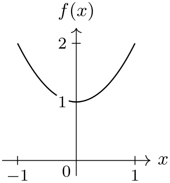
\end{tikzpicture}
82.3.4 Advanced Reference: Underlying Cartesian Axis Systems
The axis systems described in the following are typically not used directly by the user. The systems setup directions for several axes in some sensible way, but they do not actually draw anything on these axes. For instance, the xy Cartesian creates two axes called x axis and y axis and makes the \(x\)-axis point right and the \(y\)-axis point up. In contrast, an axis system like scientific axes uses the axis system xy Cartesian internally and then proceeds to setup a lot of keys so that the axis lines are drawn, ticks and grid lines are drawn, and labels are placed at the correct positions.
-
/tikz/data visualization/xy Cartesian(no value) 
-
/tikz/data visualization/xy axes=⟨options⟩(no default) 
This axis system creates two axes called x axis and y axis that point right and up, respectively. By default, one unit is mapped to one cm.
                    \usetikzlibrary {datavisualization.formats.functions}

                    \begin{tikzpicture}

                      \datavisualization [xy Cartesian, visualize as smooth line]

                        data
                    [format=function] {

                          var
                    x
                    :
                    interval [-1.25:1.25];

                          func
                    y
                    =
                    \value x*\value x*\value x;

                        };

                    \end{tikzpicture}
This key applies the ⟨options⟩ both to the x axis and the y axis.
-
/tikz/data visualization/xyz Cartesian cabinet(no value) 
-
/tikz/data visualization/xyz axes=⟨options⟩(no default) 
This axis system works like xy Cartesian, only it additionally creates an axis called z axis that points left and down. For this axis, one unit corresponds to \(\frac {1}{2}\sin 45^\circ \mathrm {cm}\). This is also known as a cabinet projection.
This key applies the ⟨options⟩ both to the x axis and the y axis.
-
/tikz/data visualization/uv Cartesian(no value) 
-
/tikz/data visualization/uv axes=⟨options⟩(no default) 
This axis system works like xy Cartesian, but it introduces two axes called u axis and v axis rather than the x axis and the y axis. The idea is that in addition to a “major” \(xy\)-coordinate system this is also a “smaller” or “minor” coordinate system in use for depicting, say, small vectors with respect to this second coordinate system.
Applies the ⟨options⟩ to both the u axis and the y axis.
82.4 Ticks and Grids
82.4.1 Concepts
A tick is a small visual indication on an axis of the value of the axis’s attribute at the position where the tick is shown. A tick may be accompanied additionally by a textual representation, but it need not. A grid line is similar to a tick, but it is not an indication on the axis, but rather a whole line that indicates all positions where the attribute has a certain value. Unlike ticks, grid lines (currently) are not accompanied by a textual representation.
Just as for axes, the data visualization system decouples the specification of which ticks are present in principle from where they are visualized. In the following, I describe how you specify which ticks and grid lines you would like to be drawn and how they should look like (their styling). The axis system of your choice will then visualize the ticks at a sensible position for the chosen system. For details on how to change where whole axis is shown along with its ticks, see Section 82.5.4.
Specifying which ticks you are interested in is done as follows: First, you use ticks key (or, for specifying which grid lines should be present, the grid key). This key takes several possible options, described in detail in the following, which have different effects:
-
1. Keys like step=10 or minor steps between steps cause a “semi-automatic” computation of possible steps. Here, you explicitly specify the stepping of steps, but the first stepping and their number are computed automatically according to the range of possible values for the attribute.
-
2. Keys like few, some, or many can be passed to ticks in order to have TikZ compute good tick positions automatically. This is usually what you want to happen, which is why most axis system will implicitly say ticks={some}.
-
3. Keys like at or also at provide “absolute control” over which ticks or grid lines are shown. For these keys, you can not only specify at what value a tick should be shown, but also its styling and also whether it is a major, minor, or subminor tick or grid line.
In the following, the main keys ticks and grids are documented first. Then the different kinds of ways of specifying where ticks or grid lines should be shown are explained.
82.4.2 The Main Options: Tick and Grid
-
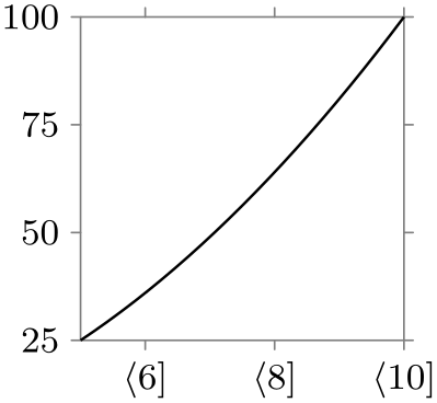
/tikz/data visualization/axis options/ticks=⟨options⟩ (default some) 
This key can be passed to an axis in order to configure which ticks are present for the axis. The possible ⟨options⟩ include, for instance, keys like step, which is used to specify a stepping for the ticks, but also keys like major or minor for specifying the positions of major and minor ticks in detail. The list of possible options is described in the rest of this section.
Note that the ticks option will only configure which ticks should be shown in principle. The actual rendering is done only when the visualize ticks key is used, documented in Section 82.5.4, which is typically done only internally by an axis system.
The ⟨options⟩ will be executed with the path prefix /tikz/data visualization/. When the ticks key is used multiple times for an axis, the ⟨options⟩ accumulate.
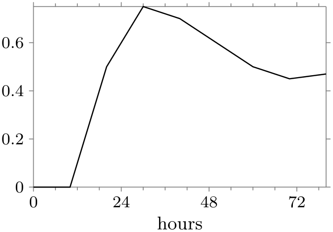
                    \usetikzlibrary {datavisualization}

                    \tikz \datavisualization [

                      scientific axes, visualize as line,

                      x axis={ticks={step=24, minor steps between steps=3},

                                label=hours}]

                      data {

                        x, y

                        0, 0

                        10, 0

                        20, 0.5

                        30, 0.75

                        40, 0.7

                        50, 0.6

                        60, 0.5

                        70, 0.45

                        80, 0.47

                      };
-
/tikz/data visualization/axis options/grid=⟨options⟩ (default at default ticks) 
This key is similar to ticks, only it is used to configure where grid lines should be shown rather than ticks. In particular, the options that can be passed to the ticks key can also be passed to the grid key. Just like ticks, the ⟨options⟩ only specify which grid lines should be drawn in principle; it is the job of the visualize grid key to actually cause any grid lines to be shown.
If you do not specify any ⟨options⟩, the default text at default ticks is used. This option causes grid lines to be drawn at all positions where ticks are shown by default. Since this usually exactly what you would like to happen, most of the time you just need to all axes=grid to cause a grid to be shown.
-
/tikz/data visualization/axis options/ticks and grid=⟨options⟩(no default) 
This key passes the ⟨options⟩ to both the ticks key and also to the grid key. This is useful when you want to specify some special points explicitly where you wish a tick to be shown and also a grid line.

                    \usetikzlibrary {datavisualization.formats.functions}

                    \tikz \datavisualization

                      [scientific axes,

                       visualize as smooth line,

                       all axes=
                    {grid, unit length=1.25cm},

                       y axis={ ticks=few },

                       x axis={ ticks=many, ticks and grid={ major
                      also at={(pi/2) as $\frac{\pi}{2}$}}}]

                      data [format=function] {

                        var
                    x
                    :
                    interval [-pi/2:3*pi] samples
                    50;

                        func
                    y
                    =
                    sin(\value x r);

                      };
82.4.3 Semi-Automatic Computation of Tick and Grid Line Positions
Consider the following problem: The data visualization engine determines that in a plot the \(x\)-values vary between \(17.4\) and \(34.5\). In this case, we certainly do not want, say, ten ticks at exactly ten evenly spaced positions starting with \(17.4\) and ending with \(34.5\), because this would yield ticks at positions like \(32.6\). Ticks should be placed at “nice” positions like \(20\), \(25\), and \(30\).
Determining which positions are “nice” is somewhat difficult. In the above example, the positions \(20\), \(25\), and \(30\) are certainly nice, but only three ticks may be a bit few of them. Better might be the tick positions \(17.5\), \(20\), \(22.5\), through to \(32.5\). However, users might prefer even numbers over fractions like \(2.5\) as the stepping.
A tick placement strategy is a method of automatically deciding which positions are good for placing ticks. The data visualization engine comes with a number of predefined strategies, but you can also define new ones yourself. When the data visualization is requested to automatically determine “good” positions for the placement of ticks on an axis, it uses one of several possible basic strategies. These strategies differ dramatically in which tick positions they will choose: For a range of values between \(5\) and \(1000\), a linear steps strategy might place ticks at positions \(100\), \(200\), through to \(1000\), while an exponential steps strategy would prefer the tick positions \(10\), \(100\) and \(1000\). The exact number and values of the tick positions chosen by either strategy can be fine-tuned using additional options like step or about.
Here is an example of the different stepping chosen when one varies the tick placement strategy:
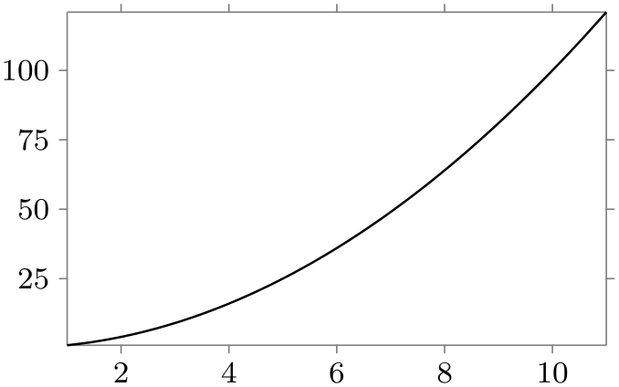
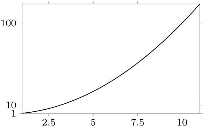
                \usetikzlibrary {datavisualization.formats.functions}

                \begin{tikzpicture}

                  \datavisualization [scientific axes, visualize as smooth line]

                    data [format=function] {

                      var
                x
                :
                interval [1:11];

                      func
                y
                =
                \value x*\value x;

                    };

                \end{tikzpicture}

                \qquad

                \begin{tikzpicture}

                  \datavisualization [scientific axes, visualize as smooth line,

                    y axis={exponential steps},

                    x axis={ticks={quarter about strategy}},

                  ]

                    data [format=function] {

                      var
                x
                :
                interval [1:11];

                      func
                y
                =
                \value x*\value x;

                    };

                \end{tikzpicture}
Two strategies are always available: linear steps, which yields (semi)automatic ticks are evenly spaced positions, and exponential steps, which yields (semi)automatic steps at positions at exponentially increasing positions – which is exactly what is needed for logarithmic plots. These strategies are details in Section 82.4.13.
The following options are used to configure tick placement strategies like linear steps. Unlike the basic choice of a placement strategy, which is an axis option, the following should be passed to the option ticks or grid only. So, you would write things like x axis={ticks={step=2}}, but x axis={linear steps}.
-
/tikz/data visualization/step=⟨value⟩ (no default, initially 1) 
The value of this key is used to determine the spacing of the major ticks. The key is used by the linear steps and exponential steps strategies, see the explanations in Section 82.4.13 for details. Basically, all ticks are placed at all multiples of ⟨value⟩ that lie in the attribute range interval.
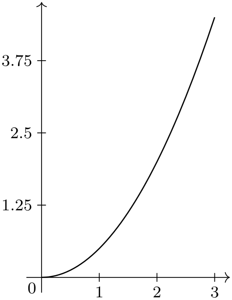
                    \usetikzlibrary {datavisualization.formats.functions}

                    \tikz \datavisualization [

                        school book axes, visualize as smooth line,

                        y axis={ticks={step=1.25}},

                      ]

                        data
                    [format=function] {

                          var
                    x
                    :
                    interval [0:3];

                          func
                    y
                    =
                    \value x*\value x/2;

                        };
-
/tikz/data visualization/minor steps between steps=⟨number⟩ (default 9) 
Specifies that between any two major steps (whose positions are specified by the step key), there should be ⟨number⟩ many minor steps. Note that the default of 9 is exactly the right number so that each interval between two minor steps is exactly a tenth of the size of a major step. See also Section 82.4.13 for further details.
                    \usetikzlibrary {datavisualization.formats.functions}

                    \begin{tikzpicture}

                      \datavisualization [school book axes, visualize as smooth line,

                        x axis={ticks={minor steps between steps=3}},

                        y axis={ticks={minor steps between steps}},

                      ]

                        data
                    [format=function] {

                          var
                    x
                    :
                    interval [-1.5:1.5];

                          func
                    y
                    =
                    \value x*\value x;

                        };

                    \end{tikzpicture}
82.4.4 Automatic Computation of Tick and Grid Line Positions
The step option gives you “total control” over the stepping of ticks on an axis, but you often do not know the correct stepping in advance. In this case, you may prefer to have a good value for step being computed for you automatically.
Like the step key, these options are passed to the ticks option. So, for instance, you would write x axis={ticks={about=4}} to request about four ticks to be placed on the \(x\)-axis.
-
/tikz/data visualization/about=⟨number⟩(no default) 
-
/tikz/data visualization/about strategy=⟨list⟩(no default) 
-
• Naturally, since the stepping value refers to the exponent, the whole computation of a good stepping value needs to be done “in the exponent”. Mathematically spoken, instead of considering the difference \(r = v_{\max } - v_{\min }\), we consider the difference \(r = \log v_{\max } - \log v_{\min }\). With this difference, we still compute \(s = r / \meta {number}\) and let \(s = m \cdot 10^k\) with \(1 \le m < 10\).
-
• It makes no longer sense to use values like \(2.5\) for \(m'\) since this would yield a fractional exponent. Indeed, the only sensible values for \(m'\) seem to be \(1\), \(3\), \(6\), and \(10\). Because of this, the about strategy is ignored and one of these values or a multiple of one of them by a power of ten is used.
-
/tikz/data visualization/standard about strategy(no value) 
-
/tikz/data visualization/euro about strategy(no value) 
-
/tikz/data visualization/half about strategy(no value) 
-
/tikz/data visualization/decimal about strategy(no value) 
-
/tikz/data visualization/quarter about strategy(no value) 
-
/tikz/data visualization/int about strategy(no value) 
This key asks the data visualization to place about ⟨number⟩ many ticks on an axis. It is not guaranteed that exactly ⟨number⟩ many ticks will be used, rather the actual number will be the closest number of ticks to ⟨number⟩ so that their stepping is still “good”. For instance, when you say about=10, it may happen that exactly 10, but perhaps even 13 ticks are actually selected, provided that these numbers of ticks lead to good stepping values like 5 or 2.5 rather than numbers like 3.4 or 7. The method that is used to determine which steppings a deemed to be “good” depends on the current tick placement strategy.
Linear steps. Let us start with linear steps: First, the difference between the maximum value \(v_{\max }\) and the minimum value \(v_{\min }\) on the axis is computed; let us call it \(r\) for “range”. Then, \(r\) is divided by ⟨number⟩, yielding a target stepping \(s\). If \(s\) is a number like \(1\) or \(5\) or \(10\), then this number could be used directly as the new value of step. However, \(s\) will typically something strange like \(0.023\,45\) or \(345\,223.76\), so \(s\) must be replaced by a better value like \(0.02\) in the first case and perhaps \(250\,000\) in the second case.
In order to determine which number is to be used, \(s\) is rewritten in the form \(m \cdot 10^k\) with \(1 \le m < 10\) and \(k \in \mathbb Z\). For instance, \(0.023\,45\) would be rewritten as \(2.345 \cdot 10^{-2}\) and \(345\,223.76\) as \(3.452\,2376 \cdot 10^5\). The next step is to replace the still not-so-good number \(m\) like \(2.345\) or \(3.452\,237\) by a “good” value \(m'\). For this, the current value of the about strategy is used:
The ⟨list⟩ is a comma-separated sequence of pairs ⟨threshold⟩/⟨value⟩ like for instance 1.5/1.0 or 2.3/2.0. When a good value \(m'\) is sought for a given \(m\), we iterate over the list and find the first pair ⟨threshold⟩/⟨value⟩ where ⟨threshold⟩ exceeds \(m\). Then \(m'\) is set to ⟨value⟩. For instance, if ⟨list⟩ is 1.5/1.0,2.3/2.0,4/2.5,7/5,11/10, which is the default, then for \(m=3.141\) we would get \(m'=2.5\) since \(4 > 3.141\), but \(2.3 \le 3.141\). For \(m=6.3\) we would get \(m'=5\).
Once \(m'\) has been determined, the stepping is set to \(s' = m' \cdot 10^k\).
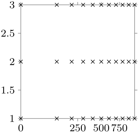
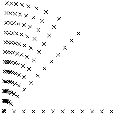
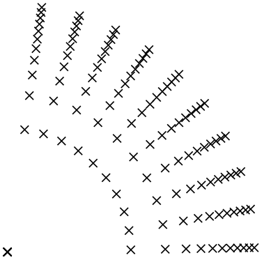
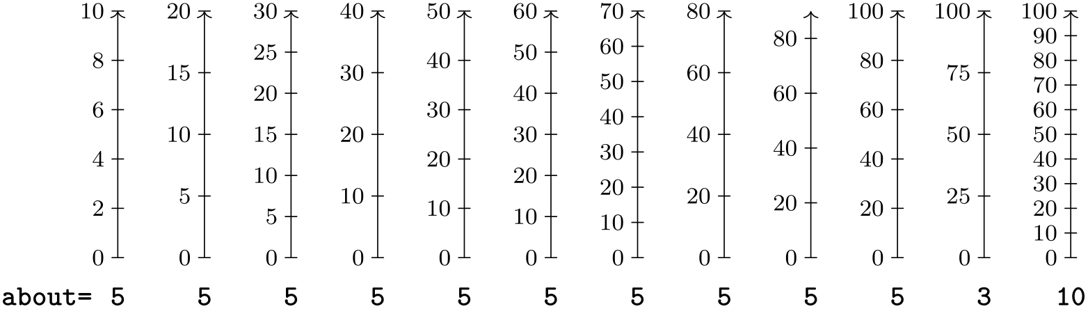
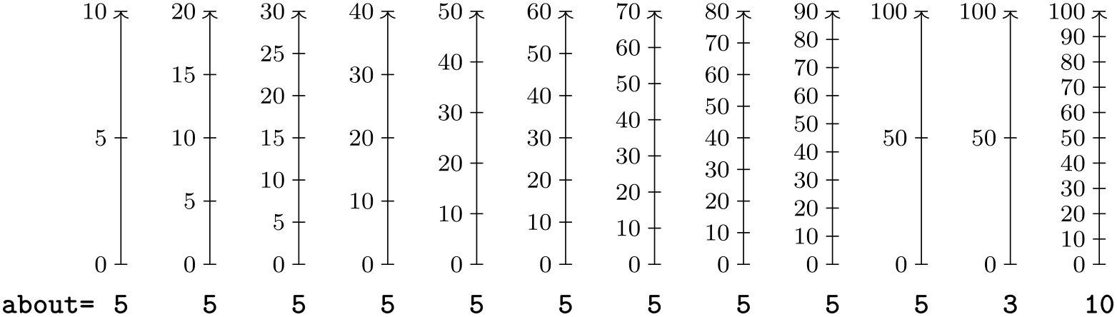
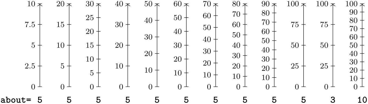
The net effect of all this is that for the default strategy the only valid stepping are the values \(1\), \(2\), \(2.5\) and \(5\) and every value obtainable by multiplying one of these values by a power of ten. The following example shows the effects of, first, setting about=5 (corresponding to the some option) and then having axes where the minimum value is always 0 and where the maximum value ranges from 10 to 100 and, second, setting about to the values from 3 (corresponding to the few option) and to 10 (corresponding to the many option) while having the minimum at 0 and the maximum at 100:
Exponential steps. For exponential steps the strategy for determining a good stepping value is similar to linear steps, but with the following differences:
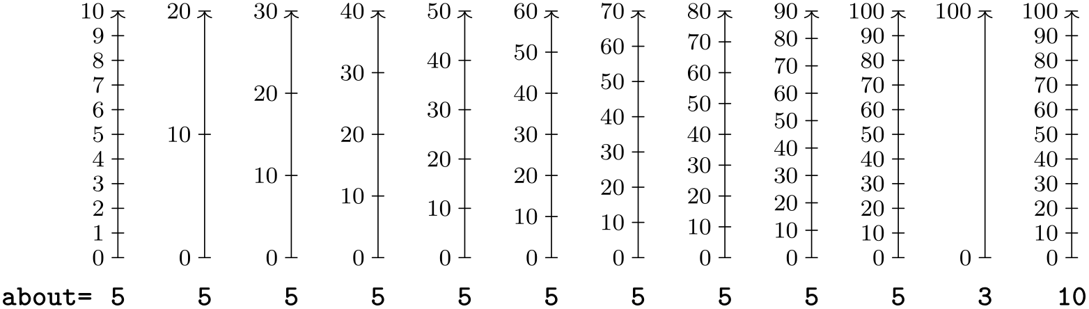
The following example shows the chosen steppings for a maximum varying from \(10^1\) to \(10^5\) and from \(10^{10}\) to \(10^{50}\) as well as for \(10^{100}\) for about=3:

Alternative strategies.
In addition to the standard about strategy, there are some additional strategies that you might wish to use instead:
Permissible values for \(m'\) are: \(1\), \(2\), \(2.5\), and \(5\). This strategy is the default strategy.
Permissible values for \(m'\) are: \(1\), \(2\), and \(5\). These are the same values as for the Euro coins, hence the name.

Permissible values for \(m'\): \(1\) and \(5\). Use this strategy if only powers of \(10\) or halves thereof seem logical.
The only permissible value for \(m'\) is \(1\). This is an even more radical version of the previous strategy.
Permissible values for \(m'\) are: \(1\), \(2.5\), and \(5\).
Permissible values for \(m'\) are: \(1\), \(2\), \(3\), \(4\), and \(5\).

-
/tikz/data visualization/many(no value) 
This is an abbreviation for about=10.
-
/tikz/data visualization/some(no value) 
This is an abbreviation for about=5.
-
/tikz/data visualization/few(no value) 
This is an abbreviation for about=3.
-
/tikz/data visualization/none(no value) 
Switches off the automatic step computation. Unless you use step= explicitly to set a stepping, no ticks will be (automatically) added.
82.4.5 Manual Specification of Tick and Grid Line Positions
The automatic computation of ticks and grid lines will usually do a good job, but not always. For instance, you might wish to have ticks exactly at, say, prime numbers or at Fibonacci numbers or you might wish to have an additional tick at \(\pi \). In these cases you need more direct control over the specification of tick positions.
First, it is important to understand that the data visualization system differentiates between three kinds of ticks and grid lines: major, minor, and subminor. The major ticks are the most prominent ticks where, typically, a textual representation of the tick is shown; and the major grid lines are the thickest. The minor ticks are smaller, more numerous, and lie between major ticks. They are used, for instance, to indicate positions in the middle between major ticks or at all integer positions between major ticks. Finally, subminor ticks are even smaller than minor ticks and they lie between minor ticks.
Four keys are used to configure the different kinds:
-
/tikz/data visualization/major=⟨options⟩(no default) 
The key can be passed as an option to the ticks key and also to the grid key, which in turn is passed as an option to an axis. The ⟨options⟩ passed to major specify at which positions major ticks/grid lines should be shown (using the at option and also at option) and also any special styling. The different possible options are described later in this section.

                    \usetikzlibrary {datavisualization.formats.functions}

                    \tikz \datavisualization

                      [ school book axes, visualize as smooth line,

                        x axis={ticks={major={at={1, 1.5, 2}}}}]

                      data [format=function] {

                        var
                    x
                    :
                    interval [-1.25:2];

                        func
                    y
                    =
                    \value x
                    *
                    \value x
                    / 2;

                      };
-
/tikz/data visualization/minor=⟨options⟩(no default) 
Like major, only for minor ticks/grid lines.
                    \usetikzlibrary {datavisualization.formats.functions}

                    \tikz \datavisualization

                      [ school book axes, visualize as smooth line,

                        x axis={grid={minor={at={1, 1.5, 2}}}}]

                      data [format=function] {

                        var
                    x
                    :
                    interval [-1.25:2];

                        func
                    y
                    =
                    \value x
                    *
                    \value x
                    / 2;

                      };
-
/tikz/data visualization/subminor=⟨options⟩(no default) 
Like major, only for subminor ticks/grid lines.
-
/tikz/data visualization/common=⟨options⟩(no default) 
This key allows you to specify ⟨options⟩ that apply to major, minor and subminor alike. It does not make sense to use common to specify positions (since you typically do not want both a major and a minor tick at the same position), but it can be useful to configure, say, the size of all kinds of ticks:
The following keys can now be passed to the major, minor, and subminor keys to specify where ticks or grid lines should be shown:
-
/tikz/data visualization/at=⟨list⟩(no default) 
-
/tikz/data visualization/major at=⟨list⟩(no default) 
-
/tikz/data visualization/minor at=⟨list⟩(no default) 
-
/tikz/data visualization/subminor at=⟨list⟩(no default) 
Basically, the ⟨list⟩ must be a list of values that is processed with the \foreach macro (thus, it can contain ellipses to specify ranges of value). Empty values are skipped.
The effect of passing at to a major, minor, or subminor key is that ticks or grid lines on the axis will be placed exactly at the values in ⟨list⟩. Here is an example:
                    \usetikzlibrary {datavisualization.formats.functions}

                    \tikz \datavisualization

                      [ school book axes, visualize as smooth line,

                        x axis={ticks={major={at={-1,0.5,(pi/2)}}}}]

                      data [format=function] {

                        var
                    x
                    :
                    interval [-1.25:2];

                        func
                    y
                    =
                    \value x
                    *
                    \value x
                    / 2;

                      };
When this option is used, any previously specified tick positions are overwritten by the values in ⟨list⟩. Automatically computed ticks are also overwritten. Thus, this option gives you complete control over where ticks should be placed.
Normally, the individual values inside the ⟨list⟩ are just numbers that are specified in the same way as an attribute value. However, such a value may also contain the keyword as, which allows you so specify the styling of the tick in detail. Section 82.4.6 details how this works.
It is often a bit cumbersome that one has to write things like
A slight simplification is given by the following keys, which can be passed directly to ticks and grid:
A shorthand for major={at={⟨list⟩}}.
A shorthand for major={at={⟨list⟩}}.
A shorthand for major={at={⟨list⟩}}.
-
/tikz/data visualization/also at=⟨list⟩(no default) 
-
/tikz/data visualization/major also at=⟨list⟩(no default) 
-
/tikz/data visualization/minor also at=⟨list⟩(no default) 
-
/tikz/data visualization/subminor also at=⟨list⟩(no default) 
This key is similar to at, but it causes ticks or grid lines to be placed at the positions in the ⟨list⟩ in addition to the ticks that have already been specified either directly using at or indirectly using keys like step or some. The effect of multiple calls of this key accumulate. However, when at is used after an also at key, the at key completely resets the positions where ticks or grid lines are shown.

As for at, there are some shorthands available:
A shorthand for major={also at={⟨list⟩}}.
A shorthand for major={also at={⟨list⟩}}.
A shorthand for major={also at={⟨list⟩}}.
82.4.6 Styling Ticks and Grid Lines: Introduction
When a tick, a tick label, or a grid line is visualized on the page, a whole regiment of styles influences the appearance. The reason for this large number of interdependent styles is the fact that we often wish to influence only a very certain part of how a tick is rendered while leaving the other aspects untouched: Sometimes we need to modify just the font of the tick label; sometimes we wish to change the length of the tick label and the tick label position at the same time; sometimes we wish to change the color of grid line, tick, and tick label; and sometimes we wish to generally change the thickness of all ticks.
Let us go over the different kinds of things that can be styled (grid lines, ticks, and tick labels) one by one and let us have a look at which styles are involved. We will start with the grid lines, since they turn out to be the most simple, but first let us have a look at the general style and styling mechanism that is used in many placed in the following:
82.4.7 Styling Ticks and Grid Lines: The Style and Node Style Keys
All keys of the data visualization system have the path prefix /tikz/data visualization. This is not only true for the main keys like scientific axes or visualize as line, but also for keys that govern how ticks are visualized. In particular, a style like every major grid has the path prefix /tikz/data visualization and all keys stored in this style are also executed with this path prefix.
Normally, this does not cause any trouble since most of the keys and even styles used in a data visualization are intended to configure what is shown in the visualization. However, at some point, we may also with to specify options that no longer configure the visualization in general, but specify the appearance of a line or a node on the TikZ layer.
Two keys are used to “communicate” with the TikZ layer:
-
/tikz/data visualization/style=⟨TikZ options⟩(no default) 
This key takes options whose path prefix is /tikz, not /tikz/data visualization. These options will be appended to a current list of such options (thus, multiple calls of this key accumulate). The resulting list of keys is not executed immediately, but it will be executed whenever the data visualization engine calls the TikZ layer to draw something (this placed will be indicated in the following).
                    \usetikzlibrary {datavisualization.formats.functions}

                    \tikz \datavisualization

                      [scientific axes,

                       all axes={ticks={style=blue}, length=3cm},

                       y axis={grid, grid={minor steps between
                      steps, major={style=red}}},

                       visualize as line]

                      data [format=function] {

                        var
                    x
                    :
                    interval [5:10];

                        func
                    y
                    =
                    \value x
                    *
                    \value x;

                      };
-
/tikz/data visualization/styling(no value) 
Executing this key will cause all “accumulated” TikZ options from previous calls to the key /tikz/data visualization/style to be executed. Thus, you use style to set TikZ options, but you use styling to actually apply these options. Usually, you do not call this option directly since this application is only done deep inside the data visualization engine.
Similar to style (and styling) there also exist the node style (and node styling) key that takes TikZ options that apply to nodes only – in addition to the usual style.
-
/tikz/data visualization/node style=⟨TikZ options⟩(no default) 
This key works like style, but it has an effect only on nodes that are created during a data visualization. This includes tick labels and axis labels:
Note that in the example the ticks themselves (the little thicker lines) are not red.
-
/tikz/data visualization/node styling(no value) 
Executing this key will cause all “accumulated” node stylings to be executed.
82.4.8 Styling Ticks and Grid Lines: Styling Grid Lines
When a grid line is visualized, see Section 82.5.3 for details on when this happens, the following styles are executed in the specified order.
-
1. grid layer.
-
2. every grid.
-
3. every major grid or every minor grid or every subminor grid, depending on the kind of grid line.
-
4. locally specified options for the individual grid line, see Section 82.4.11.
-
5. styling, see Section 82.4.7.
All of these keys have the path prefix /tikz/data visualization. However, the options stored in the first style (grid layer) and also in the last (styling) are executed with the path prefix /tikz (see Section 82.4.7).
Let us now have a look at these keys in detail:
-
/tikz/data visualization/grid layer(style, initially on background layer) 
This key is used to specified the layer on which grid lines should be drawn (layers are explained in Section 45). By default, all grid lines are placed on the background layer and thus behind the data visualization. This is a sensible strategy since it avoids obscuring the more important data with the far less important grid lines. However, you can change this style to “get the grid lines to the front”:
                    \usetikzlibrary {datavisualization.formats.functions}

                    \tikz \datavisualization

                      [scientific axes,

                       all axes={

                           length=3cm,

                           grid,

                           grid={minor steps between steps}

                         },

                       grid layer/.style=, % none, so on top of data (bad idea)

                       visualize as line]

                      data [format=function] {

                        var
                    x
                    :
                    interval [5:10];

                        func
                    y
                    =
                    \value x
                    *
                    \value x;

                      };
When this style is executed, the keys stored in the style will be executed with the prefix /tikz. Normally, you should only set this style to be empty or to on background layer.
-
/tikz/data visualization/every grid(style, no value) 
This style provides overall configuration options for grid lines. By default, it is set to the following:
low=min, high=max
This causes grid lines to span all possible values when they are visualized, which is usually the desired behavior (the low and high keys are explained in Section 82.5.4. You can append the style key to this style to configure the overall appearance of grid lines. It should be noted that settings to style inside every grid will take precedence over ones in every major grid and every minor grid. In the following example we cause all grid lines to be dashed (which is not a good idea in general since it creates a distracting background pattern).
                    \usetikzlibrary {datavisualization.formats.functions}

                    \tikz \datavisualization

                      [scientific axes,

                       all axes={length=3cm, grid},

                       every grid/.append style={style=densely dashed},

                       visualize as line]

                      data [format=function] {

                        var
                    x
                    :
                    interval [5:10];

                        func
                    y
                    =
                    \value x
                    *
                    \value x;

                      };
-
/tikz/data visualization/every major grid(style, no value) 
This style configures the appearance of major grid lines. It does so by calling the style key to setup appropriate TikZ options for visualizing major grid lines. The default definition of this style is:
In the following example, we use thin major blue grid lines:
                    \usetikzlibrary {datavisualization.formats.functions}

                    \tikz \datavisualization

                      [scientific axes,

                       all axes={

                           length=3cm,

                           grid,

                           grid={minor steps between steps}

                         },

                       every major grid/.style = {style={blue, thin}},

                       visualize as line]

                      data [format=function] {

                        var
                    x
                    :
                    interval [5:10];

                        func
                    y
                    =
                    \value x
                    *
                    \value x;

                      };
As can be seen, this is not exactly visually pleasing. The default settings for the grid lines should work in most situations; you may wish to increase the blackness level, however, when you experience trouble during printing or projecting graphics.
82.4.9 Styling Ticks and Grid Lines: Styling Ticks and Tick Labels
Styling ticks and tick labels is somewhat similar to styling grid lines. Let us start with the tick mark, that is, the small line that represents the tick. When this mark is drawn, the following styles are applied:
-
1. every ticks.
-
2. every major ticks or every minor ticks or every subminor ticks, depending on the kind of ticks to be visualized.
-
3. locally specified options for the individual tick, see Section 82.4.11.
-
4. tick layer
-
5. every odd tick or every even tick, see Section 82.4.12.
-
6. draw
-
7. styling, see Section 82.4.7.
For the tick label node (the node containing the textual representation of the attribute’s value at the tick position), the following styles are applied:
-
1. every ticks.
-
2. every major ticks or every minor ticks or every subminor ticks, depending on the kind of ticks to be visualized.
-
3. locally specified options for the individual tick, see Section 82.4.11.
-
4. tick node layer
-
5. every odd tick or every even tick, see Section 82.4.12.
-
6. styling, see Section 82.4.7.
-
7. node styling, see Section 82.4.7.
-
/tikz/data visualization/every major ticks(style, no value) 
The default is
                      style={line
                    cap=round}, tick
                    length=2pt
-
/tikz/data visualization/every subminor ticks(style, no value) 
The default is
                      style={help
                    lines, line
                    cap=round}, tick
                    length=0.8pt
-
/tikz/data visualization/tick layer(style, initially on background layer) 
Like grid layer, this key specifies on which layer the ticks should be placed.
-
/tikz/data visualization/tick node layer(style, initially empty) 
Like tick layer, but now for the nodes. By default, tick nodes are placed on the main layer and thus on top of the data in case that the tick nodes are inside the data.
82.4.10 Styling Ticks and Grid Lines: Exceptional Ticks
You may sometimes wish to style a few ticks differently from the other ticks. For instance, in the axis system school book axes there should be a tick label at the 0 position only on one axis and then this label should be offset a bit. In many cases this is easy to achieve: When you add a tick “by hand” using the at or also at option, you can add any special options in square brackets.
However, in some situations the special tick position has been computed automatically for you, for instance by the step key or by saying tick=some. In this case, adding a tick mark with the desired options using also at would cause the tick mark with the correct options to be shown in addition to the tick mark with the wrong options. In cases like this one, the following option may be helpful:
-
/tikz/data visualization/options at=⟨value⟩ as [⟨options⟩](no default) 
This key causes the ⟨options⟩ to be executed for any tick mark(s) at ⟨value⟩ in addition to any options given already for this position:
                    \usetikzlibrary {datavisualization.formats.functions}

                    \tikz \datavisualization [

                      scientific axes,

                      visualize as smooth line,

                      x axis={ticks={major={

                          options at = 3    as
                      [no tick text],

                          also at    =
                      (pi) as

                            [{tick text padding=1ex}] $\pi$}}}]

                    data [format=function] {

                      var
                    x
                    :
                    interval[0:2*pi];

                      func
                    y
                    =
                    sin(\value x r);

                    };
-
/tikz/data visualization/no tick text at=⟨value⟩(no default) 
Shorthand for options at=⟨value⟩ as [no tick text].
82.4.11 Styling Ticks and Grid Lines: Styling and Typesetting a Value
The at and also at key allow you to provide a comma-separated ⟨list⟩ of ⟨value⟩s where ticks or grid lines should be placed. In the simplest case, the ⟨value⟩ is simply a number. However, the general syntax allows three different kinds of ⟨value⟩s:
-
1. ⟨value⟩
-
2. ⟨value⟩ as [⟨local options⟩]
-
3. ⟨value⟩ as [⟨local options⟩] ⟨text⟩
In the first case, the ⟨value⟩ is just a number that is interpreted like any other attribute value.
In the second case, where the keyword as is present, followed by some option in square brackets, but nothing following the closing square bracket, when the tick or grid line at position ⟨value⟩ is shown, the ⟨local options⟩ are executed first. These can use the style key or the node style key to configure the appearance of this single tick or grid line. You can also use keys like low or high to influence how large the grid lines or the ticks are or keys like tick text at low to explicitly hide or show a tick label.
In the third case, which is only important for ticks and not for grid, the same happens as in the second case, but the text that is shown as tick label is ⟨text⟩ rather than the automatically generated tick label. This automatic generation of tick labels is explained in the following.
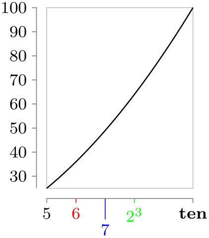
\usetikzlibrary {datavisualization.formats.functions}
\tikz \datavisualization
[scientific axes=clean,
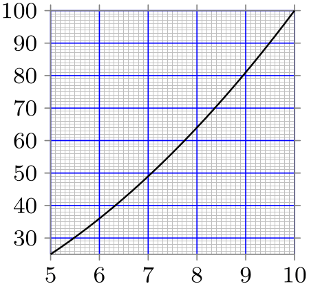
x axis={length=2.5cm, ticks={major at={
5,
6 as [style=red],
7 as [{style=blue, low=-1em}],
8 as [style=green] $2^3$,
10 as ten
}}},
visualize as line]
data [format=function] {
var
x
:
interval [5:10];
func
y
=
\value x
*
\value x;
};
A value like “2” or “17” could just be used as ⟨text⟩ to be displayed in the node of a tick label. However, things are more difficult when the to-be-shown value is \(0.0000000015\), because we then would typically (but not always) prefer something like \(1.5 \cdot 10^{-9}\) to be shown. Also, we might wish a unit to be added like \(23\mathrm {m}/\mathrm {s}\). Finally, we might wish a number like \(3.141\) to be replaced by \(\pi \). For these reasons, the data visualization system does not simply put the to-be-shown value in a node as plain text. Instead, the number is passed to a typesetter whose job it is to typeset this number nicely using TeX’s typesetting capabilities. The only exception is, as indicated above, the third syntax version of the at and also at keys, where ⟨text⟩ is placed in the tick label’s node, regardless of what the typesetting would usually do.
The text produced by the automatic typesetting is computed as follows:
-
1. The current contents of the key tick prefix is put into the node.
-
2. This is followed by a call of the key tick typesetter which gets the ⟨value⟩ of the tick as its argument in scientific notation.
-
3. This is followed by the contents of the key tick suffix.
Let us have a look at these keys in detail:
-
/tikz/data visualization/tick prefix=⟨text⟩ (no default, initially empty) 
The ⟨text⟩ will be put in front of every typeset tick:
-
/tikz/data visualization/tick suffix=⟨text⟩ (no default, initially empty) 
-
/tikz/data visualization/tick unit=⟨roman math text⟩(no default) 
Works like tick prefix. This key is especially useful for adding units like “cm” or “\(\mathrm m/\mathrm s\)” to every tick label. For this reason, there is a (near) alias that is easier to memorize:
A shorthand for tick suffix={$\,\rm⟨roman math text⟩$}:
-
/tikz/data visualization/tick typesetter=⟨value⟩(no default) 
The key gets called for each number that should be typeset. The argument ⟨value⟩ will be in scientific notation (like 1.0e1 for \(10\)). By default, this key applies \pgfmathprintnumber to its argument. This command is a powerful number printer whose configuration is documented in Section 97.
You are invited to code underlying this key so that a different typesetting mechanism is used. Here is a (not quite finished) example that shows how, say, numbers could be printed in terms of multiples of \(\pi \):
                    \usetikzlibrary {datavisualization.formats.functions}

                    \def\mytypesetter#1{%

                      \pgfmathparse{#1/pi}%

                      \pgfmathprintnumber{\pgfmathresult}$\pi$%

                    }

                    \tikz \datavisualization

                      [school book axes, all axes={unit length=1.25cm},

                       x axis={ticks={step=(0.5*pi), tick typesetter/.code=\mytypesetter{##1}}},

                       y axis={include value={-1,1}},

                       visualize as smooth line]

                      data [format=function] {

                        var
                    x
                    :
                    interval [0.5:7];

                        func
                    y
                    =
                    sin(\value x r);

                      };
82.4.12 Stacked Ticks
Sometimes, the text of tick labels are so long or so numerous that the text of adjacent tick labels overlap (or have too little padding):
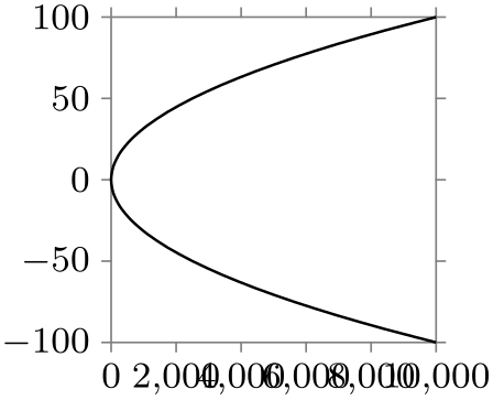
                \usetikzlibrary {datavisualization.formats.functions}

                \tikz \datavisualization [scientific axes,

                                          all axes={length=2.5cm},

                                          visualize as smooth line]

                  data [format=function] {

                    var
                y
                :
                interval[-100:100];

                    func
                x
                =
                \value y*\value y;

                  };
There are two ways to address this problem:
-
• One can rotate the labels on horizontal axes:
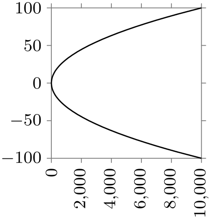
This is often a good solution, but may be hard to read. Also consider rotating labels only by \(45^\circ \) or \(30^\circ \).
-
• One can specify different shifts of the nodes for the different ticks, whereby the ticks text no longer overlap.
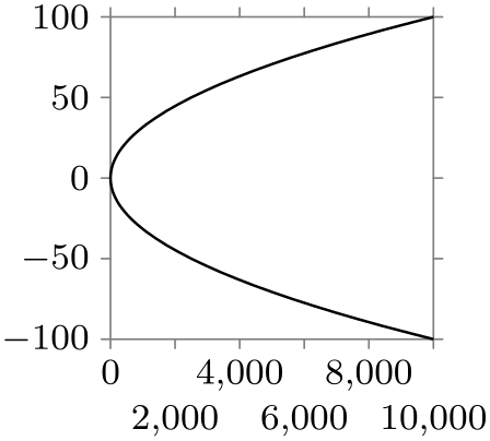
                    \usetikzlibrary {datavisualization.formats.functions}

                    \tikz \datavisualization [scientific axes,

                                              all axes={length=2.5cm},

                                              x axis={ticks={major at={0,4000,8000,

                                                      2000
                      as [node style={yshift=-1em}],

                                                      6000
                      as [node style={yshift=-1em}],

                                                      10000
                      as [node style={yshift=-1em}]}}},

                                              visualize as smooth line]

                      data [format=function] {

                        var
                    y
                    :
                    interval[-100:100];

                        func
                    x
                    =
                    \value y*\value y;

                      };
However, specifying shifts “by hand” in the above way is not always an option, especially when the tick positions should be computed automatically. Instead, the stack option can be used, which is much easier to use and gives better results:

                    \usetikzlibrary {datavisualization.formats.functions}

                    \tikz \datavisualization [scientific axes,

                                              all axes={length=2.5cm}, x axis={ticks=stack},

                                              visualize as smooth line]

                      data [format=function] {

                        var
                    y
                    :
                    interval[-100:100];

                        func
                    x
                    =
                    \value y*\value y;

                      };
The stack option is actually just a style that gives you access to the general even/odd mechanism for ticks with labels. Whenever a tick mark is created where a tick label is also to be drawn, two special things happen:
-
1. For every odd tick mark, the every odd tick style is executed, for every even tick mark the every even tick. Here, “odd” and “even” are with respect to the order in which the ticks have been added to the list of at positions for each major, minor, or subminor tick list, not with respect to the order in which they will appear on the axis. Thus, when you write
then for 1, 3, 0, and -2 as well as 9 and 7 the key every odd tick will be executed, while every even tick will be executed for positions 2, 4, -1, and also 8.
-
2. When a tick node label is shown at the low position of the tick mark, the dimension stored in the key tick text low even padding is added to the low value. Provided that this padding is not zero (which is the default), the length of the even tick marks will be increased and the tick label node will be placed at a greater distance from the axis.
Similar keys exist for padding ticks with labels at high positions and also at even positions.

The following keys work similarly:
-
/tikz/data visualization/tick text low odd padding=⟨dimension⟩ (no default, initially 0pt) 
-
/tikz/data visualization/tick text high even padding=⟨dimension⟩ (no default, initially 0pt) 
-
/tikz/data visualization/tick text high odd padding=⟨dimension⟩ (no default, initially 0pt) 
-
/tikz/data visualization/tick text odd padding=⟨dimension⟩(no default) 
A shorthand for setting tick text odd low padding and tick text odd high padding at the same time.
-
/tikz/data visualization/tick text even padding=⟨dimension⟩(no default) 
A shorthand for setting tick text even low padding and tick text even high padding at the same time.
-
/tikz/data visualization/tick text padding=⟨dimension⟩(no default) 
Sets all text paddings to ⟨dimension⟩.
-
/tikz/data visualization/stack=⟨dimension⟩ (default 1em) 
Shorthand for tick text even padding=⟨dimension⟩.
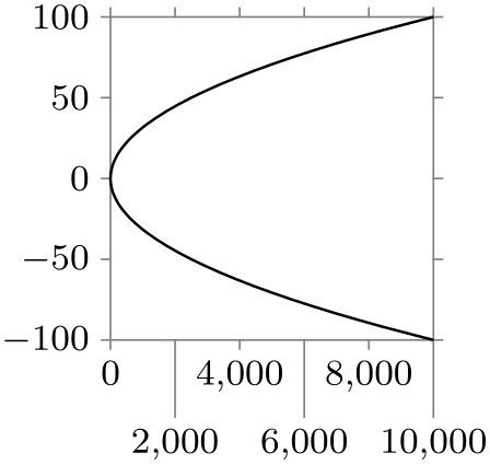
                    \usetikzlibrary {datavisualization.formats.functions}

                    \tikz \datavisualization [scientific axes,

                                              all axes={length=2.5cm},

                                              x axis={ticks={stack=1.5em}},

                                              visualize as smooth line]

                      data [format=function] {

                        var
                    y
                    :
                    interval[-100:100];

                        func
                    x
                    =
                    \value y*\value y;

                      };
-
/tikz/data visualization/stack'=⟨dimension⟩(no default) 
Shorthand for tick text odd padding=⟨dimension⟩. The difference to stack is that the set of value that are “lowered” is exactly exchanged with the set of value “lowered” by stack.
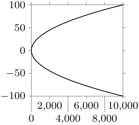
                    \usetikzlibrary {datavisualization.formats.functions}

                    \tikz \datavisualization [scientific axes,

                                              all axes={length=2.5cm},

                                              x axis={ticks=stack'},

                                              visualize as smooth line]

                      data [format=function] {

                        var
                    y
                    :
                    interval[-100:100];

                        func
                    x
                    =
                    \value y*\value y;

                      };
Note that the above keys have an effect on all tick labels of an axis, also on special ticks that you may have added using the also at key. When using the stack key, you should specify a tick text padding explicitly for such keys:
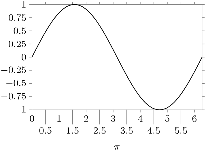
                \usetikzlibrary {datavisualization.formats.functions}

                \tikz \datavisualization

                  [scientific axes,

                   x axis={ticks={stack, many, major
                  also at=

                       {(pi) as
                  [{tick text padding=2.5em}] $\pi$}}},

                   visualize as smooth line]

                  data [format=function] {

                    var
                x
                :
                interval[0:(2*pi)];

                    func
                y
                =
                sin(\value x r);

                  };
82.4.13 Reference: Basic Strategies
-
/tikz/data visualization/axis options/linear steps(no value) 
This strategy places ticks at positions that are evenly spaced by the current value of step.
In detail, the following happens: Let \(a\) be the minimum value of the data values along the axis and let \(b\) be the maximum. Let the current stepping be \(s\) (the stepping is set using the step option, see below) and let the current phasing be \(p\) (set using the phase) option. Then ticks are placed all positions \(i\cdot s + p\) that lie in the interval \([a,b]\), where \(i\) ranges over all integers.
The tick positions computed in the way described above are major step positions. In addition to these, if the key minor steps between steps is set to some number \(n\), then \(n\) many minor ticks are introduced between each two major ticks (and also before and after the last major tick, provided the values still lie in the interval \([a,b]\)). Note that is \(n\) is \(1\), then one minor tick will be added in the middle between any two major ticks. Use a value of \(9\) (not \(10\)) to partition the interval between two major ticks into ten equally sized minor intervals.

                    \usetikzlibrary {datavisualization}

                    \begin{tikzpicture}

                      \datavisualization

                        [scientific axes={inner ticks, width=3cm},

                         x axis={ticks={step=3, minor steps between steps=2}},

                         y axis={ticks={step=.36}},

                         visualize as scatter]

                        data
                    {

                          x, y

                          17, 30

                          34, 32

                        };

                    \end{tikzpicture}
-
/tikz/data visualization/axis options/exponential steps(no value) 
This strategy produces ticks at positions that are appropriate for logarithmic plots. It is automatically selected when you use the logarithmic option with an axis.
In detail, the following happens: As for linear steps let numbers \(a\), \(b\), \(s\), and \(p\) be given. Then, major ticks are placed at all positions \(10^{i\cdot s+p}\) that lie in the interval \([a,b]\) for \(i \in \mathbb {Z}\).
The minor steps are added in the same way as for linear steps. In particular, they interpolate linearly between major steps.
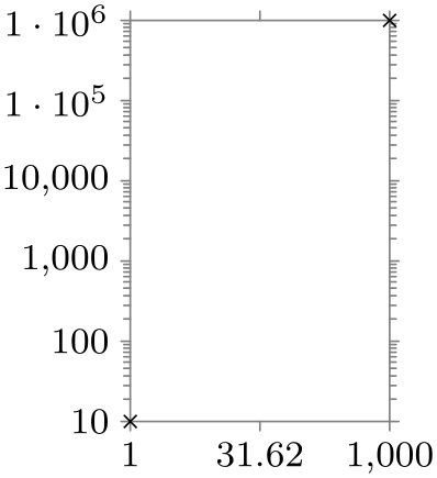
                    \usetikzlibrary {datavisualization}

                    \begin{tikzpicture}

                      \datavisualization

                        [scientific axes,

                         x axis={logarithmic, length=2cm, ticks={step=1.5}},

                         y axis={logarithmic, ticks={step=1, minor steps between steps=9}},

                         visualize as scatter]

                        data
                    {

                          x, y

                          1, 10

                          1000, 1000000

                        };

                    \end{tikzpicture}
82.4.14 Advanced: Defining New Placement Strategies
-
/tikz/data visualization/axis options/tick placement strategy=⟨macro⟩(no default) 
-
/tikz/data visualization/compute step=⟨code⟩(no default) 
This key can be used to install a so-called tick placement strategy. Whenever visualize ticks is used to request some ticks to be visualized, it is checked whether some automatic ticks should be created. This is the case when the following key is set:
The ⟨code⟩ should compute a suitable value for the stepping to be used by the ⟨macro⟩ in the tick placement strategy.
For instance, the step key sets compute step to \def\tikz@lib@dv@step{#1}. Thus, when you say step=5, then the desired stepping of 5 is communicated to the ⟨macro⟩ via the macro \tikz@lib@dv@step.
Provided compute step is set to some nonempty value, upon visualization of ticks the ⟨macro⟩ is executed. Typically, ⟨macro⟩ will first call the ⟨code⟩ stored in the key compute step. Then, it should implement some strategy then uses the value of the computed or desired stepping to create appropriate at commands. To be precise, it should set the keys major, minor, and/or subminor with some appropriate at values.
Inside the call of ⟨macro⟩, the macro \tikzdvaxis will have been set to the name of the axis for which default ticks need to be computed. This allows you to access the minimum and the maximum value stored in the scaling mapper of that axis.
                    \usetikzlibrary {datavisualization}

                    \def\silly{

                      \tikzdatavisualizationset{major={at={

                            2,3,5,7,11,13}}}

                    }

                    \begin{tikzpicture}

                      \datavisualization [

                        scientific axes, visualize as scatter,

                        x axis={tick placement strategy=\silly}

                          ]

                        data
                    {

                          x, y

                          0, 0

                          15, 15

                        };

                    \end{tikzpicture}
82.5 Advanced: Creating New Axis Systems
The datavisualization library comes with a number of predefined axis systems, like scientific axes=clean, but it is also possible and to define new axis systems. Doing so involves the following steps:
-
1. Creating a number of axes.
-
2. Configuring attributes of these axes like their length or default scaling.
-
3. Creating visual representations of the axes.
-
4. Creating visual representations of the ticks and grid lines.
The first step uses new ... axis keys to create new axes, the last steps use visualize ... keys to create the visual representations of the axes.
Note that the axis system has no control over the actual attribute value ranges and neither over which ticks need to be drawn. The axis system can only provide good defaults and then specify how the ticks or labels should be drawn and where on the page – but not at which values.
In the following, as a running example let us develop an axis system our system that does the following: For the \(x\)-axis is looks like a normal scientific axis system, but there are actually two \(y\)-axes: One at the left and one at the right, each using a different attribute, but both coexisting in the same picture.
82.5.1 Creating the Axes
A new axis system is created as a style key with the prefix /tikz/data visualization. Thus, we would write:
In our system we need three axis: The \(x\)-axis, the left axis and the right axis. Since all of these axes are Cartesian axes, we write the following:
                \tikzset{

                  data visualization/our system/.style={

                    new Cartesian axis=x axis,

                    new Cartesian axis=left axis,

                    new Cartesian axis=right axis,

                    x axis={attribute=x},

                    left axis={unit vector={(0cm,1pt)}},

                    right axis={unit vector={(0cm,1pt)}},

                  }

                }
As can be seen, we also configure things so that the \(x\)-axis will use the x attribute by default (users can later change this by saying x axis={attribute=⟨some other attribute⟩}), but we do not configure the attributes of the left axis nor the right axis. We also make the left and right axis point upward (the x axis needs no configuration here since a Cartesian axis points right by default). The reason is the left would not be a particularly good attribute name and this way we ensure that users have to pick names themselves (hopefully good ones).
The next step is to define a standard scaling for the axes. Here, we can use the same as for scientific axes, so we would add the following keys to the definition of our system:
                x
                axis
                   ={length=\pgfkeysvalueof{/tikz/data
                visualization/scientific
                axes/width}},

                left
                axis
                ={length=\pgfkeysvalueof{/tikz/data
                visualization/scientific
                axes/height}},

                right
                axis={length=\pgfkeysvalueof{/tikz/data
                visualization/scientific
                axes/height}}
We now already have enough to try our system, although we will not yet see any axes or ticks, but we will see the correct scaling of the attributes. Let us first define a data group:
                \tikz \datavisualization data
                group {people
                and
                money} =
                {

                    data [set=people 1] {

                      time, people

                      1900, 1000000000

                      1920, 1500000000

                      1930, 2000000000

                      1980, 3000000000

                    }

                    data [set=people 2] {

                      time, people

                      1900, 2000000000

                      1920, 2500000000

                      1940, 4000000000

                      2000, 5700000000

                    }

                    data [set=money 1] {

                      time, money

                      1910, 1.1

                      1920, 2

                      1930, 5

                      1980, 2

                    }

                    data [set=money 2] {

                      time, money

                      1950, 3

                      1960, 3

                      1970, 4

                      1990, 3.5

                    }

                  };
                \usetikzlibrary {datavisualization}

                \tikz \datavisualization [

                    our system,

                    x axis={attribute=time, length=4cm},

                    left axis ={attribute=money},

                    right axis={attribute=people},

                    visualize as line/.list={people 1, people 2, money 1, money 2},

                    people 1={style={visualizer color=blue}},

                    people 2={style={visualizer color=blue!50}},

                    money 1={style={visualizer color=red}},

                    money 2={style={visualizer color=red!50}}]

                  data
                group {people
                and
                money};
82.5.2 Visualizing the Axes
We must now show the axes themselves. For this we can use the visualize axis key:
-
/tikz/data visualization/axis options/visualize axis=⟨options⟩(no default) 
-
/tikz/data visualization/axis options/goto=⟨value⟩(no default) 
-
• min: The attribute is set to the minimal value that the attribute has attained along this axis.
-
• max: Like min.
-
• padded min: This will also set the ⟨attribute⟩ monitored by the axis to the same value as min. Additionally, however, the subkey /data point/⟨attribute⟩/offset is set to the current padding for the minimum, see the description of padding min later on. The effect of this is that the actual point “meant” by the attribute is offset by this padding along the attribute’s axis.
-
• padded max: Like padded min.
-
/tikz/data visualization/axis options/goto pos=⟨fraction⟩(no default) 
-
/tikz/data visualization/low=⟨value⟩(no default) 
-
/tikz/data visualization/high=⟨value⟩(no default) 
-
/tikz/data visualization/padded(no value) 
-
1. axis layer
-
2. every axis
-
3. styling
-
/tikz/data visualization/every axis(style, no value) 
-
/tikz/data visualization/axis options/padding min=⟨dimension⟩(no default) 
-
/tikz/data visualization/axis options/padding max=⟨dimension⟩(no default) 
-
/tikz/data visualization/axis options/padding=⟨dimension⟩(no default) 
This key is passed to an axis as an option. It causes a visual representation of the axis to be created during the data visualization. The ⟨options⟩ are used to determine where the axis should be drawn and how long it should be. We can specify, for instance, that an axis should be drawn at the minimum value of another axis or where another axis has the value 0.
The goto, high, and low Keys. In our example, the left axis should be shown at the left hand side. This is the position where the x axis has its minimum value. To specify this, we would use the following code:
As can be seen, we can pass another axis as an ⟨option⟩ to visualize axis, where we pass the following key to the axis in turn:
The key can be passed to an axis. It will set the attribute monitored by the axis to the given ⟨value⟩, which is usually some number. However, ⟨value⟩ may also be one of the following, which causes a special behavior:
The right axis would be visualized the same way, only at goto=max. The \(x\)-axis actually needs to be visualized twice: Once at the bottom and once at the top. Thus, we need to call visualize axis twice for this axis:
                    \usetikzlibrary {datavisualization}

                    \tikzset{

                      data visualization/our system/.append style={

                        left axis=
                    {visualize axis={x axis=   {goto=min}}},

                        right axis={visualize axis={x axis=   {goto=max}}},

                        x axis=
                    {visualize axis={left axis={goto=min}},

                                      visualize
                      axis={left axis={goto=max}}},

                     }

                    }

                    \tikz \datavisualization [

                        our system,

                        x axis={attribute=time, length=4cm},

                        left axis ={attribute=money},

                        right axis={attribute=people},

                        visualize as line/.list={people 1, people 2, money 1, money 2}]

                      data
                    group {people
                    and
                    money};
There is another key that is similar to goto, but has a slightly different semantics:
The key works like goto, only the ⟨fraction⟩ is not interpreted as a value but as a fraction of the way between the minimum and the maximum value for this axis.
Suppose that for an axis the attribute range interval is \([500,1000]\) and the reasonable interval is \([1,3]\). Then for a ⟨fraction⟩ of 0, the mapping process would choose value \(1\) from the reasonable interval, for a ⟨fraction⟩ of 1 the position \(3\) from the reasonable interval, and for a ⟨fraction⟩ or 0.25 the position \(1.5\) since it is one quarter at the distance from \(1\) to \(3\).
Note that neither the attribute range interval nor the transformation function for the attribute are important for the goto pos option – the ⟨fraction⟩ is computed with respect to the reasonable interval. Also note that the values of the actual attribute corresponding to the fractional positions in the reasonable interval are not computed.
                        \usetikzlibrary {datavisualization}

                        \tikzset{

                          data visualization/our system/.append style={

                            x axis=
                        {visualize axis={left axis={goto pos=0.25}},

                                          visualize
                          axis={left axis={goto pos=0.5}}},

                         }

                        }

                        \tikz \datavisualization [

                            our system,

                            x axis={attribute=time, length=4cm},

                            left axis ={attribute=money},

                            right axis={attribute=people},

                            visualize as line/.list={people 1, people 2, money 1, money 2}]

                          data
                        group {people
                        and
                        money};
By default, when an axis is visualized, it spans the set of all possible values for the monitored attribute, that is, from min to max. However, there are actually two keys that allow you to adjust this:
This is the attribute value where the axis visualization starts. The same special values as for goto are permissible (like min or padded min, but also 0 or 1).
Like low, only for where the axis ends.
By default, low=min and high=max are set for an axis visualization. Another sensible setting is low=padded min and high=padded max. The following key provides a shorthand for this:
Shorthand for low=padded min, high=padded max.
As an example, consider the scientific axes=clean. Here, each axis is actually drawn three times: Once at the minimum, once at the maximum and then once more at the padded minimum.
The axis line. When an axis is drawn, TikZ does not simply draw a straight line from the low position to the high position. In reality, the data visualization system uses the two commands \pgfpathdvmoveto and \pgfpathdvlineto internally. These will replace the straight line by a curve in certain situations. For instance, in a polar coordinate system, if an axis should be drawn along an angle axis for a fixed radius, an arc will be used instead of a straight line.
Styling the axis. As can be seen, we now get the axis we want (but without the ticks, visualizing them will be explained later). The axis is, however, simply a black line. We can style the axis in a manner similar to styling ticks and grid lines, see Section 82.4.7. In detail, the following styles get executed:
Additionally, even before every axis is executed, low=min and high=max are executed.
Put styling of the axis here. It is usually a good idea to set this style to style={black!50}.
Recall that the styling key is set using the style key, see Section 82.4.7.
                    \usetikzlibrary {datavisualization}

                    \tikzset{

                      data visualization/our system/.append style={

                        every axis/.style={style=black!50}, % make this the default

                        left axis=
                    {visualize axis={x axis=   {goto=min}, style=red!75}},

                        right axis={visualize axis={x axis=   {goto=max}, style=blue!75}},

                        x axis=
                    {visualize axis={left axis={goto=min}},

                                      visualize
                      axis={left axis={goto=max}}},

                     }

                    }

                    \tikz \datavisualization [

                        our system,

                        x axis={attribute=time, length=4cm},

                        left axis ={attribute=money},

                        right axis={attribute=people},

                        visualize as line/.list={people 1, people 2, money 1, money 2}]

                      data
                    group {people
                    and
                    money};
Padding the Axis. When an axis is visualized, it is often a good idea to make it “a little bit longer” or to “remove it a bit from the border”, because the visualization of an axis should not interfere with the actual data. For this reason, a padding can be specified for axes:
This is the dimension that is used whenever goto=padded min is used. The ⟨dimension⟩ is then put into the offset subkey of the attribute monitored by the axis. When a data point is transformed by a linear transformer and when this subkey is nonzero, this offset is added. (For an angle axis of a polar transformer, the ⟨dimension⟩ is interpreted as an additional angle rather than as an additional distance). Note that ⟨dimension⟩ should typically be negative since “adding the ⟨dimension⟩” will then make the axis longer (because it starts at a smaller value). The standard axis systems set the padding to some default and take its value into account:
                        \usetikzlibrary {datavisualization.formats.functions}

                        \begin{tikzpicture}

                          \datavisualization [scientific axes=clean,

                                              x axis={padding min=-1cm},

                                              visualize as smooth line]

                            data
                        [format=function] {

                              var
                        x
                        :
                        interval [-3:5];

                              func
                        y
                        =
                        \value x
                        *
                        \value x;

                            };

                        \end{tikzpicture}
Using padded and using the padded key, we can visualize our axis “a little removed from the actual data”:
                        \usetikzlibrary {datavisualization}

                        \tikzset{

                          data visualization/our system/.append style={

                            all axes= {padding=.5em},

                            left axis=
                        {visualize axis={x axis=   {goto=padded min}, padded}},

                            right axis={visualize axis={x axis=   {goto=padded max}, padded}},

                            x axis=
                        {visualize axis={left axis={goto=padded min}, padded},

                                          visualize
                          axis={left axis={goto=padded max}, padded}},

                         }

                        }

                        \tikz \datavisualization [

                            our system,

                            x axis={attribute=time, length=3cm},

                            left axis ={attribute=money},

                            right axis={attribute=people},

                            visualize as line/.list={people 1, people 2, money 1, money 2}]

                          data
                        group {people
                        and
                        money};
Works like padding min, but ⟨dimension⟩ should typically be positive.
Sets both padding min to the negated value of ⟨dimension⟩ and padding max to ⟨dimension⟩.
82.5.3 Visualizing Grid Lines
As explained earlier, the grid key is used to specify at which positions grid lines should be drawn in principle. However, this key does not actually cause any grid lines to be drawn. Instead, the visualize grid key is used by the axis system to specify how grid lines are drawn.
-
/tikz/data visualization/axis options/visualize grid=⟨options⟩(no default) 
-
1. A grid line is supposed to indicate all positions where a certain attribute attains a fixed value. But, then, a grid line does not really need to be a grid line. Consider for instance a three dimensional axis system. A “grid line” for the \(x\)-coordinate 3 would actually be a “grid plane”.
-
2. For a polar coordinate system and a fixed radius, this set of positions at a certain radius is not a straight line, but an arc. For more complicated coordinate systems such as the one arising from three-dimensional spherical projections, a grid line may well be a fairly involved curve.
-
1. A grid line is always a line, not a plane or a volume. This means that in the example of a three dimensional axis system and the \(x\)-attribute being 3, one would have to choose whether the grid line should go “along” the \(y\)-axis or “along” the \(z\)-axis for this position. One can, however, call the visualize grid command twice, once for each direction, to cause grid lines to be shown for both directions.
-
2. A grid line is created by moving to a start position and then doing a lineto to the target position. However, the “moveto” and “lineto” are done by calling special commands of the data visualization system. These special commands allow coordinate system to “notice” that the line is along an axis and will allow them to replace the straight line by an appropriate curve. The polar axes systems employ this strategy, for instance.
-
/tikz/data visualization/direction axis=⟨axis name⟩(no default) 
This key is passed to an axis. It causes grid lines to be drawn at the positions specified by the grid key for this axis. The ⟨options⟩ govern where and how the grid lines will be drawn.
The direction axis. At first sight, one might expect that the grid lines for an axis should simply be drawn perpendicular to the axis between the minimum and maximum value of the axis. However, things are somewhat more difficult in reality:
The visualize grid command addresses these complications as follows:
By the above discussion, in order to create a grid line for attribute \(a\) having value \(v\), we need to specify an axis “along” which the line should be drawn. When there are only two axes, this is usually “the other axis”. This “other axis” is specified using the following key:
You must pass this key as an ⟨option⟩ each time you use visualize axis. When the grid line is drawn, the attribute \(a\) is set to \(v\) and the axis ⟨axis name⟩’s attribute is set once to the current value of low and once to high. Then a line is drawn between these two positions using \pgfpathdvlineto.
The low and high keys are the same as the ones used in the visualize axis key.
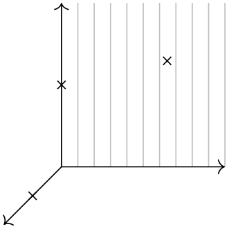
                    \usetikzlibrary {datavisualization}

                    \tikz \datavisualization [

                        xyz Cartesian cabinet,

                        all axes={visualize axis={low=0, style=->}},

                        x axis={visualize grid={direction axis=y axis}, grid=many},

                        visualize as scatter]

                      data {

                        x, y, z

                        0, 0, 1

                        0, 1, 0

                        2, 2, 2

                      };

                    \usetikzlibrary {datavisualization}

                    \tikz \datavisualization [

                        xyz Cartesian cabinet,

                        all axes={visualize axis={low=0, style=->}, grid=many},

                        x axis={visualize grid={direction axis=z axis}},

                        z axis={visualize grid={direction axis=x axis},

                                  visualize grid={direction axis=y
                      axis},},

                        visualize as scatter]

                      data {

                        x, y, z

                        0, 0, 1

                        0, 1, 0

                        2, 2, 2

                      };
Styling the grid lines. When a grid line is draw, styles are applied as described in Section 82.4.8.
The major, minor, and subminor grid lines. The grid option allows you to specify for each kind of grid line (major, minor, or subminor) a set of different values for which these grid lines should be drawn. Correspondingly, it is also possible to configure for each kind of grid line how it should be drawn. For this, the major, minor, subminor, and also the common keys can be used inside the ⟨options⟩ of visualize grid. While as option to grid these keys are used to specify at values, as options of visualize grid they are used to configure the different kinds of grid lines.
Most of the time, no special configuration is necessary since all styling is best done by configuring keys like every major grid. You need to use a key like major only if you wish to configure for instance the low or high values of a major grid line differently from those of minor grid lines – are rather unlikely setting – or when the styling should deviate from the usual settings.
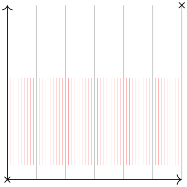
                    \usetikzlibrary {datavisualization}

                    \tikz \datavisualization [

                        xy Cartesian,

                        all axes={visualize axis={low=0, style=->},

                                    grid={some, minor steps between steps}},

                        x axis=
                    {visualize grid={

                                      direction
                      axis=y axis,

                                      minor={low=0.25, high=1.75, style=red!50}}},

                        visualize as scatter]

                      data {

                        x, y

                        0, 0

                        3, 3

                      };
Returning to the example of our system with the two axis systems, it is straight-forward to configure the grid lines of the \(x\)-axis: The direction axis is either of the other two axis (they point in the same direction and they have the same range). For the other two axes, we visualize one grid independently of the other, using different colors.
                \usetikzlibrary {datavisualization}

                \tikzset{

                  data visualization/our system/.append style={

                    x axis=
                {visualize grid={direction axis=left axis}},

                    left axis=
                {visualize grid={direction axis=x axis,

                                                  common={style=red!50}}},

                    right axis={visualize grid={direction axis=x axis,

                                                  common={style=blue!50}}},

                  }

                }

                \tikz \datavisualization [

                    our system,

                    x axis={attribute=time, length=3cm, grid=many},

                    left axis ={attribute=money, grid=some},

                    right axis={attribute=people, grid=few},

                    visualize as line/.list={people 1, people 2, money 1, money 2}]

                  data
                group {people
                and
                money};
82.5.4 Visualizing the Ticks and Tick Labels
-
/tikz/data visualization/axis options/visualize ticks=⟨options⟩(no default) 
-
• The visualize ticks key will have setup attribute \(a\) to be equal to \(v\).
-
• You should now use the goto or goto pos key together with all other axes to configure at which position with respect to these other options the tick mark should be shown. For instance, suppose we want tick marks in our system for the \(x\)-axis at the bottom and at the top. This corresponds to once setting the left axis to its minimal value and once to its maximal value:

                        \usetikzlibrary {datavisualization}

                        \tikzset{

                          data visualization/our system/.append style={

                            x axis={visualize ticks={direction axis=left axis, left
                          axis={goto=min}},

                                      visualize ticks={direction
                          axis=left axis, left
                          axis={goto=max}},

                              }

                            }
 }

                        \tikz \datavisualization [

                            our system,

                            x axis={attribute=time, length=3cm, ticks=many},

                            left axis ={attribute=money},

                            right axis={attribute=people},

                            visualize as line/.list={people 1, people 2, money 1, money 2}]

                          data
                        group {people
                        and
                        money};
-
• In the above example, we may wish to shorten the ticks a bit at the bottom and at the top. For this, we use the low and high key:
-
/tikz/data visualization/low=⟨dimension⟩(no default)
When used with the visualize ticks option, the low key contains a dimension that specifies the extend of the tick going “toward the minimum” of the direction axis. More precisely, when a tick mark is visualized, a unit tangent vector at the current data point in the direction of the direction axis is computed and this vector is multiplied by ⟨dimension⟩ to compute the start position of the tick line. The end position is given by this vector times the high value.
Note that the ⟨dimension⟩ should usually be negative for the low key and positive for the high key.
For tick marks where a tick label node is shown, the ⟨dimension⟩ is increased by the current values of keys like tick text even low padding, see Section 82.4.12 for details.
-
/tikz/data visualization/high=⟨dimension⟩(no default)
Like low.
-
/tikz/data visualization/tick length=⟨dimension⟩(no default) 
Shorthand for low=-⟨dimension⟩, high=⟨dimension⟩.
What we want to happen is that in the upper visualization of the ticks the low value is 0pt, while in the lower one the high value is 0pt:

                        \usetikzlibrary {datavisualization}

                        \tikzset{

                          data visualization/our system/.append style={

                            x axis={

                                visualize ticks={direction axis=left
                          axis,high=0pt,left
                          axis={goto=min}},

                                visualize ticks={direction axis=left
                          axis,low=0pt,left
                          axis={goto=max}},

                              }

                            }
 }

                        \tikz \datavisualization [

                            our system,

                            x axis={attribute=time, length=3cm, ticks=many},

                            left axis ={attribute=money},

                            right axis={attribute=people},

                            visualize as line/.list={people 1, people 2, money 1, money 2}]

                          data
                        group {people
                        and
                        money};
-
-
/tikz/data visualization/tick text at low=⟨true or false⟩ (default true) 
-
/tikz/data visualization/tick text at high=⟨true or false⟩ (default true) 
-
/tikz/data visualization/no tick text(no value) 
-
• In order to compute an appropriate anchor, the tick mark is considered: This is a short line pointing in a certain direction. For a tick label node at the low position, the anchor attribute is setup in such a way that the node label will be below the low position when the tick mark direction points up, it will be to the right when the direction points left, above when it points down, and so on also for diagonal directions. Similarly, for the high position, when the direction points up, the node will be placed above the tick mark and so on.
This computation is done automatically.
-
• The tick label node is styled. The styles that are applied are described in Section 82.4.9.
-
• A tick label node for the low position is usually anchored at this low position, but an additional padding will be added as described in Section 82.4.12.
Visualizing a tick involves (possibly) drawing a tick mark and adding (possibly) the tick node. The process is similar to visualize grid: Users use the ticks key to configure how many ticks they would like for an axis and at which positions. The axis system uses the visualize ticks key to specify where these ticks should actually be shown.
Unlike grid lines, which are typically only visualized once for each combination of an axis and a direction axis, tick marks might be visualized at different places for the same axis. Consider for instance the scientific axes:
Have a look at the ticks on the \(y\)-axis: There are ticks at values 0, 1, 2, 3, and 4. These are visualized both at the left side (where the tick nodes are also shown) and additionally also at the right side, but only as small marks. Similarly, the ticks on the \(x\)-axis appear at the bottom, but also (in much simpler versions) at the top. Both for the \(x\)-axis and for the \(y\)-axis the visualize ticks key was called twice.
The tick marks. Drawing a tick mark is quite similar to visualizing a grid line; indeed a tick mark can be thought of as a “mini grid line”: Just like a grid line it “points a long an axis”. However, a tick will always be a short straight line – even when the coordinate system is actually twisted (experimentation has shown that ticks that follow the curvature of the coordinate system like grid lines are hard to recognize). For this reason, the low and high keys have a different meaning from the one used with the visualize grid key. In detail to configure the size and position of a tick mark for the value \(v\) of attribute \(a\), proceed as follows:
In order to style the tick mark, use the styling mechanism that is detailed in Section 82.4.9.
The tick label node. At certain tick positions, we may wish to add a node indicating the value of the attribute at the given position. The visualize ticks command has no influence over which text should be shown at a node – the text is specified and typeset as explained in Section 82.4.11.
Each time visualize ticks, for each tick position up to two tick label nodes will be created: One at the low position and one at the high position. The following keys are used to configure which of these cases happen:
Pass this option to visualize ticks when you want tick label nodes to be placed at the low position of each tick mark.
                        \usetikzlibrary {datavisualization}

                        \tikzset{

                          data visualization/our system/.append style={

                            x axis={

                                visualize ticks={direction axis=left
                          axis, left axis={goto=min},

                                                 high=0pt, tick
                          text at
                          low, stack},

                                visualize ticks={direction axis=left
                          axis, left axis={goto=max},

                                                 low=0pt, tick
                          text at
                          high, stack}

                              }

                            }
 }

                        \tikz \datavisualization [

                            our system,

                            x axis={attribute=time, length=3cm, ticks=some},

                            left axis ={attribute=money},

                            right axis={attribute=people},

                            visualize as line/.list={people 1, people 2, money 1, money 2}]

                          data
                        group {people
                        and
                        money};
Like tick text at low.
Shorthand for tick text at low=false, tick text at high=false.

                        \usetikzlibrary {datavisualization.formats.functions}

                        \tikz \datavisualization [scientific axes, all axes={length=3cm},

                                                  x axis={ticks={

                                                        major
                          also at={6.5 as [no tick text]}}},

                                                  visualize as smooth line]

                          data [format=function] {

                            var
                        x
                        :
                        interval [5:10];

                            func
                        y
                        =
                        \value x
                        *
                        \value x;

                          };
When a tick label node is to be placed at the low or the high position, the next step is to determine the exact position and the correct anchor of the node. This is done as follows:
82.5.5 Visualizing the Axis Labels
The label option can be used with an axis to specify a text should be shown next to the axis to indicates which attribute this axis refers to. Like ticks or grid, the label option does not actually draw the label, this is the job of the visualize label key, which is configured by the axis system.
-
/tikz/data visualization/axis options/visualize label=⟨options⟩(no default) 
-
/tikz/data visualization/axis option/anchor at min(no value) 
-
/tikz/data visualization/axis option/anchor at max(no value) 
The ⟨options⟩ should be used to configure a “good place” for the axis label. Usually, you will use the goto or the goto pos key.
For the example of our system, we would like the label of the x axis to be placed below at the middle of the axis, so we use goto pos=.5 to determine this position. Concerning the other axes, we want it to be placed at the minimum position of the left axis with a lot of padding.
                    \usetikzlibrary {datavisualization}

                    \tikzdatavisualizationset{

                      our
                    system/.append
                    style={

                        x
                    axis={visualize
                    label={

                            x
                    axis={goto
                    pos=.5},

                            left
                    axis={padding=1.5em, goto=padded
                    min}}}

                      }

                    }

                    \tikz \datavisualization [

                        our system,

                        x axis={attribute=time, ticks=some, label},

                        left axis ={attribute=money},

                        right axis={attribute=people},

                        visualize as line/.list={

                            people 1, people 2, money 1, money 2}]

                      data
                    group {people
                    and
                    money};
In the above example, the padding of 1.5em was rather arbitrary and “suboptimal”. It would be outright wrong if the labels on the x axis were larger or if they were missing. It would be better if the vertical position of the x axis label were always “below” all other options. For such cases a slightly strange approach is useful: You position the node using node style={at=...} where at is now the normal TikZ option that is used to specify the position of a node. Inside the ..., you specify that the horizontal position should be the bottom of up-to-now-constructed data visualization and the vertical position should be at the “origin”, which is, however, the position computed by the goto keys for the axes:
                    \usetikzlibrary {datavisualization}

                    \tikzdatavisualizationset{

                      our
                    system/.append
                    style={

                        x
                    axis={visualize
                    label={

                          x
                    axis={goto
                    pos=.5},

                          node
                    style={

                            at={(0,0 |- data visualization bounding box.south)},

                            below

                    } } } } }

                    \tikz \datavisualization [

                        our system,

                        x axis={attribute=time, ticks=some, label=Year},

                        left axis ={attribute=money},

                        right axis={attribute=people},

                        visualize as line/.list={

                            people 1, people 2, money 1, money 2}]

                      data
                    group {people
                    and
                    money};
Two additional keys are useful for positioning axis labels:
When passed to an axis, this key sets the anchor so that a node positioned at either the min or the padded min value of the axis will be placed “nicely” with respect to the axis. For instance, if the axis points upwards from the min value to the max value, the anchor would be set to north since this gives a label below the axis’s start. Similarly, if the axis points right, the anchor would be set to east, and so on.
Like anchor at min.
82.5.6 The Complete Axis System
Here is the code for the complete axis system developed above and an example of how it is used:
                \tikzdatavisualizationset{ our
                system/.style={

                  % The axes

                  new
                Cartesian
                axis=x
                axis,     new
                Cartesian
                axis=left
                axis,         new
                Cartesian
                axis=right
                axis,

                  % The directions of the axes

                  all
                axes={padding=.5em},       left
                axis={unit
                vector={(0cm,1pt)}},  right
                axis={unit
                vector={(0cm,1pt)}},

                  % The default attributes, other attributes must be configured

                  x
                axis={attribute=x},

                  % The lengths of the axes

                  x
                axis
                   ={length=\pgfkeysvalueof{/tikz/data
                visualization/scientific
                axes/width}},

                  left
                axis
                ={length=\pgfkeysvalueof{/tikz/data
                visualization/scientific
                axes/height}},

                  right
                axis={length=\pgfkeysvalueof{/tikz/data
                visualization/scientific
                axes/height}},

                  % The styling of the axes

                  every
                axis/.style={style=black!50}, % make this the default

                  % Visualizing the axes themselves

                  left
                axis= {visualize
                axis={x
                axis=   {goto=padded
                min}, style=red!75, padded}},

                  right
                axis={visualize
                axis={x
                axis=   {goto=padded
                max}, style=blue!75,padded}},

                  x
                axis=    {visualize
                axis={left
                axis={goto=padded
                min}, padded},

                              visualize
                axis={left
                axis={goto=padded
                max}, padded}},

                  % Visualizing the grid, when requested

                  x
                axis=    {visualize
                grid={direction
                axis=left
                axis}},

                  left
                axis= {visualize
                grid={direction
                axis=x
                axis, common={style=red!50}}},

                  right
                axis={visualize
                grid={direction
                axis=x
                axis, common={style=blue!50}}},

                  % Visualizing the ticks, when requested

                  left
                axis={visualize
                ticks={style={red!50!black}, direction
                axis=x
                axis,

                                              x
                axis={goto=padded
                min}, high=0pt, tick
                text
                at
                low}},

                  right
                axis={visualize
                ticks={style={blue!80!black}, direction
                axis=x
                axis,

                                              x
                axis={goto=padded
                max}, low=0pt, tick
                text
                at
                high}},

                  x
                axis={visualize
                ticks={direction
                axis=left
                axis, left
                axis={goto=padded
                min}, high=0pt,

                                           tick
                text
                at
                low},

                          visualize
                ticks={direction
                axis=left
                axis, left
                axis={goto=padded
                max}, low=0pt}},

                  % By default, there are ticks on all axes

                  all
                axes={ticks},

                  % Visualizing the axis labels, when requested

                  x
                axis={visualize
                label={x
                axis={goto
                pos=.5}, node
                style={

                        at={(0,0 |- data visualization bounding box.south)}, below}}},

                  left
                axis={visualize
                label={left
                axis={goto
                pos=.5}, node
                style={

                        at={(0,0 -| data visualization bounding box.west)}, rotate=90, anchor=south, red!50!black}}},

                  right
                axis={visualize
                label={right
                axis={goto
                pos=.5}, node
                style={

                        at={(0,0 -| data visualization bounding box.east)}, rotate=-90, anchor=south,  blue!80!black}}},

                }}
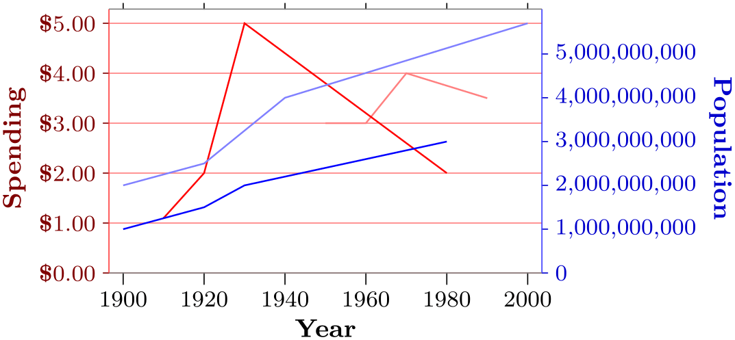
                \usetikzlibrary {datavisualization}

                \tikz \datavisualization [

                  our system,

                  x axis={attribute=time, label=Year,

                      ticks={tick
                  text padding=2pt,  style={/pgf/number format/set thousands
                  separator=}}},

                  left axis={attribute=money, label=Spending,

                      padding min=0, include value=0, grid,

                      ticks={tick prefix=\$, style={/pgf/number format/fixed,

                          /pgf/number format/fixed
                  zerofill, /pgf/number format/precision=2}}},

                  right axis={attribute=people,

                      label=Population,

                      padding min=0, include value=0,

                      ticks={style=/pgf/number format/fixed}},

                  visualize as line/.list={

                      people 1, people 2, money 1, money 2},

                  people 1={style={visualizer color=blue}},

                  people 2={style={visualizer color=blue!50}},

                  money 1={style={visualizer color=red}},

                  money 2={style={visualizer color=red!50}} ]

                data
                group {people
                and
                money};
82.5.7 Using the New Axis System Key
The axis system our system that we developed in the course of the previous section is not yet “configurable”. The only configuration that was possible was to “misuse” the width and height keys of the scientific axes.
In order to make our system configurable so that we can say our system=⟨options⟩, where ⟨options⟩ are executed with the path prefix
                /tikz/data
                visualization/our
                system
we can use the following key:
-
/tikz/data visualization/new axis system={⟨axis system name⟩}{⟨axis setup⟩}{⟨default options⟩}
{⟨application options⟩}(no default) ¶ -
/tikz/data visualization/⟨axis system name⟩=⟨options⟩(no default) 
-
1. The ⟨axis setup⟩ with the path prefix /tikz/data visualization/.
-
2. The ⟨default options⟩ with the same path prefix.
-
3. The following style:
-
/tikz/data visualization/every ⟨axis system name⟩(style, no value) 
Even though this style has the path prefix /tikz/data visualization itself, the keys stored in this style will be executed with the path prefix /tikz/data visualization/⟨axis system name⟩.
-
-
4. The ⟨options⟩ with the path prefix /tikz/data visualization/⟨axis system name⟩.
-
5. The ⟨application options⟩ with the path prefix /tikz/data visualization/
The new axis system key takes four parameters. The first one, ⟨system name⟩, is the name of the to-be-created axis system, our system in our case. The new axis system will create the following new key:
When the key ⟨axis system name⟩ is used, the following keys will be executed in the following order:
Let us now have a look at what all of this means. First, the ⟨axis setup⟩ will contain all options that setup the axis system in all ways that need not be configured. For instance, the ⟨axis setup⟩ for the scientific axes will create an x axis and also a y axis (because these are always present), but will not setup the label visualization (because this can be configured in different ways). For our system, which cannot be configured at all, we would place all of our configuration in the ⟨axis setup⟩.
The ⟨default options⟩ can be used to pick default values that would usually be passed to the ⟨options⟩ of the newly created axis system. For instance, for scientific axis, the ⟨default options⟩ are set to outer ticks,standard labels, because these are the defaults.
Finally, the ⟨application options⟩ can be used to actually apply the configuration that has been chosen by the ⟨options⟩. The idea is that ⟨default options⟩, ⟨options⟩, and also every ⟨axis system name⟩ all have a chance of changing, re-changing and re-setting all sorts of styles and keys. Then, with the last change “winning”, the resulting setting of a style can be executed, which may then cause a label visualization to be installed.