TikZ and PGF Manual
Data Visualization
85 Polar Axes
85.1 Overview
-
TikZ Library datavisualization.polar 
\usetikzlibrary{datavisualization.polar} %
LaTeX
and plain
TeX
\usetikzlibrary[datavisualization.polar] % ConTeXt
This library contains keys that allow you to create plots in a polar axis system is used.
In a polar axis system two attributes are visualized by displacing a data point as follows: One attribute is used to compute a an angle (a direction) while a second attribute is used as a radius (a distance). The angle can be measured in degrees, radians, or can be scaled arbitrarily.
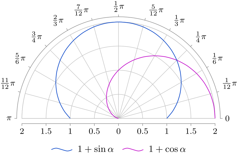
                \usetikzlibrary { datavisualization.formats.functions, datavisualization.polar, }

                \tikz \datavisualization [

                  scientific polar axes={0 to pi, clean},

                  all axes=grid,

                  style sheet=vary hue,

                  legend=below

                    ]

                  [visualize as smooth line=sin,

                   sin={label in legend={text=$1+\sin \alpha$}}]

                  data [format=function] {

                    var
                 angle
                :
                interval [0:pi];

                    func
                radius
                =
                sin(\value{angle}r) +
                1;

                  }

                  [visualize as smooth line=cos,

                   cos={label in legend={text=$1+\cos\alpha$}}]

                  data [format=function] {

                    var
                 angle
                :
                interval [0:pi];

                    func
                radius
                =
                cos(\value{angle}r) +
                1;

                  };
Most of the time, in order to create a polar axis system, you will just use the scientific polar axes key, which takes a number of options that allow you to configure the axis system in greater detail. This key is documented in Section 85.2. Internally, this key uses more low level keys which are documented in the en suite sections.
It is worthwhile to note that the axes of a polar axis system are, still, normal axes of the data visualization system. In particular, all the configurations possible for, say, Cartesian axes also apply to the “angle axis” and the “radius axis” of a polar axis system. For instance, you can could make both axes logarithmic or style their ticks:
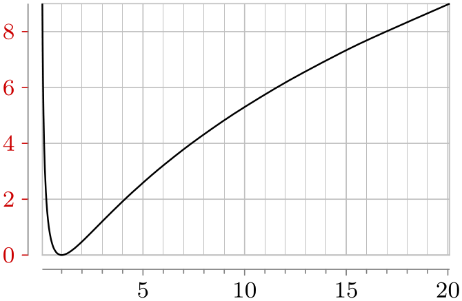
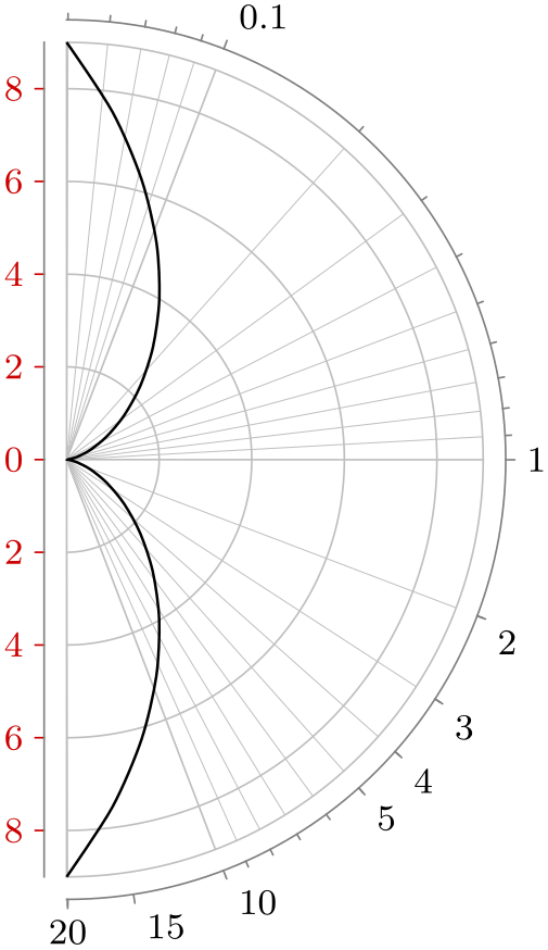
                \usetikzlibrary { datavisualization.formats.functions, datavisualization.polar, }

                \tikz[baseline] \datavisualization [

                  scientific axes={clean},

                  x axis={attribute=angle, ticks={minor steps between steps=4}},

                  y axis={attribute=radius, ticks={some, style=red!80!black}},

                  all axes=grid,

                  visualize as smooth line=sin]

                  data [format=function] {

                    var
                t
                :
                interval [-3:3];

                    func
                angle
                = exp(\value t);

                    func
                radius
                =
                \value{t}*\value{t};

                  };

                \qquad

                \tikz[baseline] \datavisualization [

                  scientific polar axes={right half clockwise, clean},

                  angle axis={logarithmic,

                      ticks={

                        minor steps between steps=8,

                        major also at/.list={2,3,4,5,15,20}}},

                  radius axis={ticks={some, style=red!80!black}},

                  all axes=grid,

                  visualize as smooth line=sin]

                  data [format=function] {

                    var
                t
                :
                interval [-3:3];

                    func
                angle
                = exp(\value t);

                    func
                radius
                =
                \value{t}*\value{t};

                  };
85.2 Scientific Polar Axis System
-
/tikz/data visualization/scientific polar axes=⟨options⟩(no default) 
This key installs a polar axis system that can be used in a “scientific” publication. Two axes are created called the angle axis and the radius axis. Unlike “normal” Cartesian axes, these axes do not point in a specific direction. Rather, the radius axis is used to map the values of one attribute to a distance from the origin while the angle axis is used to map the values of another attribute to a rotation angle.
The ⟨options⟩ will be executed with the path prefix
/tikz/data
visualization/scientific
polar axes
The permissible keys are documented in the later subsections of this section.
Let us start with the configuration of the radius axis since it is easier. Firstly, you should specify which attribute is linked to the radius. The default is radius, but you will typically wish to change this. As with any other axis, the attribute key is used to configure the axis, see Section 82.2.2 for details. You can also apply all other configurations to the radius axis like, say, unit length or length or style. Note, however, that the logarithmic key will not work with the radius axis for a scientific polar axes system since the attribute value zero is always placed at the center – and for a logarithmic plot the value 0 cannot be mapped.
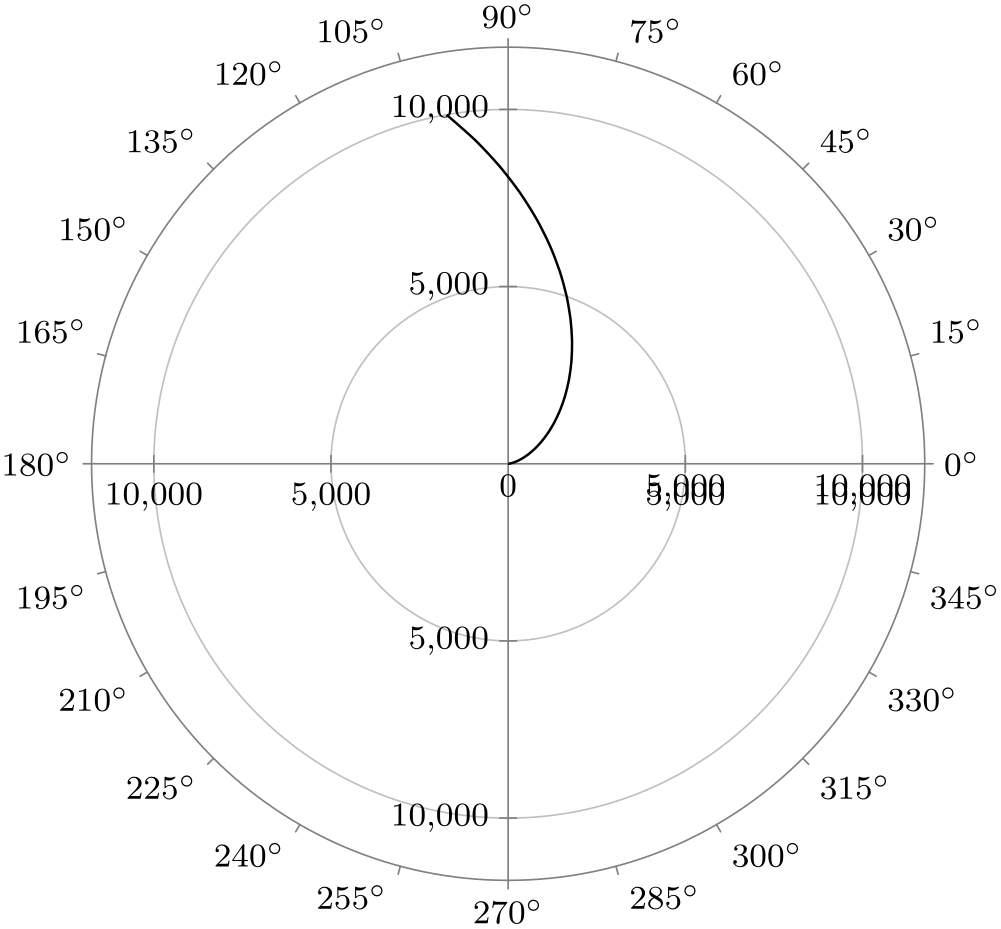
                    \usetikzlibrary { datavisualization.formats.functions, datavisualization.polar, }

                    \tikz \datavisualization [

                      scientific polar axes,

                      radius axis={

                          attribute=distance,

                          ticks={step=5000},

                          padding=1.5em,

                          length=3cm,

                          grid

                        },

                      visualize as smooth line]

                    data [format=function] {

                      var  angle
                    :
                    interval [0:100];

                      func
                    distance
                    =
                    \value{angle}*\value{angle};

                    };
For the angle axis, you can also specify an attribute using the attribute key. However, for this axis the mapping of a value to an actual angle is a complicated process involving many considerations of how the polar axis system should be visualized. For this reason, there are a large number of predefined such mappings documented in Section 85.2.2. Finally, as for a scientific plot, you can configure where the ticks should be shown using the keys inner ticks, outer ticks, and clean, documented below.
85.2.1 Tick Placements
-
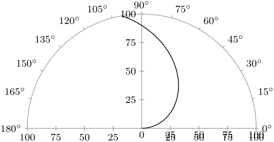
/tikz/data visualization/scientific polar axes/outer ticks(no value) 
This key, which is the default, causes ticks to be drawn “outside” the outer “ring” of the polar axes:
                    \usetikzlibrary { datavisualization.formats.functions, datavisualization.polar, }

                    \tikz \datavisualization [

                      scientific polar axes={outer ticks, 0 to 180},

                      visualize as smooth line]

                    data [format=function] {

                      var  angle
                    :
                    interval [0:100];

                      func
                    radius
                    =
                    \value{angle};

                    };
-
/tikz/data visualization/scientific polar axes/inner ticks(no value) 
This key causes the ticks to be “turned to the inside”. I do not recommend using this key.

                    \usetikzlibrary { datavisualization.formats.functions, datavisualization.polar, }

                    \tikz \datavisualization [

                      scientific polar axes={inner ticks, 0 to 180},

                      visualize as smooth line]

                    data [format=function] {

                      var  angle
                    :
                    interval [0:100];

                      func
                    radius
                    =
                    \value{angle};

                    };
-
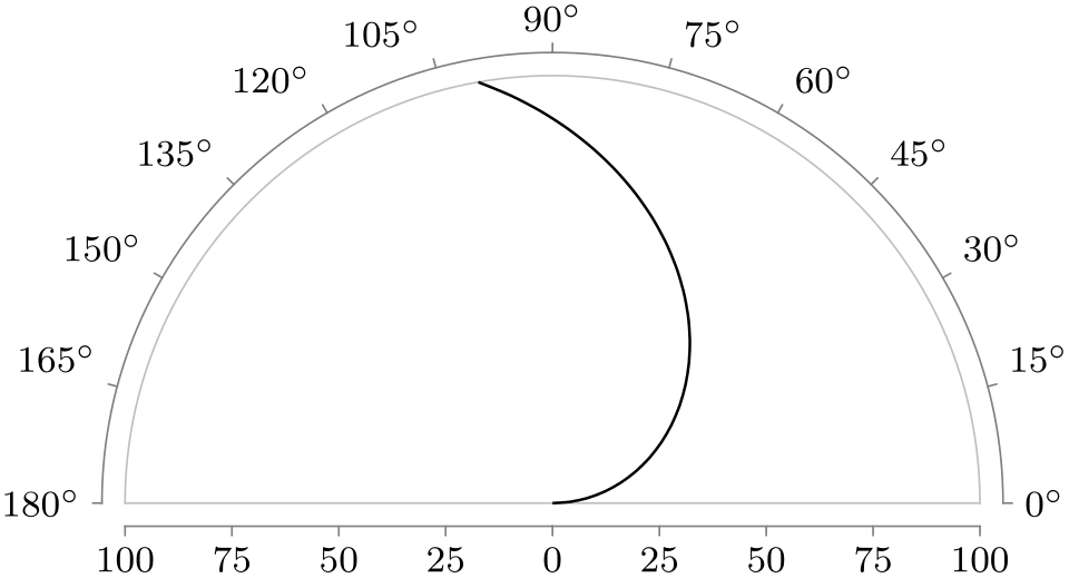
/tikz/data visualization/scientific polar axes/clean(no value) 
This key separates the area where the data is shown from the area where the ticks are shown. Usually, this is the best choice for the tick placement since it avoids a collision of data and explanations.
                    \usetikzlibrary { datavisualization.formats.functions, datavisualization.polar, }

                    \tikz \datavisualization [

                      scientific polar axes={clean, 0 to 180},

                      visualize as smooth line]

                    data [format=function] {

                      var  angle
                    :
                    interval [0:100];

                      func
                    radius
                    =
                    \value{angle};

                    };
85.2.2 Angle Ranges
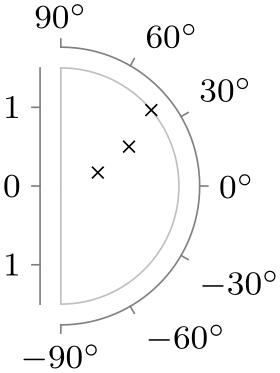
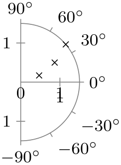
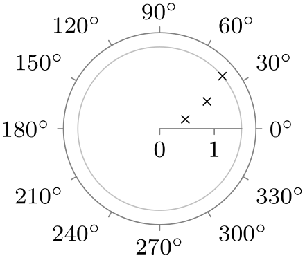
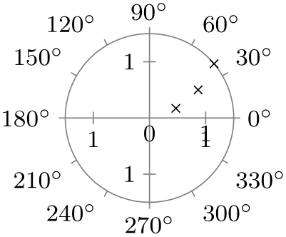
Suppose you create a polar plot in which the radius values vary between, say, \(567\) and \(1234\). Then the normal axis scaling mechanisms can be used to compute a good scaling for the “radius axis”: Place the value \(1234\) at a distance of , say, \(5\,\mathrm {cm}\) from the origin and place the value \(0\) at the origin. Now, by comparison, suppose that the values of the angle axis’s attribute ranged between, say, \(10\) and \(75.7\). In this case, we may wish the angles to be scaled so that the minimum value is horizontal and the maximum value is vertical. But we may also wish the a value of \(0\) is horizontal and a value of \(90\) is vertical.
Since it is unclear which interpretation is the right one, you have to use an option to select which should happen. The applicable options fall into three categories:
-
• Options that request the scaling to be done in such a way that the attribute is interpreted as a value in degrees and such that the minimum and maximum of the depicted range is a multiple of \(90^\circ \). For instance, the option 0 to 180 causes the angle axis to range from \(0^\circ \) to \(180^\circ \), independently of the actual range of the values.
-
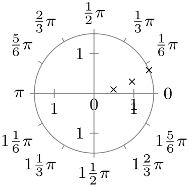
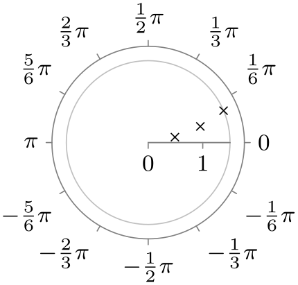
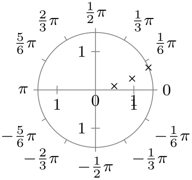
• Options that work as above, but use radians rather than degrees. An example is the option 0 to pi.
-
• Options that map the minimum value in the data to a horizontal or vertical line and the maximum value to another such line. This is useful when the values neither directly correspond to degrees or radians. In this case, the angle axis may also be a logarithmic axis.
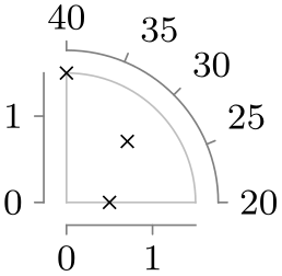
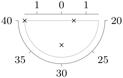
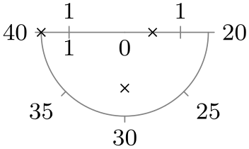
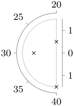
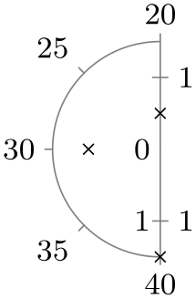
In addition to the above categories, all of the option documented in the following implicitly also select quadrants that are used to depict the data. For instance, the 0 to 90 key and also the 0 to pi half key setup the polar axis system in such a way that only first (upper right) quadrant is used. No check is done whether the data fill actually lie in this quadrant – if it does not, the data will “bleed outside” the range. Naturally, with a key like 0 to 360 or 0 to 2pi this cannot happen.
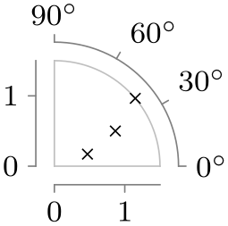
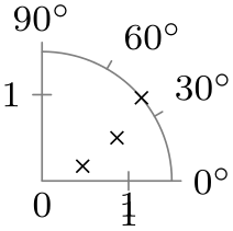
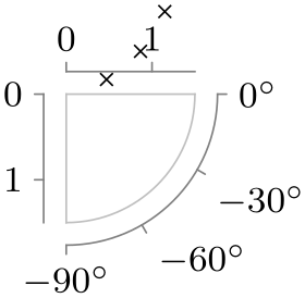
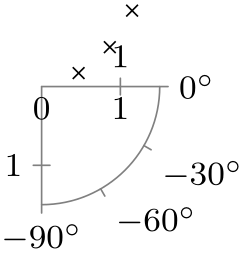
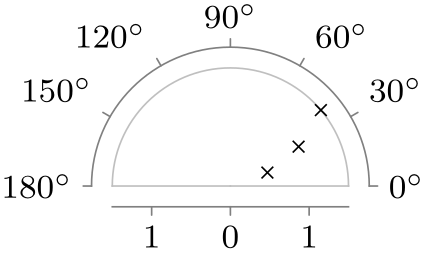
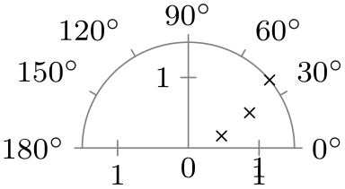
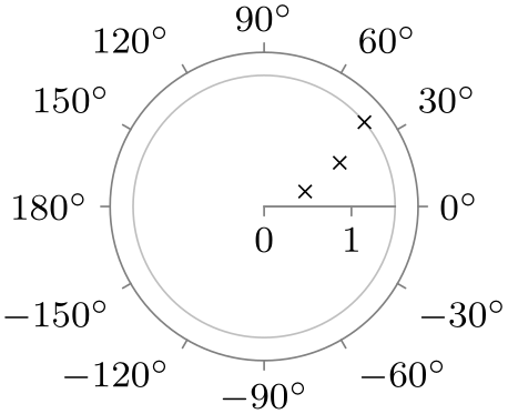
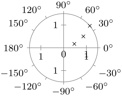
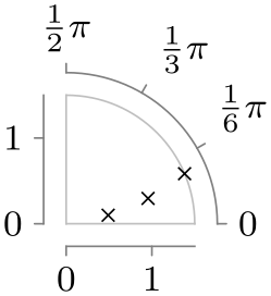
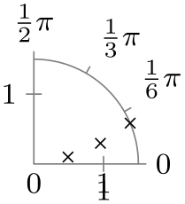
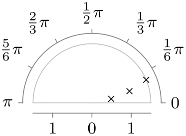
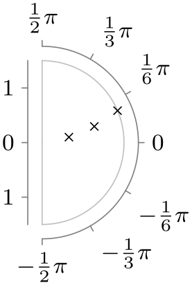
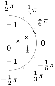
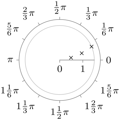
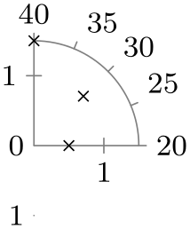
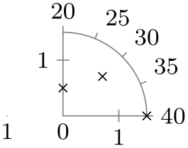
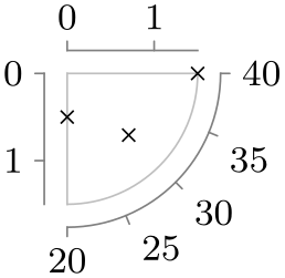
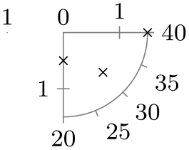
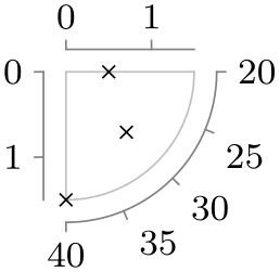
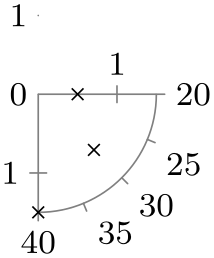
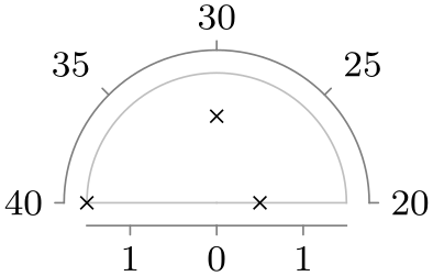
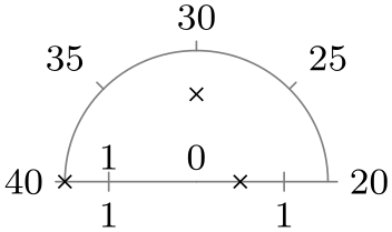
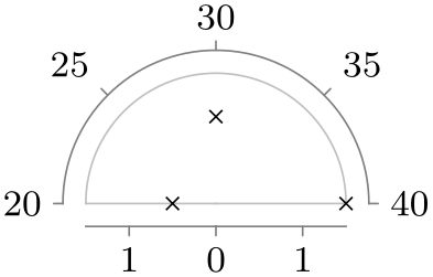
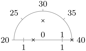
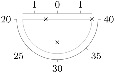
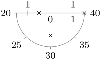
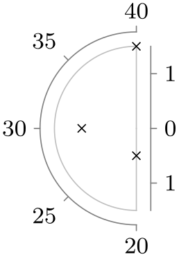
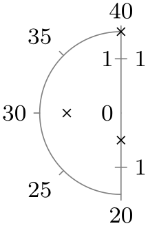
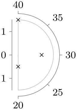
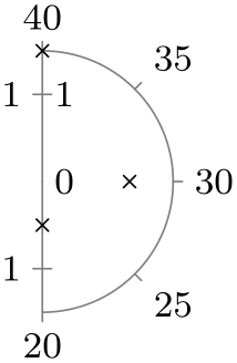
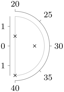
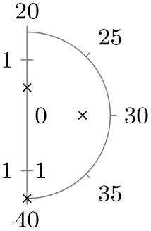
In order to save some space in this manual, in the following the different possible keys are only given in a table together with a small example for each key. The examples were created using the following code:

                \usetikzlibrary {datavisualization.polar}

                \tikz \datavisualization [

                  scientific polar axes={

                      clean,

                      0 to 90  % the option

                    },

                  angle axis={ticks={step=30}},

                  radius axis={length=1cm, ticks={step=1}},

                  visualize as scatter]

                data
                point [angle=20, radius=0.5]

                data
                point [angle=30, radius=1]

                data
                point [angle=40, radius=1.5];
For the options on radians, the angle values have been replaced by 0.2, 0.3, and 0.4 and the stepping has been changed by setting step=(pi/6). For the quadrant options, no stepping is set at all (it is computed automatically).
| Option | With clean ticks | With outer ticks |
| 0 to 90 |
|
|
| -90 to 0 |
|
|
| 0 to 180 |
|
|
| -90 to 90 |
|
|
| 0 to 360 |
|
|
| -180 to 180 |
|
|
| Option | With clean ticks | With outer ticks |
| 0 to pi half |
|
|
| -pi half to 0 |

|

|
| 0 to pi |
|

|
| -pi half to pi half |
|
|
| 0 to 2pi |
|
|
| -pi to pi |
|
|
| Option | With clean ticks | With outer ticks |
| quadrant |
|
|
| quadrant clockwise |

|
|
| fourth quadrant |
|
|
| fourth quadrant clockwise |
|
|
| upper half |
|
|
| upper half clockwise |
|
|
| lower half |
|
|
| lower half clockwise |
|
|
| Option | With clean ticks | With outer ticks |
| left half |
|
|
| left half clockwise |
|
|
| right half |
|
|
| right half clockwise |
|
|
85.3 Advanced: Creating a New Polar Axis System
-
/tikz/data visualization/new polar axes={⟨angle axis name⟩}{⟨radius axis name⟩}(no default) 
-
/tikz/data visualization/axis options/unit vectors={⟨unit vector 0 degrees⟩}{⟨unit vector 90 degrees⟩} (no default, initially {(1pt,0pt)}{(0pt,1pt)}) 
This key actually creates two axes, whose names are give as parameters: An angle axis and a radius axis. These two axes work in concert in the following way: Suppose a data point has two attributes called angle and radius (these attribute names can be changed by changing the attribute of the ⟨angle axis name⟩ or the ⟨radius axis name⟩, respectively). These two attributes are then scaled as usual, resulting in two “reasonable” values \(a\) (for the angle) and \(r\) (for the radius). Then, the data point gets visualized (in principle, details will follow) at a position on the page that is at a distance of \(r\) from the origin and at an angle of \(a\).

                    \usetikzlibrary {datavisualization.polar}

                    \tikz \datavisualization

                        [new polar axes={angle axis}{radius
                      axis},

                         radius axis={length=2cm},

                         visualize as scatter]

                      data [format=named] {

                        angle={0,20,...,160}, radius={0,...,5}

                      };
In detail, the ⟨angle axis⟩ keeps track of two vectors \(v_0\) and \(v_{90}\), each of which will usually have unit length (length 1pt) and which point in two different directions. Given a radius \(r\) (measured in TeX pts, so if the radius attribute 10pt, then \(r\) would be \(10\)) and an angle \(a\), let \(s\) be the sine of \(a\) and let \(c\) be the cosine of \(a\), where \(a\) is a number is degrees (so \(s\) would be \(1\) for \(a = 90\)). Then, the current page position is shifted by \(c \cdot r\) times \(v_0\) and, additionally, by \(s \cdot r\) times \(v_{90}\). This means that in the “polar coordinate system” \(v_0\) is the unit vector along the “\(0^\circ \)-axis” and \(v_{90}\) is the unit vector along “\(90^\circ \)-axis”. The values of \(v_0\) and \(v_{90}\) can be changed using the following key on the ⟨angle axis⟩:
Both the ⟨unit vector 0 degrees⟩ and the ⟨unit vector 90 degrees⟩ are TikZ coordinates:

                        \usetikzlibrary {datavisualization.polar}

                        \tikz \datavisualization

                            [new polar axes={angle axis}{radius
                          axis},

                             radius axis={unit length=1cm},

                             angle axis={unit vectors={(10:1pt)}{(60:1pt)}},

                             visualize as scatter]

                          data [format=named] {

                            angle={0,90}, radius={0.25,0.5,...,2}

                          };
Once created, the angle axis can be scaled conveniently using the following keys:
-
/tikz/data visualization/axis options/degrees(no value) 
When this key is passed to the angle axis of a polar axis system, it sets up the scaling so that a value of 360 on this axis corresponds to a complete circle.

                    \usetikzlibrary {datavisualization.polar}

                    \tikz \datavisualization

                        [new polar axes={angle axis}{radius
                      axis},

                         radius axis={unit length=1cm},

                         angle axis={degrees},

                         visualize as scatter]

                      data [format=named] {

                        angle={10,90}, radius={0.25,0.5,...,2}

                      };
-
/tikz/data visualization/axis options/radians(no value) 
In contrast to degrees, this option sets up things so that a value of 2*pi on this axis corresponds to a complete circle.

                    \usetikzlibrary {datavisualization.polar}

                    \tikz \datavisualization

                        [new polar axes={angle axis}{radius
                      axis},

                         radius axis={unit length=1cm},

                         angle axis={radians},

                         visualize as scatter]

                      data [format=named] {

                        angle={0,1.5}, radius={0.25,0.5,...,2}

                      };