Manual for Package pgfplots
2D/3D Plots in LATeX, Version 1.18.2
https://github.com/pgf-tikz/pgfplots
Step-by-Step Tutorials
3.3Use Cases involving Scatter Plots
Assuming that we are more or less familiar with the basics of the preceding tutorials, we would like to draw a scatter plot. A scatter plot is one in which markers indicate the important information.
There are many different kinds of scatter plots and this section covers a couple of them.
3.3.1Scatter Plot Use Case A
In this subsection, we address the following scatter plot use case: assume that we are given a couple of special \((x,y)\) coordinates along with color data at every vertex. We would like to draw markers at the positions and choose individual colors depending on the color data.
3.3.1.1Importing the Data File
We assume that our input data is given as a table containing much more columns than we need. The first couple of rows are as follows:
# ordering = colwise , basis = BASIS _ HAT _ HIER , number points =1657 ,
# ( max ) level ( s ): (7 ,8) , domain =[0 ,1] x [ 0 , 6 . 2 8 3 1 8 5 3 ]
x _0 x _1 f(x) l _0 i _0
0 0 0 0 0
0 0.024543693 -0.00054758064 0 0
0 0.049087385 -0.0021903226 0 0
0 0.073631078 -0.00054758064 0 0
0 0.09817477 -0.0095006552 0 0
What we need is the first and second column to get the \(x\)- and \(y\)-coordinate values, respectively, and the third column f(x) to choose color values. The color values are very small and have a high range: there are values of order \(10^{-6}\) and there are values of order \(1\). Such ranges are best shown on a logarithmic scale, which is why we will resort to some logarithmic scale on the absolute values of this column. Thus, a requirement will be to accept a math expression (involving logs) on the color data column.
Note that the data file (and all others referenced in this manual) are shipped with pgfplots; you can find them in the subfolder doc/latex/pgfplots/plotdata.
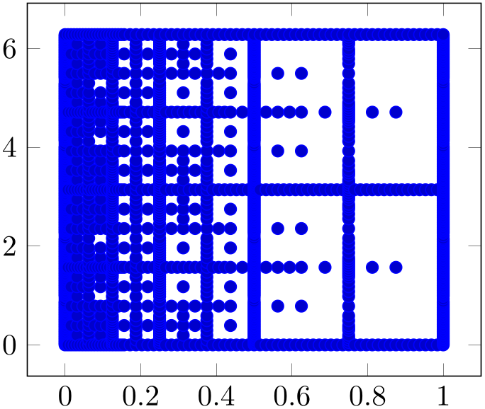
We learned already how to read table data from a file, so our first step is relatively straightforward.
% Preamble: \pgfplotsset{width=7cm,compat=1.18}
\begin{tikzpicture}
\begin{axis}
\addplot+ [only marks] table
{concat_VV_together_grid.dat};
\end{axis}
\end{tikzpicture}
Here, the only non-trivial variation is the option
only marks which is given after the plus sign. Keep in mind
that \addplot+[ options
 ] means that pgfplots shall combine the set of options of its
cycle list with
 options
 . In our case, only marks does what it says. The
only marks plot handler is the most simple scatter plot: it
uses the same color for every marker.
Note that \addplot table takes the first column as x and the second as y (which matches our input file perfectly).
3.3.1.2Fine Tuning
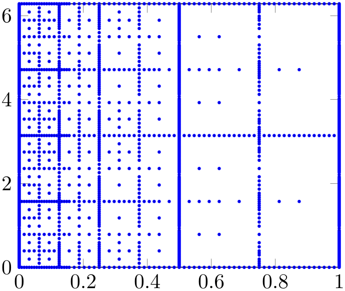
We agree that our initial import has unsuitable displayed limits: there is too much white space around the interesting plot area. In addition, the markers overlap because they are too large. We can modify the appearance as follows:
% Preamble: \pgfplotsset{width=7cm,compat=1.18}
\begin{tikzpicture}
\begin{axis}[
enlargelimits=false,
]
\addplot+ [only marks,mark size=0.6pt]
                        table
                {concat_VV_together_grid.dat};
\end{axis}
\end{tikzpicture}
As before, we assume that we add more options after \begin{axis}. Consequently, we introduced suitable indentation and a trailing comma after the option. Note that enlargelimits is typically active; it means that pgfplots increases the displayed range by \(10\%\) by default. Deactivating it produces tight limits according to the input data.
Our second option is mark size – using an absolute size (about the radius or half size of the marker).
3.3.1.3Color Coding According To Input Data
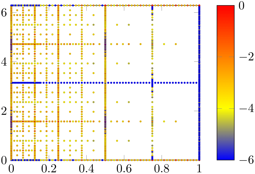
We are quite close to our goal, except for the colors. As discussed, our input file contains three columns and the third one should be used to provide color information. In our case, the data file has a column named f(x).
% Preamble: \pgfplotsset{width=7cm,compat=1.18}
\begin{tikzpicture}
\begin{axis}[
enlargelimits=false,
colorbar,
]
\addplot+ [
only marks,
scatter,
point meta={
ln(1e-6+abs(\thisrow{f(x)}))/ln(10)
},
mark size=0.6pt,
                        ] table
                {concat_VV_together_grid.dat};
\end{axis}
\end{tikzpicture}
We added a couple of options to our example: the options scatter, and point meta, colorbar. The option scatter has a slightly misleading name as we already had a scatter plot before we added that option. It activates scatter plots with individual appearance: without further options, it chooses individual colors for every marker. The “individual colors” are based on something which is called “point meta” in pgfplots. The point meta is typically a scalar value for every input coordinate. In the default configuration, it is interpreted as “color data” for the coordinate in question. This also explains the other option: point meta=... tells pgfplots which values are to be used to determine colors. Note that the default value of point meta is to use the \(y\) coordinate. In our case, we have a complicated math expression which is related to our input file: it contains small quantities in column f(x) which are based shown on a logarithmic scale as their differ over a huge range. Since a logarithm must not have a non-positive argument, we have \(10^{-6} + \text {abs}(\dotsb )\) as expression which ensures that the argument is never smaller than 10^{-6} and that is is positive. The divider /ln(10) means that we have logarithms base \(10\). But the key point of the whole complicated expression can be summarized as follows:
-
1. We can use \thisrow{
 column name
 } to refer to table columns. Here, “this row” means to evaluate the table for the “data point which is
being read from the current row”.
-
2. We can combine \thisrow with any complicated math expression.
The third new option colorbar activates the color bar on the right hand side (as you guessed correctly). We see that the smallest value is \(-6\) which corresponds to our value 1e-6 in the math expression.
You might wonder how a scalar value (the number stored in the f(x) column) results in a color. pgfplots computes the minimum and maximum value of all such numbers. Then, it maps every number into a colormap. A colormap defines a couple of colors and interpolates linearly between such colors. That means that the smallest value of point meta is mapped to the first color in a colormap whereas the largest value of point meta is mapped to the last color in the colormap. All others are mapped to something in-between.
More information about colormap and point meta can be found in Section 4.7.6.1 and in Section 4.8.
3.3.2Scatter Plot Use Case B
As already mentioned, there are various use cases for scatter plots. The default configuration of the scatter key is to read numeric values of point meta and choose colors by mapping that value into the current colormap.
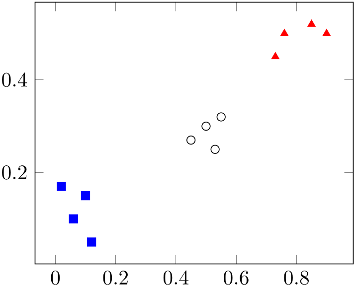
A different application would be to expect symbolic input (some string) and choose different markers depending on that input symbol.
Suppose that you are given a sequence of input coordinates of the form \((x,y)\)
 class label
 and that you want to choose marker options depending on the
 class label
 . A pgfplots solution could be
% Preamble: \pgfplotsset{width=7cm,compat=1.18}
\begin{tikzpicture}
\begin{axis}
\addplot [
scatter,
only marks,
point meta=explicit symbolic,
scatter/classes={
a={mark=square*,blue},
b={mark=triangle*,red},
                            c={mark=o,draw=black}% <-- don't add
                comma
},
] table [meta=label] {
                        x
                     y
                       label
0.1 0.15 a
0.45 0.27 c
0.02 0.17 a
0.06 0.1 a
0.9 0.5 b
0.5 0.3 c
0.85 0.52 b
0.12 0.05 a
0.73 0.45 b
0.53 0.25 c
0.76 0.5 b
0.55 0.32 c
};
\end{axis}
\end{tikzpicture}
As in our previous use case in Section 3.3.1, we have the options scatter, only marks, and a configuration how to retrieve the point meta values by means of the meta key. One new key is point meta=explicit symbolic: it tells pgfplots that any encountered values of point meta are to be interpreted as string symbols. Furthermore, it tells pgfplots that the every input coordinate comes with an explicit value (as opposed to a common math expression, for example). The other different option is scatter/classes. As you guessed from the listing, it is a map from string symbol to marker option list. This allows to address such use cases in a simple way.
This example has actually been replicated from the reference manual section for scatter/classes.
3.3.3Scatter Plot Use Case C
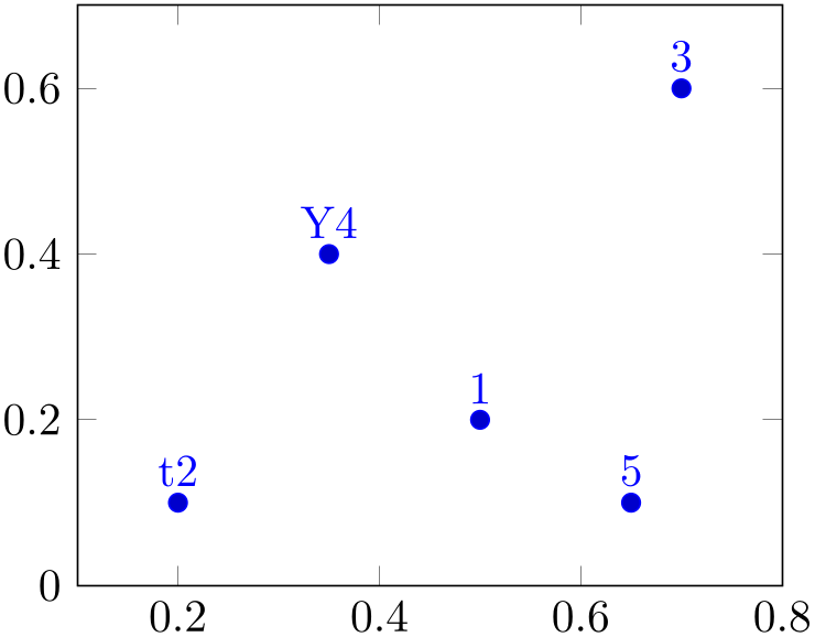
Finally, this tutorial sketches a further use case for scatter plots: given a sequence of coordinates \((x,y)\) with individual string labels, we want to draw the string label at the designated positions.
This can be implemented by means of the nodes near coords feature of pgfplots, which is actually based on scatter:
% Preamble: \pgfplotsset{width=7cm,compat=1.18}
\begin{tikzpicture}
\begin{axis}[
enlargelimits=0.2,
]
\addplot+ [nodes near coords,only marks,
                       point meta=explicit
                symbolic]
table [meta=label] {
                        x
                   y   label
0.5 0.2 1
0.2 0.1 t2
0.7 0.6 3
0.35 0.4 Y4
0.65 0.1 5
};
\end{axis}
\end{tikzpicture}
In this case, we have point meta=explicit symbolic in order to express the fact that our labels are of textual form (see the reference manual section for nodes near coords for applications of numeric labels). The remaining stuff is done by the implementation of nodes near coords. Note that enlarged the axis limits somewhat in order to include the text nodes in the visible area.
There is much more to say about scatter plots, and about nodes near coords. Please consider this subsection as a brief pointer to Section 4.5.12 in the reference manual.
3.3.4Summary
We learned how to generate scatter plots with single color using only marks, scatter plots with individually colored markers using the scatter key, scatter plots with specific marker styles depending on some class label using scatter/classes and text nodes using nodes near coords.
Furthermore, we introduced the concept of “point meta data”: once as (scalar valued) color data, once as symbolic class label and once as text label.
There is much more to say, especially about point meta which is introduced and explained in all depth in Section 4.8.
There is also more to say about scatter plots, for example how to generate scatter plots with individually sized markers and/or colors (by relying on \pgfplotspointmetatransformed, see the reference manual section for visualization depends on). In addition, scatter plots can be customized to a high degree which is explained in Section 4.5.12.