Manual for Package pgfplots
2D/3D Plots in LATeX, Version 1.18.2
https://github.com/pgf-tikz/pgfplots
The Reference
4.9Axis Descriptions
Axis descriptions are labels for \(x\)- and \(y\)-axis, titles, legends and the like. Axis descriptions are drawn after the plot is finished and they are not subjected to clipping.
4.9.1Placement of Axis Descriptions
This section describes how to modify the placement of titles, labels, legends and other axis descriptions. It may be skipped at first reading.
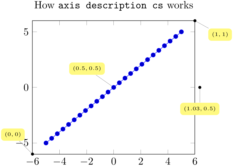
There are different methods to place axis descriptions. One of them is to provide coordinates relative to the axis’ rectangle such that (0,0) is the lower left corner and (1,1) is the upper right corner – this is very useful for figure titles or legends. Coordinates of this type, i.e. without unit like (0,0) or (1.03,1), are called axis description cs (the cs stands for “coordinate system”). One other method is of primary interest for axis labels – they should be placed near the tick labels, but it a way that they don’t overlap or obscure tick labels. Furthermore, axis labels shall be placed such that they are automatically moved if the axis is rotated (or tick labels are moved to the right side of the figure). There is a special coordinate system to realize these two demands, the ticklabel cs.
In the following, the two coordinate systems axis description cs and ticklabel cs are described in more detail. It should be noted that axis description cs is used automatically, so it might never be necessary to use it explicitly.
-
Coordinate system axis description cs 
A coordinate system which is used to
place axis descriptions. Whenever the option ‘at={( x
x ,
, y
y )}’ occurs in label style, legend style or any other axis
description, (
 x
x ,
, y
y ) is interpreted to be a coordinate in
axis description cs.
The point \((0,0)\) is always the lower left corner of the tightest bounding box around the axes (without any descriptions or ticks) while the point \((1,1)\) is the upper right corner of this bounding box.
In most cases, it is not necessary to explicitly write axis description cs as it is the default coordinate system for any axis description. An example for how coordinates are placed is shown below.
% Preamble: \pgfplotsset{width=7cm,compat=1.18}
% [See the TikZ manual if you'd like to learn about nodes and pins]
\begin{tikzpicture}
\tikzset{
every pin/.style={fill=yellow!50!white,rectangle,rounded corners=3pt,font=\tiny},
small dot/.style={fill=black,circle,scale=0.3},
}
\begin{axis}[
clip=false,
title=How \texttt{axis description cs} works,
]
\addplot {x};
\node [small dot,pin=120:{$(0,0)$}] at (axis description cs:0,0) {};
\node [small dot,pin=-30:{$(1,1)$}] at (axis description cs:1,1) {};
\node [small dot,pin=-90:{$(1.03,0.5)$}] at (axis description cs:1.03,0.5) {};
\node [small dot,pin=125:{$(0.5,0.5)$}] at (axis description cs:0.5,0.5) {};
\end{axis}
\end{tikzpicture}
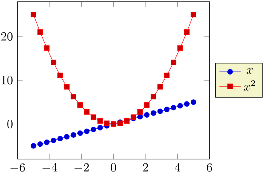
Axis descriptions are TikZ nodes, that means all placement and detail options of TikZ apply. The point on the node’s boundary which is actually shifted to the at coordinate needs to be provided with an anchor (cf the PGF/TikZ manual, Section “Nodes and edges”):
% Preamble: \pgfplotsset{width=7cm,compat=1.18}
\begin{tikzpicture}
\begin{axis}[
legend entries={$x$,$x^2$},
legend style={
at={(1.03,0.5)},
anchor=west,
},
]
\addplot {x};
\addplot {x^2};
\end{axis}
\end{tikzpicture}
Standard anchors of nodes are north, east, south, west and mixed components like north east. Please refer to the PGF/TikZ manual for a complete documentation of anchors.
-
• Each of the anchors described in Section 4.19 can be described by axis description cs as well.
-
• The axis description cs is independent of axis reversals or skewed axes. Only for the default configuration of boxed axes is it the same as rel axis cs, i.e. (0,0) is the same as the smallest axis coordinate and (1,1) is the largest one in case of standard boxed axes.44
-
• Even for three dimensional axes, the axis description cs is still two-dimensional: it always refers to coordinates relative to the tightest bounding box around the axis (without any descriptions or ticks).
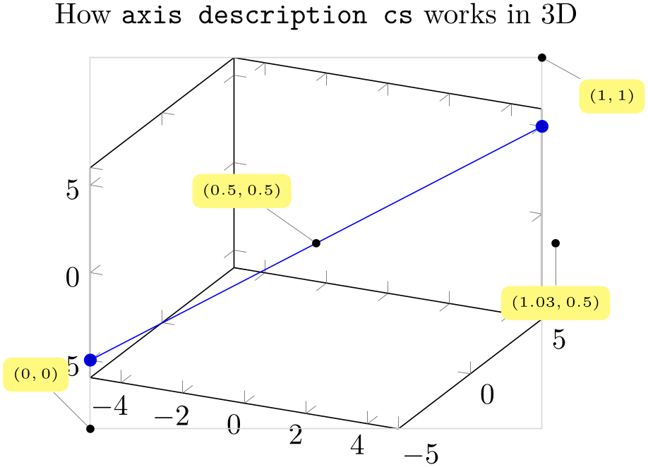
% Preamble: \pgfplotsset{width=7cm,compat=1.18}% the same as above for 3D ...% [See the TikZ manual if you'd like to learn about nodes and pins]\begin{tikzpicture}\tikzset{every pin/.style={fill=yellow!50!white,rectangle,rounded corners=3pt,font=\tiny},small dot/.style={fill=black,circle,scale=0.3},}\begin{axis}[clip=false,title=How \texttt{axis description cs} works in 3D,]\addplot3 coordinates {(-5,-5,-5) (5,5,5)};\draw [black!15] (axis description cs:0,0) rectangle (axis description cs:1,1);\node [small dot,pin=120:{$(0,0)$}] at (axis description cs:0,0) {};\node [small dot,pin=-30:{$(1,1)$}] at (axis description cs:1,1) {};\node [small dot,pin=-90:{$(1.03,0.5)$}] at (axis description cs:1.03,0.5) {};\node [small dot,pin=125:{$(0.5,0.5)$}] at (axis description cs:0.5,0.5) {};\end{axis}\end{tikzpicture} -
• Since the view does not influence these positions, axis description cs might not be a good choice for axis labels in 3D. The ticklabel cs is used in this case.
-
Coordinate system xticklabel cs 
-
Coordinate system yticklabel cs 
-
Coordinate system zticklabel cs 
-
Coordinate system ticklabel cs 
-
Coordinate system xticklabel* cs 
-
Coordinate system yticklabel* cs 
-
Coordinate system zticklabel* cs 
-
Coordinate system ticklabel* cs 
A set of special coordinate systems intended to place axis descriptions (or any other drawing operation) besides tick labels, in a way such that neither tick labels nor the axis as such are obscured.
See also xlabel near ticks as one main application of ticklabel cs.
The xticklabel cs (and its variants) always refer to one, uniquely identified axis: the one which is (or would be) annotated with tick labels.
The ticklabel cs (without explicit x, y or z) can only be used in contexts where the axis character is known from context (for example, inside of xlabel style – there, the ticklabel cs is equivalent to xticklabel cs).
The starred variants xticklabel* cs and its friends do not take the size of any tick labels into account.
Each of these coordinate systems allows to specify points on a straight line which is placed parallel to an axis containing tick labels, moved away just far enough to avoid overlaps with the tick labels:
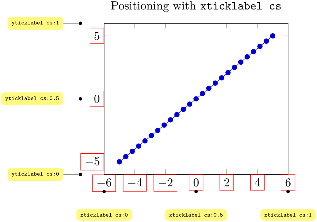
% Preamble: \pgfplotsset{width=7cm,compat=1.18}
\tikzset{
every pin/.style={fill=yellow!50!white,rectangle,rounded corners=3pt,font=\tiny},
small dot/.style={fill=black,circle,scale=0.3},
}
\begin{tikzpicture}
\begin{axis}[
clip=false,
ticklabel style={draw=red},
title=Positioning with \texttt{xticklabel cs},
]
\addplot {x};
\node [small dot,pin=-90:{\texttt{xticklabel cs:0}}] at (xticklabel cs:0) {};
\node [small dot,pin=-90:{\texttt{xticklabel cs:0.5}}] at (xticklabel cs:0.5) {};
\node [small dot,pin=-90:{\texttt{xticklabel cs:1}}] at (xticklabel cs:1) {};
\node [small dot,pin=180:{\texttt{yticklabel cs:0}}] at (yticklabel cs:0) {};
\node [small dot,pin=180:{\texttt{yticklabel cs:0.5}}] at (yticklabel cs:0.5) {};
\node [small dot,pin=180:{\texttt{yticklabel cs:1}}] at (yticklabel cs:1) {};
\end{axis}
\end{tikzpicture}
The basic idea is to place coordinates on a straight line which is parallel to the axis containing tick labels – but shifted such that the line does not cut through tick labels.
Note that an axis description which has been placed with xticklabel cs or its friends is also useful for skewed axes or the axis x line variants – it is often the same value for all these variants. In particular, it is useful for three-dimensional axes, see below.
Typically, xticklabel cs places nodes exactly at the position where the largest associated tick label is finished. While this is very useful, it might be undesired – for example if one wants to move into the opposite direction (here, the special anchor near ticklabel opposite might be of interest). To this end, there are the starred variants, i.e. xticklabel* cs and its friends:
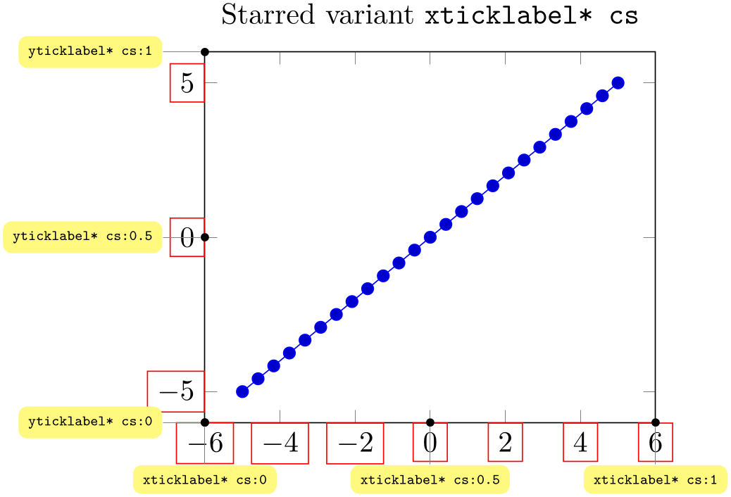
% Preamble: \pgfplotsset{width=7cm,compat=1.18}
\tikzset{
every pin/.style={fill=yellow!50!white,rectangle,rounded corners=3pt,font=\tiny},
small dot/.style={fill=black,circle,scale=0.3},
}
\begin{tikzpicture}
\begin{axis}[
clip=false,
ticklabel style={draw=red},
title=Starred variant \texttt{xticklabel* cs},
]
\addplot {x};
\node [small dot,pin=-90:{\texttt{xticklabel* cs:0}}] at (xticklabel* cs:0) {};
\node [small dot,pin=-90:{\texttt{xticklabel* cs:0.5}}] at (xticklabel* cs:0.5) {};
\node [small dot,pin=-90:{\texttt{xticklabel* cs:1}}] at (xticklabel* cs:1) {};
\node [small dot,pin=180:{\texttt{yticklabel* cs:0}}] at (yticklabel* cs:0) {};
\node [small dot,pin=180:{\texttt{yticklabel* cs:0.5}}] at (yticklabel* cs:0.5) {};
\node [small dot,pin=180:{\texttt{yticklabel* cs:1}}] at (yticklabel* cs:1) {};
\end{axis}
\end{tikzpicture}
The preceding example places all the additional anchors precisely onto the axis on which tick labels are drawn. The starred version xticklabel* cs ignores the size of tick labels.
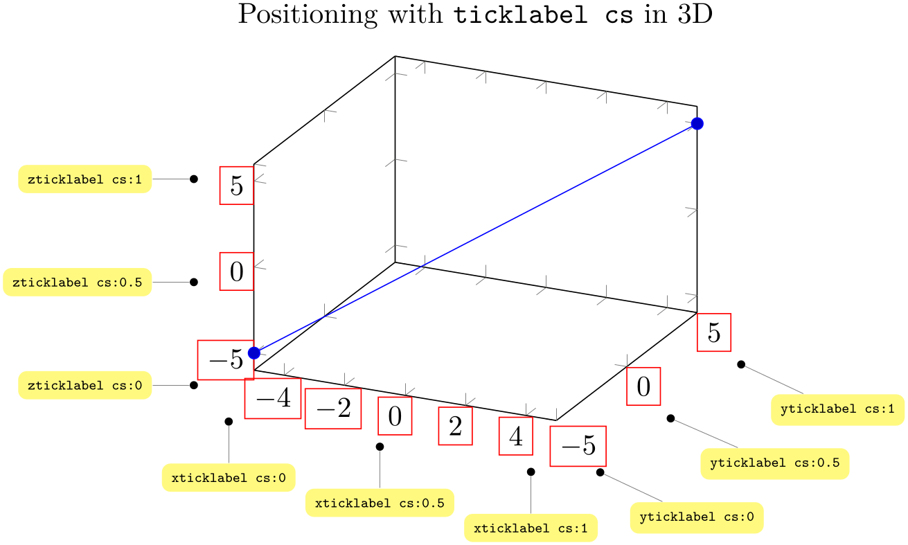
Of course, it is relatively simple to get the same coordinates as in the two dimensional example above with axis description cs, except that ticklabel cs always respects the tick label sizes appropriately. However, ticklabel cs becomes far superior when it comes to three dimensional positioning:
% Preamble: \pgfplotsset{width=7cm,compat=1.18}
% the same as above for 3D ...
\begin{tikzpicture}
\tikzset{
every pin/.style={fill=yellow!50!white,rectangle,rounded corners=3pt,font=\tiny},
small dot/.style={fill=black,circle,scale=0.3},
}
\begin{axis}[
ticklabel style={draw=red},
clip=false,
title=Positioning with \texttt{ticklabel cs} in 3D,
]
                            \addplot3
                    coordinates {(-5,-5,-5) (5,5,5)};
\node [small dot,pin=-90:{\texttt{xticklabel cs:0}}] at (xticklabel cs:0) {};
\node [small dot,pin=-90:{\texttt{xticklabel cs:0.5}}] at (xticklabel cs:0.5) {};
\node [small dot,pin=-90:{\texttt{xticklabel cs:1}}] at (xticklabel cs:1) {};
\node [small dot,pin=-45:{\texttt{yticklabel cs:0}}] at (yticklabel cs:0) {};
\node [small dot,pin=-45:{\texttt{yticklabel cs:0.5}}] at (yticklabel cs:0.5) {};
\node [small dot,pin=-45:{\texttt{yticklabel cs:1}}] at (yticklabel cs:1) {};
\node [small dot,pin=180:{\texttt{zticklabel cs:0}}] at (zticklabel cs:0) {};
\node [small dot,pin=180:{\texttt{zticklabel cs:0.5}}] at (zticklabel cs:0.5) {};
\node [small dot,pin=180:{\texttt{zticklabel cs:1}}] at (zticklabel cs:1) {};
\end{axis}
\end{tikzpicture}
The coordinate ticklabel cs:0 is associated with the lower axis limit while ticklabel cs:1 is near the upper axis limit. The value 0.5 is in the middle of the axis, any other values (including negative values or values beyond \(1\)) are linearly interpolated in-between.
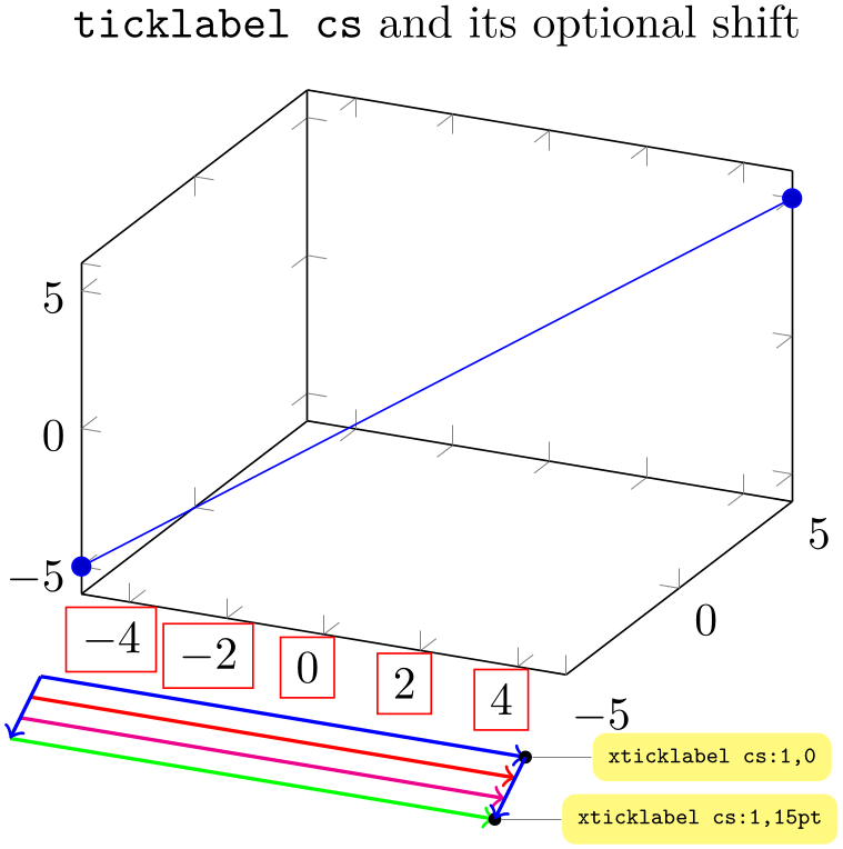
All coordinate systems like ticklabel cs also accepts a second (optional) argument: a shift “away” from the tick labels. The shift points to a vector which is orthogonal the associated axis,45 away from the tick labels. A shift of 0pt is directly at the edge of the tick labels in direction of the normal vector, positive values move the position away and negative closer to the tick labels.
% Preamble: \pgfplotsset{width=7cm,compat=1.18}
\tikzset{
every pin/.style={fill=yellow!50!white,rectangle,rounded corners=3pt,font=\tiny},
small dot/.style={fill=black,circle,scale=0.3},
}
\begin{tikzpicture}
\begin{axis}[
xticklabel style={draw=red},
clip=false,
title=\texttt{ticklabel cs} and its optional shift,
]
                            \addplot3
                    coordinates {(-5,-5,-5) (5,5,5)};
\draw [blue,thick,->] (xticklabel cs:0,0) -- (xticklabel cs:1,0);
\draw [red,thick,->] (xticklabel cs:0,5pt) -- (xticklabel cs:1,5pt);
\draw [magenta,thick,->] (xticklabel cs:0,10pt) -- (xticklabel cs:1,10pt);
\draw [green,thick,->] (xticklabel cs:0,15pt) -- (xticklabel cs:1,15pt);
\node [small dot,pin=0:{\texttt{xticklabel cs:1,0}}] at (xticklabel cs:1,0) {};
\node [small dot,pin=0:{\texttt{xticklabel cs:1,15pt}}] at (xticklabel cs:1,15pt) {};
\draw [blue,thick,->] (xticklabel cs:0,0) -- (xticklabel cs:0,15pt);
\draw [blue,thick,->] (xticklabel cs:1,0) -- (xticklabel cs:1,15pt);
\end{axis}
\end{tikzpicture}
Whenever the ticklabel cs is used, the anchor should be set to anchor=near ticklabel (see below).
Whenever the starred version ticklabel* cs is used, both anchors anchor=near ticklabel and anchor=near ticklabel opposite are useful choices.
There is one specialty: if you reverse an axis (with x dir=reverse), points provided by ticklabel cs will be unaffected by the axis reversal. This is intended to provide consistent placement even for reversed axes. Use allow reversal of rel axis cs=false to disable this feature.
The purpose of ticklabel cs is to place nodes “next to tick labels”. The position of tick labels as such is determined in a similar way to ticklabel* cs with a customized shift along the outer normal vector. The shift is typically
\pgfkeysvalueof{/pgfplots/major tick length} (or half of it for centered axes).
Besides the mentioned positioning methods, there is also the predefined node
current axis. The anchors of current axis can also be used to place
descriptions: At the time when axis descriptions are drawn, all anchors which refer to the axis origin (that means the
“real” point \((0,0)\)) or any of the axis corners can be referenced using current axis. anchor name
 . Please see Section 4.19, Alignment, for further details.
44 This was different in versions before 1.3: earlier versions did not have the distinction between axis description cs and rel axis cs.
45 Actually, the outer normal has the impression of being “orthogonal” to its axis, which appears to be sufficient.
4.9.2Alignment of Axis Descriptions
This section describes how to modify the default alignment of axis descriptions. It can be skipped at first reading.
The two topics positioning and alignment always work together: positioning means to select an appropriate coordinate and alignment means to select an anchor inside of the description which will actually be moved to the desired position.
TikZ uses many anchors to provide alignment; most of them are named like north, north east etc. These names hold for any axis description as well (as axis descriptions are TikZ nodes). Readers can learn details about this topic in the PGF/TikZ manual or some more advice in Section 4.19.
When it comes to axis descriptions, pgfplots offers some specialized anchors and alignment methods which are described below.
-
Anchor near xticklabel 
-
Anchor near yticklabel 
-
Anchor near zticklabel 
-
Anchor near ticklabel 
These anchors can be used to align at the part of a node (for example, an axis description) which is nearest to the tick labels of a particular axis (or nearest to the position where tick labels would have been drawn if there were any).
These anchors are used for axis labels, especially for three dimensional axes. Furthermore, they are used for every tick label.
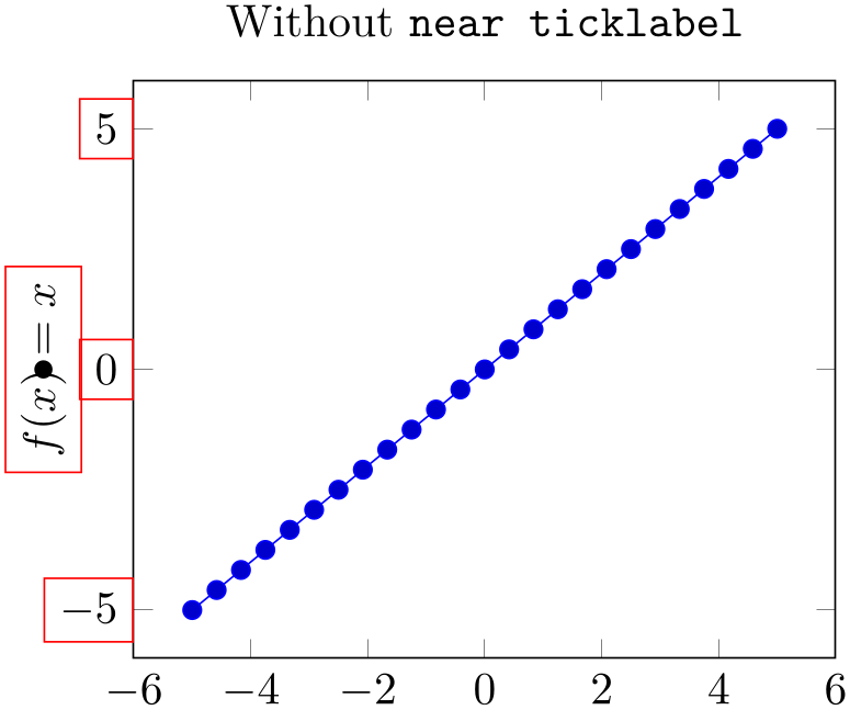
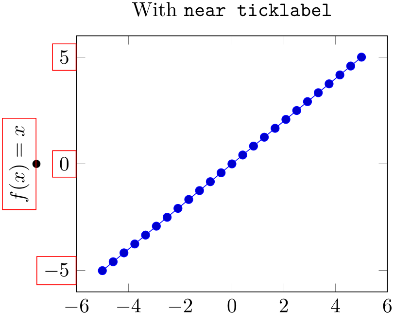
Maybe it is best to demonstrate it by example:
% Preamble: \pgfplotsset{width=7cm,compat=1.18}
\begin{tikzpicture}
\begin{axis}[
title=Without \texttt{near ticklabel},
ylabel={$f(x)=x$},
every axis y label/.style={
at={(ticklabel cs:0.5)},rotate=90,anchor=center,
},
                            clip=false,                 %
                    to display the \path below
ylabel style={draw=red},
yticklabel style={draw=red},
]
\addplot {x};
% visualize the position:
\fill (yticklabel cs:0.5) circle(2pt);
\end{axis}
\end{tikzpicture}
\begin{tikzpicture}
\begin{axis}[
title=With \texttt{near ticklabel},
ylabel={$f(x)=x$},
every axis y label/.style={
at={(ticklabel cs:0.5)},rotate=90,anchor=near ticklabel,
},
clip=false,
ylabel style={draw=red},
yticklabel style={draw=red},
]
\addplot {x};
\fill (yticklabel cs:0.5) circle(2pt);
\end{axis}
\end{tikzpicture}
The motivation is to place nodes such that they are anchored next to the tick label, regardless of the node’s rotation or the position of ticks. The special anchor near ticklabel is only available for axis labels (as they have a uniquely identified axis, either \(x\), \(y\) or \(z\)).
In more detail, the anchor is placed such that first, the node’s center is on a line starting in the node’s at position going in direction of the inwards normal vector of the axis line which contains the tick labels and second, the node does not intrude the axis (but see also the key near ticklabel align and the details in the lengthy elaboration in the documentation for near xticklabel opposite below). This normal vector is the same which is used for the shift argument in ticklabel cs: it is orthogonal to the tick label axis. Furthermore, near ticklabel inverts the transformation matrix before it computes this intersection point.
The near ticklabel anchor and its friends will be added temporarily to any shape used inside of an axis. This includes axis descriptions, but it is not limited to them: it applies to every TikZ \node[anchor=near xticklabel] ... setting.
Note that it is not necessary at all to have tick labels in an axis. The anchor will be placed such that it is near the axis on which tick labels would be drawn. In fact, every tick label uses anchor=near ticklabel as initial configuration.
-
Anchor near xticklabel opposite 
-
Anchor near yticklabel opposite 
-
Anchor near zticklabel opposite 
-
Anchor near ticklabel opposite 
These anchors are similar to near xticklabel and its variants, except that they align at the opposite direction.
Mathematically speaking, the only difference to near xticklabel and its variants is the sign in front of the normal vector.
But it is probably best explained by means of an example.
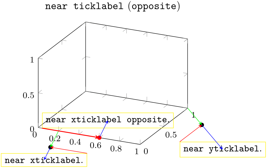
% Preamble: \pgfplotsset{width=7cm,compat=1.18}
\begin{tikzpicture}
\begin{axis}[
clip=false,
small,
title=\texttt{near ticklabel} (\texttt{opposite}),
min=0, max=1,
]
\node [draw=yellow,anchor=near xticklabel,font=\small]
(namex) at (xticklabel cs:0.2) {\texttt{near xticklabel}.};
\fill (xticklabel cs:0.2) circle(2pt);
\draw [green,-stealth] (xticklabel* cs:0.2) -- (xticklabel cs:0.2);
\draw [blue,-stealth] (xticklabel cs:0.2) -- (namex.center);
                            \draw [red,-stealth]   (namex.north
                    east)   -- (xticklabel cs:0.2);
\node [draw=yellow,anchor=near xticklabel opposite,font=\small]
(namexx) at (xticklabel* cs:0.6) {\texttt{near xticklabel opposite}.};
\fill [red] (xticklabel* cs:0.6) circle(2pt);
\draw [blue,-stealth] (xticklabel* cs:0.6) -- (namexx.center);
\draw [red,thick,-stealth] (namexx.south west) -- (xticklabel* cs:0.6);
\node [draw=yellow,anchor=near yticklabel,font=\small]
(name) at (yticklabel cs:1) {\texttt{near yticklabel}.};
\fill (yticklabel cs:1) circle(2pt);
\draw [green,-stealth] (yticklabel* cs:1) -- (yticklabel cs:1);
\draw [blue,-stealth] (yticklabel cs:1) -- (name.center);
                            \draw [red,-stealth]   (name.north west)  --
                    (yticklabel cs:1);
\end{axis}
\end{tikzpicture}
The figure is a boxed three-dimensional axis with standard ranges. It has three manually placed nodes. The nodes are placed at (xticklabel cs:0.2), at (xticklabel* cs:0.6), and at (yticklabel cs:1), respectively. The ‘at’ locations are visually emphasized using filled circles.
Despite the different locations, we clearly see the effect of near xticklabel opposite: it causes the node to be aligned into the box rather than outside of the box. Note that this is the only essential difference between the two nodes ‘near xticklabel opposite’ and ‘near xticklabel’.
The figure also shows the difference between xticklabel cs and xticklabel* cs when we compare the ‘at’ locations. Take, for example, the two nodes on the \(x\)-axis. The position at (xticklabel cs:0.2) is shifted by the green arrow. The length of this arrow is precisely the length of the largest \(x\) tick label. The position at (xticklabel* cs:0.6) is exactly on the axis; it ignores the size of any tick labels. Note that the direction of the green arrow is the “outer normal vector in \(x\) direction” (in our case, it is the vector sum of the \(z\) and \(y\) unit vectors with appropriate signs).
The difference between near xticklabel opposite and near xticklabel is that the direction of the green arrow (the “outer normal”) is flipped.
The nodes also highlight how the anchoring works. This technique is almost the same for both anchor=near xticklabel and anchor=near xticklabel opposite. Let us discuss the technique for the node with text ‘near yticklabel’. The black circle is placed at (yticklabel cs:1). This position has been computed by starting at \(100\%\) of the \(y\)-axis46 and moving along the green vector whose magnitude is the size of the bounding box of the largest \(y\) tick label. As soon as the ‘at’ location is fixed, the algorithm for near yticklabel starts. First, it computes the anchor inside of the node for which we do not penetrate the \(y\)-axis. To this end, it checks the direction of the green vector. It came up with north west. Then, it considers the red line which starts at (name.north west) and has the same direction as the \(y\)-axis. Note that the red line and the \(y\)-axis are parallel. It also considers the blue line. This line points into the direction of the green line and is fixed by the current node’s center. The precise intersection point of the red line and the blue line are the result of anchor=near yticklabel. The same applies for the other two nodes as well: the red line is always parallel to the axis under consideration and is anchored at the “snap to nearest anchor” of the node. The blue line is always parallel to the outer normal vector of the axis under consideration, and is anchored at the current node’s center.
-
/pgfplots/near ticklabel align=inside|center|outside (initially center) 
Allows to change the alignment algorithm of anchor=near ticklabel.
In the default configuration, anchor=near ticklabel and its variants take the node’s center in order to derive the final anchor. This corresponds to the target of the blue line in the illustration for near xticklabel opposite, see above.
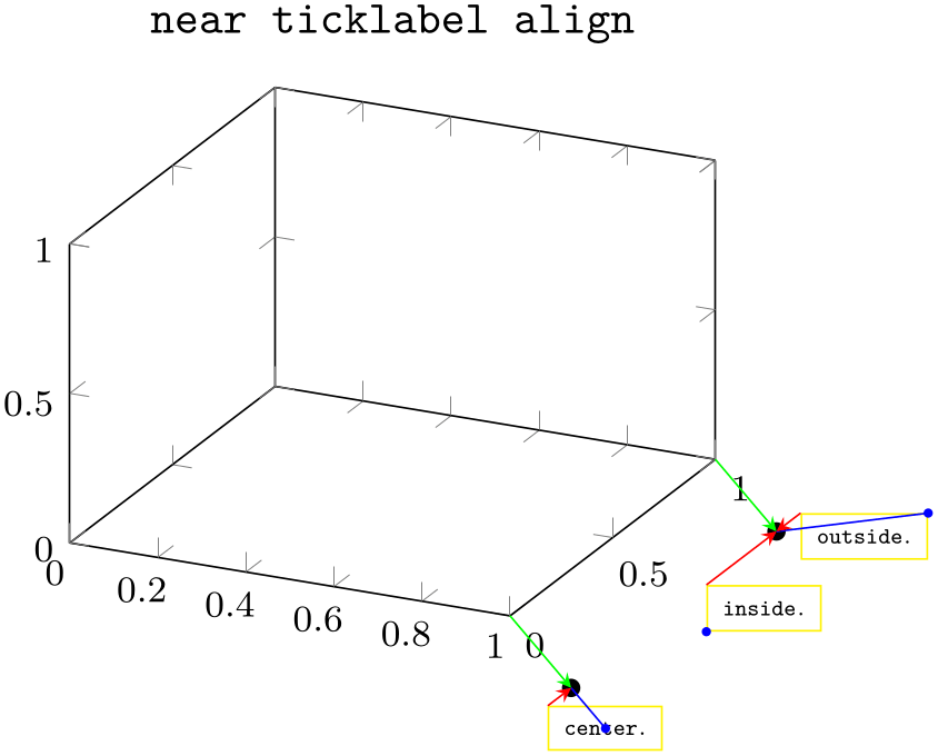
This key changes the node’s anchor which is used here. The choice center can move half of the node’s bounding box beyond the associated axis. The choice inside moves the complete node’s bounding box in a way such that it is not beyond the associated axis. The choice outside moves the entire node’s bounding box in a way that it is beyond the associated axis:
% Preamble: \pgfplotsset{width=7cm,compat=1.18}
\begin{tikzpicture}
\begin{axis}[
clip=false,
small,
title=\texttt{near ticklabel align},
min=0, max=1,
/tikz/node style/.style={
draw=yellow,
anchor=near yticklabel,
font=\tiny,
},
]
\node [node style,/pgfplots/near ticklabel align=center]
(C) at (yticklabel cs:0) {\texttt{center}.};
\node [node style,/pgfplots/near ticklabel align=inside]
(I) at (yticklabel cs:1) {\texttt{inside}.};
\node [node style,/pgfplots/near ticklabel align=outside]
(O) at (yticklabel cs:1) {\texttt{outside}.};
\fill (yticklabel cs:0) circle(2pt);
\fill (yticklabel cs:1) circle(2pt);
\fill [blue] (C.center) circle(1pt);
\fill [blue] (I.south west) circle(1pt);
\fill [blue] (O.north east) circle(1pt);
\draw [green,-stealth] (yticklabel* cs:0) -- (yticklabel cs:0);
\draw [blue] (yticklabel cs:0) -- (C.center);
                            \draw [red,-stealth]    (C.north
                    west)     -- (yticklabel cs:0);
\draw [green,-stealth] (yticklabel* cs:1) -- (yticklabel cs:1);
\draw [blue] (yticklabel cs:1) -- (O.north east);
                            \draw [red,-stealth]    (O.north
                    west)     -- (yticklabel cs:1);
                            \draw [red,-stealth]    (I.north
                    west)     -- (yticklabel cs:1);
\end{axis}
\end{tikzpicture}
The example is similar to the one above: it generates an empty axis with a default range. Then, it creates three nodes: one for choice center, one for choice inside, and one for choice outside. The node for center is placed at (yticklabel cs:0) (lower black circle). We see that its bounding box extends the size of the \(y\)-axis. This is because its anchor C.center is used for the alignment. Both the node for inside and the node for outside are placed at (yticklabel cs:1) (upper black circle). Their only difference is the choice for near ticklabel align. The node for inside does not extend the size of the \(y\)-axis; it is placed within its boundaries – because its internal anchor (I.north east) (blue) has automatically been used in order to align the node. The node for outside is completely outside of the extends for the \(y\)-axis because its (blue) anchor (O.south west) has been chosen.
Note that the red lines are always the same. They are the “snap to nearest” anchor such that the node is outside of the axis. Only the location of the blue anchors is affected by this key.
Note that near ticklabel align always results in the same alignment, independent of the actual position of the node. This is because an anchor is independent of the at location of a node. In this context, the names “inside” and “outside” might be a bad choice: they stress the intended meaning if the node is chosen at the upper end of the axis. However, if you say at (yticklabel cs:0), near ticklabel align=inside, it will actually end up outside of the axis. This is because the “inside” anchor has been computed without considering where the node is.
-
/pgfplots/near ticklabel at={
 coordinate
 } (initially empty)
Occasionally, anchor=near ticklabel results in a different anchor depending on where the node is placed. This can happen for a polaraxis.
If this key is needed, pgfplots will spit out the warning “The anchor ‘near ticklabel’ cannot be computed correctly because the position is missing. Please add ‘near ticklabel at=coordinate’ with a suitable coordinate”.
pgfplots uses context information to determine the correct information, so this may be
unnecessary. If you encounter this warning, you should add
near ticklabel at= value
value with a suitable value.
-
/tikz/sloped like x axis(no value) 
-
/tikz/sloped like y axis(no value) 
-
/tikz/sloped like z axis(no value) 
-
/tikz/sloped like x axis={
 options
 }
}
-
/tikz/sloped like y axis={
 options
 }
}
-
/tikz/sloped like z axis={
 options
 }
}
-
/pgfplots/sloped/allow upside down=true|false (initially false) 
-
/pgfplots/sloped/execute for upside down=code (initially empty) 
-
/pgfplots/sloped/reset nontranslations=true|false (initially true) 
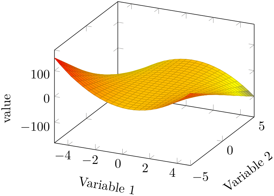
A key which replaces the rotational/scaling parts of the transformation matrix such that the node is sloped like the provided axis. For two dimensional plots, sloped like y axis is effectively the same as rotate=90. For a three dimensional axis, this will lead to a larger difference:
% Preamble: \pgfplotsset{width=7cm,compat=1.18}
\begin{tikzpicture}
\begin{axis}[
xlabel=Variable 1,
ylabel=Variable 2,
zlabel=value,
xlabel style={sloped like x axis},
ylabel style={sloped},
]
\addplot3 [surf] {y*x*(1-x)};
\end{axis}
\end{tikzpicture}
Inside of axis labels, sloped is an alias for
sloped like  char
char axis with the correct
 char
char chosen automatically.
Please note that rotated text might not look very good (neither on screen nor printed).
It is possible to customize
sloped like x axis by means of the
following keys, which need to be provided as
 options
 (simply ignore the lengthy gray key prefixes):
Use sloped like x axis=allow upside down to enable upside down labels.
Use sloped like x axis={execute for upside down=\tikzset{anchor=north}} or something like that to handle upside down text nodes in a customized way (this is used by the smithchart library).
Use sloped like x axis={reset nontranslations=false} to append the transformations to the actual transformation matrix (instead of replacing it).
4.9.3Labels
-
/pgfplots/xlabel={
 text
text }
}
-
/pgfplots/ylabel={
 text
text }
}
-
/pgfplots/zlabel={
 text
text }
}
These options set axis labels to
 text
text which is any
TeX
text.
To include special characters, you can use curly braces: “xlabel={, = characters}”. This is necessary if characters like ‘=’ or ‘,’ need to be included literally.
Use
xlabel/.add={ prefix
 }{
}{ suffix
 } to modify an already assigned label.
Labels are TikZ nodes which are placed with
% for x:
\node [
style=every axis label,
style=every axis x label,
]
% for y:
\node [
style=every axis label,
style=every axis y label,
]
so their position and appearance can be customized.
For example, a multiline xlabel can be configured using
                    \begin{axis}[xlabel style={align=right,text width=3cm},xlabel=A quite long label
                    with a line break]
...
\end{axis}
See the PGF/TikZ manual to learn more about align and text width.
Since version 1.3, label placement can respect the size of adjacent tick labels. Use \pgfplotsset{compat=1.3} (or newer) in the preamble to activate this feature. See xlabel near ticks for details.
-
/pgfplots/xlabel shift={
 dimension
 } (initially 0pt)
-
/pgfplots/ylabel shift={
 dimension
 } (initially 0pt)
-
/pgfplots/zlabel shift={
 dimension
 } (initially 0pt)
-
/pgfplots/label shift={
 dimension
 }
}
Shifts labels in direction of the outer normal vector of
the axis by an amount of
 dimension
 . The label shift sets all three label
shifts to the same value.
This does only work if \pgfplotsset{compat=1.3} (or newer) has been called (more precisely: if xlabel near ticks is active for the respective axis).
-
/pgfplots/xlabel near ticks(no value) 
-
/pgfplots/ylabel near ticks(no value) 
-
/pgfplots/zlabel near ticks(no value) 
-
/pgfplots/compat=1.3
These keys place axis labels (like xlabel) near the tick labels. If tick labels are small, labels will move closer to the axis. If tick labels are large, axis labels will move away from the axis. This is the default for every three dimensional plot, but it won’t be used initially for two-dimensional plots for backwards compatibility. Take a look at the definition of near ticklabel for an example.
The definition of these styles is
\pgfplotsset{
/pgfplots/xlabel near ticks/.style={
/pgfplots/every axis x label/.style={
at={(ticklabel cs:0.5)},anchor=near ticklabel,
},
},
/pgfplots/ylabel near ticks/.style={
/pgfplots/every axis y label/.style={
at={(ticklabel cs:0.5)},rotate=90,anchor=near ticklabel,
},
},
}
It is encouraged to write
\pgfplotsset{compat=1.3} % or newer
in your preamble to install the styles document-wide – it leads to the best output (it avoids unnecessary space). It is not activated initially for backwards compatibility with older versions which used fixed distances from the tick labels.
-
/pgfplots/xlabel absolute(no value) 
-
/pgfplots/ylabel absolute(no value) 
-
/pgfplots/zlabel absolute(no value) 
-
/pgfplots/compat=pre 1.3
Installs placement styles for axis labels such that xlabel yields a description of absolute, fixed distance to the axis. This is the initial configuration (for backwards compatibility with versions before 1.3). Use compat=1.3 to get the most recent, more flexible configuration. Take a look at the definition of near ticklabel for an example.
These styles are defined by
\pgfplotsset{
/pgfplots/xlabel absolute/.style={
/pgfplots/every axis x label/.style={at={(0.5,0)},below,yshift=-15pt},
/pgfplots/every x tick scale label/.style={
at={(1,0)},yshift=-2em,left,inner sep=0pt,
},
},
/pgfplots/ylabel absolute/.style={
/pgfplots/every axis y label/.style={at={(0,0.5)},xshift=-35pt,rotate=90},
/pgfplots/every y tick scale label/.style={
at={(0,1)},above right,inner sep=0pt,yshift=0.3em,
},
},
}
There is no predefined absolute placement style for three dimensional axes.
Whenever possible, consider using /.append style instead of overwriting the default styles to ensure compatibility with future versions.
-
/pgfplots/title={
 text
text }
}
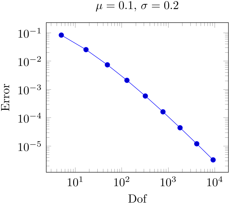
Adds a caption to the plot. This will place a TikZ node with
\node [every axis title] {text};
to the current axis.
% Preamble: \pgfplotsset{width=7cm,compat=1.18}
\begin{tikzpicture}
\begin{loglogaxis}[
xlabel=Dof,ylabel=Error,
title={$\mu=0.1$, $\sigma=0.2$},
]
                        \addplot coordinates
                    {
(5, 8.312e-02)
(17, 2.547e-02)
(49, 7.407e-03)
(129, 2.102e-03)
(321, 5.874e-04)
(769, 1.623e-04)
(1793, 4.442e-05)
(4097, 1.207e-05)
(9217, 3.261e-06)
};
\end{loglogaxis}
\end{tikzpicture}
The title’s appearance and/or placement can be reconfigured with
\pgfplotsset{title style={at={(0.75,1)}}}
% or, equivalently,
\pgfplotsset{every axis title/.append style={at={(0.75,1)}}}
This will place the title at 75% of the \(x\)-axis. The coordinate \((0,0)\) is the lower left corner and \((1,1)\) the upper right one (see axis description cs for details).
Use
title/.add={ prefix
 }{
}{ suffix
 } to modify an already assigned title.
Allows to insert
 commands
 after axis labels, titles and legends have been typeset.
As all other axis descriptions, the code can use \((0,0)\) to access the lower left corner and \((1,1)\) to access the upper right one. It won’t be clipped.
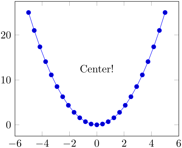
% Preamble: \pgfplotsset{width=7cm,compat=1.18}
\pgfplotsset{
every axis/.append style={
extra description/.code={
\node at (0.5,0.5) {Center!};
},
},
}
\begin{tikzpicture}
\begin{axis}
\addplot {x^2};
\end{axis}
\end{tikzpicture}
4.9.4Legends
Legends can be generated in two ways: the first is to use \addlegendentry or \legend inside of an axis. The other method is to use the key legend entries.
-
\addlegendentry[
 options
 ]{
]{ name
name }
}
Adds a single legend entry to the legend list. This will also enable legend drawing.
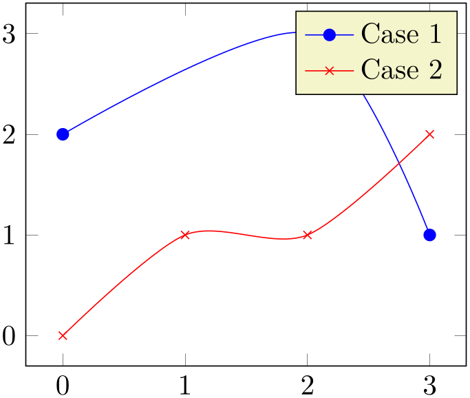
% Preamble: \pgfplotsset{width=7cm,compat=1.18}
\begin{tikzpicture}
\begin{axis}
                        \addplot [smooth,mark=*,blue] coordinates
                    {
(0,2)
(2,3)
(3,1)
};
                        \addlegendentry{Case
                    1}
\addplot [smooth,color=red,mark=x]
coordinates {
(0,0)
(1,1)
(2,1)
(3,2)
};
                        \addlegendentry{Case
                    2}
\end{axis}
\end{tikzpicture}
It does not matter where \addlegendentry commands are placed, only the sequence matters. You will need one \addlegendentry for every \addplot command (unless you prefer an empty legend).
The optional
 options
 affect how the text is drawn; they apply only for this particular description text. For example,
\addlegendentry[red]{Text} would yield a
red legend text. Behind the scenes, the text is placed with
\node[
 options
 ] {
] { name
name };, so
 options
 can be any TikZ option which affects nodes.
Using \addlegendentry disables the key legend entries.
-
\addlegendentryexpanded[
 options
 ]{
]{ TeX
text
 }
}
A variant of
\addlegendentry which provides a method to
deal with macros inside of
 TeX
text
 .
.
Suppose
 TeX
text
 contains some sort of parameter which varies for every plot. Moreover, you like to use a loop to generate the
plots. Then, it is simpler to use
\addlegendentryexpanded:
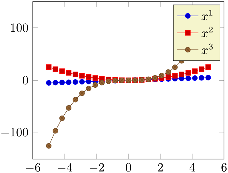
% Preamble: \pgfplotsset{width=7cm,compat=1.18}
\begin{tikzpicture}
\begin{axis}
                        \foreach \p in
                    {1,2,3} {
\addplot {x^\p};
\addlegendentryexpanded{$x^\p$}
}
\end{axis}
\end{tikzpicture}
Note that this example wouldn’t have worked with \addlegendentry{$x^\p$} because the macro \p is no longer defined when pgfplots attempts to draw the legend.
The invocation \addlegendentryexpanded{$x^\p$} is equivalent to calling \addlegendentry{$x^2$} if \p expands to 2.
The argument
 TeX
text
 is expanded until nothing but un-expandable material remains (i.e. it uses the
TeX
primitive \edef). Occasionally,
 TeX
text
 contains parts which should be expanded (like \p) and other parts which should be left unexpanded (for example
\pgfmathprintnumber{\p}). Then, use
\noexpand\pgfmathprintnumber{\p}
or, equivalently
\protect\pgfmathprintnumber{\p}
to avoid expansion of the macro which follows the \protect immediately.
-
\legend{
 list
list }
}
You can use
\legend{ list
list } to assign a complete legend.
\legend{$d=2$,$d=3$,$d=4$,$d=5$,$d=6$}
The argument of \legend is a list of entries, one for each plot.
Two different delimiters are supported:
to avoid confusion with the dots ... notation, you may need to encapsulate a legend entry containing periods by curly braces: \legend{{ML spcm.},{CW spcm.},{ML AC}} (or use the \\ delimiter, see below).
2. It is also possible to delimit the list by ‘\\’. In this case, the last element must be terminated by \\ as well:
\legend{$a=1, b=2$\\,$a=2, b=3$\\$a=3, b=5$\\}
This syntax simplifies the use of ‘,’ inside of legend entries, but it does not support the dots notation.
The short marker/line combination shown in legends is acquired from the
 style options
 argument of \addplot.
Using \legend overwrites any other existing legend entries.
-
/pgfplots/legend entries={
 comma separated list
 }
}
This key can be used to assign legend entries just like the commands \addlegendentry and \legend. Again, the positioning is relative to the axis rectangle (unless units like cm or pt are specified explicitly).

% Preamble: \pgfplotsset{width=7cm,compat=1.18}
\begin{tikzpicture}
\begin{axis}[
legend entries={$x$,$x^2$},
]
\addplot {x};
\addplot {x^2};
\end{axis}
\end{tikzpicture}
The commands for legend creation take precedence: the key legend entries is only considered if there is no legend command in the current axis.
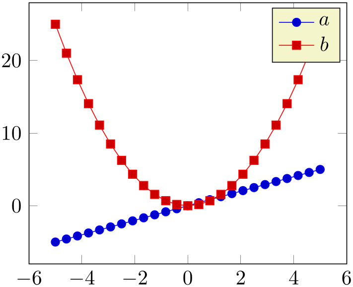
% Preamble: \pgfplotsset{width=7cm,compat=1.18}
\begin{tikzpicture}
\begin{axis}[
legend entries={$x$,$x^2$},
]
\addplot {x};
\addplot {x^2};
\legend{$a$,$b$} % overrides the option
\end{axis}
\end{tikzpicture}
Please be careful with whitespaces in
 comma separated list
 : they will contribute to legend entries. Consider using ‘%’ at the end of each line in multiline
arguments (the end of line character is also a whitespace in
TeX).
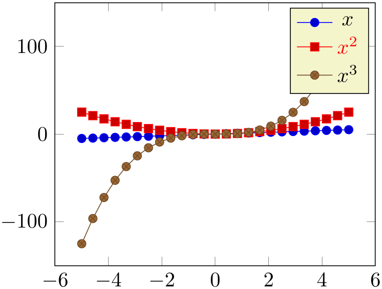
Just as for \addlegendentry, it is possible to provide [ options
 ] to single descriptions. To do so, place the options in square brackets right before the text:
% Preamble: \pgfplotsset{width=7cm,compat=1.18}
\begin{tikzpicture}
\begin{axis}[
legend entries={$x$,[red]$x^2$,$x^3$},
]
\addplot {x};
\addplot {x^2};
\addplot {x^3};
\end{axis}
\end{tikzpicture}
If the square brackets contain a comma, you can enclose the complete entry in curly braces like {[red,font=\Huge]Text} (or you can use the ‘\\’ delimiters).
4.9.5Legend Appearance
-
/pgfplots/every axis legend(style, no value) 
The style “every axis legend” determines the legend’s position and outer appearance:
will draw it at the lower left corner of the axis while
means the upper right corner. The ‘anchor’ option determines which point of the legend will be placed at \((0,0)\) or \((1,1)\).
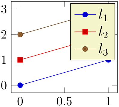
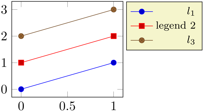
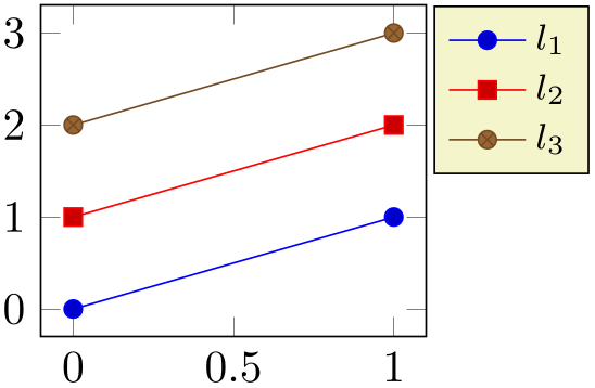
The legend is a TikZ matrix, so one can use any TikZ option which affects nodes and matrices (see the PGF/TikZ manual). The matrix is created by something like
\matrix [style=every axis legend] {
                        draw plot specification 1 &
                    \node{legend 1}\\
                        draw plot specification 2 &
                    \node{legend 2}\\
...
};
% Preamble: \pgfplotsset{width=7cm,compat=1.18}
\begin{tikzpicture}
\begin{axis}[
% this modifies 'every axis legend':
legend style={font=\large},
]
                        \addplot coordinates
                    {(0,0) (1,1)};
                        \addplot coordinates
                    {(0,1) (1,2)};
                        \addplot coordinates
                    {(0,2) (1,3)};
\legend{$l_1$,$l_2$,$l_3$}
\end{axis}
\end{tikzpicture}
% Preamble: \pgfplotsset{width=7cm,compat=1.18}
\begin{tikzpicture}
\begin{axis}[
% align right:
legend style={
cells={anchor=east},
legend pos=outer north east,
},
]
                        \addplot coordinates
                    {(0,0) (1,1)};
                        \addplot coordinates
                    {(0,1) (1,2)};
                        \addplot coordinates
                    {(0,2) (1,3)};
                        \legend{$l_1$, legend
                    $2$,$l_3$}
\end{axis}
\end{tikzpicture}
% Preamble: \pgfplotsset{width=7cm,compat=1.18}
% similar placement as previous example:
\pgfplotsset{
every axis legend/.append style={
at={(1.02,1)},
anchor=north west,
},
}
\begin{tikzpicture}
\begin{axis}
                        \addplot coordinates
                    {(0,0) (1,1)};
                        \addplot coordinates
                    {(0,1) (1,2)};
                        \addplot coordinates
                    {(0,2) (1,3)};
\legend{$l_1$,$l_2$,$l_3$}
\end{axis}
\end{tikzpicture}
Use legend columns={ number
 } to configure the number of horizontal legend entries.
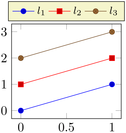
% Preamble: \pgfplotsset{width=7cm,compat=1.18}
\begin{tikzpicture}
\pgfplotsset{
every axis legend/.append style={
at={(0.5,1.03)},
anchor=south
},
}
\begin{axis}[
legend columns=4,
]
                        \addplot coordinates
                    {(0,0) (1,1)};
                        \addplot coordinates
                    {(0,1) (1,2)};
                        \addplot coordinates
                    {(0,2) (1,3)};
\legend{$l_1$,$l_2$,$l_3$}
\end{axis}
\end{tikzpicture}
Instead of the /.append style, it is possible to use legend style as in the following example. It has the same effect.
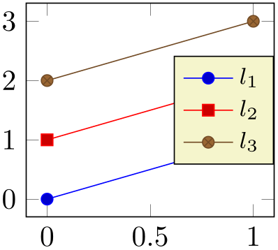
% Preamble: \pgfplotsset{width=7cm,compat=1.18}
\begin{tikzpicture}
\begin{axis}[
legend style={
at={(1,0.5)},
anchor=east},
]
                        \addplot coordinates
                    {(0,0) (1,1)};
                        \addplot coordinates
                    {(0,1) (1,2)};
                        \addplot coordinates
                    {(0,2) (1,3)};
\legend{$l_1$,$l_2$,$l_3$}
\end{axis}
\end{tikzpicture}
The default every axis legend style is
\pgfplotsset{every axis legend/.style={
cells={anchor=center},% Centered entries
                            inner xsep=3pt,inner ysep=2pt,nodes={inner sep=2pt,text
                    depth=0.15em},
anchor=north east,
shape=rectangle,
fill=white,
draw=black,
at={(0.98,0.98)},
}
}
Whenever possible, consider using /.append style to keep the default styles active. This ensures compatibility with future versions.
Note that in order to disable drawing of the legend box, you can use draw=none as style argument:

% Preamble: \pgfplotsset{width=7cm,compat=1.18}
\begin{tikzpicture}
\begin{axis}[
tiny,
title=With legend box,
]
\addplot [blue]{x};
\addplot [red]{2*x};
\legend{$x$,$2x$}
\end{axis}
\end{tikzpicture}
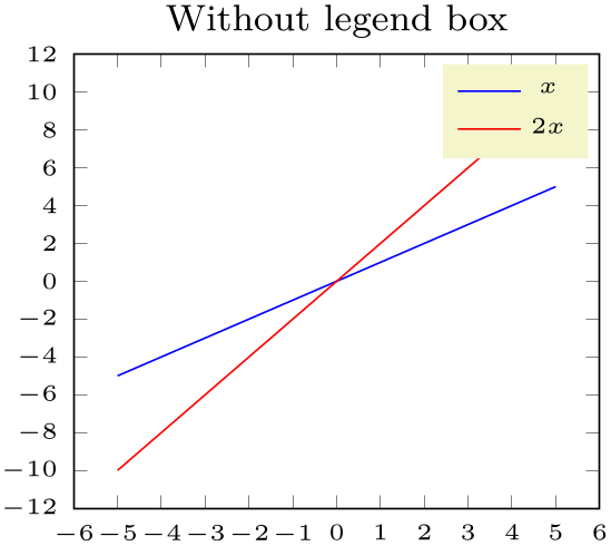
% Preamble: \pgfplotsset{width=7cm,compat=1.18}
\begin{tikzpicture}
\begin{axis}[
tiny,
title=Without legend box,
legend style={draw=none},
]
\addplot [blue]{x};
\addplot [red]{2*x};
\legend{$x$,$2x$}
\end{axis}
\end{tikzpicture}
-
/pgfplots/legend style={
 key-value-list
 }
}
An abbreviation for
every axis legend/.append style={ key-value-list
 }.
}.
It appends options to the already existing style every axis legend.
-
/pgfplots/legend pos=south west|south east|north west|north east|outer north east 
A style which provides shorthand access to some commonly used legend positions.
Each of these styles appends at={( x
x ,
, y
y )},anchor=
 name
name values to every axis legend.

% Preamble: \pgfplotsset{width=7cm,compat=1.18}
\begin{tikzpicture}
\begin{axis}[
legend pos=south west,
]
                        \addplot coordinates
                    {(0,0) (1,1)};
                        \addplot coordinates
                    {(0,1) (1,2)};
                        \addplot coordinates
                    {(0,2) (1,3)};
\legend{$l_1$,$l_2$,$l_3$}
\end{axis}
\end{tikzpicture}
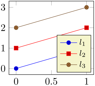
% Preamble: \pgfplotsset{width=7cm,compat=1.18}
\begin{tikzpicture}
\begin{axis}[
legend pos=south east,
]
                        \addplot coordinates
                    {(0,0) (1,1)};
                        \addplot coordinates
                    {(0,1) (1,2)};
                        \addplot coordinates
                    {(0,2) (1,3)};
\legend{$l_1$,$l_2$,$l_3$}
\end{axis}
\end{tikzpicture}
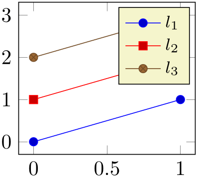
% Preamble: \pgfplotsset{width=7cm,compat=1.18}
\begin{tikzpicture}
\begin{axis}[
legend pos=north east,
]
                        \addplot coordinates
                    {(0,0) (1,1)};
                        \addplot coordinates
                    {(0,1) (1,2)};
                        \addplot coordinates
                    {(0,2) (1,3)};
\legend{$l_1$,$l_2$,$l_3$}
\end{axis}
\end{tikzpicture}
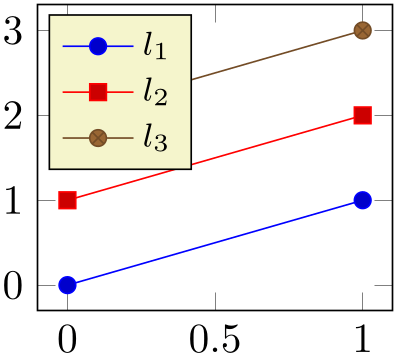
% Preamble: \pgfplotsset{width=7cm,compat=1.18}
\begin{tikzpicture}
\begin{axis}[
legend pos=north west,
]
                        \addplot coordinates
                    {(0,0) (1,1)};
                        \addplot coordinates
                    {(0,1) (1,2)};
                        \addplot coordinates
                    {(0,2) (1,3)};
\legend{$l_1$,$l_2$,$l_3$}
\end{axis}
\end{tikzpicture}
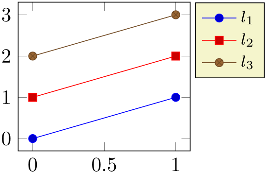
% Preamble: \pgfplotsset{width=7cm,compat=1.18}
\begin{tikzpicture}
\begin{axis}[
                        legend pos=outer north
                    east,
]
                        \addplot coordinates
                    {(0,0) (1,1)};
                        \addplot coordinates
                    {(0,1) (1,2)};
                        \addplot coordinates
                    {(0,2) (1,3)};
\legend{$l_1$,$l_2$,$l_3$}
\end{axis}
\end{tikzpicture}
-
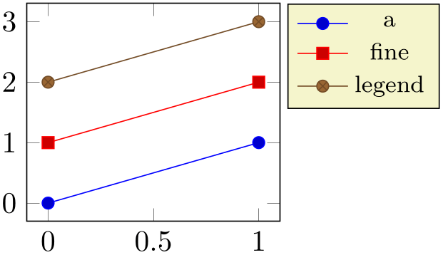
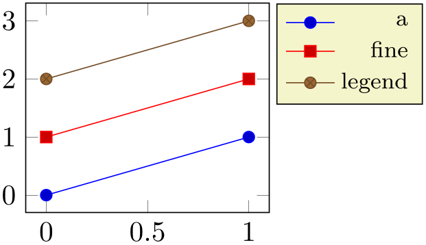
/pgfplots/legend cell align=left|right|center (initially center) 
These keys provide horizontal alignment of legend cells.
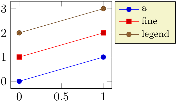
% Preamble: \pgfplotsset{width=7cm,compat=1.18}
\begin{tikzpicture}
\begin{axis}[
legend cell align=left,
                        legend pos=outer north
                    east,
]
                        \addplot coordinates
                    {(0,0) (1,1)};
                        \addplot coordinates
                    {(0,1) (1,2)};
                        \addplot coordinates
                    {(0,2) (1,3)};
\legend{a,fine,legend}
\end{axis}
\end{tikzpicture}
% Preamble: \pgfplotsset{width=7cm,compat=1.18}
\begin{tikzpicture}
\begin{axis}[
legend cell align=center,
                        legend pos=outer north
                    east,
]
                        \addplot coordinates
                    {(0,0) (1,1)};
                        \addplot coordinates
                    {(0,1) (1,2)};
                        \addplot coordinates
                    {(0,2) (1,3)};
\legend{a,fine,legend}
\end{axis}
\end{tikzpicture}
% Preamble: \pgfplotsset{width=7cm,compat=1.18}
\begin{tikzpicture}
\begin{axis}[
legend cell align=right,
                        legend pos=outer north
                    east,
]
                        \addplot coordinates
                    {(0,0) (1,1)};
                        \addplot coordinates
                    {(0,1) (1,2)};
                        \addplot coordinates
                    {(0,2) (1,3)};
\legend{a,fine,legend}
\end{axis}
\end{tikzpicture}
They are actually just styles for commonly used alignment choices: the choice left is equivalent to legend style={cells={anchor=west}}; the second choice right is equivalent to legend style={cells={anchor=east}}, and center to legend style={cells={anchor=center}}. Using different values allows more control over cell alignment.
-
/pgfplots/legend columns={
 number
 }
(default 1)
Allows to configure the maximum number of adjacent legend entries. The default value 1 places legend entries vertically below each other.
Use legend columns=-1 to draw all entries horizontally.
-
/pgfplots/legend plot pos=left|right|none (initially left) 
Configures where the small line specifications will be drawn: left of the description, right of the description or not at all.
-
/pgfplots/every legend image post(style, no value) 
A style which can be used to provide drawing options to every small legend image. These options apply after current plot style has been set, allowing users different line styles for legends than for plots.
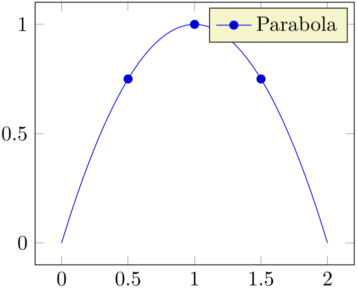
For example, suppose you have a line plot and you plot selected markers on top of it (in the same color). Then, you may want to draw just a single legend entry (which should contain both the line and the markers). The following example shows a solution:
% Preamble: \pgfplotsset{width=7cm,compat=1.18}
\begin{tikzpicture}
\begin{axis}[
legend image post style={mark=*},
]
\addplot+ [only marks,forget plot]
                            coordinates
                    {(0.5,0.75) (1,1) (1.5,0.75)};
\addplot+ [mark=none,smooth,domain=0:2]
{-x*(x-2)};
\addlegendentry{Parabola}
\end{axis}
\end{tikzpicture}
The example has two \addplot commands, one for the line and one for markers. Due to the forget plot option, the marker plot (the first one) doesn’t advance the cycle list. The axis has only one legend entry, and since legend image post style={mark=*} has been used, the legend has a plot mark as well. Due to the forget plot option, the marker plot will not get a separate legend label.
-
/pgfplots/legend image post style={
 key-value-list
 }
}
An abbreviation for
every legend image post/.append style={ key-value-list
 }.
}.
It appends options to the already existing style every legend image post.
Allows to replace the default images which are drawn inside of legends. When this key is evaluated, the current plot specification has already been activated (using \begin{scope}[current plot style])47, so any drawing operations use the same styles as the \addplot command.
The default is the style line legend.
At the time when legend images are drawn, the style every axis legend is in effect – which have unwanted side-effects due to changed parameters (especially those concerning node placement, alignment, and shifting). It might be necessary to reset these parameters manually (pgfplots also attempts to reset the fill color).
-
/pgfplots/line legend(style, no value) 
A style which sets legend image code (back) to its initial value.
Its initial value is
\pgfplotsset{
/pgfplots/line legend/.style={
legend image code/.code={
\draw [mark repeat=2,mark phase=2,##1]
                                    plot
                    coordinates {
(0cm,0cm)
(0.3cm,0cm)
(0.6cm,0cm)
};
},
},
}
The style line legend can also be used to apply a different legend style to one particular plot (see the documentation on area legend for an example).
-
/pgfplots/empty legend(style, no value) 
A style which clears legend image code, thereby omitting the legend image.
-
/pgfplots/area legend(style, no value) 
A style which sets legend image code to
% Preamble: \pgfplotsset{width=7cm,compat=1.18}
% \usetikzlibrary{patterns}
\begin{tikzpicture}
\begin{axis}[area legend,
axis x line=bottom,axis y line=left,
domain=0:1,
legend pos=north west,
axis on top,xmin=0,
]
                        \addplot [pattern=crosshatch
                    dots,
pattern color=blue,draw=blue,
samples=500]
{sqrt(x)} \closedcycle;
\addplot [pattern=crosshatch,
pattern color=blue!30!white,
draw=blue!30!white]
{x^2} \closedcycle;
\addplot [red,line legend]
                            coordinates
                    {(0,0) (1,1)};
\legend{$\sqrt x$,$x^2$,$x$}
\end{axis}
\end{tikzpicture}
-
/pgfplots/xbar legend(no value) 
-
/pgfplots/ybar legend(no value) 
-
/pgfplots/zbar legend(no value) 
-
/pgfplots/xbar interval legend(no value) 
-
/pgfplots/ybar interval legend(no value) 
-
/pgfplots/zbar interval legend(no value) 
-
/pgfplots/single xbar legend(no value) 
-
/pgfplots/single ybar legend(no value) 
-
/pgfplots/single zbar legend(no value) 
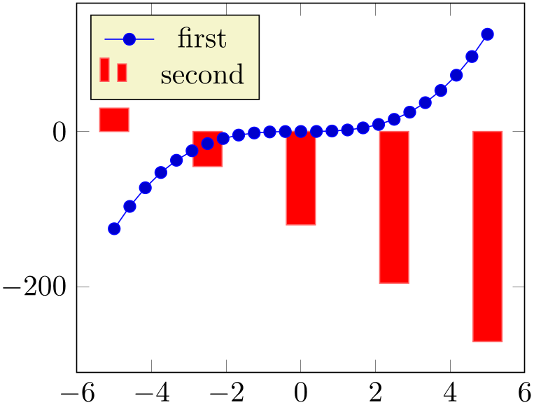
These style keys redefine legend image code such that legends use xbar, ybar or the xbar interval and ybar interval handlers.
% Preamble: \pgfplotsset{width=7cm,compat=1.18}
\begin{tikzpicture}
\begin{axis}[legend pos=north west]
\addplot {x^3};
\addplot [
ybar,
ybar legend,
fill=red,
draw=red!60,
mark=none,
samples=5,
] {-30*(x +4)};
\legend{first,second}
\end{axis}
\end{tikzpicture}
The initial values for these styles might be interesting if someone wants to modify them. Here they are:
\pgfplotsset{
/pgfplots/xbar legend/.style={
/pgfplots/legend image code/.code={
\draw [##1,/tikz/.cd,bar width=3pt,yshift=-0.2em,bar shift=0pt]
                                plot
                    coordinates {(0cm,0.8em) (2*\pgfplotbarwidth,0.6em)};
},
},
/pgfplots/ybar legend/.style={
/pgfplots/legend image code/.code={
\draw [##1,/tikz/.cd,bar width=3pt,yshift=-0.2em,bar shift=0pt]
                                plot
                    coordinates {(0cm,0.8em) (2*\pgfplotbarwidth,0.6em)};
},
},
/pgfplots/xbar interval legend/.style={
/pgfplots/legend image code/.code={
\draw [##1,/tikz/.cd,yshift=-0.2em,bar interval width=0.7,bar interval shift=0.5]
                                plot
                    coordinates {(0cm,0.8em) (5pt,0.6em) (10pt,0.6em)};
},
},
/pgfplots/ybar interval legend/.style={
/pgfplots/legend image code/.code={
\draw [##1,/tikz/.cd,yshift=-0.2em,bar interval width=0.7,bar interval shift=0.5]
                                plot
                    coordinates {(0cm,0.8em) (5pt,0.6em) (10pt,0.6em)};
},
},
/pgfplots/single xbar legend/.style={
/pgfplots/legend image code/.code={
\draw[##1,/tikz/.cd,bar width=6pt,yshift=0.2ex,bar shift=0pt]
                                plot
                    coordinates {(0.8em,0pt)};
},
},
/pgfplots/single ybar legend/.style={
/pgfplots/legend image code/.code={
\draw[##1,/tikz/.cd,bar width=6pt,yshift=-0.2em,bar shift=0pt]
                                plot
                    coordinates {(0pt,0.8em)};
},
},
}
-
/pgfplots/mesh legend(no value) 
Redefines legend image code such that it is compatible with mesh and surf plot handlers (for three dimensional visualization mainly).
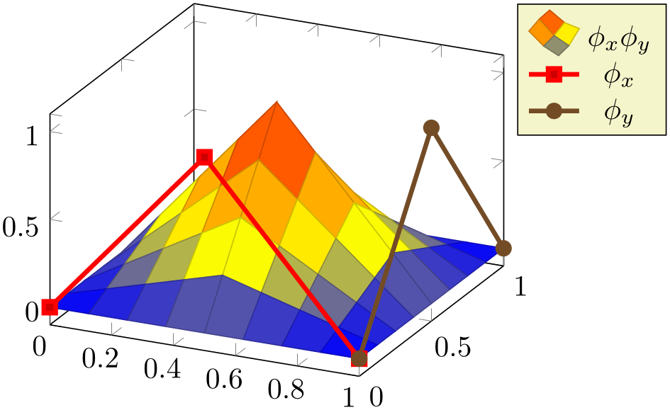
% Preamble: \pgfplotsset{width=7cm,compat=1.18}
\begin{tikzpicture}
\begin{axis}[legend pos=outer north east]
                            \addplot3
                    [surf,samples=9,domain=0:1]
                                {(1-abs(2*(x-0.5))) *
                    (1-abs(2*(y-0.5)))};
\addlegendentry{$\phi_x \phi_y$}
                            \addplot3+ [ultra thick] coordinates
                    {(0,0,0) (0.5,0,1) (1,0,0)};
\addlegendentry{$\phi_x $}
                            \addplot3+ [ultra thick] coordinates
                    {(1,0,0) (1,0.5,1) (1,1,0)};
\addlegendentry{$\phi_y $}
\end{axis}
\end{tikzpicture}
-
/pgfplots/reverse legend=true|false (initially false) 
-
/pgfplots/legend reversed=true|false (initially false) 
Allows to reverse the order in which the pairs (legend entry, plot style) are drawn.

% Preamble: \pgfplotsset{width=7cm,compat=1.18}
\begin{tikzpicture}
\begin{axis}[
reverse legend,
]
\addplot {x};
\addlegendentry{$x$}
\addplot {x^2};
\addlegendentry{$x^2$}
\addplot {x^3};
\addlegendentry{$x^3$}
\end{axis}
\end{tikzpicture}
-
/pgfplots/transpose legend=true|false (initially false) 
-
/pgfplots/legend transposed=true|false (initially false) 
Allows to transpose the order in which the pairs (legend entry, plot style) are drawn.
Consider a set of \(3\) experiments, each consisting of \(2\) parameters. We might want to draw them together as in the following example:
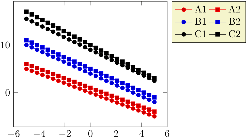
% Preamble: \pgfplotsset{width=7cm,compat=1.18}
\begin{tikzpicture}
\begin{axis}[
legend columns=2,
legend pos=outer north east,
cycle multi list={
                                color
                    list\nextlist
[2 of]mark list
},
]
\addplot {-x}; \addlegendentry{A1}
\addplot {-x+1}; \addlegendentry{A2}
                        \addplot {-1.2*x +
                    4};  \addlegendentry{B1}
                        \addplot {-1.2*x +
                    5};  \addlegendentry{B2}
                        \addplot {-1.3*x +
                    9};  \addlegendentry{C1}
                        \addplot {-1.4*x +
                    10}; \addlegendentry{C2}
\end{axis}
\end{tikzpicture}
An alternative might be to draw them horizontally – then, we’d like to use transpose legend to get a flat legend:
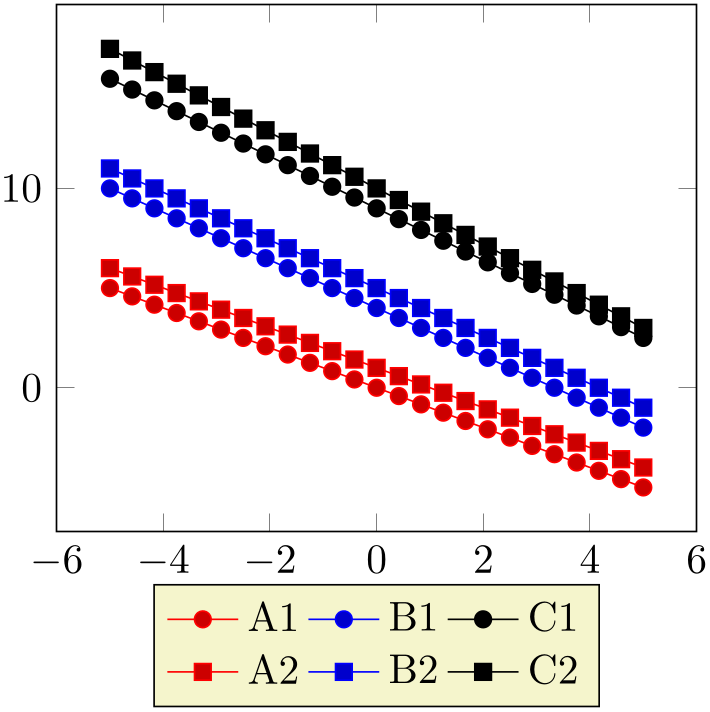
% Preamble: \pgfplotsset{width=7cm,compat=1.18}
\begin{tikzpicture}
\begin{axis}[
transpose legend,
legend columns=2,
legend style={at={(0.5,-0.1)},anchor=north},
cycle multi list={
color list\nextlist
[2 of]mark list
},
]
\addplot {-x}; \addlegendentry{A1}
\addplot {-x+1}; \addlegendentry{A2}
\addplot {-1.2*x +
4}; \addlegendentry{B1}
\addplot {-1.2*x +
5}; \addlegendentry{B2}
\addplot {-1.3*x +
9}; \addlegendentry{C1}
\addplot {-1.4*x +
10}; \addlegendentry{C2}
\end{axis}
\end{tikzpicture}
Thus, legend columns defines the input columns, before the transposition (in other words, legend columns indicates the rows of the resulting legend).
Transposing legends has only an effect if legend columns \(>1\). Note that reverse legend has higher precedence: it is applied first.
47 This was different in versions before 1.3. The new scope features allow plot styles to change legend image code.
4.9.6Legends with \label and \ref
pgfplots offers a \label and \ref feature for LaTeX to assemble a legend manually, for example as part of the figure caption. These references work as usual LaTeX references: a \label remembers where and what needs to be referenced and a \ref expands to proper text. In context of plots, a \label remembers the plot specification of one plot and a \ref expands to the small image which would also be used inside of legends.
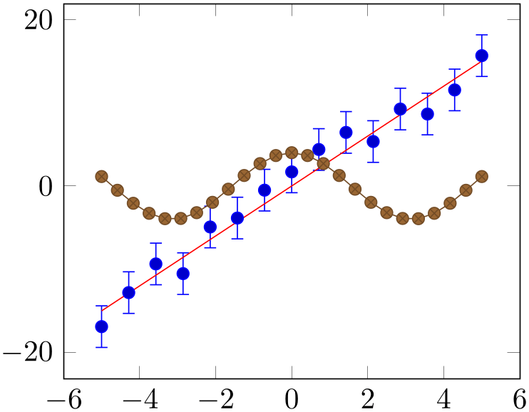
% Preamble: \pgfplotsset{width=7cm,compat=1.18}
\begin{tikzpicture}[baseline]
\begin{axis}
\addplot+ [
only marks,
samples=15,
error bars/y dir=both,
error bars/y fixed=2.5,
] {3*x+2.5*rand};
\label{pgfplots:label1}
\addplot+ [mark=none] {3*x};
\label{pgfplots:label2}
\addplot {4*cos(deg(x))};
\label{pgfplots:label3}
\end{axis}
\end{tikzpicture}
The picture shows the estimations
 which are subjected to noise. It appears the model
 fits the data appropriately. Finally,
 is only here to get three examples.
-
\label{
 label name
 }
}
-
\label[
 reference
 ]{
]{ label name
 }
}
When used after \addplot, this command creates a
LaTeX
label named
 label name
 .48 If this label is cross-referenced with
\ref{
 label name
 } somewhere, the associated plot specification will be inserted.
The label is assembled using legend image code and the plot style of the last plot. Any pgfplots option is expanded until only TikZ (or pgf) options remain; these options are used to get an independent label.
More precisely, the small image generated by \ref{ label name
 } is
} is
where the contents is determined by legend image code and the plot style.
The second syntax, \label[ reference
 ]{
]{ label name
 } allows to label particular pieces of an
\addplot command. It is (currently) only interesting for
scatter/classes: there, it allows to reference particular classes of the scatter plot. See page (page for section 4.5.12) for more details.
Note that \label information, even the small TikZ pictures here, can be combined with the external library for image externalization, see Section 8.1 for details (in particular, the external/mode key). In other words, references remain valid even if the defining axis has been externalized.
-
\ref{
 label name
 }
}
Can be used to reference a labeled, single plot. See the example above.
This will also work together with hyperref links and \pageref.49
-
/pgfplots/refstyle={
 label name
 }
}
Can be used to set the styles of a labeled, single plot. This allows to write
\addplot[/pgfplots/refstyle={pgfplots:label2}]
somewhere. Please note that it may be easier to define a style with .style.
-
/pgfplots/every crossref picture(style, no value) 
A style which will be used by the cross-referencing feature for plots. The default is
-
/pgfplots/invoke before crossref tikzpicture={
 TeX
code
 }
}
-
/pgfplots/invoke after crossref tikzpicture={
 TeX
code
 }
}
Code which is invoked just before or just after every cross reference picture. This applies to legend images generated with \ref, legend to name and colorbar to name images.
The initial configuration checks if the external library is in effect. If so, it modifies the generated figure names by means of \tikzappendtofigurename{_crossref}.
48 This feature is only available in LaTeX, sorry.
49 Older versions of pgfplots required the use of \protect\ref when used inside of captions or section headings. This is no longer necessary.
4.9.7Legends Outside Of an Axis
Occasionally, one has multiple adjacent plots, each with the same legend – and just one legend suffices. But where shall it be placed? And how? One solution is to use the overlay key to exclude the legend from bounding box computations, and place it absolutely such that it fits. Another is the legend to name feature:
-
/pgfplots/legend to name={
 name
name } (initially empty)
Enables a legend export
mode: instead of drawing the legend, a self-contained, independent set of drawing commands will be stored using the label
 name
name . The definition is done using \label{
 name
name }, just like any other
LaTeX
label. The name can be referenced using
\ref{ name
name }.
}.
Thus, typing \ref{ name
name } somewhere outside of the axis, maybe even outside of any picture, will cause the legend to be drawn.
% Preamble: \pgfplotsset{width=7cm,compat=1.18}
\pgfplotsset{footnotesize,samples=10}
\begin{center}% note that \centering uses less vspace...
\begin{tikzpicture}
\begin{axis}[
legend columns=-1,
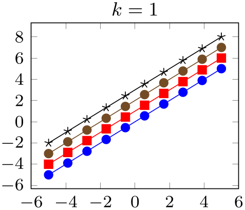
legend entries={$(x+0)^k$;,$(x+1)^k$;,$(x+2)^k$;,$(x+3)^k$},
legend to name=named,
title={$k=1$},
]
\addplot {x};
\addplot {x+1};
\addplot {x+2};
\addplot {x+3};
\end{axis}
\end{tikzpicture}
%
\begin{tikzpicture}
\begin{axis}[title={$k=2$}]
\addplot {x^2};
\addplot {(x+1)^2};
\addplot {(x+2)^2};
\addplot {(x+3)^2};
\end{axis}
\end{tikzpicture}
%
\begin{tikzpicture}
\begin{axis}[title={$k=3$}]
\addplot {x^3};
\addplot {(x+1)^3};
\addplot {(x+2)^3};
\addplot {(x+3)^3};
\end{axis}
\end{tikzpicture}
\\
\ref{named}
\end{center}
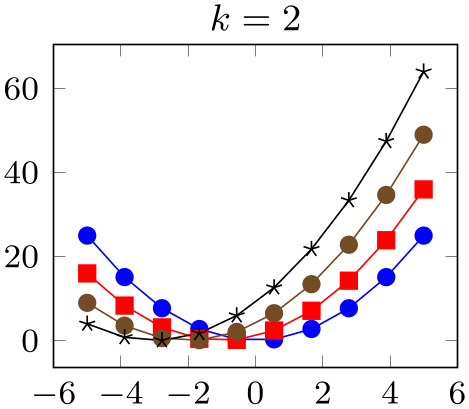
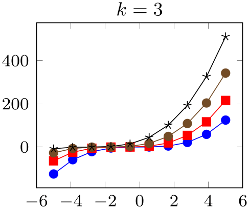
Note that only the first plot has legend entries. Thus, its legend will be created as usual, and stored under the name ‘named’, but it won’t be drawn. The stored legend can then be drawn with \ref{named} below the three plots. Since there is no picture in this context, a \tikz picture is created and a \matrix[/pgfplots/every axis legend] path is drawn inside of it, resulting in the legend as if it had been placed inside of the axis.
The stored legend will contain the currently active values of legend and plot style related options. This includes legend image code, every axis legend, and any plot style options (and some more). The algorithm works in the same way as for \label and \ref, i.e. it keeps any options with /tikz/ prefix and expands those with /pgfplots/ prefix.
Note that the legend is drawn with every axis legend, even though the placement options might be chosen to fit into an axis. You may want to adjust the style in the same axis in which the stored legend has been defined (the value will be copied and restored as well).
The \ref{ name
name } command retrieves a stored legend (one defined by
legend to name) and draws it.
\ref{named}:

If you want the legend to be exported and drawn inside of the current axis, consider using
extra description/.append code={\ref{ name
name }}.
}}.
Note that \ref can be combined with the external library for image externalization. In other words, the legend will work even if the defining axis has been externalized, see Section 8.1 for details (in particular the external/mode key).
Note furthermore that this .aux file related stuff is (currently) only supported, if pgfplots is run by means of LaTeX, sorry.
-
/pgfplots/every legend to name picture(style, no value) 
A style which is installed when \ref is used outside of a picture: a new picture will be created with \tikz[/pgfplots/every legend to name picture].
Thus, you can redefine this style to set alignment options (such as baseline). For example, the initialization
\pgfplotsset{
                          legend style={matrix
                      anchor=west,at={(0pt,0pt)}},
every legend to name picture/.style={baseline},
}
...
will cause the legend to be positioned such that its west anchor is at y=0pt. The baseline option will align this point of the legend with the text baseline (please refer to the documentation for baseline in Section 4.19 for details).
50 Since this manual uses colored links, the text in \ref would usually be blue. Using \pgfplotslegendfromname avoids link text colors in the legend (this has been applied to the manual styles here).
4.9.8Legends with Customized Texts or Multiple Lines
-
\addlegendimage{
 options
 }
}
Adds a further legend image for legend creation.
Each \addplot command appends its plot style options to a
list, and \addlegendimage adds
 options
 to the very same list.
Thus, the effect is as if you had provided \addplot[ options
 ], but \addlegendimage bypasses all the
logic usually associated with a plot. In other words: except for the legend, the state of the axis remains as if the command
would not have been issued. Not even the current plot’s index is advanced.
% Preamble: \pgfplotsset{width=7cm,compat=1.18}
\begin{tikzpicture}
\begin{semilogyaxis}[
domain=0:4,
]
\addplot {x}; \addlegendentry{$x$}
\addplot {x^2}; \addlegendentry{$x^2$}
\addplot {x^3}; \addlegendentry{$x^3$}
                        \addlegendimage{empty
                    legend}
\addlegendentry{---}
\addplot {x^(-1)}; \addlegendentry{$x^{-1}$}
\addplot {x^(-2)}; \addlegendentry{$x^{-2}$}
\addplot {x^(-3)}; \addlegendentry{$x^{-3}$}
\end{semilogyaxis}
\end{tikzpicture}
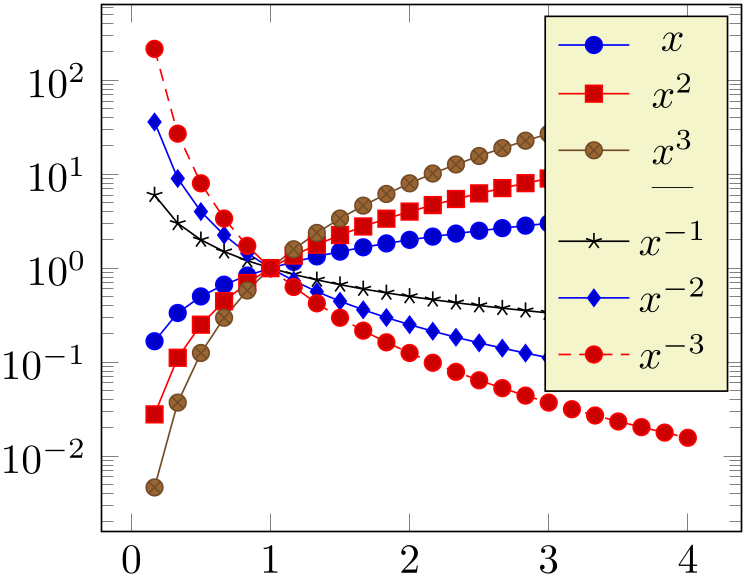
The example above has six plots, each with its legend entry. Furthermore, it has an \addlegendimage command and its separate legend entry. We see that \addlegendimage needs its own legend entry, but it is detached from the processing of plots as such. In our case, we chose empty legend as style for the separator.
Use \addlegendimage to provide custom styles into legends, for example to document custom \draw commands inside of an axis.
You can call \label after \addlegendimage just as for a normal style.
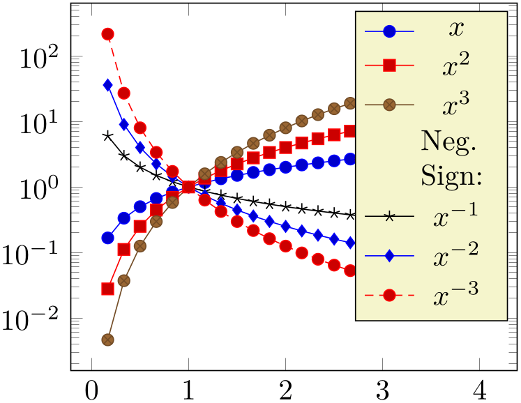
Occasionally, one may want multiple lines for legend entries. That is possible as well using a fixed text width:
% Preamble: \pgfplotsset{width=7cm,compat=1.18}
\begin{tikzpicture}
\begin{semilogyaxis}[
domain=0:4,
]
\addplot {x}; \addlegendentry{$x$}
\addplot {x^2}; \addlegendentry{$x^2$}
\addplot {x^3}; \addlegendentry{$x^3$}
                    \addlegendimage{empty
                legend}
\addlegendentry [text width=25pt,text depth=]
{Neg. Sign:}
\addplot {x^(-1)}; \addlegendentry{$x^{-1}$}
\addplot {x^(-2)}; \addlegendentry{$x^{-2}$}
\addplot {x^(-3)}; \addlegendentry{$x^{-3}$}
\end{semilogyaxis}
\end{tikzpicture}
The example provides options for the single multiline element. Note that the initial configuration of legend style employs text depth=0.15em, which needs to be reset manually to text depth={}.51
There are two approaches with the same effect which are subject of the following example:

% Preamble: \pgfplotsset{width=7cm,compat=1.18}
\begin{tikzpicture}
\begin{semilogyaxis}[
domain=0:4,
legend entries={
$x$,$x^2$,$x^3$,
{[text width=25pt,text depth=]Neg. Sign:},
$x^{-1}$,$x^{-2}$,$x^{-3}$},
% same effect:
% legend style={
% nodes={text width=25pt,text depth=},}
]
\addplot {x};
\addplot {x^2};
\addplot {x^3};
                    \addlegendimage{empty
                legend}
\addplot {x^(-1)};
\addplot {x^(-2)};
\addplot {x^(-3)};
\end{semilogyaxis}
\end{tikzpicture}
Here, the legend entries are provided using the single key syntax. Note that the special options are provided as part of the legend entry, using square brackets right before the text as such. The comments indicate that you could also add the text width stuff to legend style, in which case it would hold for every node.
Note that legend texts are realized using \node[ options
 ] {
] { text
text };, so anything which produces a valid TikZ node is permitted (this includes minipage or
tabular environments inside of
 text
text ).
).
4.9.9Axis Lines
An extension by Pascal Wolkotte
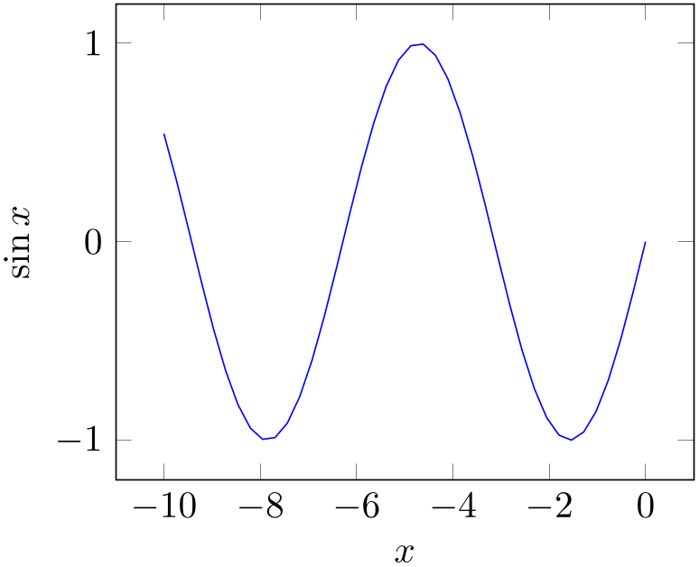
By default the axis lines are drawn as a box, but it is possible to change the appearance of the \(x\)- and \(y\)-axis lines.
-
/pgfplots/axis x line=box|top|middle|center|bottom|none (initially box) 
-
/pgfplots/axis x line*=box|top|middle|center|bottom|none (initially box) 
-
/pgfplots/axis y line=box|left|middle|center|right|none (initially box) 
-
/pgfplots/axis y line*=box|left|middle|center|right|none (initially box) 
-
/pgfplots/axis z line=box|left|middle|center|right|none (initially box) 
-
/pgfplots/axis z line*=box|left|middle|center|right|none (initially box) 
-
/pgfplots/axis lines=box|left|middle|center|right|none 
-
/pgfplots/axis lines*=box|left|middle|center|right|none 
-
• In case axis x line=box, the style every boxed x axis will be installed immediately.
-
• In case axis x line\(\neq \)box, the style every non boxed x axis will be installed immediately. Furthermore, some of these choices will modify axis label positions.
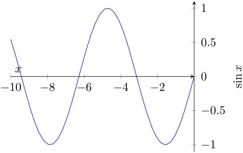
These keys allow to choose the locations of the axis lines. The last one, axis lines sets the same value for every axis.
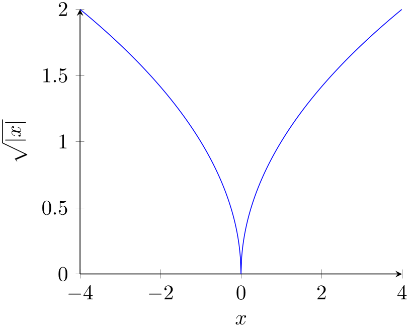
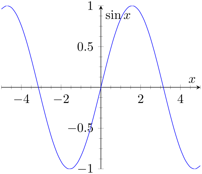
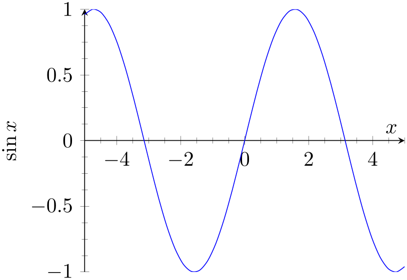
Ticks and tick labels are placed according to the chosen value as well. The choice bottom will draw the \(x\) line at \(y=y_{\min }\), middle will draw the \(x\) line at \(y=0\), and top will draw it at \(y=y_{\max }\). Finally, box is a combination of options top and bottom. The choice axis x line=none is an alias for hide x axis. The \(y\) and \(z\) variants work in a similar way.
The case center is a synonym for middle, both draw the line through the respective coordinate \(0\). If this coordinate is not part of the axis limit, the lower axis limit is chosen instead.
The starred versions \(\dotsc \)line* only affect the axis lines, without correcting the positions of axis labels, tick lines or other keys which are (possibly) affected by a changed axis line. The non-starred versions are actually styles which set the starred key and some other keys which also affect the figure layout:
The handling of axis y line and axis z line is similar. The default styles are defined as
\pgfplotsset{
every non boxed x axis/.style={
xtick align=center,
enlarge x limits=false,
x axis line style={-stealth},
},
every boxed x axis/.style={},
}
In addition, conditional modifications of axis label styles will be taken. For example, axis x line=middle will set
\pgfplotsset{every axis x label/.style={at={(current axis.left of origin)},anchor=south west}}
if the matching \(y\) style has value axis y line=right and
\pgfplotsset{every axis x label/.style={at={(current axis.right of origin)},anchor=south east}}
if axis y line\(\neq \)right.
Feel free to overwrite these styles if the default does not fit your needs or taste. Again, these styles will not be used for the variants with the “starred” versions (like axis lines* or axis x line*).
% Preamble: \pgfplotsset{width=7cm,compat=1.18}
\begin{tikzpicture}
\begin{axis}[
xlabel=$x$,ylabel=$\sin x$,
]
\addplot [
blue,mark=none,
domain=-10:0,samples=40,
] {sin(deg(x))};
\end{axis}
\end{tikzpicture}
% Preamble: \pgfplotsset{width=7cm,compat=1.18}
\begin{tikzpicture}
\begin{axis}[
axis x line=middle,
axis y line=right,
ymax=1.1, ymin=-1.1,
xlabel=$x$,ylabel=$\sin x$,
]
\addplot [
blue,mark=none,
domain=-10:0,samples=40,
] {sin(deg(x))};
\end{axis}
\end{tikzpicture}
% Preamble: \pgfplotsset{width=7cm,compat=1.18}
\begin{tikzpicture}
\begin{axis}[
axis x line=bottom,
axis y line=left,
xlabel=$x$,ylabel=$\sqrt{|x|}$,
]
\addplot [
blue,mark=none,
domain=-4:4,samples=501,
] {sqrt(abs(x))};
\end{axis}
\end{tikzpicture}
% Preamble: \pgfplotsset{width=7cm,compat=1.18}
\begin{tikzpicture}
\begin{axis}[
minor tick num=3,
axis y line=center,
axis x line=middle,
xlabel=$x$,ylabel=$\sin x$,
]
\addplot [
smooth,blue,mark=none,
domain=-5:5,samples=40,
] {sin(deg(x))};
\end{axis}
\end{tikzpicture}
% Preamble: \pgfplotsset{width=7cm,compat=1.18}
\begin{tikzpicture}
\begin{axis}[
minor tick num=3,
axis y line=left,
axis x line=middle,
xlabel=$x$,ylabel=$\sin x$,
]
\addplot [
smooth,blue,mark=none,
domain=-5:5,samples=40,
] {sin(deg(x))};
\end{axis}
\end{tikzpicture}
In case middle, the style every inner x axis line allows to adjust the appearance.
Note that three dimensional axes only support to use the same value for every axis, i.e. three dimensional axes support only the axis lines key (or, preferably for 3D axes, the axis lines* key – check what looks best). See Section 4.11.4 for examples of three dimensional axis line variations.
-
/pgfplots/every inner x axis line(no value) 
-
/pgfplots/every inner y axis line(no value) 
-
/pgfplots/every inner z axis line(no value) 
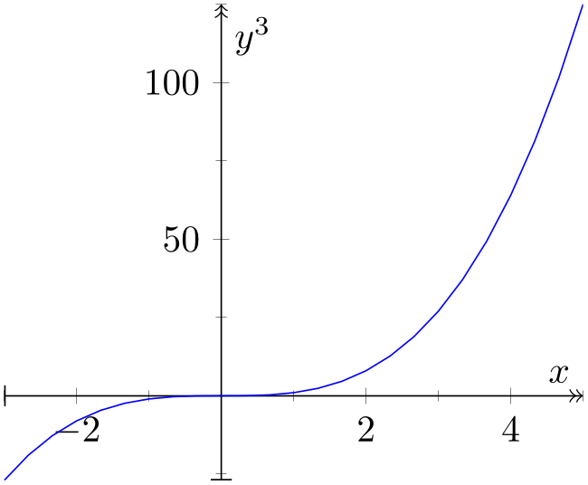
A style key which can be redefined to customize the appearance of inner axis lines. Inner axis lines are those drawn by the middle (or center) choice of axis x line, see above.
This style affects only the line as such.
% Preamble: \pgfplotsset{width=7cm,compat=1.18}
\begin{tikzpicture}
\begin{axis}[
minor tick num=1,
axis x line=middle,
axis y line=middle,
every inner x axis line/.append style={|->>},
every inner y axis line/.append style={|->>},
xlabel=$x$,ylabel=$y^3$,
]
\addplot [blue,domain=-3:5] {x^3};
\end{axis}
\end{tikzpicture}
-
/pgfplots/every outer x axis line(no value) 
-
/pgfplots/every outer y axis line(no value) 
-
/pgfplots/every outer z axis line(no value) 
Similar to every inner x axis line, this style configures the appearance of all axis lines which are part of the outer box.
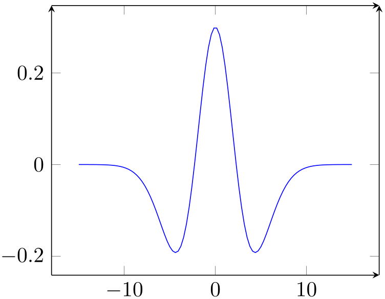
% Preamble: \pgfplotsset{width=7cm,compat=1.18}
\begin{tikzpicture}
\begin{axis}[
separate axis lines, % important !
every outer x axis line/.append style={-stealth},
every outer y axis line/.append style={-stealth},
]
\addplot [
blue,id=DoG,
samples=100,domain=-15:15,
                        ] gnuplot {1.3*exp(-x**2/10) -
                    exp(-x**2/20)};
\end{axis}
\end{tikzpicture}
-
/pgfplots/axis line style={
 key-value-list
 }
}
A command which appends
 key-value-list
 to all axis line appearance styles.
-
/pgfplots/inner axis line style={
 key-value-list
 }
}
A command which appends
 key-value-list
 to both,
every inner x axis line and the
\(y\) variant.
-
/pgfplots/outer axis line style={
 key-value-list
 }
}
A command which appends
 key-value-list
 to both,
every outer x axis line and the
\(y\) variant.
-
/pgfplots/every boxed x axis(no value) 
-
/pgfplots/every boxed y axis(no value) 
-
/pgfplots/every boxed z axis(no value) 
A style which will be installed as soon as axis x line=box (y) is set.
The default is simply empty.
-
/pgfplots/every non boxed x axis(no value) 
-
/pgfplots/every non boxed y axis(no value) 
-
/pgfplots/every non boxed z axis(no value) 
A style which will be installed as soon as axis x line (y) will be set to something different than box.
The default is
\pgfplotsset{
every non boxed x axis/.style={
xtick align=center,
enlarge x limits=false,
x axis line style={-stealth},
},
}
with similar values for the y-variant. Feel free to redefine this style to your needs and taste.
-
/pgfplots/separate axis lines={
 true,false
 }
(default true)
Enables or disables separate path commands for every axis line. This option affects only the case if axis lines are drawn as a box.
Both cases have their advantages and disadvantages, I fear there is no reasonable default (suggestions are welcome).
The case separate axis lines=true allows to draw arrow heads on each single axis line, but it can’t close edges very well – in case of thick lines, unsatisfactory edges occur.
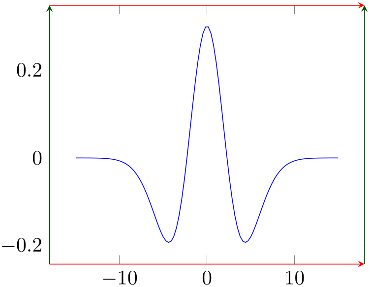
% Preamble: \pgfplotsset{width=7cm,compat=1.18}
\begin{tikzpicture}
\begin{axis}[
separate axis lines,
every outer x axis line/.append style=
{-stealth,red},
every outer y axis line/.append style=
{-stealth,green!30!black},
]
\addplot [
blue,
samples=100,domain=-15:15,
] {1.3*exp(0-x^2/10) - exp(0-x^2/20)};
% Unfortunately, there is a bug in PGF 2.00
% something like exp(-10^2)
% must be written as exp(0-10^2) :-(
\end{axis}
\end{tikzpicture}
The case separate axis lines=false issues just one path for all axis lines. It draws a kind of rectangle, where some parts of the rectangle may be skipped over if they are not wanted. The advantage is that edges are closed properly. The disadvantage is that at most one arrow head is added to the path (and yes, only one drawing color is possible).
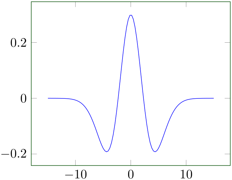
% Preamble: \pgfplotsset{width=7cm,compat=1.18}
\begin{tikzpicture}
\begin{axis}[
separate axis lines=false,
every outer x axis line/.append style=
{-stealth,red},
every outer y axis line/.append style=
{-stealth,green!30!black},
]
\addplot [
blue,id=DoG,
samples=100,domain=-15:15,
                        ] gnuplot {1.3*exp(-x**2/10) -
                    exp(-x**2/20)};
\end{axis}
\end{tikzpicture}
4.9.10Moving Axis Lines
pgfplots offers styles to shift axis lines along their normal vector:
-
/pgfplots/axis x line shift={
 dimension or unit
 } (initially empty)
-
/pgfplots/axis y line shift={
 dimension or unit
 } (initially empty)
-
/pgfplots/axis z line shift={
 dimension or unit
 } (initially empty)
-
/pgfplots/axis line shift={
 dimension or unit
 } (initially empty)
Allows to shift one or more axis lines together with all their descriptions.
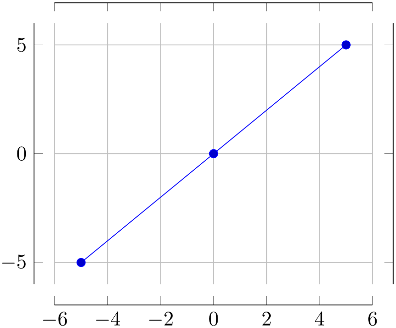
% Preamble: \pgfplotsset{width=7cm,compat=1.18}
\begin{tikzpicture}
\begin{axis}[
axis line shift=10pt,
grid=major
]
\addplot+ [samples=3] {x};
\end{axis}
\end{tikzpicture}
The option takes the axis lines and shifts them along their “outer normal vectors”. This direction is known for every axis; it is the direction which points away from the center.
The operation is often combined with the axis lines variations, for example
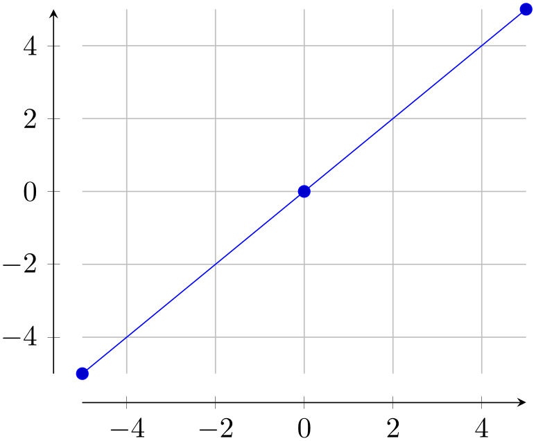
% Preamble: \pgfplotsset{width=7cm,compat=1.18}
\begin{tikzpicture}
\begin{axis}[
axis lines=left,
axis line shift=10pt,
grid=major,
]
\addplot+ [samples=3] {x};
\end{axis}
\end{tikzpicture}
Keep in mind that axis lines=left also reconfigures the axis such that it has an arrow head and enlargelimits=false (see also axis lines*=left). Customizations are, of course possible, for example an arrow tip which shows the end of the axis:
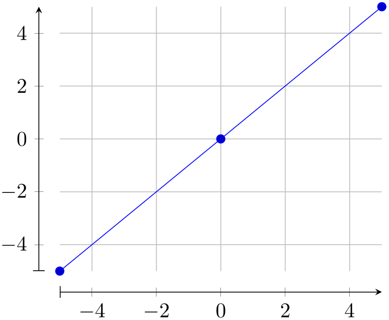
% Preamble: \pgfplotsset{width=7cm,compat=1.18}
\begin{tikzpicture}
\begin{axis}[
axis lines=left,
axis line style={|-stealth},
axis line shift=10pt,
grid=major,
]
\addplot+ [samples=3] {x};
\end{axis}
\end{tikzpicture}
The argument
 dimension or unit
 can be a dimension like 10pt (as in the previous examples). However, it can also be given in terms of axis units:
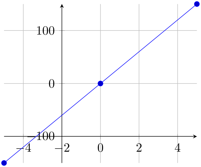
% Preamble: \pgfplotsset{width=7cm,compat=1.18}
\begin{tikzpicture}
\begin{axis}[
axis lines=center,
axis y line shift=2,
axis x line shift=100,
grid=major,
]
\addplot+ [samples=3] {30*x};
\end{axis}
\end{tikzpicture}
In this context, axis y line shift=2 shifts the \(y\)-axis by \(2\) units along the \(x\)-axis since the \(x\)-axis (with negative sign) is the “outer normal”. Shifting by axis units is only possible for two-dimensional plots since the outer normal is well-defined here: it is the other available axis.
The feature axis line shift can also be
applied to three dimensional axes (with a
 dimension
 argument, not a unit). In this case, the shift is also along the “outer normal vector”. Note that this vector is
a combination of the two other axes, so the resulting axis is no longer aligned with grid lines! Handle this option with
care as it easily results in confusion when one tries to align the axis descriptions with grid lines.
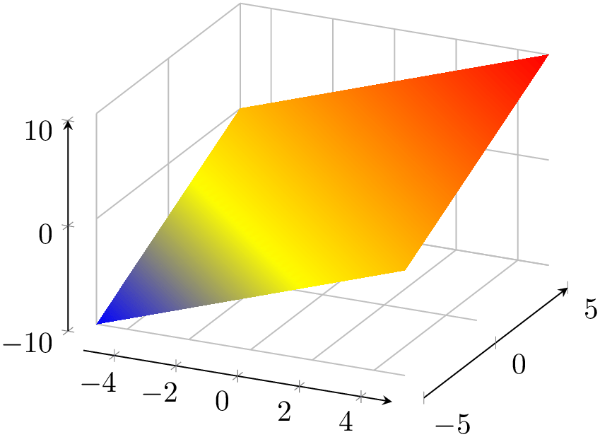
% Preamble: \pgfplotsset{width=7cm,compat=1.18}
\begin{tikzpicture}
\begin{axis}[
axis lines=left,
axis line shift=10pt,
grid=major,
]
\addplot3 [surf,shader=interp,samples=2] {x+y};
\end{axis}
\end{tikzpicture}
The option axis line shift is a style
which configures a shifts of
 dimension
 for each axis.
Note that axis line shift implies separate axis lines and will implicitly configure hide obscured x ticks=false and its variants.
4.9.11Two Ordinates (\(y\)-axis) or Multiple Axes
In some applications, more than one \(y\)-axis is used if the \(x\) range is the same. This section demonstrates how to create them. The idea in pgfplots is to draw two axes on top of each other, one with descriptions only on the left and the second with descriptions only on the right:

% Preamble: \pgfplotsset{width=7cm,compat=1.18}
\begin{tikzpicture}
% let both axes use the same layers
\pgfplotsset{set layers}
\begin{axis}[
scale only axis,
xmin=-5,xmax=5,
axis y line*=left, % the '*' avoids arrow heads
xlabel=$x$,
ylabel=First ordinate,
]
\addplot {x^2};
\end{axis}
\begin{axis}[
scale only axis,
xmin=-5,xmax=5,
axis y line*=right,
axis x line=none,
ylabel=Second ordinate,
]
\addplot [red] {3*x};
\end{axis}
\end{tikzpicture}
Thus, the two axes are drawn “on top” of each other – one, which contains the \(x\)-axis and the left \(y\)-axis, and one which has only the right \(y\)-axis. Since pgfplots does not really know what it’s doing here, user attention in the following possibly non-obvious aspects is required:
-
1. Scaling. You should set scale only axis because this forces equal dimensions for both axis, without respecting any labels.
-
2. Same \(x\) limits. You should set those limits explicitly.
-
3. You need to tell pgfplots that it should share the same graphics layers for both axes. In this case, pgfplots will draw plots of the first axis and of the second axis onto the same layer. It will also draw background(s) into the background layer and descriptions into the foreground layer. Use the key \pgfplotsset{set layers} in front of the first axis to prepare the complete picture for layered graphics.
You may want to consider different legend styles. It is also possible to use only the axis, without any plots:
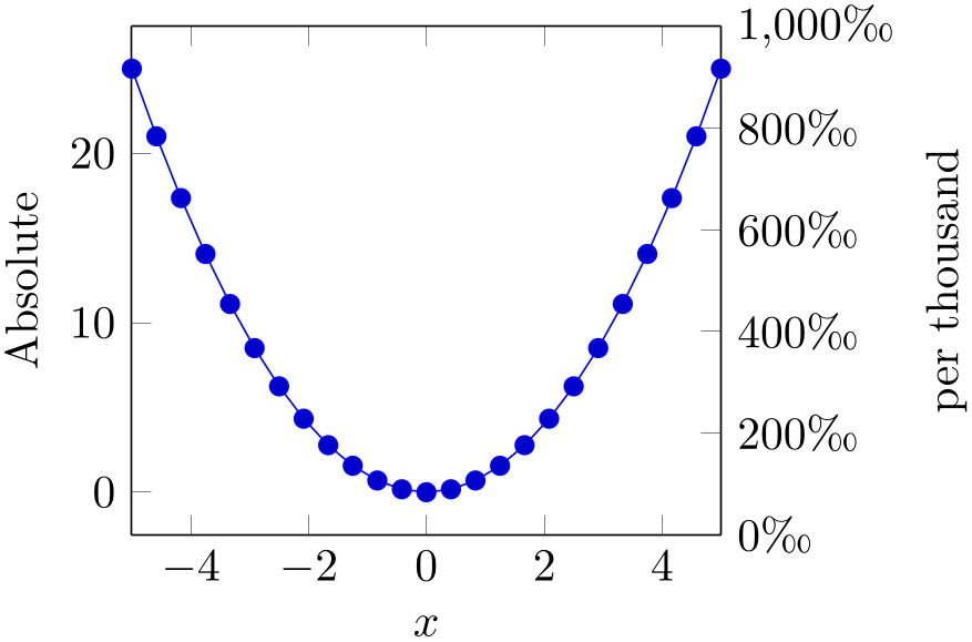
% Preamble: \pgfplotsset{width=7cm,compat=1.18}
% \usepackage{textcomp}
\begin{tikzpicture}
% let both axes use the same layers
\pgfplotsset{set layers}
\begin{axis}[
scale only axis,
xmin=-5,xmax=5,
axis y line*=left, % '*' avoids arrow heads
xlabel=$x$,
ylabel=Absolute,
]
\addplot {x^2};
\end{axis}
\begin{axis}[
scale only axis,
xmin=-5,xmax=5,
ymin=0,ymax=1000,
yticklabel={
$\pgfmathprintnumber{\tick}$\textperthousand
},
axis y line*=right,
axis x line=none,
ylabel=per thousand,
]
\end{axis}
\end{tikzpicture}
4.9.12Axis Discontinuities
An extension by Pascal Wolkotte
In case the range of either of the axis do not include the zero value, it is possible to visualize this with a discontinuity decoration on the corresponding axis line.
-
/pgfplots/axis x discontinuity=crunch|parallel|none (initially none) 
-
/pgfplots/axis y discontinuity=crunch|parallel|none (initially none) 
-
/pgfplots/axis z discontinuity=crunch|parallel|none (initially none) 
Insert a discontinuity decoration on the \(x\)- (or \(y\)-, respectively) axis. This is to visualize that the \(y\)-axis does cross the \(x\)-axis at its \(0\) value, because the minimum \(x\)-axis value is positive or the maximum value is negative.
The description applies to axis y discontinuity and axis z discontinuity as well, simply substitute \(x\) by \(y\) or \(z\), respectively.
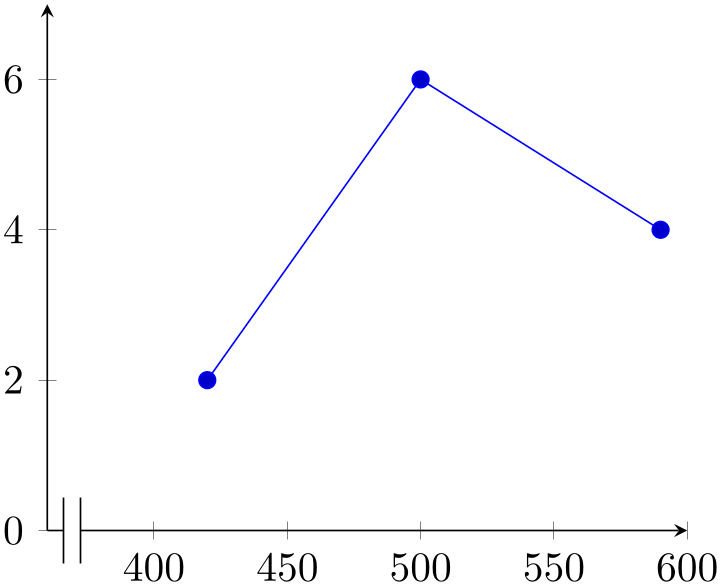
% Preamble: \pgfplotsset{width=7cm,compat=1.18}
\begin{tikzpicture}
\begin{axis}[
axis x line=bottom,
axis x discontinuity=parallel,
axis y line=left,
xmin=360, xmax=600,
ymin=0, ymax=7,
enlargelimits=false,
]
                        \addplot coordinates
                    {
(420,2)
(500,6)
(590,4)
};
\end{axis}
\end{tikzpicture}
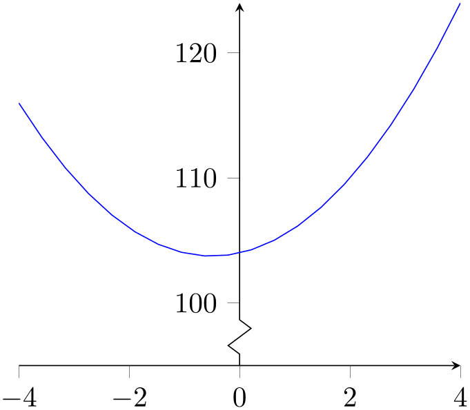
% Preamble: \pgfplotsset{width=7cm,compat=1.18}
\begin{tikzpicture}
\begin{axis}[
axis x line=bottom,
axis y line=center,
tick align=outside,
axis y discontinuity=crunch,
ymin=95, enlargelimits=false,
]
\addplot [blue,mark=none,
domain=-4:4,samples=20,
] {x*x+x+104};
\end{axis}
\end{tikzpicture}
A problem might occur with the placement of the ticks on the axis. This can be solved by specifying the minimum or maximum axis value for which a tick will be placed.
-
/pgfplots/xtickmin={
 coord
coord }
(default axis limits)
-
/pgfplots/ytickmin={
 coord
coord }
(default axis limits)
-
/pgfplots/ztickmin={
 coord
coord }
(default axis limits)
-
/pgfplots/xtickmax={
 coord
coord }
(default axis limits)
-
/pgfplots/ytickmax={
 coord
coord }
(default axis limits)
-
/pgfplots/ztickmax={
 coord
coord }
(default axis limits)
The options xtickmin, xtickmax and ytickmin, ytickmax allow to define the axis tick limits, i.e. the axis values before respectively after no ticks will be placed. Everything outside of the axis tick limits will be not drawn. Their default values are equal to the axis limits.
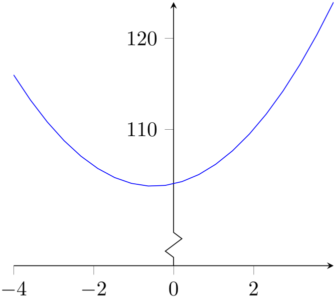
% Preamble: \pgfplotsset{width=7cm,compat=1.18}
\begin{tikzpicture}
\begin{axis}[
axis x line=bottom,
axis y line=center,
tick align=outside,
axis y discontinuity=crunch,
xtickmax=3,
ytickmin=110,
ymin=95, enlargelimits=false,
]
\addplot [blue,mark=none,
domain=-4:4,samples=20,
] {x*x+x+104};
\end{axis}
\end{tikzpicture}
-
/pgfplots/hide x axis=true|false (initially false) 
-
/pgfplots/hide y axis=true|false (initially false) 
-
/pgfplots/hide z axis=true|false (initially false) 
-
/pgfplots/hide axis=true|false (initially false) 
Allows to hide either a selected axis or all of them. No outer rectangle, no tick marks and no labels will be drawn. Only titles and legends will be processed as usual.
Axis scaling and clipping (!) will be done as if you did not use hide axis.
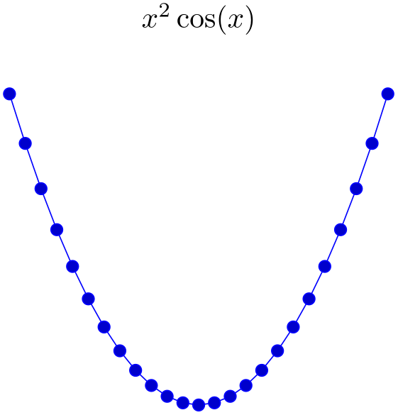
% Preamble: \pgfplotsset{width=7cm,compat=1.18}
\begin{tikzpicture}
\begin{axis}[
hide x axis,
hide y axis,
title={$x^2\cos(x)$},
]
\addplot {cos(x)*x^2};
\end{axis}
\end{tikzpicture}% <- eliminate space.
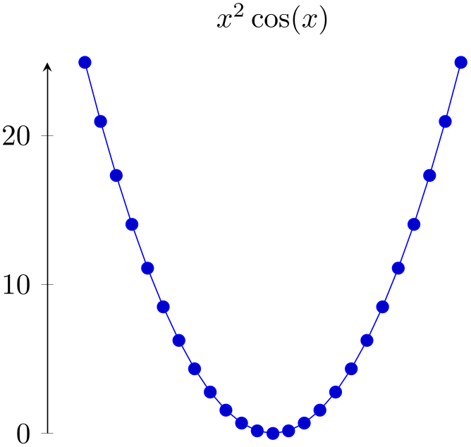
% Preamble: \pgfplotsset{width=7cm,compat=1.18}
\begin{tikzpicture}
\begin{axis}[
hide x axis,
axis y line=left,
title={$x^2\cos(x)$},
]
\addplot {cos(x)*x^2};
\end{axis}
\end{tikzpicture}% <- eliminate space
Note that a hidden axis contributes nothing to the resulting picture’s bounding box,52 see clip bounding box.
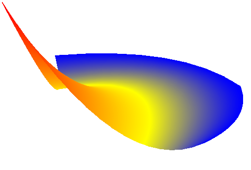
% Preamble: \pgfplotsset{width=7cm,compat=1.18}
% requires \usepgfplotslibrary{patchplots}
% and compat=1.8 or newer
\begin{tikzpicture}
\begin{axis}[hide axis]
\addplot3 [
patch,
patch type=biquadratic,
shader=interp,
] coordinates {
(0,0,1) (6,1,0) (5,5,0) (-1,5,0)
(3,1,0) (6,3,0) (2,6,0) (0,3,0)
(3,3.75,0)
};
\end{axis}
\end{tikzpicture}% <- eliminate space
This can be used to embed a pgfplots path which needs an axis to a standard TikZ picture. See also Section 4.26 for details how to synchronize the alignment between a pgfplots figure (which typically rescales its coordinates) to that of a standard tikzpicture.
Note that pgfplots uses the input coordinates to determine the bounding box of the picture. In this case, the bounding box is slightly smaller than the shading. A cure would be to increase the bounding box manually.
You may want to disable the clip path using the option clip=false.
4.9.13Color Bars
pgfplots supports mesh, surface and scatter plots which can use color maps. While color maps can be chosen as described in Section 4.7.6, they can be visualized using color bars.
-
/pgfplots/colorbar=true|false (initially false) 
Activates or deactivates color bars.

% Preamble: \pgfplotsset{width=7cm,compat=1.18}
\begin{tikzpicture}
\begin{axis}[colorbar]
\addplot [mesh,ultra thick] {x};
\end{axis}
\end{tikzpicture}
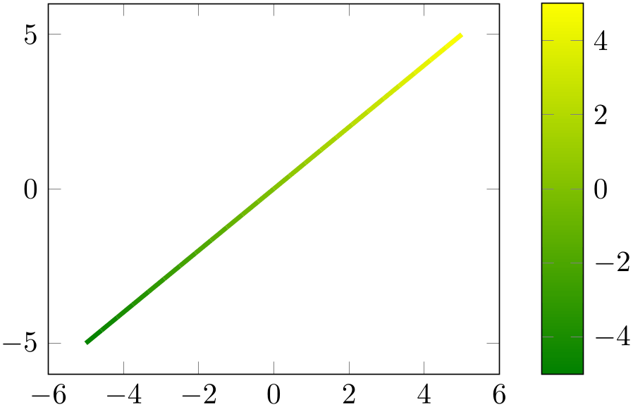
% Preamble: \pgfplotsset{width=7cm,compat=1.18}
\begin{tikzpicture}
\begin{axis}[colorbar,colormap/greenyellow]
\addplot [mesh,ultra thick] {x};
\end{axis}
\end{tikzpicture}
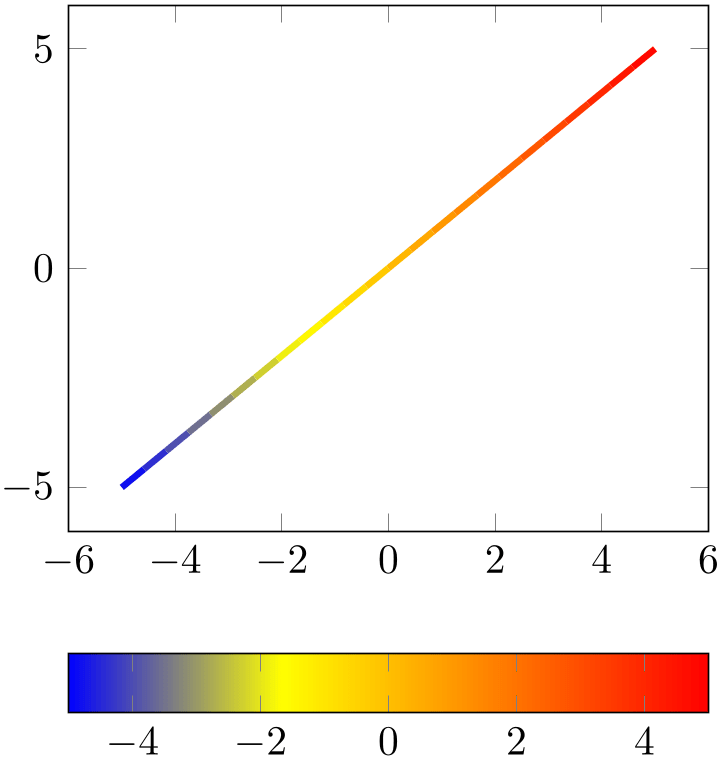
% Preamble: \pgfplotsset{width=7cm,compat=1.18}
\begin{tikzpicture}
\begin{axis}[colorbar horizontal]
\addplot [mesh,ultra thick] {x};
\end{axis}
\end{tikzpicture}
A color bar is only useful for plots with non-zero color data range, more precisely, for which minimum and maximum point meta data is available. Usually, this is the case for scatter, mesh or surf (or similar) plots, but you can also set point meta min and point meta max manually in order to draw a colorbar.
Color bars are just normal axes which are placed right besides their parent axes. The only difference is that they inherit several styles such as line width and fonts and they contain a bar shaded with the color map of the current axis.
Color bars are drawn internally with
where the placement, alignment, appearance and other options are done by the two styles every colorbar and colorbar shift. These styles and the possible placement and alignment options are described below.
-
• Since there is always only one color bar per plot, this color bar uses the axis wide configurations of color map and color data. Consider using colorbar source to select color data limits of a particular \addplot command instead.
-
• If someone needs more than one color bar, the draw command above needs to be updated. See the key colorbar/draw/.code for this special case.
-
/pgfplots/colorbar right(style, no value) 
A style which redefines every colorbar and colorbar shift such that color bars are placed right of their parent axis.
This is the initial configuration.
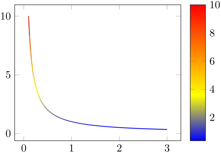
% Preamble: \pgfplotsset{width=7cm,compat=1.18}
\begin{tikzpicture}
\begin{axis}[colorbar right]
\addplot [mesh,thick,samples=150,domain=0.1:3] {1/x};
\end{axis}
\end{tikzpicture}
The style colorbar right is defined as
\pgfplotsset{
colorbar right/.style={
/pgfplots/colorbar=true,
/pgfplots/colorbar shift/.style={xshift=0.3cm},
/pgfplots/every colorbar/.style={
title=,
xlabel=,
ylabel=,
zlabel=,
legend entries=,
axis on top,
at={(parent axis.right of north east)},
anchor=north west,
xmin=0,
xmax=1,
ymin=\pgfkeysvalueof{/pgfplots/point meta min},
ymax=\pgfkeysvalueof{/pgfplots/point meta max},
plot graphics/xmin=0,
plot graphics/xmax=1,
plot graphics/ymin=\pgfkeysvalueof{/pgfplots/point meta min},
plot graphics/ymax=\pgfkeysvalueof{/pgfplots/point meta max},
enlargelimits=false,
scale only axis,
height=\pgfkeysvalueof{/pgfplots/parent
axis height},
x=\pgfkeysvalueof{/pgfplots/colorbar/width},
yticklabel pos=upper,
xtick=\empty,
colorbar vertical/lowlevel,
},
},
/pgfplots/colorbar vertical/lowlevel/.style={
plot graphics/lowlevel draw/.code 2 args={
\pgfuseshading{...} % some
advanced basic level shading operations
},
},
}
colorbar right redefines every colorbar. That means any user customization must take place after colorbar right:
% correct:
\begin{axis}[colorbar right, colorbar style={}]
% wrong, colorbar right resets the customization:
\begin{axis}[colorbar style={}, colorbar right]
-
/pgfplots/colorbar left(style, no value) 
A style which redefines every colorbar and colorbar shift such that color bars are placed left of their parent axis.
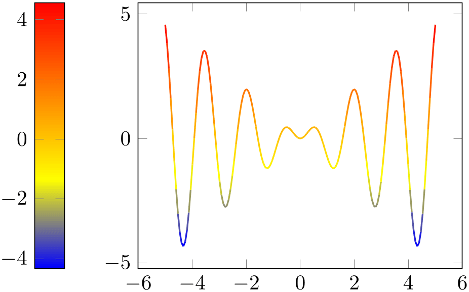
% Preamble: \pgfplotsset{width=7cm,compat=1.18}
\begin{tikzpicture}
\begin{axis}[colorbar left]
\addplot [mesh,thick,samples=150]
{x*sin(deg(4*x))};
\end{axis}
\end{tikzpicture}
The style colorbar left is defined as
\pgfplotsset{
colorbar left/.style={
/pgfplots/colorbar right,
/pgfplots/colorbar shift/.style={xshift=-0.3cm},
/pgfplots/every colorbar/.append style={
at={(parent axis.left of north west)},
anchor=north east,
yticklabel pos=lower,
},
},
}
colorbar left redefines every colorbar. That means any user customization must take place after colorbar left (see also the documentation for colorbar right).
-
/pgfplots/colorbar horizontal(style, no value) 
A style which redefines every colorbar and colorbar shift such that color bars are placed below their parent axis, with a horizontal bar.

% Preamble: \pgfplotsset{width=7cm,compat=1.18}
\begin{tikzpicture}
\begin{axis}[colorbar horizontal]
\addplot [
only marks,
scatter,
scatter src={
mod(\coordindex,15)
},
samples=150,
] {rand};
\end{axis}
\end{tikzpicture}
This style is defined as
\pgfplotsset{
colorbar horizontal/.style={
/pgfplots/colorbar=true,
/pgfplots/colorbar shift/.style={yshift=-0.3cm},
/pgfplots/every colorbar/.style={
title=,
xlabel=,
ylabel=,
zlabel=,
legend entries=,
axis on top,
at={(parent axis.below south west)},
anchor=north west,
ymin=0,
ymax=1,
xmin=\pgfkeysvalueof{/pgfplots/point meta min},
xmax=\pgfkeysvalueof{/pgfplots/point meta max},
plot graphics/ymin=0,
plot graphics/ymax=1,
plot graphics/xmin=\pgfkeysvalueof{/pgfplots/point meta min},
plot graphics/xmax=\pgfkeysvalueof{/pgfplots/point meta max},
enlargelimits=false,
scale only axis,
width=\pgfkeysvalueof{/pgfplots/parent
axis width},
y=\pgfkeysvalueof{/pgfplots/colorbar/width},
xticklabel pos=lower,
ytick=\empty,
colorbar horizontal/lowlevel,
},
},
/pgfplots/colorbar horizontal/lowlevel/.style={
plot graphics/lowlevel draw/.code 2 args={
\pgfuseshading{...} % some
advanced basic level shading operations
},
},
}
colorbar horizontal redefines every colorbar. That means any user customization must take place after colorbar horizontal:
% correct:
\begin{axis}[colorbar horizontal, colorbar style={}]
% wrong, colorbar horizontal resets the customization:
\begin{axis}[colorbar style={}, colorbar horizontal]
-
/pgfplots/every colorbar(style, no value) 
-
Predefined node parent axis 
-
/pgfplots/point meta min(no value)
-
/pgfplots/point meta max(no value)
-
/pgfplots/colorbar source={
 true,false
 } (initially false)
-
/pgfplots/parent axis width(no value) 
-
/pgfplots/parent axis height(no value) 
-
• every tick,
This style governs the placement, alignment and appearance of color bars. Any desired detail changes for color bars can be put into this style. Additionally, there is a style colorbar shift which is set after every colorbar. The latter style is intended to contain only shift transformations like xshift or yshift (making it easier to overwrite or deactivate them).
While a color bar is drawn, the predefined node parent axis can be used to align at the parent axis.
A node for the parent axis of a color bar. It is only valid for color bars.
Thus,
\pgfplotsset{
colorbar style={
at={(parent
axis.right of north east)},
anchor=north west,
},
colorbar shift/.style={xshift=0.3cm},
}
places the colorbar in a way that its top left (north west) corner is aligned right of the top right corner (right of north east) of its parent axis. Combining this with the colorbar shift is actually the same as the initial setting.
Since color bars depend on some of its parent’s properties, these properties are available as values of the following keys:
The values of these keys contain the lower and upper bound of the color map, i.e. the lower and upper limit for the color bar.
The value is \pgfkeysvalueof{/pgfplots/point meta min} inside of every colorbar.
The value is usually determined using the axis wide point meta limits, i.e. they are computed as minimum and maximum value over all plots (unless the user provided limits manually). Consider the colorbar source key if you’d like to select point meta limits of one specific \addplot command.
Allows to select a specific \addplot command whose point meta limits are taken as upper and lower limit of a colorbar’s data range. This affects the tick descriptions of the colorbar. It needs to be provided as argument to \addplot, i.e. using
or as key inside of a cycle list.
Using colorbar source automatically implies point meta rel=per plot for that specific plot.
If there are more than one \addplot commands with colorbar source, the last one is selected.
The values of these keys contain the size of the parent axis. They can be used as width and/or height arguments for every colorbar with \pgfkeysvalueof{/pgfplots/parent axis width}.
These values are only valid inside of color bars.
Besides these values, each color bar inherits a list of styles of its parent axis, namely
This can be used to inherit line width and/or fonts.
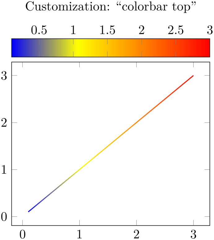
% Preamble: \pgfplotsset{width=7cm,compat=1.18}
\begin{tikzpicture}
\begin{axis}[
colorbar horizontal,
colorbar style={
at={(0.5,1.03)},
anchor=south,
xticklabel pos=upper,
},
title style={yshift=1cm},
title=Customization: ``colorbar
top'',
]
\addplot [
mesh,
thick,
samples=150,
domain=0.1:3,
] {x};
\end{axis}
\end{tikzpicture}
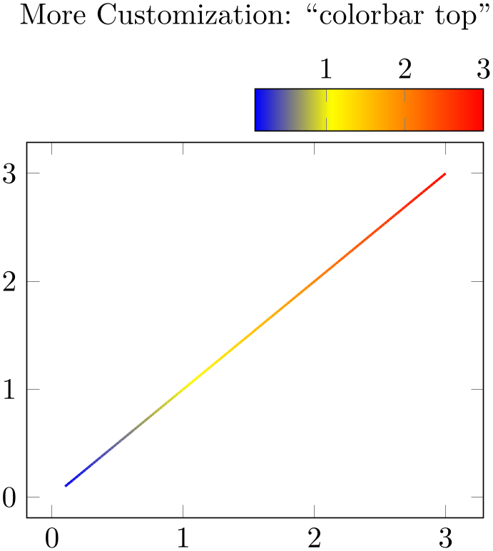
% Preamble: \pgfplotsset{width=7cm,compat=1.18}
\begin{tikzpicture}
\begin{axis}[
colorbar horizontal,
colorbar style={
at={(1,1.03)},anchor=south east,
width=0.5*
\pgfkeysvalueof{/pgfplots/parent axis width},
xticklabel pos=upper,
},
title style={yshift=1cm},
title=More Customization:
``colorbar top'',
]
\addplot [
mesh,
thick,
samples=150,
domain=0.1:3,
] {x};
\end{axis}
\end{tikzpicture}
Please take a look at the predefined styles colorbar right, colorbar left and colorbar horizontal for more details about configuration possibilities for every colorbar.
A color bar is just a normal axis. That means every colorbar can contain specifications where to place tick labels, extra ticks, scalings and most other features of a normal axis as well (except nested color bars).
-
/pgfplots/colorbar style={
 key-value list
 }
}
A shortcut for
every colorbar/.append style={ key-value list
 }. It appends options to the colorbar style.
-
/pgfplots/colorbar/width={
 dimension
 } (initially 0.5cm)
Sets the width of a color bar.

% Preamble: \pgfplotsset{width=7cm,compat=1.18}
\begin{tikzpicture}
\begin{axis}[
view/az=45,
colorbar,
colorbar/width=2cm,
colormap/blackwhite,
]
\addplot3
[surf,domain=0:1,y domain=-3:3] {x*(1-x)*tanh(y)};
\end{axis}
\end{tikzpicture}
For horizontal color bars, this sets the height.
-
/pgfplots/colorbar shift(style, no value) 
This style is installed after every colorbar. It is intended to contain only shift transformations like xshift and/or yshift. The reason to provide two separate styles is to allow easier deactivation of shift transformations.
-
Predefined node current colorbar axis 
A predefined node for the color bar of an axis. After \end{axis}, this node can be used to align further graphical elements at the color bar. Note that current axis refers to the axis as such while current colorbar axis refers to the color bar (which is an axis itself).
This code key belongs to the low level interface of color bars. It is invoked whenever a color bar needs to be drawn. Usually, it won’t be necessary to use or modify this key explicitly.
When this key is invoked, the styles inherited from the parent axis are already set and the required variables (see the documentation of every colorbar) are initialized.
This code key can be replaced if one needs more than one color bar (or other wrinkles).
The initial configuration is
\pgfplotsset{
colorbar/draw/.code={
\axis [every colorbar,colorbar shift,colorbar=false]
                        \addplot graphics
                    {};
\endaxis
},
}
Please note that a color bar axis is nothing special as such – it is just a normal axis with one \addplot graphics command and it is invoked with a special set of options. The only special thing is that a set of styles and some variables are inherited from its parent axis.
-
/pgfplots/colorbar sampled={
 optional options
 }
(style, default surf,mark=none,shader=flat)
A style which installs a discretely sampled color bar.
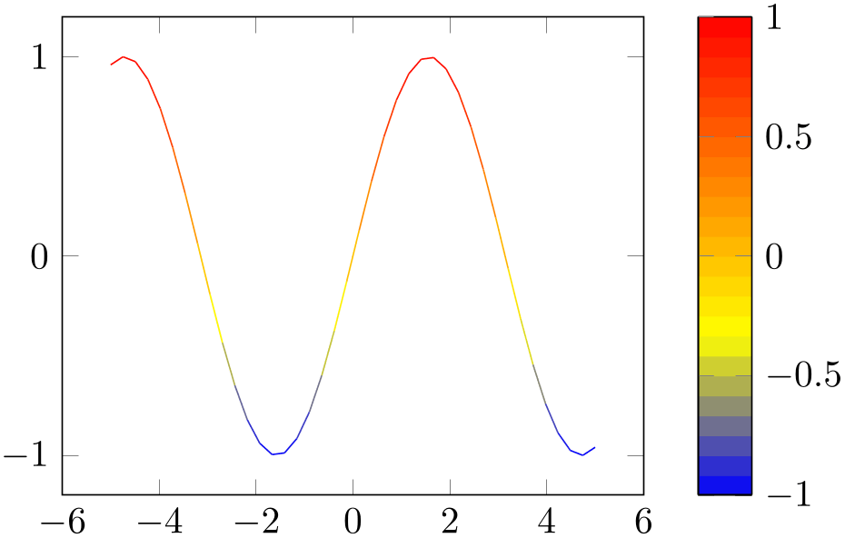
% Preamble: \pgfplotsset{width=7cm,compat=1.18}
\begin{tikzpicture}
\begin{axis}[colorbar sampled]
\addplot [mesh,samples=40] {sin(deg(x))};
\end{axis}
\end{tikzpicture}
this style merely changes the appearance of the colorbar. The way colormaps are used to determine plot colors is unrelated to this key. See also colormap access=direct for ways to affect the color selection.
The style uses \addplot3[ options
 ] to draw the colorbar, with domain set to the color range and the current value
of the samples key to determine the number of samples. In
other words: it uses
\addplot
expression
and a surface plot to visualize the colorbar. Use
colorbar style={samples=10}
to change the number of samples.
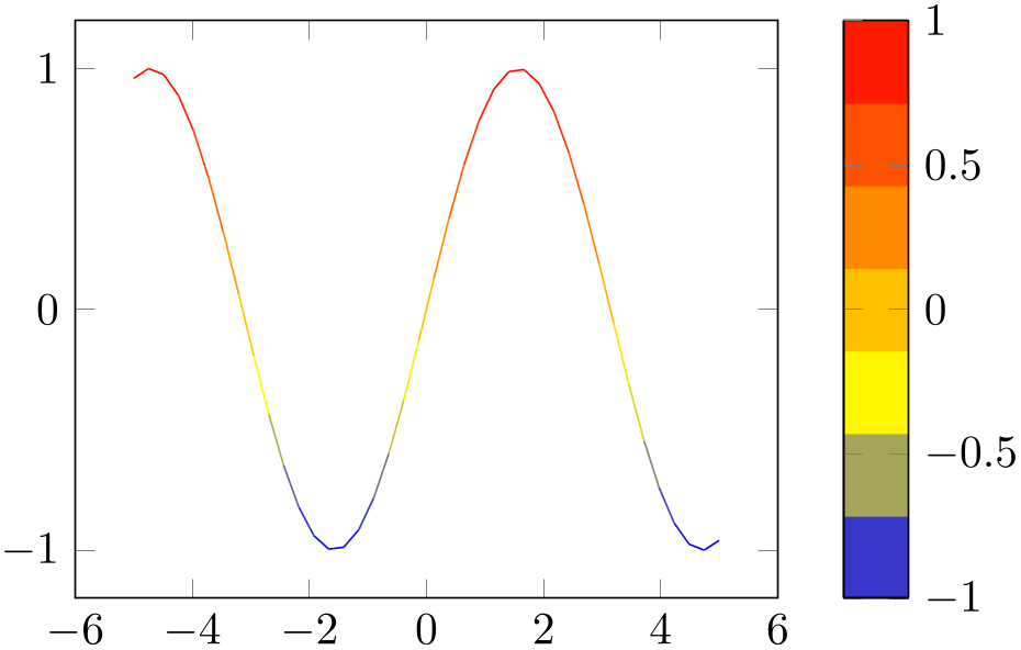
% Preamble: \pgfplotsset{width=7cm,compat=1.18}
\begin{tikzpicture}
\begin{axis}[colorbar sampled,colorbar style={samples=8}]
\addplot [mesh,samples=40] {sin(deg(x))};
\end{axis}
\end{tikzpicture}
The
 options
 can be used to change the \addplot3 options used for the
colorbar visualization. For example,
colorbar sampled={surf,shader=interp} will
use Gouraud shading which has visually the same effect as the standard color bar.
-
/pgfplots/colorbar sampled line={
 optional options
 }
(style, default scatter,only marks)
A style which draws a discrete colorbar. In contrast to colorbar sampled, it visualizes the colorbar using a line plot, not a surf plot.
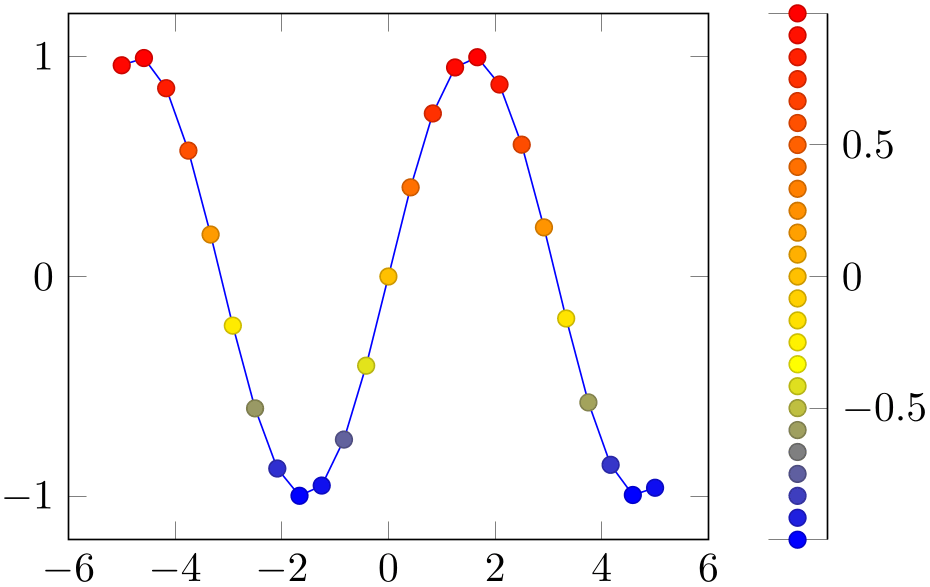
% Preamble: \pgfplotsset{width=7cm,compat=1.18}
\begin{tikzpicture}
\begin{axis}[colorbar sampled line]
                            \addplot+
                    [scatter] {sin(deg(x))};
\end{axis}
\end{tikzpicture}
this style merely changes the appearance of the colorbar. The way colormaps are used to determine plot colors is unrelated to this key. See also colormap access=direct for ways to affect the color selection.
The initial configuration uses a scatter plot to visualize
the colorbar, it can be changed by specifying
 options
 .
.
Furthermore, the axis appearance is changed using axis y line*=left|right, depending on the position of the color bar (or axis x line*=bottom for colorbar horizontal).
Consider the tick align=outside feature if you prefer tick lines outside of the colorbar instead of inside.
-
/pgfplots/every colorbar sampled line(style, no value) 
A style which is used by colorbar sampled line to change the color of the line without ticks.
It is initially set to help lines.
-
/pgfplots/colorbar as legend(style, no value) 
A colorbar which uses the same place for each color. It is useful for colormaps with nonuniform positions where each item has to be documented in the colorbar, even if it is only relevant for a “small” portion of the data range.
The following example shows a nonuniform colormap with the default (proportional) display: each color receives as much “room” as its interval occupies.

\pgfplotscolorbardrawstandalone[
colorbar style={
ticklabel style={font=\tiny},
},
colormap access=const,
colormap={CM}{
of colormap={
viridis,
target pos={
0,200,300,350,375,
400,700,800,850,1000
},
sample for=const,
},
},
]
If we use the very same colormap but visualize it as colorbar as legend, we get the same “room” for each color, independent of the underlying position interval – it is more like a legend than a normal colorbar:

\pgfplotscolorbardrawstandalone[
colorbar as legend,
colorbar style={
ticklabel style={font=\tiny},
},
colormap access=const,
colormap={CM}{
of colormap={
viridis,
target pos={
0,200,300,350,375,
400,700,800,850,1000
},
sample for=const,
},
},
]
Clearly, such a colorbar looses the capability to interpolate positions; it becomes a lookup table (which, again, is more like a legend).
Note that colorbar of legend installs the following style:
This means that all tick labels are formatted to “precision=3 relative to \(10^3\)”, compare the reference of /pgf/number format/relative* in PgfplotsTable53.
This style has its best fit for colormap access=const, especially in conjunction with sample for=const.54 It may produce unexpected results when used for continuous mappings.
53 This precise number formatting will be improved eventually – it is too limited for all number ranges.
54 Note that sample for=const adds a dummy color. This dummy color is omitted when displaying colorbar as legend, assuming it is a dummy color for the last interval. This may produce unexpected effects when used with a continuous colormap.
4.9.14Color Bars Outside Of an Axis
Occasionally, one has multiple adjacent plots, each with the same colormap and the same point meta min and point meta max values and we’d like to show a single colorbar. pgfplots supports the colorbar to name feature which is similar to the related method for legends, legend to name:
-
/pgfplots/colorbar to name={
 name
name } (initially empty)
-
/pgfplots/every colorbar to name picture(style, no value) 
Enables to detach a
colorbar from its parent axis: instead of drawing
the colorbar, a self-contained, independent set of drawing commands will be stored using the label
 name
name . The label is defined using \label{
 name
name }, just as for any other
LaTeX
label. The name can be referenced using
\ref{ name
name }.
}.
Thus, typing \ref{ name
name } somewhere outside of the axis, maybe even outside of any picture, will cause the
colorbar to be drawn.
\pgfplotsset{footnotesize,samples=10, domain=0:1,point meta min=0, point meta max=1}
\begin{center}% note that \centering uses less vspace...
\begin{tikzpicture}
\begin{axis}[colorbar,colorbar horizontal,colorbar to name={storedcolorbar}]
\addplot [scatter,only marks,mark=*] {rnd};
\end{axis}
\end{tikzpicture}
%
\begin{tikzpicture}
\begin{axis}
\addplot+ [domain=0:1,mark=none,mesh] {x^2};
\end{axis}
\end{tikzpicture}
%
\begin{tikzpicture}
\begin{axis}[view={0}{90}]
\addplot3 [surf] {x*y};
\end{axis}
\end{tikzpicture}
\\
\ref{storedcolorbar}
\end{center}
The feature works in the same way as described for legend to name, please refer to its description on page (page for section 4.9.7) for the details. We only summarize the differences here.
A style which is installed when \ref is used outside of a picture: a new picture will be created with \tikz[/pgfplots/every colorbar to name picture].
See also the every legend to name picture style.
4.9.15Tick Labels
Ticks and their labels are documented in Section 4.15.


