Manual for Package pgfplots
2D/3D Plots in LATeX, Version 1.18.2
https://github.com/pgf-tikz/pgfplots
The Reference
4.25Miscellaneous Options
-
/pgfplots/disablelogfilter=true|false (initially false, default true) 
Disables numerical evaluation of \(\log (x)\) in TeX. If you specify this option, any plot coordinates and tick positions must be provided as \(\log (x)\) instead of \(x\). This may be faster and (possibly) more accurate than the numerical log. The current implementation of \(\log (x)\) normalizes \(x\) to \(m\cdot 10^e\) and computes
\[ \log (x) = \log (m) + e \log (10) \]
where \(y = \log (m)\) is computed with a Newton method applied to \(\exp (y) - m\). The normalization involves string parsing without TeX registers. You can safely evaluate \(\log (1\cdot 10^{-7})\) although TeX registers would produce an underflow for such small numbers.
-
/pgfplots/disabledatascaling=true|false (initially false, default true) 
Disables internal re-scaling of input data. Normally, every input data like plot coordinates, tick positions or whatever, are parsed without using TeX’s limited number precision. Then, a transformation like
\[ T(x) = 10^{q-m} \cdot x - a \]
is applied to every input coordinate/position where \(m\) is “the order of \(x\)” base \(10\). Example: \(x=1234 = 1.234\cdot 10^3\) has order \(m=4\) while \(x=0.001234 = 1.234\cdot 10^{-3}\) has order \(m=-2\). The parameter \(q\) is the order of the axis’ width/height.
The effect of the transformation is that your plot coordinates can be of arbitrary magnitude like \(0.0000001\) and \(0.0000004\). For these two coordinates, pgfplots will use 100pt and 400pt internally. The transformation is quite fast since it relies only on period shifts. This scaling allows precision beyond TeX’s capabilities.
The option “disabledatascaling” disables this data transformation. This has two consequences: first, coordinate expressions like ( axis cs:x,y
 ) have the same effect as (x,y), no re-scaling is applied. Second, coordinates are restricted to what
TeX
can handle.75
) have the same effect as (x,y), no re-scaling is applied. Second, coordinates are restricted to what
TeX
can handle.75
So far, the data scale transformation applies only to normal axes (logarithmic scales do not need it).
-
/pgfplots/execute at begin plot={
commands}
This axis option allows to invoke
commands
at the beginning of each \addplot command. The argument
commands
can be any
TeX
content.
You may use this in conjunction with x filter=... to reset any counters or whatever. An example would be to change every \(4\)th coordinate.
-
/pgfplots/execute at end axis={
commands}
The counterpart for execute at begin axis. The hook is actually superfluous, it is executed immediately after before end axis. It is executed in the same TeX group as execute at begin axis.
-
/pgfplots/execute at begin plot visualization={
commands}
Allows to add customized code which is executed at the beginning of each plot visualization. In contrast to execute at begin plot, this happens not immediately during \addplot, but late during the postprocessing of \end{axis} when actual drawing commands are generated.
One possible application is shown below:76 suppose you want to use \usepackage{ocg} in order to switch layers dynamically, for example in a beamer package. This can be implemented as follows:
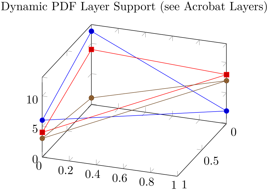
% Preamble: \pgfplotsset{width=7cm,compat=1.18}
% requires \usepackage[pdftex]{ocg}
\begin{tikzpicture}
\begin{axis}[
title=Dynamic PDF Layer Support (see Acrobat Layers),
view={110}{35},
]
\addplot3+ [
execute at begin plot visualization=\begin{ocg}{First Layer}{FirstLayer}{0},
execute at end plot visualization=\end{ocg},
]
                                coordinates
                    {(0,0,12) (0,1,2) (1,0,6) (0,0,12)};
\addplot3+ [
execute at begin plot visualization=\begin{ocg}{Second Layer}{SecondLayer}{0},
execute at end plot visualization=\end{ocg},
]
                                coordinates
                    {(0,0,9) (0,1,8) (1,0,4) (0,0,9)};
\addplot3+ [
execute at begin plot visualization=\begin{ocg}{Third Layer}{ThirdLayer}{0},
execute at end plot visualization=\end{ocg},
]
                                coordinates
                    {(0,0,1) (0,1,7) (1,0,3) (0,0,1)};
\end{axis}
\end{tikzpicture}
The execute * hooks insert the ocg-statements at the correct positions, and the single plot commands are added to different dynamic layers. Use the Acrobat Reader and its “Layers” Tab to switch each of them on or off. Note that it would not be enough to add the \begin{ocg}... statements right into the text since pgfplots postpones drawing commands until \end{axis} (splitting of survey and visualization phase).
See the article Creating PDF layers using ocg.sty on texample.net for more details on ocg and how to obtain it.
Technical note: these hooks are also inserted for \pgfplotsextra commands.
-
/pgfplots/execute at end plot visualization={
commands}
This is the counterpart of execute at begin plot visualization.
-
/pgfplots/forget plot={
true,false} (initially false)
Allows to include plots which are not remembered for legend entries, which do not increase the number of plots and which are not considered for cycle lists.
A forgotten plot can be some sort of decoration which has a separate style and does not influence the axis state, although it is processed as any other plot. Provide this option to \addplot as in the following example.
% Preamble: \pgfplotsset{width=7cm,compat=1.18}
\begin{tikzpicture}
\begin{loglogaxis}[
% some descriptions:
table/x=Basis,
table/y={L2/r},
xlabel=Degrees of Freedom,
ylabel=relative Error,
                        title=New Experiments (old in
                    gray),
legend entries={$e_1$,$e_2$,$e_3$},
]
\addplot [black!15,forget plot]
                            table
                    {plotdata/oldexperiment1.dat};
\addplot [black!15,forget plot]
                            table
                    {plotdata/oldexperiment2.dat};
\addplot [black!15,forget plot]
                            table
                    {plotdata/oldexperiment3.dat};
                        \addplot table
                    {plotdata/newexperiment1.dat};
                        \addplot table
                    {plotdata/newexperiment2.dat};
                        \addplot table
                    {plotdata/newexperiment3.dat};
\end{loglogaxis}
\end{tikzpicture}
Since forgotten plots won’t increase the plot index, they will use the same cycle list entry as following plots.
The style every forget plot can be used to configure styles for each such plot:
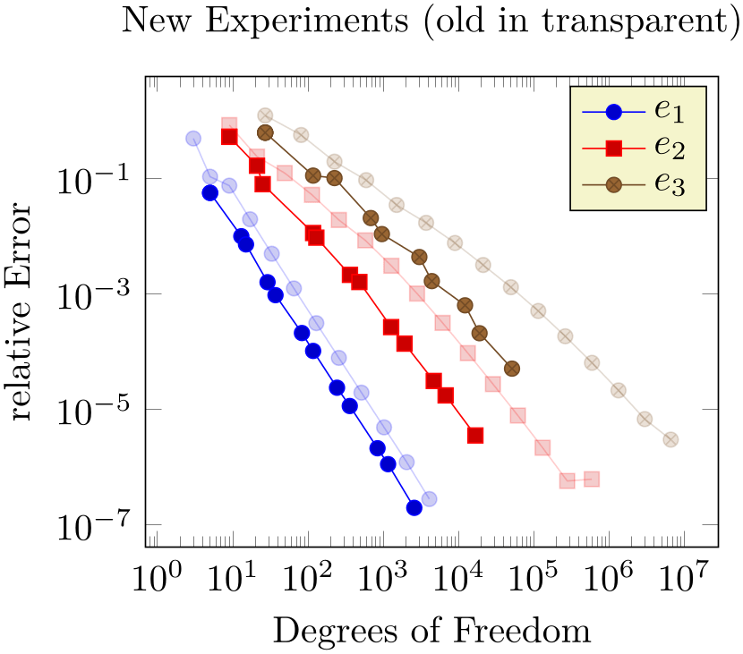
% Preamble: \pgfplotsset{width=7cm,compat=1.18}
\begin{tikzpicture}
\begin{loglogaxis}[
forget plot style={opacity=0.2},
% same as above:
table/x=Basis,
table/y={L2/r},
xlabel=Degrees of Freedom,
ylabel=relative Error,
                        title=New Experiments (old in
                    transparent),
legend entries={$e_1$,$e_2$,$e_3$},
]
\foreach \exp in {1,2,3} {
\addplot+ [forget plot]
                              table
                    {plotdata/oldexperiment\exp.dat};
                          \addplot table
                    {plotdata/newexperiment\exp.dat};
}
\end{loglogaxis}
\end{tikzpicture}
Here, the \addplot+ command means we are using the same cycle list as the following plot and forget plot style modifies every forget style and yields transparency of the “old experiments”.
Please note that every axis plot no index
styles are not applicable here.
A forgotten plot will be stacked normally if stack plots is enabled!


Allows to insert
commands
just before the axis is ended (see also
execute at end axis). This option takes effect inside of the clipped area.
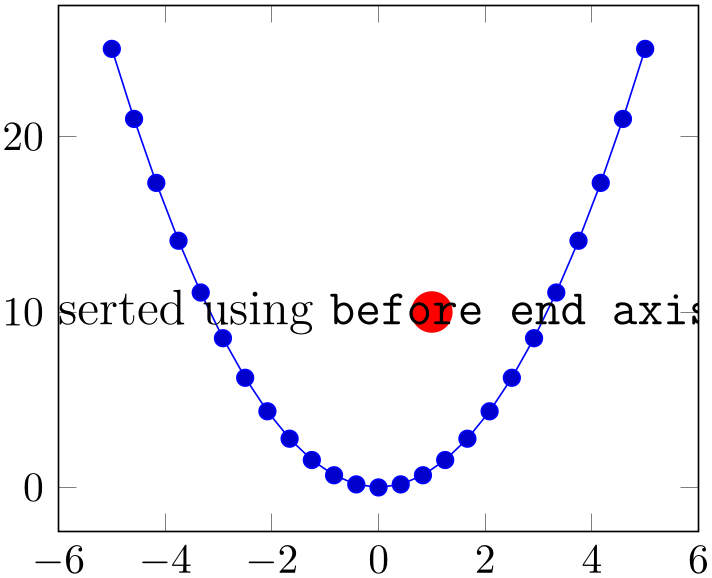
% Preamble: \pgfplotsset{width=7cm,compat=1.18}
\pgfplotsset{
every axis/.append style={
before end axis/.code={
\fill [red] (1,10) circle(5pt);
\node at (-4,10)
                                    {\large This
                    text has been inserted
                                     using
                    \texttt{before end axis}.};
},
},
}
\begin{tikzpicture}
\begin{axis}
\addplot {x^2};
\end{axis}
\end{tikzpicture}
Allows to insert
commands
right after the end of the clipped drawing commands. While
before end axis has the same effect as if
commands
had been placed inside of your axis,
after end axis allows to access axis
coordinates without being clipped.

% Preamble: \pgfplotsset{width=7cm,compat=1.18}
\pgfplotsset{
every axis/.append style={
after end axis/.code={
\fill [red] (1,10) circle(5pt);
\node at (-4,10)
                                    {\large This
                    text has been inserted using \texttt{after end axis}.};
},
},
}
\begin{tikzpicture}
\begin{axis}
\addplot {x^2};
\end{axis}
\end{tikzpicture}
-
/pgfplots/axis on top=true|false (initially false) 
If set to true, axis lines, ticks, tick labels and grid lines will be drawn on top of plot graphics.
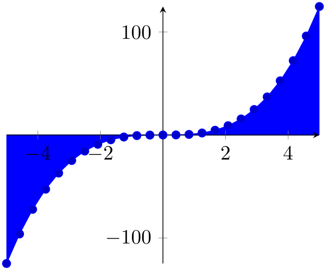
% Preamble: \pgfplotsset{width=7cm,compat=1.18}
\begin{tikzpicture}
\begin{axis}[
axis on top=true,
axis x line=middle,
axis y line=middle,
]
\addplot+ [fill] {x^3} \closedcycle;
\end{axis}
\end{tikzpicture}
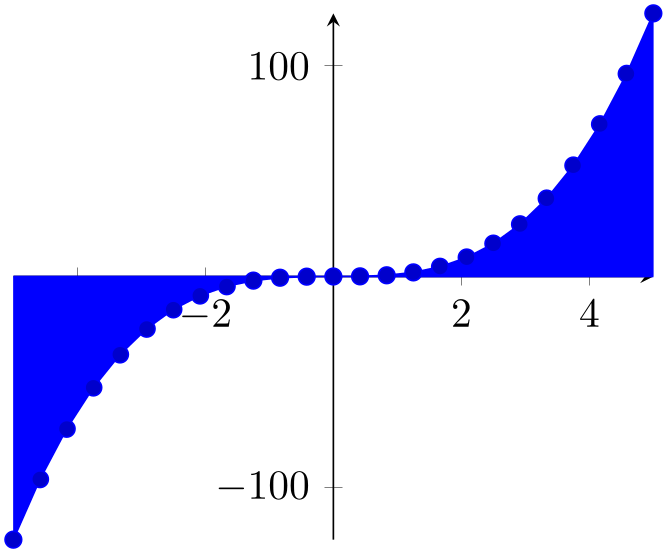
% Preamble: \pgfplotsset{width=7cm,compat=1.18}
\begin{tikzpicture}
\begin{axis}[
axis on top=false,
axis x line=middle,
axis y line=middle,
]
\addplot+ [fill] {x^3} \closedcycle;
\end{axis}
\end{tikzpicture}
Please note that this feature does not affect plot marks. I think it looks unfamiliar if plot marks are crossed by axis descriptions.
-
/pgfplots/visualization depends on=
\macro (initially empty)
-
/pgfplots/visualization depends on=
expression\as\macro (initially empty)
-
/pgfplots/visualization depends on=value
content\as\macro (initially empty)
Allows to communicate data to pgfplots which is essential to perform the visualization although pgfplots isn’t aware of it.
Suppose you want a scatter plot, which depends on the \((x,y)\) coordinates, the point meta data to draw individual colors and furthermore data which influences the mark size. Thus, you need a total of \(4\) coordinates for every data point, although pgfplots supports only \(3\) in its initial configuration.
Before we actually come to the main point of the problem, we’ll talk about how to get a scatter plot which has individual colors and individual sizes. It is not sufficient to set mark size alone, since mark size is evaluated only once, before markers are processed (the same holds for every mark). Thus, we can use scatter combined with
scatter/@pre marker code/.append style={/tikz/mark size=\perpointmarksize}.
The @pre marker code is installed for every marker of a scatter plot individually. Now, we come to the problem as such: where can we get the value for mark size, in our case called \perpointmarksize?
A solution is visualization depends on (using the second input syntax at this point):
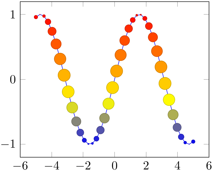
% Preamble: \pgfplotsset{width=7cm,compat=1.18}
\begin{tikzpicture}
\begin{axis}
\addplot+ [
scatter,
scatter src=y,
samples=40,
visualization depends on=
{5*cos(deg(x)) \as \perpointmarksize},
scatter/@pre marker code/.append style=
{/tikz/mark size=\perpointmarksize},
]
{sin(deg(x))};
\end{axis}
\end{tikzpicture}
Here, we define \perpointmarksize as 5*cos(deg(x)). The expression will be evaluated together with all
other coordinates. Thus, everything which is available during the survey phase can be used here. This includes the final
coordinates x, y, z; the constant meta expands to the current per point
meta data. Furthermore, \thisrow{colname} expands to the value of a table column.
The command
visualization depends on evaluates
and remembers every value in internal data structures. The remembered value is then available as
\macro
during the visualization phase. In our example, the @pre marker code is evaluated during the visualization phase
and applies mark size=5*cos(deg(x)).
The first syntax,
visualization depends on=\macro, tells pgfplots to use an already defined
\macro. The second syntax with
content\as\macro
provides also the value.
There can be more than one visualization depends on phrase.
In case the stored value is not of numerical type,77 you can use the prefix ‘value’ before the argument, i.e.
visualization depends on=value \macro
or
visualization depends on=value content\as \macro.
Such a value will be expanded and stored, but not parsed as number (at least not by pgfplots).
-
/pgf/fpu={
true,false} (initially true)
This key activates or deactivates the floating point unit. If it is disabled (false), the core pgf math engine written by Mark Wibrow and Till Tantau will be used for \addplot expression. However, this engine has been written to produce graphics and is not suitable for scientific computing. It is limited to fixed point numbers in the range \(\pm 16384.00000\).
If the fpu is enabled (true, the initial configuration) the high-precision floating point library of pgf written by Christian Feuersänger will be used. It offers the full range of IEEE double precision computing in TeX. This FPU is also part of PgfplotsTable, and it is activated by default for create col/expr and all other predefined mathematical methods.
Use
in order to de-activate the extended precision. If you prefer using the fp (fixed point) package, possibly combined with Mark Wibrows corresponding pgf library, the fpu will be deactivated automatically. Please note, however, that fp has a smaller data range (about \(\pm 10^{17}\)) and may be slower.
75 Please note that the axis’ scaling requires to compute \(1/( x_{\max } - x_{\min } )\). The option disabledatascaling may lead to overflow or underflow in this context, so use it with care! Normally, the data scale transformation avoids this problem.
76 This example from the game theory was provided by Pavel Stříž.
77 Or if it is just a constant and you’d like to improve speed.