Manual for Package pgfplots
2D/3D Plots in LATeX, Version 1.18.2
https://github.com/pgf-tikz/pgfplots
The Reference
4.3The \addplot Command: Coordinate Input
% Preamble: \pgfplotsset{width=7cm,compat=1.18}
\begin{tikzpicture}
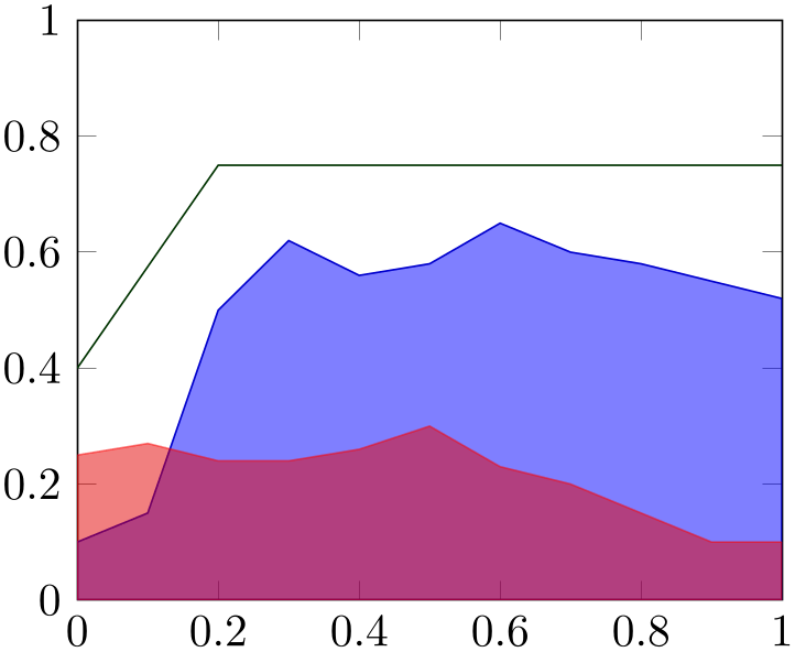
\begin{axis}[ymin=0,ymax=1,enlargelimits=false]
\addplot [blue!80!black,fill=blue,fill opacity=0.5,
] coordinates {
(0,0.1) (0.1,0.15) (0.2,0.5) (0.3,0.62)
(0.4,0.56) (0.5,0.58) (0.6,0.65) (0.7,0.6)
(0.8,0.58) (0.9,0.55) (1,0.52)
}
|- (0,0) -- cycle;
\addplot [red,fill=red!90!black,opacity=0.5,
] coordinates {
(0,0.25) (0.1,0.27) (0.2,0.24) (0.3,0.24)
(0.4,0.26) (0.5,0.3) (0.6,0.23) (0.7,0.2)
(0.8,0.15) (0.9,0.1) (1,0.1)
}
|- (0,0) -- cycle;
                    \addplot [green!20!black] coordinates
                {
(0,0.4) (0.2,0.75) (1,0.75)
};
\end{axis}
\end{tikzpicture}
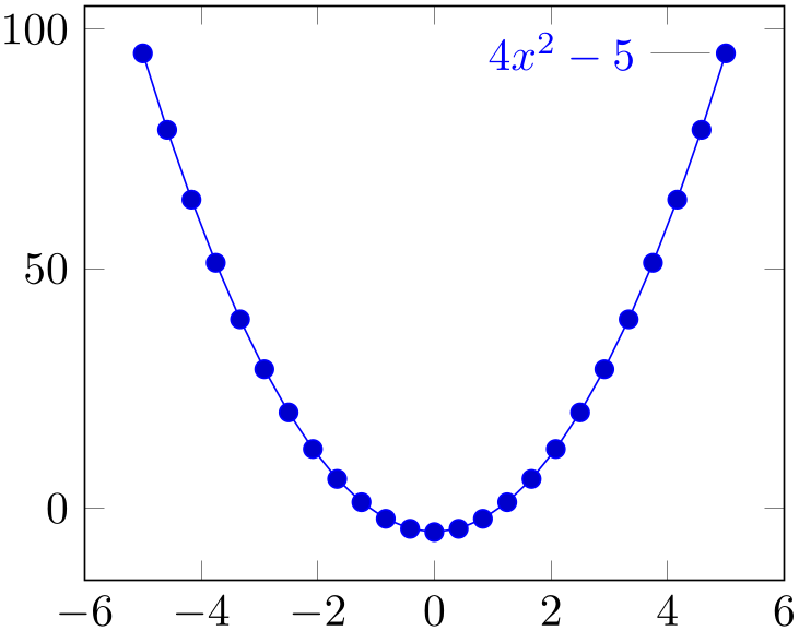
% Preamble: \pgfplotsset{width=7cm,compat=1.18}
\begin{tikzpicture}
\begin{axis}
\addplot+ [
id=parable,
domain=-5:5,
] gnuplot {4*x**2 - 5}
node [pin=180:{$4x^2-5$}]{}
;
\end{axis}
\end{tikzpicture}
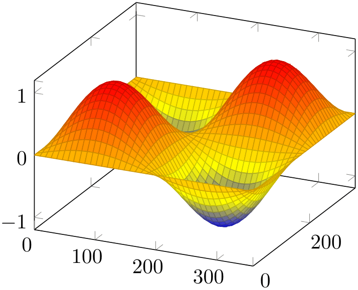
% Preamble: \pgfplotsset{width=7cm,compat=1.18}
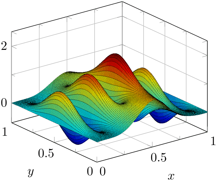
\begin{tikzpicture}
\begin{axis}
\addplot3 [
surf,
domain=0:360,
samples=40,
] {sin(x)*sin(y)};
\end{axis}
\end{tikzpicture}
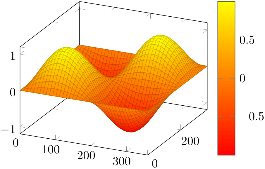
% Preamble: \pgfplotsset{width=7cm,compat=1.18}
\begin{tikzpicture}
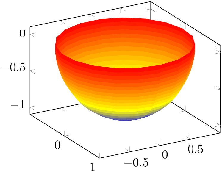
\begin{axis}[colormap/redyellow,colorbar]
\addplot3 [
surf,
domain=0:360,
samples=40,
] {sin(x)*sin(y)};
\end{axis}
\end{tikzpicture}
Inside of an axis environment, the \addplot command is the main user interface. It comes in two variants: \addplot for two-dimensional visualization and \addplot3 for three-dimensional visualization.
-
\addplot[
 options
 ]
input data
trailing path commands;
]
input data
trailing path commands;
-
• The style /pgfplots/every axis plot will be installed at the beginning of
options. That means you can use
to add options to all your plots – maybe to set line widths to thick. Furthermore, if you have more than one plot inside of an axis, you can also use
\pgfplotsset{every axis plot no 3/.append style={...}}to modify options for the plot with number \(3\) only. The first plot in an axis has number \(0\).
-
• The
options
are remembered for the legend. They are available as ‘current plot style’ as long as the path is not yet finished or in associated error bars.
-
• See Section 4.7 for a list of available markers and line styles.
-
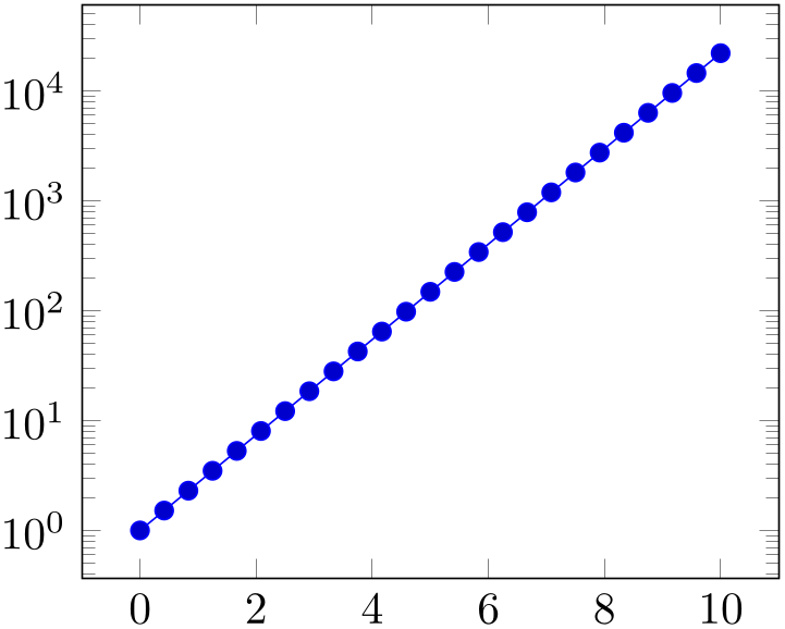
• For log plots, pgfplots will compute the natural logarithm \(\log (\cdot )\) numerically using a floating point unit developed for this purpose.3 For example, the following numbers are valid input to \addplot.
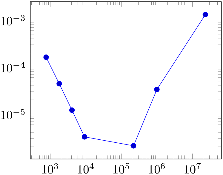
% Preamble: \pgfplotsset{width=7cm,compat=1.18}\begin{tikzpicture}\begin{loglogaxis}\addplot coordinates {(769, 1.6227e-04)(1793, 4.4425e-05)(4097, 1.2071e-05)(9217, 3.2610e-06)(2.2e5, 2.1E-6)(1e6, 0.00003341)(2.3e7, 0.00131415)};\end{loglogaxis}\end{tikzpicture}You can represent arbitrarily small or very large numbers as long as its logarithm can be represented as a TeX length (up to about \(16384\)). Of course, any coordinate \(x\le 0\) is not possible since the logarithm of a non-positive number is not defined. Such coordinates will be skipped automatically (using the initial configuration unbounded coords=discard).
-
• For normal (non-logarithmic) axes, pgfplots applies floating point arithmetics to support large or small numbers like \(0.00000001234\) or \(1.234\cdot 10^{24}\). Its number range is much larger than TeX’s native support for numbers. The relative precision is between \(4\) and \(7\) significant decimal digits for the mantissa.
As soon as the axes limits are completely known, pgfplots applies a transformation which maps these floating point numbers into TeX precision using transformations \(T_x(x) = 10^{s_x} \cdot x - a_x\) and \(T_y(y) = 10^{s_y} \cdot y - a_y\) and (for 3D plots) \(T_z(y) = 10^{s_z} \cdot z - a_z\) with properly chosen integers \(s_x, s_y, s_z \in \mathbb {Z}\) and shifts \(a_x,a_y, a_z\in \mathbb {R}\). Section 4.25 contains a description of disabledatascaling and provides more details about the transformation.
-
• Some of the coordinate input routines use the powerful \pgfmathparse feature of pgf to read their coordinates, among them \addplot coordinates, \addplot expression and \addplot table. This allows to use mathematical expressions as coordinates which will be evaluated using the floating point routines (this applies to logarithmic and linear scales).
-
• pgfplots automatically computes missing axis limits. The automatic computation of axis limits works as follows:
This is the main plotting command, available within each axis environment. It can be used one or more times within an axis to add plots to the current axis. There is also an \addplot3 command which is described in Section 4.6.
It reads point coordinates from one of the available input sources specified by
input data, updates limits, remembers
options
for use in a legend (if any) and applies any necessary coordinate transformations (or logarithms).
The
options
can be omitted in which case the next entry from the
cycle list will be inserted as
options. These keys characterize the plot’s type like linear interpolation with
sharp plot, smooth plot, constant interpolation with
const plot, bar plot, mesh plots,
surface plots or whatever and define colors, markers and line specifications.2 Plot variants like error bars, the number of
samples or a sample
domain can also be configured in
options.
The
input data
is one of several coordinate input tools which are described in more detail below. Finally, if
\addplot successfully processed all coordinates from
input data, it generates TikZ paths to realize the drawing operations. Any
trailing path commands
are appended to the final drawing command, allowing to continue the TikZ path (from the last plot coordinate).
Some more details:
-
\addplot+[
options] …;
Does the same like
\addplot[options] ...; except that
options
are appended to the arguments which would have been taken for
\addplot ... (the element of the default list).
Thus, you can combine cycle list and
options.

% Preamble: \pgfplotsset{width=7cm,compat=1.18}
\begin{tikzpicture}
\begin{axis}
\addplot {sin(deg(x))};
\end{axis}
\end{tikzpicture}
\begin{tikzpicture}
\begin{axis}
\addplot+
[only marks] {sin(deg(x))};
\end{axis}
\end{tikzpicture}
The distinction is as follows: \addplot ... (without
options) lets pgfplots select colors, markers and linestyles automatically (using
cycle list). The variant \addplot+[option] ... will use the same automatically determined styles, but in addition it uses
options. Finally, \addplot[options] (without the +) uses only the manually provided
options.
-
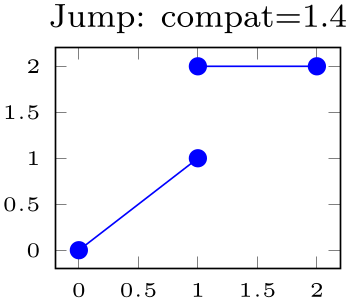
/pgfplots/empty line=auto|none|scanline|jump (initially auto) 
Controls how empty lines in the input coordinate stream are to be interpreted. You should ensure that you have \pgfplotsset{compat=1.4} or newer in your preamble and leave this key at its default empty line=auto.
Empty lines can occur between the coordinates of \addplot coordinates or successive rows of the data file input routines \addplot table (and \addplot file).
The choice auto checks if the current plot type is mesh or surf. If so, it uses scanline. If the current plot type is some other plot type (like a standard line plot), it uses jump. Note that the value auto for non-mesh plots results in none if compat=1.3 or older is used. In other words: you have to write \pgfplotsset{compat=1.4} or newer to let pgfplots interpret empty lines as jump in standard line plots:
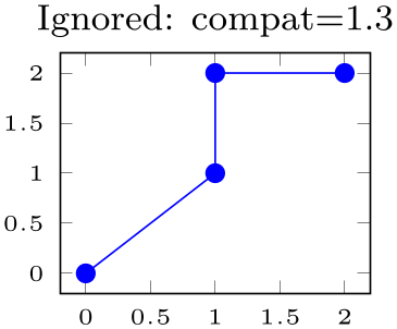
% Preamble: \pgfplotsset{width=7cm,compat=1.18}
\begin{tikzpicture}
\begin{axis}[tiny,
title={Ignored: compat=1.3},
compat=1.3,
]
\addplot table {
A B
0 0
1 1
1 2
2 2
};
\end{axis}
\end{tikzpicture}
\begin{tikzpicture}
\begin{axis}[tiny,
title={Jump: compat=1.4},
compat=1.4,
]
\addplot table {
A B
0 0
1 1
1 2
2 2
};
\end{axis}
\end{tikzpicture}
The choice scanline is only useful for mesh and surf: it is used to decode a matrix from a coordinate stream. If an empty line occurs once every \(N\) data points, the “scanline” length is \(N\). This information, together with mesh/ordering and the total number of points, allows to deduce the matrix size. However, the distance between empty lines has to be consistent: if the first two empty lines have a distance of \(2\) and the next comes after \(5\), pgfplots will ignore the information and will expect explicit matrix sizes using mesh/rows and/or mesh/cols. The choice scanline is ignored if mesh input=patches. It has no effect for other plot types.
The choice none will silently discard any empty line in the input stream.
The choice jump tells pgfplots to generate a jump.
2 In version 1.2.2 and earlier, there was an explicit distinction between “behavior” options like
error bars, domain, number of samples etc. and “style options” like color, line width, markers etc. This
distinction is obsolete now, simply collect everything into
options.
3 This floating point unit is available as TikZ library as part of TikZ.
4.3.1Coordinate Lists
-
                        \addplot coordinates
                        {
coordinate list};
-
\addplot[
 options
 ] coordinates
{coordinate list}
trailing path commands;
] coordinates
{coordinate list}
trailing path commands;
-
\addplot3 … 
The ‘\addplot coordinates’ command is like that provided by TikZ and reads its input data from a sequence of point coordinates, encapsulated in round braces.
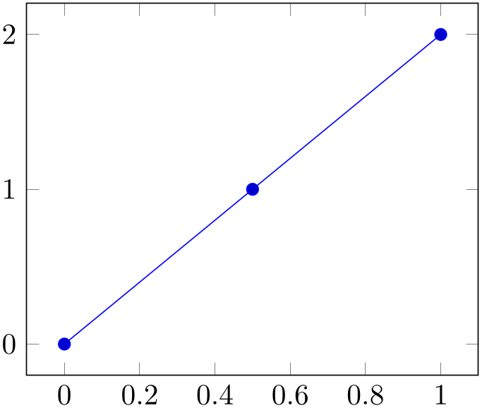
% Preamble: \pgfplotsset{width=7cm,compat=1.18}
\begin{tikzpicture}
\begin{axis}
                        \addplot coordinates
                    {
(0,0)
(0.5,1)
(1,2)
};
\end{axis}
\end{tikzpicture}
You should only use this input format if you have short diagrams and you want to provide mathematical expressions for each of the involved coordinates. Any data plots are typically easier to handle using a table format and \addplot table.
The coordinates can be numbers, but they can also contain mathematical expressions like sin(0.5) or \h*8 (assuming you defined \h somewhere). However, expressions which involve round braces need to be encapsulated in a further set of curly braces, for example ({sin(0.5)},{cos(0.1)}).
You can also supply error coordinates (reliability bounds) if you are interested in error bars. Simply append the error
coordinates with ‘+- (ex,ey)’ (or +- (ex,ey,ez)) to the associated coordinate:
% Preamble: \pgfplotsset{width=7cm,compat=1.18}
\begin{tikzpicture}
\begin{axis}
\addplot+ [
error bars/.cd,
x dir=both,
x explicit,
] coordinates {
                            (0,0)   +-
                    (0.1,0)
                            (0.5,1) +-
                    (0.4,0.2)
(1,2)
                            (2,5)   +-
                    (1,0.1)
};
\end{axis}
\end{tikzpicture}
or
                    \addplot coordinates
                    {
(900,1e-6) +- (0.1,0.2)
(2600,5e-7) +- (0.2,0.5)
(4000,7e-8) +- (0.1,0.01)
};
These error coordinates are only used in case of error bars, see Section 4.12. You will also need to configure whether these values denote absolute or relative errors.
The coordinates as such can be numbers as +5, -1.2345e3, 35.0e2, 0.00000123 or 1e2345e-8. They are not limited to TeX’s precision.
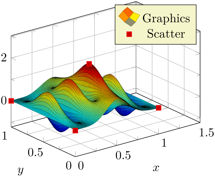
Furthermore, coordinates allows to define “meta data” for each coordinate. The interpretation of meta data depends on the visualization technique: for scatter plots, meta data can be used to define colors or style associations for every point (see 4.5.12 for an example). Meta data (if any) must be provided after the coordinates and after error bar bounds (if any) in square brackets:
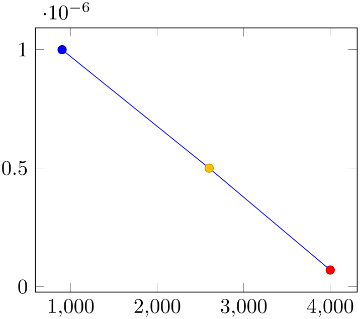
% Preamble: \pgfplotsset{width=7cm,compat=1.18}
\begin{tikzpicture}
\begin{axis}
\addplot+ [
scatter,
scatter src=explicit,
] coordinates {
(900,1e-6) [1]
(2600,5e-7) [2]
(4000,7e-8) [3]
};
\end{axis}
\end{tikzpicture}
Please refer to the documentation of point meta at 4.8 for more information about per point meta data.
The coordinate stream can contain empty lines to tell pgfplots that the function has jumps. To use it, simply insert an empty line (and ensure that you have \pgfplotsset{compat=1.4} or newer in your preamble). See the documentation of empty line for details.
-
/pgfplots/plot coordinates/math parser=true|false (initially true) 
Allows to turn off support for mathematical expressions in every coordinate inside of \addplot coordinates. This might be necessary if coordinates are not in numerical form (or if you’d like to improve speed).
It is necessary to disable plot coordinates/math parser if you use some sort of symbolic transformations (i.e. text coordinates).
4.3.2Reading Coordinates From Tables
-
\addplot table [
column selection]{file or inline table};
-
\addplot[
options] table
[column selection]{file or inline table}
trailing path commands;
-
\addplot3 … 
-
1. If tables contain few rows and many columns, the
\macro
framework will be more efficient.
-
2. If tables contain more than \(200\) data points (rows), you should always use file input (and reload if necessary).
-
• Use \addplot table [x={
column name},y={column name}] to access column names. Those names are case sensitive and need to exist.
-
• Use \addplot table [x index={
column index},y index={column index}] to access column indices. Indexing starts with \(0\). You may also use an index for \(x\) and a
column name for \(y\).
-
• Use \addplot table [x expr=\coordindex,y={
column name}] to plot the coordinate index versus some \(y\) data.
-
• Use \addplot table [header=false] {
file name} if your input file has no column names. Otherwise, the first non-comment line is checked for column names: if all
entries are numbers, they are treated as numerical data; if one of them is not a number, all are treated as column
names.
-
• It is possible to read error coordinates from tables as well. Simply add options ‘x error’, ‘y error’ or ‘x error index’/‘y error index’ to
source columns. See Section 4.12 for details about error bars.
-
• It is possible to read per point meta data (usable in scatter src, see Section 4.5.12) as has been discussed for \addplot coordinates and \addplot file above. The meta data column can be provided using the meta key (or the meta index key).
-
• Use \addplot table [
source columns] {\macro} to use a pre-read table. Tables can be read using
\pgfplotstableread{datafile.dat}\macroname.If you like, you can insert the optional keyword ‘from’ before \macroname.
-
• The accepted input format of tables is as follows:
-
– Rows are separated by new line characters.
Alternatively, you can use row sep=\\ which enables ‘\\’ as row separator. This might become necessary for inline table data, more precisely: if newline characters have been converted to white spaces by TeX’s character processing before pgfplots had a chance to see them. This happens if inline tables are provided inside of macros. Use row sep=\\ and separate the rows by ‘\\’ if you experience such problems.
-
– Columns are usually separated by white spaces (at least one tab or space).
If you need other column separation characters, you can use the
col sep=space|tab|comma|colon|semicolon|braces|&|ampersand
option documented in all detail in the manual for PgfplotsTable which is part of pgfplots.
-
– Any line starting with ‘#’ or ‘%’ is ignored.
-
– The first line will be checked if it contains numerical data. If there is a column in the first line which is no number, the complete line is considered to be a header which contains column names. Otherwise it belongs to the numerical data and you need to access column indices instead of names.
-
– The accepted number format is the same as for ‘\addplot coordinates’, see above.
-
– If you omit column selectors, the default is to plot the first column against the second. That means \addplot table does exactly the same job as \addplot file for this case.
-
– If you need unbalanced columns, simply use nan as “empty cell” placeholder. These coordinates will be skipped in plots.
-
-
• It is also possible to use mathematical expressions together with ‘\addplot table’. This is documented in all detail in Section 4.3.4, but the key idea is to use one of x expr, y expr, z expr or meta expr as in ‘\addplot table[x expr=\thisrow{maxlevel}+3,y=L2]’.
-
• The PgfplotsTable package coming with pgfplots has a the feature “Postprocessing Data in New Columns” (see its manual).
This allows to compute new columns based on existing data. One of these features is create col/linear regression (described in Section 4.24).
You can invoke all the create col/
key name
features directly in
\addplot table
using
\addplot table [x={create col/
key name=arguments}].
In this case, a new column will be created using the functionality of
key name. This column generation is described in all detail in PgfplotsTable. Finally, the
resulting data is available as \(x\) coordinate (the same holds for
y= or
z=).
One application (with several examples how to use this syntax) is line fitting with create col/linear regression, see Section 4.24 for details.
-
• The table can contain empty lines to tell pgfplots that the function has jumps. To use it, simply insert an empty line (and ensure that you have \pgfplotsset{compat=1.4} or newer in your preamble). See the documentation of empty line for details.
-
• Technical note: every opened file will be protocolled into your log file.
This input method is the main input format for any data-based function. It accepts either a file containing data or an inline table provided in curly braces.
Given a data file like
                    dof     L2
                                 Lmax
                               maxlevel
5 8.31160034e-02 1.80007647e-01 2
17 2.54685628e-02 3.75580565e-02 3
49 7.40715288e-03 1.49212716e-02 4
129 2.10192154e-03 4.23330523e-03 5
321 5.87352989e-04 1.30668515e-03 6
769 1.62269942e-04 3.88658098e-04 7
1793 4.44248889e-05 1.12651668e-04 8
4097 1.20714122e-05 3.20339285e-05 9
9217 3.26101452e-06 8.97617707e-06 10
one may want to plot ‘dof’ versus ‘L2’ or ‘dof’ versus ‘Lmax’. This can be done by
\begin{tikzpicture}
\begin{loglogaxis}[
xlabel=Dof,
ylabel=$L_2$ error,
]
\addplot table [x=dof,y=L2] {datafile.dat};
\end{loglogaxis}
\end{tikzpicture}
or, for the Lmax column, using
\begin{tikzpicture}
\begin{loglogaxis}[
xlabel=Dof,
ylabel=$L_\infty$ error,
]
\addplot table [x=dof,y=Lmax] {datafile.dat};
\end{loglogaxis}
\end{tikzpicture}
It is also possible to provide the data inline, i.e. directly as argument in curly braces:
\begin{tikzpicture}
\begin{loglogaxis}[
xlabel=Dof,
ylabel=$L_\infty$ error,
]
\addplot table [x=dof,y=Lmax] {
                                dof     L2
                                 Lmax
                               maxlevel
                                5
                          8.31160034e-02  1.80007647e-01  2
                                17
                         2.54685628e-02  3.75580565e-02  3
                                49
                         7.40715288e-03  1.49212716e-02  4
                                129
                        2.10192154e-03  4.23330523e-03  5
                                321
                        5.87352989e-04  1.30668515e-03  6
                                769
                        1.62269942e-04  3.88658098e-04  7
                                1793
                       4.44248889e-05  1.12651668e-04  8
                                4097
                       1.20714122e-05  3.20339285e-05  9
                                9217
                       3.26101452e-06  8.97617707e-06  10
};
\end{loglogaxis}
\end{tikzpicture}
Inline table may be convenient together with ‘\\’ and row sep=\\, see below for more information.
Alternatively, you can load the table once into an internal structure and use it multiple times:4
I am not really sure how much time can be saved, but it works anyway. The \pgfplotstableread command is documented in all detail in the manual for PgfplotsTable. As a rule of thumb, decide as follows:
Occasionally, it might be handy to load a table, apply manual preparation steps (for example \pgfplotstabletranspose) and plot the result tables afterwards.
If you do prefer to access columns by column indices instead of column names (or your tables do not have column names), you can also use
Summary and remarks:
4 In earlier versions, there was an addition keyword ‘from’ before the argument like \addplot table from {\loadedtable}. This keyword is still accepted, but no longer required.
Keys To Configure Table Input
The following list of keys allow different methods to select input data or different input formats. Note that the common prefix
‘table/’ can be omitted if these keys are set after
\addplot table[options]. The /pgfplots/ prefix can always be omitted when used in a pgfplots method.
-
/pgfplots/table/x={
column name}
-
/pgfplots/table/y={
column name}
-
/pgfplots/table/z={
column name}
-
/pgfplots/table/x index={
column index}
-
/pgfplots/table/y index={
column index}
-
/pgfplots/table/z index={
column index}
These keys define the sources for \addplot table. If both column names and column indices are given, column names are preferred. Column indexing starts with \(0\). The initial setting is to use x index=0 and y index=1.
Please note that column aliases will be considered if unknown column names are used. Please refer to the manual of PgfplotsTable which comes with this package.
-
/pgfplots/table/x expr={
expression}
-
/pgfplots/table/y expr={
expression}
-
/pgfplots/table/z expr={
expression}
These keys allow to combine the mathematical expression parser with file input. They are listed here to complete the list of table keys, but they are described in all detail in Section 4.3.4.
The key idea is to provide an
expression
which depends on table data (possibly on all columns in one row). Only data within the same row can be used where columns
are referenced with \thisrow{column name} or \thisrowno{column index}.
Please refer to Section 4.3.4 for details.
-
/pgfplots/table/x error={
column name}
-
/pgfplots/table/y error={
column name}
-
/pgfplots/table/z error={
column name}
-
/pgfplots/table/x error index={
column index}
-
/pgfplots/table/y error index={
column index}
-
/pgfplots/table/z error index={
column index}
-
/pgfplots/table/x error expr={
math expression}
-
/pgfplots/table/y error expr={
math expression}
-
/pgfplots/table/z error expr={
math expression}
These keys define input sources for error bars with explicit error values.
The x error method provides an input column name (or
alias), the x error index method provides
input column indices and
x error expr works just as
table/x expr: it allows arbitrary mathematical expressions which may depend on any number of table columns using
\thisrow{col name}.
Please see Section 4.12 for details about the usage of error bars.
-
/pgfplots/table/x error plus={
column name}
-
/pgfplots/table/y error plus={
column name}
-
/pgfplots/table/z error plus={
column name}
-
/pgfplots/table/x error plus index={
column index}
-
/pgfplots/table/y error plus index={
column index}
-
/pgfplots/table/z error plus index={
column index}
-
/pgfplots/table/x error plus expr={
math expression}
-
/pgfplots/table/y error plus expr={
math expression}
-
/pgfplots/table/z error plus expr={
math expression}
-
/pgfplots/table/x error minus={
column name}
-
/pgfplots/table/y error minus={
column name}
-
/pgfplots/table/z error minus={
column name}
-
/pgfplots/table/x error minus index={
column index}
-
/pgfplots/table/y error minus index={
column index}
-
/pgfplots/table/z error minus index={
column index}
-
/pgfplots/table/x error minus expr={
math expression}
-
/pgfplots/table/y error minus expr={
math expression}
-
/pgfplots/table/z error minus expr={
math expression}
These keys define input sources for error bars with asymmetric error values, i.e. different values for upper and lower bounds.
They are to be used in the same way as x error. In fact, x error is just a style which sets both x error plus and x error minus to the same value.
Please see Section 4.12 for details about the usage of error bars.
-
/pgfplots/table/meta={
column name}
-
/pgfplots/table/meta index={
column index}
-
/pgfplots/table/meta expr={
expression}
These keys define input sources for per point meta data. Please see page (page for section 4.5.12) for details about meta data or the documentation for \addplot coordinates and \addplot file for further information.
These keys are only useful in conjunction with point meta=explicit or point meta=explicit symbolic. Note that
\addplot [point meta=explicit] table [meta=colname] ... ;
is equivalent to
                    \addplot [point meta=\thisrow{colname}] table
                    [] ... ;
If the value of point meta is neither explicit nor explicit symbolic, the choice table/meta (and its friends) are ignored.
However, if point meta is one of explicit or explicit symbolic, the choice table/meta (or one of its friends) is mandatory.
-
/pgfplots/table/row sep=newline|\\ (initially newline) 
-
1. First possibility: call \pgfplotstableread{
data}\yourmacro outside of any macro declaration.
-
2. Use row sep=\\.
Configures the character to separate rows.
The choice newline uses the end of line as it appears in the table data (i.e. the input file or any inline table data).
The choice \\ uses ‘\\’ to indicate the end of a row.
Note that newline for inline table data is “fragile”: you can’t provide such data inside of TeX macros (this does not apply to input files). Whenever you experience problems, proceed as follows:
The same applies if you experience problems with inline data and special col sep choices (like col sep=tab).
The reasons for such problems is that TeX scans the macro bodies and replaces newlines by white spaces. It does other substitutions of this sort as well, and these substitutions can’t be undone (maybe not even found).
-
/pgfplots/table/read completely={
auto,true,false} (initially auto)
Allows to customize
\addplot table{file name} such that it always reads the entire table into memory.
This key has just one purpose, namely to create postprocessing columns on the fly and to plot those columns afterwards. This “lazy evaluation” which creates missing columns on the fly is documented in the PgfplotsTable manual (in section “Postprocessing Data in New Columns”).
The initial configuration auto checks whether one of the keys table/x, table/y, table/z or table/meta contains a create on use column. If so, it enables read completely, otherwise it prefers to load the file in the normal way.
Attention:
Usually, \addplot table only picks required entries, requiring linear runtime complexity. As soon as read completely is activated, tables are loaded completely into memory. Due to data structures issues (“macro append runtime”), the runtime complexity for read completely is \(O(N^2)\) where \(N\) is the number of rows. Thus: use this feature only for “small” tables.5
-
/pgfplots/table/ignore chars={
comma-separated-list} (initially empty)
Allows to silently remove a set of single characters from input files. The characters are separated by commas. The documentation for this command, including cases like ‘\%,\#,\ ’ or binary character codes like ‘\^^ff’ can be found in the manual for PgfplotsTable.
-
/pgfplots/table/white space chars={
comma-separated-list} (initially empty)
Allows to define a list of single characters which are actually treated like white spaces (in addition to tabs and spaces). Please refer to the manual of PgfplotsTable for details.
-
/pgfplots/table/comment chars={
comma-separated-list} (initially empty)
Allows to add one or more additional comment characters. Each of these characters has a similar effect as the # character, i.e. all following characters of that particular input line are skipped.
For example, comment chars=! uses ‘!’ as additional comment character (which allows to parse Touchstone files).
Please refer to the manual of PgfplotsTable for details.
-
/pgfplots/table/skip first n={
integer} (initially 0)
Allows to skip the first
integer
lines of an input file. The lines will not be processed.
Please refer to the manual of PgfplotsTable for details.
-
/pgfplots/table/search path={
comma-separated-list} (initially .)
Allows to provide a search path for input tables. This variable is evaluated whenever pgfplots attempts to read a data file. This includes both \pgfplotstableread and \addplot table; its value resembles a comma-separated list of path names. The requested file will be read from the first matching location in that list.
Use ‘.’ to search using the normal TeX file searching procedure. This standard search procedure will typically use the current working directory and the environment variable TEXINPUTS as for any other \input or \include statements.
An entry in
comma-separated-list
can be relative to the current working directory, i.e. something like
search path={.,../datafiles} is accepted.
-
/pgfplots/table/search path/implicit .=true|false (initially true) 
PgfplotsTable allows to add ‘.’ to the value of search path implicitly as this is typically assumed in many applications of search paths.
The initial configuration search path/implicit .=true will ensure that ‘.’ is added in front of the search path if the user value does not contain a ‘.’.
The value search path/implicit .=false will not add ‘.’.
Keep in mind that ‘.’ means “let TeX search for the file on its own”. This will typically find files in the current working directory, but it will also include processing of the environment variable TEXINPUTS.
5 This remark might be deprecated; many of the slow routines have been optimized in the meantime to have at least pseudolinear runtime.
4.3.3Computing Coordinates with Mathematical Expressions
-
\addplot {
 math expression
 }
;
}
;
-
\addplot[
options] {math expression}
trailing path commands;
-
\addplot3 … 
-
1. What really goes on is a loop which assigns the current sample coordinate to the macro \x. pgfplots defines a math constant x which always has the same value as \x.
In short: it is the same whether you write \x or just x inside of math expressions.
The variable name can be customized using variable=t. Then, t will be the same as \t.
-
2. The complete set of math expressions can be found in the pgf manual. The most important mathematical operations are +, -, *, /, abs, round, floor, mod, <, >, max, min, sin, cos, tan, deg (conversion from radians to degrees), rad (conversion from degrees to radians), atan, asin, acos, cot, sec, cosec, exp, ln, sqrt, the constants pi and e, ^ (power operation), factorial,6 rand (random between \(-1\) and \(1\)), rnd (random between \(0\) and \(1\)), number format conversions hex, Hex, oct, bin and some more. The math parser has been written by Mark Wibrow and Till Tantau, the FPU routines have been developed as part of pgfplots. The documentation for both parts can be found in the PGF/TikZ manual.
Please note, however, that trigonometric functions are defined in degrees (see trig format). The character ‘^’ is used for exponentiation (not ‘**’ as in gnuplot).
-
3. If the \(x\)-axis is logarithmic, samples will be drawn logarithmically.
-
4. Plot expression also allows to define per point meta data (color data) using point meta=
math expression.
This input method allows to provide mathematical expressions which will be sampled. But unlike \addplot gnuplot, the expressions are evaluated using the math parser of pgf, no external program is required.
Plot expression samples x from the interval \([a,b]\) where \(a\)
and \(b\) are specified with the domain key. The number of
samples can be configured with samples=N
as for plot gnuplot.
% Preamble: \pgfplotsset{width=7cm,compat=1.18}
\begin{tikzpicture}
\begin{axis}
\addplot {x^2 + 4};
\addplot {-5*x^3 - x^2};
\end{axis}
\end{tikzpicture}
Please note that pgf’s math parser is configured to use trig format=degrees by default whenever trigonometric functions are involved:
% Preamble: \pgfplotsset{width=7cm,compat=1.18}
\begin{tikzpicture}
\begin{axis}
\addplot+ [
domain=0:360,
] {sin(x)};
\end{axis}
\end{tikzpicture}
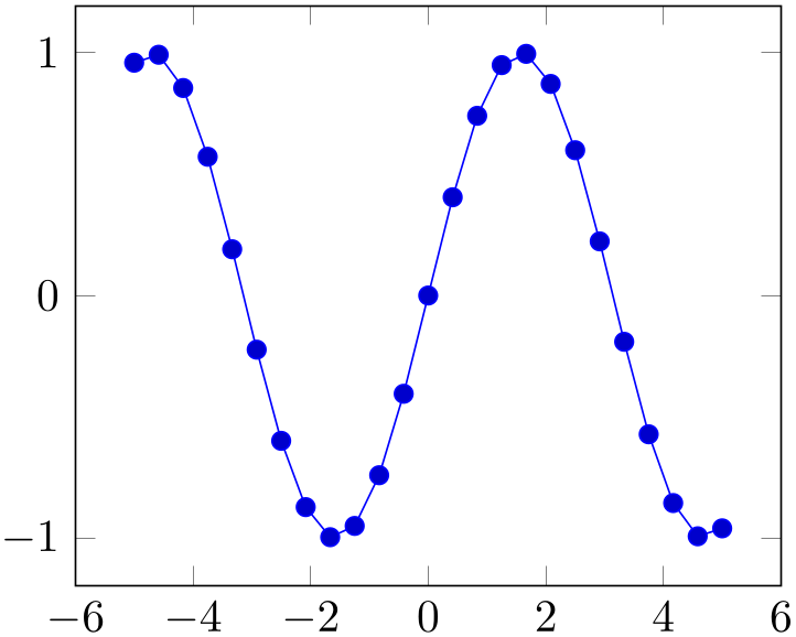
If you want to use radians, use
% Preamble: \pgfplotsset{width=7cm,compat=1.18}
\begin{tikzpicture}
\begin{axis}
\addplot+ [
domain=-pi:pi,
] {sin(deg(x))};
\end{axis}
\end{tikzpicture}
to convert the radians to degrees (also see trig format and trig format plots).
The plot expression parser also accepts some more options like
samples at={coordinate list} or domain=first:last
which are described below.
Remarks
About the precision and number range:
Starting with version 1.2, \addplot expression uses a floating point unit. The FPU provides the full data range of scientific computing with a relative precision between \(10^{-4}\) and \(10^{-6}\). The /pgf/fpu key provides some more details.
Note that pgfplots makes use of lualatex’s features: if you use lualatex instead of pdflatex, pgfplots will use lua’s math engine which is both faster and more accurate (compat=1.12 or higher).
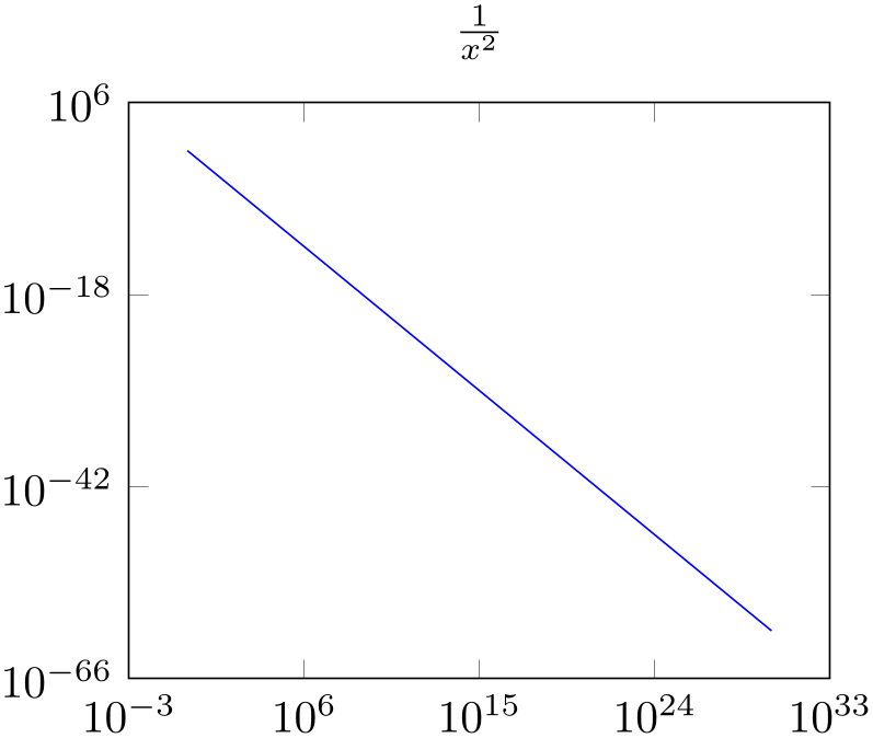
% Preamble: \pgfplotsset{width=7cm,compat=1.18}
\begin{tikzpicture}
\begin{loglogaxis}[
title={$\frac{1}{x^2}$},
]
\addplot [
blue,
domain=1:1e30,
] {x^-2};
\end{loglogaxis}
\end{tikzpicture}
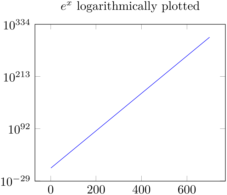
% Preamble: \pgfplotsset{width=7cm,compat=1.18}
\begin{tikzpicture}
\begin{semilogyaxis}[
                        title={$e^x$ logarithmically
                    plotted},
]
\addplot [
blue,
domain=1:700,
] {exp(x)};
\end{semilogyaxis}
\end{tikzpicture}
-
\addplot (
x expression,y expression)
;
-
\addplot[
options] (x expression,y expression)
trailing path commands;
-
\addplot3 … 
A variant of \addplot expression which allows to provide different coordinate expressions for the \(x\)- and \(y\)-coordinates. This can be used to generate parameterized plots.
Please note that \addplot (x,x^2) is equivalent to \addplot expression {x^2}.
Note further that since the complete point expression is surrounded by round braces, round braces for either
\(x\) expression
or
\(y\) expression
need special attention. You will need to introduce curly braces additionally to allow round braces:
\addplot ({\(x\) expr}, {\(y\) expr}, {\(z\) expr});
-
/pgfplots/domain=
\(x_1\):\(x_2\) (initially [-5:5])
-
/pgfplots/y domain=
\(y_1\):\(y_2\)
-
/pgfplots/domain y=
\(y_1\):\(y_2\)
Sets the function’s domain(s) for
\addplot
expression
and
\addplot gnuplot. Two dimensional plot expressions are defined as functions \(f\colon [x_1,x_2] \to \mathbb {R}\) and
\(x_1\)
and
\(x_2\)
are set with domain. Three dimensional plot expressions use functions \(f\colon [x_1,x_2] \times [y_1,y_2] \to \mathbb {R}\) and
\(y_1\)
and
\(y_2\)
are set with y domain. If y domain is empty, \([y_1,y_2] = [x_1,x_2]\) is
assumed for three dimensional plots (see page (??) for details about three dimensional plot expressions).
The keys y domain and domain y are the same.
The domain key will be ignored if samples at is specified; samples at has higher precedence.
Please note that domain is not necessarily the same as the axis limits (which are configured with the xmin/xmax options).
The domain keys are only relevant for gnuplot and \addplot expression. In case you’d like to plot only a subset of other coordinate input routines, consider using the coordinate filter restrict x to domain.
Remark for TikZ users:
/pgfplots/domain and /tikz/domain are independent options. Please prefer the pgfplots variant (i.e. provide domain to an axis, \pgfplotsset or a plot command). Since older versions also accepted something like \begin{tikzpicture}[domain=\(\dotsc \)], this syntax is also accepted as long as no pgfplots domain key is set.
-
/pgfplots/samples={
number} (initially 25)
-
/pgfplots/samples y={
number}
Sets the number of sample points for \addplot expression and plot gnuplot. The samples key defines the number of samples used for line plots while the samples y key is used for mesh plots (three dimensional visualization, see page (??) for details). If samples y is not set explicitly, it uses the value of samples.
The samples key won’t be used if samples at is specified; samples at has higher precedence.
The same special treatment of /tikz/samples and /pgfplots/samples as for the domain key applies here. See above for details.
-
/pgfplots/samples at={
coordinate list}
Sets the \(x\)-coordinates for \addplot expression explicitly. This overrides domain and samples.
The
coordinate list
is a \foreach expression, that means it can
contain a simple list of coordinates (comma-separated), but also complex ... expressions like7
\pgfplotsset{samples at={5e-5,7e-5,10e-5,12e-5}}
\pgfplotsset{samples at={-5,-4.5,...,5}}
\pgfplotsset{samples at={-5,-3,-1,-0.5,0,...,5}}
The same special treatment of /tikz/samples at and /pgfplots/samples at as for the domain key applies here. See above for details.
Attention:
samples at overrides
domain, even if domain has been set after
samples at! Use samples at={} to clear
coordinate list
and re-activate domain.
-
/pgfplots/variable={
variable name} (initially x)
-
/pgfplots/variable y={
variable name} (initially y)
Defines the variables names which will be sampled in domain (with variable) and in domain y (with variable y).
The same variables are used for parametric and for non-parametric plots. Use variable=t to change them if you like (for gnuplot, there is such a distinction; see parametric/var 1d).
Technical remark: TikZ also uses the variable key. However, it expects a macro name, i.e. \x instead of just x. Both possibilities are accepted here.
-
/pgfplots/trig format plots=default|deg|rad (initially default) 
Allows to reconfigure the input format for trigonometric functions like sin, cos, tan, and their friends.
This key reconfigures trigonometric functions inside of plot expressions, point meta arguments, and other items which are directly related to the evaluation of plot coordinates.
Note that this does not apply to TikZ drawing instructions like \node, \draw, \fill, etc.
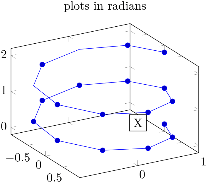
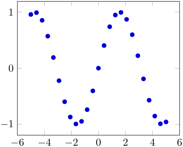
% Preamble: \pgfplotsset{width=7cm,compat=1.18}
\begin{tikzpicture}
\begin{axis}[view={60}{30},trig format plots=rad,
title=plots in radians,
]
\addplot3+ [domain=0:4*pi,samples=19,samples y=1]
({sin(x)},
{cos(x)},
{2*x/(4*pi)});
% drawing instructions still use PGF's default
\node [fill=white,draw=black,anchor=center] at
({sin(90)},{cos(90)},1) {X};
\end{axis}
\end{tikzpicture}
Limitations:
this feature is currently unavailable for polaraxis and smithchart.
-
/pgf/trig format=deg|rad (initially deg) 
Allows to reconfigure the trigonometric format for all user arguments.
This affects all user arguments including view, TikZ polar coordinates, pins of \nodes, start/end angles for edges, etc.
At the time of this writing, this feature is in experimental state: it can happen that it breaks TikZ internals. Please handle with care and report any bugs.

% Preamble: \pgfplotsset{width=7cm,compat=1.18}
\begin{tikzpicture}
\begin{axis}[view={rad(60)}{rad(30)},
trig format=rad,
title=all in radians,
]
\addplot3+ [domain=0:4*pi,samples=19,samples y=1]
({sin(x)},
{cos(x)},
{2*x/(4*pi)});
% drawing instructions now also use radians
\node [fill=white,draw=black,anchor=center] at
({sin(pi/2)},{cos(pi/2)},1) {X};
\end{axis}
\end{tikzpicture}
6 Starting with pgf versions newer than 2.00, you can use the postfix operator ! instead of factorial.
7 Unfortunately, the ... is somewhat restrictive when it comes to extended accuracy. So, if you have particularly small or large numbers (or a small distance), you have to provide a comma-separated list (or use the domain key).
4.3.4Mathematical Expressions And File Data
pgfplots allows to combine ‘\addplot table’ and ‘plot expression’ to get both file input and modifications by means of mathematical expressions.
-
\addplot table [
column selection and expressions]{file};
-
\addplot[
options] table
[column selection and expressions]{file}
trailing path commands;
-
\addplot3 …
-
\thisrow{
column name}
-
\coordindex 
-
\lineno 
-
1. Column access via x has higher precedence than index access via x index.
-
2. Even if x expr is provided, the values of x index and x are still checked. Any value found using column name access or column index access is made available as \columnx (or \columny, \columnz, \columnmeta, resp.). However, the result of x expr is used as plot coordinate.
This allows to access the cell values identified by x or x index using the “pointer” \columnx. I am not sure if this yields any advantage, but it is possible nevertheless. If in doubt, prefer using \thisrow{
column name}.
Besides the already discussed possibility to provide a column selection by means of column names (x=name
or x index=index, see Section 4.3.2), it is also possible to provide
mathematical expressions as arguments.
Mathematical expressions are specified with x expr=expression
inside of
column selection and expressions. They can depend on zero, one or more columns of the input file. A column is referenced using the special command
‘\thisrow{column name}’ within
expression
(or \thisrownocolumn index).
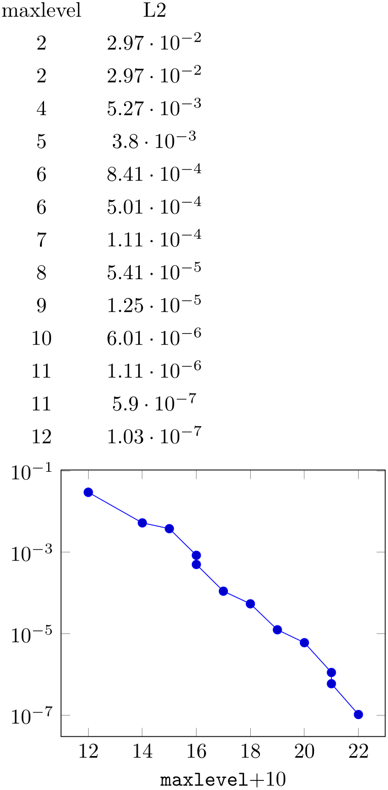
% Preamble: \pgfplotsset{width=7cm,compat=1.18}
\pgfplotstabletypeset[columns={maxlevel,L2}]{plotdata/newexperiment1.dat}
\begin{tikzpicture}
\begin{semilogyaxis}[
xlabel=\texttt{maxlevel}$ + 10$,
]
\addplot table [
x expr=\thisrow{maxlevel}+10,
y=L2,
] {plotdata/newexperiment1.dat};
\end{semilogyaxis}
\end{tikzpicture}
Besides x expr, there are keys y expr, z expr and meta expr where the latter allows to provide point meta data (which is used as scatter src or color data for surface plots etc.).
Inside of
expression, the following macros can be used to access numerical data cells inside of the input file:
Yields the value of the column designated by
column name. There is no limit on the number of columns which can be part of a mathematical expression, but only values inside of
the currently processed table row can be used.
It is possible to provide column aliases for
column name
as described in the manual of PgfplotsTable.
The argument
column name
has to denote either an existing column or one for which a column alias exists (see the manual of
PgfplotsTable). If it can’t be resolved, the math parser yields an “Unknown
function” error message.
Limitations:
this macro is currently unavailable if you use something of like \addplot table {\loadedtable} and the expression occurs outside of the normal plot coordinates. You have hit the limitation if and only if you encounter an error of sorts
! Package PGF Math Error: Unknown function `thisrow_unavailable_load_table_directly'.
The only alternative is to load the table directly from a file name, i.e. using \addplot table {filename.txt}. Also see \pgfplotstablesave.
Yields the current index of the table row (starting with \(0\)). This does not count header or comment lines.
Yields the current line number (starting with \(0\)). This does also count header and comment lines.
If x index, x and x expr (or the corresponding keys for y, z or meta) are combined, this is how they interact:
Attention:
If your table has less than two rows, you may need to set x index={},y index={} explicitly. This is a consequence of the fact that column name/index access is still applied even if an expression is provided.
4.3.5Computing Coordinates with Mathematical Expressions (gnuplot)
-
                        \addplot gnuplot
                    [
further options]{gnuplot code};
-
\addplot[
options] gnuplot
[further options]{gnuplot code}
trailing path commands;
-
\addplot3 … 
-
• \addplot expression does not require any external programs and requires no additional command line options.
-
• \addplot expression does not produce a lot of temporary files.
-
• \addplot gnuplot uses radians for trigonometric functions while \addplot expression has degrees (unless pgf is configured for trig format=rad).
-
• \addplot gnuplot is faster than pdflatex. Using lualatex and compat=1.12 (or higher) can reach a similar speed.
-
• \addplot gnuplot has a higher accuracy. Note that lualatex and compat=1.12 (or higher) come with the same precision.
-
• The independent variable for one-dimensional plots can be changed with the variable option, just as for \addplot expression. Similarly, the second variable for two dimensional plots can be changed with variable y.
For parametric plots, the variable names need to be adjusted with parametric/var 1d and parametric/var 2d (since gnuplot uses t and u,v as initial values for parametric plots).
-
• Please note that \addplot gnuplot does not allow separate per point meta data (color data for each coordinate). You can, however, use point meta=f(x) or point meta=x.
-
• The generated output file name can be customized with id, see below.
In contrast to \addplot expression, the plot gnuplot command8 employs the external program gnuplot to compute coordinates. The resulting coordinates are written to a text file which will be plotted with \addplot file. pgf checks whether coordinates need to be regenerated and calls gnuplot whenever necessary (this is usually the case if you change the number of samples, the argument to \addplot gnuplot or the plotted domain).9
The differences between \addplot expression and plot gnuplot are:
Since system calls are a potential danger, they need to be enabled explicitly using command line options, for example
pdflatex -shell-escape filename.tex.
Sometimes it is called shell-escape or enable-write18. Sometimes one needs two hyphens – that all depends on your TeX distribution.
% Preamble: \pgfplotsset{width=7cm,compat=1.18}
\begin{tikzpicture}
\begin{axis}
                        \addplot gnuplot
                    [
id=sin,
] {sin(x)};
\end{axis}
\end{tikzpicture}
% Preamble: \pgfplotsset{width=7cm,compat=1.18}
\begin{tikzpicture}
\begin{semilogyaxis}
\addplot gnuplot
[
id=exp,
domain=0:10,
] {exp(x)};
\end{semilogyaxis}
\end{tikzpicture}
The
options
determine the appearance of the plotted function; these parameters also affect the legend. There is also a set of options
which are specific to the gnuplot interface. These options are described in all detail in
the PGF/TikZ manual, Section 22.6. A short summary is
shown below. Some remarks:
Please refer to the PGF/TikZ manual, Section 22.6 for more details about \addplot function and the gnuplot interaction.
-
/pgfplots/parametric=true|false (initially false) 
Set this to true if you’d like to use parametric plots with gnuplot. Parametric plots use a comma separated list of expressions to make up \(x(t),\, y(t)\) for a line plot or \(x(u,v), \, y(u,v)\, z(u,v)\) for a mesh plot (refer to the gnuplot manual for more information about its input methods for parametric plots).
-
/pgfplots/parametric/var 1d={
variable name} (initially t)
-
/pgfplots/parametric/var 2d={
variable name,variable name} (initially u,v)
Allows to change the dummy variables used by parametric gnuplot plots. The initial setting is the one of gnuplot: to use the dummy variable ‘t’ for parametric line plots and ‘u,v’ for parametric mesh plots.
These keys are quite the same as variable and variable y, only for parametric plots. If you like to change variables for non-parametric plots, use variable and/or variable y.
In case you don’t want the distinction between parametric and non-parametric plots, use
-
/tikz/prefix={
file name prefix}
A common path prefix for temporary filenames (see the PGF/TikZ manual, Section 22.6 for details).
8 Note that plot gnuplot is actually a re-implementation of the plotfunction method known from pgf. It also invokes pgf basic layer commands.
9 Please note that pgfplots produces slightly different files than TikZ when used with plot gnuplot (it configures high precision output). You should use different id for pgfplots and TikZ to avoid conflicts in such a case.
4.3.6Computing Coordinates with External Programs (shell)
-
                        \addplot shell
                    [
further options]{shell commands};
-
\addplot[
options] shell
[further options]{shell commands}
trailing path commands;
-
\addplot3 … 
In contrast to
\addplot gnuplot, the plot shell command allows execution of arbitrary shell
commands to compute coordinates. The resulting coordinates are written to a text file which will be plotted with
\addplot file. pgf checks whether coordinates need to be regenerated and executes the
shell commands
whenever necessary.
Since system calls are a potential danger, they need to be enabled explicitly using command line options, for example
pdflatex -shell-escape filename.tex.
Sometimes it is called shell-escape or enable-write18. Sometimes one needs two slashes – that all depends on your TeX distribution.
% Preamble: \pgfplotsset{width=7cm,compat=1.18}
\begin{tikzpicture}
\begin{axis}
\addplot shell
[
prefix=pgfshell_,
id=cos
] {
awk 'BEGIN{
pi=3.14159; N=10;
                                for(i=0;i<=N;i++) print
                    i,cos(i/N*pi);
}'
};
\end{axis}
\end{tikzpicture}

% Preamble: \pgfplotsset{width=7cm,compat=1.18}
\begin{tikzpicture}
\begin{axis}
% just reprint the result from above
\addplot+ [
prefix=pgfshell_,
id=replot,
] shell {cat pgfshell_cos.out};
\end{axis}
\end{tikzpicture}
The
options
determine the appearance of the plotted function; these parameters also affect the legend. There is also a set of options
which are specific to the gnuplot and the shell interface. These options are described in all detail in
the PGF/TikZ manual, Section 22.6. A short summary is
shown below.
-
/tikz/id={
unique string identifier}
A unique identifier for the current plot. It is used to generate temporary filenames for shell output.
-
/tikz/prefix={
file name prefix}
A common path prefix for temporary filenames (see the PGF/TikZ manual, Section 22.6 for details).
4.3.7Using External Graphics as Plot Sources
-
\addplot graphics {
file name};
-
\addplot[
options] graphics
{file name}
trailing path commands;
-
\addplot3 … 
-
1. The free vector graphics program inkscape can help here. Its feature “File \(\gg \) Document Properties: Fit page to selection” computes a tight bounding box around every picture element.
However, some images may contain a rectangular path which is as large as the bounding box (Matlab® computes such .eps images). In this case, use the “Ungroup” method (context menu of inkscape) as often as necessary and remove such a path.
Finally, save as .eps.
However, inkscape appears to have problems with postscript fonts – it substitutes them. This doesn’t pose problems in this application because fonts shouldn’t be part of such images – the descriptions will be drawn by pgfplots.
-
2. The tool pdfcrop removes surrounding whitespace in .pdf images and produces quite good bounding boxes.
This plot type allows to extend the plotting capabilities of pgfplots beyond its own limitations. The idea is to generate the graphics as such (for example, a contour plot, a complicated shaded surface10 or a large point cluster) with an external program like Matlab® or gnuplot. The graphics, however, should not contain an axis or descriptions. Then, we use \includegraphics and a pgfplots axis which fits exactly on top of the imported graphics.
Of course, one could do this manually by providing proper scales and such. The operation \addplot graphics is intended so simplify this process. However the main difficulty is to get images with correct bounding box. Typically, you will have to adjust bounding boxes manually.
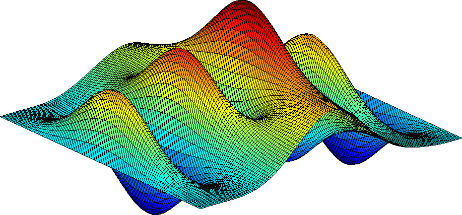
Let’s start with an example: Suppose we use, for example, Matlab to generate a surface plot like
which is then found in external1.png. The surf command of Matlab generates the surface, the following commands disable the axis descriptions, initialise the desired view and export it. Viewing the image in any image tool, we see a lot of white space around the surface – Matlab has a particular weakness in producing tight bounding boxes, as far as I know. Well, no problem: use your favorite image editor and crop the image (most image editors can do this automatically). We could use the free ImageMagick command
convert -trim external1.png external1.png
to get a tight bounding box. Then, we use
% Preamble: \pgfplotsset{width=7cm,compat=1.18}
\begin{tikzpicture}
\begin{axis}[
enlargelimits=false,
axis on top,
]
                        \addplot graphics
                    [
xmin=-3,xmax=3,
ymin=-3,ymax=3,
] {external1};
\end{axis}
\end{tikzpicture}
to load the graphics11 just as if we would have drawn it with pgfplots. The axis on top simply tells pgfplots to draw the axis on top of any plots (see its description).
Please note that pgfplots offers support for smaller surface plots as well which might be an option – unless the number of samples is too large. See Section 4.6.6 for details.
However, external programs have the following advantages here: they are faster, allow more complexity and provide real \(z\) buffering which is currently only simulated by pgfplots. Thus, it may help to consider \addplot graphics for complicated surface plots.
Our first test was successful – and not difficult at all because graphics programs can automatically compute the bounding box. There are a couple of free tools available which can compute tight bounding boxes for .eps or .pdf graphics:
10 See also Section 4.6.6 for an overview of pgfplots methods to draw shaded surfaces.
11 Please note that I had no Matlab license at hand, so I used gnuplot to produce an equivalent replacement graphics. The principles hold for gnuplot, Matlab, and Octave, however.
4.3.7.1Adjusting bounding boxes manually
In case you don’t have tools at hand to provide correct bounding boxes, you can still use TeX to set the bounding box manually. Some viewers like gv provide access to low-level image coordinates. The idea is to determine the number of units which need to be removed and communicate these units to \includegraphics.
I am aware of the following methods to determine bounding boxes manually:
- inkscape
-
I am pretty sure that inkscape can do it.
- gv
-
The ghost script viewer gv always shows the postscript units under the mouse cursor.
- gimp
-
The graphics program gimp usually shows the cursor position in pixels, but it can be configured to display postscript points (pt) instead.
Let’s follow this approach in a further example.
We use gnuplot to draw a (relatively stupid) example data set. The gnuplot script
set samples 30000
set parametric
unset border
unset xtics
unset ytics
set output "external2.eps"
set terminal postscript eps color
plot [t=0:1] rand(0),rand(0) with dots notitle lw 5
generates external2.eps with a uniform random sample of size \(30000\). As before, we import this scatter plot into pgfplots using \addplot graphics. Again, the bounding box is too large, so we need to adjust it (gnuplot can do this automatically, but we do it anyway to explain the mechanisms):
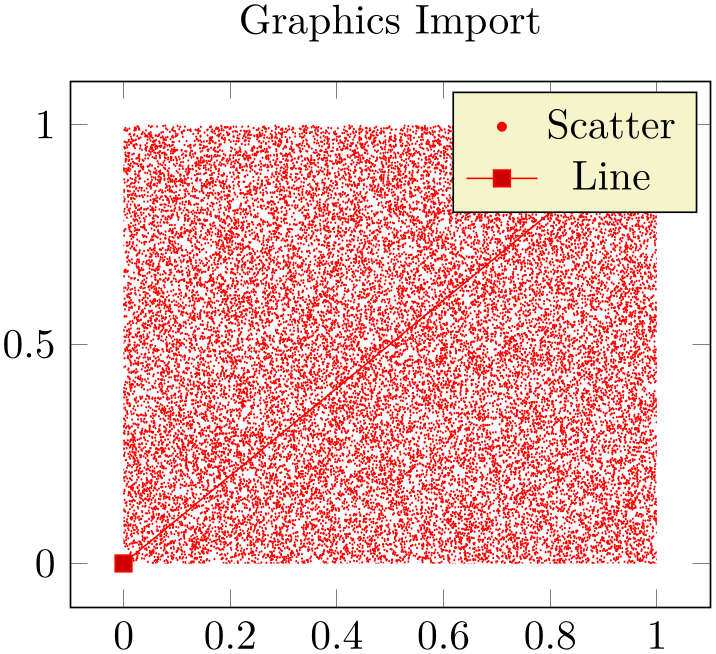
Using gv, I determined that the bounding box needs to be shifted 12 units to the left and 9 down. Furthermore, the right end is 12 units too far off and the top area has about 8 units space wasted. This can be provided to the trim option of \includegraphics, and we use clip to clip the rest away:
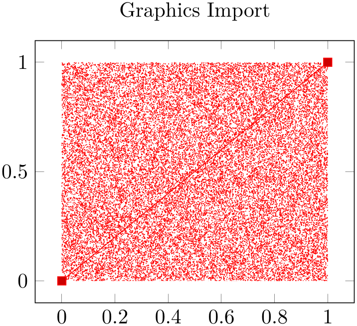
% Preamble: \pgfplotsset{width=7cm,compat=1.18}
\begin{tikzpicture}
\begin{axis}[
axis on top,
title=Graphics Import,
]
                      \addplot graphics
                  [
xmin=0,xmax=1,
ymin=0,ymax=1,
% trim=left bottom right top
includegraphics={trim=12 9 12 8,clip},
] {external2};
                      \addplot coordinates
                  {(0,0) (1,1)};
\end{axis}
\end{tikzpicture}
So, \addplot graphics takes a graphics file along with options which can be passed to \includegraphics. Furthermore, it provides the information how to embed the graphics into an axis. The axis can contain any other \addplot command as well and will be resized properly.
4.3.7.2Details about plot graphics:
The loaded graphics file is drawn with
\node[/pgfplots/plot graphics/node] {\includegraphics[options]{file name}};
where the node style is a configurable style. The node is placed at the coordinate designated by xmin, ymin.
The
options
are any arguments provided to the
includegraphics key (see below) and
width and
height determined such that the graphics fits exactly into
the rectangle denoted by the xmin, ymin and
xmax, ymax coordinates.
The scaling will thus ignore the aspect ratio of the external image and prefer the one used by pgfplots. You will need to provide width and height to the pgfplots axis to change its scaling. Use the scale only axis key in such a case.
4.3.7.3Legends in plot graphics:
A legend for \addplot graphics uses the current plot handler and the current plot mark:
% Preamble: \pgfplotsset{width=7cm,compat=1.18}
\begin{tikzpicture}
\begin{axis}[axis on top,title=Graphics Import]
% provide options for the legend:
\addplot [
red,
only marks,mark=*,mark size=1pt,
] graphics [
xmin=0,xmax=1,ymin=0,ymax=1,
% trim=left bottom right top
includegraphics={trim=12 9 12 8,clip},
] {external2};
                      \addplot coordinates
                  {(0,0) (1,1)};
\legend{Scatter,Line}
\end{axis}
\end{tikzpicture}
4.3.8Keys To Configure Plot Graphics
The following list of keys configure
\addplot graphics. Note that the common prefix ‘\addplot graphics/’ can be omitted if these keys are set after
\addplot graphics[options]. The /pgfplots/ prefix can always be omitted when used in a pgfplots method.
-
/pgfplots/plot graphics/xmin={
coordinate}
-
/pgfplots/plot graphics/ymin={
coordinate}
-
/pgfplots/plot graphics/zmin={
coordinate}
-
/pgfplots/plot graphics/xmax={
coordinate}
-
/pgfplots/plot graphics/ymax={
coordinate}
-
/pgfplots/plot graphics/zmax={
coordinate}
These keys are required for \addplot graphics and provide information about the external data range. The graphics will be squeezed between these coordinates. The arguments are axis coordinates; they are only useful if you provide each of them.
Alternatively, you can also use the plot graphics/points feature to provide the external data range, see below.
-
/pgfplots/plot graphics/points={
list of coordinates} (initially empty)
This key also allows to
provide the external data range. It constitutes an alternative to
plot graphics/xmin (and its variants): simply
provide at least two coordinates in
list of coordinates. Their bounding box is used to determine the external data range, and the graphics is squeezed between these coordinates.
The example from above can be written equivalently as

% Preamble: \pgfplotsset{width=7cm,compat=1.18}
\begin{tikzpicture}
\begin{axis}[
axis on top,
title=Graphics Import,
]
                        \addplot graphics
                    [
% instead of the min/max things:
points={(0,1) (1,0)},
% trim=left bottom right top
includegraphics={trim=12 9 12 8,clip},
] {external2};
                        \addplot coordinates
                    {(0,0) (1,1)};
\end{axis}
\end{tikzpicture}
The
list of coordinates
is a sequence of the form (x,y) for two-dimensional plots and (x,y,z) for three-dimensional ones, the
ordering is irrelevant. The single elements are separated by white space.
It is possible to mix plot graphics/xmin and variants with plot graphics/points.
The plot graphics/points key has further functionality for inclusion of three-dimensional graphics which is discussed at the end of this section (on page (page for section 4.3.8)). Here is a short reference on the accepted syntax for three-dimensional plot graphics: in addition to the (x,y,z) syntax, you can provide arguments of the form (x,y,z) => (X,Y). Here, the first (three-dimensional) coordinate is a logical coordinate and the second (two-dimensional) coordinate denotes the coordinates of the very same point, but inside of the included image (relative to the lower left corner of the image). Applications and examples for this syntax can be found in the section for three-dimensional plot graphics (see page (page for section 4.3.8)).
-
/pgfplots/plot graphics/includegraphics={
options}
A list of
options which will be passed as is to \includegraphics. Interesting options include the trim=left
bottom
right
top
key which reduces the bounding box and clip which discards everything outside of the bounding
box. The scaling options won’t have any effect, they will be overwritten by pgfplots.
-
/pgfplots/plot graphics/node(style, no value) 
A predefined style used for the TikZ node containing the graphics. The predefined value is
\pgfplotsset{
plot graphics/node/.style={
transform shape,
inner sep=0pt,
outer sep=0pt,
every node/.style={},
anchor=south west,
at={(0pt,0pt)},
rectangle
}
}
-
/pgfplots/plot graphics(no value) 
This key belongs to the public low-level plotting interface. You won’t need it in most cases.
This key is similar to sharp plot or smooth or const plot: it installs a low-level plot handler which expects exactly two points: the lower left corner and the upper right one. The graphics will be drawn between them. The graphics file name is expected as value of the /pgfplots/plot graphics/src key. The other keys described above need to be set correctly (excluding the limits, these are ignored at this level of abstraction). This key can be used independently of an axis.
-
/pgfplots/plot graphics/lowlevel draw={
width}{height}
A low-level
interface for
\addplot
graphics
which actually invokes \includegraphics. But there is no magic involved: the command is simply expected to draw a
box of dimensions
width
\(\times \)
height. The coordinate system has already been shifted correctly.
The initial configuration is
\includegraphics[value of “plot graphics/includegraphics”,width=#1,height=#2]
{value of “plot graphics/src”}.
Thus, you can tweak \addplot graphics to place any TeX box of the desired dimensions into an axis between the provided minimum and maximum coordinates. It is not necessary to make use of the graphics file name or the options in the ‘includegraphics’ key if you overwrite this low-level interface with
plot graphics/lowlevel draw/.code 2 args={code which depends on #1 and #2}.
Support for External Three-Dimensional Graphics
pgfplots offers several visualization techniques for three dimensional graphics. Nevertheless, complex visualizations or specialized applications are beyond the scope of pgfplots and you might want to use other tools to generate such figures.
The \addplot graphics tool of pgfplots allows to include three-dimensional external graphics: it generates a three-dimensional axis on its own. The idea is to provide a graphics (without descriptions) and use pgfplots to overlay a three-dimensional axis automatically. This allows to maintain document consistency (making it unnecessary to use different programs within the same document).
You are probably wondering how this is possible. Well, it needs more user input than two-dimensional external graphics. The cost to include external three dimensional images into pgfplots is essentially control of a graphics program like gimp: you need to identify the 3D coordinates of a couple of points in your image. pgfplots will then squeeze the graphics correctly, and it reconfigures the axis to ensure a correct display of the result.
Matlab versus other tools:
Although this section is based on Matlab images, the technique to import three-dimensional graphics is independent of Matlab. Thus, if you have a different tool, you need to read all that follows. However, users of Matlab can use a simplified export mechanism which has been contributed by Jürnjakob Dugge. Please skip to Section 4.3.8 if you use Matlab to generate the graphics files (although you may want to take a brief look at the examples on the following pages to learn about flexibility or legends).
Let’s start with two examples. Suppose you generate a surface plot with Matlab and want to include it in pgfplots. We have the Matlab script
which generates the figure in question.
After automatically computing a tight bounding box for plotgraphics3dsurf.png (I used gimp’s Image\(\gg \)Autocrop feature), and making the background color transparent (gimp: select the outer white space with the magic wand, then use12 Layer\(\gg \)Transparency\(\gg \)Color to Transparency) we get:
The key idea is now to identify several points in the image, and assign both their logical three-dimensional coordinates and the corresponding two-dimensional canvas coordinates in image coordinates. How? Well, the three-dimensional coordinates are known to Matlab, it can display them for you if you click somewhere into the image, compare Figure 1 (left).
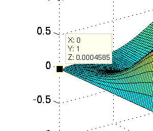
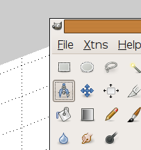
Figure 1: Using Matlab to extract image coordinates (left) and Gimp to measure distances (right).
The two-dimensional canvas coordinates need work; they need to be provided relative to the lower left corner of the image. I used gimp and activated “Points” as units (lower left corner). The lower left corner now displays the image coordinates in pt which is compatible with pgfplots. An alternative to pointing onto coordinates is a measurement tool; compare Figure 1 (right) for the “Measure” tool in gimp which allows to compute the length of a line (in our case, the length of the lower left corner to the point of interest).
I selected four points in the graphics and noted their 2d image coordinates and their 3d logical coordinates as follows:
% Preamble: \pgfplotsset{width=7cm,compat=1.18}
\begin{tikzpicture}
\begin{axis}[
grid=both,minor tick num=1,
xlabel=$x$,ylabel=$y$,
]
                    \addplot3
                graphics [
points={% important
(0,1,0) => (0,207-112)
(1,0,0) => (446,207-133)
                            (0.5546,0.5042,1.825) =>
                (236,207)
(0,0,0) => (194,207-202)
},
] {plotdata/plotgraphics3dsurf.png};
\end{axis}
\end{tikzpicture}
Here, the points key gets our collected
coordinates as argument. It accepts a sequence of maps of the form
3d logical coordinate
=>
2d canvas coordinate. In our case, (0,1,0) has been found in the .png file at (0,207-112). Note that I introduced
the difference since gimp counts from the upper left, but pgfplots counts from the lower
left.
Once these four point coordinates are gathered, we find Matlab’s surface plot in a pgfplots axis. You can modify any appearance options, including different axis limits or further \addplot commands:
% Preamble: \pgfplotsset{width=7cm,compat=1.18}
\begin{tikzpicture}
\begin{axis}[
xmax=1.5,% extra limits
grid=both,minor tick num=1,
xlabel=$x$,ylabel=$y$,
]
\addplot3 [surf] % 'surf': only used for legend
graphics [
points={
                                (0,1,0) =>
                (0,207-112)
                                (1,0,0) =>
                (446,207-133)
                                (0.5546,0.5042,1.825) =>
                (236,207)
                                (0,0,0) =>
                (194,207-202)
},
] {plotdata/plotgraphics3dsurf.png};
\addlegendentry{Graphics}
\addplot3+ [only marks] coordinates {
(0,1,0) (1,0,0)
(0.5546,0.5042,1.825) (0,0,0)
};
\addlegendentry{Scatter}
\end{axis}
\end{tikzpicture}
pgfplots uses the four input points to compute appropriate x, y and z unit vectors (and the origin in graphics coordinates). These four vectors (with two components each) can be computed as a result of a linear system of size \(8\times 8\), that is why you need to provide four input points (each has two coordinates). pgfplots computes the unit vectors of the imported graphics, and afterwards it rescales the result such that it fits into the specified width and height. This rescaling respects the unit vector ratio (more precisely, it uses scale mode=scale uniformly instead of scale mode=stretch to fill). Consequently, the freedom to change the view of a three-dimensional axis which contains a projected graphics is considerably smaller than before. Surprisingly, you can still change axis limits and width and height – pgfplots will take care of a correct display of your imported graphics. Since version 1.6, you can also change zmin and/or zmax – pgfplots will respect your changes as good as it can.
Here is a further example. Suppose we are given the three-dimensional visualization

It has been generated by Matlab (I only added transparency to the background with gimp). Besides advanced visualization techniques, it uses axis equal, i.e. unit vector ratio=1 1 1. As before, we need to identify four points, each with its 3d logical coordinates (from Matlab) and the associated 2d canvas coordinates relative to the lower left corner of the graphics (note that there is a lot of white space around the graphics). Here is the output of pgfplots when you import the resulting graphics:
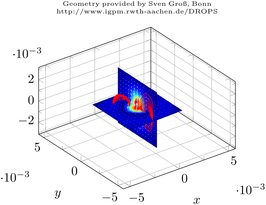
% Preamble: \pgfplotsset{width=7cm,compat=1.18}
\begin{tikzpicture}
\begin{axis}[
grid=both,minor tick num=1,
xlabel=$x$,ylabel=$y$,
title={\centering
Geometry provided by Sven Gro\ss, Bonn\\
http://www.igpm.rwth-aachen.de/DROPS\\},
title style={text width=6cm,font=\tiny},
]
                    \addplot3
                graphics [
points={
                            (-0.002625,0.002625,0) =>
                (140,234)
                            (0,0.00263,0.00263)    =>
                (230,364)
                            (0,-0.00263,-0.00263)  =>
                (366,81)
                            (0,-0.00263,0.00263)   =>
                (366,276)
(0.002625,0.002625,0.002625)
},
] {plotdata/risingdrop3d.png};
\end{axis}
\end{tikzpicture}
Note that I provided five three-dimensional coordinates here, but the last entry has no => mapping to two-dimensional canvas coordinates. Thus, it is only used to update the bounding box (see the reference manual for the points key for details).
The example above leads to a relatively small image and much “empty space”. This is due to the scale mode=scale uniformly implementation of pgfplots: it decided that the best way is to enlarge the involved axis limits. Here, “best way” means to satisfy width/height constraints combined with minimally enlarged (never shrunk) axis limits. The remaining degrees of freedom are width, height, and the axis limits. In our case, changing the ratio between width and height improves the display:
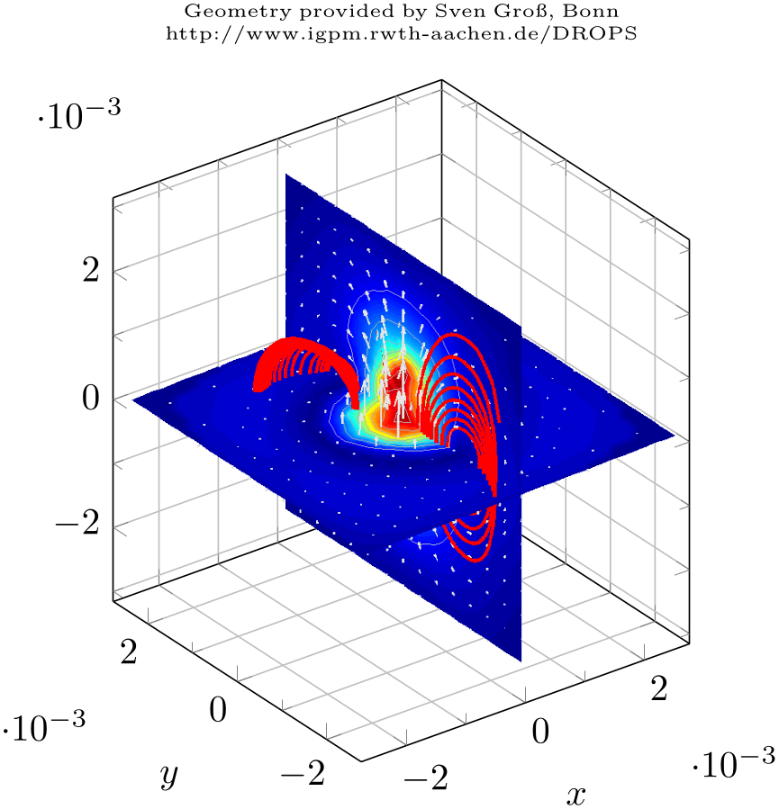
% Preamble: \pgfplotsset{width=7cm,compat=1.18}
\begin{tikzpicture}
\begin{axis}[
height=8cm,width=7cm,% improve scaling manually
grid=both,minor tick num=1,
xlabel=$x$,ylabel=$y$,
title={\centering
Geometry provided by Sven Gro\ss, Bonn\\
http://www.igpm.rwth-aachen.de/DROPS\\},
title style={text width=6cm,font=\tiny},
]
                    \addplot3
                graphics [
points={
                            (-0.002625,0.002625,0) =>
                (140,234)
                            (0,0.00263,0.00263)    =>
                (230,364)
                            (0,-0.00263,-0.00263)  =>
                (366,81)
                            (0,-0.00263,0.00263)   =>
                (366,276)
(0.002625,0.002625,0.002625)
},
] {plotdata/risingdrop3d.png};
\end{axis}
\end{tikzpicture}
What happens is that pgfplots selects a single scaling factor which is applied to all units as they have been deduced from the points key. This ensures that the imported graphics fits correctly into the axis. In addition, pgfplots does its best to satisfy the remaining constraints.
The complete description of how pgfplots scales the axis can be found in the documentation for scale mode=scale uniformly. Here is just a brief summary: pgfplots assumes that the prescribed width and height have to be satisfied. To this end, it rescales the projected unit vectors (i.e. the space which is taken up for each unit in \(x\), \(y\), and \(z\)) and it can modify the axis limits. In the default configuration scale uniformly strategy=auto, pgfplots will never shrink axis limits.
Compatibility remark:
Note that the scaling capabilities have been improved for pgfplots version 1.6. In previous versions, only scale uniformly strategy=change vertical limits was available which lead to clipped axes. In short: please consider writing \pgfplotsset{compat=1.6} or newer into your document to benefit from the improved scaling. If you have \pgfplotsset{compat=1.5} or older, the outcome for \addplot3 graphics will be different.
We consider a third example which has been generated by the Matlab code
clear all
close all
seed = sum(clock)
rand('seed',seed);
X = rand(10,10,10);
data = smooth3(X,'box',5);
p1 = patch(isosurface(data,.5), ...
'FaceColor','blue','EdgeColor','none');
p2 = patch(isocaps(data,.5), ...
'FaceColor','interp','EdgeColor','none');
isonormals(data,p1)
daspect([1 2 2])
view(3); axis vis3d tight
camlight; lighting phong
% print -dpng plotgraphics3withaxis
axis off
print -dpng plotgraphics3
save plotgraphics3.seed seed -ASCII % to reproduce the result
I only added background transparency with gimp and got the following graphics:
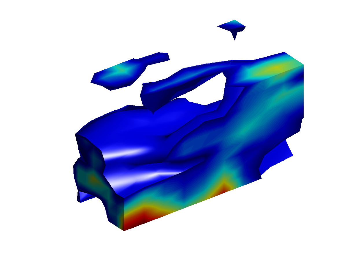
We proceed as before and collect four points, each with 3d logical coordinates (by clicking into the Matlab figure) and their associated 2d canvas (graphics) coordinates using the measure tool of gimp. The result is shown in the code example below.
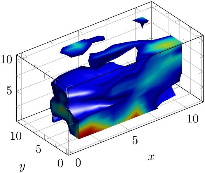
% Preamble: \pgfplotsset{width=7cm,compat=1.18}
\begin{tikzpicture}
\begin{axis}[
grid=both,minor tick num=1,
xlabel=$x$,ylabel=$y$,
3d box,
]
                    \addplot3
                graphics [
points={
                            (1,1,1)    =>
                (205,48)
(10,1,10) => (503,324)
(1,1,4.044)=> (206,102)
(10,10,10) => (390,398)
},
] {plotdata/plotgraphics3.png};
\end{axis}
\end{tikzpicture}
Note that it has non-standard data aspect ratio which is respected by pgfplots automatically.
External Three-Dimensional Graphics and Matlab
An extension by Jürnjakob Dugge
The procedure to map three-dimensional logical coordinates to two-dimensional canvas coordinates is tedious.
Jürnjakob Dugge contributed a script which does most of the logic and your work is reduced to a copy–paste job. With his permission, I post the contribution here.
The idea is to start a simple script which records mappings for any coordinates which have been clicked by the user. It works as follows:
-
1. Create the Matlab plot, say, using
hist3(randn(10000,2)) % some random dataset(get(gca,'child'),'FaceColor','interp','CDataMode','auto'); % colors% make sure the "print" paper format is the same as the screen paper format:set(gcf,'PaperPositionMode','auto') -
2. Save the following code as pgfplotscsconversion.m:
function pgfplotscsconversion% Hook into the Data Cursor "click" eventh = datacursormode(gcf);set(h,'UpdateFcn',@myupdatefcn,'SnapToDataVertex','off');datacursormode on% select four points in plot using mouse% The function that gets called on each Data Cursor clickfunction [txt] = myupdatefcn(obj,event_obj)% Get the screen resolution, in dots per inchdpi = get(0,'ScreenPixelsPerInch');% Get the click position in pixels, relative to the lower left of the% screenscreen_location=get(0,'PointerLocation');% Get the position of the plot window, relative to the lower left of% the screenfigurePos = get(gcf,'Position');% Get the data coordinates of the cursorpos = get(event_obj,'Position');% Format the data and figure coordinates. The factor "72.27/dpi" is% necessary to convert from pixels to TeX points (72.27 points per inch)display(['(',num2str(pos(1)),',',num2str(pos(2)),',',num2str(pos(3)),') => (', ...num2str((screen_location(1)-figurePos(1))*72.27/dpi),',', ...num2str((screen_location(2)-figurePos(2))*72.27/dpi),')'])% Format the tooltip displaytxt = {['X: ',num2str(pos(1))],['Y: ',num2str(pos(2))],['Z: ',num2str(pos(3))]};Run pgfplotscsconversion, click on four points in your plot. Preferably select non-colinear points near the edges of the plot. Copy and paste the four lines that were written to the Matlab command window.
Make sure that the first two points have different \(X\) and \(Y\) values on screen (i.e. image canvas coordinates).
-
3. Export the plot as an image
axis offprint -dpng matlabout -r400 % PNG called "matlabout.png" with 400 dpi resolutionIf you want to export vectors graphics, you should note that pdf output of Matlab is clumsy. It might be best to export to eps first, followed by a conversion from eps to pdf.
If you really want to use pdf output of Matlab, you may need to set the paper size to match the figure size by yourself, since the PDF driver does not automatically adjust the size:
% It might be better to use print -depsc followed by epstopdf.% Use this if you (really) want to use print -dpdf:currentScreenUnits=get(gcf,'Units') % Get current screen unitscurrentPaperUnits=get(gcf,'PaperUnits') % Get current paper unitsset(gcf,'Units',currentPaperUnits) % Set screen units to paper unitsplotPosition=get(gcf,'Position') % Get the figure position and sizeset(gcf,'PaperSize',plotPosition(3:4)) % Set the paper size to the figure sizeset(gcf,'Units',currentScreenUnits) % Restore the screen unitsprint -dpdf matlabout % PDF called "matlabout.pdf" -
4. Include the image in your pgfplots axis. If you selected points on the plot corners, your xmin, xmax, ymin and ymax should be set automatically, otherwise you may want to provide those yourself. Also, adjustments of width and height might be of interest to get the right vertical placement of the plot. Consider changing zmin and/or zmax to fit your needs (preferably only one of them; otherwise pgfplots may be unable to fix the height).
This contribution is from
http://tex.stackexchange.com/questions/52987/3-dimensional-histogram-in-pgfplots .
Summary: External Three-Dimensional Graphics
As has been shown in the previous sections, \addplot3 graphics allows to include three-dimensional graphics and pgfplots overlays a flexible axis with all its power. The cost to do so is
-
1. collect both logical three-dimensional coordinates and image-internal two-dimensional coordinates for four points of your graphics.
In Matlab, this can be simplified by the tool mentioned on page (page for section 4.3.8).
-
2. If your axes form a right-handed coordinate system, that is all. If not, also add x dir=reverse for any reversed axes.
Consider the following list of you encounter problems while working with \addplot3 graphics:
-
• It must be possible to deduce the origin and the three (two-dimensional) unit vectors from the four provide points; otherwise the algorithm will fail.
The algorithm should detect any deficiencies. However, if you encounter strange “Dimension too large” messages here, you can try other arguments in points. Take a look into your logfile, it will probably indicate the source of problems (or use the debug key).
-
• Ensure that the external graphics has an orthogonal axis. In fact, the axis may be skewed (just like a pgfplots axis can be created by means of custom x, y, and z vectors). However, the external image must not have perspective projection as this is unsupported by pgfplots. The points command needs to receive four points which belong to linearly independent position vectors.
-
• pgfplots uses the first two points to squeeze the graphics into the desired coordinates (which implies that they should not have the same canvas \(X\) or \(Y\) coordinates). It verifies that the remaining points arguments are projected correctly.
-
• The resulting scaling by means of scale mode=scale uniformly will try to satisfy all scaling constraints. You can change these constraints by modifying width, height, xmin, xmax, ymin, ymax, zmin, zmax and/or any combination of these parameters. See also unit rescale keep size which controls the flexibility of limit changes. There is also a key scale uniformly strategy which allows to select a different scaling strategy.
-
• The image should have a “right-handed coordinate system”: you should be able to take your right hand, point your thumb in direction of the \(x\)-axis, your first finger in direction of \(y\), and your second finger in direction of the \(z\)-axis. If that is impossible, once of your axes is reversed and you need to communicate that to pgfplots explicitly by means of the x dir=reverse key (and its variants).
-
• Note that this feature has been verified with standard Cartesian axes only.
-
• There is a debug key to investigate what the algorithm is doing:
-
/pgfplots/plot graphics/debug=true|false|visual (initially false) 
If you provide \addplot3 graphics[debug,points={...}], pgfplots will provide debug information onto your terminal and into the logfile. It will also generate extra files containing the determined unit vectors and the linear system used to derive them (one such file for every \addplot3 graphics statement, the filename will be the graphics file name and .dat appended).
Without the debug key, only the logfile will contain brief information what pgfplots is doing behind the scenes.
The choice true activates log messages. The choice visual activates log messages and places some filled circles at the provided points. The choice false disables all debug features.
-
4.3.9Reading Coordinates From Files
-
\addplot file {
name};
-
\addplot[
options] file
{name}
trailing path commands;
-
\addplot3 … 
Deprecation note:
If you have data files, you should generally use \addplot table. The input type \addplot file is almost the same, but considerably less powerful. It is only kept for backwards compatibility.
The \addplot file input mechanism is similar to the TikZ command ‘\addplot file’. It is to be used like
where
name
is a text file with at least two columns which will be used as \(x\)- and \(y\)-coordinates. Lines starting with
‘%’ or ‘#’ are ignored. Such files are often generated by
gnuplot:
#Curve 0, 20 points
#x y type
0.00000 0.00000 i
0.52632 0.50235 i
1.05263 0.86873 i
1.57895 0.99997 i
...
9.47368 -0.04889 i
10.00000 -0.54402 i
This listing has been copied from the PGF/TikZ manual, Section 22.4.
Plot file accepts one optional argument,
\addplot file [skip first] {datafile.dat};
which allows to skip over a non-comment header line. This allows to read the same input files as \addplot table by skipping over column names. Please note that comment lines do not count as lines here.
The input method \addplot file can also read meta data for every coordinate. As already explained for \addplot coordinates (see above), meta data can be used to change colors or other style parameters for every marker separately. Now, if point meta is set to explicit or to explicit symbolic and the input method is \addplot file, one further element will be read from disk – for every line. Meta data is always the last element which is read. See page (page for section 4.5.12) for information and examples about per point meta data and page (page for section 4.5.12) for an application example using scatter/classes.
Plot file is very similar to \addplot table: you can achieve the same effect with
Due to its simplicity, \addplot file is slightly faster while \addplot table allows higher flexibility.
Technical note: every opened file will be protocolled into your logfile.
The file can contain empty lines to tell pgfplots that the function has jumps. To use it, simply insert an empty line (and ensure that you have \pgfplotsset{compat=1.4} or newer in your preamble). See the documentation of empty line for details.
-
/pgfplots/plot file/skip first=true|false (initially false) 
-
/pgfplots/plot file/ignore first=true|false (initially false) 
The two keys can be
provided as arguments to \addplot file[options] {filename}; to skip the first non-comment entry in the file. They are equivalent. If you provide them in this context,
the prefix /pgfplots/plot file can be omitted.