Manual for Package pgfplots
2D/3D Plots in LATeX, Version 1.18.2
https://github.com/pgf-tikz/pgfplots
The Reference
4.5Two Dimensional Plot Types
pgfplots supports several two-dimensional line plots like piecewise linear line plots, piecewise constant plots, smoothed plots, bar plots and comb plots. Most of them use the pgf plot handler library directly, see the PGF/TikZ manual (Section 18.8).
Plot types are part of the plot style, so they are set with options. Most of the basic 2d plot types are part of TikZ, see the PGF/TikZ manual (Section 18.8), and are probably known to users of TikZ. They are documented here as well.
4.5.1Linear Plots
-
/tikz/sharp plot(no value) 
-
\addplot+[sharp plot]
Linear (‘sharp’) plots are the default. Point coordinates are simply connected by straight lines.
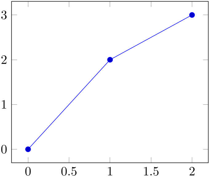
% Preamble: \pgfplotsset{width=7cm,compat=1.18}
\begin{tikzpicture}
\begin{axis}
\addplot+ [
sharp plot,
] coordinates {
(0,0) (1,2) (2,3)
};
\end{axis}
\end{tikzpicture}
The ‘+’ here means to use the normal plot cycle list and append ‘sharp plot’ to its option list.
4.5.2Smooth Plots
-
/tikz/smooth(no value) 
-
\addplot+[smooth]
Smooth plots interpolate smoothly between successive points.
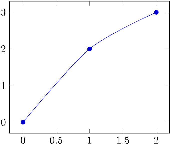
% Preamble: \pgfplotsset{width=7cm,compat=1.18}
\begin{tikzpicture}
\begin{axis}
\addplot+ [
smooth,
] coordinates {
(0,0) (1,2) (2,3)
};
\end{axis}
\end{tikzpicture}
As described in the PGF/TikZ manual in all detail, this plot handler results in a “smooth” outline. However, it “not very intelligent” (compare the PGF/TikZ manual) and is unrelated to common plot-based interpolation schemes.
-
/tikz/tension={
 tension
 } (initially 0.55)
A parameter which controls how the remaining degrees of freedom are fixed: it controls the smoothing effect. Higher values results in more “rounded” corners whereas low values result in sharp corners.
Please refer to the PGF/TikZ manual for details.
4.5.3Constant Plots
Constant plots draw lines parallel to the \(x\)-axis to connect coordinates. The discontinuous edges may be drawn or not, and marks may be placed on left or right ends.
-
/tikz/const plot(no value) 
-
\addplot+[const plot]
Connects all points with horizontal and vertical lines. Marks are placed left-handed on horizontal line segments, causing the plot to be right-sided continuous at all data points.

% Preamble: \pgfplotsset{width=7cm,compat=1.18}
\begin{tikzpicture}
\begin{axis}
\addplot+ [
const plot,
] coordinates {
(0,0.1) (0.1,0.15) (0.2,0.5) (0.3,0.62)
(0.4,0.56) (0.5,0.58) (0.6,0.65) (0.7,0.6)
(0.8,0.58) (0.9,0.55) (1,0.52)
};
\end{axis}
\end{tikzpicture}
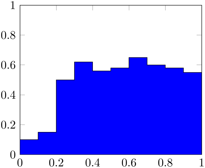
% Preamble: \pgfplotsset{width=7cm,compat=1.18}
\begin{tikzpicture}
\begin{axis}[ymin=0,ymax=1,enlargelimits=false]
\addplot [
const plot,
fill=blue,
draw=black,
] coordinates {
(0,0.1) (0.1,0.15) (0.2,0.5) (0.3,0.62)
(0.4,0.56) (0.5,0.58) (0.6,0.65) (0.7,0.6)
(0.8,0.58) (0.9,0.55) (1,0.52)
}
\closedcycle
;
\end{axis}
\end{tikzpicture}
-
/tikz/const plot mark left(no value) 
-
\addplot+[const plot mark left]
An alias for ‘const plot’.
-
/tikz/const plot mark right(no value) 
-
\addplot+[const plot mark right]
A variant which places marks on the right of each line segment, causing plots to be left-sided continuous at the given coordinates.
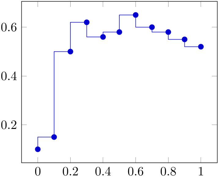
% Preamble: \pgfplotsset{width=7cm,compat=1.18}
\begin{tikzpicture}
\begin{axis}
\addplot+ [
const plot mark right,
] coordinates {
(0,0.1) (0.1,0.15) (0.2,0.5) (0.3,0.62)
(0.4,0.56) (0.5,0.58) (0.6,0.65) (0.7,0.6)
(0.8,0.58) (0.9,0.55) (1,0.52)
};
\end{axis}
\end{tikzpicture}
-
/tikz/const plot mark mid(no value) 
-
\addplot+[const plot mark mid]
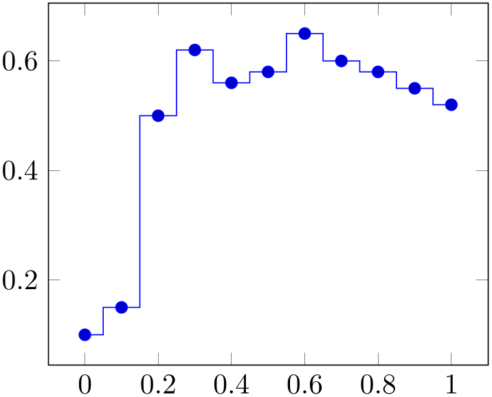
A variant which places marks in the middle of each line segment, causing plots to be symmetric around its data points.
% Preamble: \pgfplotsset{width=7cm,compat=1.18}
\begin{tikzpicture}
\begin{axis}
\addplot+ [
const plot mark mid,
] coordinates {
(0,0.1) (0.1,0.15) (0.2,0.5) (0.3,0.62)
(0.4,0.56) (0.5,0.58) (0.6,0.65) (0.7,0.6)
(0.8,0.58) (0.9,0.55) (1,0.52)
};
\end{axis}
\end{tikzpicture}
Note that “symmetric” is only true for constant mesh width: if the \(x\)-distances between adjacent data points differ, const plot mark mid will produce vertical lines in the middle between each pair of consecutive points.
-
/tikz/jump mark left(no value) 
-
\addplot+[jump mark left]
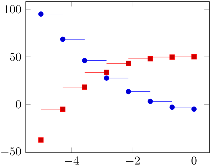
A variant of ‘const plot mark left’ which does not draw vertical lines.
% Preamble: \pgfplotsset{width=7cm,compat=1.18}
\begin{tikzpicture}
\begin{axis}[samples=8]
\addplot+ [
jump mark left,
domain=-5:0,
] {4*x^2 - 5};
\addplot+ [
jump mark right,
domain=-5:0,
] {0.7*x^3 + 50};
\end{axis}
\end{tikzpicture}
-
/tikz/jump mark right(no value) 
-
\addplot+[jump mark right]
A variant of ‘const plot mark right’ which does not draw vertical lines.
-
/tikz/jump mark mid(no value) 
-
\addplot+[jump mark mid]
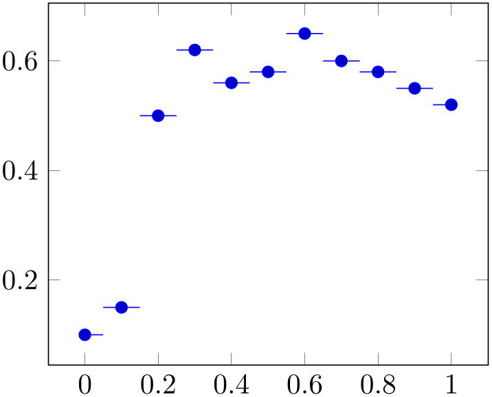
A variant of ‘const plot mark mid’ which does not draw vertical lines.
% Preamble: \pgfplotsset{width=7cm,compat=1.18}
\begin{tikzpicture}
\begin{axis}
\addplot+ [
jump mark mid,
] coordinates {
(0,0.1) (0.1,0.15) (0.2,0.5) (0.3,0.62)
(0.4,0.56) (0.5,0.58) (0.6,0.65) (0.7,0.6)
(0.8,0.58) (0.9,0.55) (1,0.52)
};
\end{axis}
\end{tikzpicture}
4.5.4Bar Plots
Bar plots place horizontal or vertical bars at coordinates. Multiple bar plots in one axis can be stacked on top of each other or aligned next to each other.
-
/tikz/xbar(no value) 
-
\addplot+[xbar]
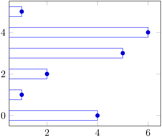
Places horizontal bars between the \((y=0)\) line and each coordinate.
This option is used on a per-plot basis and configures only the visualization of coordinates. The figure-wide style /pgfplots/xbar also sets reasonable options for ticks, legends and multiple plots.
% Preamble: \pgfplotsset{width=7cm,compat=1.18}
\begin{tikzpicture}
\begin{axis}
\addplot+ [
xbar,
] coordinates {
(4,0) (1,1) (2,2)
(5,3) (6,4) (1,5)
};
\end{axis}
\end{tikzpicture}
Bars are centered at plot coordinates with width bar width. Using bar plots usually means more than just a different way of how to connect coordinates, for example to draw ticks outside of the axis, change the legend’s appearance or introduce shifts if multiple \addplot commands appear.
There is a pre-configured style for xbar which is installed automatically if you provide xbar as argument to the axis environment which provides this functionality.
% Preamble: \pgfplotsset{width=7cm,compat=1.18}
\begin{tikzpicture}
\begin{axis}[xbar,enlargelimits=0.15]
\addplot [draw=blue,
                            pattern=horizontal lines light
                    blue,
] coordinates {
(10,5) (15,10) (5,15) (24,20) (30,25)
};
\addplot [draw=black,
                            pattern=horizontal lines dark
                    blue,
] coordinates {
(3,5) (5,10) (15,15) (20,20) (35,25)
};
\end{axis}
\end{tikzpicture}
Here xbar yields /pgfplots/xbar because it is an argument to the axis, not to a single plot.
For bar plots, it is quite common to provide textual coordinates or even descriptive nodes near the bars. This can be implemented using the keys symbolic y coords and nodes near coords, respectively:

% Preamble: \pgfplotsset{width=7cm,compat=1.18}
\begin{tikzpicture}
\begin{axis}[
xbar, xmin=0,
width=12cm, height=3.5cm, enlarge y limits=0.5,
xlabel={\#participants},
symbolic y coords={no,yes},
ytick=data,
nodes near coords, nodes near coords align={horizontal},
]
\addplot coordinates {(3,no) (7,yes)};
\end{axis}
\end{tikzpicture}
The symbolic y coords defines a dictionary of accepted coordinates which are then expected in \(y\)-coordinates and the nodes near coords key displays values as extra nodes (see their reference documentations for details). The example employs enlarge y limits in order to get some more free space since the default spacing is not always appropriate for bar plots.
Note that it might be quite important to include xmin=0 explicitly as in the example above. Without it, the lower bound will be used:

% Preamble: \pgfplotsset{width=7cm,compat=1.18}
\begin{tikzpicture}
\begin{axis}[
title=Uses lowest $x$ coords for xmin,
xbar,
width=12cm, height=3.5cm, enlarge y limits=0.5,
xlabel={\#participants},
symbolic y coords={no,yes},
ytick=data,
nodes near coords, nodes near coords align={horizontal},
]
\addplot coordinates {(1,no) (9,yes)};
\end{axis}
\end{tikzpicture}
Besides line, fill, and color styles, bars can be configured with bar width and bar shift, see below.
-
/pgfplots/xbar={
 shift for multiple plots
 }
(style, default 2pt)
-
/pgfplots/bar shift auto={
 shift for multiple plots
 }
(default 2pt)
This style sets /tikz/xbar and some commonly used options concerning horizontal bars for the complete axis. This is automatically done if you provide xbar as argument to an axis argument, see above.
The xbar style defines shifts if multiple plots are placed
into one axis. It draws bars adjacent to each other, separated by
 shift for multiple plots
 . Furthermore, it sets the style
bar cycle list and sets tick and legend appearance
options.
The style is defined as follows.
\pgfplotsset{
/pgfplots/xbar/.style={
/tikz/xbar,
bar cycle list,
tick align=outside,
xbar legend,
/pgfplots/bar shift auto={#1},
},
}
The formula for
bar shift assigns shifts dependent on the total number of
plots and the current plot’s number. It is designed to fill a total width of \(n \cdot \)bar width\(+ (n-1) \cdot \) shift for multiple plots
 . The \(0.5\) compensates for centering.
The style is defined as
\pgfplotsset{
/pgfplots/bar shift auto/.style={
/pgf/bar shift={%
% total width = n*w + (n-1)*skip
                                    % -> subtract half for
                        centering
                                    -0.5*(\numplotsofactualtype*\pgfplotbarwidth
                        + (\numplotsofactualtype-1)*(#1)) +
% the '0.5*w' is for centering
(.5+\plotnumofactualtype)*\pgfplotbarwidth + \plotnumofactualtype*(#1)},
},
}
-
/tikz/ybar(no value) 
-
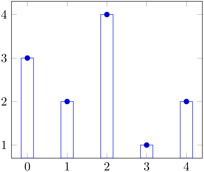
\addplot+[ybar]
Like xbar, this option generates bar plots. It draws vertical bars between the (\(x=0\)) line and each input coordinate.
% Preamble: \pgfplotsset{width=7cm,compat=1.18}
\begin{tikzpicture}
\begin{axis}
\addplot+ [
ybar,
] coordinates {
(0,3) (1,2) (2,4) (3,1) (4,2)
};
\end{axis}
\end{tikzpicture}
The example above simply changes how input coordinates shall be visualized. As mentioned for xbar, one usually needs modified legends and shifts for multiple bars in the same axis.
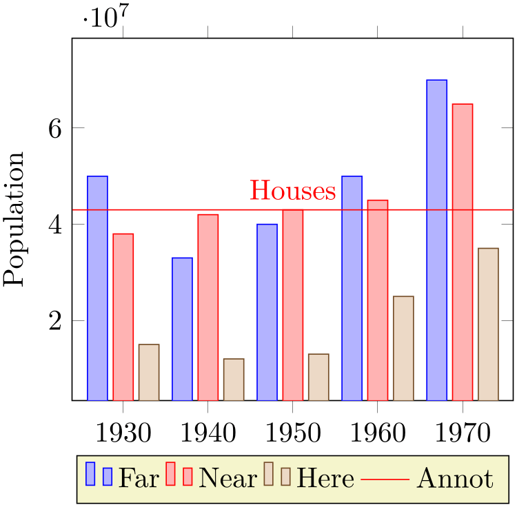
There is a predefined style which installs these customizations when provided to the axis environment:
% Preamble: \pgfplotsset{width=7cm,compat=1.18}
\begin{tikzpicture}
\begin{axis}[
x tick label style={
/pgf/number format/1000 sep=},
ylabel=Population,
enlargelimits=0.15,
legend style={at={(0.5,-0.15)},
anchor=north,legend columns=-1},
ybar,
bar width=7pt,
]
                        \addplot coordinates
                    {
(1930,50e6) (1940,33e6)
(1950,40e6) (1960,50e6) (1970,70e6)
};
                        \addplot coordinates
                    {
(1930,38e6) (1940,42e6)
(1950,43e6) (1960,45e6) (1970,65e6)
};
                        \addplot coordinates
                    {
(1930,15e6) (1940,12e6)
(1950,13e6) (1960,25e6) (1970,35e6)
};
\addplot [red,line legend,
sharp plot,update limits=false,
                        ] coordinates
                    { (1910,4.3e7) (1990,4.3e7) }
node [above] at (1950,4.3e7) {Houses};
\legend{Far,Near,Here,Annot}
\end{axis}
\end{tikzpicture}
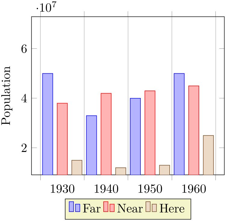
Here, ybar yields /pgfplots/ybar because it is an argument to the axis, not to a single plot. The style affects the first three \addplot commands. Note that it shifts them horizontally around the plot coordinates. The fourth \addplot command is some kind of annotation which doesn’t update limits.
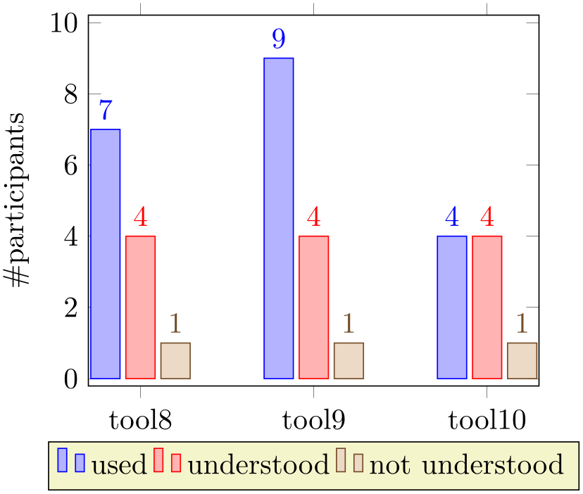
The ybar style can be combined with symbolic x coords in a similar way as described for xbar:
% Preamble: \pgfplotsset{width=7cm,compat=1.18}
\begin{tikzpicture}
\begin{axis}[
ybar,
enlargelimits=0.15,
legend style={at={(0.5,-0.15)},
anchor=north,legend columns=-1},
ylabel={\#participants},
symbolic x coords={tool8,tool9,tool10},
xtick=data,
nodes near coords,
nodes near coords align={vertical},
]
                    \addplot coordinates
                    {(tool8,7) (tool9,9) (tool10,4)};
                    \addplot coordinates
                    {(tool8,4) (tool9,4) (tool10,4)};
                    \addplot coordinates
                    {(tool8,1) (tool9,1) (tool10,1)};
                        \legend{used,understood,not
                    understood}
\end{axis}
\end{tikzpicture}
As for xbar, the bar width and shift can be configured with bar width and bar shift. However, the bar shift is better provided as argument to /pgfplots/ybar since this style will overwrite the bar shift. Thus, prefer /pgfplots/ybar=4pt to set the bar shift.
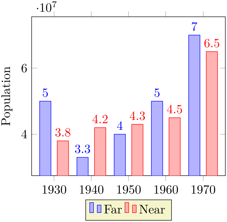
Sometimes it is useful to write the \(y\) values directly near the bars. This can be realized using the nodes near coords method:
% Preamble: \pgfplotsset{width=7cm,compat=1.18}
\begin{tikzpicture}
\begin{axis}[
x tick label style={
/pgf/number format/1000 sep=},
ylabel=Population,
enlargelimits=0.15,
legend style={at={(0.5,-0.15)},
anchor=north,legend columns=-1},
ybar=5pt,% configures `bar shift'
bar width=9pt,
nodes near coords,
                        point meta=y
                    *10^-7, % the displayed number
]
                        \addplot coordinates
                    {
(1930,50e6) (1940,33e6)
(1950,40e6) (1960,50e6) (1970,70e6)
};
                        \addplot coordinates
                    {
(1930,38e6) (1940,42e6)
(1950,43e6) (1960,45e6) (1970,65e6)
};
\legend{Far,Near}
\end{axis}
\end{tikzpicture}
Any support style changes are possible, of course. A useful example for bar plots might be to use rotated tick labels:
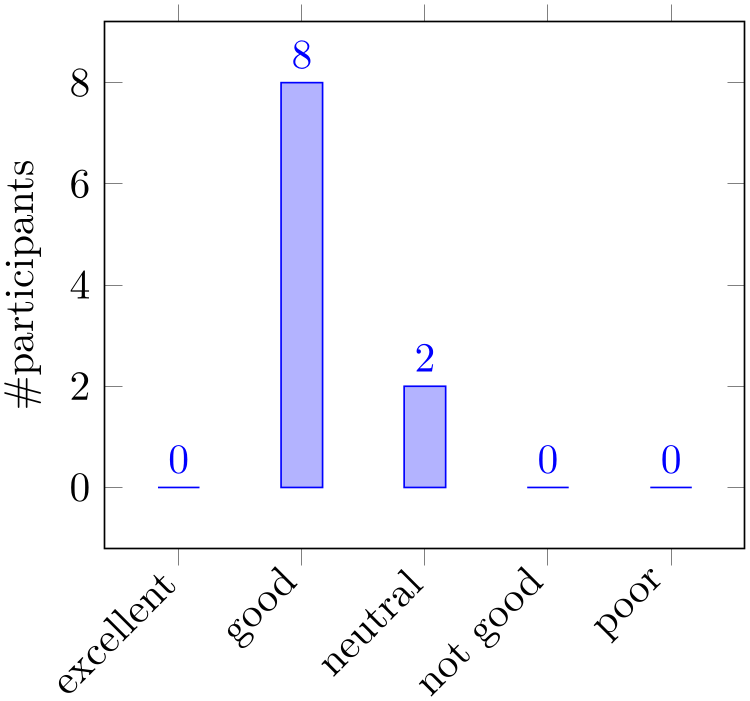
% Preamble: \pgfplotsset{width=7cm,compat=1.18}
\begin{tikzpicture}
\begin{axis}[
ybar,
enlargelimits=0.15,
legend style={at={(0.5,-0.2)},
anchor=north,legend columns=-1},
ylabel={\#participants},
symbolic x coords={excellent,good,neutral,%
not good,poor},
xtick=data,
nodes near coords,
nodes near coords align={vertical},
x tick label style={rotate=45,anchor=east},
]
                        \addplot coordinates
                    {
(excellent,0) (good,8) (neutral,2)
(not good,0) (poor,0)
};
\end{axis}
\end{tikzpicture}
-
/pgfplots/ybar={
 shift for multiple plots
 }
(style, default 2pt)
As /pgfplots/xbar, this style sets the /tikz/ybar option to draw vertical bars, but it also provides commonly used options for vertical bars.
If you supply ybar to an axis environment, /pgfplots/ybar will be chosen instead of /tikz/ybar.
It changes the legend, draws ticks outside of the axis lines and draws multiple
\addplot arguments adjacent to each other; block-centered
at the \(x\)-coordinate and separated by
 shift for multiple plots
 . It will also install the bar shift for
every node near coord. Furthermore, it installs the style bar cycle list. It is defined similarly to /pgfplots/xbar.
-
/pgfplots/bar cycle list(no value) 
A style which installs cycle lists for multiple bar plots.
\pgfplotsset{
/pgfplots/bar cycle list/.style={/pgfplots/cycle list={
{blue,fill=blue!30!white,mark=none},
{red,fill=red!30!white,mark=none},
{brown!60!black,fill=brown!30!white,mark=none},
{black,fill=gray,mark=none},
},
},
}
-
/pgf/bar width={
 dimension or unit
 } (initially 10pt)
Configures the width used by xbar and ybar. It is accepted to provide mathematical expressions.
As of pgfplots 1.7, it is allows to provide a unit as bar width. In this case, the bar width will be interpreted as axis unit:
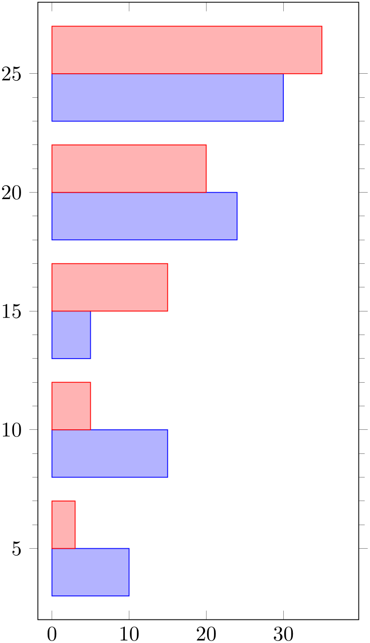
% Preamble: \pgfplotsset{width=7cm,compat=1.18}
\begin{tikzpicture}
\begin{axis}[
                        xbar=0pt,% space of 0pt between adjacent
                    bars
bar width=2,
width=7cm,
height=12cm,
minor y tick num=4,
ytick=data,
enlargelimits=0.15,
]
                        \addplot coordinates
                    {
(10,5) (15,10) (5,15) (24,20) (30,25)
};
                        \addplot coordinates
                    {
(3,5) (5,10) (15,15) (20,20) (35,25)
};
\end{axis}
\end{tikzpicture}
In order to interpret arguments as units, you have to write \pgfplotsset{compat=1.7} (or newer) into your preamble. Older versions will implicitly append the pt suffix if the argument is no dimension.
Note that you may need to enlargelimits in order to see the complete bar – pgfplots will not automatically update the axis limits to respect bar width.
-
/pgf/bar shift={
 dimension or unit
 } (initially 0pt)
Configures a shift for xbar and ybar. Use bar shift together with bar width to draw multiple bar plots into the same axis. It is accepted to provide mathematical expressions.
As of pgfplots 1.7, it is allows to provide an unit as bar shift. In this case, the bar shift will be interpreted as axis unit.
Note that you may need to enlargelimits in order to see the complete bar – pgfplots will not automatically update the axis limits to respect bar shift.
-
/pgfplots/bar direction=auto|x|y (initially auto) 
If pgfplots encounters a value bar width=1 (i.e. without dimension like 1pt), it attempts to evaluate the bar’s direction.
The default configuration auto assumes that you write something like ybar,bar width=1. In this case, it is clear that you have a \(y\) bar and pgfplots assumes bar direction=y.
However, this context information is unavailable. In this case, you can use the choice x if pgfplots in unaware that it works on an xbar plot or y if pgfplots is unaware that you meant an ybar plot.
-
/tikz/ybar interval(no value) 
-
\addplot+[ybar interval]
-
1. the \(y\) value of the \(i\)th coordinates,
-
2. the \(x\) value of the \(i\)th coordinate as left interval boundary,
-
3. the \(x\) value of the \((i+1)\)th coordinate as right interval boundary.
This plot type produces vertical bars with width (and shift) relatively to intervals of coordinates.
There is one conceptional difference when working with intervals: an interval is defined by two coordinates. Since ybar has one value for each interval, the \(i\)th bar is defined by
Consequently, there is one coordinate too much: the last coordinate will only be used to determine the interval width; its \(y\) value doesn’t influence the bar appearance.
It is installed on a per-plot basis and configures only the visualization of coordinates. See the style /pgfplots/ybar interval which configures the appearance of the complete figure.
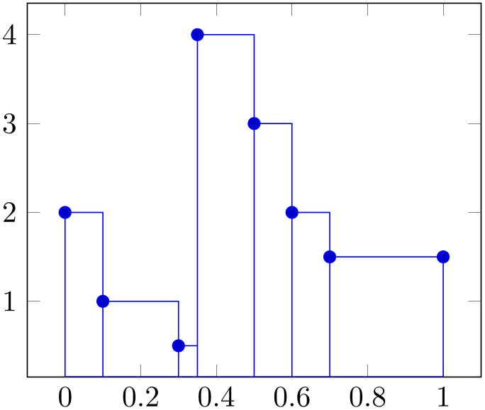
% Preamble: \pgfplotsset{width=7cm,compat=1.18}
\begin{tikzpicture}
\begin{axis}
\addplot+ [
ybar interval,
] coordinates {
(0,2) (0.1,1) (0.3,0.5) (0.35,4) (0.5,3)
(0.6,2) (0.7,1.5) (1,1.5)
};
\end{axis}
\end{tikzpicture}
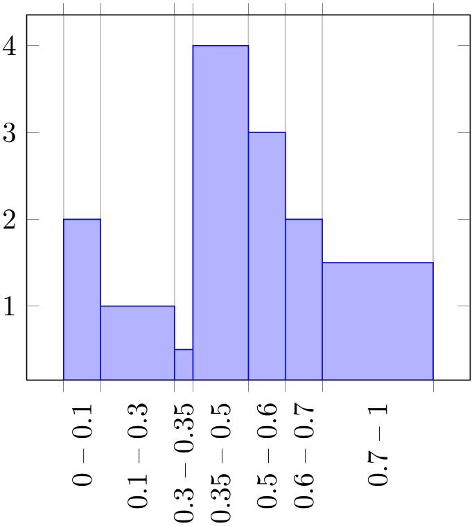
% Preamble: \pgfplotsset{width=7cm,compat=1.18}
\begin{tikzpicture}
\begin{axis}[ybar interval,
xtick=data,
xticklabel interval boundaries,
x tick label style={
rotate=90,
anchor=east,
},
]
                        \addplot coordinates
                    {
(0,2) (0.1,1) (0.3,0.5) (0.35,4) (0.5,3)
(0.6,2) (0.7,1.5) (1,1.5)
};
\end{axis}
\end{tikzpicture}
% Preamble: \pgfplotsset{width=7cm,compat=1.18}
\begin{tikzpicture}
\begin{axis}[
x tick label style={
/pgf/number format/1000 sep=},
ylabel=Population,
enlargelimits=0.05,
legend style={at={(0.5,-0.15)},
anchor=north,legend columns=-1},
ybar interval=0.7,
]
                        \addplot coordinates
                    {
(1930,50e6) (1940,33e6)
(1950,40e6) (1960,50e6) (1970,70e6)
};
                        \addplot coordinates
                    {
(1930,38e6) (1940,42e6)
(1950,43e6) (1960,45e6) (1970,65e6)
};
                        \addplot coordinates
                    {
(1930,15e6) (1940,12e6)
(1950,13e6) (1960,25e6) (1970,35e6)
};
\legend{Far,Near,Here}
\end{axis}
\end{tikzpicture}
-
/pgfplots/ybar interval={
 relative width
 }
(style, default 1)
A style which is intended to install options for ybar interval for a complete figure. This includes tick and legend appearance, management of multiple bar plots in one figure and a more adequate cycle list using the style bar cycle list.
-
/tikz/xbar interval(no value) 
-
\addplot+[xbar interval]
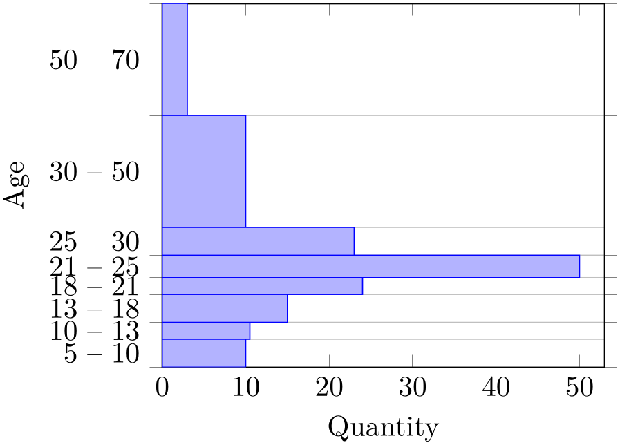
As ybar interval, just for horizontal bars.
% Preamble: \pgfplotsset{width=7cm,compat=1.18}
\begin{tikzpicture}
\begin{axis}[
xmin=0,xmax=53,
ylabel=Age,
xlabel=Quantity,
enlargelimits=false,
ytick=data,
yticklabel interval boundaries,
xbar interval,
]
                        \addplot coordinates
                    {
(10,5) (10.5,10) (15,13) (24,18) (50,21)
(23,25) (10,30) (3,50) (3,70)
};
\end{axis}
\end{tikzpicture}
-
/pgfplots/xbar interval={
 relative width
 }
(style, default 1)
A style which is intended to install options for xbar interval for a complete figure, see the style /pgfplots/ybar interval for details.
-
/pgfplots/xticklabel interval boundaries(no value) 
-
/pgfplots/yticklabel interval boundaries(no value) 
-
/pgfplots/zticklabel interval boundaries(no value) 
These are style keys which set
x tick label as interval and
configure the tick appearance to be
 start
start –
–
 end
end for each tick interval.
4.5.5Histograms
This section has been moved to the statistics library, see Section 5.12.2.
4.5.6Box Plots
This section has been moved to the statistics library, see Section 5.12.1.
4.5.7Comb Plots
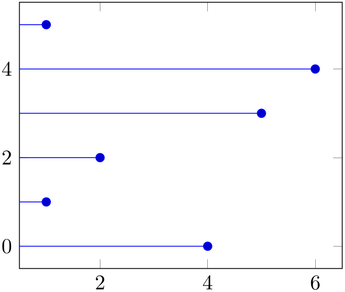
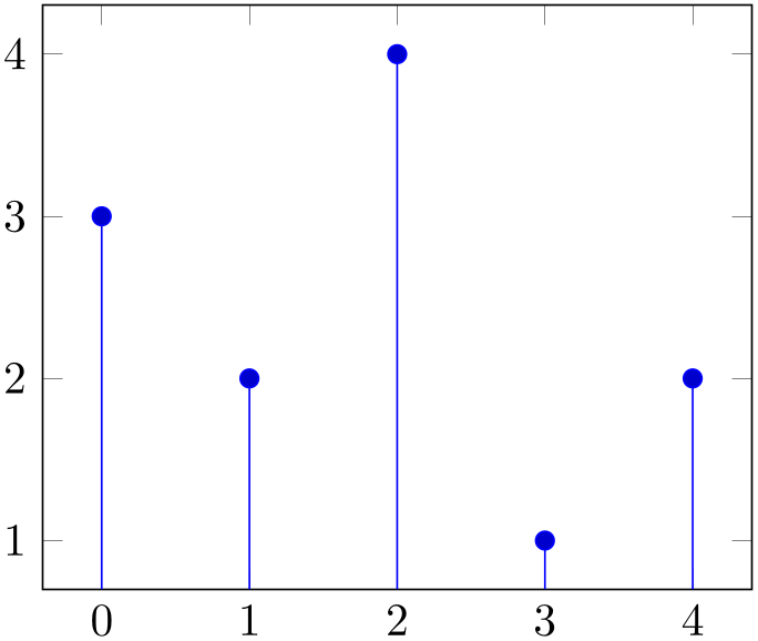
Comb plots are very similar to bar plots except that they employ single horizontal/vertical lines instead of rectangles.
-
/tikz/xcomb(no value) 
-
\addplot+[xcomb]
% Preamble: \pgfplotsset{width=7cm,compat=1.18}
\begin{tikzpicture}
\begin{axis}
\addplot+ [
xcomb,
] coordinates {
(4,0) (1,1) (2,2)
(5,3) (6,4) (1,5)
};
\end{axis}
\end{tikzpicture}
-
/tikz/ycomb(no value) 
-
\addplot+[ycomb]
% Preamble: \pgfplotsset{width=7cm,compat=1.18}
\begin{tikzpicture}
\begin{axis}
\addplot+ [
ycomb,
] coordinates {
(0,3) (1,2) (2,4) (3,1) (4,2)
};
\end{axis}
\end{tikzpicture}
4.5.8Quiver Plots (Arrows)
-
/pgfplots/quiver={
 options with ‘quiver/’ prefix
 }
}
-
\addplot+[quiver={
 options with ‘quiver/’ prefix
 }]
}]
-
/pgfplots/quiver/u=
 expression
 (initially 0)
-
/pgfplots/quiver/v=
 expression
 (initially 0)
-
/pgfplots/quiver/w=
 expression
 (initially 0)
-
/pgfplots/quiver/u value={
 value
value } (initially 0)
-
/pgfplots/quiver/v value={
 value
value } (initially 0)
-
/pgfplots/quiver/w value={
 value
value } (initially 0)
-
/pgfplots/quiver/colored(no value) 
-
/pgfplots/quiver/colored={
 color
color }
}
-
/pgfplots/quiver/scale arrows={
 scale
scale } (initially 1)
-
/pgfplots/quiver/update limits=true|false (initially true) 
-
/pgfplots/quiver/every arrow(style, initially empty) 
-
/pgfplots/quiver/quiver legend(style, no value) 
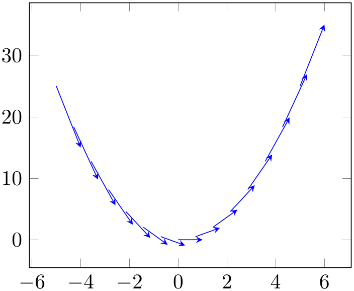
A plot type which draws small arrows, starting at \((x,y)\), in direction of \((u,v)\).
% Preamble: \pgfplotsset{width=7cm,compat=1.18}
\begin{tikzpicture}
\begin{axis}
\addplot [
blue,
quiver={u=1,v=2*x},
-stealth,
samples=15,
] {x^2};
\end{axis}
\end{tikzpicture}
The base point \((x,y)\) is provided as before; in the example above, it is generated by \addplot expression and yields \((x,x^2)\). The vector direction \((u,v)\) needs to be given in addition. Our example with quiver/u=1 and quiver/v=2*x results in \(u=1\) and \(v=2x\). Thus, we have defined and visualized a vector field for the derivative of \(f(x) = x^2\).
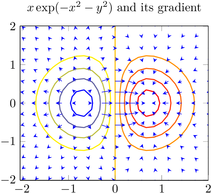
A common example is to visualize the gradient \((\partial _x f,\partial _y f)(x,y)\) of a two-dimensional function \(f(x,y)\):
% Preamble: \pgfplotsset{width=7cm,compat=1.18}
\begin{tikzpicture}
\begin{axis}[
                        title={$x \exp(-x^2-y^2)$ and
                    its gradient},
domain=-2:2,
view={0}{90},
axis background/.style={fill=white},
]
\addplot3 [
contour lua={number=9,labels=false},thick,
] {exp(0-x^2-y^2)*x};
\addplot3 [
blue,-stealth,samples=15,
quiver={
u={exp(0-x^2-y^2)*(1-2*x^2)},
v={exp(0-x^2-y^2)*(-2*x*y)},
scale arrows=0.3,
},
] {exp(0-x^2-y^2)*x};
\end{axis}
\end{tikzpicture}
The example visualizes \(f(x,y) = x\exp (-x^2-y^2)\) using contour gnuplot as first step. The options contour/number and contour/labels provide fine-tuning for the contour and are not of interest here (so is the axis background which just improves visibility of contour lines). What we are interested in is the quiver= style: it defines u and v to some two-dimensional expressions. Furthermore, we used quiver/scale arrows to reduce the arrow size. The -stealth is a TikZ style which configures outgoing arrow styles of type ‘stealth’. The samples=15 key configures how we get our input data. In our case, we have input data \((x_i,y_j,f(x_i,y_j))\) with \(15\) samples for each, \(i\) and \(j\).
It is also possible to place quiver plots on a prescribed \(z\) value:

Here, the quiver plots is placed on top of a surf. It visualizes the gradient (using a common scale factor of \(1/10\) to reduce the arrow lengths). The quiver/w=0 means that arrows have no \(z\) difference, and the {1} argument indicates that all start at \((x_i,y_j,1)\). Here, the values \((x_i,y_j)\) are sampled in the domain=0:1 argument (with samples=10), i.e. arrows start at \((x_i,y_j,1)\) and end at \((x_i+y_j/10, y_j+x_i/10, 1)\).
So far, quiver plots do not assume a special sequence of input points. This has two consequences: first, you can plot any vector field by considering just \((x,y) + (u,v)\) (or \((x,y,z) + (u,v,w)\)) – the data doesn’t necessarily need to be a two-dimensional function (as opposed to surf etc). On the other hand, you need to provide quiver/scale arrows manually since quiver doesn’t know the mesh width in case you provide matrix data13.
Note that quiver plots are currently not available together with logarithmic axes.
These keys define how the vector directions \((u,v)\) (or, for three dimensional plots, \((u,v,w)\)) shall be set.
The
 expression
 can be a constant expression like quiver/u=1 or
quiver/u=42*5. It may also depend on the final base
point values using the values x, y or
z as in the example above. In this context,
x yields the \(x\)-coordinate of the point where the vector
starts, y the \(y\)-coordinate and so on.
Attention:
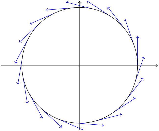
the fact that x refers to the final \(x\)-coordinate means that parametric plots should use \(t\) as variable14. Consider the following example:
% Preamble: \pgfplotsset{width=7cm,compat=1.18}
\begin{tikzpicture}
\begin{axis}[
axis equal,
axis lines=middle,
axis line style={->},
tick style={color=black},
xtick=\empty,ytick=\empty,
]
\addplot [samples=20, domain=0:2*pi,->,blue,
% the default choice 'variable=\x' leads to
% unexpected results here!
variable=\t,
quiver={
u={-sin(deg(t))},
v={cos(deg(t))},
scale arrows=0.5,
},
] ( {cos(deg(t))}, {sin(deg(t))} );
\addplot [
samples=100, domain=0:2*pi,
] ( {cos(deg(x))}, {sin(deg(x))} );
\end{axis}
\end{tikzpicture}
Here, a parametric plot is used to draw a circle and tangent vectors. The choice variable=\t plays a functional role besides naming conventions: it allows to access the parametric variable within the expressions for both u and v. On the other hand, we could have used u=y and v=-x since x expands to the \(x\) coordinate with value sin(deg(t)) and y expands to the \(y\) coordinate cos(deg(t)).
Another important application is to use table column references like quiver/u=\thisrow{col} in conjunction with \addplot table:
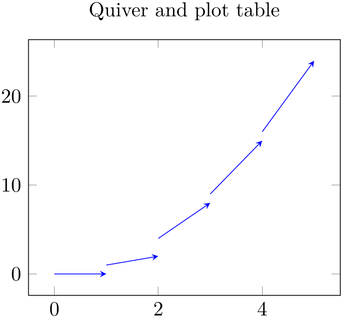
Here, the
 expression
 employs \thisrow which always refers to the actual row
of
\addplot table.
Note that
 expression
 should always be of numeric type (no symbolic input extensions are supported currently).
These keys have the same function as quiver/u and its variants. However, they don’t call the math parser, so only single values are allowed (including something like \thisrow{columnname}).
Allows to define an individual color for each arrow. Omitting the argument ‘ color
color ’ is identical to
quiver/colored=mapped
color
which uses the point meta to get colors for every
arrow.
If you just want to set the same color for every arrow, prefer using \addplot[blue,quiver] which is more efficient.
Allows to rescale the arrows by a factor. This may be necessary if the arrow length is longer than the distance between adjacent base points \((x_i,y_i)\). There may come a feature to rescale them automatically.
A boolean indicating whether points \((x,y) + (u,v)\) shall contribute to the axis limits.
Allows to provide individual arrow styles.
The style can contain any TikZ drawing option. It will be evaluated for every individual arrow and may depend upon anything which is available at visualization time.
In particular, this includes point meta data, typically using \pgfplotspointmetatransformed \(\in [0,1000]\) where \(0\) corresponds to point meta min and \(1000\) corresponds to point meta max:
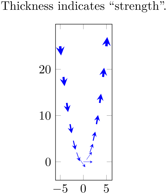
% Preamble: \pgfplotsset{width=7cm,compat=1.18}
\begin{tikzpicture}
% define some constants:
\def\U{1}
\def\V{2*x}
\def\LEN{(sqrt((\U)^2 + (\V)^2)}
\begin{axis}[axis equal image,
                            title=Thickness indicates
                        ``strength''.
]
\addplot [blue,
point meta={\LEN},
quiver={
u={(\U)/\LEN}, v={(\V)/\LEN},
scale arrows=2,
every arrow/.append style={
line width=2pt*\pgfplotspointmetatransformed/1000
},
},
-stealth,samples=15,
] {x^2};
\end{axis}
\end{tikzpicture}
In the example, we have some 2d vector field stored in helper constants \U and \V. The length of each vector is stored in \LEN here. The quiver plot as such contains unit length vectors – and the \LEN enters an every arrow style to get varying line width.
An every arrow style might also depend upon mapped color (provided point meta has been set).
Again, if you do not need individual arrow styles, prefer using a plot style (cycle list or argument to \addplot) which is more efficient.
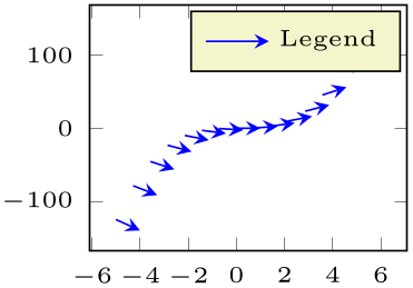
A style which redefines legend image code in order to produce a suitable legend for quiver plots.
It is implicitly activated whenever quiver plot handlers are selected.
% Preamble: \pgfplotsset{width=7cm,compat=1.18}
\begin{tikzpicture}
\begin{axis}[tiny]
\addplot [
blue,
quiver={u=1,v=3*x},
-stealth,
samples=15,
] {x^3};
\addlegendentry{Legend}
\end{axis}
\end{tikzpicture}
13 Actually, I might add something like quiver/scale arrows=auto in the future, I don’t know yet. Loops through input data are slow in TeX, automatic mesh widths computation even more…
14 Sorry for this usability issue.
4.5.9Stacked Plots
-
/pgfplots/stack plots=x|y|false (initially false) 
Allows stacking of plots in either \(x\) or \(y\) direction. Stacking means to add either \(x\)- or \(y\)-coordinates of successive \addplot commands on top of each other.
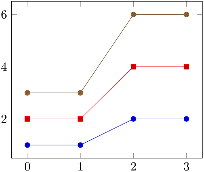
% Preamble: \pgfplotsset{width=7cm,compat=1.18}
\begin{tikzpicture}
\begin{axis}[stack plots=y]
                        \addplot coordinates
                    {
(0,1) (1,1) (2,2) (3,2)
};
                        \addplot coordinates
                    {
(0,1) (1,1) (2,2) (3,2)
};
                        \addplot coordinates
                    {
(0,1) (1,1) (2,2) (3,2)
};
\end{axis}
\end{tikzpicture}
The current implementation for stack plots does not interpolate missing coordinates. That means stacking will fail if the plots have different grids.
-
/pgfplots/ybar stacked=plus|minus (style, default plus) 
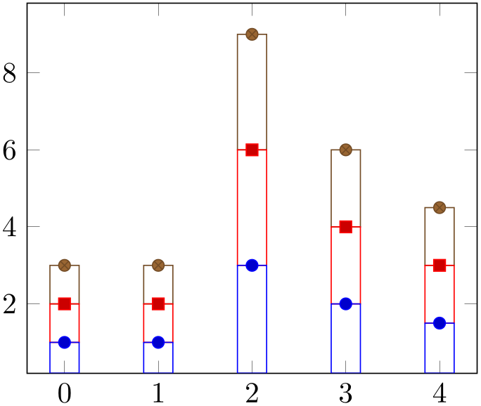
The plot handler stack plots is particularly useful for bar plots. There are two possible modes of operation: the first is to set stack plots=y,/tikz/ybar. It activates just these two features without making them aware of each other. The second is to set ybar stacked which activates the two features and makes them aware of each other.
If you use stack plots together with /tikz/ybar, you have kind of a low-level implementation which is kind of “raw”:
% Preamble: \pgfplotsset{width=7cm,compat=1.18}
\begin{tikzpicture}
\begin{axis}[stack plots=y,/tikz/ybar]
                        \addplot coordinates
                    {
(0,1) (1,1) (2,3) (3,2) (4,1.5)
};
                        \addplot coordinates
                    {
(0,1) (1,1) (2,3) (3,2) (4,1.5)
};
                        \addplot coordinates
                    {
(0,1) (1,1) (2,3) (3,2) (4,1.5)
};
\end{axis}
\end{tikzpicture}
Using ybar stacked enables stacked vertical bars (i.e. ybar and stack plots=y) and it also adjusts the legend and tick appearance and assigns a useful cycle list. To this end, it should be given as option to the axis:
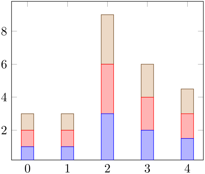
% Preamble: \pgfplotsset{width=7cm,compat=1.18}
\begin{tikzpicture}
\begin{axis}[ybar stacked]
                        \addplot coordinates
                    {
(0,1) (1,1) (2,3) (3,2) (4,1.5)
};
                        \addplot coordinates
                    {
(0,1) (1,1) (2,3) (3,2) (4,1.5)
};
                        \addplot coordinates
                    {
(0,1) (1,1) (2,3) (3,2) (4,1.5)
};
\end{axis}
\end{tikzpicture}
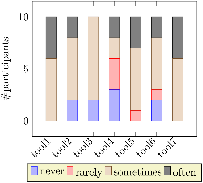
% Preamble: \pgfplotsset{width=7cm,compat=1.18}
\begin{tikzpicture}
\begin{axis}[
ybar stacked,
enlargelimits=0.15,
legend style={at={(0.5,-0.20)},
anchor=north,legend columns=-1},
ylabel={\#participants},
symbolic x coords={tool1, tool2, tool3, tool4,
tool5, tool6, tool7},
xtick=data,
x tick label style={rotate=45,anchor=east},
]
\addplot+ [ybar] coordinates {(tool1,0) (tool2,2)
(tool3,2) (tool4,3) (tool5,0) (tool6,2) (tool7,0)};
\addplot+ [ybar] coordinates {(tool1,0) (tool2,0)
(tool3,0) (tool4,3) (tool5,1) (tool6,1) (tool7,0)};
\addplot+ [ybar] coordinates {(tool1,6) (tool2,6)
(tool3,8) (tool4,2) (tool5,6) (tool6,5) (tool7,6)};
\addplot+ [ybar] coordinates {(tool1,4) (tool2,2)
(tool3,0) (tool4,2) (tool5,3) (tool6,2) (tool7,4)};
\legend{never, rarely, sometimes, often}
\end{axis}
\end{tikzpicture}
-
/pgfplots/xbar stacked=plus|minus (style, default plus) 
The same remarks as for ybar stacked hold for xbar stacked as well: xbar stacked is a figure-wide style which enables stacked horizontal bars (i.e. xbar and stack plots=x). It also adjusts the legend and tick appearance and assigns a useful cycle list.
Consequently, one can have a “raw” picture which combines stacking and bars as in the following picture (i.e. without xbar stacked):
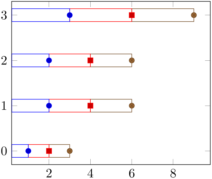
% Preamble: \pgfplotsset{width=7cm,compat=1.18}
\begin{tikzpicture}
\begin{axis}[stack plots=x,/tikz/xbar]
                        \addplot coordinates
                    {
(1,0) (2,1) (2,2) (3,3)
};
                        \addplot coordinates
                    {
(1,0) (2,1) (2,2) (3,3)
};
                        \addplot coordinates
                    {
(1,0) (2,1) (2,2) (3,3)
};
\end{axis}
\end{tikzpicture}
Alternatively, one activates xbar stacked right after \begin{axis} and benefits from several style adoptions.
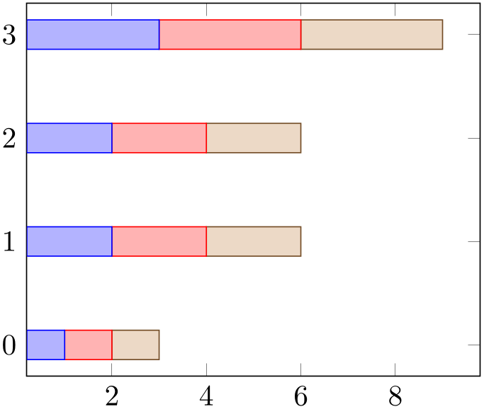
% Preamble: \pgfplotsset{width=7cm,compat=1.18}
\begin{tikzpicture}
\begin{axis}[xbar stacked]
                        \addplot coordinates
                    {
(1,0) (2,1) (2,2) (3,3)
};
                        \addplot coordinates
                    {
(1,0) (2,1) (2,2) (3,3)
};
                        \addplot coordinates
                    {
(1,0) (2,1) (2,2) (3,3)
};
\end{axis}
\end{tikzpicture}
-
/pgfplots/stack dir=plus|minus (initially plus) 
Configures the direction of stack plots. The value plus will add coordinates of successive plots while minus subtracts them.
-
/pgfplots/reverse stacked plots=true|false (initially true, default true) 
Configures the sequence in which stacked plots are drawn. This is more or less a technical detail which should not be changed in any normal case.
The motivation is as follows: suppose multiple \addplot commands are stacked on top of each other and they are processed in the order of appearance. Then, the second plot could easily draw its lines (or fill area) on top of the first one – hiding its marker or line completely. Therefore, pgfplots reverses the sequence of drawing commands.
This has the side-effect that any normal TikZ paths inside of an axis will also be processed in reverse sequence.
-
/pgfplots/stacked ignores zero=true|false (initially true, default true) 
-
/pgfplots/stacked ignores zero/default=true|false (initially true) 
-
/pgfplots/stacked ignores zero/markers=true|false (initially true) 
-
/pgfplots/stacked ignores zero/errorbars=true|false (initially false) 
Configures stacked plots to ignore “zero” increments.
In this context, “ignore” means to suppress visualization if an increment vanishes.
Configuring \pgfplotsset{compat=1.9} (or higher) activates this feature for xbar stacked and ybar stacked.
A detail key which allows to customize how and where to apply stacked ignores zero. This key is ignored unless stacked ignores zero=true. Its default configuration is to suppress visualization of an empty increment for the standard visualization and for markers. Error bars will be displayed, though (the error bar is typically non-empty even if the increment is \(0\)).
-
/pgfplots/xbar interval stacked=plus|minus (style, default plus) 
A style similar to /pgfplots/xbar stacked for the interval based bar plot variant.
-
/pgfplots/ybar interval stacked=plus|minus (style, default plus) 
A style similar to /pgfplots/ybar stacked for the interval based bar plot variant.
4.5.9.1Stacked Bar Plots and Nodes Near Coords
It is possible to combine ybar stacked and xbar stacked with nodes near coords. In contrast to non-stacked plots, it appears to be of limited use to draw a node near the top of the stack. Instead, one typically wants to see the difference added in each stacking step. To this end, pgfplots will automatically reconfigure nodes near coords to display the added values in the center of each new bar:
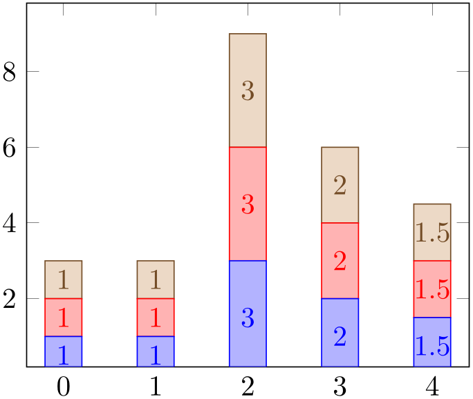
% Preamble: \pgfplotsset{width=7cm,compat=1.18}
% needs \pgfplotsset{compat=1.9} or newer!
\begin{tikzpicture}
\begin{axis}[
ybar stacked,nodes near coords,
bar width=0.4,
]
\addplot coordinates
{(0,1) (1,1) (2,3) (3,2) (4,1.5)};
\addplot coordinates
{(0,1) (1,1) (2,3) (3,2) (4,1.5)};
\addplot coordinates
{(0,1) (1,1) (2,3) (3,2) (4,1.5)};
\end{axis}
\end{tikzpicture}
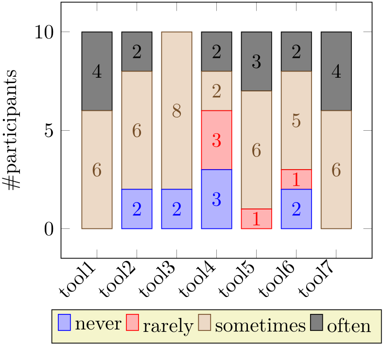
% Preamble: \pgfplotsset{width=7cm,compat=1.18}
% needs \pgfplotsset{compat=1.9} or newer!
\begin{tikzpicture}
\begin{axis}[
ybar stacked,
bar width=15pt,
nodes near coords,
enlargelimits=0.15,
legend style={at={(0.5,-0.20)},
anchor=north,legend columns=-1},
ylabel={\#participants},
symbolic x coords={tool1, tool2, tool3, tool4,
tool5, tool6, tool7},
xtick=data,
x tick label style={rotate=45,anchor=east},
]
\addplot+ [ybar] coordinates {(tool1,0) (tool2,2)
(tool3,2) (tool4,3) (tool5,0) (tool6,2) (tool7,0)};
\addplot+ [ybar] coordinates {(tool1,0) (tool2,0)
(tool3,0) (tool4,3) (tool5,1) (tool6,1) (tool7,0)};
\addplot+ [ybar] coordinates {(tool1,6) (tool2,6)
(tool3,8) (tool4,2) (tool5,6) (tool6,5) (tool7,6)};
\addplot+ [ybar] coordinates {(tool1,4) (tool2,2)
(tool3,0) (tool4,2) (tool5,3) (tool6,2) (tool7,4)};
\legend{never, rarely, sometimes, often}
\end{axis}
\end{tikzpicture}
Note that the preceding example contains no nodes for coordinates with value 0. This is due to the key stacked ignores zero which is active if compat=1.9 or newer: empty increments will be discarded.
This automatic reconfiguration is essentially part of the styles xbar stacked or ybar stacked: both reconfigure nodes near coords. Note that this feature has been introduced in version 1.9. In order to maintain backwards compatible to previous workarounds, you have to write compat=1.9 to get these effects.
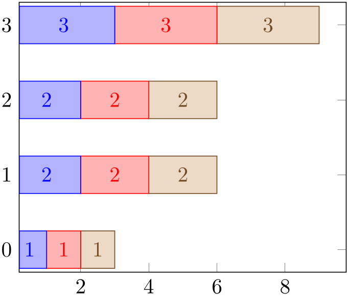
% Preamble: \pgfplotsset{width=7cm,compat=1.18}
\begin{tikzpicture}
\begin{axis}[
xbar stacked,nodes near coords,
bar width=0.5,
]
\addplot coordinates
{(1,0) (2,1) (2,2) (3,3)};
\addplot coordinates
{(1,0) (2,1) (2,2) (3,3)};
\addplot coordinates
{(1,0) (2,1) (2,2) (3,3)};
\end{axis}
\end{tikzpicture}
4.5.9.2Stacked Plots with Negative Values
The meaning of negative values in xbar stacked or ybar stacked and their visualization depends on the use case, and they need to be defined. pgfplots offers two different interpretations of negative values in the context of stacked plots:
-
/pgfplots/stack negative=on previous|separate (initially separate) 
-
• all but stacked bar plots,
-
• all plots if compat is less than 1.13.
The choice on previous will simply sum any values as they are found in the input data. Thus, if you have four plots which are stacked on top of each other, and the first has value \(10\), the second value \(50\), and the third value \(-10\), and the fourth has \(30\), the final value will be \(10+50-10+30 = 80\). However, visualizing a bar of negative size as a usual xbar stacked graph is hard to read and requires vertical offsets in this context. This can be accomplished as follows:
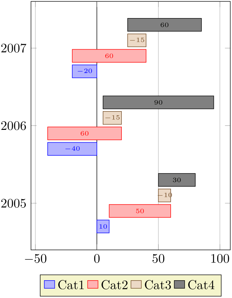
% Preamble: \pgfplotsset{width=7cm,compat=1.18}
\begin{tikzpicture}
\pgfplotstableread{
Year Cat1 Cat2 Cat3 Cat4
                            2005  10    50    -10
                      30
                            2006  -40   60    -15
                      90
                            2007  -20   60    -15
                      60
}\mytable
\begin{axis}[
xbar stacked,
stack negative=on previous,
%
xmajorgrids,
legend style={at={(0.5,-0.1)},
anchor=north,legend columns=-1},
bar width=10pt,
bar shift auto,
nodes near coords,
nodes near coords style={font=\tiny},
y=60pt,
ytick distance=1,
enlarge y limits=0.3,
/pgf/number format/1000 sep=,
extra x ticks={0},
extra x tick style={grid style={black},
xticklabel=\empty},
]
                        \addplot table
                    [x index=1,y=Year] {\mytable};
                        \addplot table
                    [x index=2,y=Year] {\mytable};
                        \addplot table
                    [x index=3,y=Year] {\mytable};
                        \addplot table
                    [x index=4,y=Year] {\mytable};
\legend{Cat1,Cat2,Cat3,Cat4}
\end{axis}
\end{tikzpicture}
In this case, the values for \(y=2005\) resemble our input case of \(10+50-10+30=80\). It is a “normal” xbar stacked with the configuration stack negative=on previous – but with the special key bar shift auto which is also used in order to create grouped xbar charts: every \addplot receives a vertical offset.
Despite the similarity with “waterfall charts”, this is not indented to be a waterfall chart. At the time of this writing, pgfplots has no support for waterfall charts.
The choice stack negative=on previous is the initial value for
As of compat=1.13, the initial value of stack negative is separate for xbar stacked, ybar stacked, and their * interval based variants.
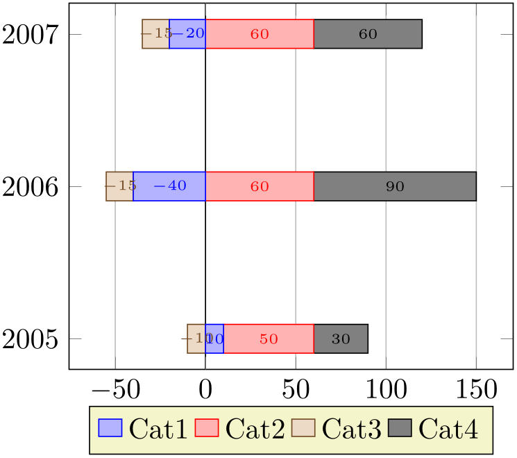
The alternative choice separate tracks the start points of bars separately for negative and non-negative values:
% Preamble: \pgfplotsset{width=7cm,compat=1.18}
\begin{tikzpicture}
\pgfplotstableread{
Year Cat1 Cat2 Cat3 Cat4
                            2005  10    50    -10
                      30
                            2006  -40   60    -15
                      90
                            2007  -20   60    -15
                      60
}\mytable
\begin{axis}[
xbar stacked,
% is default anyway:
stack negative=separate,
%
/pgf/number format/1000 sep=,
xmajorgrids,
nodes near coords,
nodes near coords style={font=\tiny},
ytick distance=1,
legend style={at={(0.5,-0.1)},
anchor=north,legend columns=-1},
extra x ticks={0},
extra x tick style={grid style={black},
xticklabel=\empty},
]
                        \addplot table
                    [x index=1,y=Year] {\mytable};
                        \addplot table
                    [x index=2,y=Year] {\mytable};
                        \addplot table
                    [x index=3,y=Year] {\mytable};
                        \addplot table
                    [x index=4,y=Year] {\mytable};
\legend{Cat1,Cat2,Cat3,Cat4}
\end{axis}
\end{tikzpicture}
In this case, positive contributions extend into the positive \(x\)-axis whereas negative contributions extend into the negative \(x\)-axis. There is no final sum (or better: there are two final sums). The effect is as if you would have defined two separate axes, one for the positive contributions and one for the negative ones and aligned them at the origin.
As of compat=1.13, stack negative=separate is the initial setting for stacked bar plots. Older compatibility levels use stack negative=on previous.
4.5.10Area Plots
Area plots means two-dimensional plots in which an area is filled between a couple of curves. Note that this is a rather incomplete characterization as mesh, surface, and patch plots are, of course, also “area plots” of some sort.
This section covers two types of area plots, namely those which are defined by stack plots and those which are defined using \addplot fill between.
4.5.10.1Filling Using Stacked Plots
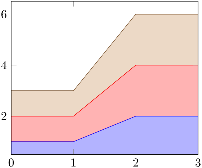
The first (and older) option to fill areas between plots is a combination of \closedcycle and stack plots. They can be combined with any other plot type.
% Preamble: \pgfplotsset{width=7cm,compat=1.18}
\begin{tikzpicture}
\begin{axis}[
stack plots=y,
area style,
enlarge x limits=false,
]
\addplot coordinates
{(0,1) (1,1) (2,2) (3,2)}
\closedcycle;
\addplot coordinates
{(0,1) (1,1) (2,2) (3,2)}
\closedcycle;
\addplot coordinates
{(0,1) (1,1) (2,2) (3,2)}
\closedcycle;
\end{axis}
\end{tikzpicture}
The main property of this kind of area visualization is that all plots of an axis are taken together, and since they are stacked, they form areas.
Area plots may need modified legends, for example using the area legend key. Furthermore, one may want to consider the axis on top key such that filled areas do not overlap ticks and grid lines since such plots typically cover huge areas of the axis.
Note that Area plots which rely on stack plots have one severe limitation: stacking works if and only if each plot has the same coordinates (in our case of stack plots=y, each plot has the same \(x\) coordinates).
-
/pgfplots/area style(style, no value) 
-
/pgfplots/area cycle list(style, no value) 
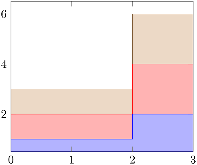
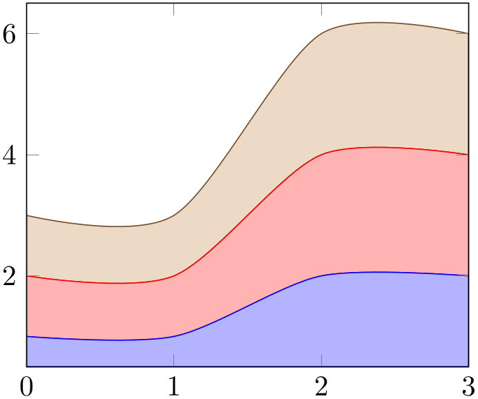
A style which installs a cycle list suitable for area plots. The initial configuration of this style simply invokes the bar cycle list which does also provide filled plot styles.
% Preamble: \pgfplotsset{width=7cm,compat=1.18}
\begin{tikzpicture}
\begin{axis}[
const plot,
stack plots=y,
area style,
enlarge x limits=false,
]
\addplot coordinates
{(0,1) (1,1) (2,2) (3,2)}
\closedcycle;
\addplot coordinates
{(0,1) (1,1) (2,2) (3,2)}
\closedcycle;
\addplot coordinates
{(0,1) (1,1) (2,2) (3,2)}
\closedcycle;
\end{axis}
\end{tikzpicture}
% Preamble: \pgfplotsset{width=7cm,compat=1.18}
\begin{tikzpicture}
\begin{axis}[
smooth,
stack plots=y,
area style,
enlarge x limits=false,
]
\addplot coordinates
{(0,1) (1,1) (2,2) (3,2)}
\closedcycle;
\addplot coordinates
{(0,1) (1,1) (2,2) (3,2)}
\closedcycle;
\addplot coordinates
{(0,1) (1,1) (2,2) (3,2)}
\closedcycle;
\end{axis}
\end{tikzpicture}
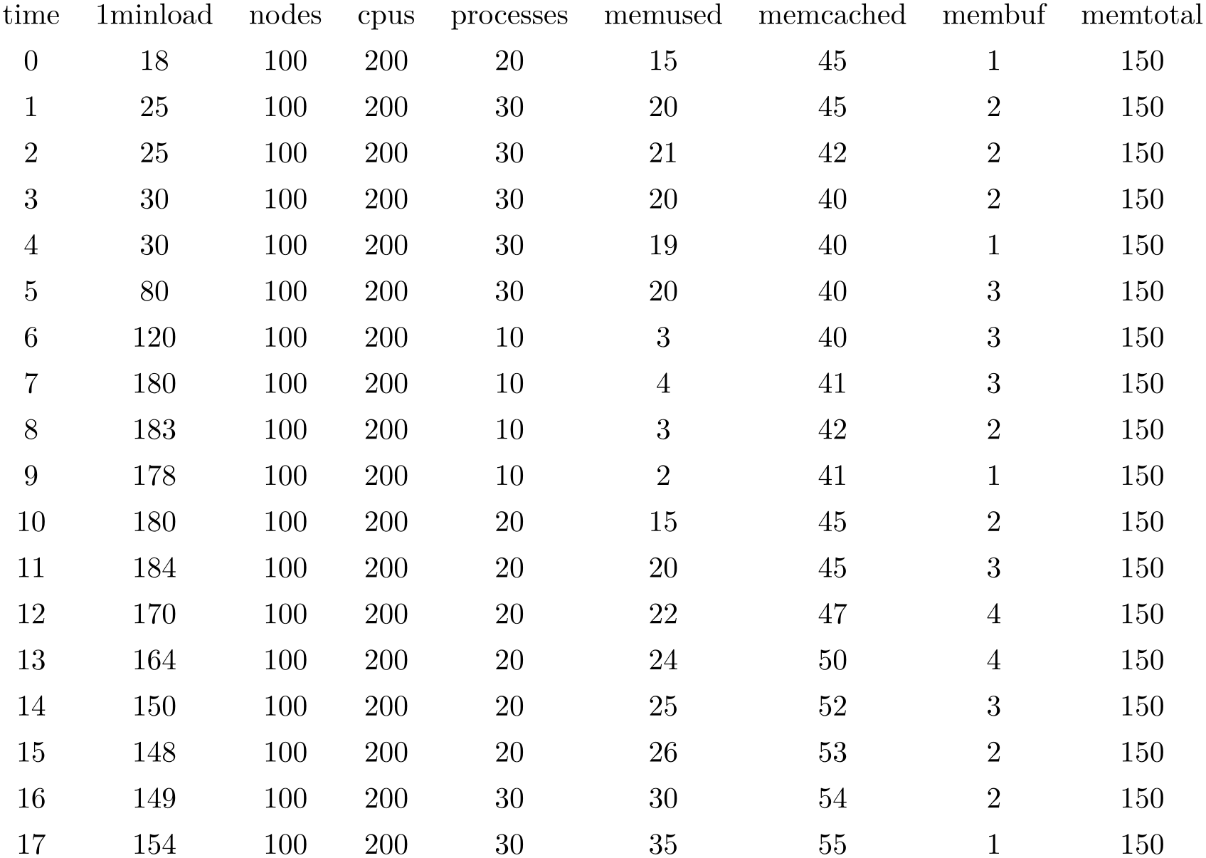
\pgfplotstableread{pgfplots.timeseries.dat}\loadedtable
\pgfplotstabletypeset\loadedtable
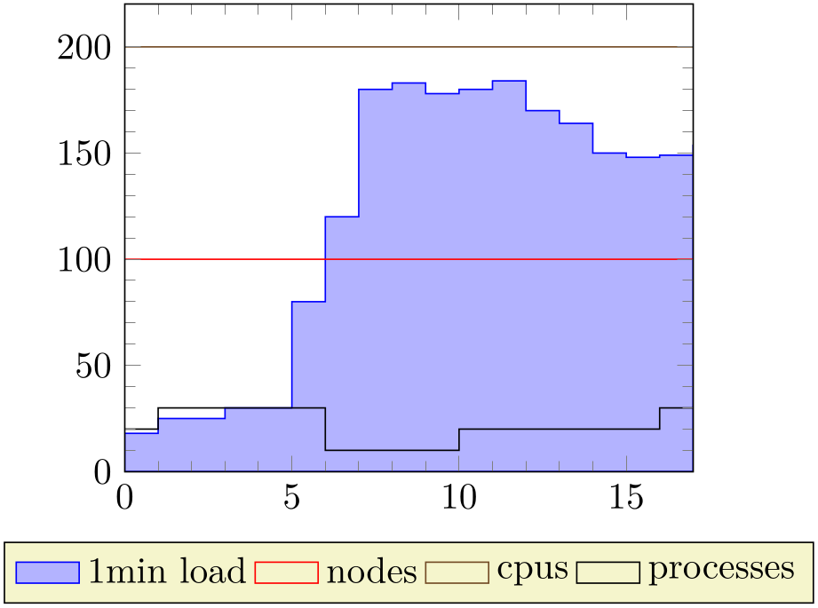
% Preamble: \pgfplotsset{width=7cm,compat=1.18}
\pgfplotstableread{pgfplots.timeseries.dat}{\loadedtable}
\begin{tikzpicture}
\begin{axis}[
ymin=0,
minor tick num=4,
enlarge x limits=false,
axis on top,
every axis plot post/.append style={mark=none},
const plot,
legend style={
area legend,
at={(0.5,-0.15)},
anchor=north,
legend columns=-1,
},
]
\addplot [draw=blue,fill=blue!30!white]
                            table
                [x=time,y=1minload]       from \loadedtable
\closedcycle;
\addplot table [x=time,y=nodes] from \loadedtable;
\addplot table [x=time,y=cpus] from \loadedtable;
\addplot table [x=time,y=processes] from \loadedtable;
\legend{1min load,nodes,cpus,processes}
\end{axis}
\end{tikzpicture}
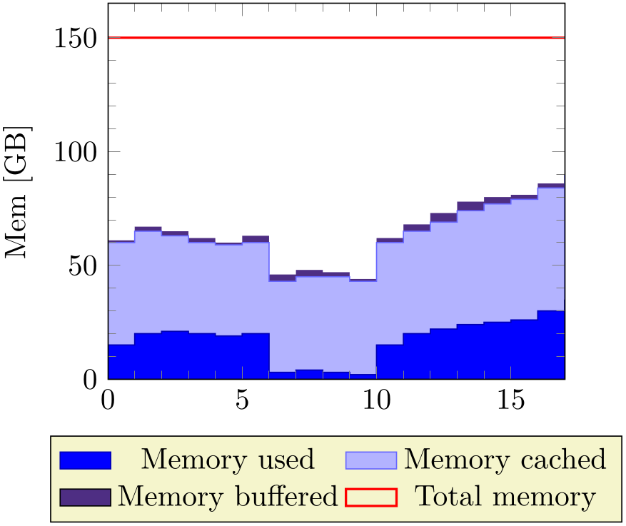
% Preamble: \pgfplotsset{width=7cm,compat=1.18}
\pgfplotstableread{pgfplots.timeseries.dat}\loadedtable
\begin{tikzpicture}
\begin{axis}[
ymin=0,
minor tick num=4,
enlarge x limits=false,
const plot,
axis on top,
stack plots=y,
cycle list={
{blue!70!black,fill=blue},
{blue!60!white,fill=blue!30!white},
{draw=none,fill={rgb:red,138;green,82;blue,232}},
{red,thick}
},
ylabel={Mem [GB]},
legend style={
area legend,
at={(0.5,-0.15)},
anchor=north,
legend columns=2},
]
                    \addplot  table
                [x=time,y=memused]      from \loadedtable \closedcycle;
                    \addplot  table
                [x=time,y=memcached]    from \loadedtable \closedcycle;
                    \addplot  table
                [x=time,y=membuf]       from \loadedtable \closedcycle;
\addplot+ [stack plots=false]
                              table
                [x=time,y=memtotal]     from \loadedtable;
                    \legend{Memory used,Memory
                cached,Memory buffered,Total memory}
\end{axis}
\end{tikzpicture}
4.5.10.2Filling Under/Between Named Plots
The second way to fill areas under or between plots is the fillbetween library shipped with pgfplots.
TikZ allows to name a plot or a path using name path. The fillbetween library offers the special “plot type” \addplot fill between which expects two such named paths on input. Then, it generates filled areas between these named paths.
The biggest difference to Area plots by means of
stack plots as discussed in the previous section is that
\addplot
fill between
accepts arbitrary input plots: the coordinates can vary, the ranges can vary, even
smooth and
sharp plot can be combined. In addition,
\addplot
fill between
allows to select only subregions between the two input paths by means of its
soft clip feature, and it accepts individually styled fill segments
using its styles every even segment, every segment no
 index
index , etc.
The reference documentation is Section 5.7, but the following examples attempt to cover basic use cases around “fill between”. Please refer to the reference documentation in Section 5.7 for an in-depth discussion of every involved key.
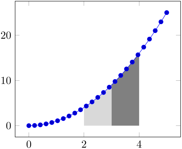
The following advanced example selects two partial areas using soft clip in order to fill these areas:
% Preamble: \pgfplotsset{width=7cm,compat=1.18}
% requires \usepgfplotslibrary{fillbetween}
\begin{tikzpicture}
\begin{axis}
\addplot+ [name path=A,domain=0:5] {x^2};
\path [name path=B]
(\pgfkeysvalueof{/pgfplots/xmin},0) --
(\pgfkeysvalueof{/pgfplots/xmax},0);
\addplot [gray] fill between [
                        of=A and
                B,soft clip={domain=3:4},
];
                    \addplot [gray!30] fill
                between [
                        of=A and
                B,soft clip={domain=2:3},
];
\end{axis}
\end{tikzpicture}
The preceding example is characterized by two paths, each of which is named using
name path. The path named ‘A’ is a plot of \(x^2\). The other path named ‘B’ is actually
nothing but the visible \(x\)-axis, the \path instruction means
that it is not drawn at all. Note that
\pgfkeysvalueof{/pgfplots/xmin}
expands to the visible lower \(x\)-axis limit. Finally, we see two
\addplot
fill between
instructions, both with the selection of=A and B and both
with (different) values of soft clip. The soft clip key restricts the filled segments to the bounding
rectangle defined by some path
 lower corner
 rectangle
  upper corner
 where the two arguments are the lower and upper corner of an invisible rectangular bounding box. In our case, this bounding box
has been defined by some domain restriction and the upper and
lower axis limits. Only those parts of the filled segment makes up the result of
\addplot
fill between.
This restriction to a specific interval (or better: rectangle) is also available when stroking the involved paths ‘A’ or ‘B’: pgfplots comes with decoration=soft clip which can be combined with postaction as follows.
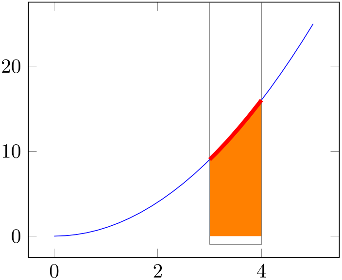
% Preamble: \pgfplotsset{width=7cm,compat=1.18}
% requires \usepgfplotslibrary{fillbetween}
\begin{tikzpicture}
\begin{axis}
% define some common macro
\def\clippath{
                        (3,-1) rectangle
                (4,100)
}
\draw [help lines] \clippath;
\addplot+ [name path=A,domain=0:5,
mark=none,
postaction={decorate,red,line width=2pt,
decoration={
soft clip,
                                soft clip
                path={\clippath},
},
},
] {x^2};
\path [name path=B]
(\pgfkeysvalueof{/pgfplots/xmin},0) --
(\pgfkeysvalueof{/pgfplots/xmax},0);
\addplot [orange] fill between [
                        of=A and
                B,soft clip={\clippath},
];
\end{axis}
\end{tikzpicture}
The preceding example has a \def\clippath which defines a re-usable bounding box. Here, the fill between statement is similar to the preceding example, with the only difference that our macro is used as value. The main difference is the postaction in plot ‘A’. A postaction is a TikZ construct which allows to draw the same path twice. The second time the plot is drawn makes use of the option list after postaction. In our case, it is a decoration which will be drawn in red with thick lines. The decoration applies a soft clip path. In this context, soft clip is applied to one path only, but the idea is the same: only the parts within the soft clip argument are displayed.
Note that fill between is also possible for arbitrary plots, not just the \(x\)-axis. In fact, one can combine any two plots.
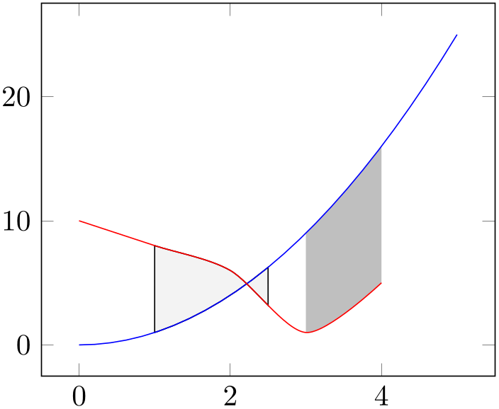
% Preamble: \pgfplotsset{width=7cm,compat=1.18}
% requires \usepgfplotslibrary{fillbetween}
\begin{tikzpicture}
\begin{axis}
\addplot [blue,name path=A,domain=0:5] {x^2};
\addplot [red,name path=B,smooth] table {
                        x
                y
0 10
1 8
2 6
3 1
4 5
};
                    \addplot [gray!50] fill
                between [
                        of=A and
                B,
soft clip={domain=3:4},
];
\addplot [gray!10,draw=black] fill between [
                        of=A and
                B,
soft clip={domain=1:2.5},
];
\end{axis}
\end{tikzpicture}
The preceding example has two plots with a different number of samples, a different range, and a different input method. Nevertheless, the area between these two plots can be filled just as in the previous examples, including any intersections.
It is also possible to define individual styles for the filled segments. To this end, one has to set the split key which activates separate output paths. This enables the use of special styles which is shown in in the following example. Here, we have two styles with explicitly numbered segment indices:
% Preamble: \pgfplotsset{width=7cm,compat=1.18}
% requires \usepgfplotslibrary{fillbetween}
\begin{tikzpicture}
\begin{axis}
\addplot [blue,name path=A,domain=0:5] {x^2};
\addplot [red,name path=B,smooth] table {
                        x
                y
0 10
1 8
2 6
3 1
4 5
};
\addplot [gray] fill between [
                        of=A and
                B,
split,
every segment no 0/.style=
{pattern color=gray!50,
pattern=north east lines},
every segment no 1/.style=
{pattern=north west lines},
];
\end{axis}
\end{tikzpicture}
Note that the example has no soft clip argument. Consequently, it fills between the start and end points of the involved paths. The split argument combined with the styles yields individually drawn fill segments.
Further reading: see Section 5.7.
4.5.11Closing Plots (Filling the Area Under Plots)
-
\closedcycle 
Provide
\closedcycle as
 trailing path commands
 after \addplot to draw a closed line from the last plot
coordinate to the first one.
Use \closedcycle whenever you intend to fill the area under a plot.
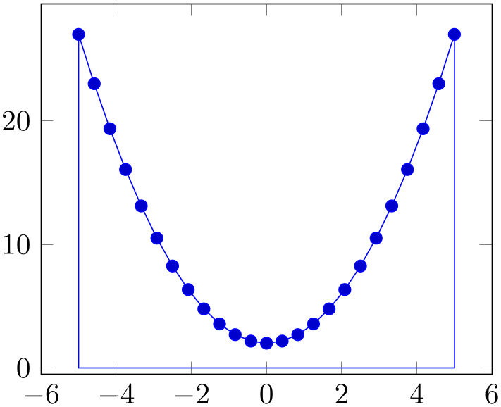
% Preamble: \pgfplotsset{width=7cm,compat=1.18}
\begin{tikzpicture}
\begin{axis}
\addplot {x^2+2} \closedcycle;
\end{axis}
\end{tikzpicture}
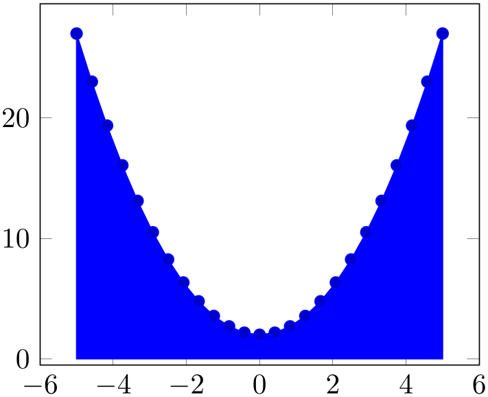
% Preamble: \pgfplotsset{width=7cm,compat=1.18}
\begin{tikzpicture}
\begin{axis}
\addplot+ [fill] {x^2+2} \closedcycle;
\end{axis}
\end{tikzpicture}
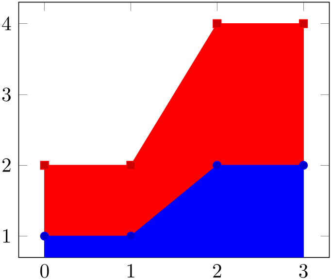
In case of stacked plots, \closedcycle connects the current plot with the previous plot instead of connecting with the \(x\)-axis.15
% Preamble: \pgfplotsset{width=7cm,compat=1.18}
\begin{tikzpicture}
\begin{axis}[stack plots=y]
\addplot+ [fill] coordinates {
(0,1) (1,1) (2,2) (3,2)
}
\closedcycle
;
\addplot+ [fill] coordinates {
(0,1) (1,1) (2,2) (3,2)
}
\closedcycle
;
\end{axis}
\end{tikzpicture}
Closing a plot is also possible for three-dimensional axes, see Section 4.6.3.1 on page (page for section 4.6.3.1).
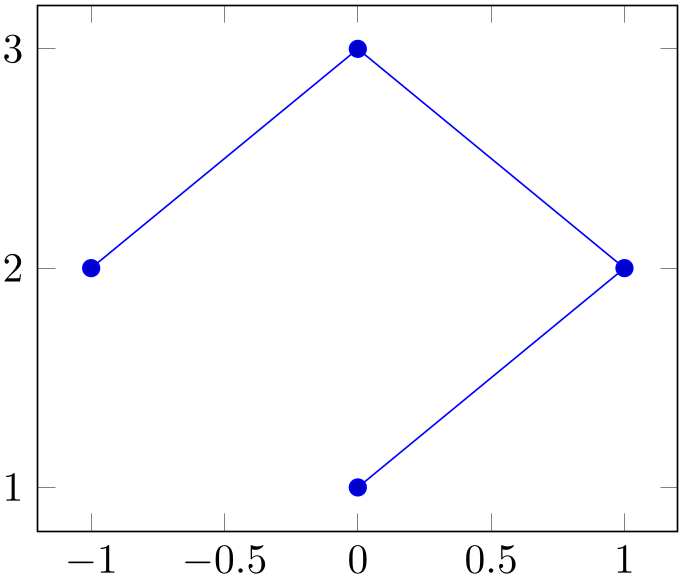
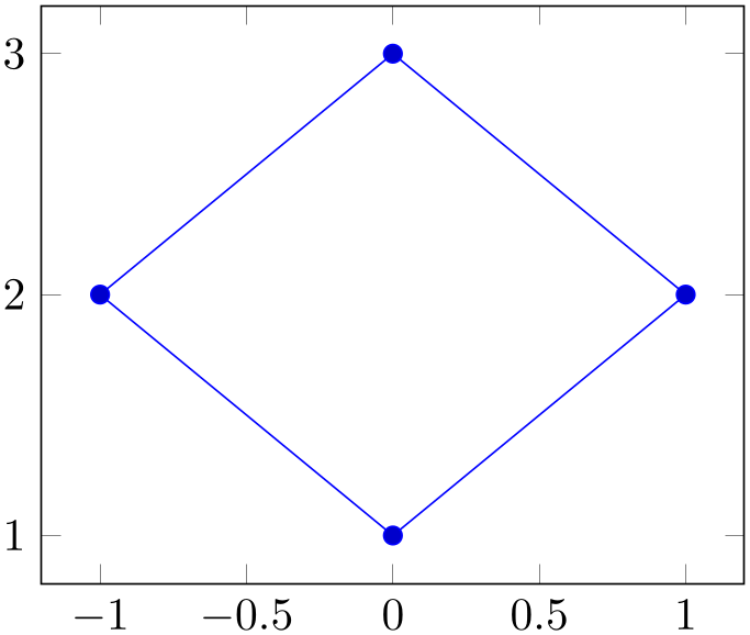
Note that \closedcycle has been designed for functions (i.e. for a plot where every \(x\) has at most one \(y\) value). For arbitrary curves, you can safely use the TikZ path --cycle instead which simply connects the last and the first path element:
% Preamble: \pgfplotsset{width=7cm,compat=1.18}
\begin{tikzpicture}
\begin{axis}
                    \addplot coordinates
                {
(0,1) (1,2) (0,3) (-1,2)
};
\end{axis}
\end{tikzpicture}
% Preamble: \pgfplotsset{width=7cm,compat=1.18}
\begin{tikzpicture}
\begin{axis}
                    \addplot coordinates
                {
(0,1) (1,2) (0,3) (-1,2)
}
--cycle
;
\end{axis}
\end{tikzpicture}
% Preamble: \pgfplotsset{width=7cm,compat=1.18}
\begin{tikzpicture}
\begin{axis}
\addplot+ [fill] coordinates {
(0,1) (1,2) (0,3) (-1,2)
}
--cycle
;
\end{axis}
\end{tikzpicture}
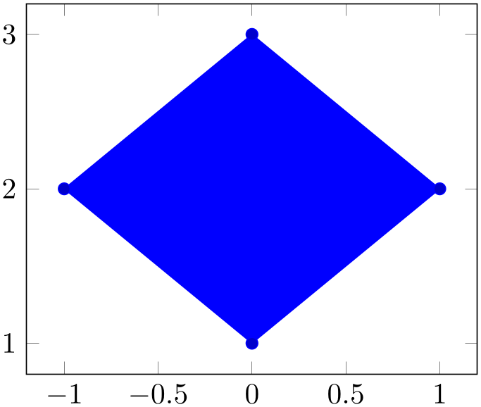
The --cycle is actually a path instruction of [7]; it connects the first and the last coordinate of one path. Note that this is automatically done for filled paths.
15 The implementation for stacked plots requires some additional logic to determine the filled area: \closedcycle will produce a plot coordinates command with reversed coordinates of the previous plot. This is usually irrelevant for end users, but it assumes that the plot’s type is symmetric. Since constant plots are inherently asymmetric, \closedcycle will use const plot mark right as reversed sequence for const plot mark left.
4.5.12Scatter Plots
The most simple scatter plots produce the same as the line plots above – but they contain only markers. They are enabled using the only marks key of TikZ.
-
/tikz/only marks(no value) 
-
\addplot+[only marks]
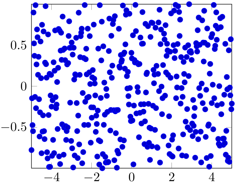
Draws a simple scatter plot: all markers have the same appearance.
% Preamble: \pgfplotsset{width=7cm,compat=1.18}
\begin{tikzpicture}
\begin{axis}[enlargelimits=false]
\addplot+ [
only marks,
samples=400,
] {rand};
\end{axis}
\end{tikzpicture}
The only marks visualization style simply draws marks at
every coordinate. Marks can be set with mark= mark name
 and marker options like size and color can be specified using the
mark options=
 style options
 key (or by modifying the every mark style). The available
markers along with the accepted style options can be found in Section 4.7.
More sophisticated scatter plots change the marker appearance for each data point. An example is that marker colors depend on the magnitude of function values \(f(x)\) or other provided coordinates. The term “scatter plot” will be used for this type of plot in the following sections.
Scatter plots require “source” coordinates. These source coordinates can be the \(y\)-coordinate, or explicitly provided additional values.
-
/pgfplots/scatter(no value) 
-
\addplot+[scatter]
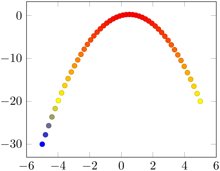
Enables marker appearance modifications. The default implementation acquires “source coordinates” for every data point (see scatter src below) and maps them linearly into the current color map. The resulting color is used as draw and fill color of the marker.
% Preamble: \pgfplotsset{width=7cm,compat=1.18}
\begin{tikzpicture}
\begin{axis}
\addplot+ [
scatter,
only marks,
samples=50,
scatter src=y,
] {x - x^2};
\end{axis}
\end{tikzpicture}
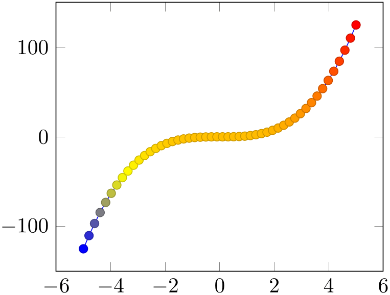
The key scatter is simply a boolean variable which enables marker modifications. It applies only to markers and it can be combined with any other plot type.
% Preamble: \pgfplotsset{width=7cm,compat=1.18}
\begin{tikzpicture}
\begin{axis}
\addplot+ [
scatter,
samples=50,
scatter src=y,
] {x^3};
\end{axis}
\end{tikzpicture}
Scatter plots can be configured using a set of options. One of them is mandatory, the rest allows fine grained control over marker appearance options.
-
/pgfplots/scatter src=none|
 expression
 |x|y|z|f(x)|explicit|explicit symbolic (initially none)
This key is necessary for
any scatter plot and it is set to f(x) as soon as
scatter is activated and no different choice has been
made. It needs to be provided as
 option
 for \addplot to configure the value used to determine
marker appearances. Actually, scatter src is nothing
but an alias for point meta, so the main documentation for this key at 4.8.2. However, we
summarize the choices here together with scatter plot examples.
Usually, scatter src provides input data (numeric or string type) which is used to determine colors and other style options for markers. The default configuration expects numerical data which is mapped linearly into the current color map.
The value of scatter src determines how to get this data: the choices x, y and z will use either the \(x\)-, \(y\)- or \(z\)-coordinates to determine marker options. Any coordinate filters, logarithms or stacked-plot computations have already been applied to these values (use rawx, rawy and rawz for unprocessed values). The special choice f(x) is the same as y for two dimensional plots and the same as z for three dimensional plots. The choice explicit expects the scatter source data as additional coordinate from the coordinate input streams (see Section 4.3.1 for how to provide input meta data or below for some small examples). They will be treated as numerical data. The choice explicit symbolic also expects scatter source data as additional meta information for each input coordinate, but it treats them as strings, not as numerical data. Consequently, no arithmetics is performed. It is the task of the scatter plot style to do something with it. See, for example, the scatter/classes style below. Finally, it is possible to provide an arbitrary mathematical expression which involves zero, one or more of the values x (the current \(x\)-coordinate), y (the current \(y\)-coordinate) or z (the current \(z\)-coordinate, if any).
If data is read from tables, mathematical expressions might also involve
\thisrow{ column name
 } or \thisrowno{
 column index
 } to access any of the table cells in the current row.
Here are examples for how to provide data for the choices explicit and explicit symbolic.
\begin{tikzpicture}
\begin{axis}
% provide color data explicitly using []
% behind coordinates:
                            \addplot+
                    [scatter,scatter src=explicit]
                                coordinates
                    {
(0,0) [1.0e10]
(1,2) [1.1e10]
(2,3) [1.2e10]
(3,4) [1.3e10]
% ...
};
% Assumes a datafile.dat like
% xcolname ycolname colordata
% 0 0 0.001
% 1 2 0.3
% 2 2.1 0.4
% 3 3 0.5
% ...
% the file may have more columns.
                            \addplot+
                    [scatter,scatter src=explicit]
                                table
                    [x=xcolname,y=ycolname,meta=colordata]
{datafile.dat};
% Same data as last example:
                            \addplot+
                    [scatter,scatter src=\thisrow{colordata}+\thisrow{ycolname}]
                                table
                    [x=xcolname,y=ycolname]
{datafile.dat};
% Assumes a datafile.dat like
% 0 0 0.001
% 1 2 0.3
% 2 2.1 0.4
% 3 3 0.5
% ...
% the first three columns will be used here:
                            \addplot+
                    [scatter,scatter src=explicit]
                                file
                    {datafile.dat};
\end{axis}
\end{tikzpicture}
Please note that scatter src\(\neq \)none results in computational work even if scatter=false.
-
/pgfplots/scatter/use mapped color={
 options for each marker
 } (style, initially draw=mapped color!80!black,fill=mapped color)
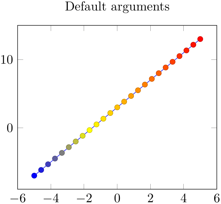
This style is
installed by default. When active, it recomputes the color
mapped color for every processed point coordinate by transforming
the scatter src coordinates into the current color map
linearly. Then, it evaluates the options provided as
 options for each marker
 which are expected to depend on mapped color.
The user interface for color maps is described in Section 4.7.6.
% Preamble: \pgfplotsset{width=7cm,compat=1.18}
\begin{tikzpicture}
\begin{axis}[title=Default arguments]
\addplot+ [
scatter,
scatter src=y,
] {2*x+3};
\end{axis}
\end{tikzpicture}
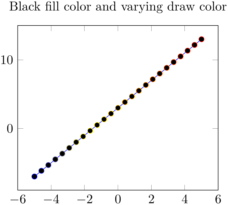
% Preamble: \pgfplotsset{width=7cm,compat=1.18}
\begin{tikzpicture}
\begin{axis}[
                        title=Black fill
                    color and varying draw color,
scatter/use mapped color={
draw=mapped color,
fill=black,
},
]
\addplot+ [
scatter,
scatter src=y,
] {2*x+3};
\end{axis}
\end{tikzpicture}
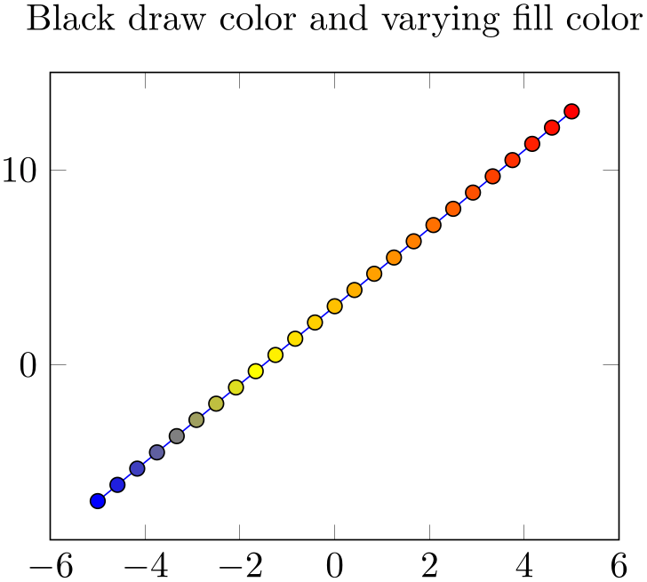
% Preamble: \pgfplotsset{width=7cm,compat=1.18}
\begin{tikzpicture}
\begin{axis}[
                        title=Black draw
                    color and varying fill color,
scatter/use mapped color={
draw=black,
fill=mapped color,
},
]
\addplot+ [
scatter,
scatter src=y,
] {2*x+3};
\end{axis}
\end{tikzpicture}
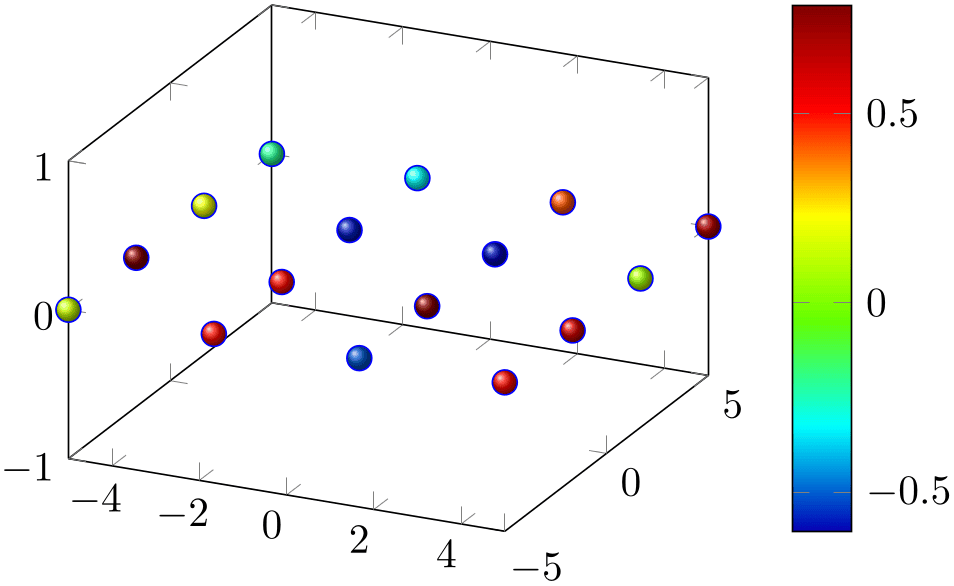
% Preamble: \pgfplotsset{width=7cm,compat=1.18}
\begin{tikzpicture}
\begin{axis}[colormap/bluered,colorbar]
\addplot3+ [
samples=4,
z buffer=sort,
% enable scatter:
scatter,
% redefine appearance:
scatter/use mapped color={ball color=mapped color},
% configure input:
scatter src=rand,
only marks,
mark=ball,
mark size=3pt,
] {0};
\end{axis}
\end{tikzpicture}
This key is actually a style which redefines @pre marker code and @post marker code (see below).
Remark:
The style use mapped color redefines @pre marker code and @post marker code. There is a starred variant use mapped color* which appends the functionality while keeping the old marker code.
-
/pgfplots/scatter/classes={
 styles for each class name
 }
}
A scatter plot style which visualizes points using several classes. The style assumes
that every point coordinate has a class label attached, that means the choice
scatter src=explicit symbolic is assumed.16 A class label can be a number, but it can also be a symbolic constant. Given class
labels for every point,
 styles for each class name
 contains a comma-separated list which associates appearance options to each class label.
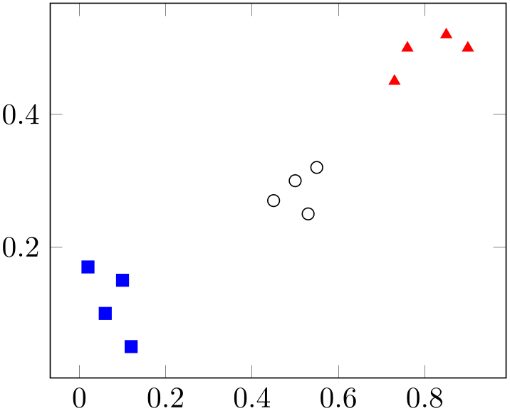
% Preamble: \pgfplotsset{width=7cm,compat=1.18}
\begin{tikzpicture}
\begin{axis}[
scatter/classes={
a={mark=square*,blue},
b={mark=triangle*,red},
                            c={mark=o,draw=black}   % <-- don't add
                    comma
},
]
% \addplot[] is better than \addplot+[] here:
% it avoids scalings of the cycle list
\addplot [
scatter,only marks,
scatter src=explicit symbolic,
] coordinates {
(0.1,0.15) [a]
(0.45,0.27) [c]
(0.02,0.17) [a]
(0.06,0.1) [a]
(0.9,0.5) [b]
(0.5,0.3) [c]
(0.85,0.52) [b]
(0.12,0.05) [a]
(0.73,0.45) [b]
(0.53,0.25) [c]
(0.76,0.5) [b]
(0.55,0.32) [c]
};
\end{axis}
\end{tikzpicture}
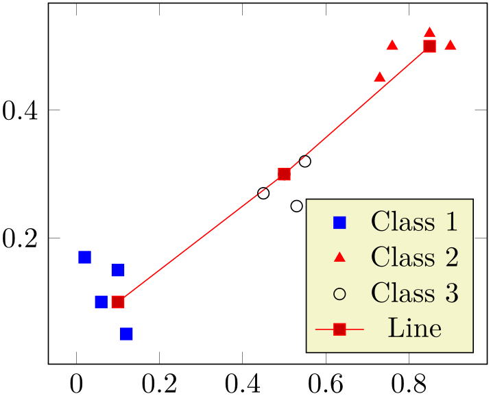
In this example, the coordinate (0.1,0.15) has the associated label ‘a’ while (0.45,0.27) has the label ‘c’ (see Section 4.3 for details about specifying point meta data). Now, the argument to scatter/classes contains styles for every label – for label ‘a’, square markers will be drawn in color blue.
The generation of a legend works as for a normal plot – but scatter/classes requires one legend entry for every provided class. It communicates the class labels to the legend automatically. It works as if there had been different \addplot commands, one for every class label.
It is also possible to provide scatter/classes as argument to a single plot, allowing different scatter plots in one axis.
% Preamble: \pgfplotsset{width=7cm,compat=1.18}
\begin{tikzpicture}
\begin{axis}[legend pos=south east]
% The data file contains:
% x y label
% 0.1 0.15 a
% 0.45 0.27 c
% 0.02 0.17 a
% 0.06 0.1 a
% 0.9 0.5 b
% 0.5 0.3 c
% 0.85 0.52 b
% 0.12 0.05 a
% 0.73 0.45 b
% 0.53 0.25 c
% 0.76 0.5 b
% 0.55 0.32 c
\addplot [
% clickable coords={\thisrow{label}},
scatter/classes={
a={mark=square*,blue},
b={mark=triangle*,red},
                                c={mark=o,draw=black,fill=black}% no
                    comma
},
scatter,only marks,
scatter src=explicit symbolic,
] table [x=x,y=y,meta=label]
{plotdata/scattercl.dat};
\addplot coordinates
{(0.1,0.1) (0.5,0.3) (0.85,0.5)};
                        \legend{Class 1,Class 2,Class
                    3,Line}
\end{axis}
\end{tikzpicture}
In general, the format of
 styles for each class name
 is a comma separated list of
 label
label ={
={ style options
 }.
}.
Attention:
The keys every mark and
mark options have no effect when used inside of
 styles for each class name
 ! So, instead of assigning mark options, you can simply provide the options directly. They apply only to markers anyway.
Remark:
To use \label and \ref in conjunction with scatter/classes, you can provide the class labels as optional arguments to \label in square brackets:
\addplot [
scatter/classes={
a={mark=square*,blue},
b={mark=triangle*,red},
                            c={mark=o,draw=black,fill=black}    %
                    <-- don't add comma here
},
scatter,only marks,
scatter src=explicit symbolic,
]
% [and coordinate input here... ]
;
\label[a]{label:for:first:class}
\label[b]{label:for:second:class}
\label[c]{label:for:third:class}
...
                    First class is \ref{label:for:first:class}, second is
                    \ref{label:for:second:class}.
Remark:
It is possible to click into the plot to display labels with mouse popups, see the clickable coords key of the clickable library.
Remark:
The style scatter/classes redefines @pre marker code and @post marker code. There is a starred variant scatter/classes* which appends the functionality while keeping the old marker code.
-
/pgfplots/nodes near coords={
 content
 }
(default \pgfmathprintnumber\pgfplotspointmeta)
-
/pgfplots/nodes near coords*={
 content
 }
(default \pgfmathprintnumber\pgfplotspointmeta)
-
• nodes near coords uses the same options for line styles and colors as the current plot. This may be changed using the style every node near coord, see below.
-
• nodes near coords is actually one of the scatter plot styles. It redefines scatter/@pre marker code to generate several TikZ \node commands.
In order to use nodes near coords together with other scatter plot styles (like scatter/use mapped color or scatter/classes), you may append a star to each of these keys. The variant nodes near coords* will append code to scatter/@pre marker code without overwriting the previous value.
-
• Consider using enlargelimits together with nodes near coords if text is clipped away.
-
• Currently nodes near coords does not work satisfactorily for ybar interval or xbar interval, sorry.
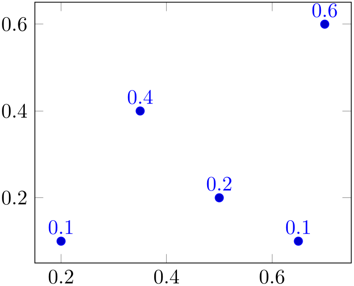
A scatter plot style which places text nodes near every coordinate.
% Preamble: \pgfplotsset{width=7cm,compat=1.18}
\begin{tikzpicture}
\begin{axis}[nodes near coords]
\addplot+ [
only marks
] coordinates {
(0.5,0.2) (0.2,0.1) (0.7,0.6)
(0.35,0.4) (0.65,0.1)
};
\end{axis}
\end{tikzpicture}
The
 content
 is, if nothing else has been specified, the content of the “point meta”, displayed using the default
 content
 =\pgfmathprintnumber{\pgfplotspointmeta}. The macro \pgfplotspointmeta contains whatever
has been selected by the point meta key, it defaults to
the \(y\)-coordinate for two dimensional plots and the \(z\)-coordinate for three dimensional plots.
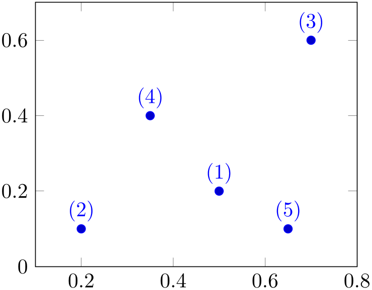
Since point meta=explicit symbolic allows to treat string data, you can provide textual descriptions which will be shown inside of the generated nodes:17
% Preamble: \pgfplotsset{width=7cm,compat=1.18}
\begin{tikzpicture}
\begin{axis}[nodes near coords,enlargelimits=0.2]
\addplot+ [
only marks,
point meta=explicit symbolic,
] coordinates {
(0.5,0.2) [(1)]
(0.2,0.1) [(2)]
(0.7,0.6) [(3)]
(0.35,0.4) [(4)]
(0.65,0.1) [(5)]
};
\end{axis}
\end{tikzpicture}
The square brackets are the way to provide explicit point meta for \addplot coordinates. Please refer to the documentation of plot file and \addplot table for how to get point meta from files.
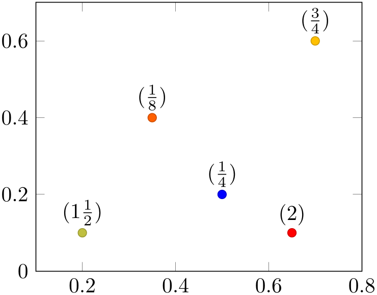
The
 content
 can also depend on something different than
\pgfplotspointmeta. But since
 content
 is evaluated during \end{axis}, pgfplots might
not be aware of any special information inside of
 content
 – you’ll need to communicate it to pgfplots with the
visualization depends on key as
follows:
% Preamble: \pgfplotsset{width=7cm,compat=1.18}
\begin{tikzpicture}
\begin{axis}[enlargelimits=0.2]
\addplot [
scatter,mark=*,only marks,
                                % we use 'point meta' as color
                    data...
point meta=\thisrow{color},
                                % ... therefore, we can't use it as
                    argument for nodes near coords ...
nodes near coords*={$(\pgfmathprintnumber[frac]\myvalue)$},
                                % ... which requires to define a
                    visualization dependency:
visualization depends on={\thisrow{myvalue} \as \myvalue},
] table {
                                x
                         y    color
                      myvalue
                                0.5    0.2
                     1       0.25
                                0.2    0.1
                     2       1.5
                                0.7    0.6
                     3       0.75
                                0.35   0.4  4
                          0.125
                                0.65   0.1  5
                          2
};
\end{axis}
\end{tikzpicture}
The example uses a scatter plot to get different colors, where the scatter src (or, equivalently, point meta) is already used to define the markers color. In addition to the colored scatter plot, we’d like to add nodes near coords, where the displayed nodes should contain \thisrow{myvalue}. To do so, we define scatter,point meta=\thisrow{color} (just as described in the previous sections). Furthermore, we use nodes near coords* in order to combine different scatter styles (see below for details). The value for nodes near coords* depends on \thisrow{myvalue}, but we can’t use \pgfplotspointmeta (which is already occupied). Thus, we communicate the additional input data by means of visualization depends on={\thisrow{myvalue} \as \myvalue}. The statement defines a new macro, \myvalue, and assigns the value \thisrow{myvalue}. Furthermore, it configures pgfplots to remember this particular macro and its contents until \end{axis} (see the documentation for visualization depends on for details).
The style nodes near coords might be useful for bar plots, see ybar for an example of nodes near coords.
Remarks and Details:
-
/pgfplots/every node near coord(style, no value) 
A style used for every node generated by nodes near coords. It is initially empty.
-
/pgfplots/nodes near coords style={
 key-value-list
 }
}
An abbreviation for
every node near coord/.append style={ key-value-list
 }.
}.
It appends options to the already existing style every node near coord.
-
/pgfplots/node near coords style={
 key-value-list
 }
}
An abbreviation for
every node near coord/.append style={ key-value-list
 }.
}.
It appends options to the already existing style every node near coord.
-
/pgfplots/node near coord style={
 key-value-list
 }
}
An abbreviation for
every node near coord/.append style={ key-value-list
 }.
}.
It appends options to the already existing style every node near coord.
-
/pgfplots/nodes near coords align={
 alignment method
 } (initially auto)
-
auto uses horizontal if the \(x\)-coordinates are shown or vertical in all other cases. This checks the current value of point meta.
-
horizontal uses left if \pgfplotspointmeta \(<0\) and right otherwise.
-
vertical uses below if \pgfplotspointmeta \(<0\) and above otherwise.
-
It is also possible to provide any TikZ alignment option such as anchor=north east, below or something like that. It is also allowed to provide multiple options.
Specifies how to align nodes generated by nodes near coords.
Possible choices for
 alignment method
 are
are
-
/pgfplots/coordinate style/.condition={
 expression
 }{
}{ options
 }
}
-
/pgfplots/coordinate style/.from={
 something expanding to options
 }
}
-
/pgfplots/coordinate style/.clear(no value) 
-
• scatter,
-
• scatter explicit color,
These keys allow to
define
 options
 for selected coordinates.
The first key coordinate style/.condition receives an
 expression
 and associates its
 options
 with all matching coordinates:
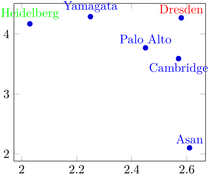
% Preamble: \pgfplotsset{width=7cm,compat=1.18}
\begin{tikzpicture}
\begin{axis}
\addplot+ [
nodes near coords,
only marks,
coordinate style/.condition=
{\coordindex==0}{below},
coordinate style/.condition=
{\coordindex==1}{red},
coordinate style/.condition=
{x < 2.1 && y > 4}{green},
point meta=explicit symbolic,
] table [meta=label] {
Depth Breadth label
2.57 3.59 Cambridge
2.58 4.27 Dresden
2.45 3.77 {Palo Alto}
2.61 2.10 Asan
2.03 4.17 Heidelberg
2.25 4.29 Yamagata
};
\end{axis}
\end{tikzpicture}
The plot uses \addplot table and associates textual information with each data point. In addition, it uses three coordinate style conditions in order to modify the appearance of a couple of these points. Consequently, the label “Cambridge” is placed below its coordinate, “Dresden” is drawn in red and “Heidelberg” in green.
The second possibility coordinate style/.from is unconditional and defines style information from a common source. Its major use is to define a source which expands to different values for each point, for example using \thisrow:
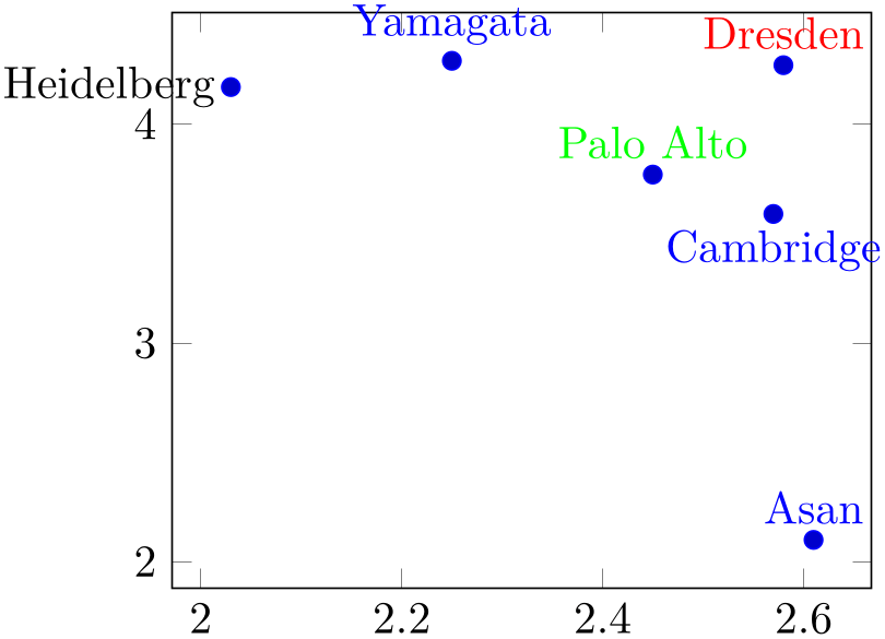
% Preamble: \pgfplotsset{width=7cm,compat=1.18}
\begin{tikzpicture}
\begin{axis}
\addplot+ [
nodes near coords,
only marks,
coordinate style/.from=
\thisrow{style},
coordinate style/.condition=
{x < 2.1 && y > 4}{black},
point meta=explicit symbolic,
] table [meta=label] {
                            Depth Breadth label
                          style
                            2.57  3.59    Cambridge
                      below
                            2.58  4.27    Dresden
                        red
2.45 3.77 {Palo Alto} green
                            2.61  2.10    Asan
                           {}
2.03 4.17 Heidelberg {left}
                            2.25  4.29    Yamagata
                       {}
};
\end{axis}
\end{tikzpicture}
We reuse the example from above, but with a fourth column “style” which becomes part of
coordinate style/.from and assigns
 options
 to each individual coordinate. Note that “Heidelberg” also matches the second conditional style so it receives
the additional options left (read from the “style” column) and
black (from coordinate style). Note than “Asan”
and “Yamagata” have an empty value in the style column and are drawn in their normal style inherited from the
plot.
Finally, coordinate style/.clear deletes all previously configured values.
All coordinate styles are active. If a coordinate matches more than one coordinate style, it receives the resulting options in the same sequence as the coordinate style definitions appear in your file.
Note that coordinate style overwrites nodes near coords align (which, in turn, is unsupported within coordinate style).
The key coordinate style is useful and available for other plot types as well. The following example is based on a normal scatter plot in which the red point receives special options:
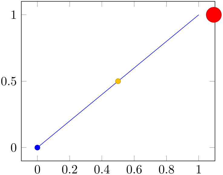
% Preamble: \pgfplotsset{width=7cm,compat=1.18}
\begin{tikzpicture}
\begin{axis}
\addplot+ [
scatter,
coordinate style/.condition=
{abs(x-1) < 0.001}{scale=3,xshift=4pt},
                        ] coordinates
                    {(0,0) (0.5,0.5) (1,1)};
\end{axis}
\end{tikzpicture}
Here, we use the formula \(\lvert x-1 \rvert < 0.001\) in order to identify the point coordinates and increase the associated marker’s size and move its position. In this context, it is often a good practice to have a condition which takes rounding problems into account, i.e. to avoid the equal operator.
At the time of this writing, coordinate style is supported by the following plot handlers:
See also the examples in Section 4.17.2.
-
/pgfplots/scatter/position=absolute|relative (initially relative) 
Allows to choose how to position scatter plot markers. This applies only if the scatter option is true.
The choice relative is the initial configuration, it means that the scatter marker is placed at the given point’s coordinates. Technically, it means that the transformation matrix is shifted such that (0,0) is right at the current point’s coordinates. This is typically what you want.
The choice absolute allows to position a scatter plot
marker absolutely, for example by means of axis cs. This can be combined with
nodes near coords and a suitable set of
 options
 in
every node near coord/.style={
 options
 }: one could say at={(\coordindex,\coordindex*5)} or
something like that. Note that this choice necessarily needs an
at key to specify the node’s position, otherwise its
position will be undefined.18
-
1. The scatter source coordinates form a data stream whose data limits are computed additionally to the axis limits. This step is skipped for symbolic meta data.
-
2. Before any markers are drawn, a linear coordinate transformation from these data limits to the interval \([0.0,1000.0]\) is initialised.
-
3. Every scatter source coordinate19 will be transformed linearly and the result is available as macro \pgfplotspointmetatransformed \(\in [0.0,1000.0]\).
The decision is thus based on per thousands of the data range. The transformation is skipped for symbolic meta data (and the meta data is simply contained in the mentioned macro).
-
4. The pgf coordinate system is translated such that (0pt,0pt) is the plot coordinate.
-
5. The code of scatter/@pre marker code is evaluated (without arguments).
-
6. The standard code which draws markers is evaluated.
-
7. The code of scatter/@post marker code is evaluated (without arguments).
These two keys constitute the public interface which determines the marker appearance depending on scatter source coordinates.
Redefining them allows fine grained control even over marker types, line styles and colors.
The scatter plot algorithm works as follows:
The idea is to generate a set of appearance keys which depends on
\pgfplotspointmetatransformed. Then, a call to \scope[ generated keys
 ] as @pre code and the associated \endscope as @post code will draw markers individually
using [
 generated keys
 ].
].
A technical example is shown below. It demonstrates how to write user defined routines, in this case a three-class system.20

% Preamble: \pgfplotsset{width=7cm,compat=1.18}
\begin{tikzpicture}
% Low-Level scatter plot interface Example:
% use three different marker classes
% 0% -- 30% : first class
% 30% -- 60% : second class
% 60% -- 100% : third class
\begin{axis}[
scatter/@pre marker code/.code={
\ifdim\pgfplotspointmetatransformed pt<300pt
\def\markopts{mark=square*,fill=blue}
\else
\ifdim\pgfplotspointmetatransformed pt<600pt
\def\markopts{mark=triangle*,fill=orange}
\else
\def\markopts{mark=pentagon*,fill=red}
\fi
\fi
\expandafter\scope\expandafter[\markopts]
},
scatter/@post marker code/.code={
\endscope
},
]
\addplot+ [scatter,scatter src=y,samples=40]
{sin(deg(x))};
\end{axis}
\end{tikzpicture}
Please note that \ifdim compares TeX lengths, so the example employs the suffix pt for any number used in this context. That doesn’t change the semantics. The two (!) \expandafter constructions make sure that \scope is invoked with the content of \markopts instead of the macro name \markopts.
16 If scatter src is not explicit symbolic, we expect a numeric argument which is rounded to the nearest integer. The resulting integer is used as class label. If that fails, the numeric argument is truncated to the nearest integer. If that fails as well, the point has no label.
17 In this case, the \pgfmathprintnumber will be skipped automatically.
18 Well, it will be the origin of the canvas. Which is not necessarily the same as the origin of your axis.
19 During the evaluation, the public macros \pgfplotspointmeta and \pgfplotspointmetarange indicate the source coordinate and the source coordinate range in the format \(a:b\) (for log-axis, they are given in fixed-point representation and for linear axes in floating point).
20 Please note that you don’t need to copy this particular example: the multiple-class example is also available as predefined style scatter/classes.
4.5.131D Colored Mesh Plots
-
/pgfplots/mesh(no value) 
-
\addplot+[mesh]
Uses the current color map to determine colors for each fixed line segment. Each line segment will get the same color.
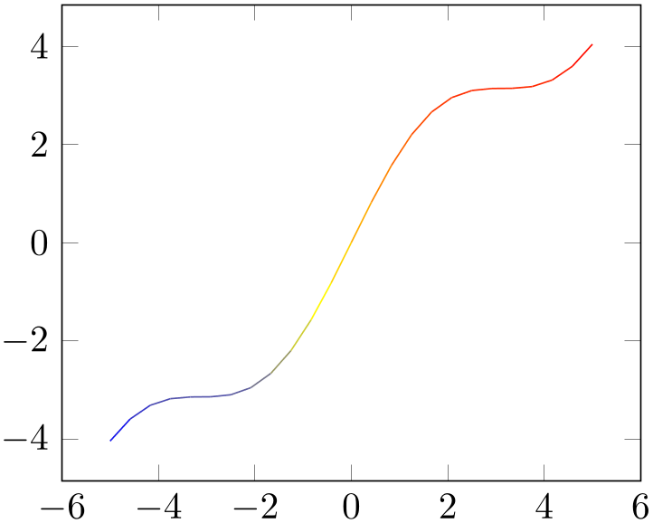
% Preamble: \pgfplotsset{width=7cm,compat=1.18}
\begin{tikzpicture}
\begin{axis}
\addplot [mesh] {x + sin(deg(x))};
\end{axis}
\end{tikzpicture}
The color data is per default the \(y\) value of the plot. It can be reconfigured using the point meta key (which is actually the same as scatter src). The following example provides the color data explicitly for \addplot coordinates, using the square bracket notation.
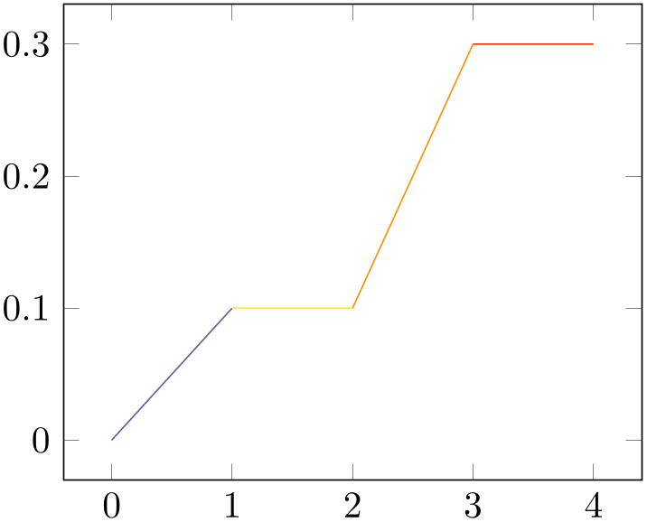
% Preamble: \pgfplotsset{width=7cm,compat=1.18}
\begin{tikzpicture}
\begin{axis}
\addplot [
mesh,
point meta=explicit,
] coordinates {
(0,0) [0]
(1,0.1) [1]
(2,0.1) [2]
(3,0.3) [3]
(4,0.3) [4]
};
\end{axis}
\end{tikzpicture}
This one-dimensional mesh plot is actually a special case of the two-dimensional mesh plots, so more detailed configuration, including how to change the color data, can be found in Section 4.6.5.
4.5.14Interrupted Plots
Sometimes it is desirable to draw parts of a single plot separately, without connection between the parts (discontinuities). pgfplots offers three ways to generate interrupted plots:
-
1. empty lines in the input file or
-
2. by providing unbounded coords or
-
3. by providing unbounded point meta.
4.5.14.1Interrupted Plots using Empty Lines
The first way to generate interrupted plots is simple; it needs no extra key (only \pgfplotsset{compat=1.4} or newer in your preamble):
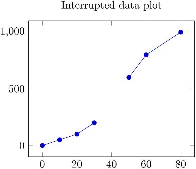
% Preamble: \pgfplotsset{width=7cm,compat=1.18}
\begin{tikzpicture}
\begin{axis}[
title=Interrupted data plot,
]
                    \addplot coordinates
                {
(0,0) (10,50) (20,100) (30,200)
(50,600) (60,800) (80,1000)
};
\end{axis}
\end{tikzpicture}
Here, pgfplots runs with the default configuration empty line=auto which interprets empty lines as “jump” markers. This works for any data input method, i.e. using \addplot coordinates, \addplot table, and \addplot file.
Note that empty line is useful for two-dimensional plots only since it has a special meaning for three-dimensional plots (in which case empty line=scanline decodes matrices).
4.5.14.2Interrupted Plots using Unbounded Coordinate Values
The second way to generate interrupted plots addresses the case where empty lines are unavailable or impossible (due to limitations of the tool generating the data file, for example). In this case, interrupted plots can be achieved using the unbounded coords key combined with coordinate values nan, inf or -inf.
-
/pgfplots/unbounded coords=discard|jump (initially discard) 
This key configures what to do if one or more coordinates of a single point are unbounded. Here, unbounded means it is either \(\pm \infty \) (+inf or -inf) or it has the special “not a number” value nan.
The initial setting discard discards the complete point and a warning is issued in the logfile.21 This setting has the same effect as if the unbounded point did not occur: pgfplots will interpolate between the bounded adjacent points.
The alternative jump allows interrupted plots: it provides extra checking for these coordinates and does not interpolate over them; only those line segments which are adjacent to unbounded coordinates will be skipped.
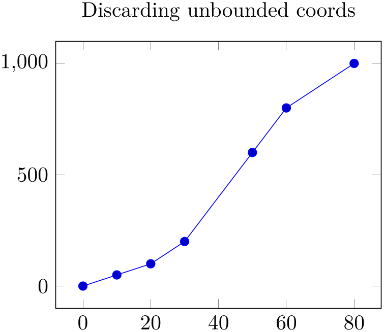
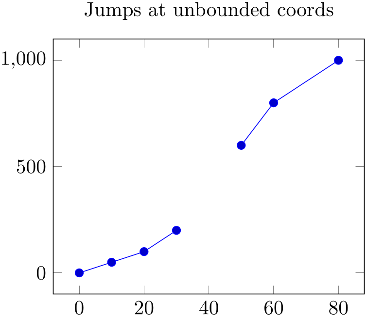
% Preamble: \pgfplotsset{width=7cm,compat=1.18}
\begin{tikzpicture}
\begin{axis}[
title=Discarding unbounded coords,
unbounded coords=discard,
]
\addplot coordinates {
(0,0) (10,50) (20,100) (30,200)
(40,inf) (50,600) (60,800) (80,1000)
};
\end{axis}
\end{tikzpicture}
\begin{tikzpicture}
\begin{axis}[
title=Jumps at unbounded coords,
unbounded coords=jump,
]
\addplot coordinates {
(0,0) (10,50) (20,100) (30,200)
(40,inf) (50,600) (60,800) (80,1000)
};
\end{axis}
\end{tikzpicture}
For plot expression and its friends, it is more likely to get very large floating point numbers instead of inf. In this case, consider using the restrict x to domain key described at 1021.
The unbounded coords=jump method does also work for mesh/surface plots: every face adjacent to an unbounded coordinate will be discarded in this case. The following example sets up a (cryptic) coordinate filter which cuts out a quarter of the domain and replaces its values with nan:

% Preamble: \pgfplotsset{width=7cm,compat=1.18}
\begin{tikzpicture}
\begin{axis}[
unbounded coords=jump,
x filter/.expression={
                            x<0 && y<0 ? nan :
                    x
},
]
\addplot3 [surf] {exp(-sqrt(x^2 + y^2))};
\end{axis}
\end{tikzpicture}
This example requires unbounded coords=jump and an unbounded value (like nan) in order to work. Choosing either unbounded coords=discard or an empty string to discard values would result in a broken lattice which would confuse pgfplots. Note that the same example can be achieved using the method in the following chapter, see the associated example below.
4.5.14.3Interrupted Plots using Unbounded Point Meta Values
The third way to generate interrupted plots is designed for input data which forms a mesh, i.e. for three-dimensional plots: in this case, point meta is expected (by mesh or surf and its variants). If one of the involved coordinates has an unbounded value for its point meta, all adjacent patches which require the point meta will be omitted.
The following example has one of its point meta values set to nan (not a number):

% Preamble: \pgfplotsset{width=7cm,compat=1.18}
\begin{tikzpicture}
\begin{axis}[y dir=reverse]
                    \addplot coordinates
                {(0,0) (3,2)};
                    \addplot [surf,point meta=explicit] coordinates
                {
(0,0) [0] (1,0) [1] (2,0) [2] (3,0) [3]
(0,1) [4] (1,1) [5] (2,1) [nan] (3,1) [7]
(0,2) [8] (1,2) [9] (2,2) [10] (3,2) [11]
};
\end{axis}
\end{tikzpicture}
Note that all four adjacent cells are omitted since the default shader is shader=flat mean, an averaging scheme which fails to compute the averages.
If we use flat corner, only one cell becomes invisible:
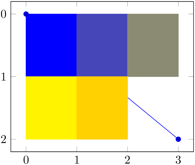
% Preamble: \pgfplotsset{width=7cm,compat=1.18}
\begin{tikzpicture}
                \begin{axis}[y dir=reverse,shader=flat
                corner]
                    \addplot coordinates
                {(0,0) (3,2)};
                    \addplot [surf,point meta=explicit] coordinates
                {
(0,0) [0] (1,0) [1] (2,0) [2] (3,0) [3]
(0,1) [4] (1,1) [5] (2,1) [nan] (3,1) [7]
(0,2) [8] (1,2) [9] (2,2) [10] (3,2) [11]
};
\end{axis}
\end{tikzpicture}
The case shader=flat corner choose the color of the first vertex of each patch. For mesh input=lattice as in our example above, this applies to the rectangle with vertices \((2,1)\), \((3,1)\), \((2,2)\), \((3,2)\).
The feature can be used to choose point meta accordingly, for example to strip certain pieces of the input:
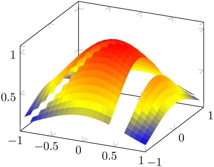
% Preamble: \pgfplotsset{width=7cm,compat=1.18}
\begin{tikzpicture}
\begin{axis}[
                    shader=flat
                corner,
domain=-1:1,
]
\addplot3 [
surf,
point meta={
                            abs(x-y)<0.1 || abs(x-0.5)<0.1 ?
                nan : z
},
] {exp(-x^2-y^2)};
\end{axis}
\end{tikzpicture}
The expression removes all points where \(x=y\) or \(x=\frac 12\) (approximately) and assigns the color value \(f(x,y)\) for all other coordinates.
This approach can also be applied to the example of the previous subsection, i.e. to
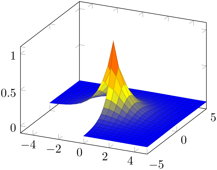
% Preamble: \pgfplotsset{width=7cm,compat=1.18}
\begin{tikzpicture}
\begin{axis}[
point meta={
x<0 && y<0 ? nan : z
},
]
\addplot3 [surf] {exp(-sqrt(x^2 + y^2))};
\end{axis}
\end{tikzpicture}
Limitations
of this approach: coordinate filtering by means of point meta still includes the omitted patch segments into the limit computation. This is different than x filter and its variants which also updates axis limits accordingly.
More about this coordinate filtering can be found in Section 4.22 “Skipping Or Changing Coordinates – Filters”.
4.5.15Patch Plots
Patch Plots visualize a sequence of one or more triangles (or other sorts of patches). These triangles can be drawn with a single color (shader=flat and shader=faceted interp) or with interpolated colors (shader=interp).
There are both two- and three-dimensional patch plots, both with the same interface and the same keys. Therefore, the reference documentation for patch plots can be found in Section 4.6.13 together with three-dimensional patch plots.
4.5.16Image (Matrix) Plots
A matrix plot consists of an input matrix and one colored cell for each element of the input matrix. Such plots are a special case of a surface plot and are described in all detail in Section 4.6.12 together with other options about surface and mesh plots.
4.5.17Polar Coordinates / Polar Axes
Polar coordinates can be provided in any kind of axis by means of data cs=polar, please refer to its reference documentation 4.23.
Polar axes are available by means of \usepgfplotslibrary{polar}; please refer to Section 5.10.
4.5.18Tieline Plots
Tieline plots are a special application in ternaryaxis. They are part of \usepgfplotslibrary{ternary}; please refer to Section 5.13.2.
4.5.19Smith Charts
Smith charts have a special coordinate system and a part of \usepgfplotslibrary{smithchart}; please refer to Section 5.11.