Manual for Package pgfplots
2D/3D Plots in LATeX, Version 1.18.2
https://github.com/pgf-tikz/pgfplots
The Reference
4.6Three Dimensional Plot Types
pgfplots provides three dimensional visualizations like scatter, line, mesh or surface plots. This section explains the methods to provide input coordinates and how to use the different plot types.
4.6.1Before You Start With 3D
Before we delve into the capabilities of pgfplots for three dimensional visualization, let me start with some preliminary remarks. The reason to use pgfplots for three dimensional plots are similar to those of normal, two dimensional plots: the possibility to get consistent fonts and document consistent styles combined with high-quality output.
While this works very nice for (not too complex) two dimensional plots, it requires considerably more effort than non-graphical documents. This is even more so for three dimensional plots. In other words: pgfplots’ three dimensional routines are slow. There are reasons for this and some of them may vanish in future versions. But one of these reasons is that TeX has never been designed for complex visualization techniques. Consider using lualatex (and at least compat=1.12) in order to reduce compilation times and to avoid memory limitations. Also consider the image externalization routines mentioned in Section 8.1, in particular the external library to reduce typesetting time. Besides the speed limitations, three dimensional plots reach memory limits easily. Therefore, the plot complexity of three dimensional plots is limited to relatively coarse resolutions. Section 8.1 also discusses methods to extend the initial TeX memory limits.
Another issue which arises in three dimensional visualization is depth: it is necessary to decide which items are to be drawn in front of others. pgfplots supports \(z\) buffering techniques up to a certain extend: it works pretty well for single scatter plots (z buffer=sort), mesh or surface plots (z buffer=auto) or parametric mesh and surface plots (z buffer=sort). However, it cannot combine different \addplot commands, those will be drawn in the order of appearance. You may encounter the limitations sometimes. Maybe it will be improved in future versions.
If you decide that you need high complexity, speed and 100% reliable z buffers (depth information), you should consider using other visualization tools and return to pgfplots in several years. If you can wait for a complex picture and you do not even see the limitations arising from z buffering limitations, you should use pgfplots. Again, consider using the automatic picture externalization with the external library discussed in Section 8.1.
4.6.2The \addplot3 Command: Three Dimensional Coordinate Input
-
\addplot3[
 options
 ]
]
 input data
 trailing path commands
 ;
;
-
1. If the key mesh input=patches has been used, pgfplots relies on the current patch type (which has an inherent dimension).
-
2. For all other values of mesh input (like mesh input=lattice and mesh input=image), pgfplots proceeds as follows:
-
• It auto-completes the values for mesh/rows and mesh/cols (or uses their prescribed values).
-
• If these keys describe a matrix of size \(1\times N\) or \(N \times 1\), pgfplots assumes that it is a line.
The “auto-completion” depends on how you provide your data.
-
• If you use \addplot3 expression, mesh/rows and mesh/cols are computed from the values samples and samples y. By default, \addplot3 expression always samples a mesh. If you want it to sample a line, set samples y=1 (or, equivalently, y domain=0:0).
-
• If you use \addplot3 table, \addplot3 coordinates, or \addplot3 file, you have basically two options: either you provide at least one of mesh/rows or mesh/cols explicitly, or you format the input table by means of end-of-scanline markers as outlined in empty line=auto or empty line=scanline. In this case, pgfplots counts scanline lengths and uses mesh/ordering to conclude how to determine the matrix values.
Thus, if you have empty lines in your input table, pgfplots will automatically identify the matrix size.
If you do not have empty lines, pgfplots expects at least one of mesh/rows or mesh/cols.
-
The \addplot3 command is the main interface for any three dimensional plot. It works in the same way as its two dimensional variant \addplot which has been described in all detail in Section 4.3.
The \addplot3 command accepts the same input methods as the \addplot variant, including expression plotting, coordinates, files and tables. However, a third coordinate is necessary for each of these methods which is usually straightforward and is explained in all detail in the following.
Furthermore, \addplot3 has a way to decide whether a line visualization or a mesh visualization has to be done. The first one is a map from one dimension into \(\mathbb {R}^3\) and the latter one a map from two dimensions to \(\mathbb {R}^3\). Here, the keys mesh/rows and mesh/cols are used to define mesh sizes (matrix sizes). Usually, you don’t have to care about that because the coordinate input routines already allow either one- or two-dimensional structure.
The precise rules how pgfplots distinguishes between line visualization and mesh visualization is as follows:
-
\addplot3 coordinates {
 coordinate list
 };
};
-
\addplot3[
 options
 ] coordinates
{
 coordinate list
 }
}
 trailing path commands
 ;
;
The \addplot3 coordinates method works like its two-dimensional variant, \addplot coordinates which is described in all detail at 31:
A long list of coordinates ( x
x ,
, y
y ,
, z
z ) is expected, separated by white spaces. The input list can be either an unordered series of coordinates, for
example for scatter or line plots. It can also have matrix structure, in which case an
empty line (which is equivalent to
“\par”) marks the end of one matrix row. Matrix structure can also be provided if one of
mesh/rows or
mesh/cols is provided explicitly.

% Preamble: \pgfplotsset{width=7cm,compat=1.18}
\begin{tikzpicture}
\begin{axis}
% this yields a 3x4 matrix:
\addplot3 [surf] coordinates {
(0,0,0) (1,0,0) (2,0,0) (3,0,0)
(0,1,0) (1,1,0.6) (2,1,0.7) (3,1,0.5)
(0,2,0) (1,2,0.7) (2,2,0.8) (3,2,0.5)
};
\end{axis}
\end{tikzpicture}
Here, \addplot3 reads a matrix with three rows and four columns. The empty lines separate one row from the following.
As for the two-dimensional
\addplot
coordinates, it is possible to provide (constant) mathematical expressions inside of single coordinates. The syntax ( x
x ,
, y
y ,
, z
z ) [
) [ meta
meta ] can be used just as for two dimensional
\addplot
coordinates
to provide explicit color data; error bars are also supported.
-
\addplot3 table [
 column selection
 ]{
]{ file
file };
};
-
\addplot3[
 options
 ] table
[
 column selection
 ]{
]{ file
file }
}
 trailing path commands
 ;
;
The \addplot3 table input works in the same way as its two dimensional counterpart \addplot table. It only expects a column for the \(z\)-coordinates.
As for \addplot3 coordinates, an empty line in the file marks the end of one matrix row.
For matrix data in files, it is important to specify the ordering in which the matrix entries have been written. The default configuration is mesh/ordering=x varies, so you need to change it to mesh/ordering=y varies in case you have column by column ordering.
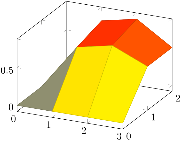
% Preamble: \pgfplotsset{width=7cm,compat=1.18}
\begin{tikzpicture}
\begin{axis}
% this yields a 3x4 matrix:
\addplot3 [surf] table {
0 0 0
1 0 0
2 0 0
3 0 0
0 1 0
1 1 0.6
2 1 0.7
3 1 0.5
0 2 0
1 2 0.7
2 2 0.8
3 2 0.5
};
\end{axis}
\end{tikzpicture}
If you have data files, you should generally use \addplot table. The input type \addplot file is almost the same, but considerably less powerful. It is only kept for backwards compatibility.
The \addplot3 file input method is the same as \addplot file – it only expects one more coordinate. Thus, the input file contains \(x_i\) in the first column, \(y_i\) in the second column and \(z_i\) in the third.
A further column is read after \(z_i\) if point meta=explicit has been requested, see the documentation of \addplot file at 147 for details.
As for \addplot3 coordinates, an empty line in the file marks the end of one matrix row.
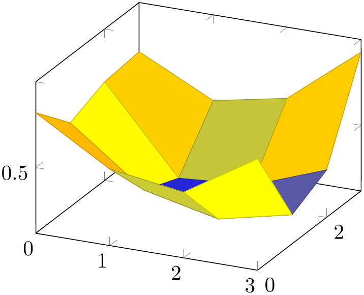
% Preamble: \pgfplotsset{width=7cm,compat=1.18}
\begin{tikzpicture}
\begin{axis}
% We have `plotdata/first3d.dat' with
% ---------
% 0 0 0.8
% 1 0 0.56
% 2 0 0.5
% 3 0 0.75
%
% 0 1 0.6
% 1 1 0.3
% 2 1 0.21
% 3 1 0.3
%
% 0 2 0.68
% 1 2 0.22
% 2 2 0.25
% 3 2 0.4
%
% 0 3 0.7
% 1 3 0.5
% 2 3 0.58
% 3 3 0.9
% -> yields a 4x4 matrix:
\addplot3 [surf] file {plotdata/first3d.dat};
\end{axis}
\end{tikzpicture}
For matrix data in files, it is important to specify the ordering in which the matrix entries have been written. The default configuration is mesh/ordering=x varies, so you need to change it to mesh/ordering=y varies in case you have column by column ordering.
-
/pgfplots/mesh/rows={
 integer
 }
}
-
/pgfplots/mesh/cols={
 integer
 }
}
For visualization of mesh or surface plots which need some sort of matrix input, the dimensions of the input matrix need to be known in order to visualize the plots correctly. The matrix structure may be known from end-of-row marks (empty lines as general end-of-scanline markers in the input stream) as has been described above.
If the matrix structure is not yet known, it is necessary to provide at least one of mesh/rows or mesh/cols where mesh/rows indicates the number of samples for \(y\)-coordinates whereas mesh/cols is the number of samples used for \(x\)-coordinates (see also mesh/ordering).
Thus, the following example is also a valid method to define an input matrix.

% Preamble: \pgfplotsset{width=7cm,compat=1.18}
\begin{tikzpicture}
\begin{axis}
% this yields also a 3x4 matrix:
                        \addplot3 [surf,mesh/rows=3] coordinates
                    {
(0,0,0) (1,0,0) (2,0,0) (3,0,0)
(0,1,0) (1,1,0.6) (2,1,0.7) (3,1,0.5)
(0,2,0) (1,2,0.7) (2,2,0.8) (3,2,0.5)
};
\end{axis}
\end{tikzpicture}
It is enough to supply one of mesh/rows or mesh/cols – the missing value will be determined automatically.
If you provide one of mesh/rows or mesh/cols, any end-of-row marker seen inside of input files or coordinate streams will be ignored.
-
/pgfplots/mesh/scanline verbose=true|false (initially false) 
Provides debug messages in the LaTeX output about end-of-scanline markers.
The message will tell whether end-of-scanlines have been found and if they are the same.
-
/pgfplots/mesh/ordering=x varies|y varies|rowwise|colwise (initially x varies) 
Allows to configure the sequence in which matrices (meshes) are read from \addplot3 coordinates, \addplot3 file or \addplot3 table.
Here, x varies means a sequence of points where \(n\)=mesh/cols successive points have the \(y\)-coordinate fixed. This is intuitive when you write down a function because \(x\) is horizontal and \(y\) vertical. Note that in matrix terminology, \(x\) refers to column indices whereas \(y\) refers to row indices. Thus, x varies is equivalent to rowwise ordering in this sense. This is the initial configuration.

% Preamble: \pgfplotsset{width=7cm,compat=1.18}
\begin{tikzpicture}
\begin{axis}[mesh/ordering=x varies]
% this yields a 3x4 matrix in `x varies'
% ordering:
\addplot3 [surf] coordinates {
(0,0,0) (1,0,0) (2,0,0) (3,0,0)
(0,1,0) (1,1,0.6) (2,1,0.7) (3,1,0.5)
(0,2,0) (1,2,0.7) (2,2,0.8) (3,2,0.5)
};
\end{axis}
\end{tikzpicture}
Note that mesh/ordering is mandatory, even though the size of the matrix can be provided in different ways. The example above uses empty lines to mark scanlines. One could also say mesh/rows=3 and omit the empty lines.
Consequently, mesh/ordering=y varies provides points such that successive \(m\)=mesh/rows points form a column, i.e. the \(x\)-coordinate is fixed and the \(y\)-coordinate changes. In this sense, y varies is equivalent to colwise ordering, it is actually a matrix transposition.

% Preamble: \pgfplotsset{width=7cm,compat=1.18}
\begin{tikzpicture}
\begin{axis}[mesh/ordering=y varies]
% this yields a 3x4 matrix in column-wise ordering:
\addplot3 [surf] coordinates {
(0,0,0) (0,1,0) (0,2,0)
(1,0,0) (1,1,0.6) (1,2,0.7)
(2,0,0) (2,1,0.7) (2,2,0.8)
(3,0,0) (3,1,0.5) (3,2,0.5)
};
\end{axis}
\end{tikzpicture}
Again, note the subtle difference to the common matrix indexing where a column has the second index fixed. pgfplots refers to the way one would write down a function on a sheet of paper (this is consistent with how Matlab® displays discrete functions with matrices).
-
\addplot3 {
 math expression
 }
;
}
;
-
\addplot3[
 options
 ] {
] { math expression
 }
}
 trailing path commands
 ;
;
Expression plotting also works in the same way as for two dimensional plots. Now, however, a two dimensional mesh is sampled instead of a single line, which may depend on x and y.
The method \addplot3 { math expr
 } visualizes the function \(f(x,y) = \)
 math expr
 where \(f \colon [x_1,x_2] \times [y_1,y_2] \to \mathbb {R}\). The interval \([x_1,x_2]\) is determined using the
domain key, for example using
domain=0:1. The interval \([y_1,y_2]\) is determined using
the y domain key. If
y domain is empty, \([y_1,y_2] = [x_1,x_2]\) will be
assumed. If y domain=0:0 (or any other interval of length
zero), it is assumed that the plot does not depend on y (thus, it is
a line plot).
The number of samples in \(x\) direction is set using the samples key. The number of samples in \(y\) direction is set using the samples y key. If samples y is not set, the same value as for \(x\) is used. If samples y\(\,\le 1\), it is assumed that the plot does not depend on y (meaning it is a line plot).
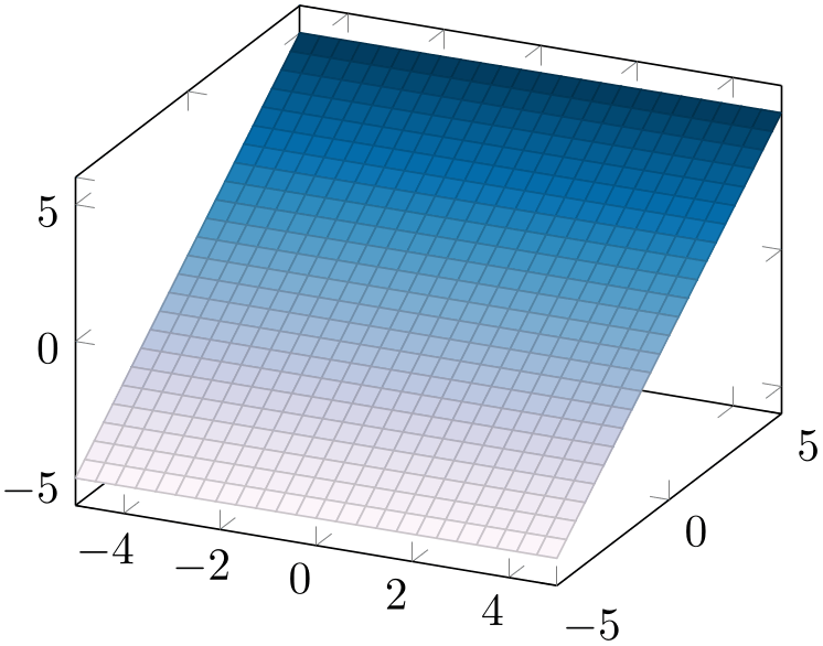
% Preamble: \pgfplotsset{width=7cm,compat=1.18}
% requires \usepgfplotslibrary{colorbrewer}
\begin{tikzpicture}
\begin{axis}[
colormap/PuBu,
]
\addplot3 [surf] {y};
\end{axis}
\end{tikzpicture}
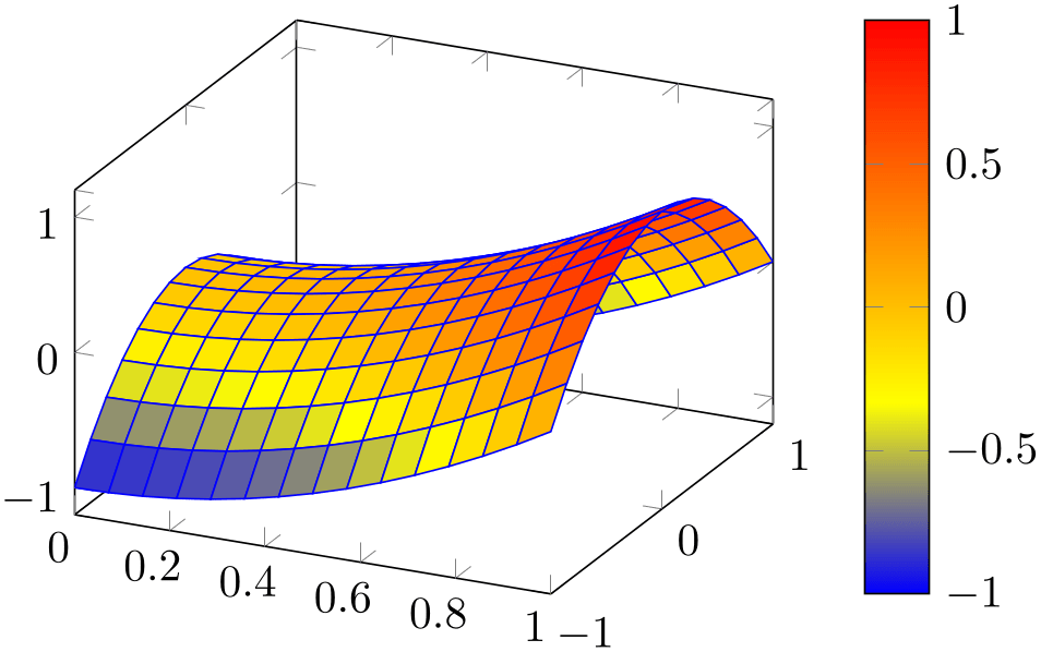
% Preamble: \pgfplotsset{width=7cm,compat=1.18}
\begin{tikzpicture}
\begin{axis}[colorbar]
\addplot3 [
surf,
faceted color=blue,
samples=15,
domain=0:1,y domain=-1:1
] {x^2 - y^2};
\end{axis}
\end{tikzpicture}
Expression plotting sets mesh/rows and mesh/cols automatically; these settings don’t have any effect for expression plotting.
-
\addplot3 expression {
 math expression
 };
};
-
\addplot3[
 options
 ] expression
{
 math expression
 }
}
 trailing path commands
 ;
;
\addplot3 { math expression
 };
};
as short-hand equivalent for
\addplot3 expression { math expression
 };
};
-
\addplot3 (
 x expression
 ,
, y expression
 ,
, z expression
 )
;
)
;
-
\addplot3[
 options
 ] (
] ( x expression
 ,
, y expression
 ,
, z expression
 )
)
 trailing path commands
 ;
;
A variant of \addplot3 expression which allows to provide different coordinate expressions for the \(x\)-, \(y\)- and \(z\)-coordinates. This can be used to generate parameterized plots.
Please note that \addplot3 (x,y,x^2) is equivalent to \addplot3 expression {x^2}.
Note further that since the complete point expression is surrounded by round braces, round braces inside of
 \(x\) expression
 ,
,
 \(y\) expression
 or
or
 \(z\) expression
 need to be treated specially. Surround the expressions (which contain round braces) with curly braces:
\addplot3 ({ \(x\) expr
 }, {
}, { \(y\) expr
 }, {
}, { \(z\) expr
 });
});
4.6.3Line Plots
Three dimensional line plots are generated if the input source has no matrix structure. Line plots take the input coordinates and connect them in the order of appearance.
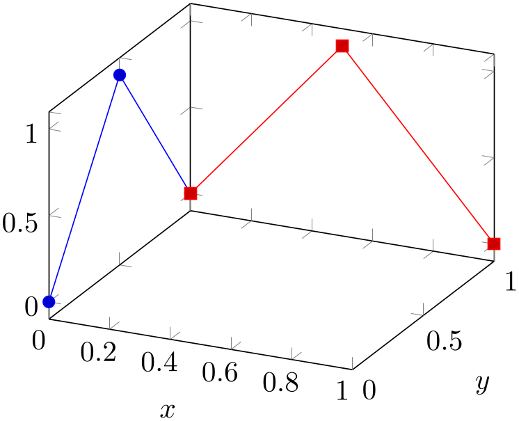
% Preamble: \pgfplotsset{width=7cm,compat=1.18}
\begin{tikzpicture}
\begin{axis}[
xlabel=$x$,
ylabel=$y$,
]
                    \addplot3
                coordinates {(0,0,0) (0,0.5,1) (0,1,0)};
                    \addplot3
                coordinates {(0,1,0) (0.5,1,1) (1,1,0)};
\end{axis}
\end{tikzpicture}
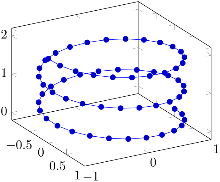
If there is no value for neither mesh/rows nor mesh/cols or if one of them is 1, pgfplots will draw a line plot. This is also the case if there is no end-of-scanline marker (empty line) in the input stream.
For \addplot3 expression, this requires to set samples y=1 to disable the generation of a mesh.
% Preamble: \pgfplotsset{width=7cm,compat=1.18}
\begin{tikzpicture}
\begin{axis}[view={60}{30}]
\addplot3+ [
domain=0:5*pi,
samples=60,
samples y=0,
] (
{sin(deg(x))},
{cos(deg(x))},
{2*x/(5*pi)}
);
\end{axis}
\end{tikzpicture}
The example above is a parametric plot by expression, i.e. it has three distinct expressions for \(x\), \(y\), and \(z\).
Line plots in three dimensions are also possible for data plots (tables). The most simple case is if you simply provide a series of three-dimensional coordinates which will be connected in the order of appearance:

% Preamble: \pgfplotsset{width=7cm,compat=1.18}
\begin{tikzpicture}
\begin{axis}
                    \addplot3
                table {
                        x   y
                  z
0 0 0
0.1 0.1 0.1
0.1 0.2 0.2
0.3 0.3 0.3
1 1 1
};
\end{axis}
\end{tikzpicture}
Note that this plot implicitly has mesh/rows=1 because it has no end-of-scanline markers (empty lines). If in doubt, you can set mesh/rows=1 explicitly to tell pgfplots that you have one-dimensional data (and not a matrix).
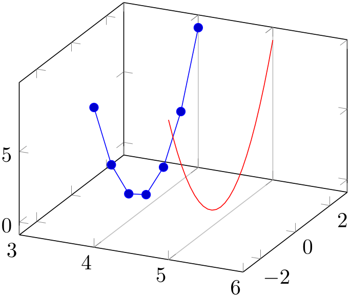
Line plots from data files are also possible if the data files only contains two coordinates – and the third should be provided somehow. In this case, the table/x expr feature comes into play: it allows to combine data plots and math expressions:
% Preamble: \pgfplotsset{width=7cm,compat=1.18}
\begin{tikzpicture}
\begin{axis}[
xmin=3,xmax=6,
extra x ticks={4,5},
extra x tick style={xticklabel=\empty,grid=major}
]
                    \addplot3
                table [x expr=4,y=a,z=b] {
a b
-3 9
-2 4
-1 1
0 0
1 1
2 4
3 9
};
\addplot3 [red,domain=-3:3,samples y=1] (5,x,x^2);
\end{axis}
\end{tikzpicture}
Here, we have two plots in one axis: one data plot from a data table with just two coordinates and one parametric plot. Both denote the same two functions. For the data plot, x expr=4 assigns the \(x\)-coordinate, and y=a,z=b define how the input columns map to coordinates. Again, the plot implicitly uses mesh/rows=1 since there is no end-of-scanline marker. The second plot does the same with the short-handed notation (5,x,x^2). It only samples one-dimensional data due to samples y=1. Finally, extra x ticks configures two additional ticks for the \(x\)-axis; this is used to display grid lines for these specific ticks. The xticklabel=\empty argument avoids overprinted \(x\) tick labels at positions \(x\in \{4,5\}\).
Three dimensional line plots will usually employ lines to connect points (i.e. the initial sharp plot handler of TikZ). The smooth method of TikZ might also prove be an option. Note that no piecewise constant plot, comb or bar plot handler is supported for three dimensional axes.
4.6.3.1Filled Lined Plots in 3D
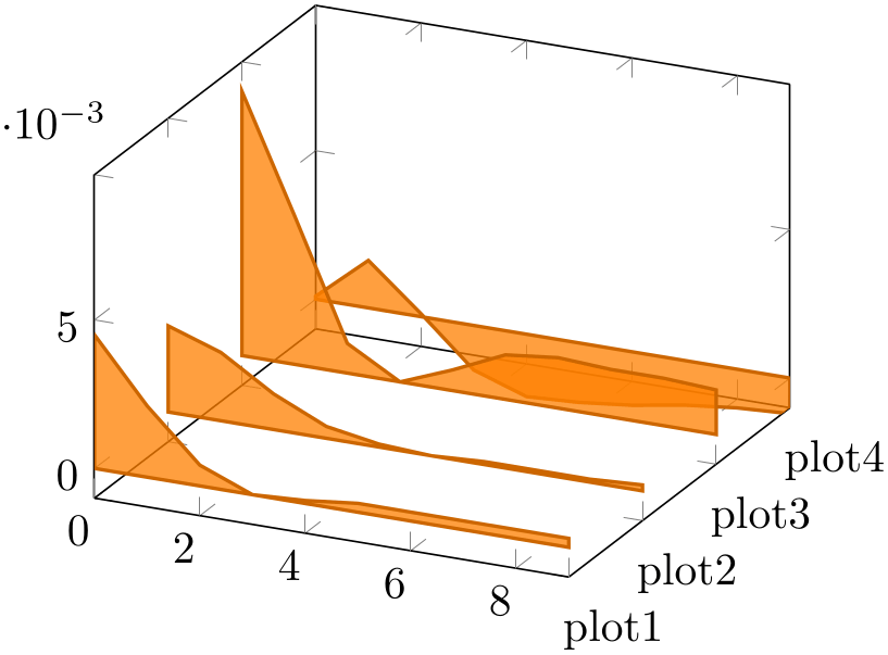
Closing a line plot is also possible for three-dimensional axes. This works in the same way as outlined in Section 4.5.11 for two-dimensional axes: by using \closedcycle.
% Preamble: \pgfplotsset{width=7cm,compat=1.18}
\begin{tikzpicture}
\pgfplotstableread{
plot1 plot2 plot3 plot4
0.0045 0.0029 0.0089 0.0001
0.0024 0.0023 0.0050 0.0016
0.0007 0.0012 0.0010 0.0001
0.0000 0.0004 -0.0000 -0.0015
0.0001 0.0001 0.0007 -0.0021
0.0003 0.0000 0.0015 -0.0020
0.0003 0.0001 0.0017 -0.0018
0.0003 0.0001 0.0016 -0.0015
0.0003 0.0001 0.0016 -0.0013
0.0003 0.0002 0.0015 -0.0012
}\tabledata
\begin{axis}[
zmin=-0.001,
area plot/.style={
fill opacity=0.75,
draw=orange!80!black,thick,
fill=orange,
mark=none,
},
ytick={1,...,4},
yticklabel=plot\pgfmathprintnumber{\tick},
]
\pgfplotsinvokeforeach{4,3,...,1}{
                        \addplot3
                [area plot] table [
x expr=\coordindex, y expr=#1, z=plot#1,
] {\tabledata} \closedcycle;
}
\end{axis}
\end{tikzpicture}
The difference here is that pgfplots will connect the first and last coordinates on the \(z=0\) plane, or, if \(z=0\) is outside of the axis limits, on the plane \(z_{\min }\).
4.6.4Scatter Plots
Three dimensional scatter plots have the same interface as for two dimensional scatter plots, so all examples of Section 4.5.12 can be used for the three dimensional case as well. The key features are to use only marks and/or scatter as plot styles.
We provide some more examples which are specific for the three dimensional case.
Our first example uses only marks to place the current plot mark at each input position:
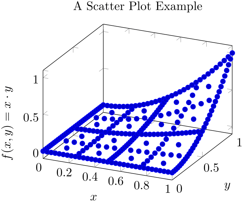
% Preamble: \pgfplotsset{width=7cm,compat=1.18}
\begin{tikzpicture}
\begin{axis}[
xlabel=$x$,
ylabel=$y$,
                    zlabel={$f(x,y) =
                x\cdot y$},
title=A Scatter Plot Example,
]
% `pgfplotsexample4_grid.dat' contains a
% large sequence of input points of the form
% x_0 x_1 f(x)
% 0 0 0
% 0 0.03125 0
% 0 0.0625 0
% 0 0.09375 0
% 0 0.125 0
% 0 0.15625 0
\addplot3+ [only marks]
                        table
                {plotdata/pgfplotsexample4_grid.dat};
\end{axis}
\end{tikzpicture}
If we add the key scatter, the plot mark will also use the colors of the current colormap:
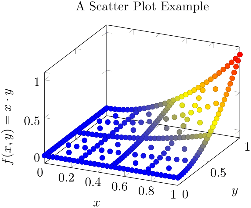
% Preamble: \pgfplotsset{width=7cm,compat=1.18}
\begin{tikzpicture}
\begin{axis}[
xlabel=$x$,
ylabel=$y$,
                    zlabel={$f(x,y) =
                x\cdot y$},
title=A Scatter Plot Example,
]
\addplot3+ [
only marks,
scatter,
] table {plotdata/pgfplotsexample4_grid.dat};
\end{axis}
\end{tikzpicture}
A more sophisticated example is to draw the approximated function as a surf plot (which requires matrix data) and the underlying grid (which is scattered data) somewhere into the same axis. We choose to place the \((x,y)\) grid points at \(z=1.4\). Furthermore, we want the grid points to be colored according to the value of column f(x) in the input table:
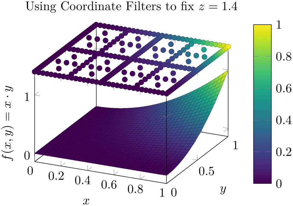
% Preamble: \pgfplotsset{width=7cm,compat=1.18}
\begin{tikzpicture}
\begin{axis}[
3d box,
zmax=1.4,
colormap/viridis,
colorbar,
xlabel=$x$,
ylabel=$y$,
zlabel={$f(x,y) = x\cdot y$},
title={Using Coordinate Filters to fix $z=1.4$},
]
% `pgfplotsexample4.dat' contains similar data as in
% `pgfplotsexample4_grid.dat', but it uses a uniform
% matrix structure (same number of points in every scanline).
% See examples above for extracts.
                        \addplot3 [surf,mesh/ordering=y
                varies]
                            table
                {plotdata/pgfplotsexample4.dat};
\addplot3 [scatter,scatter src=\thisrow{f(x)},only marks, z filter/.code={\def\pgfmathresult{1.4}}]
                            table
                {plotdata/pgfplotsexample4_grid.dat};
\end{axis}
\end{tikzpicture}
We used z filter to fix the \(z\)-coordinate to \(1.4\). We could also have used the table/z expr=1.4 feature
\addplot3 [scatter,scatter src=\thisrow{f(x)},only marks]
table [z expr=1.4] {plotdata/pgfplotsexample4_grid.dat};
to get exactly the same effect. Choose whatever you like best. The z filter works for every coordinate input routine, the z expr feature is only available for \addplot table.
The following example uses mark=cube* and z buffer=sort to place boxes at each input coordinate. The color for each box is determined by point meta={x+y+3}. The remaining keys are just for pretty printing.
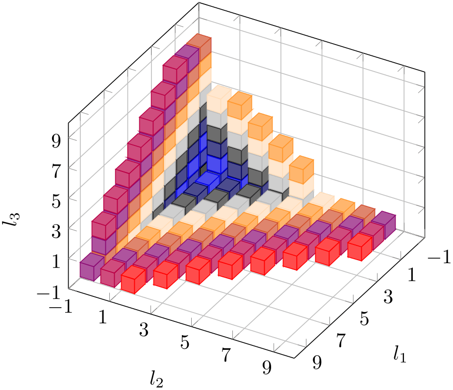
% Preamble: \pgfplotsset{width=7cm,compat=1.18}
\begin{tikzpicture}
\begin{axis}[
view={120}{40},
width=220pt,
height=220pt,
grid=major,
z buffer=sort,
xmin=-1,xmax=9,
ymin=-1,ymax=9,
zmin=-1,zmax=9,
enlargelimits=upper,
xtick={-1,1,...,19},
ytick={-1,1,...,19},
ztick={-1,1,...,19},
xlabel={$l_1$},
ylabel={$l_2$},
zlabel={$l_3$},
point meta={x+y+z+3},
colormap={summap}{
color=(black) color=(blue)
color=(black) color=(white)
color=(orange) color=(violet)
color=(red)
},
scatter/use mapped color={
                            draw=mapped
                color,fill=mapped color!70},
]
% `pgfplots_scatter4.dat' contains a large sequence of
% the form
% l_0 l_1 l_2
% 1 6 -1
% -1 -1 -1
% 0 -1 -1
% -1 0 -1
% -1 -1 0
% 1 -1 -1
% 0 0 -1
% 0 -1 0
\addplot3 [only marks,scatter,mark=cube*,mark size=7]
                            table
                {plotdata/pgfplots_scatterdata4.dat};
\end{axis}
\end{tikzpicture}
4.6.5Mesh Plots
-
\addplot+[mesh]
A mesh plot uses different colors for each mesh segment. The color is determined using a “color coordinate” which is also called “meta data” throughout this document. It is the same data which is used for surface and scatter plots as well, see Section 4.8.2. In the initial configuration, the “color coordinate” is the \(z\)-axis (or the \(y\)-axis for two dimensional plots). This color coordinate is mapped linearly into the current color map to determine the color for each mesh segment. Thus, if the smallest occurring color data is, say, \(-1\) and the largest is \(42\), points with color data \(-1\) will get the color at the lower end of the color map and points with color data \(42\) the color of the upper end of the color map.
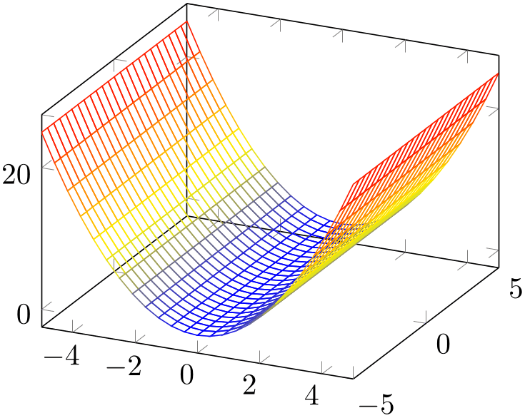
% Preamble: \pgfplotsset{width=7cm,compat=1.18}
\begin{tikzpicture}
\begin{axis}
\addplot3 [mesh] {x^2};
\end{axis}
\end{tikzpicture}
A mesh plot can be combined with markers or with the scatter key which also draws markers in different colors.
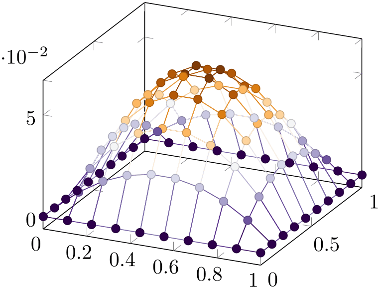
% Preamble: \pgfplotsset{width=7cm,compat=1.18}
% requires \usepgfplotslibrary{colorbrewer}
\begin{tikzpicture}
\begin{axis}[
colormap/PuOr,
]
\addplot3+ [
mesh,
scatter,
samples=10,
domain=0:1,
] {x*(1-x)*y*(1-y)};
\end{axis}
\end{tikzpicture}
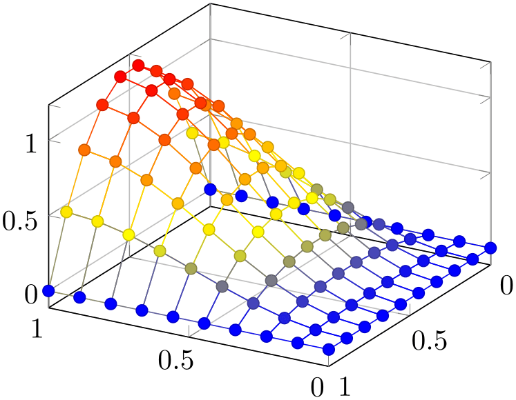
% Preamble: \pgfplotsset{width=7cm,compat=1.18}
\begin{tikzpicture}
\begin{axis}[
grid=major,
view={210}{30},
]
\addplot3+ [
mesh,
scatter,
samples=10,
domain=0:1,
] {5*x*sin(2*deg(x)) * y*(1-y)};
\end{axis}
\end{tikzpicture}
Occasionally, one may want to hide the background mesh segments. This can be achieved using the surf plot handler (see below) and a specific fill color:
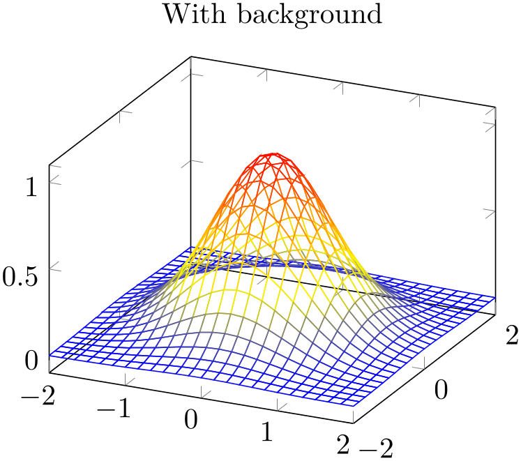
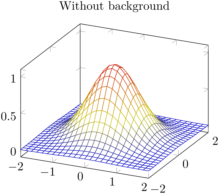
% Preamble: \pgfplotsset{width=7cm,compat=1.18}
\begin{tikzpicture}
\begin{axis}[title=With background]
                            \addplot3
                    [mesh,domain=-2:2] {exp(-x^2-y^2)};
\end{axis}
\end{tikzpicture}
\begin{tikzpicture}
\begin{axis}[title=Without background]
                            \addplot3
                    [surf,fill=white,domain=-2:2] {exp(-x^2-y^2)};
\end{axis}
\end{tikzpicture}
The fill color needs to be provided explicitly.
-
• A mesh plot uses the same implementation as shader=flat to get one color for each single segment. Thus, if shader=flat mean, the color for a segment is determined using the mean of the color data of adjacent vertices. If shader=flat corner, the color of a segment is the color of the first adjacent vertex.22
-
• As soon as mesh is activated, color=mapped color is installed. This is necessary unless one needs a different color – but mapped color is the only color which reflects the color data.
It is possible to use a different color using the color=
 color name
 as for any other plot.
-
• It is easily possible to add mark=
 marker name
 to mesh plots, scatter is also possible. Scatter plots
will use the same color data as for the mesh.
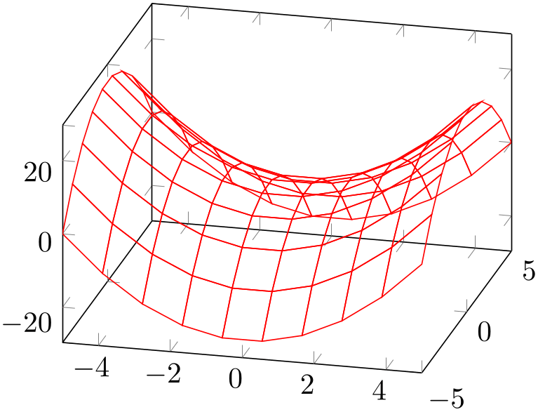
% Preamble: \pgfplotsset{width=7cm,compat=1.18}
\begin{tikzpicture}
\begin{axis}[view/az=14]
\addplot3 [
mesh,
draw=red,
samples=10,
] {x^2-y^2};
\end{axis}
\end{tikzpicture}
Mesh plots use the mesh legend style to typeset legend images.
-
/pgfplots/mesh/check=false|warning|error (initially error) 
Allows to configure whether an error is generated if mesh/rows \(\times \) mesh/cols does not equal the total number of coordinates.
If you know exactly what you are doing, it may be useful to disable the check. If you are unsure, it is best to leave the initial setting.
-
/pgfplots/z buffer=default|none|auto|sort|reverse x seq|reverse y seq|reverse xy seq (initially default) 
This key allows to choose between different \(z\) buffering strategies. A \(z\) buffer determines which parts of an image should be drawn in front of other parts. Since both, the graphics packages pgf and the final document format .pdf are inherently two dimensional, this work has to be done in TeX. Currently, several (fast) heuristics can be used which work reasonably well for simple mesh and surface plots. Furthermore, there is a (time consuming) sorting method which also works if the fast heuristics fails.
The \(z\) buffering algorithms of pgfplots apply only to a single \addplot command. Different \addplot commands will be drawn on top of each other, in the order of appearance.
The choice default checks if we are currently working with a mesh or surface plot and uses auto in this case. If not, it sets z buffer=none.
The choice none disables \(z\) buffering. This is also the case for two dimensional axes which don’t need \(z\) buffering.
The choice auto is the initial value for any mesh or surface plot: it uses a very fast heuristics to decide how to execute \(z\) buffering for mesh and surface plots. The idea is to reverse either the sequence of all \(x\)-coordinates, or those of all \(y\)-coordinates, or both. For regular meshes, this suffices to provide \(z\) buffering. In other words: the choice auto will use one of the three reverse strategies reverse * seq (or none at all). The choice auto, applied to patch plots, uses z buffer=sort since patch plots have no matrix structure.
The choice sort can be used for scatter, line, mesh, surface and patch plots. It sorts according to the depth of each point (or mesh segment). Sorting in TeX uses a slow algorithm and may require a lot of memory (although it has the expected runtime asymptotics \(\mathcal O(N \log N)\)). The depth of a mesh segment is just one number, currently determined as mean over the vertex depths. Since z buffer=sort is actually just a more intelligent way of drawing mesh segments on top of each other, it may still fail. Failure can occur if mesh segments are large and overlap at different parts of the segment (see Wikipedia “Painter’s algorithm”). If you experience problems of this sort, consider reducing the mesh width (the mesh element size) such that they can be sorted independently (for example automatically using patch refines=2, see the patchplots library).
The remaining choices apply only to mesh/surface plots (i.e. for matrix data) and do nothing more than their name indicates: they reverse the coordinate sequences of the input matrix (using quasi linear runtime). They should only be used in conjunction by z buffer=auto.
22 Starting with pgfplots 1.13 and the associated compatibility level, this holds even in the presence of \(z\) buffering.
4.6.6Surface Plots
-
/pgfplots/surf(no value) 
-
\addplot+[surf]
A surface plot visualizes a two dimensional, single patch using different fill colors for each patch segment. Each patch segment is a (pseudo) rectangle, that means input data is given in form of a data matrix as is discussed in the introductory Section 4.6.2 about three dimensional coordinates.
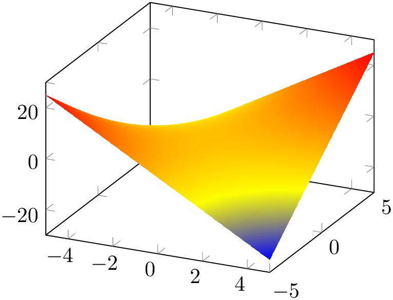
% Preamble: \pgfplotsset{width=7cm,compat=1.18}
\begin{tikzpicture}
\begin{axis}
\addplot3 [
surf,
shader=interp,
] {x*y};
\end{axis}
\end{tikzpicture}
The simplest way to generate surface plots is to use the plot expression feature, but – as discussed in Section 4.6.2 – other input methods like \addplot3 table or \addplot3 coordinates are also possible.
The appearance can be configured using colormaps, the value of the shader, faceted color keys and the current color and/or draw/fill color. As for mesh plots, the special color=mapped color is installed for the faces. The stroking color for faceted plots can be set with faceted color (see below for details).
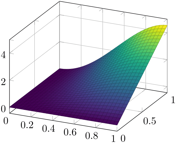
% Preamble: \pgfplotsset{width=7cm,compat=1.18}
\begin{tikzpicture}
\begin{axis}[
grid=major,
colormap/viridis,
]
\addplot3 [
surf,
samples=30,
domain=0:1,
] {5*x*sin(2*deg(x)) * y};
\end{axis}
\end{tikzpicture}
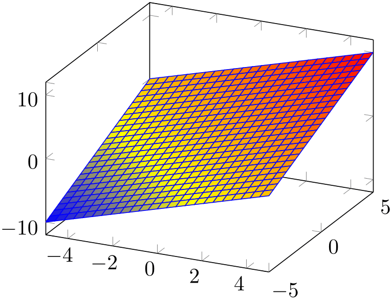
% Preamble: \pgfplotsset{width=7cm,compat=1.18}
\begin{tikzpicture}
\begin{axis}
\addplot3 [
surf,
faceted color=blue,
] {x+y};
\end{axis}
\end{tikzpicture}

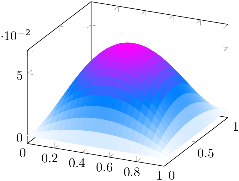
% Preamble: \pgfplotsset{width=7cm,compat=1.18}
\begin{tikzpicture}
\begin{axis}[colormap/cool]
                            \addplot3
                    [surf,samples=10,domain=0:1,shader=interp]
{x*(1-x)*y*(1-y)};
\end{axis}
\end{tikzpicture}
\begin{tikzpicture}
\begin{axis}[colormap/cool]
                            \addplot3
                    [surf,samples=25,domain=0:1,shader=flat]
{x*(1-x)*y*(1-y)};
\end{axis}
\end{tikzpicture}
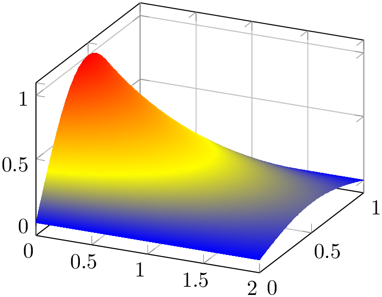
% Preamble: \pgfplotsset{width=7cm,compat=1.18}
\begin{tikzpicture}
\begin{axis}[grid=major]
\addplot3 [
surf,
shader=interp,
samples=25,
domain=0:2,
y domain=0:1,
] {exp(-x) * sin(pi*deg(y))};
\end{axis}
\end{tikzpicture}
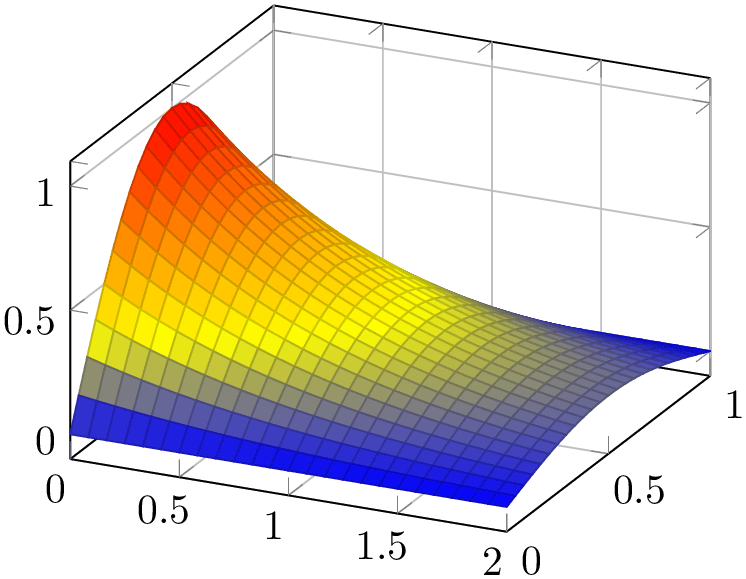
% Preamble: \pgfplotsset{width=7cm,compat=1.18}
\begin{tikzpicture}
\begin{axis}[grid=major]
\addplot3 [
surf,
shader=faceted,
samples=25,
domain=0:2,
y domain=0:1,
] {exp(-x) * sin(pi*deg(y))};
\end{axis}
\end{tikzpicture}
Details about the shading algorithm are provided below in the documentation of shader.
Surface plots use the mesh legend style to create legend images.
-
/pgfplots/shader=flat|interp|faceted|flat corner|flat mean|faceted interp (initially faceted) 
-
flat corner Uses the color data of one vertex to color the segment. The color of the first vertex determines the color of the entire segment. Note that pgfplots ensures that the outcome is always the same, even if the vertices are reordered due to z buffering or mesh/ordering.
Note that pgfplots versions up to and including 1.12 chose one of them without respectiving reordering. In order to have the ordering independent of other features, you have to write compat=1.13 or newer.
-
flat mean Uses the mean of all four color data values as segment color. This is the initial value as it provides symmetric colors for symmetric functions.
-
• the postscript driver \def\pgfsysdriver{pgfsys-dvips.def},
-
• the pdflatex driver \def\pgfsysdriver{pgfsys-pdftex.def},
-
• the lualatex driver \def\pgfsysdriver{pgfsys-pdftex.def} and
\def\pgfsysdriver{pgfsys-luatex.def}, -
• the dvipdfmx driver \def\pgfsysdriver{pgfsys-dvipdfmx.def}.
Configures the shader used for surface plots. The shader determines how the color data available at each single vertex is used to fill the surface patch.
The simplest choice is to use one fill color for each segment, the choice flat.
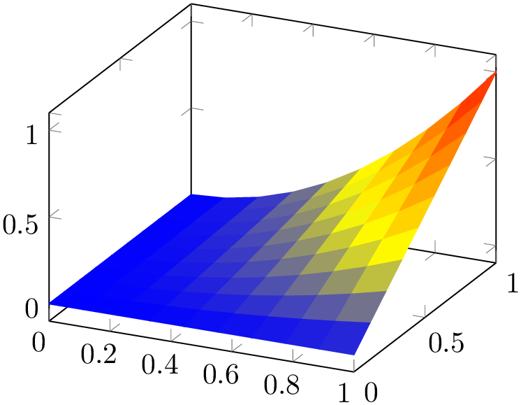
% Preamble: \pgfplotsset{width=7cm,compat=1.18}
\begin{tikzpicture}
\begin{axis}
\addplot3 [
surf,
shader=flat,
samples=10,
domain=0:1,
] {x^2*y};
\end{axis}
\end{tikzpicture}
There are (currently) two possibilities to determine the single color for every segment:
The choice flat is actually the same as flat mean. Please note that shader=flat mean and shader=flat corner also influence mesh plots – the choices determine the mesh segment color.
Another choice is shader=interp which uses Goraud shading (smooth linear interpolation of two triangles approximating rectangles) to fill the segments.
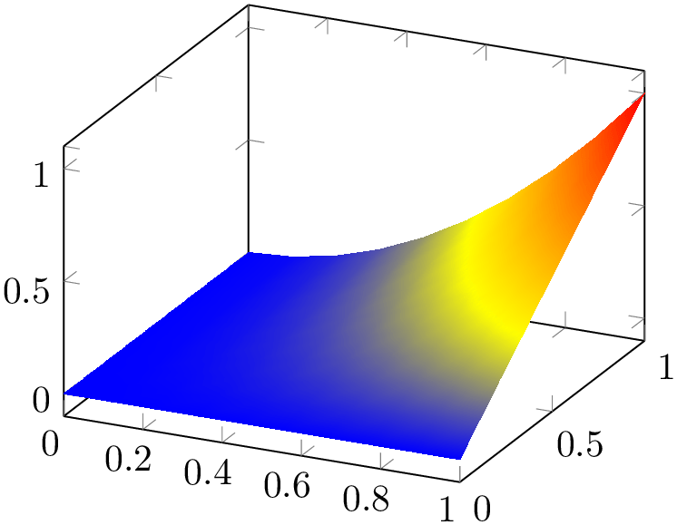
% Preamble: \pgfplotsset{width=7cm,compat=1.18}
\begin{tikzpicture}
\begin{axis}
\addplot3 [
surf,
shader=interp,
samples=10,
domain=0:1,
] {x^2*y};
\end{axis}
\end{tikzpicture}
The shader=interp employs a low-level shading implementation which is currently available for the following drivers:
For other drivers, the choice shader=interp will result in a warning and is equivalent to shader=flat mean. See also below for detail remarks.
Note that shader=interp,patch type=bilinear allows real bilinear interpolation, see the patchplots library.
The choice shader=faceted uses a constant fill color for every mesh segment (as for flat) and the value of the key /pgfplots/faceted color to draw the connecting mesh elements:
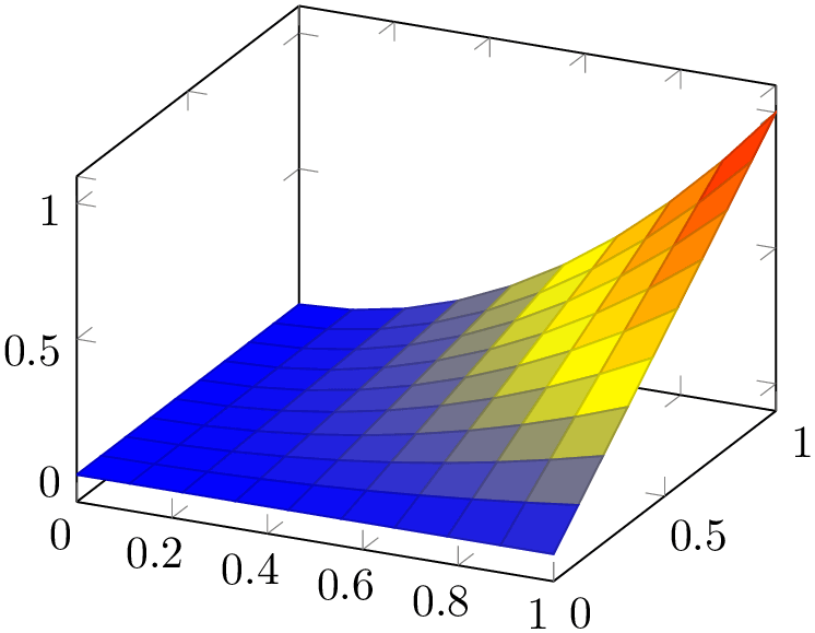
% Preamble: \pgfplotsset{width=7cm,compat=1.18}
\begin{tikzpicture}
\begin{axis}
\addplot3 [
surf,
shader=faceted,
samples=10,
domain=0:1,
] {x^2*y};
\end{axis}
\end{tikzpicture}
The last choice is shader=faceted interp. As the name suggests, it is a mixture of interp and faceted in the sense that each element is shaded using linear triangle interpolation (see also the patchplots library for bilinear interpolation) in the same way as for interp, but additionally, the edges are colored in faceted color:
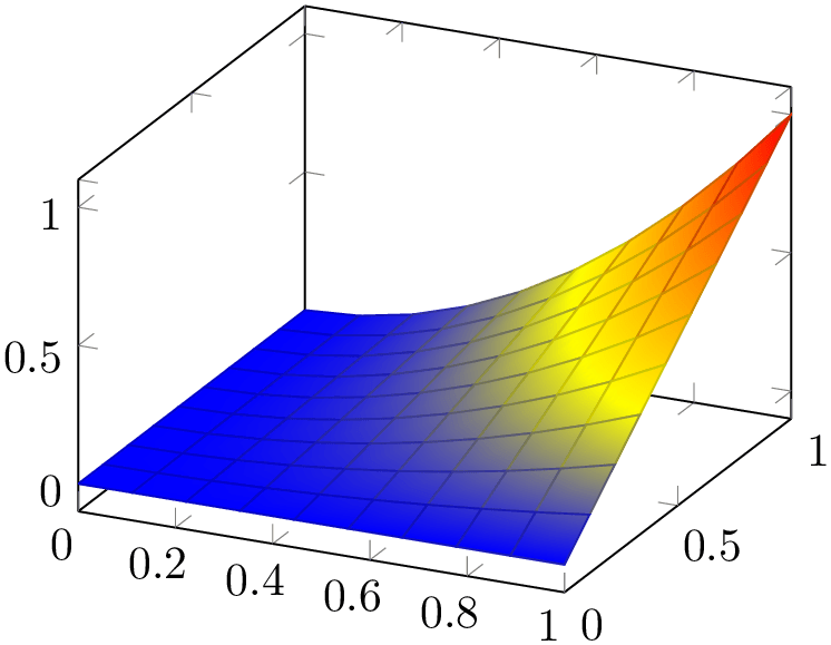
% Preamble: \pgfplotsset{width=7cm,compat=1.18}
\begin{tikzpicture}
\begin{axis}
\addplot3 [
surf,
                            shader=faceted
                    interp,
samples=10,
domain=0:1,
] {x^2*y};
\end{axis}
\end{tikzpicture}
In principle, there is nothing wrong with the idea as such, and it looks quite good – but it enlarges the resulting PDF document considerably and might take a long time to render. It works as follows: for every mesh element (either triangle for patch plots or rectangle for lattice plots), it creates a low level shading. It then fills the single mesh element with that shading, and strokes the edges with faceted color. The declaration of that many low level shadings is rather inefficient in terms of PDF objects (large output files) and might render slowly.23 For orthogonal plots (like view={0}{90}), the effect of faceted interp can be gained with less cost if one uses two separate \addplot commands: one with surf and one with mesh. Handle this choice with care.
-
• All shaders support z buffer=sort (starting with version 1.4).
-
• The choice shader=faceted is the same as shader=flat – except that it uses a special draw color.
So, shader=faceted has the same effect as
shader=flat,draw=\pgfkeysvalueof{/pgfplots/faceted color}.
-
• The flat shader uses the current draw and fill colors. They are set with color=mapped color and can be overruled with draw=
 draw color
 and fill=
 fill color
 . The mapped color always contains the color of the color map.
-
• You easily add mark=
 plot mark
 to mesh and/or surface plots or even colored plot marks with
scatter. The scatter plot feature will use the same color data as for the surface.
But: Markers and surfaces do not share the same depth information. They are drawn on top of each other.
-
-
– It uses the current color map in any case, ignoring draw and fill.
-
– For surface plots with lots of points, shader=interp produces smaller pdf documents, requires less compilation time in TeX and requires less time to display in Acrobat Reader than shader=flat.
-
– The postscript driver truncates coordinates to 24 bit – which might result in a loss of precision (the truncation is not very intelligent). See the surf shading/precision key for details. To improve compatibility, this 24 bit truncation algorithm is enabled by default also for PDF documents.
-
– The choice shader=interp works well with either Acrobat Reader or recent versions of free viewers.24 However, some free viewers show colors incorrectly (like evince). I hope this message will soon become outdated… if not, provide bug reports to the Linux community to communicate the need to improve support for Type 4 (patch) and Type 5 PDF (surf) and Type 7 (patch and elements of the patchplots library) shadings.
-
– The interp shader yields the same outcome as faceted interp,faceted color=none, although faceted interp requires much more resources.
-
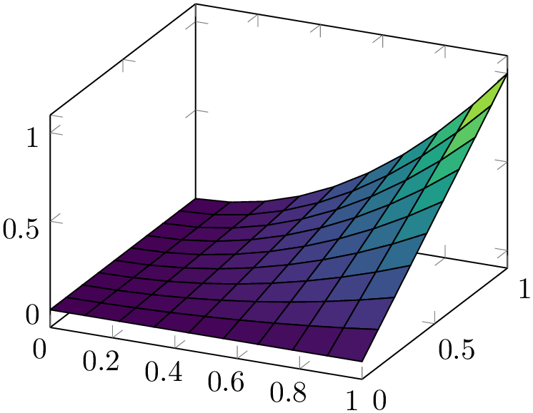
% Preamble: \pgfplotsset{width=7cm,compat=1.18}
\begin{tikzpicture}
\begin{axis}[colormap/viridis]
\addplot3 [
surf,
shader=flat,
draw=black,
samples=10,
domain=0:1,
] {x^2*y};
\end{axis}
\end{tikzpicture}
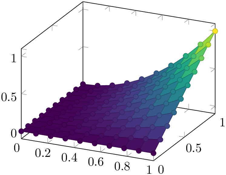
% Preamble: \pgfplotsset{width=7cm,compat=1.18}
\begin{tikzpicture}
\begin{axis}[colormap/viridis]
\addplot3 [
surf,
shader=faceted,
scatter,mark=*,
samples=10,
domain=0:1,
] {x^2*y};
\end{axis}
\end{tikzpicture}
Note that the shader always interacts with colormap access. In particular, colormap access=piecewise constant combined with shader=interp results in a filled contour plot, see Section 4.6.9 for details.
-
/pgfplots/faceted color={
 color name
 } (initially mapped color!80!black)
Defines the color to be used for meshes of faceted surface plots.
Set faceted color=none to disable edge colors.
-
/pgfplots/mesh/interior colormap={
 map name
 }{
}{ colormap specification
 }
}
-
/pgfplots/mesh/interior colormap name={
 map name
 }
}
Allows to use a different colormap for the “other side” of the surface.
Each mesh has two sides: one which “points” to the view’s origin and one which points away from it. This key allows to define a second colormap for the side which points away from the view’s origin. The motivation is to distinguish between the outer side and the interior parts of a surface:
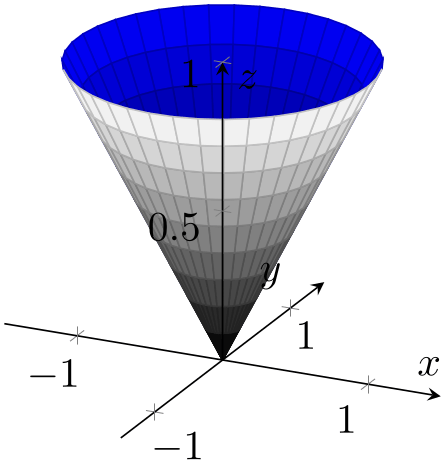
% Preamble: \pgfplotsset{width=7cm,compat=1.18}
\begin{tikzpicture}
\begin{axis}[
axis lines=center,
axis on top,
xlabel={$x$}, ylabel={$y$}, zlabel={$z$},
domain=0:1,
y domain=0:2*pi,
xmin=-1.5, xmax=1.5,
ymin=-1.5, ymax=1.5, zmin=0.0,
mesh/interior colormap=
{blueblack}{color=(black) color=(blue)},
colormap/blackwhite,
samples=10,
samples y=40,
z buffer=sort,
]
\addplot3 [surf]
({x*cos(deg(y))},{x*sin(deg(y))},{x});
\end{axis}
\end{tikzpicture}
The interior colormap is often the one for the “inner side”. However, the orientation of the surface depends on its normal vectors: pgfplots computes them using the right-hand-rule. The right-hand-rule applied to a triangle means to take the first encountered point, point the thumb in direction of the second point and the first finger in direction of the third point. Then, the normal for that triangle is the third finger (i.e. the cross product of the involved oriented edges). For rectangular patches, pgfplots uses the normal of one of its triangles.25 Consequently, mesh/interior colormap will only work if the involved patch segments are consistently oriented.
A patch whose normal vector points into the same direction as the view direction uses the standard colormap name. A patch whose normal vector points into the opposite direction (i.e. in direction of the viewport) uses mesh/interior colormap.
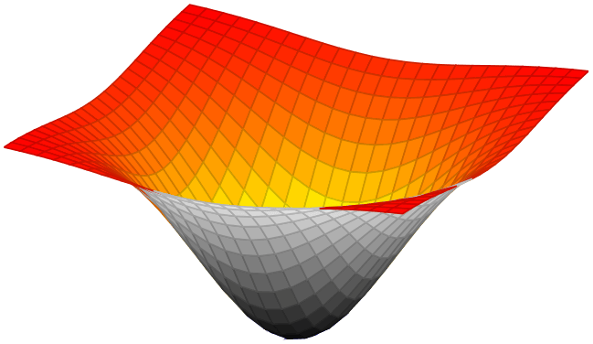
% Preamble: \pgfplotsset{width=7cm,compat=1.18}
\begin{tikzpicture}
\begin{axis}[
hide axis,
xlabel=$x$,ylabel=$y$,
mesh/interior colormap name=hot,
colormap/blackwhite,
]
\addplot3 [domain=-1.5:1.5,surf]
{-exp(-x^2-y^2)};
\end{axis}
\end{tikzpicture}
The implementation of mesh/interior colormap works well for most examples; in particular, if the number of samples is large enough to resolve the boundary between inner and outer colormap. However, it might still produce spurious artifacts:

% Preamble: \pgfplotsset{width=7cm,compat=1.18}
\begin{tikzpicture}
\begin{axis}[
                        title=Example needing
                    fine-tuning,
xlabel=$x$,
ylabel=$y$,
]
\addplot3 [surf,
mesh/interior colormap={blueblack}{
color=(black) color=(blue)
},
colormap/blackwhite,
domain=0:1,
] {
sin(deg(8*pi*x))* exp(-20*(y-0.5)^2)
+ exp(-(x-0.5)^2*30
                                    -
                    (y-0.25)^2 - (x-0.5)*(y-0.25))
};
\end{axis}
\end{tikzpicture}
The previous example has need for improvement with respect to a couple of aspects: first, it has small overshoots near some of the meshes vertices (especially on top of the hills). These can be fixed using miter limit=1. Second, the boundary between blue and black is incorrect. This can be improved by means of an increased sampling density (samples=31). In addition, we can configure pgfplots to move the boundary between the two colormaps in favor of the blue region using mesh/interior colormap thresh as follows:
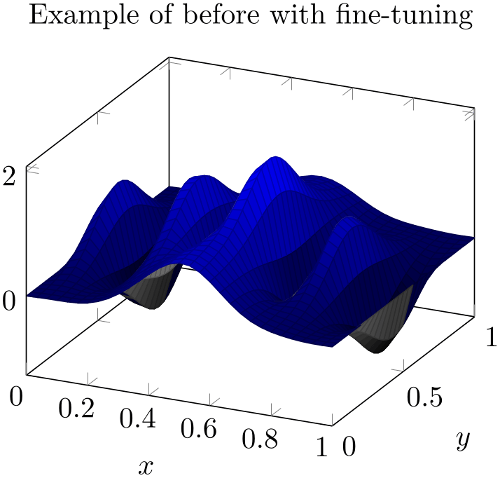
% Preamble: \pgfplotsset{width=7cm,compat=1.18}
\begin{tikzpicture}
\begin{axis}[
                        title=Example of before with
                    fine-tuning,
xlabel=$x$,
ylabel=$y$,
]
\addplot3 [
surf,
mesh/interior colormap={blueblack}{
color=(black) color=(blue)
},
% slightly increase sampling quality (was 25):
samples=31,
% avoids overshooting corners:
miter limit=1,
% move boundary between inner and outer:
mesh/interior colormap thresh=0.1,
colormap/blackwhite,
domain=0:1,
] {
sin(deg(8*pi*x))* exp(-20*(y-0.5)^2)
+ exp(-(x-0.5)^2*30
                                    -
                    (y-0.25)^2 - (x-0.5)*(y-0.25))
};
\end{axis}
\end{tikzpicture}
This improves the display.
it would be nice if the fine-tuning of these keys would be unnecessary. If someone has well-founded suggestions (like knowledge and perhaps exhaustive experiments) on how to improve the feature, let me know.
Note that mesh/interior colormap cannot be combined with mesh/refines currently.
Note that mesh/interior colormap will increase compilation times due to the computation of normal vectors.
-
/pgfplots/mesh/interior colormap thresh={
 Number between \(-1.0\) and \(+1.0\)
 } (initially 0)
A threshold which moves the boundary between the colormap and interior colormap in favor of colormap (if the value is negative) or in favor of interior colormap (if the value is positive).
The extreme value \(-1\) essentially deactivates interior colormap whereas the other extreme \(+1\) deactivates colormap.
See above for an example.
-
/pgfplots/surf shading/precision=pdf|postscript|ps (initially postscript) 
A key to configure how the low level driver for shader=interp writes its data. The choice pdf uses 32 bit binary coordinates (which is lossless). The resulting .pdf files appear to be correct, but they can’t be converted to postscript – the converter software always complains about an error.
The choice postscript (or, in short, ps) uses 24 bit truncated binary coordinates. This results in both, readable .ps and .pdf files. However, the truncation is lossy.
If anyone has ideas how to fix this problem: let me know. As far as I know, Postscript should accept 32 bit coordinates, so it might be a mistake in the shading driver.
23 My experience is as follows: Acrobat reader can efficiently render huge interp shadings. But it is very slow for faceted interp shadings. Linux viewers like xpdf are reasonably efficient for interp (at least with my bugfixes to libpoppler) and are also fast for faceted interp shadings.
24 The author of this package has submitted bugfixes to xpdf/libpoppler which should be part of the current stable versions of many viewers.
25 This may change in future versions.
4.6.7Surface Plots with Explicit Color
The surface plots described in Section 4.6.6 are all based on colormaps. This section introduces a different type of surface plot. In fact, it uses the very same plot handlers: it applies to mesh, surf, and patch plots. However, the way colors are provided and the way pgfplots interpolates colors is substantially different.
This section describes surface plots with explicit colors. These expect colors like red, green, or rgb=(0.5,0.2,1) for every vertex of the mesh – and interpolates smoothly between these vertices. This appears to be simpler, perhaps even more straightforward than surface plots based on colormaps. It is not. Surface plots with explicit color are more difficult to define, and they are more difficult to read.
If you are in doubt of whether to use a surface colored by a colormap or explicit colors, you should prefer colormaps for reasons discussed below.
-
/pgfplots/mesh/color input=colormap|explicit|explicit mathparse (initially colormap) 
Allows to configure how pgfplots expects color input for surface plots.
The choice colormap uses the standard colormaps. This particular choice expects scalar values of point meta which are mapped linearly into the colormap. It resembles the surface plots which are explained in more detail in Section 4.6.6. It is the default configuration and covers (probably) most common use cases.
The choice explicit expects explicitly provided point meta of symbolic form: every coordinate of your input coordinate stream is supposed to have an explicitly defined color as point meta. Here, “explicitly provided” refers to point meta=explicit symbolic. This choice and the available color formats are explained in all detail in the following subsections.
The choice explicit mathparse is similar to explicit, but it allows to provide just one math expression which is evaluated for every coordinate. The math expression can be of the form rgb=x,y,0.5 in which case x is used to define the “red” component, y is used to define the “green” component and the “blue” component is fixed to 0.5. This key is also explained in more detail in the following subsections.
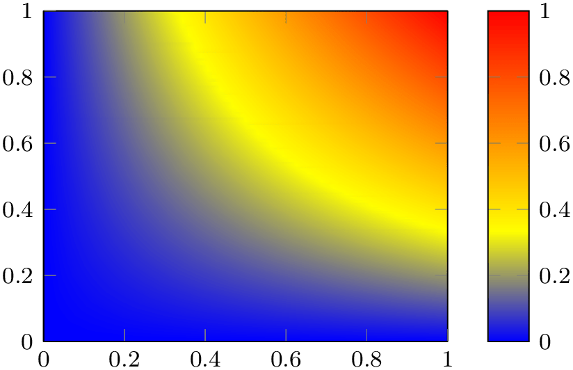
The main use case of mesh/color input=colormap is to allow a map between the interpolated colors and some value of interest. This map can be shown as colorbar:
% Preamble: \pgfplotsset{width=7cm,compat=1.18}
% \usepgfplotslibrary{patchplots}
\begin{tikzpicture}
\begin{axis}[small,view={0}{90},colorbar]
\addplot3 [
surf,
shader=interp,
patch type=bilinear,
] coordinates {
(0,0,0) (1,0,0)
(0,1,0) (1,1,1)
};
\end{axis}
\end{tikzpicture}
Note that the preceding example is a standard surf plot except for patch type=bilinear which controls how color is to be interpolated. There is a \(2 \times 2\) matrix, and its \(z\) values are used as color data. Clearly, value \(z=0\) corresponds to blue and \(z=1\) corresponds to red – and all other colors in-between are not directly related to blue and red; they are taken from the colormap. The colormap defines which colors appear: those which make up the colormap and those which can occur as interpolated colors between the colors of the color map. The pairwise mixture of colors is a property of mesh/color input=colormap, not of mesh/color input=explicit (where more than two colors are mixed together). Furthermore, the surface indicates contours of constant \(z\) level. Take, for example, the yellow contour. We know that it has some value between \(0.3\) and \(0.4\), say \(0.35\). Since these shadings are continuous, we know that the point \(z=0.35\) occurs between \(z=0\) and \(z=1\) – at every point of the surface. Due to the colormap, each point on the surface which has \(z=0.35\) will receive the yellow color. This is because the interpolation is carried out on the scalar point meta value, which is afterwards mapped into the colormap. This contour property is also unique for colormap surfaces.
The other two choices are explained in all detail in the next subsections.
4.6.7.1Providing Colors Explicitly For Each Coordinate
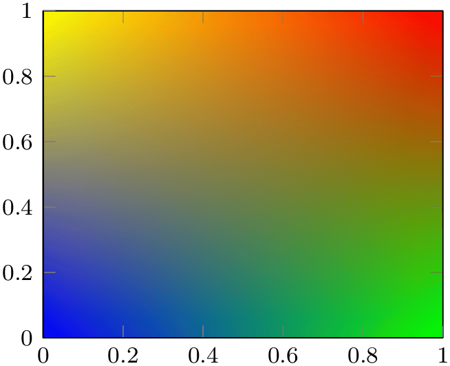
Here is a simple approach with the same vertices as the colormap example above, but with explicit colors:
% Preamble: \pgfplotsset{width=7cm,compat=1.18}
% \usepgfplotslibrary{patchplots}
\begin{tikzpicture}
\begin{axis}[small,view={0}{90}]
\addplot3 [
surf,
shader=interp,
patch type=bilinear,
mesh/color input=explicit,
] coordinates {
(0,0,0) [color=blue] (1,0,0) [color=green]
(0,1,0) [color=yellow] (1,1,1) [color=red]
};
\end{axis}
\end{tikzpicture}
The coordinates and the view is the same, even the way colors are being interpolated bilinearly. However, we have four different colors in the corners. We see these corners in the output, and we see that they are smoothly mixed together. However, the mix contains all four colors, not just two. As a direct consequence, there are no contour lines.
The absence of direct information how to map color information to “some information of the data visualization” implies that if you want to use surface plots with explicit color, you have to state clearly what you want to show. This is considerably simpler for colormaps.
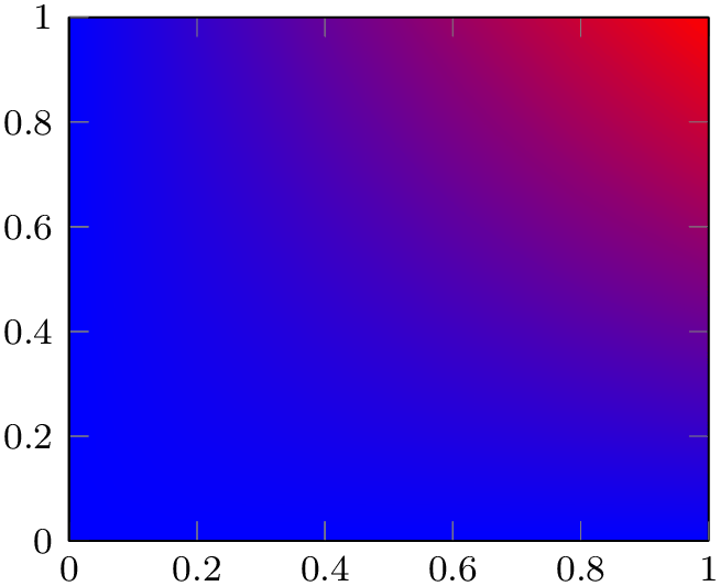
The following example configures \(z=0\) to receive blue and \(z=1\) to receive red as in our preceding colormap example (see above) using mesh/color input=explicit.
% Preamble: \pgfplotsset{width=7cm,compat=1.18}
% \usepgfplotslibrary{patchplots}
\begin{tikzpicture}
\begin{axis}[small,view={0}{90}]
\addplot3 [
surf,
shader=interp,
patch type=bilinear,
mesh/color input=explicit,
] coordinates {
(0,0,0) [color=blue] (1,0,0) [color=blue]
(0,1,0) [color=blue] (1,1,1) [color=red]
};
\end{axis}
\end{tikzpicture}
We see the bilinear nature of the interpolation; it is related to that of mesh/color input=colormap above (compare the contour lines in-between). In most cases, you simply want to show some contour lines. And for such cases, a colormap is the way to go.
There might be cases where mesh/color input=explicit is adequate. However, you will need to think it through properly. And you need to explain clearly what you did because your audience will also have to think a lot before they make sense of any data visualization based on explicit color interpolation.
The choice mesh/color input=explicit expects a choice of point meta which results in symbolic values. In this context, “symbolic” refers to a special color definition:
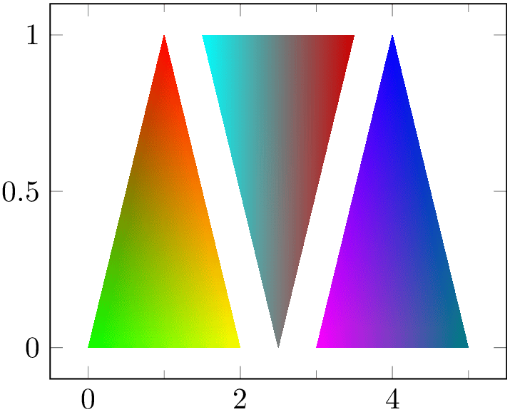
% Preamble: \pgfplotsset{width=7cm,compat=1.18}
\begin{tikzpicture}
\begin{axis}[minor x tick num=1]
\addplot [
patch,
shader=interp,
mesh/color input=explicit,
] table [meta=c] {
                        x
                y c
0 0 color=green
% default color model is rgb:
1 1 1,0,0
2 0 1,1,0
1.5 1 cmyk=1,0,0,0
2.5 0 gray=0.5
3.5 1 color=red!80!black
3 0 1,0,1
4 1 0,0,1
5 0 rgb255=0,128,128
};
\end{axis}
\end{tikzpicture}
The previous example defines a patch plot with three triangle patches, each made up of three vertices which are placed as is into the input coordinate stream. Each vertex has its color data in column c. The format of color specifications is explained in more detail in the following paragraph.
As soon as you write mesh/color input=explicit, pgfplots checks the current value of point meta. If the current value of point meta is none, it is set to point meta=explicit symbolic (that is what happened in our example above). If the current value of point meta is some choice which yields numeric output (like point meta=x or point meta=\thisrow{x}+1), it is set to point meta=explicit symbolic. If the current value of point meta is already of symbolic form, it is left unchanged.
Consequently, our example above sets point meta=explicit symbolic as soon as it encounters mesh/color input=explicit. The explicit symbolic input handler in turn expects the coordinate stream to provide point meta data for every streamed coordinate. We use a table here, and a table reads its color data from the column name provided in the table/meta key.
The accepted format of colors is quite similar to that of colormap definitions (compare Section 4.7.6.1). The common format is
 color model
 =
= arguments
 . In contrast to the similar input format inside of colormap definitions, the syntax here has no round braces and does not have
the
 length
 argument. Nevertheless, the same
 color model
 s with the same
 arguments
 are accepted. The choices are
- rgb
-
=
 red
red ,
, green
green ,
, blue
blue where each component is in the interval \([0,1]\),
- rgb255
-
=
 red
red ,
, green
green ,
, blue
blue is similar to rgb except that each component is expected in the interval
[0,255],
- gray
-
=
 value
value with
with
 value
value in the interval \([0,1]\),
- color
-
=
 named color
 where
where
 named color
 is a predefined (named) color like ‘red’ or a color expression like ‘red!50’,
- cmyk
-
=
 cyan
cyan ,
, magenta
 ,
, yellow
 ,
, black
black where each component is in the interval \([0,1]\),
- cmyk255
-
=
 cyan
cyan ,
, magenta
 ,
, yellow
 ,
, black
black is the same as cmyk but expects components in the interval \([0,255]\),
- cmy
-
=
 cyan
cyan ,
, magenta
 ,
, yellow
 where each component is in the interval \([0,1]\),
- hsb
-
=
 hue
hue ,
, saturation
 ,
, brightness
 where each component is in the interval \([0,1]\),
- Hsb
-
=
 hue
hue ,
, saturation
 ,
, brightness
 is the same as hsb except that
 hue
hue is accepted in the interval \([0,360]\) (degree),
- HTML
-
=
 hex red
 hex green
 hex blue
 where component is expected to be a hex number between 00 and FF (a variant of
rgb255),
- wave
-
=
 wave length
 which expects a single wave length as numeric argument in the range \([363,814]\).
-
/pgfplots/mesh/colorspace explicit color input=rgb|rgb255|cmy|cmyk|cmyk255|gray|wave|hsb
|Hsb|HTML (initially rgb) 
If the input color has no color model, the color components are interpreted as color in the color model specified as argument to this key.
This key has just one purpose: to omit the
 color model
 if it is the same for lots of points anyway.
-
/pgfplots/mesh/colorspace explicit color output=rgb|cmyk|gray (initially rgb) 
Any color which is encountered by the survey phase (i.e. while inspecting the point meta value) is immediately transformed into the color space configured as mesh/colorspace explicit color output.
Note that this option has no effect if you told xcolor to override the color space globally. More precisely, the use of
\usepackage[cmyk]{xcolor}
or, alternatively,
will cause all colors to be converted to cmyk, and pgfplots honors this configuration. Consequently, both these statements cause all colors to be interpolated in the desired color space, and all output colors will use this colorspace. This is typically exactly what you need.
The transformed color is used for any color interpolation. In most cases, this is done by the shader, but it applies to patch refines and patch to triangles as well.
Because the transformed color is used for color interpolation, the list of available output color spaces is considerably smaller than the available input color spaces. Only the device color spaces rgb, gray, and cmyk are available as value for mesh/colorspace explicit color output.
Any necessary colorspace transformations rely on the xcolor package.26 Note that colorspace transformations are subject to nearest color matching, i.e. they are less accurate. This is typically far beyond pure rounding issues; it is caused by the fact that these color spaces are actually so different that transformations are hard to accomplish. If you can specify colors immediately in the correct color space, you can eliminate such transformations.
Here is the same shading, once with CMYK output and once with RGB output. Depending on your output media (screen or paper), you will observe slightly different colors when comparing the pictures.
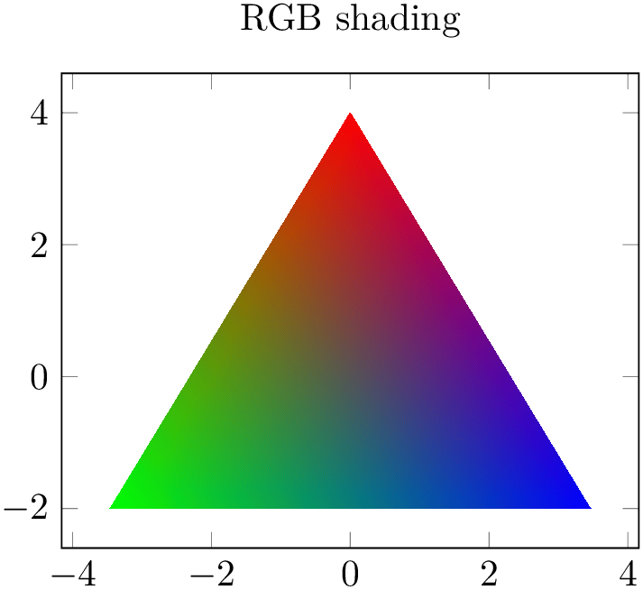
% Preamble: \pgfplotsset{width=7cm,compat=1.18}
\begin{tikzpicture}
\begin{axis}[title=RGB shading]
\addplot [
patch,
shader=interp,
mesh/color input=explicit,
mesh/colorspace explicit color output=rgb,
data cs=polar,
] coordinates {
(90,4) [color=red]
(210,4) [color=green]
(-30,4) [color=blue]
};
\end{axis}
\end{tikzpicture}
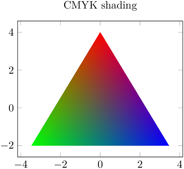
% Preamble: \pgfplotsset{width=7cm,compat=1.18}
\begin{tikzpicture}
\begin{axis}[title=CMYK shading]
\addplot [
patch,
shader=interp,
mesh/color input=explicit,
mesh/colorspace explicit color output=cmyk,
data cs=polar,
]
coordinates {
(90,4) [color=red]
(210,4) [color=green]
(-30,4) [color=blue]
};
\end{axis}
\end{tikzpicture}
This key is similar to the related key colormap default colorspace, although the values can be chosen independently.
26 Colorspace transformations are unavailable for plain TeX and ConTeXt. For these cases, you have to ensure that input and output color model are the same.
4.6.7.2Providing Color Components as Table
The previous section shows how to provide a single symbolic color expression for each coordinate, namely using point meta=explicit symbolic.
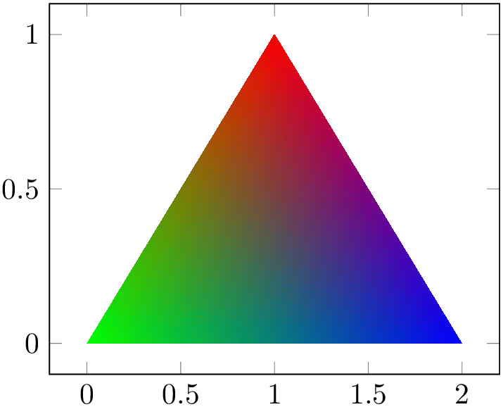
Another use case might be to provide a table containing both the coordinate values and one column by color component. In order to assemble the color specification from the input table, you can provide a symbolic expression:
% Preamble: \pgfplotsset{width=7cm,compat=1.18}
\begin{tikzpicture}
\begin{axis}
\addplot [
patch,
shader=interp,
mesh/color input=explicit,
point meta={symbolic=
{\thisrow{R},\thisrow{G},\thisrow{B}}
},
] table {
                        x
                y R G B
0 0 0 1 0
1 1 1 0 0
2 0 0 0 1
};
\end{axis}
\end{tikzpicture}
The preceding example employs a patch plot with triangular
elements as we have seen before. Furthermore, it uses explicit color input – but combined with
point meta={symbolic={ value
value }} (note the extra pair of braces). This choice accepts arbitrary symbols on input which will be reevaluated
(expanded) for every coordinate. In our example, we simply read the values from table columns using
\thisrow. Since the default input colorspace is RGB, this results in the expected triangle with red, green, and blue corners. The
result has to form a valid color specification.
Note that the symbolic expression is purely string based in this context. If you plan to use math expressions, you have to use mesh/color input=explicit mathparse as explained in the following section.
4.6.7.3Providing Colors as Math Expression
The key mesh/color input has two choices for explicit color input. The choice explicit has been discussed in the preceding paragraphs, it expects one color specification for every node for which colors are needed. It also accepts a kind of string based expressions to concatenate the expected color specification in a suitable way.
The second choice mesh/color input=explicit mathparse is almost the same – with one major difference: it allows to provide math expressions inside of the point meta value. However, the provided math expressions need to form a color specification which typically has more than one color component.
With this choice, the value of point meta is of symbolic form,
but the color components are reevaluated with the math parser for every input point which has color data. The most convenient
way to provide such expressions is point meta={symbolic={ R
R ,
, G
G ,
, B
B }} (again, note the extra set of braces for the argument).
% Preamble: \pgfplotsset{width=7cm,compat=1.18}
\begin{tikzpicture}
\begin{axis}
\addplot [
surf,
shader=interp,
mesh/color input=explicit mathparse,
point meta={symbolic={x,\thisrow{y},0}},
] table {
                        x
                y
0 0
1 0
0 1
1 1
};
\end{axis}
\end{tikzpicture}
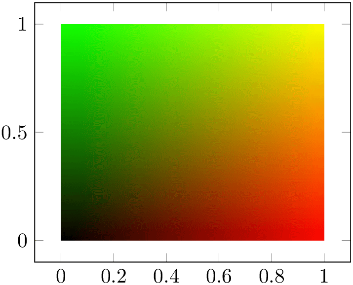
The preceding example is a surface plot with a \(2 \times 2\) input matrix. Note that the table has no explicit point meta data. The
point meta data is acquired from a common math expression
which uses the final \(x\) coordinate as
 red
red component, the value seen in the current row and column y as
 green
green value and constant value
 blue
blue \(=0\). Consequently, the output is black in the lower left corner since black is \((0,0,0)\), red in the lower right corner,
green in the upper left corner, and a mixture of both along the diagonal.
The value provided as point meta={symbolic={ value
value }} is of the same form as for
mesh/color input=explicit, i.e. it is supposed to be
of the form
 color model
 =
= color components
 . If the
 color model
 is omitted, it defaults to
mesh/colorspace explicit color input
(which is rgb
by default).
Since the math expression can be anything, it can safely be combined with plot by expression.
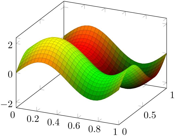
A potential use case could be to show a surface with \((x,y,z)\) and some two-dimensional quantity which is encoded as mixture of red and green. The following example relies on mesh/color input=explicit mathparse and point meta=symbolic to provide a vector of math expressions:
% Preamble: \pgfplotsset{width=7cm,compat=1.18}
% \usepgfplotslibrary{patchplots}
\begin{tikzpicture}
\begin{axis}
% this example burns colors if opacity
% is active in the document.
\addplot3 [
patch,
patch type=bilinear,
mesh/color input=explicit mathparse,
domain=0:1,
samples=30,
point meta={
symbolic={
                                (sin(deg(x*pi*2))+1)/2, %
                R
                                (sin(deg(y*pi*2))+1)/2, %
                G
                                0
                                      %
                B
}
},
] {sin(deg(x*pi*2))+sin(deg(y*pi*2))};
\end{axis}
\end{tikzpicture}
Note that the preceding example suffers from color burning:27 the green areas become too bright and the black areas become too dark. Note that the picture is entirely acceptable if it is written as stand-alone picture. But as soon as you import the picture (either as .pdf or as .png) into a document for which opacity is active, it suffers from burned colors.
The color burning is caused by the combination of RGB colorspace, the special color set in this example, and the color blending which is activated by opacity. Note that it is enough to activate opacity somewhere in the document.
In order to repair the problem for the picture at hand, one has to choose a different output colorspace:

% Preamble: \pgfplotsset{width=7cm,compat=1.18}
% \usepgfplotslibrary{patchplots}
\begin{tikzpicture}
\begin{axis}
\addplot3 [
patch,
patch type=bilinear,
mesh/color input=explicit mathparse,
%
% CMYK produces better quality here
% since the manual has opacity enabled
mesh/colorspace explicit color output=cmyk,
domain=0:1,
samples=30,
point meta={
symbolic={
                                (sin(deg(x*pi*2))+1)/2, %
                R
                                (sin(deg(y*pi*2))+1)/2, %
                G
                                0
                                      %
                B
}
},
] {sin(deg(x*pi*2))+sin(deg(y*pi*2))};
\end{axis}
\end{tikzpicture}
The key mesh/colorspace explicit color output transforms every input RGB color to a matching CMYK color. This, in turn, is a lossy transformation which seems to lack a trivial solution.28
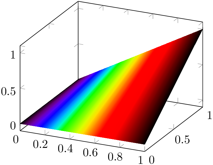
Math expressions can also be used for complicated input color spaces, for example the wave colorspace.
% Preamble: \pgfplotsset{width=7cm,compat=1.18}
\begin{tikzpicture}
\begin{axis}
\addplot3 [
surf,
shader=interp,
mesh/color input=explicit mathparse,
domain=0:1,
samples y=2,
point meta={symbolic={wave=363+x*(814-363)}},
] {x*y};
\end{axis}
\end{tikzpicture}
Note that you have to take care that the color components are within the expected bounds.
27 At least in Acrobat Reader.
28 If some expert in color space operations can contribute best practices here, feel free to contact me.
4.6.8Contour Plots
pgfplots supports visualization of contour plots. Due to the complexity of these algorithms, pgfplots needs more computation power. You have the choice between contour lua which requires no additional software to be installed, but requires you to invoke lualatex instead of pdflatex, or you can resort to contour gnuplot in which case you need to allow TeX to invoke gnuplot and you need to install gnuplot.
Both contour lua and contour gnuplot expect matrix input in the same format as for mesh or surf (that includes any of the pgfplots matrix input methods). At the time of this writing, both require temporary files for input and output data. The resulting contour lines are visualized with the contour prepared plot handler which takes precomputed contour line coordinates and handles their visualization (contour/draw color, contour/labels etc.). In short: both plot handlers expect the usual matrix input and generate contour lines. The recommended way to visualize contour lines is contour lua since it requires no 3rd party programs, but requires you to invoke lualatex.
We discuss the high level interface to external programs first and continue with contour prepared later-on.
-
/pgfplots/contour lua={
 options with ‘contour/’ or ‘contour external/’ prefix
 }
}
-
\addplot+[ contour lua={
 options with ‘contour/’ or ‘contour external/’ prefix
 }]
}]
This algorithm was implemented and contributed by Francesco Poli
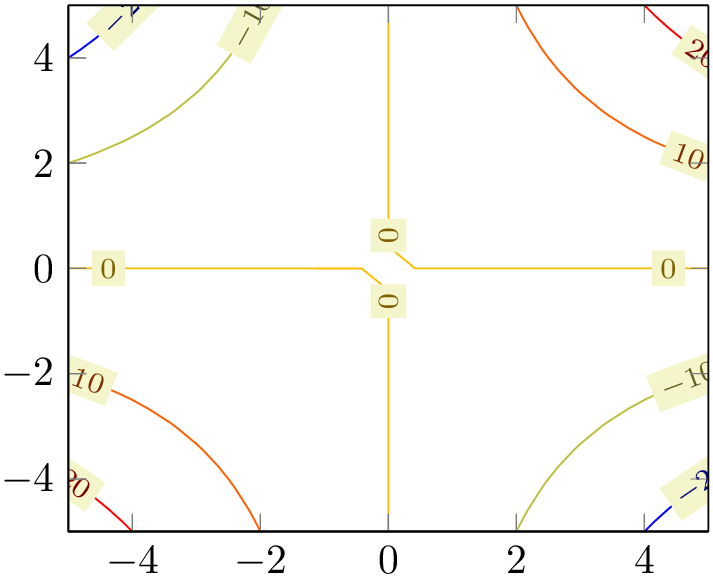
This is a high level contour plot interface. It expects matrix data in the same way as two dimensional surf or mesh plots do. It then computes contours and visualizes them.
% Preamble: \pgfplotsset{width=7cm,compat=1.18}
\begin{tikzpicture}
\begin{axis}[view={0}{90}]
\addplot3 [
contour lua
] {x*y};
\end{axis}
\end{tikzpicture}
The example uses \addplot3 together with expression plotting, that means the input data is of the form \((x_i,y_i,f(x_i,y_i))\). The view={0}{90} flag means “view from top”, otherwise the contour lines would have been drawn as \(z\) value:
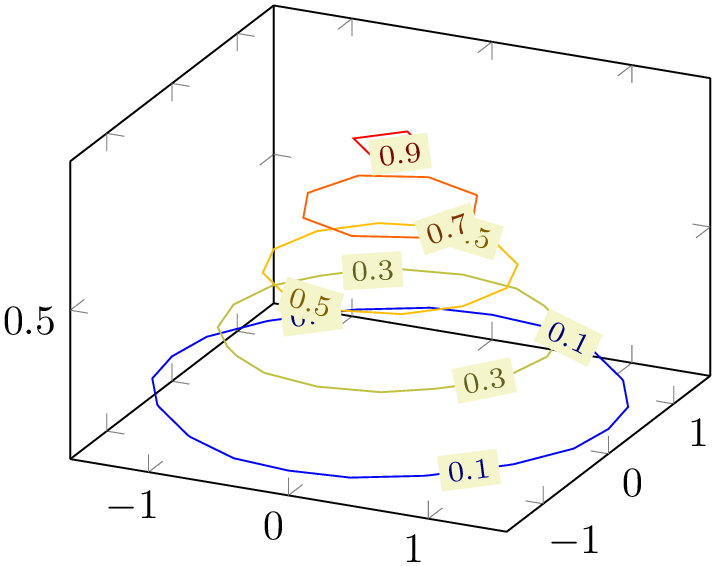
% Preamble: \pgfplotsset{width=7cm,compat=1.18}
\begin{tikzpicture}
\begin{axis}
\addplot3 [
contour lua
] {exp(0-x^2-y^2)};
\end{axis}
\end{tikzpicture}
As mentioned, you can use any of the pgfplots input methods as long as it yields matrix output. Thus, we can reuse our introductory example of matrix data, this time with inline data:
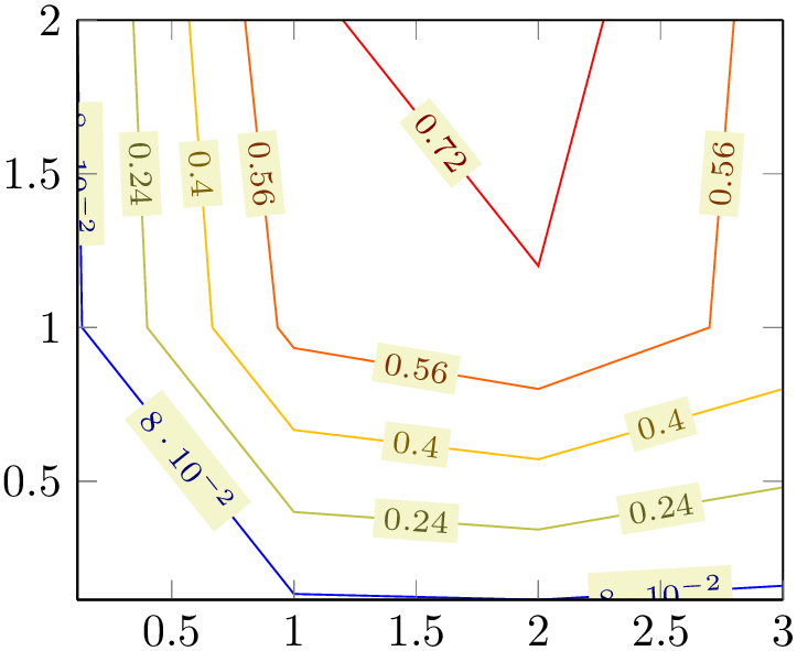
% Preamble: \pgfplotsset{width=7cm,compat=1.18}
\begin{tikzpicture}
\begin{axis}[view={0}{90}]
\addplot3 [
contour lua
] coordinates {
(0,0,0) (1,0,0) (2,0,0) (3,0,0)
(0,1,0) (1,1,0.6) (2,1,0.7) (3,1,0.5)
(0,2,0) (1,2,0.7) (2,2,0.8) (3,2,0.5)
};
\end{axis}
\end{tikzpicture}
What happens behind the scenes is that pgfplots takes the input matrix and writes all
encountered coordinates to a temporary file, including the end-of-scanline markers. Then, it generates a small
lua script and invokes a lua algorithm to compute the contour coordinates, writing everything into a
temporary output file. Afterwards, it includes lua’s output file just as if you’d write
\addplot3[contour prepared] file { temporaryfile
 };.
};.
All this invocation of lua, including input/output file management is transparent to the user. It only requires two things: first of all, it requires matrix data as input.29
The contouring algorithm of contour lua accepts \((x,y,z)\) and, in addition the point meta. Its contour information is always based on point meta. Usually, point meta and \(z\) are the same. But it is also possible to use a different point meta:
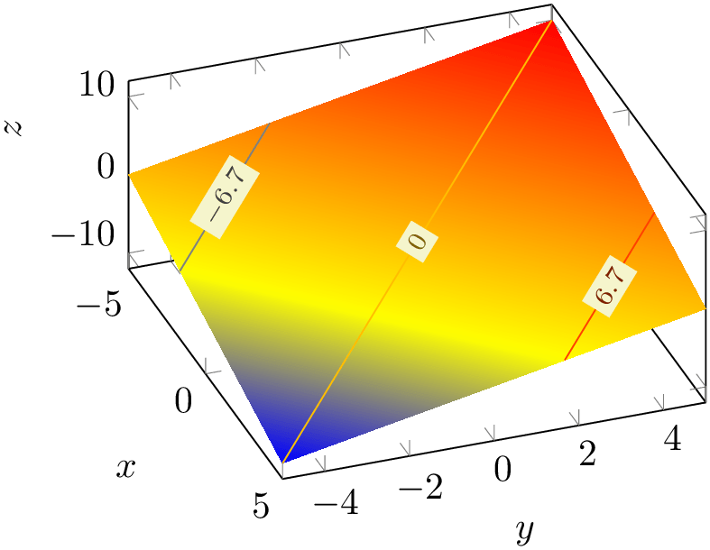
% Preamble: \pgfplotsset{width=7cm,compat=1.18}
\begin{tikzpicture}
\begin{axis}[
xlabel={$x$}, ylabel={$y$}, zlabel={$z$},
view/h=70,
view/v=50,
]
% z= -x+y
\addplot3[surf,samples=2,shader=interp]
table {
                      x       y
                          z
-5 -5 0
5 -5 -10
-5 5 10
5 5 0
};
% same data, but with contour
% and color data v= x+y :
\addplot3[
contour lua={number=3},
point meta=\thisrow{v},
]
table {
                      x       y
                          z         v
                      -5      -5      0
                           -10
                       5      -5      -10
                         0
                      -5       5      10
                          0
                       5       5      0
                           10
};
\end{axis}
\end{tikzpicture}
The resulting data can be projected onto a separate slice, for example using z filter.
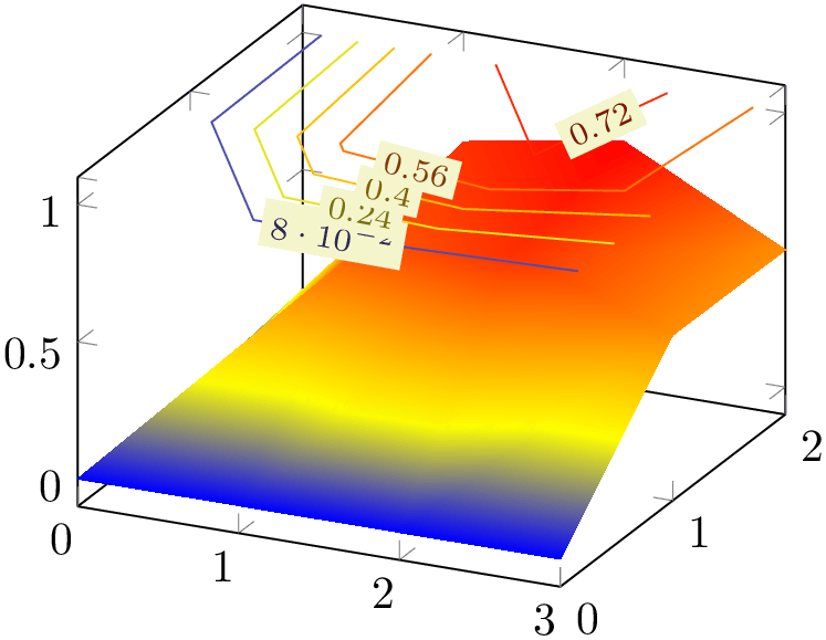
% Preamble: \pgfplotsset{width=7cm,compat=1.18}
\begin{tikzpicture}
\begin{axis}
\addplot3 [
surf,
shader=interp
] coordinates {
(0,0,0) (1,0,0) (2,0,0) (3,0,0)
(0,1,0) (1,1,0.6) (2,1,0.7) (3,1,0.5)
(0,2,0) (1,2,0.7) (2,2,0.8) (3,2,0.5)
};
\addplot3 [
contour lua,
z filter/.code={\def\pgfmathresult{1}},
] coordinates {
(0,0,0) (1,0,0) (2,0,0) (3,0,0)
(0,1,0) (1,1,0.6) (2,1,0.7) (3,1,0.5)
(0,2,0) (1,2,0.7) (2,2,0.8) (3,2,0.5)
};
\end{axis}
\end{tikzpicture}
There are several fine-tuning parameters of the input/output file management, and it is even possible to invoke different programs than lua (see contour gnuplot). These details are discussed at the end of this section.
-
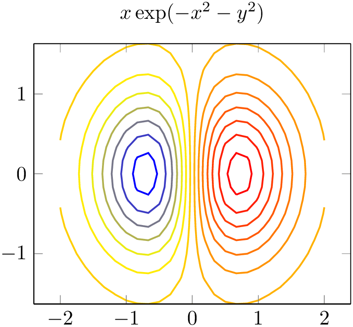
/pgfplots/contour/number={
 integer
 } (initially 5)
Configures the number of contour lines which should be produced by any contouring algorithm. The value is applied to both contour lua and contour filled.
% Preamble: \pgfplotsset{width=7cm,compat=1.18}
\begin{tikzpicture}
\begin{axis}[
title={$x \exp(-x^2-y^2)$},
domain=-2:2,enlarge x limits,
view={0}{90},
]
\addplot3 [
contour lua={number=14, labels=false},
thick,
] {exp(-x^2-y^2)*x};
\end{axis}
\end{tikzpicture}
It is also possible to change the /pgf/number format settings, see the documentation for the contour/every contour label style below.
Note that contour/number has no effect on contour prepared.
-
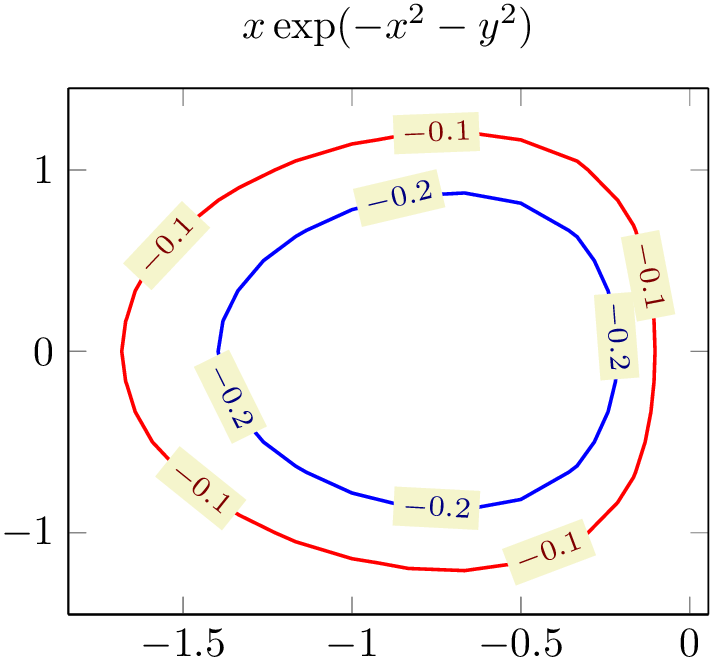
/pgfplots/contour/levels={
 list of levels
 } (initially empty)
Configures the number of contour lines which should be produced by any contouring algorithm by means of a list of discrete levels.
% Preamble: \pgfplotsset{width=7cm,compat=1.18}
\begin{tikzpicture}
\begin{axis}[
title={$x \exp(-x^2-y^2)$},
domain=-2:2,
enlargelimits,
view={0}{90},
]
\addplot3 [
contour lua={levels={-0.1,-0.2,-0.6}},
thick,
] {exp(-x^2-y^2)*x};
\end{axis}
\end{tikzpicture}
It is also possible to change the /pgf/number format settings, see the documentation for the contour/every contour label style below.
This key has higher precedence than contour/number, i.e. if both are given, contour/levels will be active.
Note that contour/levels has no effect on contour prepared.
-
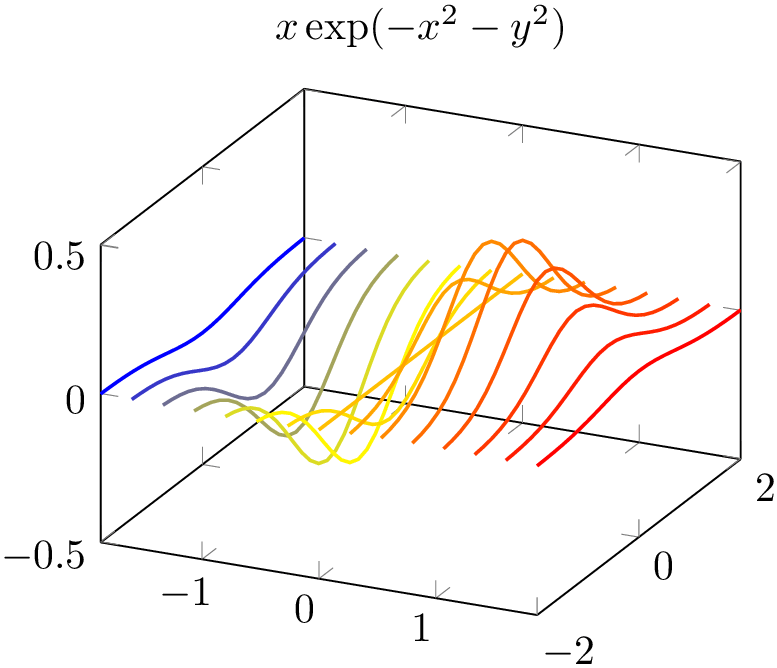
/pgfplots/contour/contour dir=x|y|z (initially z) 
Note: The key contour dir was introduced in order to support external contouring algorithms which operate on three coordinates (like contour gnuplot). However, contour lua operates on \((x,y,z)\) and point meta and can achieve the same effect using point meta=x! Thus, this key has become of less importance since contour lua.
This key allows to generate contours with respect to another direction.
% Preamble: \pgfplotsset{width=7cm,compat=1.18}
\begin{tikzpicture}
\begin{axis}[
title={$x \exp(-x^2-y^2)$},
domain=-2:2,
]
\addplot3 [
contour lua={
contour dir=x,
labels=false,
number=15,
},
thick,
] {exp(-x^2-y^2)*x};
\end{axis}
\end{tikzpicture}
The input data is the same as before – it has to be given in matrix form. The key contour dir configures the algorithm to compute contours along the provided direction.
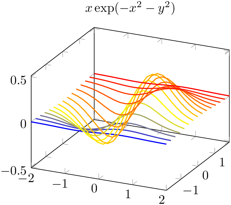
% Preamble: \pgfplotsset{width=7cm,compat=1.18}
\begin{tikzpicture}
\begin{axis}[
title={$x \exp(-x^2-y^2)$},
domain=-2:2,
]
\addplot3 [
contour lua={
contour dir=y,
labels=false,
number=15,
},
thick,
] {exp(-x^2-y^2)*x};
\end{axis}
\end{tikzpicture}
This function is also available for parameterized surfaces.
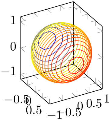
% Preamble: \pgfplotsset{width=7cm,compat=1.18}
\begin{tikzpicture}
\begin{axis}[view={60}{30},axis equal image]
\addplot3 [
contour lua={
contour dir=x,
number=20,
labels=false,
},
samples=30,domain=-1:1,y domain=0:2*pi,
] (
{sqrt(1-x^2) * cos(deg(y))},
{sqrt( 1-x^2 ) * sin(deg(y))},
x
);
\end{axis}
\end{tikzpicture}
Note, however, that each contour line receives a single color. This is what one expects for a contour plot: it has a single style, and a single contour level. Note furthermore that the color which is assigned to a contour plot with contour dir=x is different compared with the color assigned to a contour plot with contour dir=z: the argument of contour dir implicitly defines the argument for point meta (also known as color data). More precisely, a contour plot with contour dir=x has point meta=x whereas a contour plot with contour dir=z uses point meta=z.
If you would like to have individually colored segments inside of contours, you have to use a different plot handler. There is a simple alternative which works well in many cases: you can use a standard mesh plot combined with patch type=line:
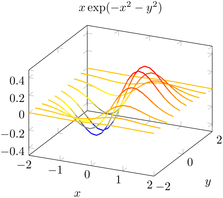
% Preamble: \pgfplotsset{width=7cm,compat=1.18}
\begin{tikzpicture}
\begin{axis}[
title={$x \exp(-x^2-y^2)$},
domain=-2:2,
xlabel=$x$, ylabel=$y$,
]
\addplot3 [
samples y=10,
samples=25,
mesh,
patch type=line,
thick,
] {exp(-x^2-y^2)*x};
\end{axis}
\end{tikzpicture}
Here, we did not generate a contour plot. We generated a mesh plot with patch type=line. The choice patch type=line causes an inherently one-dimensional plot as opposed to the default matrix style visualization which would be generated by mesh in different cases. Since a mesh plot uses one color for every patch segment, we have a lot of freedom to color the segments. In the example above, we have the default configuration point meta=z, i.e. the \(z\) value defines the color.
The fact that a mesh plot with patch type=line yields almost the same output as contour dir=y is an artifact of the scanline encoding. Our example uses \addplot3 expression which relies on mesh/ordering=x varies. If we visualize the resulting matrix by means of patch type=line, the visualization follows the scanlines which vary along the \(x\)-axis. In our example, we used samples y=10 to control the number of “contour lines”.
A consequence of the previous paragraph is that we have a more challenging task at hand if we want to get the same effect as contour dir=x: we would need mesh/ordering=y varies. In our case, we would need to transpose the data matrix. For \addplot3 expression, this is relatively simple: we can exchange the meaning of x and y to get a transposition:
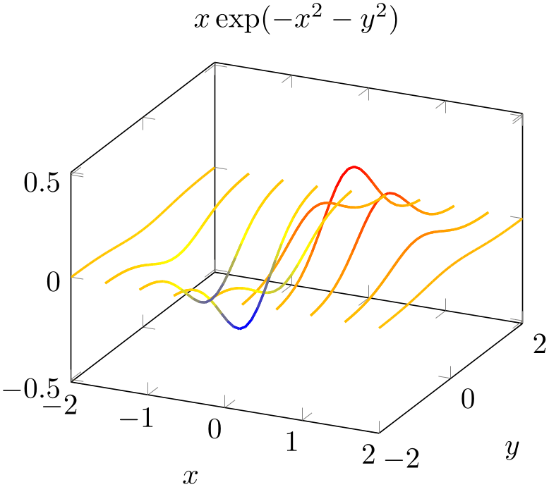
% Preamble: \pgfplotsset{width=7cm,compat=1.18}
\begin{tikzpicture}
\begin{axis}[
title={$x \exp(-x^2-y^2)$},
domain=-2:2,
xlabel=$x$,
ylabel=$y$,
]
\addplot3 [
samples y=10,
samples=25,
mesh,
patch type=line,
thick,
] (y,x,{exp(-x^2-y^2)*y});
\end{axis}
\end{tikzpicture}
This is the same example as above – but as you noted, the meaning of x and y in the expression has been exchanged and the notation has been switched to a parametric plot. Such an approach is also possible for data files, but pgfplots cannot transpose the matrix ordering on its own.
Coming back to contour dir, we can also use its output to generate several contour projections using coordinate filters.
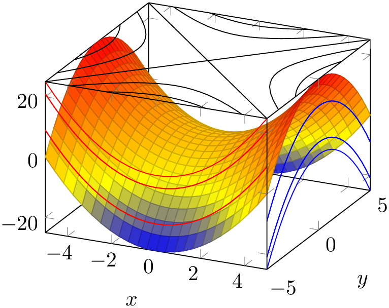
% Preamble: \pgfplotsset{width=7cm,compat=1.18}
\begin{tikzpicture}
\begin{axis}[
xlabel=$x$,ylabel=$y$,
enlargelimits=false,
3d box=complete,
]
\addplot3 [surf] {x^2-y^2};
\addplot3 [
contour lua={contour dir=y,
draw color=red,labels=false},
y filter/.expression={-5},
] {x^2-y^2};
\addplot3 [
contour lua={contour dir=x,
draw color=blue,labels=false},
x filter/.expression={5},
] {x^2-y^2};
\addplot3 [
contour lua={contour dir=z,
draw color=black,labels=false},
z filter/.expression={25},
] {x^2-y^2};
\end{axis}
\end{tikzpicture}
The preceding example uses a fixed draw color combined with x filter, y filter, and z filter to fix the contours in one of the axis planes.
This section is probably unnecessary and can be skipped. The key contour dir is implemented by means of coordinate permutations. Since contouring algorithms always support contour dir=z, it is relatively simple to compute \(z\)–contour lines from input matrixes \(X, Y, Z\). The choice contour dir=z key simply takes the input as is. The choice contour dir=x reorders the input coordinates to yzx. The choice contour dir=y reorders the input coordinates to xzy. All this reordering is applied before coordinates are handed over to the contouring algorithm (see contour external) and is undone when reading the results back from the contouring algorithm. That means that contour dir is also available for contour prepared. In this context, contour prepared is supposed to be the output of some contouring algorithm. Its input coordinates are automatically reordered according to the inverse permutation. This allows to draw \(x\) or \(y\) contours which are given in the prepared format.
-
/pgfplots/contour gnuplot={
 options with ‘contour/’ or ‘contour external/’ prefix
 }
}
-
\addplot+[ contour gnuplot={
 options with ‘contour/’ or ‘contour external/’ prefix
 }]
}]
-
1. install gnuplot on your system.
-
2. Ensure that you can invoke gnuplot from a terminal (like cmd.exe or bash). To this end, you will need to add gnuplot to the PATH environment variable.
-
3. When invoking pdflatex, you need to enable system calls.
For TeXLive, this is pdflatex -shell-escape. For MiKTeX, the system uses pdflatex -enable-write18 . Some TeX distributions require you to use two slashes for the option.
This is a high level contour plot interface. It expects matrix data in the same way as two dimensional surf or mesh plots do. It then computes contours and visualizes them. The handler contour gnuplot works in the very same way as contour lua and produces results of comparable quality. All the keys and examples mentioned above apply for contour gnuplot as well. However, you necessarily need to apply the following steps before you can use contour gnuplot:
See also the documentation for plot gnuplot for a related section.
The usage is the same as for contour lua, so please refer to the contour lua and its examples.
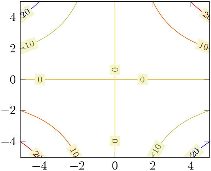
% Preamble: \pgfplotsset{width=7cm,compat=1.18}
\begin{tikzpicture}
\begin{axis}[view={0}{90}]
\addplot3 [
contour gnuplot
] {x*y};
\end{axis}
\end{tikzpicture}
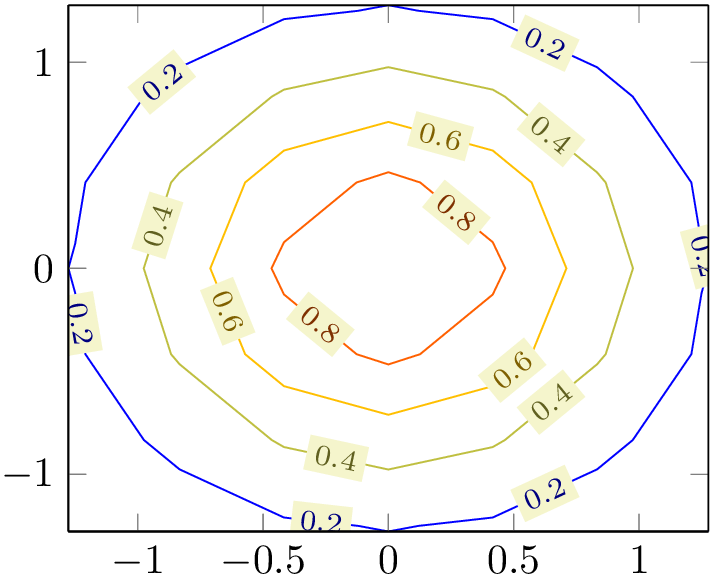
% Preamble: \pgfplotsset{width=7cm,compat=1.18}
\begin{tikzpicture}
\begin{axis}[view={0}{90}]
\addplot3 [
contour gnuplot={number=6}
] {exp(-x^2-y^2)};
\end{axis}
\end{tikzpicture}
-
/pgfplots/contour prepared={
 options with ‘contour/’ prefix
 }
}
-
\addplot+[contour prepared={
 options with ‘contour/’ prefix
 }]
}]
-
/pgfplots/contour prepared format=standard|matlab (initially standard) 
-
/pgfplots/contour/draw color={
 color
color } (initially mapped color)
-
/pgfplots/contour/labels={
 true,false
 } (initially true)
-
/pgfplots/contour lua/corners=true|false (initially false) 
-
/pgfplots/contour/label distance={
 dimension
 } (initially 70pt)
-
/pgfplots/contour/every contour plot(style, no value) 
-
/pgfplots/contour/every contour label(style, no value) 
-
/pgfplots/contour/contour label style={
 key-value-list
 }
}
-
/pgfplots/contour/labels over line(style, no value) 
-
/pgfplots/contour/handler(style, no value) 
A plot handler which expects already computed contours on input and visualizes them. It cannot compute contours on its own.
There are two accepted input formats. The first is a long sequence of coordinates of the form \((x,y,z)\) where all successive coordinates with the same \(z\) value make up a contour level (this is only part of complete truth, see below). The end-of-scanline markers (empty lines in the input) mark an interruption in one contour level.
For example, contour prepared format=standard could be30
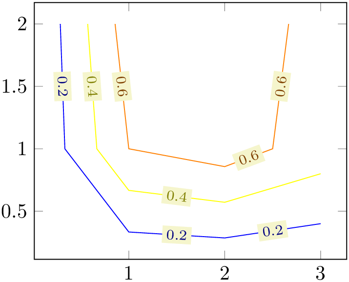
% Preamble: \pgfplotsset{width=7cm,compat=1.18}
\begin{tikzpicture}
\begin{axis}
\addplot [contour prepared] table {
                                2
                                  2
                                  0.8
                                0.857143    2
                                  0.6
                                1
                                  1
                                  0.6
                                2
                                  0.857143    0.6
                                2.5
                                1
                                  0.6
                                2.66667     2
                                  0.6
                                0.571429    2
                                  0.4
                                0.666667    1
                                  0.4
                                1
                                  0.666667    0.4
                                2
                                  0.571429    0.4
                                3
                                  0.8
                                0.4
                                0.285714    2
                                  0.2
                                0.333333    1
                                  0.2
                                1
                                  0.333333    0.2
                                2
                                  0.285714    0.2
                                3
                                  0.4
                                0.2
};
\end{axis}
\end{tikzpicture}
Note that the empty lines are not necessary in this case: empty lines make only a difference if they occur within the same contour level (i.e. if the same \(z\) value appears above and below of them).
The choice contour prepared format=matlab expects two-dimensional input data where the contour level and the number of elements of the contour line are provided as \(x\)- and \(y\)-coordinates, respectively, of a leading point. Such a format is used by matlab’s contour algorithms, i.e. it resembles the output of the Matlab commands data=contour(...) or data=contourc(...).
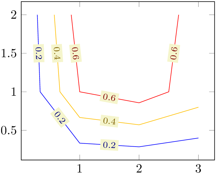
% Preamble: \pgfplotsset{width=7cm,compat=1.18}
\begin{tikzpicture}
\begin{axis}
\addplot [
contour prepared,
contour prepared format=matlab,
] table {
% (0.2,5) ==> contour `0.2' (x), 5 points follow (y):
2.0000000e-01 5.0000000e+00
3.0000000e+00 4.0000000e-01
2.0000000e+00 2.8571429e-01
1.0000000e+00 3.3333333e-01
3.3333333e-01 1.0000000e+00
2.8571429e-01 2.0000000e+00
% (0.4,5) ==> contour `0.4', consists of 5 points
4.0000000e-01 5.0000000e+00
3.0000000e+00 8.0000000e-01
2.0000000e+00 5.7142857e-01
1.0000000e+00 6.6666667e-01
6.6666667e-01 1.0000000e+00
5.7142857e-01 2.0000000e+00
% (0.6,6) ==> contour `0.6', has 6 points
6.0000000e-01 6.0000000e+00
2.6666667e+00 2.0000000e+00
2.5000000e+00 1.0000000e+00
2.0000000e+00 8.5714286e-01
1.0000000e+00 1.0000000e+00
1.0000000e+00 1.0000000e+00
8.5714286e-01 2.0000000e+00
};
\end{axis}
\end{tikzpicture}
In case you use Matlab, you can generate such data with
[x,y]=meshgrid(linspace(0,1,15));
data=contour(x,y,x.*y);
data=data';
save 'exporteddata.dat' data -ASCII
As already mentioned in the beginning, the \(z\)-coordinate is not necessarily the coordinate used to delimit contour levels. In fact, the point meta data is acquired here, i.e. you are free to use whatever \(z\) coordinate you want as long as you have a correct point meta value. The example from above could be modified as follows:
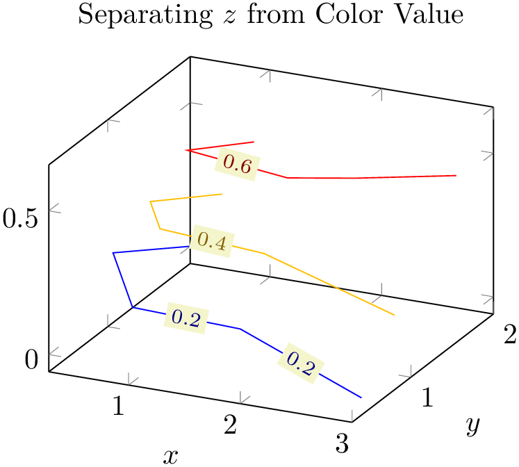
% Preamble: \pgfplotsset{width=7cm,compat=1.18}
\begin{tikzpicture}
\begin{axis}[
                        title=Separating $z$ from Color
                    Value,
xlabel=$x$,
ylabel=$y$,
]
\addplot3 [
contour prepared,
point meta=\thisrow{level},
] table {
                            x
                            y
                            z       level
                            0.857143  2
                            0.4     0.6
                            1         1
                            0.6     0.6
                            2
                            0.857143  0.6     0.6
                            2.5       1
                            0.6     0.6
                            2.66667   2
                            0.4     0.6
                            0.571429  2
                            0.2     0.4
                            0.666667  1
                            0.4     0.4
                            1
                            0.666667  0.4     0.4
                            2
                            0.571429  0.4     0.4
                            3         0.8
                          0.2     0.4
                            0.285714  2
                            0       0.2
                            0.333333  1
                            0.2     0.2
                            1
                            0.333333  0.2     0.2
                            2
                            0.285714  0.2     0.2
                            3         0.4
                          0       0.2
};
\end{axis}
\end{tikzpicture}
The example above uses different \(z\)-coordinates for each first and each last point on contour lines. The contour lines as such are defined by the level column since we wrote point meta=\thisrow{level}. Such a feature also allows contour prepared for nonstandard axes, compare the examples for the ternary lib at 1321.
Defines the draw color for every contour. Note that only mapped color actually depends on the contour level.
A detail option for contour lua which allows to modify how sharp corners in the input data are handled by the contouring algorithm. The choice corners=true adds more points to the contour lines (“corners”).
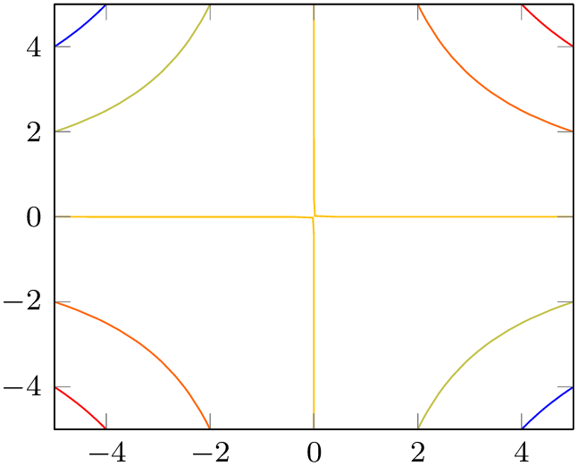

% Preamble: \pgfplotsset{width=7cm,compat=1.18}
\begin{tikzpicture}
\begin{axis}[view={0}{90},small]
\addplot3 [
contour lua={corners,labels=false}
] {x*y};
\end{axis}
\end{tikzpicture}
~
\begin{tikzpicture}
\begin{axis}[view={0}{90},small]
\addplot3 [
contour lua={labels=false}
] {x*y};
\end{axis}
\end{tikzpicture}
Configures the distance between adjacent contour labels within the same contour level.
A style which is installed as soon as either contour or contour external is set.
The initial value is
Allows to
customize contour labels. The preferred way to change this style is the
contour label style={ options
 } method, see below.
The initial value is
\pgfplotsset{
contour/every contour label/.style={
sloped,
transform shape,
inner sep=2pt,
every node/.style={mapped color!50!black,fill=white},
/pgf/number format/relative={\pgfplotspointmetarangeexponent},
},
}
Note that \pgfplotspointmetarangeexponent\(=e\) where \(\pm m \cdot 10^e\) is the largest occurring label value (technically, it is the largest occurring value of point meta).
The following example modifies the /pgf/number format styles for contour labels:
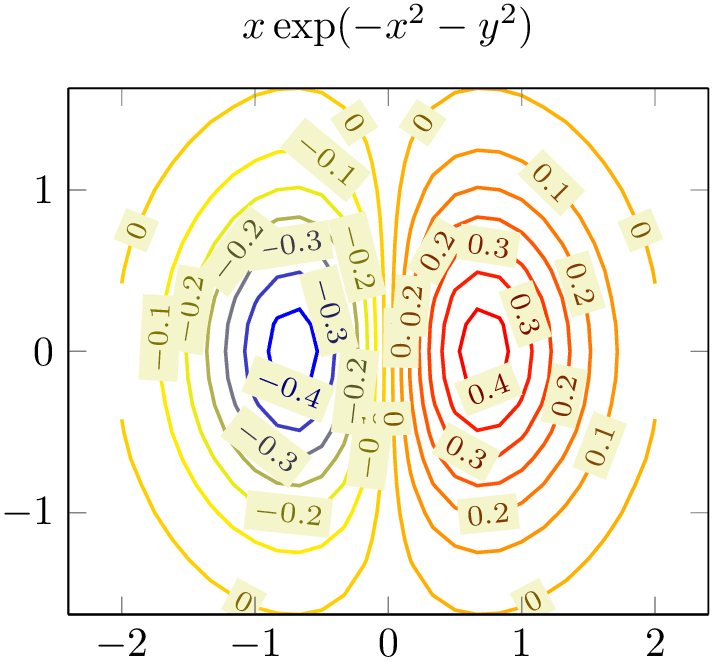
% Preamble: \pgfplotsset{width=7cm,compat=1.18}
\begin{tikzpicture}
\begin{axis}[
title={$x \exp(-x^2-y^2)$},
domain=-2:2,enlarge x limits,
view={0}{90},
]
\addplot3 [
contour lua={
scanline marks=required,
number=14,
contour label style={
/pgf/number format/fixed,
/pgf/number format/precision=1,
},
},
thick,
] {exp(0-x^2-y^2)*x};
\end{axis}
\end{tikzpicture}
An
abbreviation for
contour/every contour label/.append style={ key-value-list
 }.
}.
It appends options to the already existing style contour/every contour label.
A style which changes every contour label such that labels are right over the lines, without fill color.
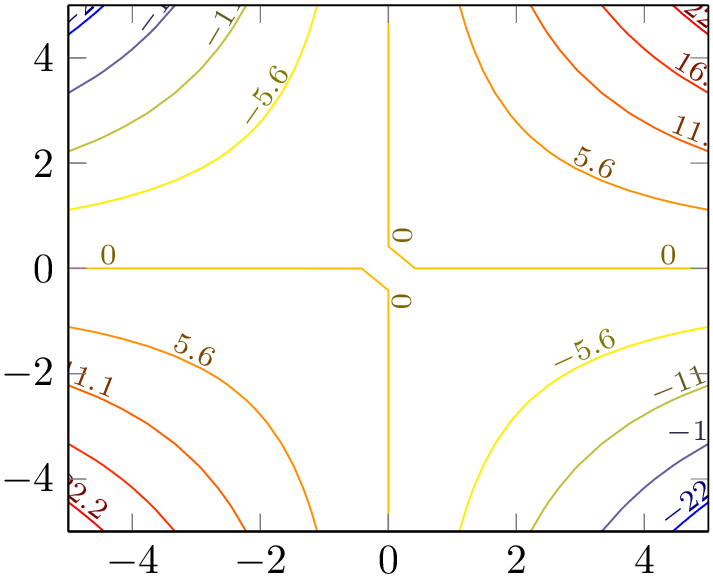
% Preamble: \pgfplotsset{width=7cm,compat=1.18}
\begin{tikzpicture}
\begin{axis}[view={0}{90}]
\addplot3 [
contour lua={
labels over line,
number=9,
},
] {x*y};
\end{axis}
\end{tikzpicture}
Allows to modify the plot handler which connects the points of a single contour level.
The initial value is
but a useful alternative might be the smooth handler:
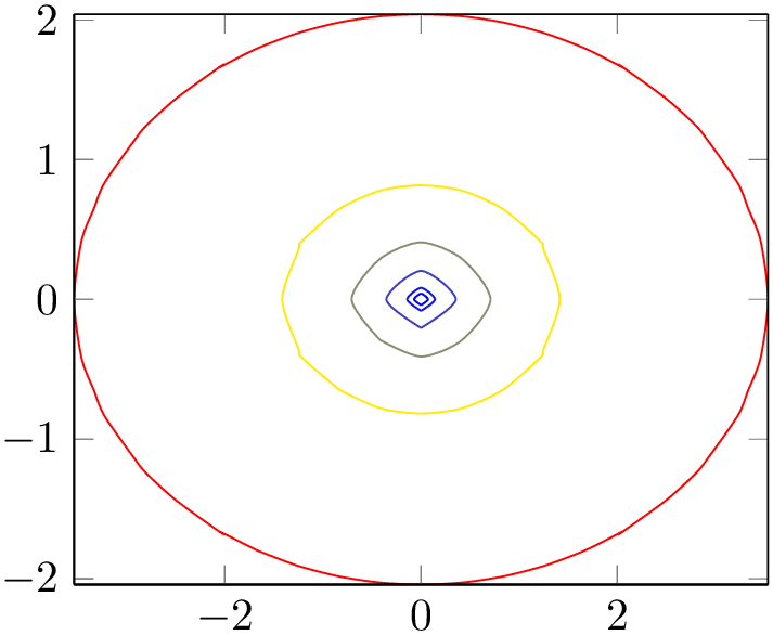
% Preamble: \pgfplotsset{width=7cm,compat=1.18}
\begin{tikzpicture}
\begin{axis}[view={0}{90}]
\addplot3 [
contour lua={
levels={0.1,0.2,0.5,1,2,5},
labels=false,
handler/.style=smooth,
},
] {2*sqrt(x^2+y^2+(-0.5*(x^2-y^2)))};
\end{axis}
\end{tikzpicture}
Unfortunately, the TikZ handler smooth has its limitations for such plots, you may need to play around with the number of samples.
-
/pgfplots/contour external={
 options with ‘contour/’ or ‘contour external/’ prefix
 }
}
-
\addplot+[ contour external={
 options with ‘contour/’ or ‘contour external/’ prefix
 }]
}]
-
/pgfplots/contour external/file={
 base file name
 } (initially empty)
-
/pgfplots/contour external/scanline marks=false|if in input|required|true (initially if in input) 
-
/pgfplots/contour external/script={
 code for external program
 } (initially empty)
-
/pgfplots/contour external/script input format=x y meta meta|x y z meta (initially x y meta meta) 
-
/pgfplots/contour external/script type=system call|lua (initially system call) 
-
/pgfplots/contour external/script extension={
 extension
 } (initially script)
-
/pgfplots/contour external/cmd={
 system call
 } (initially empty)
-
/pgfplots/contour external/output point meta={
 point meta read from result of external tool
 } (initially empty)
-
/pgfplots/contour gnuplot(style, no value)
This handler constitutes a generic interface to external programs to compute contour lines. The contour gnuplot method is actually a special case of contour external. At the time of this writing, even contour lua is a special case of contour external.
The initial configuration is to automatically generate a unique file name.
Controls how contour external writes end-of-scanline markers.
The choice false writes no such markers at all. In this case, script should contain mesh/rows and/or mesh/cols.
The choice if in input generates end-of-scanline markers if they appear in the provided input data (either as empty lines or if the user provided at least two of the three options mesh/rows, mesh/cols, or mesh/num points explicitly).
The choice required works like if in input, but it will fail unless there really was such a marker.
The choice true is an alias for required.
Provides template
code to generate a script for the external program. Inside of
 code for external program
 , the placeholder \infile will expand to the temporary input file and \outfile to the temporary
output file. The temporary \infile is a text file containing one point on each line, in the specified by
script input format, separated by tabstops. Whenever a scanline is complete, an
empty line is issued (but only if these scanline
markers are found in the input stream as well). The complete set of scanlines forms a matrix. There are no additional
comments or extra characters in the file. The macro \ordering will expand to 0 if the matrix is
stored in
mesh/ordering=x
varies
and \ordering will be 1 for
mesh/ordering=y
varies.
Inside of
 code for external program
 , you can also use
\pgfkeysvalueof{/pgfplots/mesh/rows}
and
\pgfkeysvalueof{/pgfplots/mesh/cols}; they expand to the matrix’ size. Similarly,
\pgfkeysvalueof{/pgfplots/mesh/num points}
expands to the total number of points.
Inside of
 code for external program
 , the macro \thecontournumber is defined to be the value
\pgfkeysvalueof{/pgfplots/contour/number}
and \thecontourlevels contains the value
\pgfkeysvalueof{/pgfplots/contour/levels}. These two macros simplify conditional code.
If you need one of the characters ["|;:#'`] and some macro package already uses the character for other purposes, you can prepend them with a backslash, i.e. write \" instead of ".
Defines what kind of input file the external script expects. Usually, contouring algorithms expect three coordinates and the last one is the one to which the contour computation is applied. Such algorithms need x y meta meta and the last coordinate needs to be ignored.
However, there it is possible to define contour algorithms which expect four input coordinates (x,y,z,meta) where the fourth coordinate defines the contour level. In such a case, you have to use x y z meta as choice. A related key is output point meta in this context.
Allows to define the type of script. The choice system call invokes an external program. The choice lua writes the script into a lua file and invokes the lua interpreter. This is only supported if you use lualatex instead of pdflatex. It is unrelated to lua backend.
A template to
generate system calls for the external program. Inside of
 system call
 , you may use \script as placeholder for the filename which contains the result of
contour external/script and
\scriptbase as placeholder for the same, but without file extension.
Allows to customize the point meta configuration which is applied to the result of the external tool.
In contour external, the value of point meta is used to generate the input \(z\)-coordinate for the external tool.
As soon as the external tool computed contour lines, its output is read and interpreted as contour lines – and the value of output point meta determines the value of point meta which will be used to visualize the result.
An empty value means to use the \(z\)-coordinate returned by the external tool.
Any other value is interpreted as a valid choice of point meta.
The initial configuration is
\pgfplotsset{
contour gnuplot/.style={
contour external={
script={
                                        unset
                        surface;
\ifx\thecontourlevels\empty
                                        set
                        cntrparam levels \thecontournumber;
\else
                                        set
                        cntrparam levels discrete \thecontourlevels;
\fi
                                        set
                        contour;
                                        set
                        table \"\outfile\";
                                        splot
                        \"\infile\";
},
                                    cmd={gnuplot
                        \"\script\"},
#1,%
},
},
}
Note that contour gnuplot requires explicit scanline markers in the input stream, and it assumes mesh/ordering=x varies.
Note that contour external lacks the intelligence to detect changes; it will always regenerate the output (unless the -shell-escape feature is not active).
29 Note that contour lua processes the input stream only once. Consequently, the temporary file will contain only information which was available before the first point has been seen. The example above works because it contains emptylines as end-of-scanline markers. If you do not provide such markers, you may need to provide two of the three options mesh/rows, mesh/cols, or mesh/num points.
30 This is actually the output from our \addplot3[contour gnuplot] coordinates example from above.
4.6.9Filled Contour Plots
pgfplots is able to generate contour filled plots with its built-in arithmetics.
-
/pgfplots/contour filled={
 options with ‘contour/’ prefix
 }
}
-
\addplot+[ contour filled={
 options with ‘contour/’ prefix
 }]
}]
The following paragraph makes uses of pdf features which are unsupported by some free viewers (including pdf.js and evince). Please resort to a suitable viewer if you see unexpected results.
This plot handler visualizes patches or surfaces by means of filled segments: points on the surface will be colored based on their point meta value. The point meta value is mapped into a sequence of intervals, and each interval has its own color. The intervals, in turn, are part of a colormap.
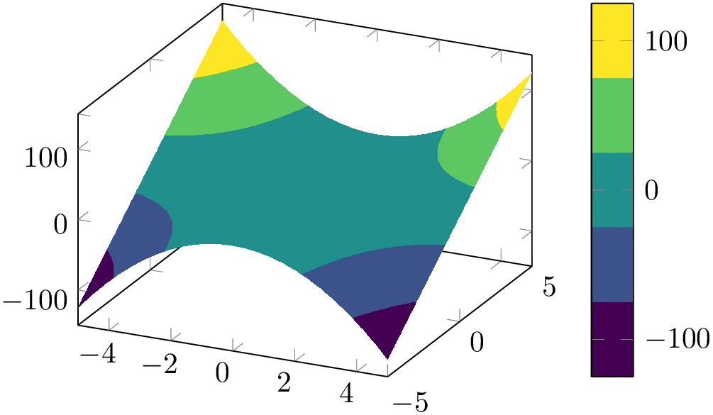
% Preamble: \pgfplotsset{width=7cm,compat=1.18}
\begin{tikzpicture}
\begin{axis}[colormap name=viridis,colorbar]
                          \addplot3
                  [contour filled] {x^2*y};
\end{axis}
\end{tikzpicture}
The number of contour levels is defined by means of contour/number, just as for contour external:
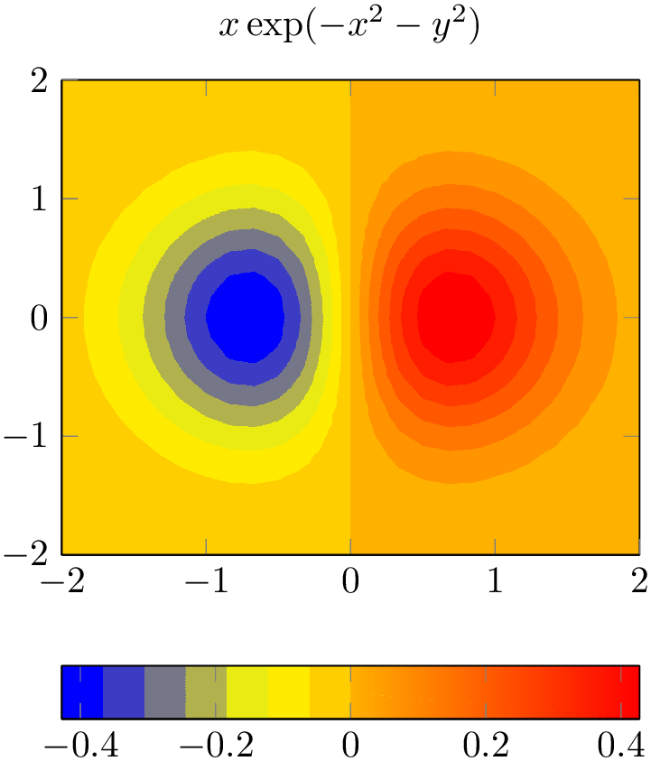
% Preamble: \pgfplotsset{width=7cm,compat=1.18}
\begin{tikzpicture}
\begin{axis}[
title={$x \exp(-x^2-y^2)$},
domain=-2:2,
view={0}{90},
colorbar horizontal,
]
\addplot3 [
contour filled={
number=14,
},
] {exp(-x^2-y^2)*x};
\end{axis}
\end{tikzpicture}
In addition to selecting a number of contour levels, you can select a predefined list of levels:
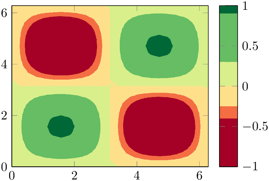
% Preamble: \pgfplotsset{width=7cm,compat=1.18}
\begin{tikzpicture}
\begin{axis}[colormap/RdYlGn,colorbar, view={0}{90}]
                          \addplot3
                  [domain=0:2*pi,trig format plots=rad,
contour filled={
levels={-0.4,-0.25,0,0.3,0.9}
},
] {sin(x)*sin(y)};
\end{axis}
\end{tikzpicture}
A filled contour plot merely affects the appearance of patch segments, so you can easily adopt axis options like view.
pgfplots implements the plot handler contour filled in almost the same way as surf: it expects the very same input format (i.e. coordinates in matrix form from any supported coordinate input stream) and expects numeric point meta. In order to determine the correct color, pgfplots evaluates point meta for each encountered vertex in the input matrix and interpolates any values of point meta on mesh segments. The interpolation scheme is normally linear, but you can write patch type=bilinear if you want bilinear interpolation of point meta (higher quality somewhat bigger output files; we come back to this at the end of this plot handler). Finally, each interpolated point meta is mapped into a colormap using colormap access=const.
The colormap in question is specific to contour filled: it is defined after the survey phase and is called internal:contourfilled. It is created using the of colormap functionality (see its reference for details). pgfplots uses target pos min and target pos max to ensure that the resulting colormap fits into the range point meta min\(:\)point meta max.
-
/pgfplots/contour/levels from colormap={
 colormap definition
 }
}
Typically, contour filled will be customized either by means of a number of contour lines or by selecting a list of prescribed levels.
However, levels from colormap is
another, highly flexible and more involved way of defining contour levels. It offers the most control over contour levels
and the associated colors, namely by adding an entire
 colormap definition
 . Such an argument must be a valid argument to
colormap={
 name
name }{
}{ colormap definition
 }. Suppose we have a water depth profile and we want to visualize it as
contour filled. In this case, we want a clear separation of “water” and “land”, but the water depth and the
land height may be asymmetric. In order to use different color maps for water and for land, we can add the following
 colormap definition
 :
:
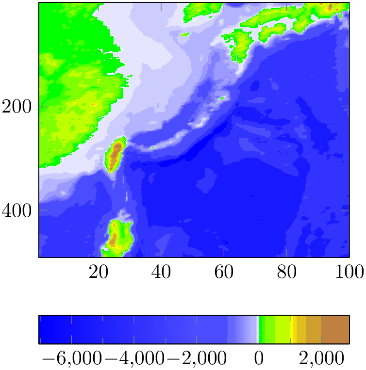
% Preamble: \pgfplotsset{width=7cm,compat=1.18}
\begin{tikzpicture}
\begin{axis}[view={0}{90},
colormap={whiteblue}{color=(blue) color=(white)},
colormap={gb}{color=(green) color=(yellow)
color=(brown)},
colorbar horizontal,
colorbar style={minor x tick num=1},
y dir=reverse,
]
\addplot3 [
contour filled={
levels from colormap={
of colormap={
whiteblue,
target pos max=,
target pos={-12000,-10000,-6000,
-5000,-3000,-1000,-750,-500,
-250,-100,-50,0}
},
of colormap={
gb,
target pos min=,
target pos={10,100,200,500,1000,
1100,1200, 1500,2000,4000,
6000,8000}
},
},
},
] table {plotdata/heightmap.dat};
\end{axis}
\end{tikzpicture}
The example is based on a
 colormap definition
 consisting of two concatenated ‘of colormap’ specifications. Furthermore, it assigns specific
target positions. The data file is in matrix form with lines of sorts X Y Z and is shipped with
pgfplots.31 The
target positions have been chosen according to the Z values present in that file – but the positions in the list
are actually beyond the range found in the data file: \(-12000\), \(-10000\), \(+4000\), \(+6000\), and \(+8000\)
have no associated data points. This is a feature of pgfplots with its
contour filled handler: it defines
target pos min and
target pos max to resemble the data
range found in the input values (more precisely: in the input values of
point meta). This ensures that the values visualized inside of the axis fit to the
colorbar without any rescaling.
Our example also clears target pos max for the right end of the first part of the definition and target pos min (the left end) for the second part of the definition. This overrides the values configured by contour filled and ensures that the concatenation works at the transition between water and land.
The colormap in question can be expressed without contour filled which shows the exact keys assigned by contour filled: the auto-generated keys are marked with ‘%<--’:

\pgfplotscolorbardrawstandalone[
colormap={whiteblue}{color=(blue) color=(white)},
colormap={gb}{color=(green)
color=(yellow) color=(brown)},
colorbar style={minor x tick num=1},
                          point meta min=-7052,               %
                      <--
                          point meta max=2895,                %
                      <--
of colormap/target pos min*=-7052, % <--
of colormap/target pos max*=2895, % <--
of colormap/sample for=const, % <--
colormap access=const, % <--
colormap={CM}{
of colormap={
whiteblue,
target pos max=,
target pos={-12000,-10000,-6000,-5000,
-3000,-1000,-750,-500,-250,-100,-50,0}
},
of colormap={
gb,
target pos min=,
target pos={10,100,200,500,1000,1100,
1200,1500,2000,4000,6000,8000}
},
},
]
See also the documentation of target pos min for details about the creation of this colormap.
Note that this specific colormap would be more descriptive if each color had its specific legend. To this end, we can employ colorbar as legend, i.e. using the following colorbar:

\pgfplotscolorbardrawstandalone[
colormap={whiteblue}{color=(blue) color=(white)},
colormap={gb}{color=(green)
color=(yellow) color=(brown)},
colorbar as legend,
colorbar style={
ticklabel style={
font=\tiny,
/pgf/number format/precision=3,
/pgf/number format/relative*=4,
},
},
point meta min=-7052,
point meta max=2895,
of colormap/target pos min*=-7052,
of colormap/target pos max*=2895,
of colormap/sample for=const,
colormap access=const,
colormap={CM}{
of colormap={
whiteblue,
target pos max=,
target pos={-12000,-10000,-6000,-5000,
-3000,-1000,-750,-500,-250,-100,-50,0}
},
of colormap={
gb,
target pos min=,
target pos={10,100,200,500,1000,1100,
1200,1500,2000,4000,6000,8000}
},
},
]
The key levels from colormap has been designed to be used in conjunction with colormap building blocks like of colormap and target pos as shown in the preceding examples: in this case, it automatically adjusts the lower end and the upper end of the positions automatically by means of target pos min. It relies on the fact that target pos min is applied to target pos.
However, levels from colormap can be used even without target pos. In this case, the upper and lower limits of the colormap are not automatically clipped to the input data range (i.e. to the range of point meta min). This is not necessarily a problem as matching the upper and lower end can be done manually:
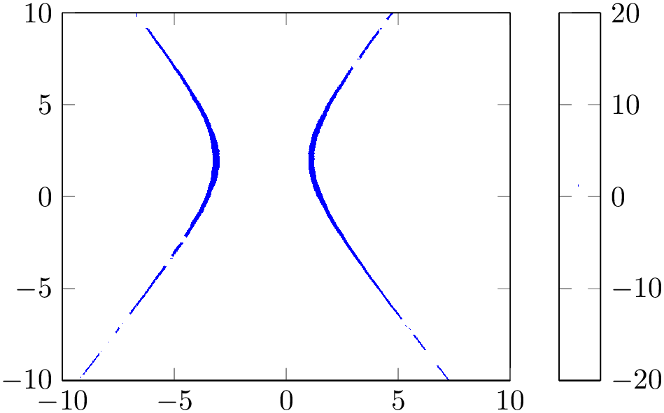
% Preamble: \pgfplotsset{width=7cm,compat=1.18}
\begin{tikzpicture}
\begin{axis}[view={0}{90},colorbar]
\addplot3 [
domain=-10:10,
contour filled={
levels from colormap={
color(-20)=(white)
color(1)=(blue)
color(1.3)=(white)
color(20)=(white)
},
},
point meta min=-20,
point meta max=20,
] {(x+1)^2/4-(y-2)^2/9};
\end{axis}
\end{tikzpicture}
The example “simulates” a normal contour plot at contour level ‘\(1\)’ using hard transitions near the critical point \(1\). Here, levels from colormap defines a special colormap which has the position range -20:20. But pgfplots does not automatically apply target pos min here, as outlined above. Instead, it assumes that the colormap is just as any other colormap and maps it linearly to point meta min\(:\)point meta max, which, in turn, is chosen from the input function. The fact that it matches to the precise contour is controlled by means of point meta min=-20 and point meta max=20; this ensures that input data range and the colormap are attached to the same scale. Note that the input function has the range \(f(x,y) \in [-16,30.2]\) for \(x,y \in [-10,10]\). 32 Here is the result together with contour lua as reference:
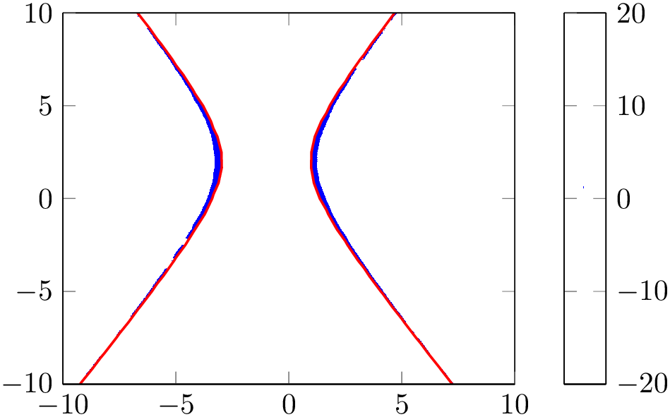
% Preamble: \pgfplotsset{width=7cm,compat=1.18}
\begin{tikzpicture}
\begin{axis}[
view={0}{90},
colorbar,
domain=-10:10,
]
\addplot3 [
contour filled={
levels from colormap={
color(-20)=(white)
color(1)=(blue)
color(1.3)=(white)
color(20)=(white)
},
},
point meta min=-20,
point meta max=20,
] {(x+1)^2/4-(y-2)^2/9};
\addplot3 [
thick,
contour lua={
draw color=red,
levels=1,
labels=false,
},
] {(x+1)^2/4-(y-2)^2/9};
\end{axis}
\end{tikzpicture}
A contour filled plot comes with the following ways to define the contour limit positions:
-
1. Defining the number of contour levels using contour/number={
 number
 },
},
-
2. Defining a prescribed list of contour/levels={
 list
list },
},
-
3. Defining the levels in levels from colormap in a suitable
 colormap definition
 ,
,
-
4. Assigning empty values to all three of the items above in which case pgfplots will use as many contour levels as there are distinct colors in the current colormap.
As already mentioned, contour filled makes use of the same routines as mesh, surf, and patch plots. In particular, it requires z buffer=sort for the same reason as the surface plots:
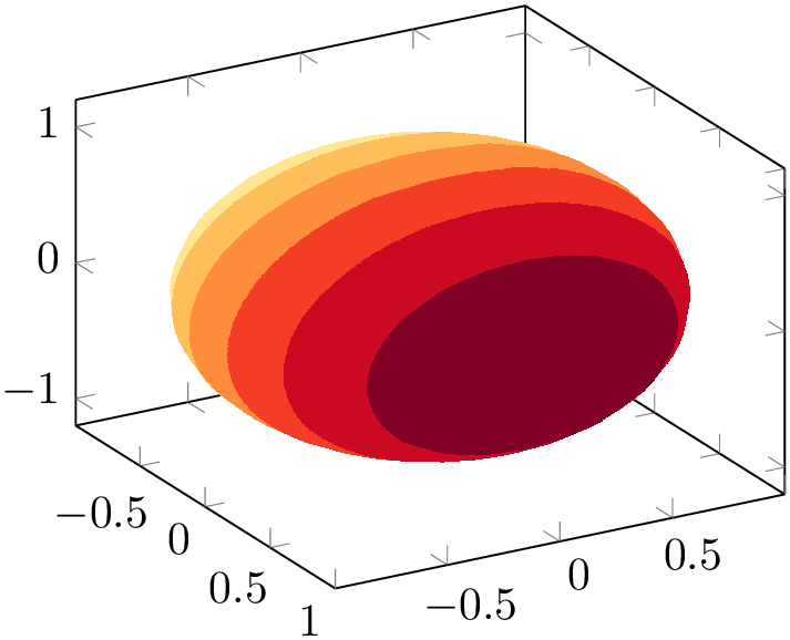
% Preamble: \pgfplotsset{width=7cm,compat=1.18}
\begin{tikzpicture}
\begin{axis}[view={60}{30},colormap/YlOrRd]
\addplot3 [
contour filled={
number=7,
},
point meta=x,
z buffer=sort,
samples=30,domain=-1:1,y domain=0:2*pi,
] (
{sqrt(1-x^2) * cos(deg(y))},
{sqrt( 1-x^2 ) * sin(deg(y))},
x
);
\end{axis}
\end{tikzpicture}
Note that contour filled only relies on point meta in order to determine contour levels. Consequently, it does not need contour dir; a simple point meta=x has the same effect (as is seen in the previous example).
A consequence of the fact that contour filled merely relies on point meta is that it supports two-dimensional plots as well, provided they have matrix structure and they provide point meta:
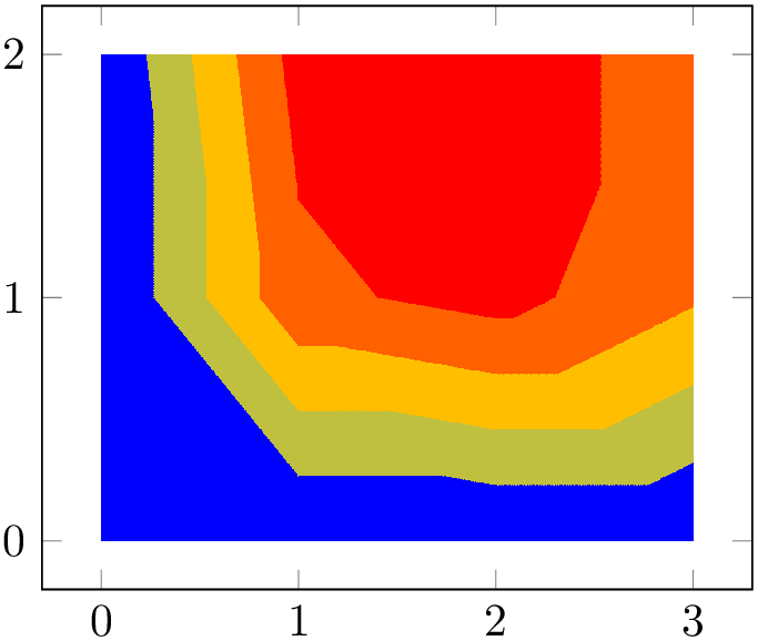
% Preamble: \pgfplotsset{width=7cm,compat=1.18}
\begin{tikzpicture}
\begin{axis}
\addplot [
contour filled,
point meta=explicit,
] coordinates {
(0,0) [0] (1,0) [0] (2,0) [0] (3,0) [0]
(0,1) [0] (1,1) [0.6] (2,1) [0.7] (3,1) [0.5]
(0,2) [0] (1,2) [0.7] (2,2) [0.8] (3,2) [0.5]
};
\end{axis}
\end{tikzpicture}
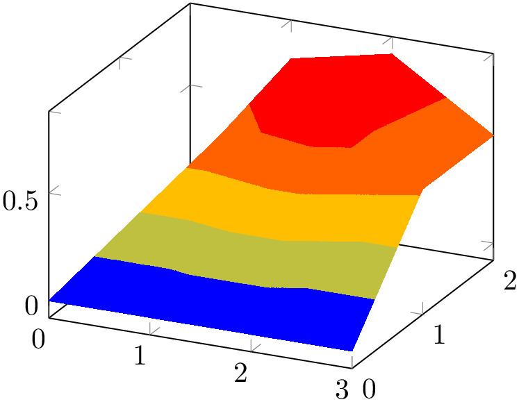
% Preamble: \pgfplotsset{width=7cm,compat=1.18}
\begin{tikzpicture}
\begin{axis}
\addplot3 [
contour filled,
] coordinates {
(0,0,0) (1,0,0) (2,0,0) (3,0,0)
(0,1,0) (1,1,0.6) (2,1,0.7) (3,1,0.5)
(0,2,0) (1,2,0.7) (2,2,0.8) (3,2,0.5)
};
\end{axis}
\end{tikzpicture}
The results of contour filled always have smooth position interpolation at any resolution. Note that the quality of edges depends on the viewer application; Acrobat Reader appears to render results with high quality. Furthermore, the quality depends on the number of input samples (as always). However, contour filled plots of coarse grained input matrices can be improved by using a better color interpolation scheme: if you add patch type=bilinear for such plots, you typically get smoother results than the default triangle-based scheme:

% Preamble: \pgfplotsset{width=7cm,compat=1.18}
% requires \usepgfplotslibrary{patchplots}
\begin{tikzpicture}
\begin{axis}
\addplot [
contour filled,
patch type=bilinear,
point meta=explicit,
] coordinates {
(0,0) [0] (1,0) [0] (2,0) [0] (3,0) [0]
(0,1) [0] (1,1) [0.6] (2,1) [0.7] (3,1) [0.5]
(0,2) [0] (1,2) [0.7] (2,2) [0.8] (3,2) [0.5]
};
\end{axis}
\end{tikzpicture}
Note that patch type=bilinear results in bigger output files and may take somewhat longer to render. It requires to load the patchplots library.
contour filled supports no contour labels and no contour outlines. Furthermore, its contour lines differ from the contours computed by contour lua.
31 Packed into the archive doc/latex/pgfplots/pgfplots.doc.src.tar.bz2. The file’s content has been imported from [5]; the precise link location is referenced in the data file itself.
32 You can play around with this example to see how the color is shifted if the ranges are not coupled.
4.6.10Parameterized Plots
Parameterized plots use the same plot types as documented in the preceding sections: both mesh and surface plots are actually special parameterized plots where \(x\) and \(y\) are on Cartesian grid points.
Parameterized plots just need a special way to provide the coordinates:

% Preamble: \pgfplotsset{width=7cm,compat=1.18}
\begin{tikzpicture}
\begin{axis}[view={60}{30}]
\addplot3+ [
domain=0:5*pi,
samples=60,
samples y=1,
] (
{sin(deg(x))},
{cos(deg(x))},
{2*x/(5*pi)}
);
\end{axis}
\end{tikzpicture}
The preceding example uses samples y=1 to indicate that a line shall be sampled instead of a matrix. The curly braces are necessary because TeX can’t nest round braces. The single expressions here are used to parameterize the helix.
Another example follows. Note that z buffer=sort is a necessary method here.
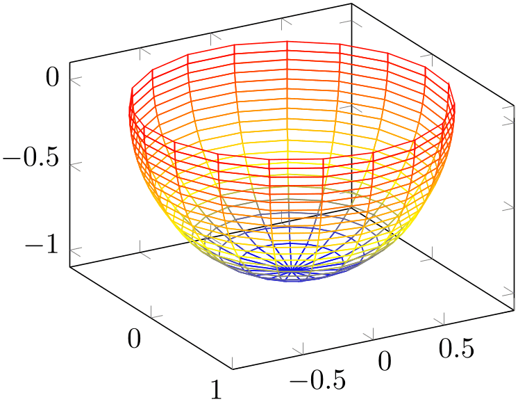
% Preamble: \pgfplotsset{width=7cm,compat=1.18}
\begin{tikzpicture}
\begin{axis}[view={60}{30}]
\addplot3 [
mesh,
z buffer=sort,
samples=20,
domain=-1:0,
y domain=0:2*pi,
] (
{sqrt(1-x^2) * cos(deg(y))},
{sqrt( 1-x^2 ) * sin(deg(y))},
x
);
\end{axis}
\end{tikzpicture}
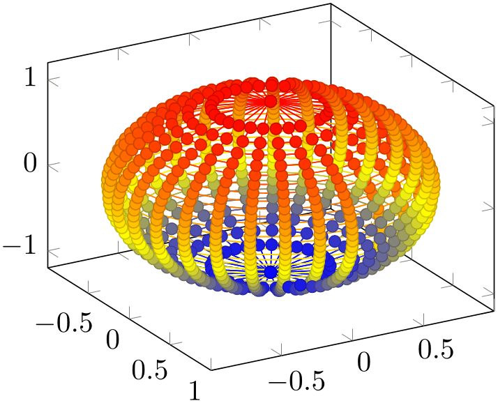
% Preamble: \pgfplotsset{width=7cm,compat=1.18}
\begin{tikzpicture}
\begin{axis}[view={60}{30}]
\addplot3 [
only marks,
mesh,z buffer=sort,
scatter,scatter src=z,
samples=30,domain=-1:1,y domain=0:2*pi,
] (
{sqrt(1-x^2) * cos(deg(y))},
{sqrt( 1-x^2 ) * sin(deg(y))},
x
);
\end{axis}
\end{tikzpicture}
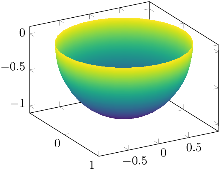
% Preamble: \pgfplotsset{width=7cm,compat=1.18}
\begin{tikzpicture}
\begin{axis}[view={60}{30},colormap/viridis]
\addplot3 [
surf,shader=interp,z buffer=sort,
samples=30,domain=-1:0,y domain=0:2*pi,
] (
{sqrt(1-x^2) * cos(deg(y))},
{sqrt( 1-x^2 ) * sin(deg(y))},
x
);
\end{axis}
\end{tikzpicture}
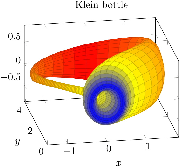
% Preamble: \pgfplotsset{width=7cm,compat=1.18}
\begin{tikzpicture}
\begin{axis}[
xlabel=$x$, ylabel=$y$,
view/h=-10,
title=Klein bottle,
]
\addplot3 [
surf,
z buffer=sort,
colormap={periodic}{
color=(blue)
color=(yellow)
color=(orange)
color=(red)
color=(orange)
color=(yellow)
color=(blue)},
domain=0:180, domain y=0:360,
samples=41, samples y=25,
variable=\u, variable y=\v,
point meta=u,
] (
{-2/15 * cos(u) * (
3*cos(v) - 30*sin(u)
+ 90 *cos(u)^4 * sin(u)
- 60 *cos(u)^6 * sin(u)
+ 5 * cos(u)*cos(v) * sin(u))
},
{-1/15 * sin(u) * (3*cos(v)
- 3*cos(u)^2 * cos(v)
- 48 * cos(u)^4*cos(v)
+ 48*cos(u)^6 *cos(v)
- 60 *sin(u)
+ 5*cos(u)*cos(v)*sin(u)
- 5*cos(u)^3 * cos(v) *sin(u)
- 80*cos(u)^5 * cos(v)*sin(u)
+ 80*cos(u)^7 * cos(v) * sin(u))
},
{2/15 * (3 + 5*cos(u) *sin(u))*sin(v)}
);
\end{axis}
\end{tikzpicture}
4.6.113D Quiver Plots (Arrows)
Three dimensional quiver plots are possible with the same interface as their two-dimensional counterparts, simply provide the third coordinate using quiver/w. Please refer to Section 4.5.8 for details and examples.
4.6.12Image (Matrix) Plots
-
/pgfplots/matrix plot(no value) 
-
\addplot+[matrix plot]
A matrix plot is very similar to a surface plot in that it produces a filled lattice of shaded rectangles. The key difference is that a surface plot expects the corners as input whereas a matrix plot expects the cell mid points as input:
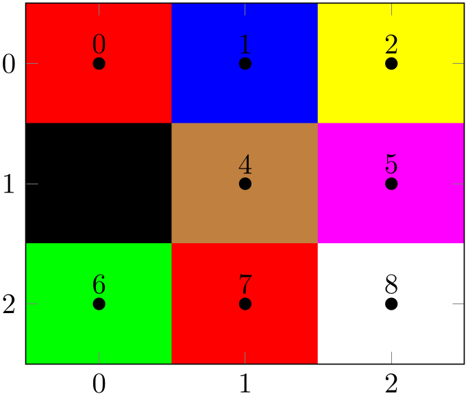
% Preamble: \pgfplotsset{width=7cm,compat=1.18}
\begin{tikzpicture}
\begin{axis}[enlargelimits=false]
\addplot [
matrix plot,
mark=*,nodes near coords=\coordindex,
mesh/color input=explicit,
] coordinates {
% row 0 1 2:
(0,0) [color=red] (1,0) [color=blue]
(2,0) [color=yellow]
% row 3 4 5
(0,1) [color=black] (1,1) [color=brown]
(2,1) [color=magenta]
% row 6 7 8
(0,2) [color=green] (1,2) [color=red]
(2,2) [color=white]
};
\end{axis}
\end{tikzpicture}
The example above shows a matrix plot along with the associated nodes near coords. The input coordinates resemble the cell mid points, and the color given according to the format mesh/color input=explicit defines the cell’s color. Note that a surface plot would connect the input vertices, but here we have one cell for every mid point.
The size of each cell is determined according to the distance of adjacent cell mid points and cells are always connected with each other; it is an interpolation scheme for adjacent cells.
A matrix plot is implemented using the same routines as surf, which means that it supports all of the options associated with a surface plot. A standard application is to visualize the matrix using a colormap:
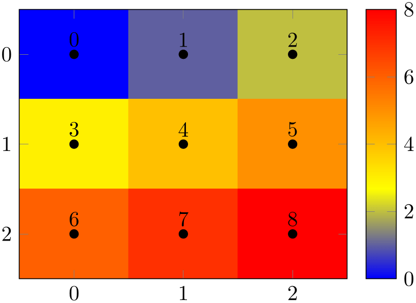
% Preamble: \pgfplotsset{width=7cm,compat=1.18}
\begin{tikzpicture}
\begin{axis}[enlargelimits=false,colorbar]
\addplot [matrix plot,
nodes near coords=\coordindex,mark=*,
point meta=explicit,
] coordinates {
(0,0) [0] (1,0) [1] (2,0) [2]
(0,1) [3] (1,1) [4] (2,1) [5]
(0,2) [6] (1,2) [7] (2,2) [8]
};
\end{axis}
\end{tikzpicture}
Note that matrix plot uses shader=flat corner by default. This ensures that the colors are taken from the inputs, i.e. from the cell mid points. Use shader=faceted or shader=interp to interpolate the colors. Similarly, other options which apply to surface plots (like faceted color, mesh/color input, or mesh/ordering) can be combined with matrix plot as well.
Note that a matrix plot has one major difference to almost all other plot handlers: providing matrix plot to one of the \addplot commands in an axis will reconfigure the entire axis such that its display fits. More precisely, a matrix plot implicitly sets the options
in the assumption that the matrix “coordinate” \((0,0)\) is typically the upper left corner (as opposed to the lower left corner as for standard axes). This reconfiguration of the axis overrides any user options for y dir and axis on top. If you prefer other values, you can and should use the starred version matrix plot* which does not reconfigure the axis in any way.
A matrix plot automatically updates axis limits to match those of the cell corners.
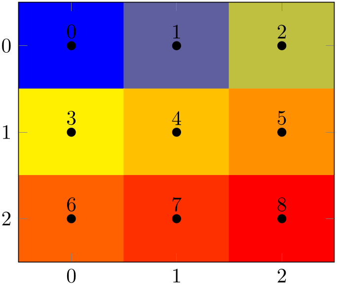
% Preamble: \pgfplotsset{width=7cm,compat=1.18}
\begin{tikzpicture}
\begin{axis}[enlargelimits=false]
\addplot [
matrix plot,
nodes near coords=\coordindex,mark=*,
mesh/cols=3,
point meta=explicit,
] table [meta=C] {
                            x
                    y  C
0 0 0
1 0 1
2 0 2
0 1 3
1 1 4
2 1 5
0 2 6
1 2 7
2 2 8
};
\end{axis}
\end{tikzpicture}
Due to current implementational restrictions, matrix plot can only update axis limits successfully if the length of the matrix scanlines is known in advance. The example above contains mesh/cols=3, and a “scanline” is a row (with \(3\) columns each). Consequently, the example above works fine. However, If mesh/cols=3 would be unknown in advance, the current implementation assumes that end-of-scanline markers are given in the input file according to empty line=scanline. As a rule of thumb, you have to follow the following guidelines when using matrix plot:
-
1. The input matrix should have an empty line whenever one line of input is finished.
-
2. If there is no empty line, the length of each scanline must be given. For the standard configuration mesh/ordering=x varies, pgfplots expects mesh/cols. For the alternative choice mesh/ordering=y varies, pgfplots expects mesh/rows to be set.
-
3. The input matrix must have at least \(2\) rows and at least \(2\) columns. This allows pgfplots to interpolate/extrapolate the vertices in a well-defined way.
If both of the first two conditions are violated, pgfplots fails to update the limits correctly and generates the warning
If you encounter this warning, you should proceed according to the guidelines above or ignore the warning and configure ymin and ymax manually.
A matrix plot expects a complete matrix on input; it is forbidden to leave holes in it. However, it supports “invisible” cells: provide unbounded values for point meta in order to produce a “hole” in the lattice:
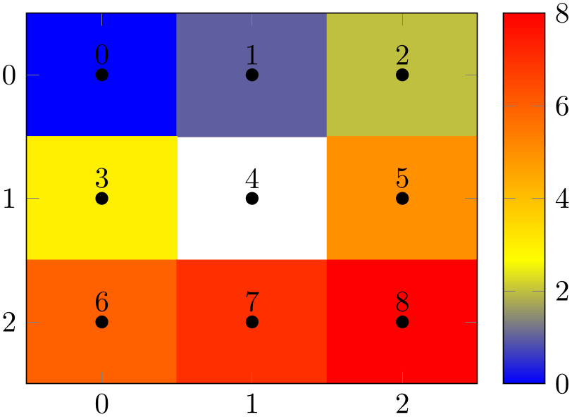
% Preamble: \pgfplotsset{width=7cm,compat=1.18}
\begin{tikzpicture}
\begin{axis}[enlargelimits=false,colorbar]
\addplot [
matrix plot,
nodes near coords=\coordindex,mark=*,
point meta=explicit,
] coordinates {
(0,0) [0] (1,0) [1] (2,0) [2]
(0,1) [3] (1,1) [nan] (2,1) [5]
(0,2) [6] (1,2) [7] (2,2) [8]
};
\end{axis}
\end{tikzpicture}
Here, “unbounded” means a color value which is nan (not a number), inf, or -inf. In case of mesh/color input=explicit, you can simply provide an empty explicit color to achieve the same effect:
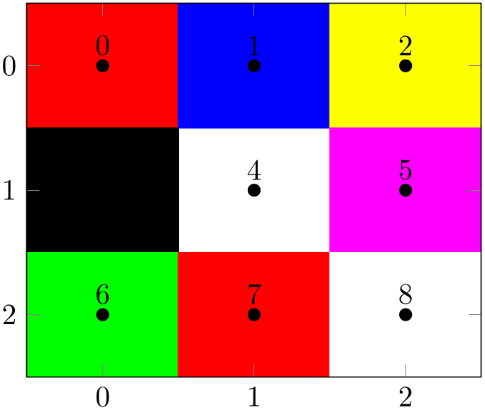
% Preamble: \pgfplotsset{width=7cm,compat=1.18}
\begin{tikzpicture}
\begin{axis}[enlargelimits=false]
\addplot [
matrix plot,
mark=*,nodes near coords=\coordindex,
mesh/color input=explicit,
] coordinates {
(0,0) [color=red] (1,0) [color=blue]
(2,0) [color=yellow]
(0,1) [color=black] (1,1) []
(2,1) [color=magenta]
(0,2) [color=green] (1,2) [color=red]
(2,2) [color=white]
};
\end{axis}
\end{tikzpicture}
This feature works for shader=flat mean or shader=interp as well. However, these shaders require color interpolation in order to determine the correct color for the visible cells. In this case, the missing cell will be replaced by the lowest possible point meta (or by black in case of mesh/color input=explicit), resulting in the following output:
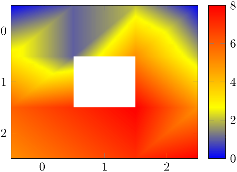
% Preamble: \pgfplotsset{width=7cm,compat=1.18}
\begin{tikzpicture}
\begin{axis}[enlargelimits=false,colorbar]
\addplot [matrix plot,
shader=interp,
point meta=explicit,
] coordinates {
(0,0) [0] (1,0) [1] (2,0) [2]
(0,1) [3] (1,1) [nan] (2,1) [5]
(0,2) [6] (1,2) [7] (2,2) [8]
};
\end{axis}
\end{tikzpicture}
A matrix plot will always be connected, even if the vertices form a distorted mesh. The input must be a complete matrix, but its \(x\)- and \(y\)-coordinates (or maybe even \(z\)-coordinates) can still be different from what one expects from a matrix. The resulting cells are produced using interpolation/extrapolation:
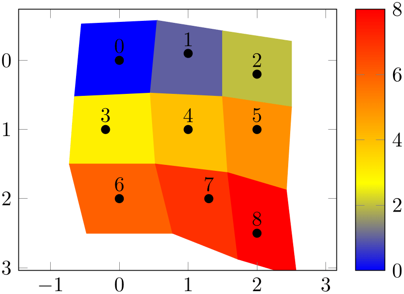
% Preamble: \pgfplotsset{width=7cm,compat=1.18}
\begin{tikzpicture}
\begin{axis}[enlargelimits=0.2,colorbar]
\addplot [
matrix plot,
nodes near coords=\coordindex,mark=*,
point meta=\coordindex,
] table {
                          x
                     y
0 0
1 -0.1
2 0.2
-0.2 1
1 1
2 1
0 2
1.3 2
2 2.5
};
\end{axis}
\end{tikzpicture}
Note that the expected usage of matrix plot is to have something which is at least close to a matrix, and the axis limits may become inaccurate if the input forms a highly irregular mesh. In particular, the axis limits in \(z\) direction are highly inaccurate for matrix plots, but the visualization is precise. Applying matrix plot to a three-dimensional input might also need z buffer=auto since matrix plot disables z buffer by default (in order to ensure correct color associations, i.e. to avoid reorderings). If you really need three-dimensional matrix plots, you may want to specify surf,mesh input=image directly, and you may need to adopt axis limits manually. The main use case of matrix plot is for input which looks roughly like an image.
Technically, matrix plot is a style which configures y dir=reverse and axis on top as outlined above, and which installs matrix plot* afterwards.
See also colormap access=direct for examples how to use matrix plot in conjunction with bitmap graphics.
-
/tikz/matrix plot*(no value) 
-
\addplot+[matrix plot*]
The same as matrix plot except that matrix plot* does not reconfigure the axis. As outlined above, matrix plot reconfigures the axis for
These options are missing for matrix plot*:
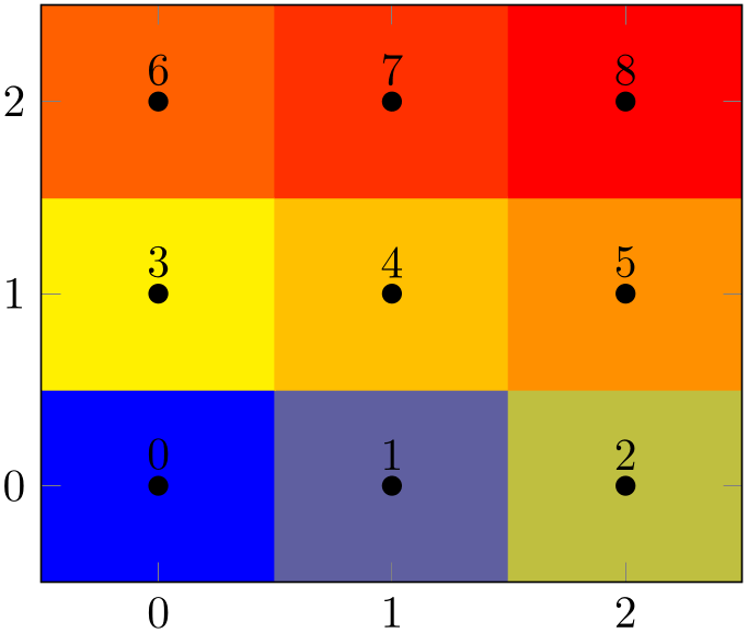
% Preamble: \pgfplotsset{width=7cm,compat=1.18}
\begin{tikzpicture}
\begin{axis}[enlargelimits=false, axis on top]
\addplot[matrix plot*,
nodes near coords=\coordindex,mark=*,
point meta=explicit,
] coordinates {
(0,0) [0] (1,0) [1] (2,0) [2]
(0,1) [3] (1,1) [4] (2,1) [5]
(0,2) [6] (1,2) [7] (2,2) [8]
};
\end{axis}
\end{tikzpicture}
Actually, matrix plot* is a style which is implemented as
Where the most important key is mesh input. Note that z buffer=none avoids reorderings which might affect the color association. Use z buffer=auto if you have a need to apply reorderings. Be aware that z buffer reorders the color data.
-
/tikz/imagesc(no value) 
-
\addplot+[imagesc]
A pure alias for matrix plot because imagesc is the reference to this type of plot in other applications.
-
/tikz/imagesc*(no value) 
-
\addplot+[imagesc*]
A pure alias for matrix plot*.
4.6.13Patch Plots
-
/pgfplots/patch(no value) 
-
\addplot+[patch]
-
/pgfplots/patch table={
 table file name or inline table
 } (initially empty)
-
/pgfplots/patch table with point meta={
 table file name or inline table
 } (initially empty)
-
/pgfplots/patch table with individual point meta={
 table file name or inline table
 } (initially empty)
-
/pgfplots/mesh input=lattice|patches|image 
-
/pgfplots/patch type=default|rectangle|triangle|line (initially default) 
-
/pgfplots/every patch(style, no value) 
Patch plots are similar to mesh and surf plots in that they describe a filled area by means of a geometry.
However, patch plots are defined by explicitly providing the elements of the geometry: they expect a sequence of triangles (or other patch types) which make up the mesh.
There are two dimensional and three dimensional patch plots, both with the same interfaces which are explained in the following sections.
The standard input format (constituted by mesh input=patches) is to provide a sequence of coordinates (either two- or three-dimensional) as usual. Each consecutive set of points makes up a patch element, which is often a triangle:
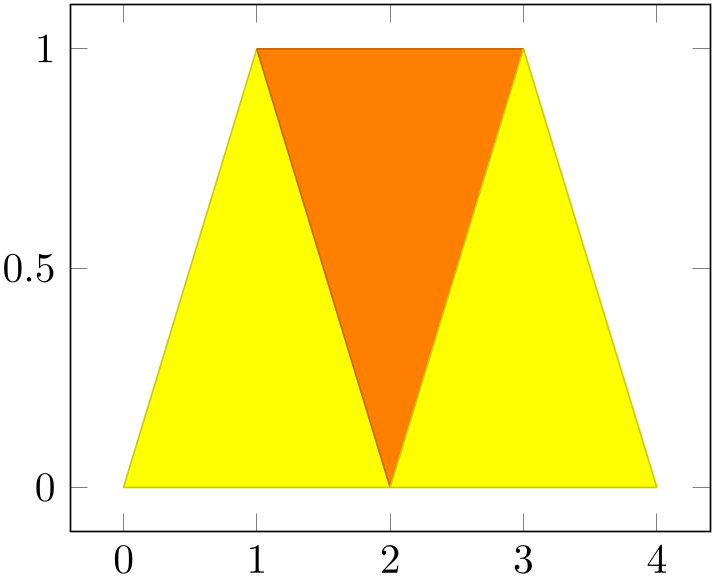
% Preamble: \pgfplotsset{width=7cm,compat=1.18}
\begin{tikzpicture}
\begin{axis}
\addplot [patch]
table {
                                x
                    y
0 0
1 1
2 0
% empty lines do not hurt, they are ignored here:
1 1
2 0
3 1
2 0
3 1
4 0
};
\end{axis}
\end{tikzpicture}
Patch plots use point meta to determine fill colors. In its initial configuration, point meta will be set to the \(y\)-coordinate (or the \(z\)-coordinate for three dimensional patch plots). Set point meta somehow to color the patches:
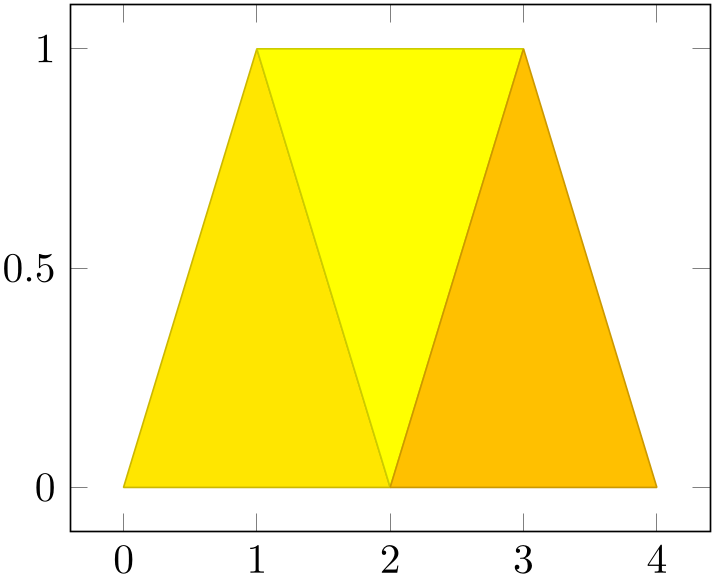
% Preamble: \pgfplotsset{width=7cm,compat=1.18}
\begin{tikzpicture}
\begin{axis}
\addplot [patch]
table [point meta=\thisrow{c}] {
                                x
                    y c
0 0 0.2
1 1 0
2 0 1
1 1 0
2 0 1
3 1 0
2 0 1
3 1 0
4 0 0.5
};
\end{axis}
\end{tikzpicture}
Patch plots make use of the mesh configuration, including the shader. Thus, the example above uses the initial shader=faceted (which uses the mean color data to determine a triangle’s color and a related stroke color). The shader=interp yields the following result:
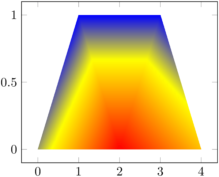
% Preamble: \pgfplotsset{width=7cm,compat=1.18}
\begin{tikzpicture}
\begin{axis}
\addplot [patch,shader=interp]
table [point meta=\thisrow{c}] {
                                x
                    y c
0 0 0.2
1 1 0
2 0 1
1 1 0
2 0 1
3 1 0
2 0 1
3 1 0
4 0 0.5
};
\end{axis}
\end{tikzpicture}
For triangles, shader=interp results in linearly interpolated point meta values throughout each individual triangle, which are then mapped to the color map (a technique also known as Gouraud shading).
The color data does not need to be continuous, it is associated to triangle vertices. Thus, changing some of the color values allows individually shaded regions:
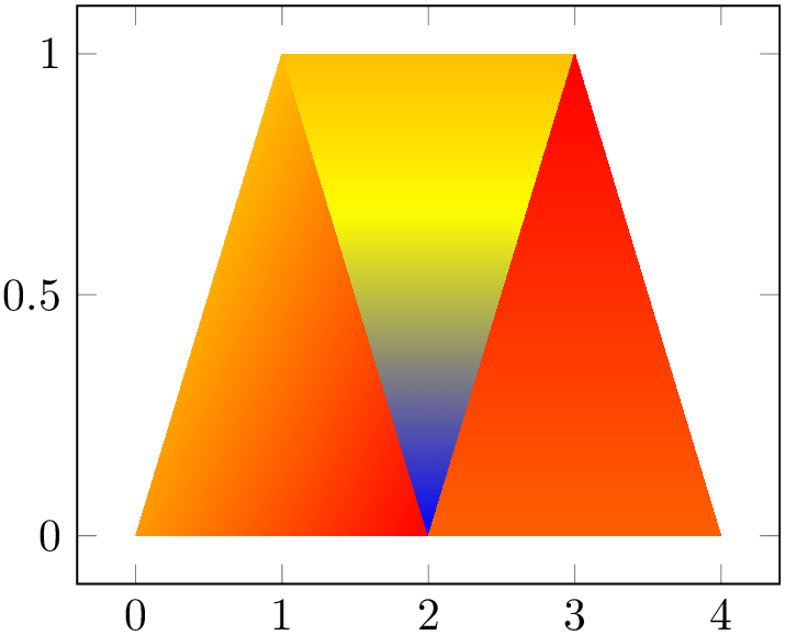
% Preamble: \pgfplotsset{width=7cm,compat=1.18}
\begin{tikzpicture}
\begin{axis}
\addplot [patch,shader=interp]
table [point meta=\thisrow{c}] {
                                x
                    y c
0 0 0.2
1 1 0
2 0 1
1 1 0
2 0 -1
3 1 0
2 0 0.5
3 1 1
4 0 0.5
};
\end{axis}
\end{tikzpicture}
Two dimensional patch plots simply draw triangles in their order of appearance. In three dimensions, single elements are sorted according to their view depth, with foreground elements drawn on top of background elements (“Painter’s algorithm”, see z buffer=sort).
Allows to provide patch connectivity data stored in an input table.
A non-empty argument for patch table enables patch
input mode. Now, the standard input stream is a long list of vertices which are stored in an array using their
\coordindex as key. Each row of
 table file name or inline table
 makes up one patch, defined by indices into the vertex array:
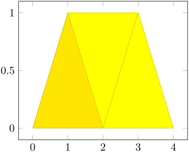
% Preamble: \pgfplotsset{width=7cm,compat=1.18}
\begin{tikzpicture}
\begin{axis}
\addplot [patch,table/row sep=\\,patch table={
0 1 2\\
1 2 3\\
4 3 5\\
}] table [row sep=\\,point meta=\thisrow{c}] {
                                x
                        y c  \\
0 0 0.2\\% 0
1 1 0 \\% 1
2 0 1 \\% 2
3 1 0 \\% 3
2 0 0.5\\% 4
4 0 0.5\\% 5
};
\end{axis}
\end{tikzpicture}
The example consists of two separate tables. The patch table argument is a table, provided inline where rows are separated by \\ (which is the purpose of the row sep=\\ key as you guessed).33 The patch table here declares three triangles: the triangle made up by vertex \(\#0\), \(\#1\) and \(\#2\), the triangle made up by \(\#1\), \(\#2\) and \(\#3\) and finally the one using the vertices \(\#4\), \(\#3\) and \(\#5\). The vertices as such are provided using the standard input methods of pgfplots; in our case using a table as well. The standard input simply provides coordinates (and point meta) which are stored in the vertex array; you could also have used \addplot coordinates to provide them (or \addplot expression).
The argument to patch table needs to be a table – either a file name or an inline table as in the example above. The first \(n\) columns of this table are assumed to contain indices into the vertex array (which is made up using all vertices of the standard input as explained in the previous paragraph). The entries in this table can be provided in floating point, just make sure they are not rounded. The variable \(n\) is the number of vertices required to make up a single patch. For triangular patches, it is \(n=3\), for patch type=bilinear it is \(n=4\) and similar for other choices of patch type.
The alternative patch table with point meta is almost the same as patch table – but it allows to provide (a single) point meta (color data) per patch instead of per vertex. Here, a further column of the argument table is interpreted as color data:
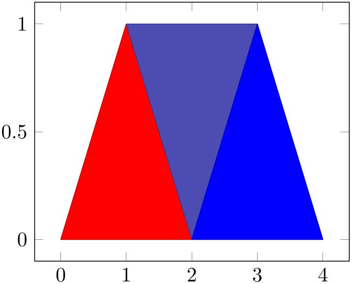
% Preamble: \pgfplotsset{width=7cm,compat=1.18}
\begin{tikzpicture}
\begin{axis}
% this uses per-patch color data:
\addplot [patch,table/row sep=\\,
patch table with point meta={
0 1 2 100\\
1 2 3 10\\
4 3 5 0\\
},
] table [row sep=\\] {
                                x
                        y \\
0 0 \\% 0
1 1 \\% 1
2 0 \\% 2
3 1 \\% 3
2 0 \\% 4
4 0 \\% 5
};
\end{axis}
\end{tikzpicture}
The
patch table with point meta always
prefers point meta data from the provided table
argument. However, it is still supported to write
point meta=\thisrow{ colname
 } or similar constructs – but now,
 colname
 refers to the provided table argument. More precisely,
point meta is evaluated in a context where the patch
connectivity has been resolved and the
patch table with point meta is
loaded.
The other alternative patch table with individual point meta is very similar, but instead of a flat color per patch, it allows to write one color value for every patch:
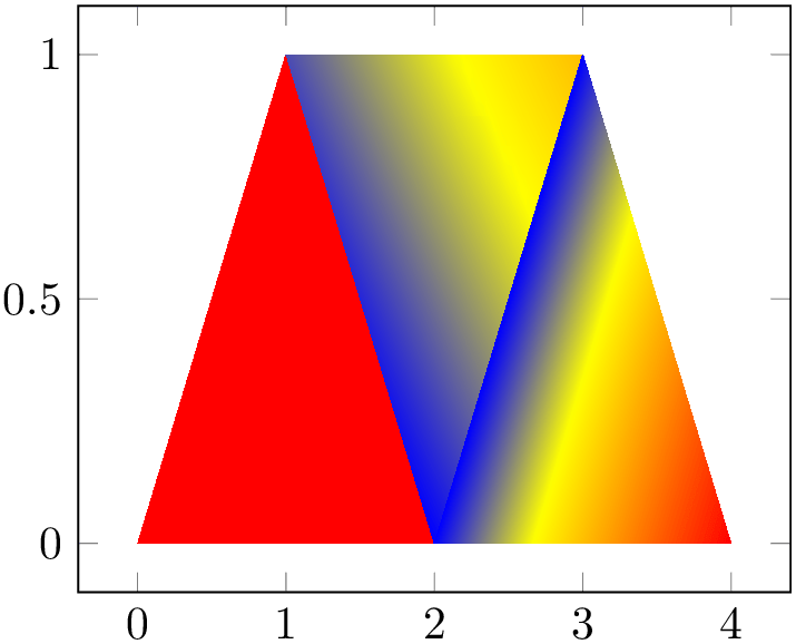
% Preamble: \pgfplotsset{width=7cm,compat=1.18}
\begin{tikzpicture}
\begin{axis}
% this uses n per-patch color values:
\addplot[patch,shader=interp,
table/row sep=\\,
patch table with individual point meta={
% V_0 V_1 V_2 C_0 C_1 C_2
                                    0   1
                          2   100 100 100 \\
                                    1   2
                          3   10  0   50  \\
                                    4   3
                          5   0   0   100 \\
}] table[row sep=\\] {
                                x
                        y \\
0 0 \\% 0
1 1 \\% 1
2 0 \\% 2
3 1 \\% 3
2 0 \\% 4
4 0 \\% 5
};
\end{axis}
\end{tikzpicture}
To find the point meta data for vertex \(\#i, i=0,1,2\), pgfplots searches in column \(i+n\) where \(n\) is the number of vertices for patch type (in our case, \(n=3\)).
Technical remark: The key patch table with individual point meta automatically installs point meta=explicit as well. It might be confusing to override the value of point meta here (although it is allowed).
The patch table input type allows to reduce the size of geometries since vertices are stored just once. pgfplots unpacks them into memory into the redundant format in order to work with single patch elements.34 In case you experience TeX memory problems with this connectivity input, consider using the redundant format. It uses other types of memory limits.
A more involved example is shown below; it uses \addplot3[patch] to visualize a three dimensional patch plot, provided by means of a long sequence of patches:
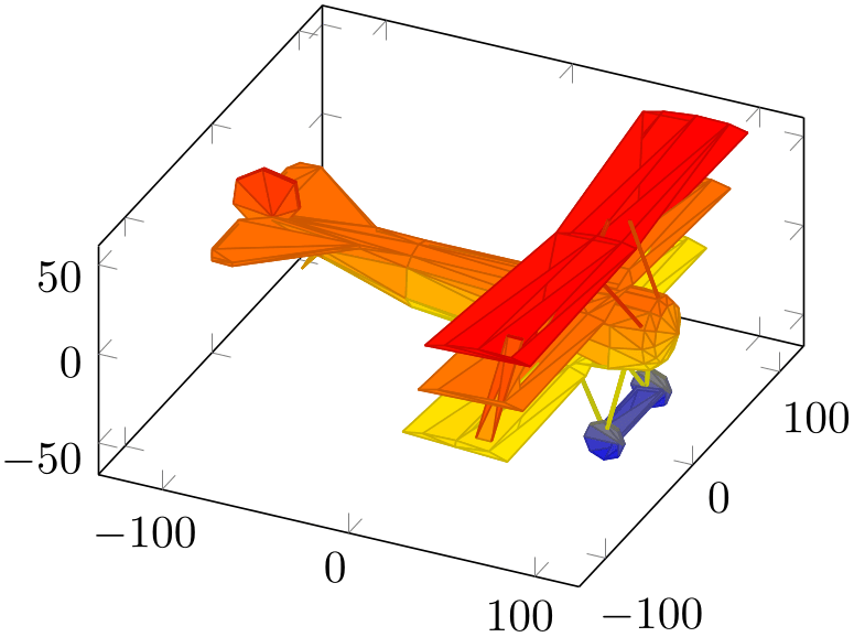
% Preamble: \pgfplotsset{width=7cm,compat=1.18}
\begin{tikzpicture}
\begin{axis}[axis equal]
% FokkerDrI_layer_0.patches.dat contains:
% # each row is one vertex; three consecutive
% # vertices make one triangle (patch)
% 105.577 -19.7332 2.85249
% 88.9233 -21.1254 13.0359
% 89.2104 -22.1547 1.46467
% # end of facet 0
% 105.577 -19.7332 2.85249
% 105.577 -17.2161 12.146
% 88.9233 -21.1254 13.0359
% # end of facet 1
\addplot3 [patch] file
{plotdata/FokkerDrI_layer_0.patches.dat};
\end{axis}
\end{tikzpicture}
The ordering in which triangles are specified is irrelevant, three-dimensional patch plots use z buffer=sort to sort patches according to their depth (defined as mean depth over each vertex), where foreground patches are drawn on top of background patches. This so-called “Painter’s algorithm” works well for most meshes. If it fails, consider using patch refines=1 or patch refines=2 to split larger elements into small ones automatically.
The drawing color associated to single vertices can be changed using the
point meta key (which is the common method to configure
color data in pgfplots). The initial configuration is
point meta=z for three dimensional
patch plots, i.e. to use the \(z\)-coordinate also as color
data. Use
point meta=\thisrow{ colname
 } in conjunction with \addplot3[patch] table to load a
selected table column.
Patch plots are (almost) the same as mesh or surf plots, they only have more freedom in their input format (and a more complicated geometry). Actually, “patch” is just a style for surf,mesh input=patches. In other words, patch is the same as surf, it even shares the same internal implementation. Thus, most of the keys to configure mesh or surf plots apply to patch as well, especially shader and z buffer. As already mentioned, \addplot3[patch] automatically activates z buffer=sort to ensure a good drawing sequence. The shader can be used to modify the appearance:
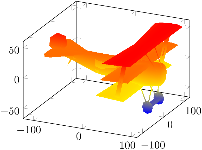
% Preamble: \pgfplotsset{width=7cm,compat=1.18}
\begin{tikzpicture}
\begin{axis}
% FokkerDrI_layer_0.facetIdx.dat contains:
% # each row makes up one facet; it
% # consists of 0-based indices into
% # the vertex array
% 0 1 2 % triangle of vertices #0,#1 and #2
% 0 3 1 % triangle of vertices #0,#3 and #1
% 3 4 1
% 5 6 7
% 6 8 7
% 8 9 7
% 8 10 9
% ...
% while FokkerDrI_layer_0.vertices.dat contains
% 105.577 -19.7332 2.85249 % vertex #0
% 88.9233 -21.1254 13.0359 % vertex #1
% 89.2104 -22.1547 1.46467 % vertex #2
% 105.577 -17.2161 12.146
% 105.577 -10.6054 18.7567
% 105.577 7.98161 18.7567
% 105.577 14.5923 12.146
% ...
\addplot3 [patch,shader=interp,
patch table=
{plotdata/FokkerDrI_layer_0.facetIdx.dat}]
file
{plotdata/FokkerDrI_layer_0.vertices.dat};
\end{axis}
\end{tikzpicture}
See the description of shader=interp for details and remarks. The example above makes use of the alternative syntax to provide a geometry: the patch table input. It allows to provide vertices separate from patch connectivity, where each patch is defined using three indices into the vertex array as discussed above.
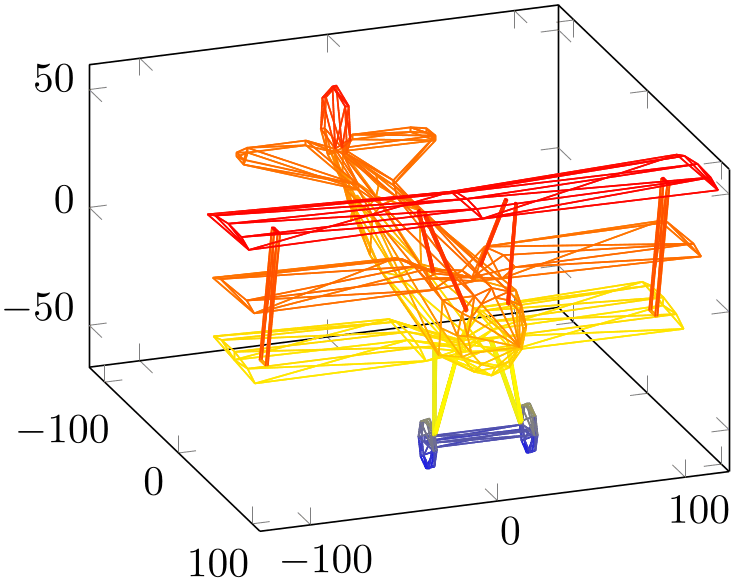
% Preamble: \pgfplotsset{width=7cm,compat=1.18}
\begin{tikzpicture}
\begin{axis}[view/h=70]
% FokkerDrI_layer_0.patches.dat contains:
% # each row is one vertex; three consecutive
% # vertices make one triangle (patch)
% 105.577 -19.7332 2.85249
% 88.9233 -21.1254 13.0359
% 89.2104 -22.1547 1.46467
% # end of facet 0
% 105.577 -19.7332 2.85249
% 105.577 -17.2161 12.146
% 88.9233 -21.1254 13.0359
% # end of facet 1
\addplot3 [patch,mesh] file
{plotdata/FokkerDrI_layer_0.patches.dat};
\end{axis}
\end{tikzpicture}
This key controls how input coordinates are decoded to get patches. It is used only if patch table is empty (patch table has its own way to decode input coordinates). Usually, you won’t need to bother with this key as it is set implicitly.
The choice mesh input=lattice is the initial configuration for mesh and surf plots: it expects input in a compact matrix form as described at the beginning of this section and requires a mesh/ordering and perhaps end-of-scanline markers. It yields patches with exactly four corners and is compatible with patch type=rectangle and patch type=bilinear (the latter requiring to load the patchplots library). In this case, the input stream contains the vertices.
The choice mesh input=patches is implicitly set when you use the patch style (remember that surf is actually some sort of patch plot on its own). It expects the input format as described for patch plots, i.e. \(n\) consecutive coordinates make up the vertices of a single patch where \(n\) is the expected number of vertices for the configured patch type.
The choice mesh input=image implements matrix plot: it expects input in the same technical format as for mesh input=lattice (i.e. using end-of-scanline markers, mesh/ordering, etc), but the coordinates are interpreted as patch mid points. It yields patches with exactly four corners and is compatible with patch type=rectangle and patch type=bilinear. The patches are generated by interpolating the coordinates between adjacent cell mid points. Vertices which have only one adjacent cell mid point are extrapolated. This choice is unsupported for one-dimensional inputs, i.e. for lines or for \(1\times n\) or \(n \times 1\) matrices. See matrix plot for more details.
Note that a non-empty patch table implies mesh input=patches.
The initial configuration patch type=default checks the configuration of mesh input: for mesh input=patches, it uses triangle. For mesh input=lattice, it checks if there is just one row or just one col and uses patch type=line in such a case, otherwise it uses patch type=rectangle.
The choice patch type=rectangle expects \(n=4\) vertices. The vertices can be either encoded as a matrix or, using mesh input=patches, in the sequence in which you would connect the vertices:

% Preamble: \pgfplotsset{width=7cm,compat=1.18}
\begin{tikzpicture}
\begin{axis}[
nodes near coords={(\coordindex)},
                            title=Rectangle from matrix
                        input,
]
% note that surf implies 'patch type=rectangle'
\addplot [
surf,
mesh/rows=2,
patch type=rectangle,
] coordinates {
(0,0) (1,0)
(0,1) (1,1)
};
\end{axis}
\end{tikzpicture}
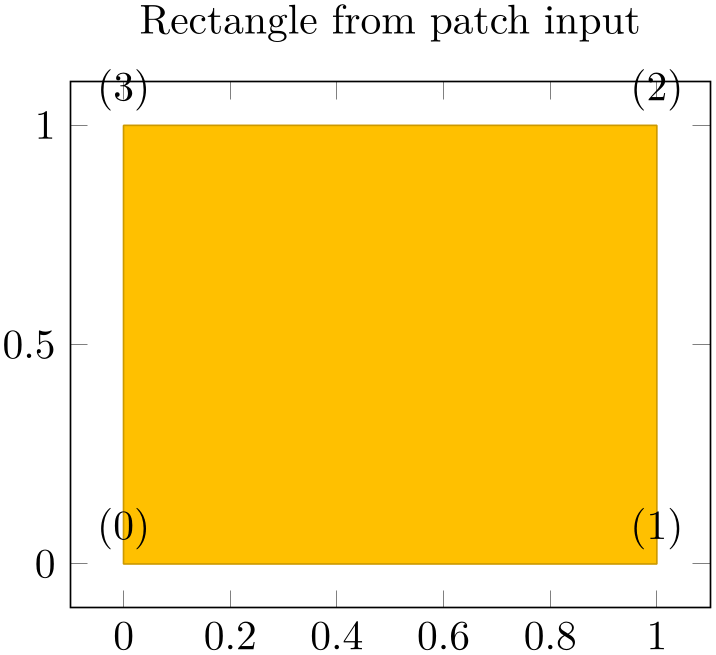
% Preamble: \pgfplotsset{width=7cm,compat=1.18}
\begin{tikzpicture}
\begin{axis}[
nodes near coords={(\coordindex)},
                            title=Rectangle from patch
                        input,
]
\addplot [
patch,
patch type=rectangle,
] coordinates {
(0,0) (1,0) (1,1) (0,1)
};
\end{axis}
\end{tikzpicture}
As for all other patch type values, the vertices can be arbitrary two- or three-dimensional points, there may be even two on top of each other (resulting in a triangle). When used together with shader=interp, patch type=rectangle is visualized using two Gouraud shaded triangles (see below for triangle). It is the most efficient representation for interpolated shadings together with mesh input=lattice since the input lattice is written directly into the PDF. Use patch type=rectangle if you want rectangular elements and perhaps “some sort” of smooth shading. Use patch type=bilinear of the patchplots library in case you need real bilinear shading. Examples of such shadings can be found in Section 5.9.1.4. The choice patch type=triangle expects \(n=3\) vertices which make up a triangle. The ordering of the vertices is irrelevant:
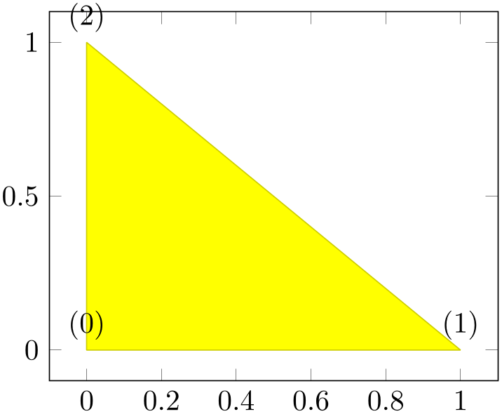
% Preamble: \pgfplotsset{width=7cm,compat=1.18}
\begin{tikzpicture}
\begin{axis}[
nodes near coords={(\coordindex)},
]
\addplot [
patch,
patch type=triangle,
] coordinates {
(0,0) (1,0) (0,1)
};
\end{axis}
\end{tikzpicture}
The use of shader=interp is implemented by means of linear interpolation of the three color values (specified with the point meta key) between the corners; the resulting interpolated point meta values are then mapped into the actual colormap. This type of interpolation is called Gouraud shading. Examples of such shadings can be found in Section 5.9.1.4.
The choice patch type=line expects \(n=2\) vertices which make up a line. It is used for one-dimensional mesh plots (see Section 4.5.13 for examples).
There are more values for patch type like bilinear, triangle quadr, biquadratic, coons, polygon and tensor bezier. Please refer to the separate patchplots library in Section 5.9.
This style will be installed as soon as the patch plot handler is activated.
The initial configuration is
which improves display of sharp triangle corners significantly (see the TikZ manual for details about miter limit and line join parameters).
There is much more to say about patch plots, like patch type which allows triangles, bilinear elements, quadratic triangles, biquadratic quadrilaterals, coons patches; the patch refines key which allows automatic refinement, patch to triangles which triangulates higher order elements; how matrix data can be used for rectangular shapes and more. These details are subject of the patchplots library in Section 5.9.
33 Note that the choice row sep=\\ is much more robust here: newlines would be converted to spaces by TeX before pgfplots had a chance to see them.
34 The reason for such an approach is that TeX doesn’t really know what an array is – and according to my experience, arrays implemented by macros tend to blow up TeX’s memory limits even faster than the alternative.
4.6.14About 3D Const Plots and 3D Bar Plots
There are currently no equivalents of const plot and its variants or the bar plot types like ybar for three dimensional axes, sorry.
4.6.15Mesh/Surface Plots with Holes
Please refer to Section 4.5.14 for interrupted plots.