Manual for Package pgfplots
2D/3D Plots in LATeX, Version 1.18.2
https://github.com/pgf-tikz/pgfplots
Step-by-Step Tutorials
3.2Solving a Real Use Case: Scientific Data Analysis
In this section, we assume that you did some scientific experiment. The scientific experiment yielded three input data tables: one table for each involved parameter \(d=2\), \(d=3\), \(d=4\). The data tables contain “degrees of freedom” and some accuracy measurement “l2_err”. In addition, they might contain some meta-data (in our case a column “level”). For example, the data table for \(d=2\) might be stored in data_d2.dat and may contain
dof l2_err level
5 8.312e-02 2
17 2.547e-02 3
49 7.407e-03 4
129 2.102e-03 5
321 5.874e-04 6
769 1.623e-04 7
1793 4.442e-05 8
4097 1.207e-05 9
9217 3.261e-06 10
The other two tables are similar, we provide them here to simplify the reproduction of the examples. The table for \(d=3\) is stored in data_d3.dat, it is
dof l2_err level
7 8.472e-02 2
31 3.044e-02 3
111 1.022e-02 4
351 3.303e-03 5
1023 1.039e-03 6
2815 3.196e-04 7
7423 9.658e-05 8
18943 2.873e-05 9
47103 8.437e-06 10
Finally, the last table is data_d4.dat
dof l2_err level
9 7.881e-02 2
49 3.243e-02 3
209 1.232e-02 4
769 4.454e-03 5
2561 1.551e-03 6
7937 5.236e-04 7
23297 1.723e-04 8
65537 5.545e-05 9
178177 1.751e-05 10
What we want is to produce three plots, each dof versus l2_err, in a loglog plot. We expect that the result is a line in a log–log plot, and we are interested in its slope \(\log e(N) = -a \log (N)\) because that characterizes our experiment.
3.2.1Getting the Data into TeX
Our first step is to get one of our data tables into pgfplots. In addition, we want axis descriptions for the \(x\)- and \(y\)-axes and a title on top of the plot.
Our first version looks like
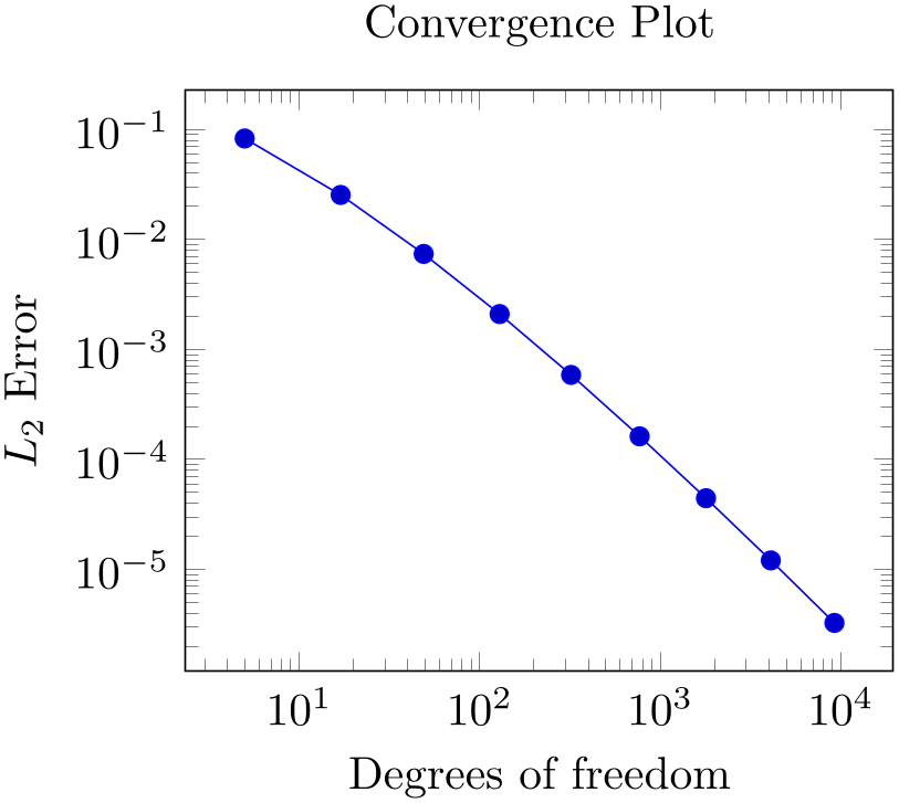
% Preamble: \pgfplotsset{width=7cm,compat=1.18}
% \documentclass{article}
% \usepackage{pgfplots}
% \pgfplotsset{compat=1.5}
% \begin{document}
\begin{tikzpicture}
\begin{loglogaxis}[
title=Convergence Plot,
xlabel={Degrees of freedom},
ylabel={$L_2$ Error},
]
                    \addplot table
                {data_d2.dat};
\end{loglogaxis}
\end{tikzpicture}
% \end{document}
Our example is similar to that of the lecture in Section 3.1.1 in that it defines some basic axis descriptions by means of title, xlabel, and ylabel and provides data using \addplot table. The only difference is that we used \begin{loglogaxis} instead of \begin{axis} in order to configure logarithmic scales on both axes. Note furthermore that we omitted any options after \addplot. As explained in Section 3.1.1, this tells pgfplots to consult its cycle list to determine a suitable option list.
3.2.2Adding the Remaining Data Files of Our Example.
pgfplots accepts more than one \addplot ... ; command – so we can just add our remaining data files:
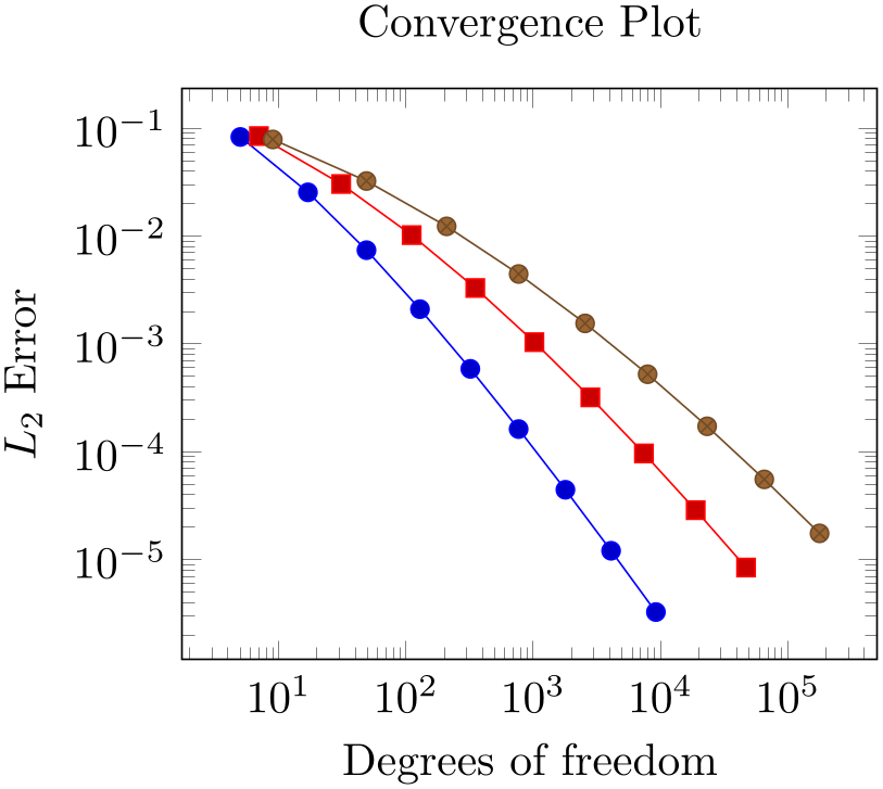
% Preamble: \pgfplotsset{width=7cm,compat=1.18}
\begin{tikzpicture}
\begin{loglogaxis}[
title=Convergence Plot,
xlabel={Degrees of freedom},
ylabel={$L_2$ Error},
]
                    \addplot table
                {data_d2.dat};
                    \addplot table
                {data_d3.dat};
                    \addplot table
                {data_d4.dat};
\end{loglogaxis}
\end{tikzpicture}
You might wonder how pgfplots chose the different line styles. And you might wonder how to modify them. Well, if you simply write \addplot without options in square brackets, pgfplots will automatically choose styles for that specific plot. Here “automatically” means that it will consult its current cycle list: a list of predefined styles such that every \addplot statement receives one of these styles. This list is customizable to a high degree.
Instead of the cycle list, you can easily provide style options manually. If you write
\addplot[ options
 ] ...,
pgfplots will only use
options
and will ignore its cycle list. If you write a plus sign before the square brackets as in
\addplot+[options] ...,
pgfplots will append
options
to the automatically assigned cycle list.
3.2.3Add a Legend and a Grid
A legend is a text label explaining what the plots are. A legend can be provided for one or more \addplot statements using the legend entries key:
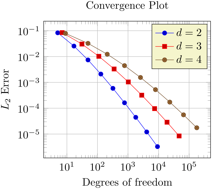
% Preamble: \pgfplotsset{width=7cm,compat=1.18}
\begin{tikzpicture}
\begin{loglogaxis}[
title=Convergence Plot,
xlabel={Degrees of freedom},
ylabel={$L_2$ Error},
grid=major,
legend entries={$d=2$,$d=3$,$d=4$},
]
                    \addplot table
                {data_d2.dat};
                    \addplot table
                {data_d3.dat};
                    \addplot table
                {data_d4.dat};
\end{loglogaxis}
\end{tikzpicture}
Here, we assigned a comma-separated list of text labels, one for each of our \addplot instructions. Note the use of math mode in the text labels. Note that if any of your labels contains a comma, you have to surround the entry by curly braces. For example, we could have used legend entries={{$d=2$},{$d=3$},{$d=4$}} – pgfplots uses these braces to delimit arguments and strips them afterwards (this holds for any option, by the way).
Our example also contains grid lines for which we used the grid=major key. It activates major grid lines in all axes.
You might wonder how the text labels map to \addplot instructions. Well, they are mapped by index. The first label is assigned to the first plot, the second label to the second plot and so on. You can exclude plots from this counting if you add the forget plot option to the plot (using \addplot+[forget plot], for example). Such plots are excluded from both cycle lists and legends.
3.2.4Add a Selected Fit-line
Occasionally, one needs to compute linear regression lines through input samples. Let us assume that we want to compute a fit line for the data in our fourth data table (data_d4.dat). However, we assume that the interesting part of the plot happens if the number of degrees of freedom reaches some asymptotic limit (i.e. is very large). Consequently, we want to assign a high uncertainty to the first points when computing the fit line.
pgfplots offers to combine table input and mathematical expressions (note that you can also type pure mathematic expressions, although this is beyond the scope of this example). In our case, we employ this feature to create a completely new column – the linear regression line:
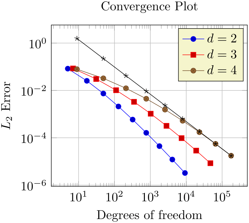
% Preamble: \pgfplotsset{width=7cm,compat=1.18}
% \usepackage{pgfplotstable}
% ...
\begin{tikzpicture}
\begin{loglogaxis}[
title=Convergence Plot,
xlabel={Degrees of freedom},
ylabel={$L_2$ Error},
grid=major,
legend entries={$d=2$,$d=3$,$d=4$},
]
                    \addplot table
                {data_d2.dat};
                    \addplot table
                {data_d3.dat};
                    \addplot table
                {data_d4.dat};
                    \addplot table
                [
x=dof,
                      y={create col/linear
                regression={y=l2_err,
variance list={1000,800,600,500,400,200,100}}}]
{data_d4.dat};
\end{loglogaxis}
\end{tikzpicture}
Note that we added a further package: pgfplotstable. It allows to postprocess tables (among other things. It also has a powerful table typesetting toolbox which rounds and formats numbers based on your input CSV file).
Here, we added a fourth plot to our axis. The first plot is also an \addplot table statement as before – and we see that it loads the data file data_d4.dat just like the plot before. However, it has special keys which control the coordinate input: x=dof means to load x coordinates from the column named “dof”. This is essentially the same as in all of our other plots (because the “dof” column is the first column). It also uses y={create col/...}. This lengthy statement defines a completely new column. The create col/linear regression prefix is a key which can be used whenever new table columns can be generated. As soon as the table is queried for the first time, the statement is evaluated and then used for all subsequent rows. The argument list for create col/linear regression contains the column name for the function values y=l2_err which are to be used for the regression line (the x arguments are deduced from x=dof as you guessed correctly). The variance list option is optional. We use it to assign variances (uncertainties) to the first input points. More precisely: the first encountered data point receives a variance of 1000, the second 800, the third 600, and so on. The number of variances does not need to match up with the number of points; pgfplots simply matches them with the first encountered coordinates.
Note that since our legend entries key contains only three values, the regression line has no legend entry. We could easily add one, if we wanted. We can also use \addplot+[forget plot] table[...] to explicitly suppress the generation of a legend as mentioned above.
Whenever pgfplots encounters mathematical expressions, it uses its built-in floating point unit. Consequently, it has a very high data range – and a reasonable precision as well.
3.2.5Add an Annotation using TikZ: a Slope Triangle
Often, data requires interpretation – and you may want to highlight particular items in your plots. This “highlight particular items” requires to draw into an axis, and it requires a high degree of flexibility. Users of TikZ would say that TikZ is a natural choice – and it is.
In our use case, we are interested in slopes. We may want to compare slopes of different experiments. And we may want to show selected absolute values of slopes.
Here, we use TikZ to add custom annotations into a pgfplots axis. We choose a particular type of a custom annotation: we want to mark two points on a line plot. One way to do so would be to determine the exact coordinates and to place a graphical element at this coordinate (which is possible using \draw ... (1e4,1e-5) ... ;). Another (probably simpler) way is to use the pos feature to identify a position “25% after the line started”.
Based on the result of Section 3.2.4, we find
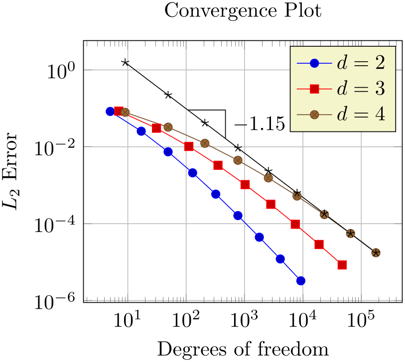
% Preamble: \pgfplotsset{width=7cm,compat=1.18}
% \usepackage{pgfplotstable}
% ...
\begin{tikzpicture}
\begin{loglogaxis}[
title=Convergence Plot,
xlabel={Degrees of freedom},
ylabel={$L_2$ Error},
grid=major,
legend entries={$d=2$,$d=3$,$d=4$},
]
                    \addplot table
                {data_d2.dat};
                    \addplot table
                {data_d3.dat};
                    \addplot table
                {data_d4.dat};
                    \addplot table
                [
x=dof,
                      y={create col/linear
                regression={y=l2_err,
variance list={1000,800,600,500,400,200,100}}}]
{data_d4.dat}
% save two points on the regression line
% for drawing the slope triangle
coordinate [pos=0.25] (A)
coordinate [pos=0.4] (B)
;
% save the slope parameter:
\xdef\slope{\pgfplotstableregressiona}
% draw the opposite and adjacent sides
% of the triangle
\draw (A) -| (B)
node [pos=0.75,anchor=west]
{\pgfmathprintnumber{\slope}};
\end{loglogaxis}
\end{tikzpicture}
The example is already quite involved since we added complexity in every step. Before we dive into the details, let us take a look at a simpler example:
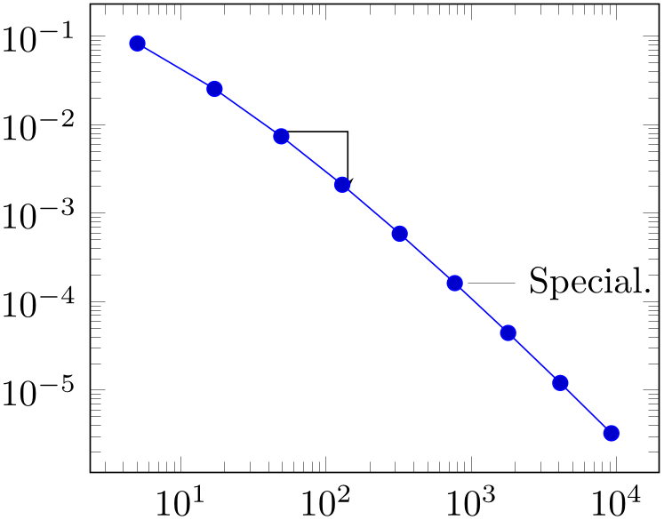
% Preamble: \pgfplotsset{width=7cm,compat=1.18}
\begin{tikzpicture}
\begin{loglogaxis}
                    \addplot table
                {data_d2.dat}
coordinate [pos=0.25] (A)
coordinate [pos=0.4] (B)
;
\draw [-stealth] (A) -| (B);
                    \node [pin=0:Special.] at
                (769,1.623e-04) {};
\end{loglogaxis}
\end{tikzpicture}
Here, we see two annotation concepts offered by pgfplots: the first is to insert drawing commands right after an \addplot command (but before the closing semicolon). The second is to add standard TikZ commands, but use designated pgfplots coordinates. Both are TikZ concepts. The first is what we want here: we want to identify two coordinates which are “somewhere” on the line. In our case, we define two named coordinates: coordinate \(A\) at 25% of the line and coordinate \(B\) at 40% of the line. Then, we use \draw (A) -| (B) to draw a triangle between these two points. The second is only useful if we know some absolute coordinates in advance.
Coming back to our initial approach with the regression line, we see that it uses the first concept: it introduces named coordinates after \addplot, but before the closing semicolon. The statement \xdef\slope introduces a new macro. It contains the (expanded due to the “eXpanded DEFinition”) value of \pgfplotstableregressiona which is the slope of the regression line. In addition to the slope triangle, we also add a node in which we typeset that value using \pgfmathprintnumber.
Note that the example above is actual a “happy case”: it can happen easily that labels which are added inside of the axis environment are clipped away:
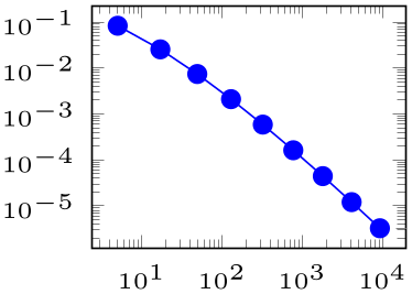
% Preamble: \pgfplotsset{width=7cm,compat=1.18}
\begin{tikzpicture}
\begin{loglogaxis}[
tiny,
]
                    \addplot table
                {data_d2.dat}
node [pos=1,pin=0:Special.] {}
;
\end{loglogaxis}
\end{tikzpicture}
The example above combines the pos label placement with the node’s label. Note that the small style tiny installs a pgfplots preset which is better suited for very small plots – it is one of the many supported scaling parameters. The problem here is apparent: the text of our extra node is clipped away. Depending on your data, you have a couple of solutions here:
-
• use clip=false to disable clipping of plot paths at all,
-
• use clip mode=individual to enable clipping only for plot paths,
-
• draw the node outside of the axis environment but inside of the picture environment.
The first attempt works quite well for most figures:
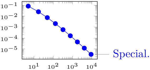
% Preamble: \pgfplotsset{width=7cm,compat=1.18}
\begin{tikzpicture}
\begin{loglogaxis}[
tiny,
clip=false,
]
                    \addplot table
                {data_d2.dat}
node [pos=1,pin=0:Special.] {}
;
\end{loglogaxis}
\end{tikzpicture}
Note that this approach in which the nodes are placed before the closing semicolon implies that nodes inherit the axis line style and color.
3.2.6Summary
We learned how to define a (logarithmic) axis, and how to assign basic axis descriptions. We also saw once more how to use one or more \addplot table commands to load table data into pgfplots. We took a brief look into regression and TikZ drawing annotations.
We also encountered the tiny style which is one of the ways to customize the size of an axis. Others are width, height, the other predefined size styles like normalsize, small, or footnotesize, and the two different scaling modes /pgfplots/scale and /tikz/scale (the first scales only the axis, the second also the labels).
Next steps might be how to visualize functions using line plots, how to align adjacent graphics properly (even if the axis descriptions vary), how to employ scatter plots of pgfplots, or how to draw functions of two variables.