Manual for Package pgfplots
2D/3D Plots in LATeX, Version 1.18.2
https://github.com/pgf-tikz/pgfplots
Step-by-Step Tutorials
3.1Solving a Real Use Case: Function Visualization
In this section, we assume that you want to visualize two functions. The first function is given by means of a data table. The second function is given by means of a math expression. We would like to place the two results side by side, and we would like to have “proper” alignment (whatever that means).
As motivated, we have one data table. Let us assume that it is as shown below.
x_0 f(x)
# some comment line
3.16693000e-05 -4.00001451e+00
1.00816962e-03 -3.08781504e+00
1.98466995e-03 -2.88058811e+00
2.96117027e-03 -2.75205040e+00
3.93767059e-03 -2.65736805e+00
4.91417091e-03 -2.58181091e+00
5.89067124e-03 -2.51862689e+00
...
9.89226496e-01 2.29825980e+00
9.90202997e-01 2.33403276e+00
9.91179497e-01 2.37306821e+00
9.92155997e-01 2.41609413e+00
9.93132498e-01 2.46412019e+00
9.94108998e-01 2.51860712e+00
9.95085498e-01 2.58178769e+00
9.96061999e-01 2.65733975e+00
9.97038499e-01 2.75201383e+00
9.98014999e-01 2.88053559e+00
9.98991500e-01 3.08771757e+00
9.99968000e-01 3.99755546e+00
Note that parts of the data file have been omitted here because it is a bit lengthy. The data file (and all others referenced in this manual) are shipped with pgfplots; you can find them in the subfolder doc/latex/pgfplots/plotdata.
3.1.1Getting the Data Into TeX
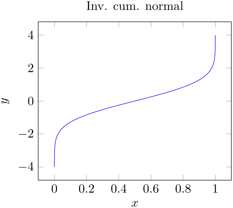
Our first step is to get the data table into pgfplots. In addition, we want axis descriptions for the x and y axes and a title on top of the plot.
Our first version looks like
% Preamble: \pgfplotsset{width=7cm,compat=1.18}
% \documentclass{article}
% \usepackage{pgfplots}
% \pgfplotsset{compat=1.5}
% \begin{document}
\begin{tikzpicture}
\begin{axis}[
title=Inv. cum. normal,
xlabel={$x$},
ylabel={$y$},
]
                        \addplot [blue] table
                {invcum.dat};
\end{axis}
\end{tikzpicture}
% \end{document}
The code listing already shows a couple of important aspects:
-
1. As usual in LaTeX, you include the package using \usepackage{pgfplots}.
-
2. Not so common is \pgfplotsset{compat=1.5} .
A statement like this should always be used in order to (a) benefit from a more or less recent feature set and (b) avoid changes to your picture if you recompile it with a later version of pgfplots.
Note that pgfplots will generate some suggested value into your logfile (since 1.6.1). The minimum suggested version is \pgfplotsset{compat=1.3} as this has great effect on the positioning of axis labels.
-
3. pgfplots relies on TikZ and pgf. You can say it is a “third party package” on top of TikZ/pgf.
Consequently, we have to write each pgfplots graph into a TikZ picture, hence the picture environment given by \begin{tikzpicture} ... \end{tikzpicture}.
-
4. Each axis in pgfplots is written into a separate environment. In our case, we chose \begin{axis} ... \end{axis} as this is the environment for a normal axis.
There are more axis environments (like the \begin{loglogaxis} ... \end{loglogaxis} environment for logarithmic axes).
Although pgfplots runs with default options, it accepts option keys. Lots of option keys. Typically, you provide all keys which you “want to have” in square brackets ([...]) “somewhere” and ignore all other keys.
Of course, the main difficulty is to get an overview over the available keys and to find out how to use them. This reference manual and especially its Chapter 4 has been designed for online browsing: it contains hundreds of cross-referenced examples. Opening the manual in a PDF viewer and searching it for keywords will hopefully jump to a good match from which you can jump to the reference section (for example about tick labels, tick positions, plot handlers, etc.). It is (and will always be) the most reliable source of detailed information about all available option keys.
Speaking about the reference manual: note that most PDF viewers also have a function to “jump back to the page before you clicked on a hyperlink” (for Acrobat Reader, open the menu View / Toolbars / More Tools and activate the “Previous View” and “Next View” buttons which are under “Page Navigation Toolbar”).
Note that the code listing contains two sets of option keys: the first is after \begin{axis} (the keys title, xlabel, and ylabel) and the second right after \addplot (the single key blue). Note, too, that the options list after the axis has been indented: each option is on a separate line, and each line has a tab stop as first character. Formatting code in this way is considered to be good practice when more than one key is specified, as it tends to be more readable than combining multiple option keys on the same line. It also facilitates commenting-out individual options.
Another good practice is placing a comma after the last option (in our case, after the value for ylabel). The trailing comma is effectively ignored – it is not a syntax error, and it does not alter the semantic meaning of the options list. Its presence, however, allows more option keys to be appended easily in the future – you won’t forget the comma.
The lack of a trailing comma in the second “set” of keys (after \addplot) demonstrates that it is not strictly necessary to format an options list as recommended above. In fact, when there is only one option key, it is common to see it included on one line, as shown. In our case, we simply said \addplot[blue], meaning that the plot will be placed in blue color, without any plot mark. If another option were to be added, though, it would be best to switch to indentation and trailing comma:
-
5. Inside of an axis, pgfplots accepts an \addplot ... ; statement (note the final semicolon).
In our case, we use \addplot table: it loads a table from a file and plots the first two columns.
There are, however, more input methods. The most important available inputs methods are \addplot expression (which samples from some mathematical expression) and \addplot table (loads data from tables), and a combination of both which is also supported by \addplot table (loads data from tables and applies mathematical expressions). Besides those tools which rely only on built-in methods, there is also an option to calculated data using external tools: \addplot gnuplot which uses gnuplot as “desktop calculator” and imports numerical data, \addplot shell (which can load table data from any system call), and the special \addplot graphics tool which loads an image together with meta data and draws only the associated axis.
In our axis, we find a couple of tokens: the first is the mandatory \addplot token. It “starts” a further plot. The second is the option list for that plot, which is delimited by square brackets (see also the notes about best practices above). The name “option list” indicates that this list can be empty. It can also be omitted completely in which case pgfplots will choose an option list from its current cycle list (more about that in a different lecture). The next token is the keyword “table”. It tells pgfplots that table data follows. The keyword “table” also accepts an option list (for example, to choose columns, to define a different col sep or row sep or to provide some math expression which is applied to each row). More on that in a different lecture. The next token is {invcum.dat}: an argument in curly braces which provides the table data. This argument is interpreted by “plot table”. Other input types would expect different types of arguments. In our case, the curly braces contain a file name. Plot table expects either a file name as in our case or a so-called “inline table”. An inline table means that you would simply insert the contents of your file inside of the curly braces. In our case, the table is too long to be inserted into the argument, so we place it into a separate file. Finally, the last (mandatory!) token is a semicolon. It terminates the \addplot statement.
-
6. Axis descriptions can be added using the keys title, xlabel, ylabel as we have in our example listing.
pgfplots accepts lots of keys – and sometimes it is the art of finding just the one that you were looking for. Hopefully, a search through the table of contents of the reference manual and/or a keyword search through the entire reference manual will show a hit.
3.1.2Fine-Tuning of the First Picture
While looking at the result of Section 3.1.1, we decide that we want to change something. First, we decide that the open ends on the left and on the right are disturbing (perhaps we have a strange taste – or perhaps we know in advance that the underlying function is not limited to any interval). Anyway, we would like to show it only in the y interval from \(-3\) to \(+3\).
We can do so as follows:

% Preamble: \pgfplotsset{width=7cm,compat=1.18}
\begin{tikzpicture}
\begin{axis}[
title=Inv. cum. normal,
xlabel={$x$},
ylabel={$y$},
ymin=-3, ymax=3,
minor y tick num=1,
]
\addplot [blue] table {invcum.dat};
\end{axis}
\end{tikzpicture}
We added three more options to the option list of the axis. The first pair is ymin=-3 and ymax=3. Note that we have placed them on the same line although we said the each should be on a separate line. Line breaks are really optional; and in this case, the two options appear to belong together. They define the display limits. Display limits define the “window” of the axis. Note that any \addplot statements might have more data (as in our case). They would still generate graphics for their complete set of data points! The keys ymin,ymax,xmin,xmax control only the visible part, i.e. the axis range. Everything else is clipped away (by default). The third new option is minor y tick num=1 which allows to customize minor ticks. Note that minor ticks are only displayed if the major ticks have the same distance as in our example.
Note that we could also have modified the width and/or height of the figure (the keys have these names). We could also have used one of the predefined styles like tiny or small in order to modify not just the graphics, but also use different fonts for the descriptions. We could also have chosen to adjust the unspecified limits: either by fixing them explicitly (as we did for y above) or by modifying the enlargelimits key (for example using enlargelimits=false).
We are now satisfied with the first picture and we would like to add the second one.
3.1.3Adding the Second Picture with a Different Plot
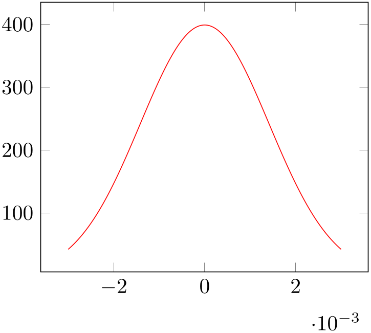
As motivated, our goal is to have two separate axes placed side by side. The second axis should show a function given as math expression. More precisely, we want to show the density function of a normal distribution here (which is just a special math expression).
We simply start a new tikzpicture and insert a new axis environment (perhaps by copy–pasting our existing one). The \addplot command is different, though:
% Preamble: \pgfplotsset{width=7cm,compat=1.18}
\begin{tikzpicture}
\begin{axis}[
]
% density of Normal distribution:
\addplot [
red,
domain=-3e-3:3e-3,
samples=201,
]
{exp(-x^2 / (2e-3^2)) / (1e-3 * sqrt(2*pi))};
\end{axis}
\end{tikzpicture}
We see that it has an axis environment with an empty option list. This is quite acceptable: after all, it is to be expected that we will add options eventually. Even if we don’t: it does not hurt. Then, we find the expected \addplot statement. As already explained, \addplot statements initiate a new plot. It is followed by an (optional) option list, then by some keyword which identifies the way input coordinates are provided, then arguments, and finally a semicolon. In our case, we find an option list which results in a red plot. The two keys domain and samples control how our math expression is to be evaluated: domain defines the sampling interval in the form a:b and samples=N expects the number of samples inserted into the sampling interval. Note that domain merely controls which samples are taken; it is independent of the displayed axis range (and both can differ significantly). If the keyword defining how coordinates are provided is missing, pgfplots assumes that the next argument is a math expression. Consequently, the first token after the option list is a math expression in curly braces. We entered the density function of a normal distribution here (compare Wikipedia).
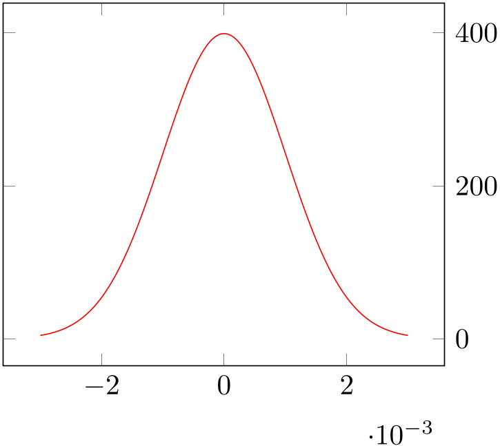
Note that the axis has an axis multiplier: the \(x\) tick labels have been chosen to be \(-2\), \(0\), and \(2\) and an extra \(x\) tick scale label of the form ‘\(\cdot 10^{-3}\)’. These tick scale labels are quite convenient are are automatically deduced from the input data. We will see an example with the effects of scaled x ticks=false at the end of this tutorial.
Inside of the math expression, you can use a lot of math functions like exp, sin, cos, sqrt, you can use exponents using the a^b syntax, and the sampling variable is x by default. Note, however, that trigonometric functions operate on degrees by default! If you need to sample the sinus function, you can use \addplot[domain=0:360] {sin(x)};. This is quite uncommon. You can also use \addplot[domain=0:2*pi] {sin(deg(x)};. This samples radians (which is more common). But since the math parser expects degrees, we have to convert x to degrees first using the deg() function. See also trig format plots=rad. The math parser is written in TeX (it does not need any third-party tool). It supports the full range of a double precision number, even though the accuracy is about that of a single precision number. This is typically more than sufficient to sample any function accurately. If you ever encounter difficulties with precision, you can still resort to \addplot gnuplot in order to invoke the external tool gnuplot as “coordinate calculator”.
The experienced reader might wonder about constant math expressions domain=-3e-3:3e-3, 2e-3^2, and 1e-3 rather than some variable name like ‘mu’ or ‘sigma’. This is actually a matter of taste: both is supported and we will switch to variable names in the next listing.
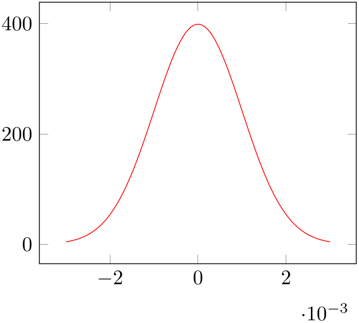
The main part of our step here is still to be done: we wanted to place two figures side by side. This can be done as follows:

% Preamble: \pgfplotsset{width=7cm,compat=1.18}
\begin{tikzpicture}
\begin{axis}[
title=Inv. cum. normal,
xlabel={$x$},
ylabel={$y$},
ymin=-3, ymax=3,
minor y tick num=1,
]
\addplot [blue] table
{invcum.dat};
\end{axis}
\end{tikzpicture}% -- avoid white space
%
\hskip 10pt % insert a non-breaking space of specified width.
%
\begin{tikzpicture}
\begin{axis}[
]
% density of Normal distribution:
\newcommand\MU{0}
\newcommand\SIGMA{1e-3}
\addplot[
red,
domain=-3*\SIGMA:3*\SIGMA,
samples=201,
]
                           {exp(-(x-\MU)^2 / 2 / \SIGMA^2) / (\SIGMA
                * sqrt(2*pi))};
\end{axis}
\end{tikzpicture}
The listing above shows the two separate picture environments: the first is simply taken as is from the previous step and the second is new. Note that both are simply placed adjacent to each other: we only inserted comment signs to separate them. This approach to place graphics side by side is common in TeX: it works for \includegraphics in the same way. You could, for example, write
\includegraphics{image1}%
%
\hskip 10pt % insert a non-breaking space of specified width.
%
\includegraphics{image2}
to place two graphics next to each other. This here is just the same (except that our graphics occupy more code in the .tex file).
Note that there is also a comment sign after \end{tikzpicture}. This is not just a best practice: it is necessary to suppress spurious spaces! In TeX, every newline character is automatically converted to a white space (unless you have an empty line, of course). In our case, we want no white spaces.
In our second picture, we see the effects of switch our math expression to constant definitions as promised earlier. The interesting part starts with two constants which are defined by means of two \newcommands: we define \MU to be 0 and \SIGMA to be 1e-3. This is one way to define constants (note that such a definition of constants should probably introduce round braces if numbers are negative, i.e. something like \newcommand\negative{(-4)}).
3.1.4Fixing the Vertical Alignment and Adjusting Tick Label Positions
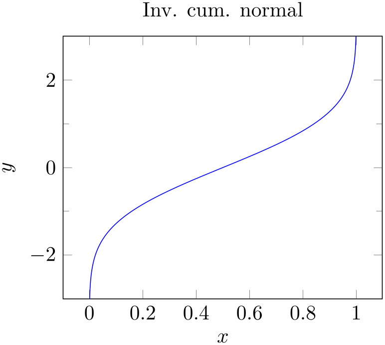
Note that even though our individual pictures look quite good, the combination of both is not properly aligned. The experienced reader identifies the weak point immediately: the bounding box of the two images differs, and they are aligned at their baseline (which is the bottom edge of the picture). In particular, the xlabel=$x$ of the left picture and the automatically inserted scaling label \cdot 10^{-3} of the right picture cause an unwanted vertical shift. We want to fix that in the next step.
Besides the bad alignment, we find it a little bit misleading that the axis descriptions of the second picture are between both pictures. We would like to move them to the right.
Let us present the result first:
% Preamble: \pgfplotsset{width=7cm,compat=1.18}
\begin{tikzpicture}[baseline]
\begin{axis}[
title=Inv. cum. normal,
xlabel={$x$},
ylabel={$y$},
ymin=-3, ymax=3,
minor y tick num=1,
]
                        \addplot [blue] table
                {invcum.dat};
\end{axis}
\end{tikzpicture}%
%
\hskip 10pt % insert a non-breaking space of specified width.
%
\begin{tikzpicture}[baseline]
\begin{axis}[
yticklabel pos=upper,
]
% density of Normal distribution:
\newcommand\MU{0}
\newcommand\SIGMA{1e-3}
\addplot [red,domain=-3*\SIGMA:3*\SIGMA,samples=201]
                            {exp(-(x-\MU)^2 / 2 / \SIGMA^2) /
                (\SIGMA * sqrt(2*pi))};
\end{axis}
\end{tikzpicture}
This listing has a couple of modifications. The most important one is the we added an option list to the tikzpicture environment: the baseline option. This option shifts the picture up or down such that the canvas coordinate \(y=0\) is aligned at the baseline of the surrounding text. In pgfplots, the \(y=0\) line is the lower edge of the box. This simple feature allows both axes to be aligned vertically: now, their boxes are aligned rather than the lower edges of their bounding boxes. The option baseline needs to be provided to all pictures for which this shifting should be done – in our case, to all which are to be placed in one row. Keep in mind that it is an option for \begin{tikzpicture}.
The second change is rather simple: we only added the option yticklabel pos=upper to the second axis. This moves all tick labels to the right, without changing anything else.
Note that there is much more to say about alignment and bounding box control. After all, we did not really change the bounding box – we simply moved the pictures up or down. There is also the use case where we want horizontal alignment: for example if the two pictures should be centered horizontally or if they should be aligned with the left- and right end of the margins. The associated keys \begin{tikzpicture}[trim axis left, trim axis right] and \centering are beyond the scope of this tutorial, please refer to Section 4.19 for details.
3.1.5Satisfying Different Tastes
We are now in a position where the figures as such are in a good shape.
However, an increase in knowledge will naturally lead to an increase in questions. Some of these questions will be part of other how-to lectures. But the most commonly asked questions are addressed here (feel free to email some more if you believe that I should include another hotspot):
-
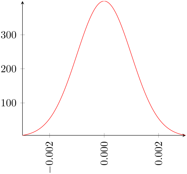
1. How can I get rid of that \(10^{-3}\) label?
-
2. How can I modify the number printing?
-
3. How can I have one single line per axis rather than a box?
This here gives brief hints where to look in this reference manual for more details. We modify the appearance of the second picture according to the questions above:
% Preamble: \pgfplotsset{width=7cm,compat=1.18}
\begin{tikzpicture}
\begin{axis}[
axis lines=left,
scaled ticks=false,
xticklabel style={
rotate=90,
anchor=east,
/pgf/number format/precision=3,
/pgf/number format/fixed,
/pgf/number format/fixed zerofill,
},
]
% density of Normal distribution:
\newcommand\MU{0}
\newcommand\SIGMA{1e-3}
\addplot [red,domain=-3*\SIGMA:3*\SIGMA,samples=201]
{exp(-(x-\MU)^2 / 2 / \SIGMA^2)
/ (\SIGMA * sqrt(2*pi))};
\end{axis}
\end{tikzpicture}
The appearance of the axes as such can be controlled by means of the axis lines key. It accepts the values left, right, box, center, none (and also top, bottom, middle which are aliases). The xticklabel style key modifies a predefined style (note the use of indentation here!). A style is a collection of keys which are applied in a specific context. Styles are very useful and are widely used by pgfplots. In our case, we adjust a couple of options like rotation, alignment (the anchor option), and number printing options. The precise details of these individual options is beyond the scope of this tutorial. The keys actually belong to TikZ – and the TikZ manual is the reference for these keys (although pgfplots also covers most of the topics). The complete set of number printing options is available in both the TikZ manual and the manual for PgfplotsTable. A brief extract can be found in Section 6.1.7.
3.1.6Finishing Touches: Automatic Generation of Individual Pdf Graphics
As last step in this lecture, I would like to talk about one technical topic. Typically, a TeX document starts quite simple: a little bit of text, perhaps one or two pictures. But they tend to grow. And eventually, you will encounter one of the weak points of pgfplots: the graphics are involved and TeX consumes a lot of time to generate them. Especially if it keeps regenerating them even though they did not change at all. The fact that we need to rerun the pdflatex processor all the time makes things worse.
Fortunately, there are solutions. A simple solution is: why can’t we write each individual graphics into a separate .pdf file and use \includegraphics to include it!? The answer is: yes, we can. And it is surprisingly simple to do so.
In order to convert every tikzpicture environment automatically to an external graphics without changing any line of code in the TeX file, we can simply write the following two lines into the document’s preamble:
But now, we have to provide a command line switch to pdflatex:
pdflatex -shell-escape myfile.tex
This works out of the box with pdflatex. If you use latex/dvips, lualatex, dvipdfm or any other TeX derivatives, you need to modify the option \tikzexternalize[system call=...] (which is, unfortunately, system-dependent, especially for the postscript variants).
It might be too much to discuss how to define individual file names or how to modify the file name generation strategy. There is also the \tikzexternalize[mode=list and make] feature which generates a GNU Make file to allow \label/\ref to things inside of the external graphics and which supports the generation of all images in parallel (if you have a multi-core PC).
Details of the external library can be found in Section 8.1 (but only a brief survey) and, in all depth, in the the PGF/TikZ manual.
3.1.7Summary
We learned how to create a standard axis, and how to assign basic axis descriptions. We also saw how to plot functions from a data table (in our case a tab-separated file, but other delimiters as in CSV files are also supported) and from math expressions. We saw that pgfplots does a reasonable good job at creating a fully-featured axis automatically (like scaling the units properly, choosing tick positions and labels). We also learned how to improve vertical alignment and how to customize the appearance of an axis.
Next steps might be how to draw multiple plots into the same axis, how to employ scatter plots of pgfplots, how to generate logarithmic axes, or how to draw functions of two variables. Some of these aspects will be part of further how-to lectures.