Manual for Package pgfplots
2D/3D Plots in LATeX, Version 1.18.2
https://github.com/pgf-tikz/pgfplots
Step-by-Step Tutorials
3.4Solving a Real Use Case: Functions of Two Variables
In this tutorial, we assume that we have two functions for which we seek a plot: the first is a sampled function given by a huge data file and the second is the math expression \(g(x,y)=\exp (-x^2-y^2)\cdot x\).
Our first function actually consists of two data files: the first file contains some scattered data which resembles a discretization (“sampling”) of a function and the second file contains data for the function as such, sampled on a lattice. Our requirement here is two draw two graphs into the same axis: one in which the function is plotted as a smooth, colored surface and one in which the scattered data file should be on top of the surface because it provides more detail how the function was represented in the computer.
The second function which is given as math expression should be visualized using a contour plot. A contour plot expects some fixed values \(g_1, \dotsc , g_k\) as input (the contour values) and plots one curve for each \(g_j = g(x,y)\) (i.e. if you go hiking without ever changing the height of your path).
3.4.1Surface Plot from Data File
Our first step is to load the data file and to plot a surface.
Clearly, functions of two variables require a more sophisticated input format: they are typically sampled on a unified grid with \(n \times m\) points, i.e. \(n\) points for \(x\) and \(m\) points for \(y\), resulting in a total of matrix with \(n\cdot m\) values \(f_{ij} = f(x_i,y_i)\). How can we read matrix data? And what if you have more than just the \(z\) value? A standard way is to write the matrix to a table, either in line by line ordering or in column by column ordering (both are common).
Here, we assume that our function values are written to a table in which the \(y\) values vary from line to line. Here is an extract of the data file (which is too large to list it here):
# ordering = colwise , number points =1089 ,
# ( max ) level ( s ): (5 ,5) , domain =[0 ,1] x [ 0 , 6 . 2 8 3 1 8 5 3 ]
x _0 x _1 f(x) l _0 i _0
0 0 0 0 0
0 0.19634954 0.038239818 0 0
0 0.39269908 0.14662768 0 0
\(\vdots \)
0 5.8904862 0.14662768 0 0
0 6.0868358 0.038239818 0 0
0 6.2831853 6.9388939 e -18 0 0

0.03125 0 3.0517578 e -05 5 1
0.03125 0.19634954 0.030093496 5 1
0.03125 0.39269908 0.1146012 5 1
0.03125 0.58904862 0.24129102 5 1
0.03125 0.78539816 0.38946059 5 1
0.03125 0.9817477 0.53949733 5 1
\(\vdots \)
Note that the data file (and all others referenced in this manual) are shipped with pgfplots; you can find them in the subfolder doc/latex/pgfplots/plotdata.
The input file contains \(x_0\), \(x_1\), and \(f(x_0,x_1)\) in columns named x_0, x_1, and f(x), respectively. In addition, it contains some meta data which is irrelevant for us here.
Note that our input file contains empty lines whenever x_0 changes. This is a common data format which simplifies the detection of “scanline length”. A scanline is one line in the input matrix, for example the line consisting of all points with \(x_0 = 0\). With such scanlines, pgfplots can automatically deduce the size of the input matrix.
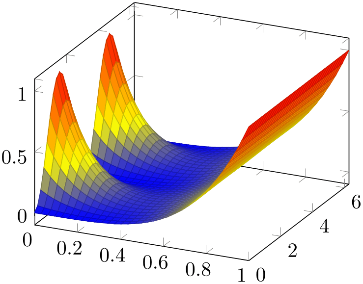
In order to plot the file as a surface, we proceed as in the previous example by using \addplot table. However, we have to use \addplot3 to indicate that a three-dimensional result is expected:
% Preamble: \pgfplotsset{width=7cm,compat=1.18}
\begin{tikzpicture}
\begin{axis}
\addplot3 [
surf,
mesh/ordering=y varies,
] table {concat_VV_together.dat};
\end{axis}
\end{tikzpicture}
The example looks familiar compared to our results of the preceding tutorials: a tikzpicture environment containing an axis environment and the mentioned \addplot3 command. The option list contains surf, which tells pgfplots how to visualize the input data. The key mesh/ordering=y varies tells pgfplots how to decode the input matrix. This is important; otherwise pgfplots would have chosen x varies which does not match our file.
Note that there is no need to configure either mesh/rows= N
N
 or mesh/cols=
 N
N
 here because these parameters are automatically deduced from the scan line lengths marked by empty lines in our input file.
Since our \addplot3 table statement does not contain any hints which columns should be plotted, pgfplots simply plots the first three columns against each other.
The colors of a surf plot are chosen from the function values (unless you configure some other value for point meta; this is similar to the scatter plot example). In case of a function of two variables, the function value is the third column.
3.4.2Fine-Tuning
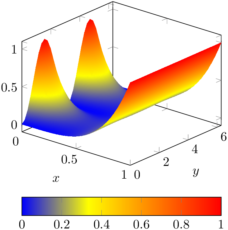
In order to stress how colors are to be mapped to values, we add a color bar to our example from the previous subsection. In addition, we rotate the view a little bit and add axis labels. Furthermore, we would like to have a smooth color mapping.
We end up at
% Preamble: \pgfplotsset{width=7cm,compat=1.18}
\begin{tikzpicture}
\begin{axis}[
view/h=40,
colorbar horizontal,
xlabel=$x$, ylabel=$y$,
]
\addplot3 [
surf,
mesh/ordering=y varies,
shader=interp,
] table {concat_VV_together.dat};
\end{axis}
\end{tikzpicture}
Here, view/h rotates the “horizontal” parts
of the view (only). It chooses a new view angle for the orthographic projection. As you guessed, there is also a
view/v key and a
view={ h
h }{
}{ v
v } variant.
The key colorbar horizontal is a style which activates a colorbar and configures it to be displayed horizontally. The labels are placed using xlabel and ylabel as we saw it before for visualizations of one-dimensional functions. A colorbar uses the current colormap and adds axis descriptions to show how values are mapped to colors.
The shader=interp key activates a smooth color interpolation.
3.4.3Adding Scattered Data on Top of the Surface
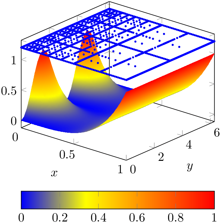
As motivated earlier, we have a second data set, one which characterizes how the function has been represented in some computer simulation. We would like to add the second data set as scatter plot on top of the function.
The data set as such is the very same as the one used in Section 3.3.1, so we do not need to list it here again. However, we have to include the two-dimensional scatter data into the three-dimensional axis in a suitable way. We chose to place it on a fixed \(z\) value as follows:
% Preamble: \pgfplotsset{width=7cm,compat=1.18}
\begin{tikzpicture}
\begin{axis}[
view/h=40,
colorbar horizontal,
xlabel=$x$, ylabel=$y$,
]
                    \addplot3 [surf,mesh/ordering=y
                varies,
shader=interp
] table {concat_VV_together.dat};
\addplot3 [blue,mark=*,
mark options={fill=blue!80!black},
only marks,mark size=0.6pt,
] table [z expr=1.2]{concat_VV_together_grid.dat};
\end{axis}
\end{tikzpicture}
Now, we have two \addplot3 table statements in the same axis. None of them uses the cycle list as we used explicit option lists. The first is our surface plot. Note that it is plotted before the scatter plot: pgfplots cannot handle depth information between adjacent \addplot statements. It does, however, handle z buffer information for data of a single \addplot statement. The second plot is our scatter plot: we recognize only marks and mark size from Section 3.3.1. In addition, we configured some color and marker options.
An important aspect is \addplot3 table[z expr=1.2] – it tells pgfplots how to choose \(z\) values for the input file (otherwise, pgfplots would have used the third column of that file). This is a convenient way to insert two-dimensional data into a three-dimensional axis, provided you have table data. There is also a different way which works for both tables and math expressions (or other input types). This different way is to install a z filter, but that is beyond the scope of this tutorial for now.
3.4.4Computing a Contour Plot of a Math Expression
This section addresses the second part of our use case example: a function of two variables given by a math expression.
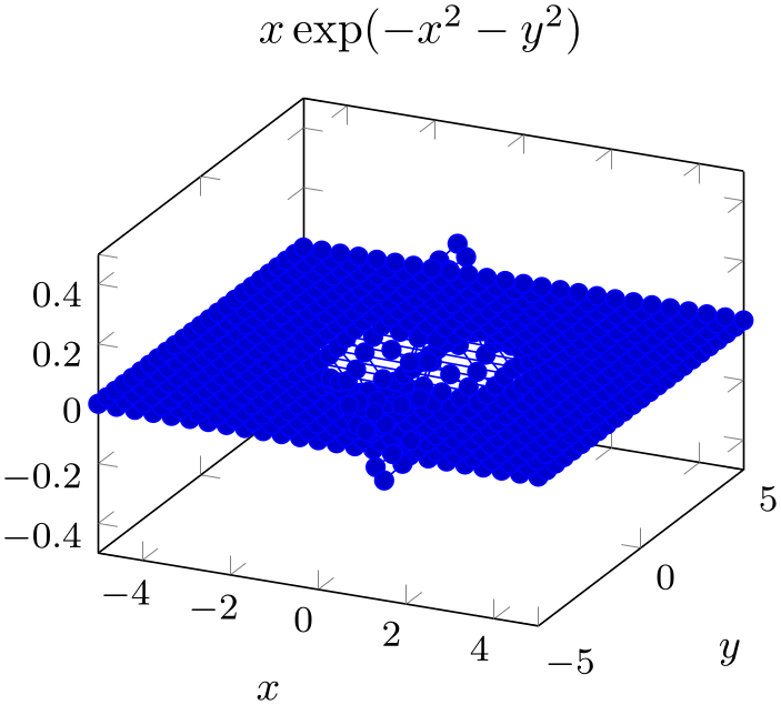
Our function of interest is \(x \exp (-x^2-y^2)\). We start as in our tutorial for one-dimensional functions given by a math expression (compare Section 3.1.3): by using an \addplot statement which is followed by a math expression in curly braces. However, we rely on \addplot3 as in the preceding section:
% Preamble: \pgfplotsset{width=7cm,compat=1.18}
\begin{tikzpicture}
\begin{axis}[
title={$x \exp(-x^2-y^2)$},
xlabel=$x$, ylabel=$y$,
small,
]
\addplot3 {exp(-x^2-y^2)*x};
\end{axis}
\end{tikzpicture}
Our example contains a basic axis environment with title, xlabel, ylabel and the small key which are already known from the preceding tutorials. The \addplot3 has no options and is immediately followed by the math expression. The absence of options tells pgfplots to rely on its cycle list. This, in turn configures mark=* with blue color – and a line plot. A line plot combined with \addplot3 is of limited use; it merely connects all incoming points. Since points are sampled as a matrix (line by line). Our next step will be to define a suitable plot handler.
Note, however, that our math expression depends on x and y. These two variables are the sampling variables of pgfplots in its default configures: both are sampled in the domain of interest using the correct number of samples. The \addplot3 statement takes care of computing \(N\cdot M\) points in the correct sequence where \(N\) is the number of samples for \(x\) and \(M\) is samples y, the number of samples used for \(y\).
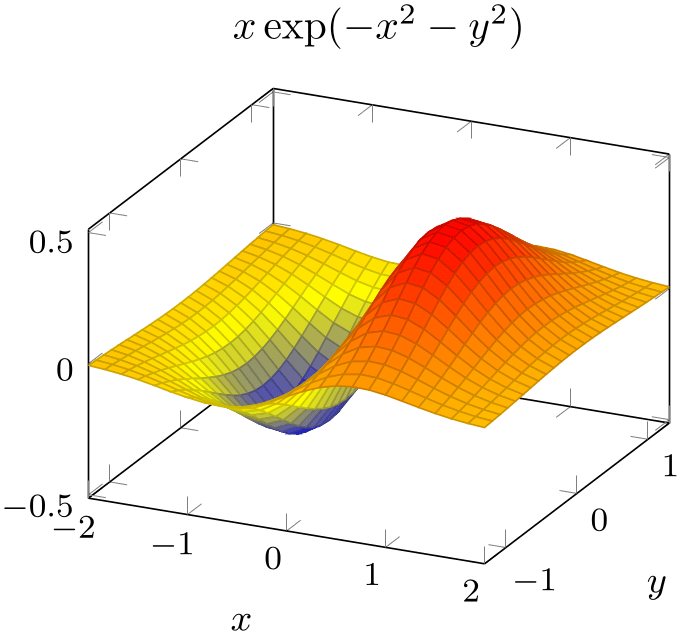
We can see that our sampling domain is too large. Switching to a smaller domain focusses on the interesting parts of our function:
% Preamble: \pgfplotsset{width=7cm,compat=1.18}
\begin{tikzpicture}
\begin{axis}[
title={$x \exp(-x^2-y^2)$},
xlabel=$x$, ylabel=$y$,
small,
]
\addplot3 [
surf,
domain=-2:2,
domain y=-1.3:1.3,
] {exp(-x^2-y^2)*x};
\end{axis}
\end{tikzpicture}
Here, we introduced an option list after \addplot3. Since we provided the option list without the leading plus sign ‘+’, pgfplots does not consider its cycle list at all (and switches off marks and the default color settings). We added domain and domain y in order to restrict the sampling domain in a suitable way. If we would have omitted domain y, the \(y\) domain would use the same value as the \(x\) domain.
As you might have guessed, the surf key has the main use case of providing a connection to the previous tutorial section: it is one of the natural visualizations for functions of two variables. As in the preceding section, the color has been deduced from the function value \(z=f(x,y)\) (more precisely, by relying on the default configuration point meta=f(x)).
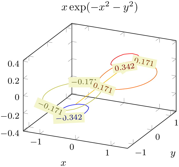
The next step is to switch to contour plots by replacing ‘surf‘ by ‘contour lua’:
% Preamble: \pgfplotsset{width=7cm,compat=1.18}
\begin{tikzpicture}
\begin{axis}[
title={$x \exp(-x^2-y^2)$},
xlabel=$x$, ylabel=$y$,
small,
]
\addplot3 [
contour lua,
domain=-2:2,
domain y=-1.3:1.3,
] {exp(-x^2-y^2)*x};
\end{axis}
\end{tikzpicture}
Now, we have a contour plot – although it is not quite what we had in mind. First, there are so few contour lines that it is hard to see anything (especially since the line width is too small). Furthermore, the view direction is unfamiliar.
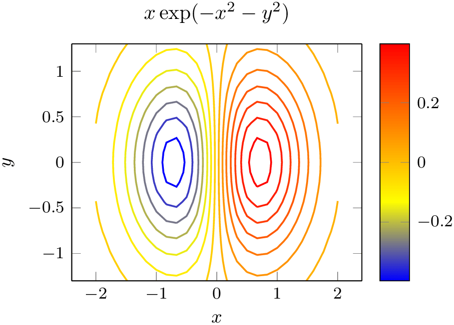
We add the view option with the argument for “view from top” and configure the number of contour lines using the contour/number key and the line width using the thick style:
% Preamble: \pgfplotsset{width=7cm,compat=1.18}
\begin{tikzpicture}
\begin{axis}[
title={$x \exp(-x^2-y^2)$},
enlarge x limits,
view={0}{90},
xlabel=$x$, ylabel=$y$,
small,
colorbar,
]
\addplot3[
domain=-2:2,
domain y=-1.3:1.3,
contour lua={number=14,labels=false},
thick,
] {exp(-x^2-y^2)*x};
\end{axis}
\end{tikzpicture}
This is what we wanted to achieve. Note that contour lua accepts options which have the key prefix contour/. In this context, the prefix is optional.
Note that contour lua is different from almost all other plot handlers of pgfplots with respect to one aspect: it requires you to invoke
lualatex  texfilename
instead of
pdflatex  texfilename
 .
.
The nonlinear algorithm to compute contour lines is currently unavailable in plain TeX which is stressed by the name ‘contour lua’.
If you cannot use lualatex for some reason, you can replace contour lua by contour gnuplot, provided that you have the external program gnuplot installed on your system (see the reference for contour gnuplot for more details).
3.4.5Summary
We have sketched how to load a data table containing a sampled function of two variables, and we learned how to visualize such data as surface plot. We learned how to rotate the view, how to change the color shader of surface plots, how to enabled colorbars, and how to add scatter plots on top of surface plots. Furthermore, we encountered the first contour plot as an example for how to sample a function of two variables by means of built-in methods of pgfplots.
It should be stressed that pgfplots needs no external tool to generate such plots: every computer with a decent version of pgfplots can regenerate these plots.
There is more to say about three-dimensional axes, in particular regarding mesh/ordering, parametric plots, perhaps line plots in three dimensions or other plot types. Furthermore, there are some limitations regarding the z buffering, i.e. how pgfplots decides which parts of the figure are in front of others. These items can be read in Section 4.6 and its subsections.
You might also be interested in styles to change the appearance of a three-dimensional axis, compare Section 4.11.